

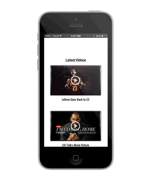
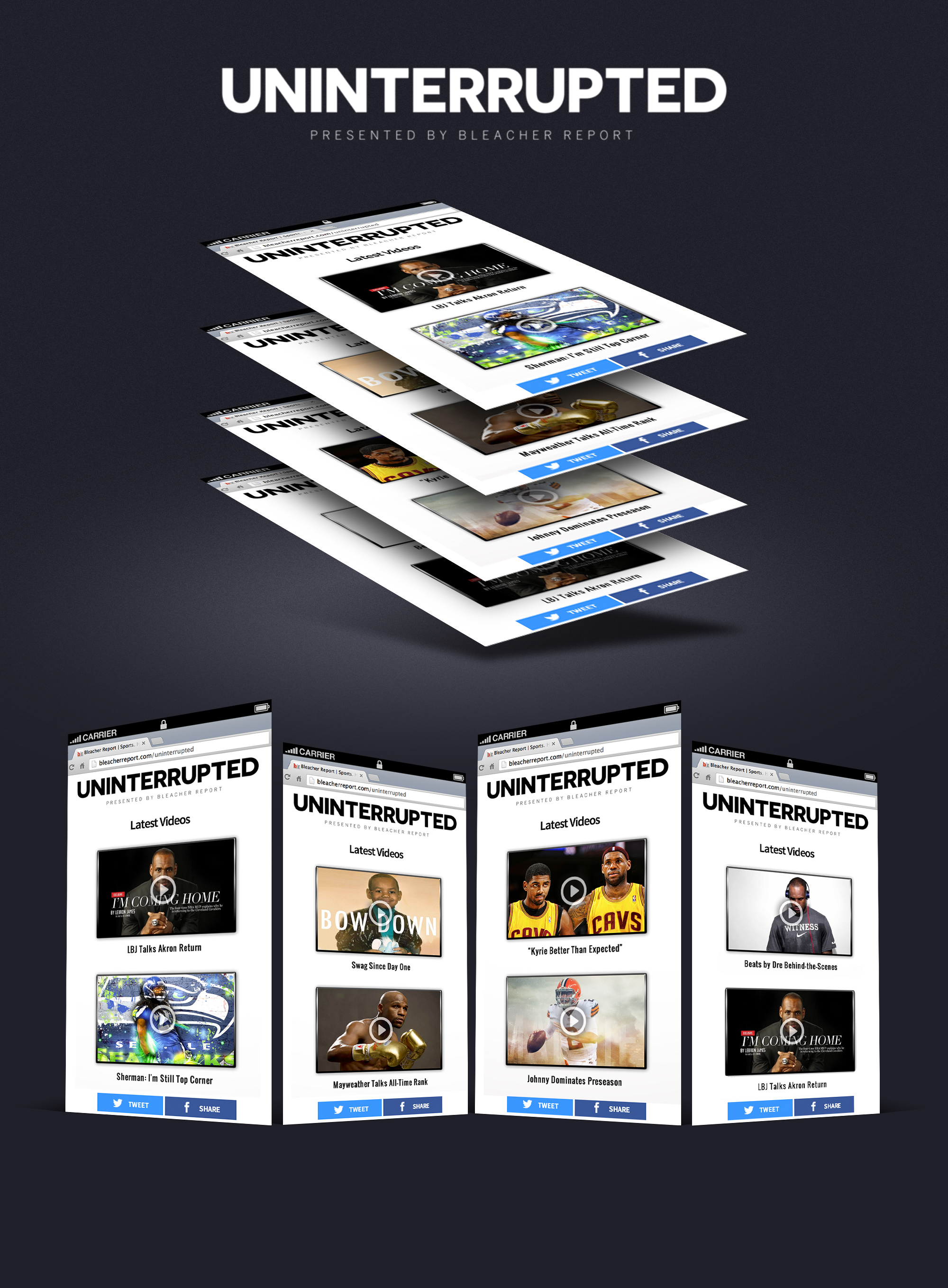
Bleacher Report and LRMR Management Company, the sports marketing entity run by LeBron James and Maverick Carter, quietly collaborated in early 2015 to create and launch Uninterrupted, a player-driven platform that put athletes at the center of their own narratives. The mission was simple yet radical: deliver unfiltered video content directly from athletes to fans without the traditional media filter. At launch, the roster of contributors was already impressive, with James, Richard Sherman, Victor Cruz, Odell Beckham Jr., Johnny Manziel, and Carmelo Anthony offering personal updates and reflections. From the start, Uninterrupted was fully integrated into Bleacher Report’s digital footprint, including its Team Stream mobile application, which at that time was the primary way fans consumed content on the go. My role was to translate this ambitious vision into a tangible product experience. I was responsible for developing the initial look and feel of the brand and ensuring that it could live within Bleacher Report’s ecosystem without losing its distinct identity. This meant building the web integration from the ground up, creating a seamless environment where Uninterrupted videos could live natively alongside Bleacher Report’s content while still carrying their own design language. I oversaw the design system that allowed the platform to maintain a stripped-down aesthetic, prioritizing the athlete’s voice above all else. This involved working closely with both LRMR and internal stakeholders at Bleacher Report to define the core user journey, design a mobile-first interface optimized for video, and deliver a product that felt immediate and personal. By establishing this foundation, I helped create the infrastructure that allowed Uninterrupted to scale quickly, expand its roster of athlete contributors, and become a trusted space for authentic storytelling.
Digiday Video Award - Best Brand Video Destination (Uninterrupted) | 2015
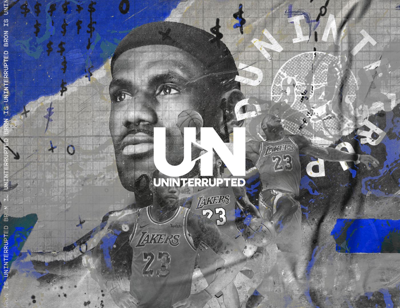
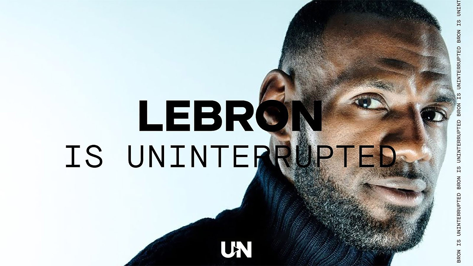
Uninterrupted was conceived as a direct line between athletes and fans, a platform where players could speak in their own voices without the mediation, framing, or selective editing that had long defined traditional sports media. In partnering with Maverick Carter and Bleacher Report to shape the brand’s look and feel, the mandate was clear: build an environment that honored the mantra More Than An Athlete by revealing the full dimensionality of these individuals, their fears, humor, activism, routines, and off-court identities, not merely their stat lines. This required a design approach that resisted spectacle in favor of clarity. The platform had to feel raw and immediate while still maintaining the trust and polish expected of a global sports property. Striking that balance became the central creative tension. I developed a visual system rooted in restraint: a minimal palette, strong typographic hierarchy, and a video-first layout that kept the athlete’s face, voice, and perspective as the focal point. The site was intentionally structured as a living stream of video, punctuated by select interactive moments that deepened engagement without cluttering the experience. Every decision, from player page architecture to thumbnail treatments, was guided by the principle of reducing friction between storyteller and audience. The resulting identity proved flexible enough to extend into original series, social packages, broadcast integrations, and physical merchandise, demonstrating that a quiet, unobtrusive design language could scale across formats while preserving the intimacy that made the platform culturally resonant in the first place. From the earliest stages, my creative vision centered on building a scalable design system that could evolve with the platform while remaining invisible enough to let athlete storytelling take precedence. I established foundational UI patterns, motion behaviors, and brand guardrails that ensured consistency across web, mobile, social, and broadcast touch points as the ecosystem expanded. By prototyping rapidly and iterating in close collaboration with LRMR and Bleacher Report stakeholders, I helped translate an abstract ethos into a tangible product experience that could launch quickly, grow deliberately, and endure culturally. This was one of my first major projects in terms of developing a brand identity and logo development and to do it at this scale, with a talent like LeBron James was an unprecedented opportunity and one I am genuinely grateful for as it set the stage for my understanding of design systems and content marketing and strategy at a foundational level. Watching the platform grow from a bold idea into a cultural force that reshaped athlete storytelling has been profoundly gratifying, both as a creative milestone and as a lasting contribution to how sport, media, and identity intersect.

.jpg)
.webp)
.jpg)
.png)

Launching the Uninterrupted brand within the Bleacher Report ecosystem presented a complex, high-stakes challenge that demanded a precise balance of brand building, product design, and social amplification. I was entrusted with this momentous responsibility at a pivotal inflection point in sports media, tasked with translating an ambitious vision into a cohesive platform that could live natively within Bleacher Report while asserting its own unmistakable identity. The raw, unfiltered nature of the content, delivered directly from athletes’ phones to fans’ hands, distinguished Uninterrupted from prior digital experiments and required a design and distribution strategy that privileged immediacy, authenticity, and emotional proximity. By embracing a mobile-first architecture, the platform enabled athletes to cultivate direct, one-to-one relationships with supporters, redefining fan engagement as a continuous dialogue rather than a mediated broadcast. Athletes gained full autonomy over the length, subject matter, and cadence of their messages, offering audiences uncensored, front-row access to the realities of their lives, from triumphs and vulnerabilities to social advocacy and personal reflection. In removing editorial filters and traditional media spin, Uninterrupted did more than distribute content; it reconfigured power dynamics within the sports media landscape, positioning the athlete not as a subject of coverage but as the primary author of their own narrative.
Early in the launch process, when Uninterrupted partnered with Bleacher Report to build its initial audience and develop a dedicated platform and landing experience, Maverick Carter visited our San Francisco office to articulate the vision firsthand. Sitting in that room as he outlined the ambition to create a direct, unfiltered channel between athletes and fans was a pivotal moment. I was tasked with translating that vision into tangible design directions, developing multiple look-and-feel explorations that could live within the Bleacher Report ecosystem while still establishing a distinct identity. What followed was an intensive cycle of concepting, prototyping, and review as we pressure-tested typography, motion language, video framing, and UI structures against the core principle of athlete-first storytelling.
I became deeply embedded in the collaborative process, working closely with Maverick Carter, LeBron James, and cross-functional teams to refine the brand’s voice and visual system. Every iteration aimed to strip away mediation and foreground authenticity, ensuring the design acted as a conduit rather than a filter. Through workshops, feedback sessions, and rapid design sprints, we shaped a platform that felt immediate, personal, and culturally fluent, laying the groundwork for a brand that could scale across digital, social, broadcast, and physical expressions while staying true to its founding ethos.
The rise of Uninterrupted marked a turning point in how athletes shaped their public identities. It arrived in the wake of LeBron James’ decision to return to Cleveland, a moment that symbolized both redemption and self-determination. For the first time, an athlete wasn’t waiting for a network or journalist to interpret his narrative; he was building a platform to tell it himself. This idea of narrative ownership became the defining spirit of the player empowerment era. Uninterrupted gave athletes the freedom to speak directly to their audiences, whether to share frustration, triumph, or reflection, and in doing so, it redefined what athlete-driven media could be. The platform helped pave the way for a wave of creative self-expression across sports culture. Soon after, The Players’ Tribune emerged, continuing the momentum toward authenticity and transparency. Today, that lineage lives on through a new generation of athlete-led media voices, from Draymond Green’s podcast to LeBron’s own Mind the Game, both of which build on the foundation Uninterrupted helped create. What began as a bold experiment in direct communication became a symbol of power reclaimed, proving that control over one’s story is the ultimate act of agency in modern sport.
.jpg)
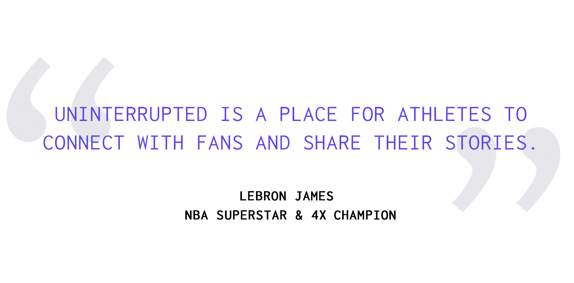
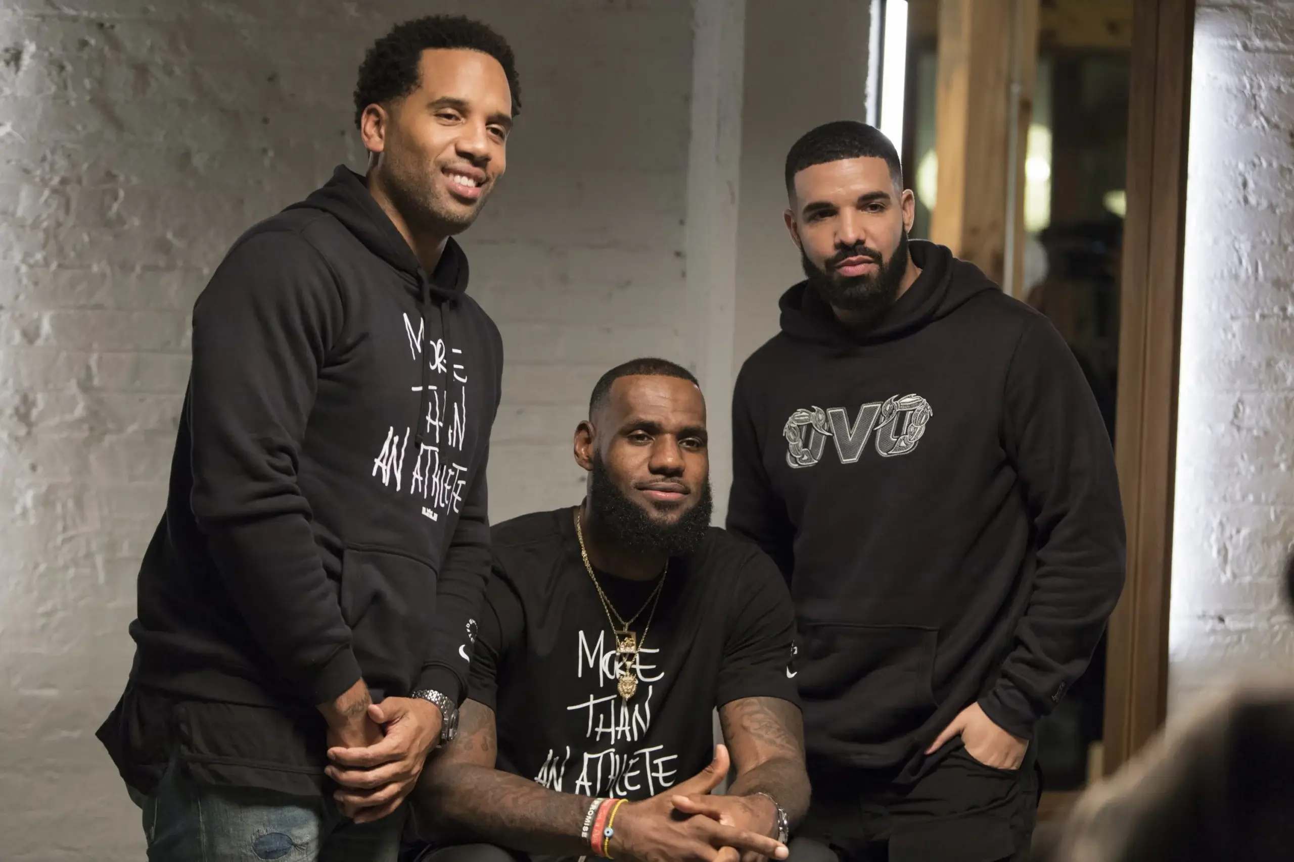
Upon the announcement of the collaboration with Bleacher Report and its parent companies Warner Media and Turner, LeBron James said, "The best thing about Uninterrupted is there are so many creative opportunities for athletes to tell their stories. I'm excited to be partnering with important, innovative companies like Warner Brothers and Turner to keep building UNINTERRUPTED as a place for athletes to go to connect with fans and share their stories in a different way." He was a willing and excited partner who saw what our team at Bleacher Report had built from a digital perspective and he felt like we could amplify what they were doing. I was thrilled to be assigned this project, being a fan of video and athlete storytelling and understanding the network that LeBron could create.
.jpg)
LeBron and his team were unequivocal in their desire for a no-frills, highly intuitive design that would minimize friction and dissolve the traditional barriers separating athletes from their fans. The mandate was clarity over ornament, access over abstraction. Every design decision had to serve the singular purpose of bringing audiences closer to the athlete’s voice. Our partnership provided the technical foundation and design rigor necessary to transform that ethos into a scalable product, and it made strategic sense on multiple levels. By embedding Uninterrupted within Bleacher Report’s ecosystem, we were able to accelerate development, leverage an existing mobile-first audience, and ensure that the platform launched with both credibility and reach. This collaboration created a rare alignment of incentives. Bleacher Report and Time Warner gained unprecedented, direct access to athlete-generated content, strengthening their cultural relevance in an evolving media landscape, while Uninterrupted benefited from enterprise-level infrastructure, distribution, and product expertise during its formative stage. My role was to help architect a system that could support this symbiosis without diluting the platform’s independence. We designed a flexible framework that allowed Uninterrupted to grow from a lightweight content hub into a robust media property, ensuring that as the roster of athletes expanded and the volume of content scaled, the experience remained seamless, intimate, and unmistakably athlete-first.
.jpg)
Athlete-led media ventures have emerged as one of the most consequential shifts in modern sports culture, redefining who controls narrative, distribution, and cultural capital. For decades, athletes were mediated through leagues, broadcasters, and journalists, their identities shaped by highlight reels and postgame soundbites. The new paradigm flips that hierarchy. Platforms built by athletes place authorship back in their hands, allowing them to speak in first person, cultivate direct relationships with fans, and build equity in the stories they generate. What began as an authenticity play has evolved into a structural reallocation of power, where content ownership, audience data, and brand partnerships flow through athlete-controlled channels rather than traditional gatekeepers.
The ability to leverage Turner’s sales arm through this unique partnership and collaboration to integrate sponsors such as Samsung and Verizon unlocked a uniquely verticalized branded content model that felt native rather than interruptive. Instead of bolting ads onto the experience, partnerships were woven into the storytelling ecosystem, aligning with the platform’s mobile-first behavior and the real contexts in which athletes were creating content. This approach allowed brands to show up inside authentic moments, whether through device integration, connectivity narratives, or enabling technologies, positioning them as facilitators of access rather than external interruptions. The result was a new commercial framework where media, technology, and athlete voice converged into a cohesive value exchange for fans, partners, and creators alike.
.jpg)
LeBron James stands at the forefront of this movement, approaching media not as a side project but as a cornerstone of a post-playing empire designed to rival his on-court legacy. Through ventures like UNINTERRUPTED, SpringHill, and a growing portfolio of production and brand partnerships, he is constructing an ecosystem that merges storytelling, commerce, and cultural influence. The strategy is both personal and systemic: control the narrative, own the platform, and translate cultural relevance into long-term enterprise value. In doing so, LeBron is not merely extending his career. He is redefining the modern athlete as a vertically integrated media company, proving that the true endgame is not retirement from sport but ownership of the lanes that shape how sport is seen, understood, and monetized for generations to come.
The ability for LeBron to record a video on the bus on the way to a game and publish it instantly as a news moment was the breakthrough that defined the platform’s power. It bypassed aggregation, hot takes, and the distortion of social feeds, allowing a personal, heartfelt message to reach fans in its original context and emotional truth. In that moment, the athlete was not a headline or a quote pulled into a debate cycle but a narrator of his own experience, speaking directly to millions without mediation. That immediacy transformed everyday in-between moments into cultural events and proved that authenticity, delivered at the speed of life, could cut through the noise more effectively than any traditional media apparatus.

One of the most rewarding aspects of building Uninterrupted was the fact that the athletes were not passive talent but active collaborators who showed up with clear opinions, lived experience, and a genuine desire to shape how their stories were told. They challenged assumptions, pushed for authenticity over polish, and brought a level of emotional candor that traditional media environments often sand down. Whether it was debating tone, choosing what moments felt too personal or not personal enough, or deciding how directly to address social issues, their participation transformed the platform from a content pipeline into a shared authorship model. That dynamic elevated the work far beyond branded storytelling and into something closer to a living archive of athlete perspective, where the final output carried the weight of real voices rather than mediated narratives. The fact that each of the founding voices had strong opinions on the platform itself heled it take shape through that influence.
.jpg)
The design process unfolded as a sustained, iterative dialogue between the Uninterrupted team, LRMR, and Bleacher Report, marked by continuous feedback loops that refined both the visual language and the product experience. Early explorations tested a range of expressive directions, from more editorially styled layouts to broadcast-inspired treatments, but each round of critique pushed us toward greater restraint. We deliberately stripped away the superfluous conventions of traditional media sites such as dense navigation, promotional clutter, and algorithmic content modules in favor of a focused, athlete-first environment. Every design decision was measured against a single question: does this bring the fan closer to the athlete’s voice or place another layer between them. That filter guided typography choices, spacing systems, motion behavior, and the hierarchy of video as the primary storytelling surface.
At a time when traditional sports coverage filtered player voices through press conferences, soundbites, and editorial agendas, Uninterrupted positioned itself as a direct channel, collapsing the distance between athlete and audience. The platform enabled moments that felt immediate and human: reflections recorded on team buses, locker room thoughts after tough losses, personal milestones shared from home. By centering authenticity over polish, it redefined fan engagement from passive consumption to relational proximity. In building the design system and user experience around this principle, the goal was to remove friction, allowing the athlete’s voice to remain the primary signal while the interface receded into the background, reinforcing the idea that the story belonged to the player, not the platform.
.jpg)
Our overarching objective was to preserve the immediacy and authenticity of athlete expression while ensuring the platform felt credible, scalable, and native to Bleacher Report’s ecosystem. This required building a flexible design system that could accommodate varied tones and personalities without diluting the brand’s core ethos of clarity and directness. As design lead, I shepherded the project from concept through execution, translating strategic intent into tangible interface patterns, visual identity standards, and interaction principles. Through successive iterations and cross-functional alignment, we arrived at a cohesive brand and product experience that felt stripped down yet intentional, modern yet unobtrusive, and capable of evolving alongside the growing roster of athlete voices it was built to amplify.
.jpg)
As design lead, I approached the direction and development of Uninterrupted as an exercise in restraint, authorship, and systems thinking, grounding every decision in the belief that the interface should disappear so the athlete could fully appear. I led the end to end exploration of the brand’s visual and experiential language, translating a bold cultural ambition into a flexible design system that could live natively across mobile, web, broadcast, and physical environments without losing its emotional clarity. My process involved building and pressure testing multiple identity territories, refining typographic hierarchies that felt intimate yet authoritative, and shaping a neutral but confident palette that would hold space for stories ranging from locker room reflections to cultural flashpoints.
.jpg)
I worked directly with Maverick Carter, LeBron, Bennet and cross functional partners to synthesize feedback into a cohesive framework, presenting iterative logo studies, motion behaviors, and UI patterns that balanced legibility, scalability, and cultural resonance. Beyond the mark itself, I architected the product experience to prioritize immediacy and trust, stripping away media clutter, designing mobile first video environments, and ensuring the brand could scale from a subtle corner bug to a courtside artifact without losing meaning. The result was not merely a visual identity but an infrastructure for narrative ownership, a system I developed to empower athletes to speak in their own cadence while the design quietly carried the weight of credibility, consistency, and cultural permanence. I had no idea I was developing the seeds of a longstanding athlete brand that would stand the test of time.
Furthermore, one of the most critical considerations in shaping the Uninterrupted platform was designing a fluid, device-agnostic experience that honored both deep immersion and fleeting, on-the-go moments. On desktop, the layout needed to feel cinematic and intentional, giving viewers the space to sit with long-form reflections, training footage, or behind-the-scenes access without distraction. On mobile, where the majority of our audience lived, the experience had to be immediate, lightweight, and frictionless, enabling fans to drop into an athlete’s world between subway stops or during halftime without cognitive overload. I focused on creating a responsive system that preserved hierarchy and clarity across breakpoints, refining tap targets, load behaviors, and video framing so that performance never compromised intimacy. Every UI decision, from typography scale to negative space, was calibrated to reduce mediation and heighten presence, allowing the athlete’s voice to feel one step away rather than broadcast from afar. The goal was a quiet interface that dissolved into the background, fostering a sense of proximity and trust, where audiences weren’t navigating a media site but entering a direct exchange. That seamless blending of contexts and emotional registers became the backbone of the design direction, ensuring the platform could move effortlessly between environments while maintaining a singular feeling of closeness and authenticity.
.jpg)
LeBron understood earlier than most that the era of glossy magazines and next-day newspaper recaps was fading, replaced by a mobile-first reality where stories live and breathe in real time on the devices in our pockets. That awareness shaped the soul of Uninterrupted. We were not repackaging press conferences or highlight reels. We were building a pipeline where the athlete’s phone became the camera, the studio, and the publishing tool all at once. Receiving footage straight from players, sometimes moments after a game or from the quiet of their living rooms, made the work feel immediate and deeply human. As a designer, it was profoundly gratifying to craft an environment that honored that rawness rather than polishing it away. The platform met the moment by embracing vertical video, fast load times, and uncluttered interfaces that respected the intimacy of handheld content. It felt like we were helping usher in a new media grammar, one where authenticity traveled at the speed of a thumb swipe and the distance between athlete and fan collapsed into a single glowing screen.
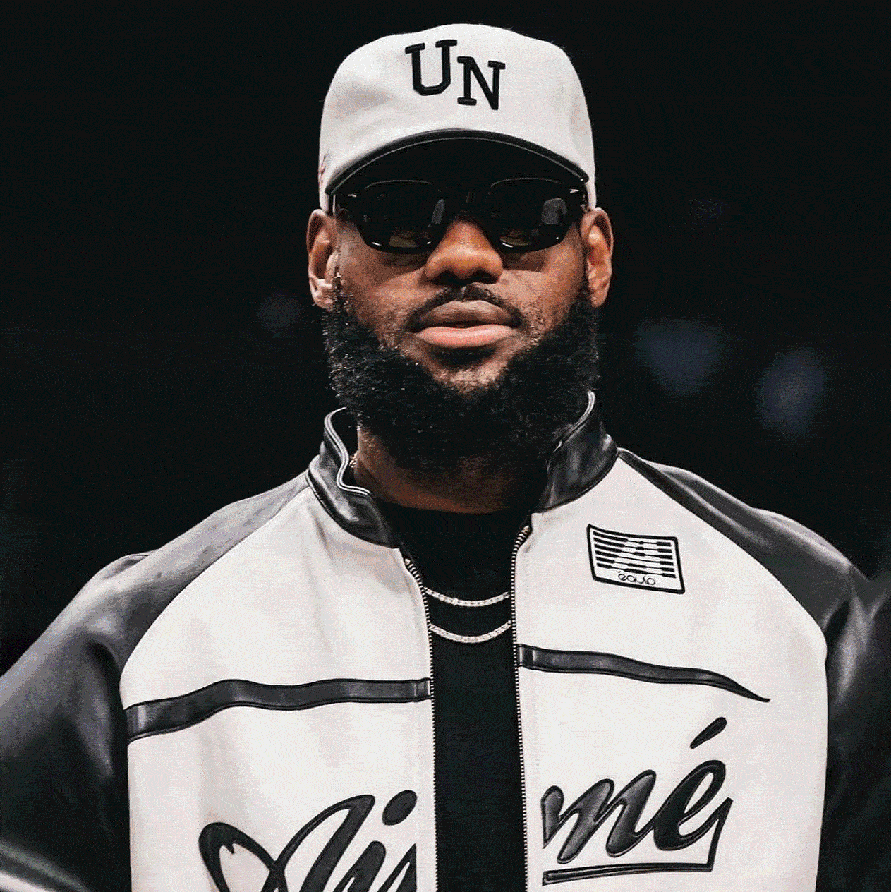
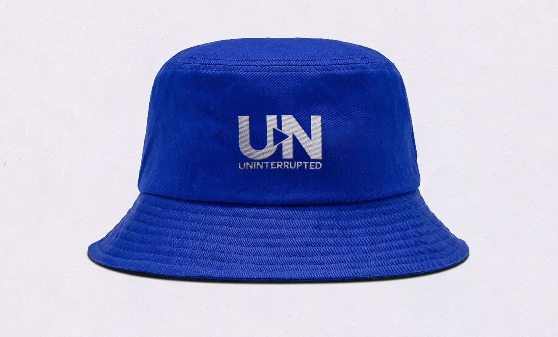
As Uninterrupted matured, it moved beyond a digital platform and began to live inside the culture it was documenting, threading itself into the visual language of sport through apparel collaborations, tunnel fits, and even sneaker colorways that carried the mark into arenas and streets alike. The UN logo started appearing on hats courtside, warmups in pregame shootarounds, and limited drops that blurred the line between media brand and lifestyle signal. What began as a minimalist bug in the corner of a video evolved into a badge of athlete autonomy, worn by players who were actively reclaiming their narratives. Seeing the identity translate from UI to fabric to rubber outsoles was a powerful validation of the design system’s flexibility. It proved the brand could move at the speed of culture, showing up not as an outsider documenting the game, but as something woven into its daily rituals, from locker rooms to sneaker rotations to the choreography of arrival shots that now define modern sports coverage.
.jpg)
One of the most visible markers of the brand’s growth was the emergence of the UN hat. It became more than merchandise, it became a cultural symbol that stood for athlete control and authenticity. My role in refining the logo system ensured that it worked as fluidly on physical products as it did within the UI. The challenge was to create a mark that could sit unobtrusively within video-heavy digital environments but also carry enough presence to stand on its own when worn on a hat or embedded within a broadcast package. Seeing athletes and fans alike wearing the UN hat courtside, on social, and in everyday life validated that design choice. It showed how a minimal and stripped down mark could transcend channels and evolve into a lifestyle signifier without diluting its meaning.
.jpg)
At the time of launch upward of 75% of Bleacher Reports audience was primarily consuming our content on mobile, and capitalizing on this data we wanted to make sure that any content that we developed in partnership with LeBron and Uninterrupted would be consumed efficiently and quickly on a user centric mobile platform. It would be a platform built for fans and athletes on the go. This mobile centric design meant that video bandwidth had to be quickly delivered, and the design assets had to be simple and clean. Knowing these limitations, we knew we had to make something striking and yet subtle at the same time which was quite a challenge. Not only did the logo have to work on merch, apparel and IRL but also on digital seamlessly. It had to work on websites, mobile phones and look right at home when LeBron would rock it to games.
.jpg)
Initial explorations were more organic and hand drawn as we leaned into a script style which would speak to the personal aspect of the initiative. However as we spoke through the different iterations, we decided to go for a cleaner look that stripped away the extra fluff and focused on a minimal and clean look that would put the focus on the video content. The key was to put as few barriers between the consumer and the athlete and make the connection as direct as possible. In developing the logo and branding, it had to work from a web perspective, but also from an apparel standpoint and from what would traditionally be considered a broadcast package.
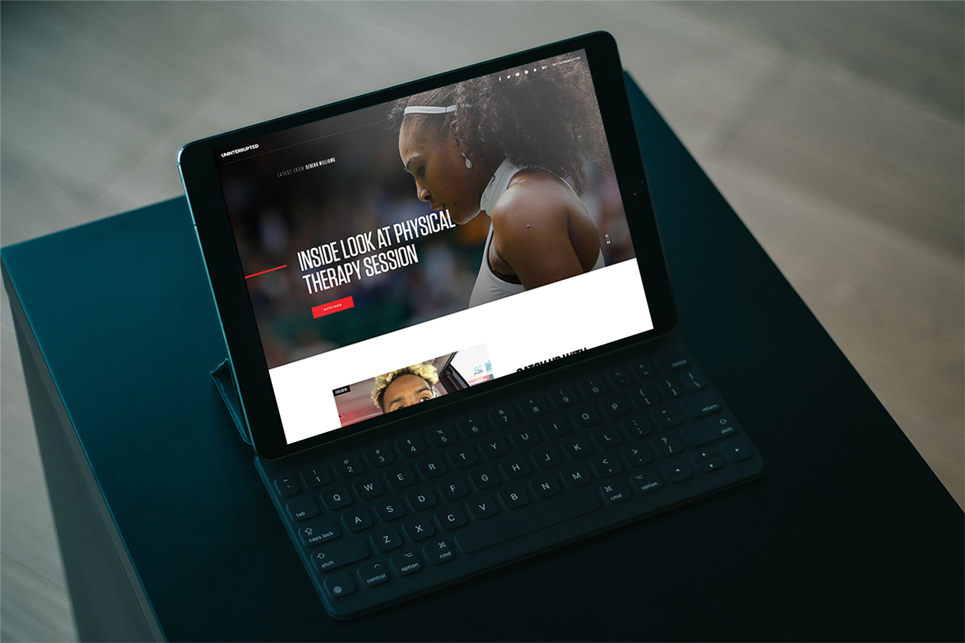
The hub page for the video experience was deliberately designed to limit distractions and allow the athlete’s voice to remain front and center. From the outset, I pushed to strip away the traditional content clutter that usually surrounds media sites, including links back to other Bleacher Report articles and ad-heavy modules. Instead, the page became a focused canvas for the athlete’s perspective, built around a clean video player with simple navigation. Categories were broken down by athlete rather than by sport or news cycle, emphasizing that this was about individuals telling their own stories in their own words. Early on, the roster of contributors was intentionally limited, so the design had to feel intimate and easy to navigate while also being scalable for future expansion. Many of these videos were in the locker room or in the sprinter on the way home from a game or even sitting at home on their couches watching a night of sports.
Taken together, these choices defined the creative direction of Uninterrupted. The minimalism of the visual identity, the athlete-first UI, the portability of the logo into lifestyle products, and the commitment to unfiltered storytelling all worked in tandem to create a brand that was scalable and resonant. The design acted as scaffolding that supported the voice of the athlete without intruding on it. That balance is why the brand grew from an experimental partnership into a cultural movement. It was not only about producing content, but about reshaping the expectations of what athlete-driven media could look like and how it could live in culture.
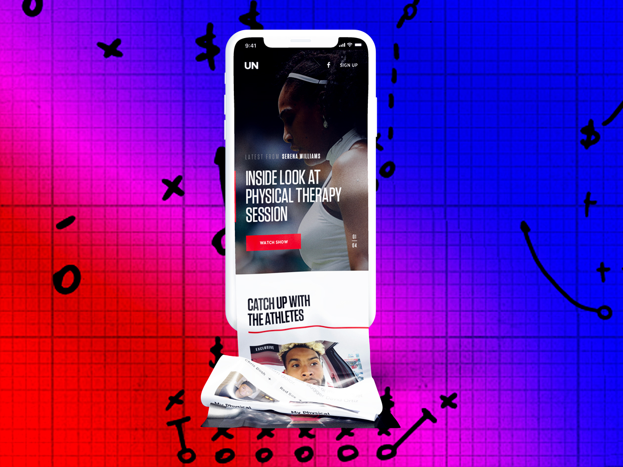
Behind the scenes, we were able to capture an unprecedented level of athlete access and translate it into a cohesive brand experience. Serena Williams allowed cameras into her physical therapy sessions, giving fans a rare look at the unseen labor behind her dominance. Odell Beckham Jr. recorded a heartfelt message thanking Kobe Bryant after his retirement and iconic 60 point finale, letting his emotion speak directly to fans without editorial filters. These videos needed to be featured simply and cleanly to dissove as much distance between the athlete and the fan, no obtrusive design to keep that intimacy.
Rob Gronkowski offered a playful, off-the-cuff look into his world that resonated with his larger-than-life persona. Each of these clips carried a different energy, but my responsibility was to ensure that the UI, visual framing, and brand environment made them feel unified under the Uninterrupted identity. The result was a pipeline of content that was raw and immediate, but always felt intentional and consistent. The UN logo bug in the corner, for attribution and sharing was ever present and the intro animation I created with the distinctive Hoodie Allen soundtrack would always play.
The play button became an essential motif within the Uninterrupted identity, subtly reinforcing that the platform was built for video-first storytelling and immediate access to the athlete’s voice. Rather than treating it as a literal icon slapped onto the interface, we embedded the triangular play form into the logic of the logo system, motion language, and UI affordances so that every interaction felt like an invitation to press play on a real, unfiltered moment. This integration allowed the brand mark to function not only as a symbol but as a behavioral cue, signaling speed, intimacy, and directness while reminding users that the most important stories on the platform begin the moment the athlete decides to record and share.
One of the defining turning points for the brand came during LeBron’s Zero Dark 23 playoff ritual, when he typically went completely silent on social media. By choosing to post reflections and behind the scenes glimpses through Uninterrupted during this blackout, he elevated the platform into something bigger than a media partnership. It became the only window into his mindset during the most critical moments of the season. My focus as a designer was to strip away any barriers between the fan and the athlete in these moments. The clean, distraction-free design made the content feel like an unmediated conversation, and it positioned Uninterrupted as the sole channel capable of breaking LeBron’s own blackout. That contrast made every piece of content feel like an event.
The cultural resonance of the platform deepened through viral moments that blurred the lines between sports, music, and everyday life. LeBron previewing Kendrick Lamar’s Untitled unmastered album on his phone became a moment of cultural cross-pollination, where NBA fans and hip hop communities collided over a simple, unfiltered video. The fact that we could turn this intimate vlog style content into larger stories within our media ecosystem was a fresh experiment. Similar to Shaq and Tout and other platforms, LeBron was trying to create his own media empire through this vision. The athletes would post these videos and upload them to our private Bleacher Report FTP server, and then Kenny Dorset and our social programming team would upload them to the website hub I had created.
The Cavaliers’ subway ride in New York is another example, a raw and mobile-shot piece that spread across mainstream outlets while keeping the Uninterrupted design elements in place. These moments worked because our design direction was intentionally invisible, amplifying the authenticity instead of overshadowing it. They showcased how a platform built for direct expression could generate cultural waves far beyond traditional sports coverage. The video was shared far and wide across many other platforms, amplifying our brand and getting it out there.
Opting for a clean Sans Serif logo that articulated that Uninterrupted was a platform rather than a media company. The goal of the logo was to be unobtrusive yet still clean enough to serve as a vessel for multiple voices. Amongst a number of iterations of the logoset and typeface, we repeatedly found ourselves leaning towards a more minimal aesthetic. As the brand grew, my challenge was to evolve the hub page into a more sophisticated platform without sacrificing its original simplicity.
I iterated on layouts that allowed for more athletes and more content categories while preserving the directness that had defined the initial launch. This required careful adjustments to typography, spacing, and interaction design to make sure the interface could handle greater content density while still feeling uncluttered. The visual branding was kept consistent throughout these iterations, using the same restrained color palette and minimal type treatments to reinforce the idea that the platform was a vessel for athlete voices rather than a media company trying to compete for attention. By setting these principles early and defending them through multiple rounds of feedback, I helped establish a design system that could scale with Uninterrupted’s growth while staying true to its core identity.
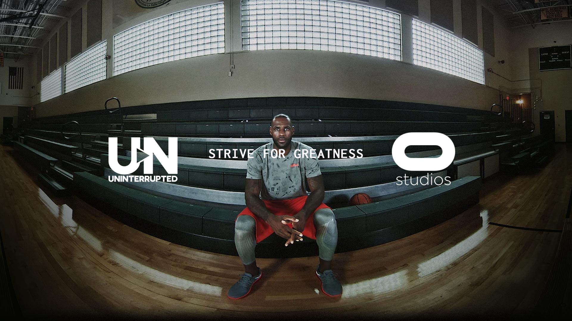
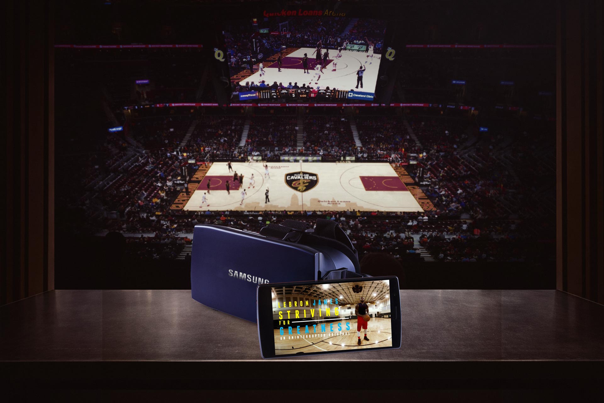
The launch of Striving for Greatness marked one of the earliest forays into immersive storytelling for Uninterrupted and showed how the brand could extend beyond traditional video. Working in partnership with Oculus Studios and Felix & Paul Studios, we crafted a 12 minute, 360 degree VR film that placed fans directly inside LeBron James’ preseason training regimen. Instead of watching a highlight reel, fans found themselves standing beside him in the gym, on the court, and even riding in the car with his family. The intimacy of those perspectives was amplified by our design approach, which emphasized proximity and presence over heavy graphics. It was the purest distillation of our goal to eliminate barriers between the athlete and the audience, and VR was the perfect medium to prove it could be done.

From a creative direction standpoint, the project reinforced the idea that Uninterrupted was not confined to any one platform. We treated VR as an extension of the same design system we had applied to mobile and broadcast, making sure the branding remained minimal while the experience felt expansive and cinematic. The film allowed viewers to explore LeBron’s preparation for his thirteenth NBA season in a way that could never be replicated on social media or even traditional television. Fans felt like part of his inner circle, and the cultural reception validated that the future of athlete storytelling could live across mediums. The success of Striving for Greatness positioned Uninterrupted not just as a content platform but as a pioneer of immersive storytelling, one that was willing to experiment with new technologies to deepen the athlete-fan relationship. The partnership with Turner and Bleacher Report also allowed for amplification of this content to grow awareness for the content and brand as can be seen in the TNT promo below.
What made the VR and 360 video exploration so compelling was its ability to collapse distance and give fans an entirely new sensory relationship with athletes. In collaboration with Oculus and Felix & Paul Studios and distributed through Facebook’s VR ecosystem, the experience allowed viewers to inhabit LeBron’s world rather than observe it. Fans could sit beside him in the car, turn their heads to see his son in the back seat, or stand inches away as he moved through grueling workouts, hearing the ambient sounds of the gym and sensing the rhythm of preparation that never surfaces in highlight culture. This was not spectacle. It was presence. By leveraging immersive technology, we expanded Uninterrupted’s core promise into a spatial experience, proving that athlete storytelling could be lived as much as watched.
Exploring VR and 360 video opened a new frontier for fan engagement, one where proximity replaced polish and curiosity replaced commentary. Viewers weren’t guided by edits or narration. They chose where to look, what to focus on, and how to experience each moment, whether tracking LeBron’s form during core exercises, scanning the gym environment, or sharing the quiet intimacy of a car ride between obligations. These moments revealed the human architecture behind greatness: discipline, family, routine, and reflection. By embracing immersive formats, we demonstrated that the future of sports media lies in giving audiences agency and access, creating experiences that bring them closer to the athlete’s lived reality while deepening trust in the authenticity of the story being told.
The Trophies series became the first episodic content format to emerge from Uninterrupted, and it proved to be a blueprint for how athlete-driven storytelling could live beyond isolated clips. During the 2016 NBA Playoffs, LeBron James used the platform to deliver personal reflections, walkthroughs of his daily preparation, and glimpses of his life off the court in between games. The creative direction was intentionally stripped down to feel like diary entries rather than staged features, and this episodic framing allowed fans to follow the Cavaliers’ journey in real time. Each drop was short, direct, and intimate, but when consumed together, they formed a narrative arc that mirrored the highs and lows of the postseason. By designing the system to handle recurring installments, I helped set the foundation for Uninterrupted to evolve into a serialized storytelling platform rather than a loose collection of uploads.
The timing could not have been more dramatic, as the 2016 Finals quickly became one of the most thrilling championship series in NBA history. With the Cavaliers coming back from a 3–1 deficit to defeat the Golden State Warriors in seven games, every episode of Trophies carried the weight of unfolding history. Fans were able to see LeBron’s mindset shift game to game, from the grind of preparation to the emotional release after pivotal wins. The series gave a rare sense of proximity to a championship run that felt both historic and deeply personal, and the design choices we made ensured that nothing got in the way of that connection. It transformed Uninterrupted into a destination for episodic athlete storytelling, proving that fans craved more than post-game press conferences or media soundbites—they wanted to follow the human journey, step by step, as history was being made.
One of the first examples of all the pieces of the design, video packaging, brand guidelines, access, and sponsorship all coming together in a piece of exclusive content around a major sports trigger happened when LeBron signed his lifetime deal with Nike. It showcased the personal connection with athletes giving a peak into their lives with the branding acting as a strong signifier of a social content vehicle, while still being unobtrusive. We partnered with the Verizon platform Go90 which would also go on to host pieces like Kobe Bryant's "Dear Basketball" as an integrated sponsor bug in the corner of the video to drive revenue.
One of Uninterrupted’s most iconic and foundational early videos offered fans a rare look inside LeBron James’s sneaker closet in his Cleveland home, transforming what could have been a simple lifestyle feature into a proof of concept for the platform’s long-term vision. Sneaker culture sits at the intersection of sport, fashion, and identity, and LeBron’s collection represented not only his dominance on the court but his influence across culture. By inviting viewers into an intimate, personal space and allowing him to narrate the significance of specific pairs in his own words, the video demonstrated the power of athlete-controlled storytelling to create authenticity that traditional media access rarely achieves. The piece quickly became a benchmark for what Uninterrupted could deliver: direct access, cultural relevance, and commercial viability. It showed brand partners and stakeholders that athlete-generated content could drive engagement while opening the door to integrated monetization, from sponsorship alignments to product storytelling and retail activations. More importantly, it signaled a shift in fan expectations. Audiences no longer wanted distant highlight reels or scripted interviews. They wanted proximity, context, and humanity. That sneaker closet tour crystallized the platform’s value proposition and helped pave the way for future branded collaborations, original series, and commerce-driven extensions that would define the next phase of athlete-led media.

The following year one of the first major events that I had the opportunity to help develop as a part of the creative production team that would work on concepts for Uninterrupted was a ping pong match between Drake and Reggie Miller that was broadcast during the halftime of the 2016 NBA All Star game in Toronto. These type of creative collaborations would set the stage for an environment of inclusivity and lead to many more partnerships between creators and the brand. Getting a big name like Drake to participate in a live event like this showcased the power of Uninterrupted to really draw some of the biggest celebrities in the industry. This proof of concept was a key moment in the evolution of the brand that I was excited to help produce and coordinate from a creative execution perspective. Drake’s early investment and creative partnership with Uninterrupted helped catalyze the brand’s expansion into Canada, positioning the platform to tap into the country’s deep basketball culture and global music influence while reinforcing its credibility at the intersection of sport, entertainment, and athlete-driven storytelling.
The redesign followed the thought of not being just a symbol or monogram, but a complete and striking identity that could be recognized and applied anywhere as a symbol and tool for expression. The content was the hero rather than the branding and so it had to feel modern yet unobtrusive so that it could be applied in a video heavy user interface. Maintaining this authenticity was a key factor in making sure the barriers between the athlete and the consumer were minimized. Not only did it become a content platform, but also a lifestyle brand that was much bigger that we ever thought it could be and would continue to evolve in new ways from product to content and apparel and more. The logo and brand system was a great foundation, but over time it was clear this would need to become far more fully fleshed out.
The Shop emerged as a defining extension of Uninterrupted’s athlete-driven media ethos, translating the intimacy of barbershop dialogue into a premium cultural format. Developed in 2017 as a 30-minute panel series set in a working barbershop, the show featured LeBron James and Maverick Carter in candid conversations with athletes, musicians, and cultural leaders, collapsing the distance between celebrity and community. Its pilot circulated online and around the NBA Finals, quickly amassing millions of views and proving that audiences were hungry for unscripted, cross-disciplinary dialogue rooted in lived experience rather than media choreography. The series later evolved into an HBO platform, elevating the format into prestige television while preserving its raw conversational core, with Drake’s DreamCrew collaborating on related projects that expanded Uninterrupted’s cultural footprint and reinforced its transnational reach. Over time, The Shop became a cultural touchstone and brand catalyst, eventually migrating to Uninterrupted’s own channels, signaling a strategic shift toward platform ownership and direct audience relationships.
.jpg)
During the design process we went through a number of iterations that were flashy and more trendy, but the continual feedback was to strip away too much of the flair that was added in an attempt to streamline things. The logo had to be versatile and going with a stripped down sans serif custom typeface that would be bold and eye catching and yet fit into any UI implementation was a key factor in the process. The seamless logo was unobtrusive and I made sure it could work in multiple contexts.
The logo can be seen integrated into the Los Angeles offices of Uninterrupted in this video as Draymond Green visits Maverick Carter to get a behind the scenes tour of their content production studio. One thing that Mav made clear was that the logo and the brand style would have to feel like it could breathe and live in actual space. He wanted a physical representation of the brand that could be a vessel for different styles and storytelling methods. Similar to how the different athletes had their own backgrounds and personalities, the logo should feel like a chameleon in the sense that it can stand out on it's own, but also blend in with any of those voices.
The Hometown episode of Dwyane Wade’s Flash3ack series was a powerful example of how Uninterrupted could elevate storytelling into something both personal and universal. In this installment Wade opened up about the experience of returning to Chicago and joining the Bulls, a team that had shaped his childhood and defined his earliest dreams. The content was intimate and reflective, blending his memories of growing up as a fan with the reality of stepping onto the court in a Bulls uniform. My role in shaping this piece was to ensure that the design system reinforced the weight of the story without overshadowing it. By creating a clean, unobtrusive visual framework, balancing archival elements with fresh footage, and leaning into the rhythm of Wade’s own narration, I helped frame an episode that resonated deeply with fans. It served as proof that Uninterrupted could handle not only in-the-moment updates but also legacy-driven narratives, positioning the brand as a vessel for athlete storytelling at every stage of their careers from the humble beginnings to the empires and dynasties of legend and myth.
As Uninterrupted matured, the integration of the logo adhered to the same foundational principles that guided the original system: restraint, clarity, and deference to the athlete’s voice. Rather than functioning as a dominant brand stamp, the mark was designed to recede into the periphery, creating a quiet but consistent signature that allowed the storytelling to remain the focal point. This approach ensured that leadership, charisma, and individual identity took center stage, with the visual framework acting as scaffolding rather than spectacle. The result was an environment where personalized content dissolved the traditional boundaries between athlete and audience, fostering a sense of proximity that felt immediate and unmediated. Maverick Carter was deeply committed to building a brand that could extend beyond a single platform and evolve into a broader cultural signifier. From the outset, we considered how the identity might translate across verticals, from digital interfaces and broadcast packages to apparel, live events, and physical spaces. By maintaining a disciplined visual language and a flexible design system, we enabled the brand to scale without diluting its meaning. What began as a minimal logo in a video player corner grew into a recognizable emblem of athlete agency and cultural influence, ultimately functioning as a lifestyle marker that signaled authenticity, ownership, and a new era in sports storytelling.
.jpg)
By 2018, as Uninterrupted evolved from a launch experiment into a culturally recognized platform with its own audience, partnerships, and original programming, bringing in Nowadays Creative marked a moment of maturation rather than reinvention. The goal was to scale the brand into a more comprehensive system that could support apparel, live experiences, sponsorship integrations, and long form storytelling while preserving the athlete first ethos at its core. The design principles I established in the early phase. restrained typography, minimal UI, motion rooted in recording and playback, and a visual language that privileged intimacy over spectacle. served as the foundation they built upon. This continuity ensured the platform could grow in scope without losing the immediacy and trust that came from putting the athlete’s voice at the center.
.jpg)
Nowadays Creative helped formalize and extend that foundation across a broader ecosystem, enabling Uninterrupted to individuate into a standalone cultural entity rather than an extension of Bleacher Report. The expanded system unified touchpoints across digital, physical, and experiential environments, from content packaging to merchandise and brand activations, while maintaining the philosophy that design should function as scaffolding for authenticity. What emerged was a more mature, scalable identity that could live in arenas, on apparel, and across screens without diluting the direct connection between athlete and audience that defined the platform from day one. The introduction of a lapis lazuli blue anchored the brand in a tone that felt both timeless and authoritative, while refined typography inspired by athletes’ own handwriting injected a human, personal cadence into the system, reinforcing that every story originated from the individual rather than the institution. This would also see the sunsetting of my original logo with a refined one that took my initial principles and elevated it in both a circular and standard linear format.
.jpg)
Showing up as an athlete-led brand within a media ecosystem long dominated by institutions like ESPN and Sports Illustrated represents a structural disruption rather than a mere content play. For decades, these legacy platforms functioned as gatekeepers of narrative authority, determining which stories were told, how athletes were framed, and where value accrued. Athlete-driven ventures invert that model by collapsing the distance between subject and storyteller, allowing players to bypass editorial filters and engage audiences on their own terms. This shift reframes athletes from content sources into media proprietors, capable of capturing first-party data, commanding sponsorships, and shaping cultural discourse in real time. In doing so, they challenge the monopoly of traditional sports media, not by competing on scale alone, but by offering authenticity, immediacy, and ownership in an era where trust and direct connection have become the most valuable currencies.
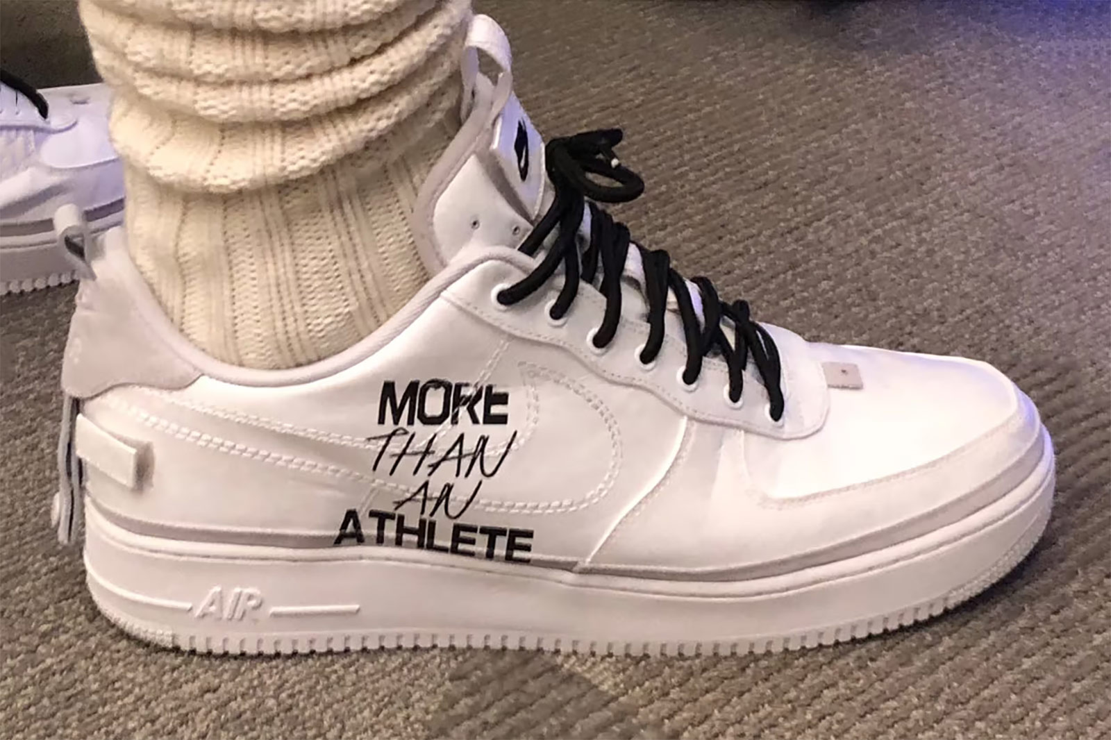
One of the most gratifying physical manifestations of the brand came when Nike partnered with Uninterrupted on a special LeBron 17 colorway rendered in a rich lapis lazuli blue and stamped with the “More Than An Athlete” ethos. Seeing that message travel from a conversation between LeBron and Maverick, to early explorations on my screen, and ultimately onto one of the most recognizable signature sneakers in the world was surreal. The shoe functioned as more than performance gear; it became a wearable declaration of athlete agency and narrative ownership. Watching fans lace them up, post them, and carry that message into arenas, streets, and everyday life made tangible the journey from idea to cultural artifact, proof that a design system built to center the athlete’s voice could extend far beyond a digital platform and live in the physical rituals of sport and style. He amplified that statement by lacing them up on Christmas Day 2019 against the Clippers, transforming the league’s most-watched holiday showcase into a global stage for the brand.
.jpg)
Working on the launch of the Uninterrupted brand while developing the look and feel of the design package was a fulfilling experience that allowed me to better understand the nuances of brand development and marketing. Understanding the core user base and product as best we could and building the plane as we were flying it meant I had to work efficiently and in a nimble manner. Seeing the brand grow and thrive to become the institution it is now is extremely gratifying and it was a pleasure to be a part of the launch of the brand and the company from a design standpoint and as an infrastructure partner in Bleacher Report. I really don't think the brand would be what it is today without those early contributions. It truly is amazing what a UN logo can do and the journey it went on.
%20copy%20(1).jpg)
Key Collaborators: Maverick Carter, Bennett Spector, Kenny Dorset, LeBron James, Paul Rivera, Jimmy Spencer, Steve Friend, Scott Moore, Drake, Richard Sherman, Victor Cruz, Odell Beckham Jr., Rob Gronkowski, Draymond Green, Ronda Rousey, Carmelo Anthony, Johnny Manziel, Ali Lee, Hayden Kim, Chris Perez, Will Lievenberg
Tools: Adobe Photoshop, Adobe Illustrator, Adobe After Effects, Final Cut Pro
Deliverables: Brand Guidelines, Logo, Video Package, Branded Content, Aparel