

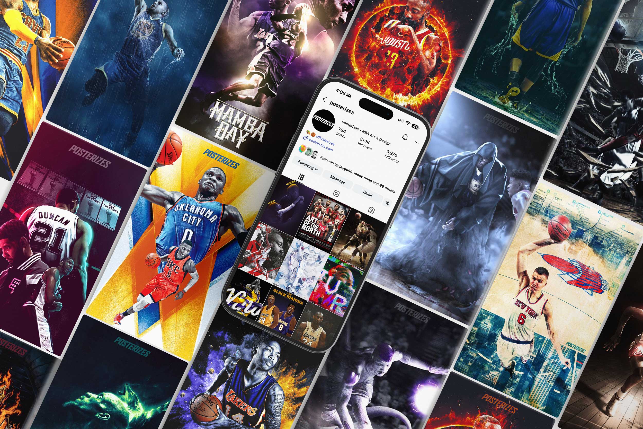
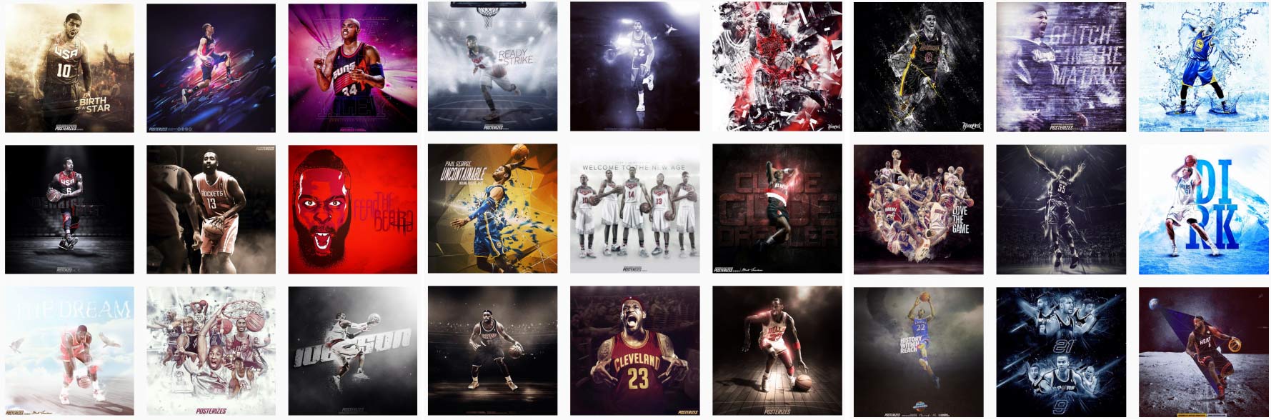
I had the opportunity to co found the Posterizes art collective and digital magazine in early 2011, at a moment when social platforms were shifting from novelty to infrastructure and culture was beginning to move at the speed of the feed. What started as a loose network of designers, illustrators, fine artists, video editors, and journalists bonded by basketball quickly evolved into a global creative engine that treated the sport not as subject matter but as a canvas for visual storytelling. We built a destination for fans who craved work that felt as expressive and experimental as the game itself, connecting a deeply engaged audience with creators producing original art daily and proving that hoop culture could live beyond highlights and box scores. The collective’s reach expanded organically across continents including Australia, Taiwan, Russia, Poland, France, Canada, the United States, and Uruguay, forming one of the earliest truly global digital art communities centered on basketball. This geographic diversity enriched the work with regional aesthetics and perspectives, turning Posterizes into a living archive of how the game resonated in different cultural contexts. The launch of our digital magazine formalized that momentum, curating long form features, artist spotlights, and editorial experiments that elevated contributors while giving brands and publishers a new talent pipeline. In an era before creator economies were codified, Posterizes generated commercial opportunities, collaborations, and commissions that helped artists sustain their practice, making the collective not only a cultural movement but an early blueprint for how online communities could create real world value for the people building them. Beyond scale, Posterizes reshaped how basketball fandom could be expressed in the digital age, positioning design as a primary language of fandom. We treated wallpapers as modern day posters, intimate artifacts that fans lived with on their most personal devices, reinforcing identity each time they unlocked a screen. By publishing daily and aligning releases with the emotional cadence of the NBA calendar, we created a ritualized rhythm that kept audiences returning with anticipation. Contributors were not merely submitting work, they were participating in a shared authorship that blurred the line between platform and community. The magazine extended that philosophy by pairing visuals with narrative context, giving the artwork permanence and critical framing in an otherwise ephemeral media landscape. Brands and publishers began to recognize the collective not only as a source of talent but as a barometer for cultural relevance within sports design. Posterizes ultimately demonstrated that when craft, timing, and community align, a grassroots initiative can evolve into a global cultural signal that ball is life and the art that we were creating was not only beloved by millions but it was the path to a whole new world of passion and commerce.
.jpg)
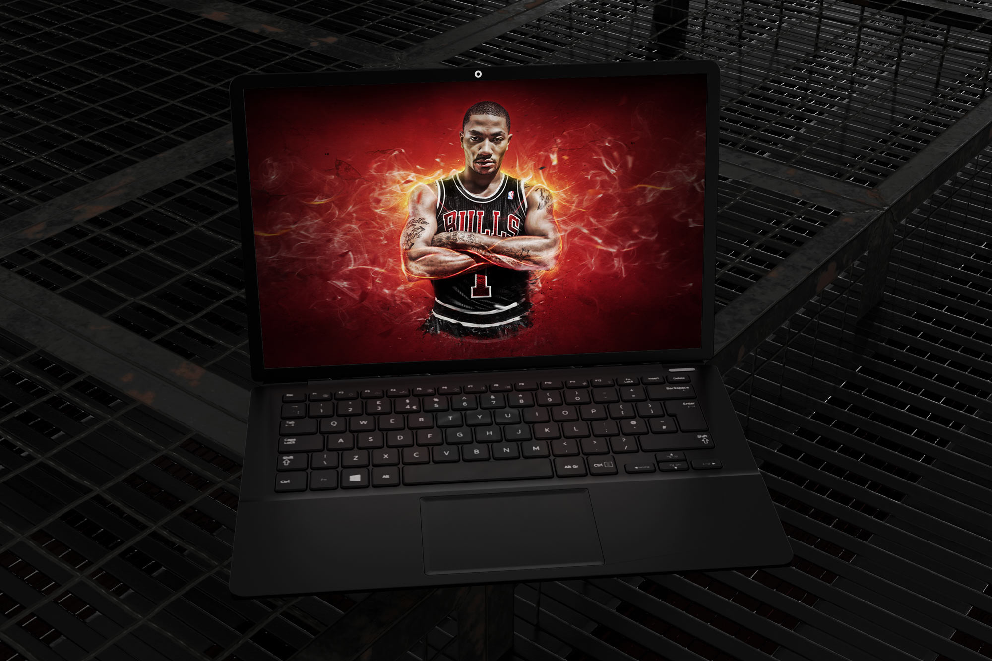
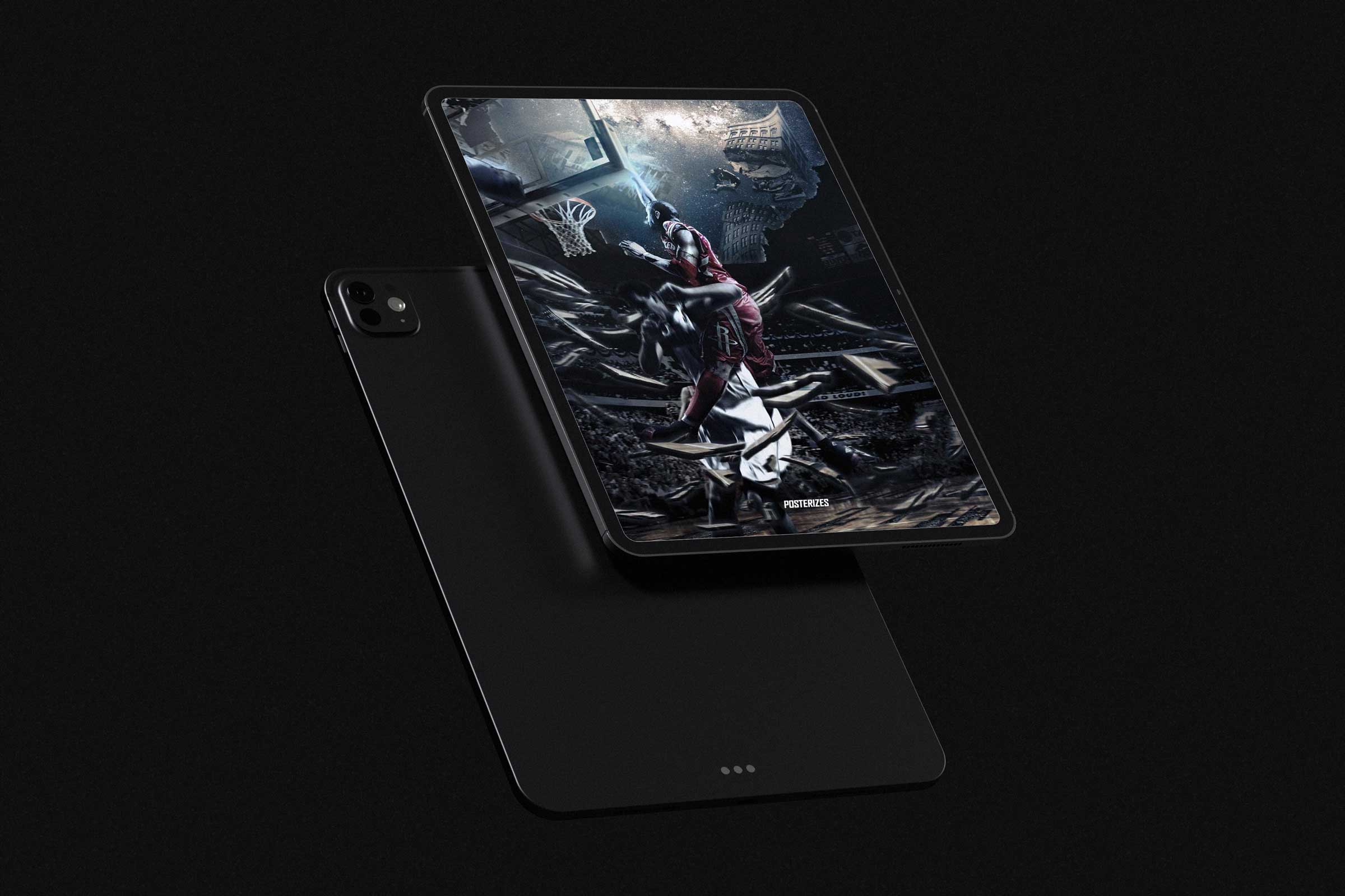
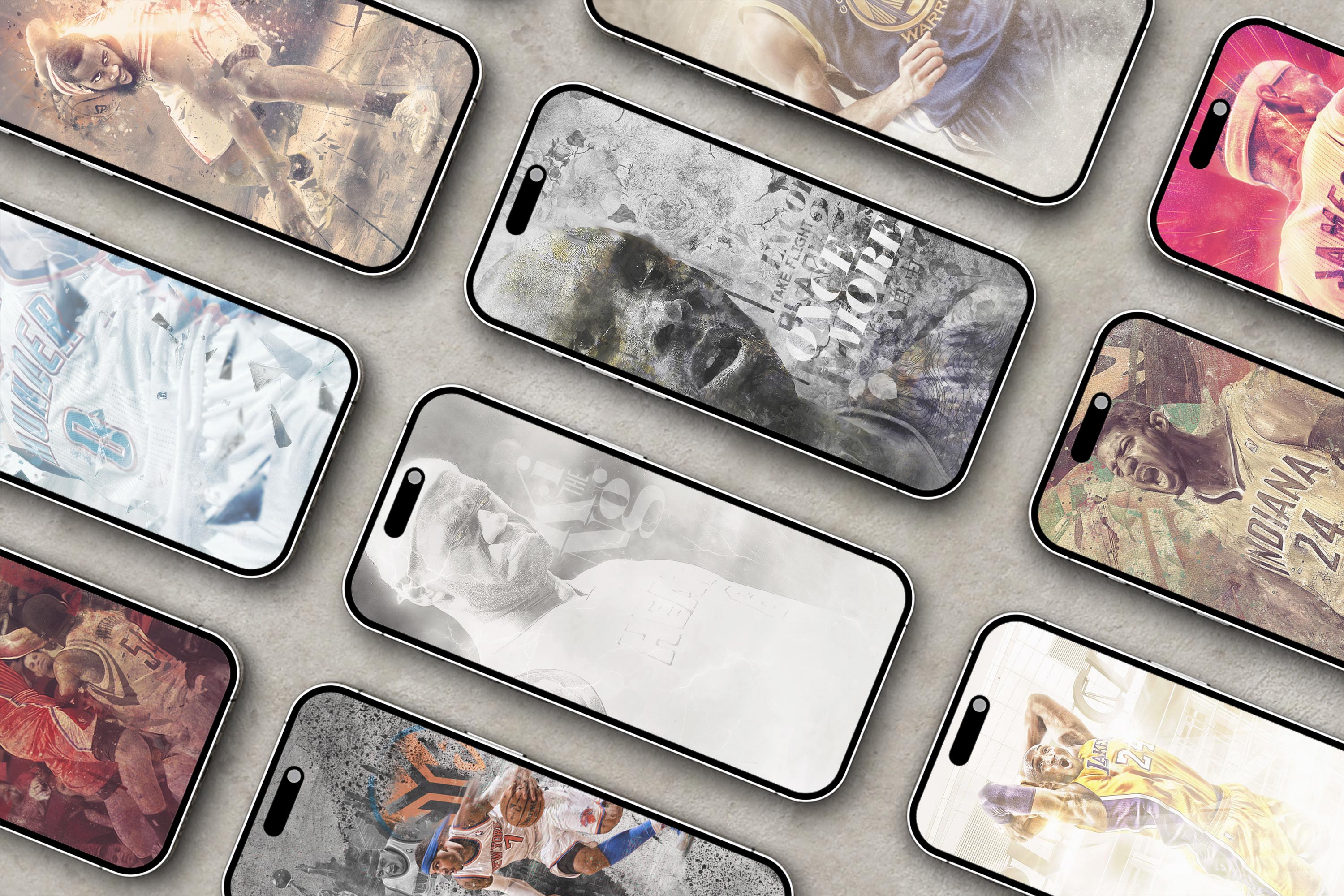
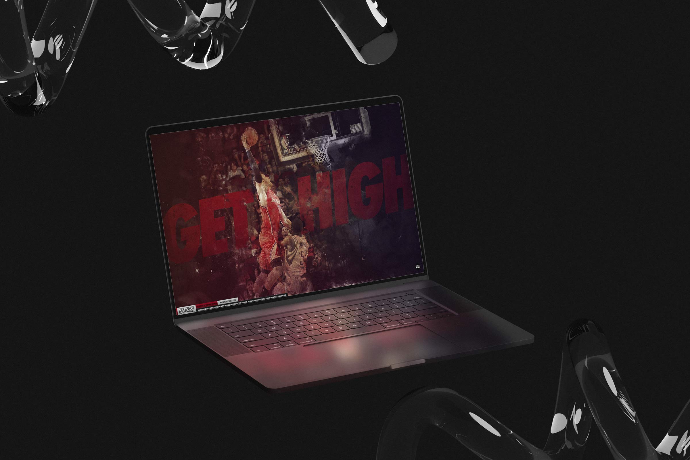
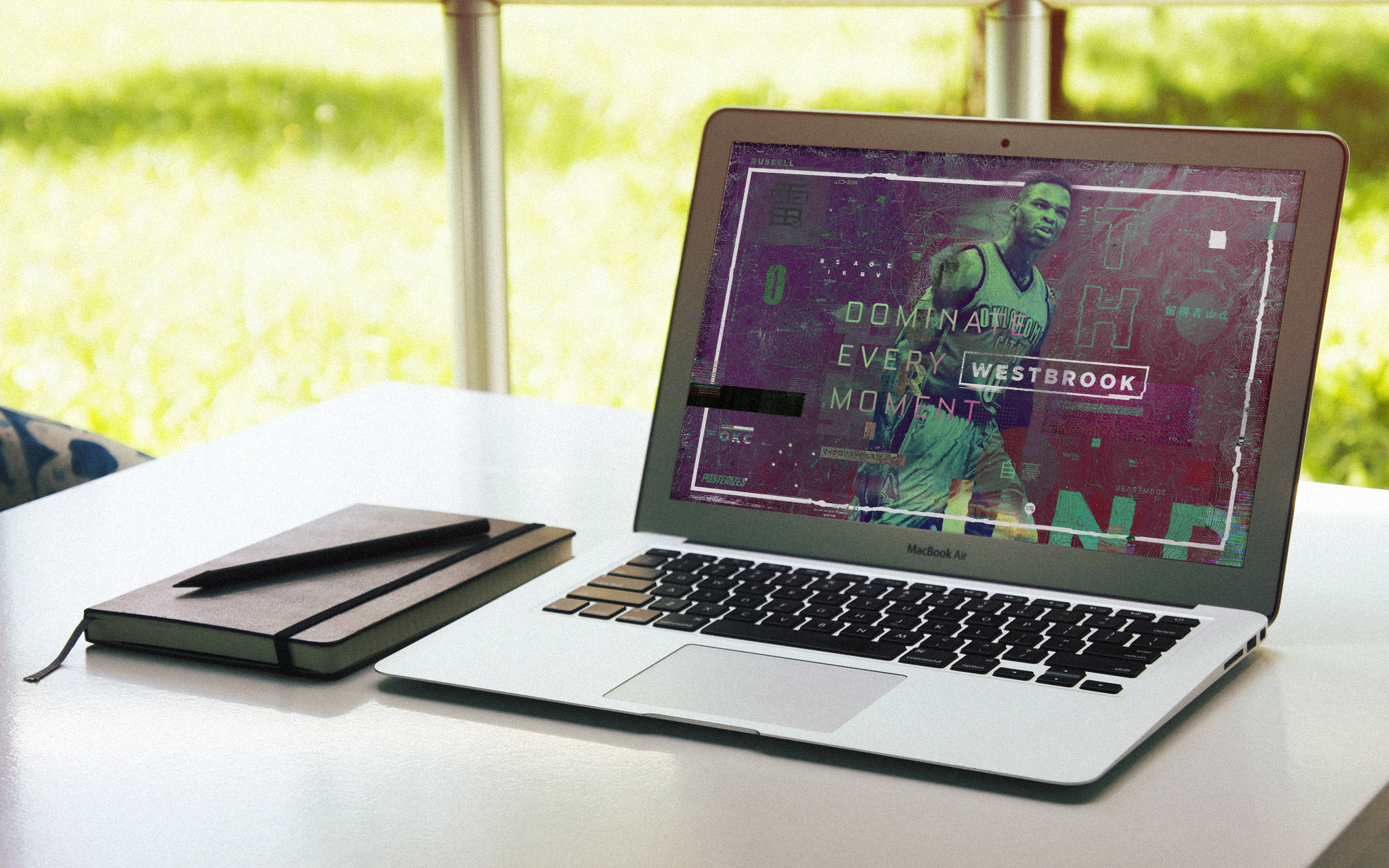
Over 20 Million Wallpaper Downloads
The biggest challenges in developing a first of its kind online basketball artwork collective and community stemmed from the very thing that made it powerful: its global nature. We were bringing together artists from multiple continents, each with distinct visual traditions, workflows, and cultural references, while navigating language barriers, inconsistent internet access, and time zone gaps that could stretch feedback cycles across entire days. Coordinating releases that felt cohesive and timely required building lightweight production systems before that language even existed in creative communities. We established shared briefs, visual reference libraries, and asynchronous critique loops so contributors in Taipei, Melbourne, Paris, and Toronto could plug into the same creative rhythm. What could have been fragmentation instead became a defining strength, allowing us to present basketball through a truly international lens that felt expansive rather than localized. My role sat at the intersection of talent development, art direction, and growth strategy. I actively recruited and onboarded artists, built a living roster that balanced emerging voices with established illustrators, and art directed collaborative drops that pushed stylistic boundaries while maintaining a recognizable Posterizes point of view. We operated on a relentless content cadence, publishing daily work that rewarded repeat visits and trained our audience to expect discovery. On the distribution side, I experimented with early social graph dynamics and platform specific formatting, optimizing imagery for Tumblr reblogs, Facebook album sharing, and the emerging visual language of Twitter and Instagram. At a time when this type of content was far from mainstream, we treated search engine optimization, metadata, and backlink ecosystems as creative tools, ensuring that fans searching for players, teams, or moments would encounter original artwork instead of stock photography. This foundation became a proving ground for the social first, culture led strategies that would define my later work. Posterizes demonstrated that community driven content could outperform traditional publishing when it felt authentic, participatory, and visually distinctive. It also forged relationships with artists who would go on to shape the visual identity of modern sports media, from sneaker culture to broadcast graphics to brand collaborations. What we built felt inevitable in hindsight, but radical at the time. More importantly, it proved that fandom is not passive consumption but active expression, and that giving fans and creators a shared platform to reinterpret the game can build loyalty that no algorithm alone can manufacture.
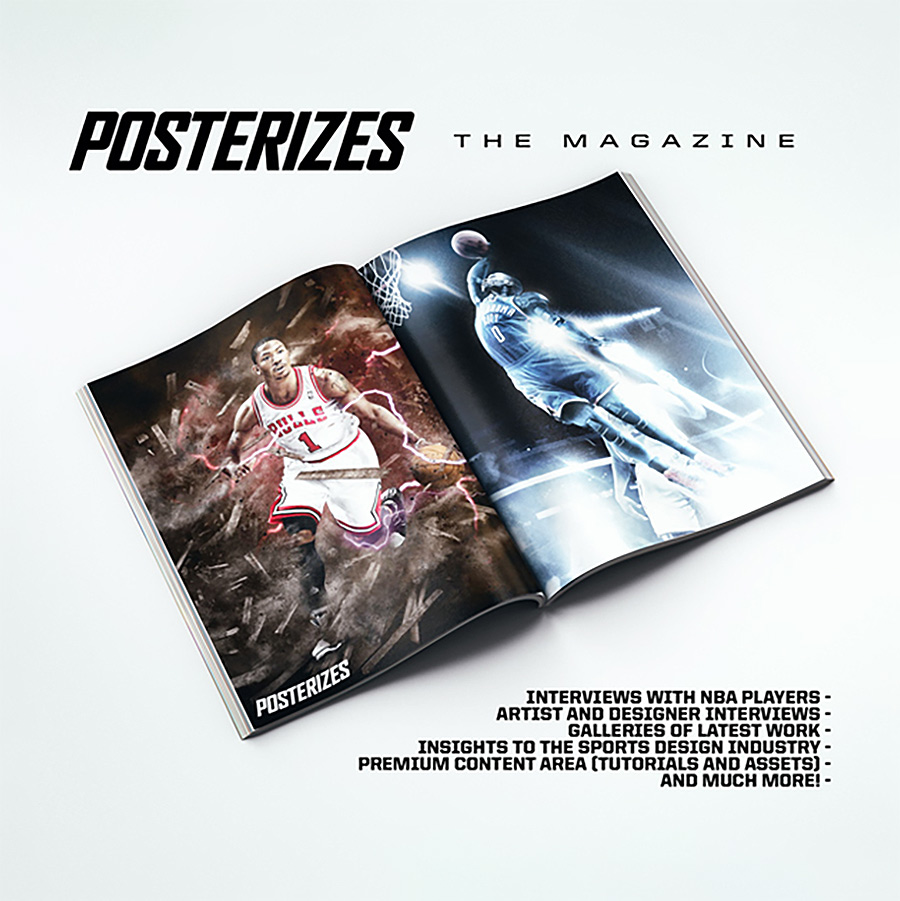

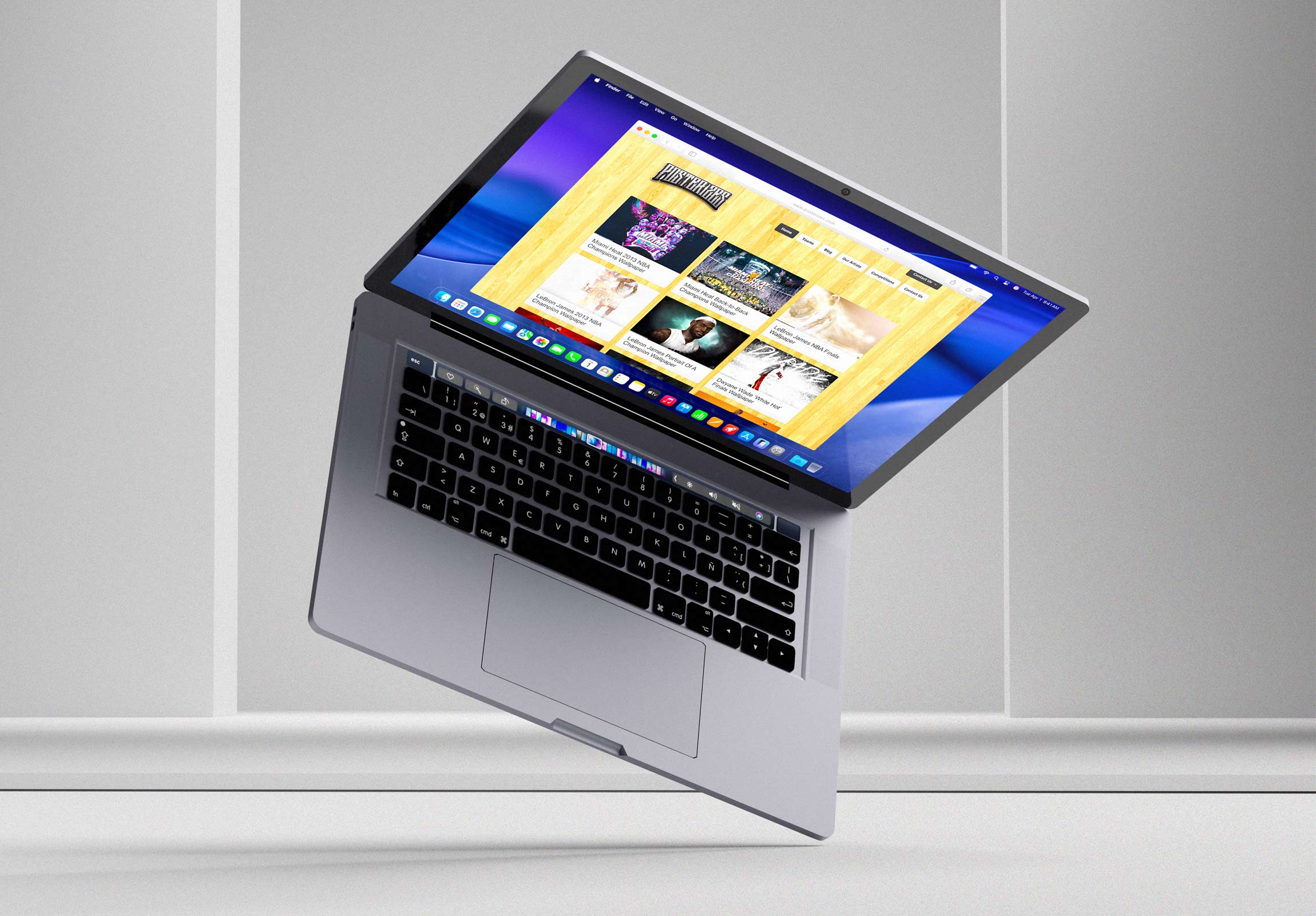
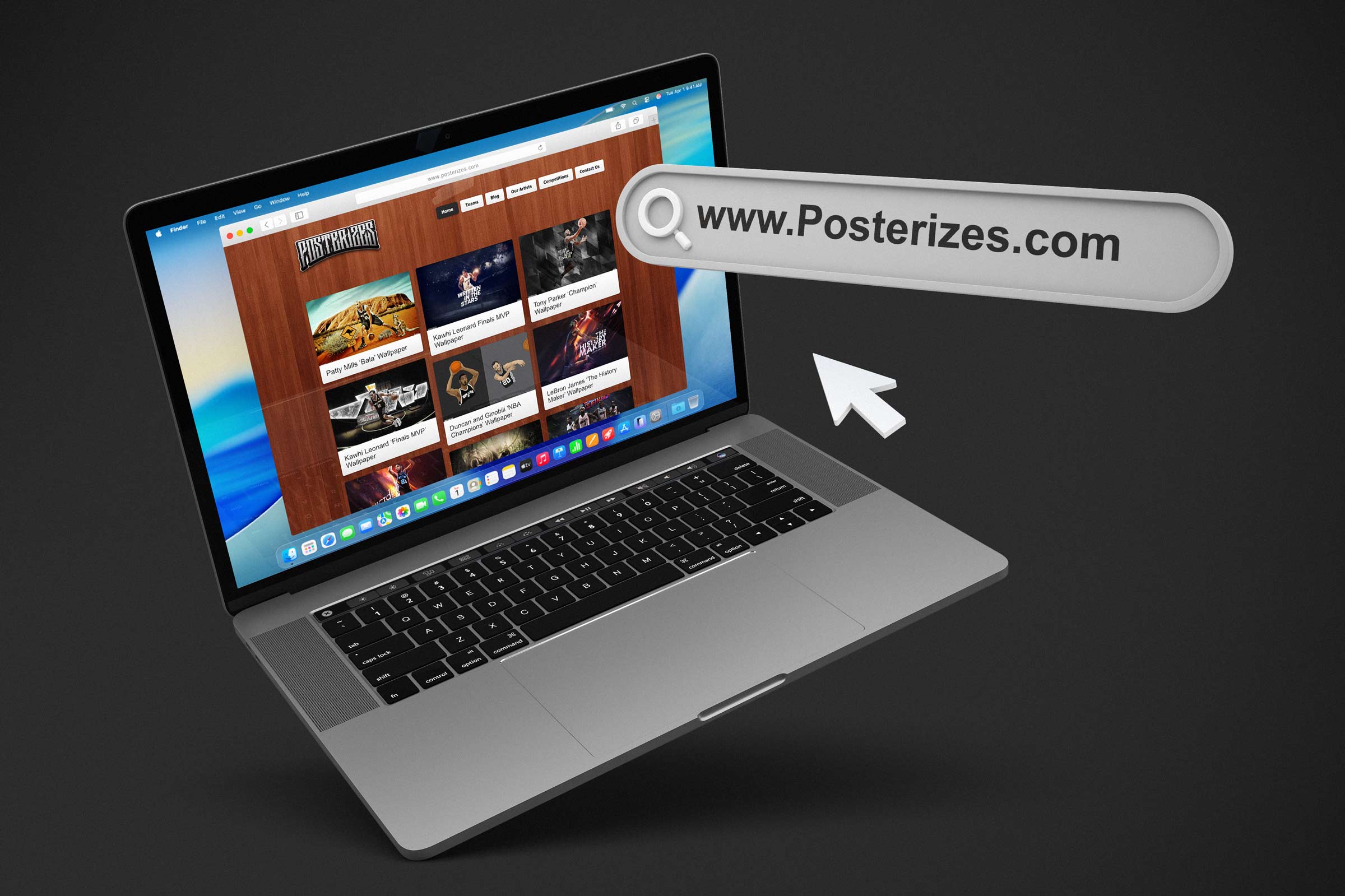
Posterizes.com was a one stop platform I co founded to provide curated, front row access to high end, high resolution sports artwork created by an international collective of exceptional graphic designers and illustrators. The site functioned as both a gallery and a distribution engine, delivering meticulously crafted visuals optimized for multiple devices and screen formats while maintaining a consistent standard of quality and attribution. By combining disciplined curation with global participation, we built a destination that felt authoritative yet accessible, where fans could experience the game through a design lens that elevated players, moments, and narratives into collectible visual artifacts. At its core, the platform translated the emotional intensity of basketball into a shared visual language that resonated across borders and cultures.

At its peak, Posterizes averaged more than 50,000 daily active users, serving a global audience whose appetite for NBA artwork reflected the sport’s expanding cultural footprint. Traffic flowed from India, Taiwan, Australia, China, Russia, the United States, Poland, and countless other countries where basketball had become a connective thread between local identity and global fandom. This geographic diversity reinforced our belief that design could function as a universal dialect, allowing fans separated by language and distance to engage with the same imagery and feel part of a larger community. The platform’s reach demonstrated that when you pair craft with accessibility, niche creative work can scale into a worldwide cultural exchange. The thesis of our site proved taste, when systemized, can scale without dilution.

It remains one of the most important design and art initiatives I have undertaken because it laid the foundation for my creative network while underscoring the power of collaboration at scale. Through Posterizes, I learned in real time how to manage distributed teams, align contributors around a shared vision, and build systems that balanced creative freedom with editorial coherence. The experience sharpened my instincts in project management, social media strategy, team leadership, and content programming, lessons that later enabled me to guide complex commercial projects to completion for both myself and the collaborators who grew alongside me. What began as an experiment in publishing basketball inspired artwork quickly evolved into a proving ground for how digital communities form, self organize, and sustain momentum when given the right structure and shared purpose. The collective thrived because contribution felt like participation, not submission, it was truly a community of artists.
Posterizes stands as evidence that when obsession meets structure, culture moves. What started as a solution to fragmented wallpapers became a globally distributed creative network that shaped how a generation visually remembers the NBA. We built infrastructure around passion, turned fandom into authorship, and proved that independent taste communities could influence industry standards without institutional backing. The work traveled because it was made from inside the culture, not adjacent to it. Long before creator economies were formalized, we demonstrated how attribution, craft, and timing could compound into real opportunity. The platform may have had a lifespan, but the standards it normalized did not. Wherever sports design is treated as serious cultural expression rather than decoration, a trace of Posterizes lives there. Posterizes was a cultural rehearsal for the internet that now exists. It proved that distributed creatives could build global influence, that fandom could be expressed through design with seriousness and rigor, and that independent communities could set aesthetic standards before institutions caught up.
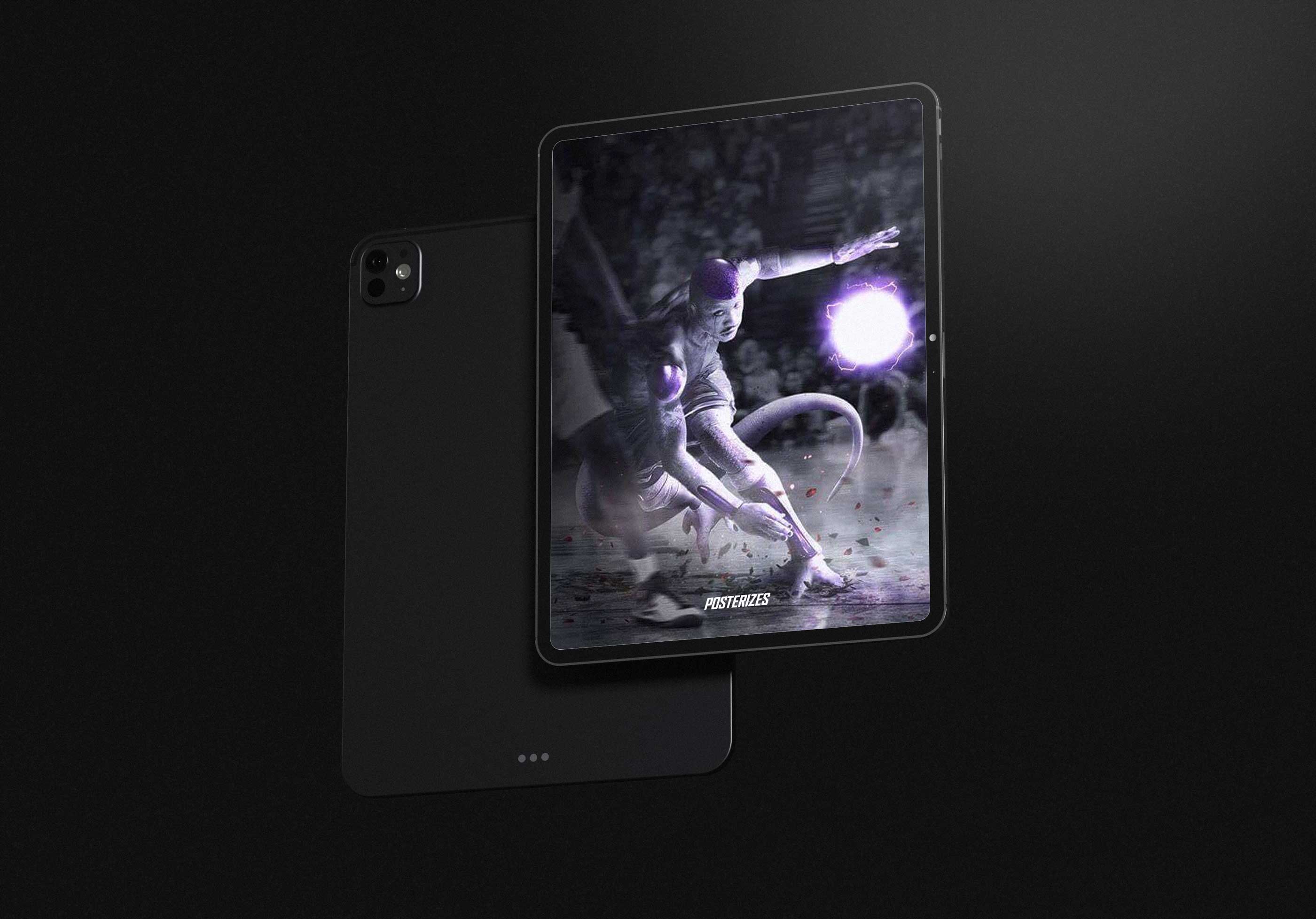
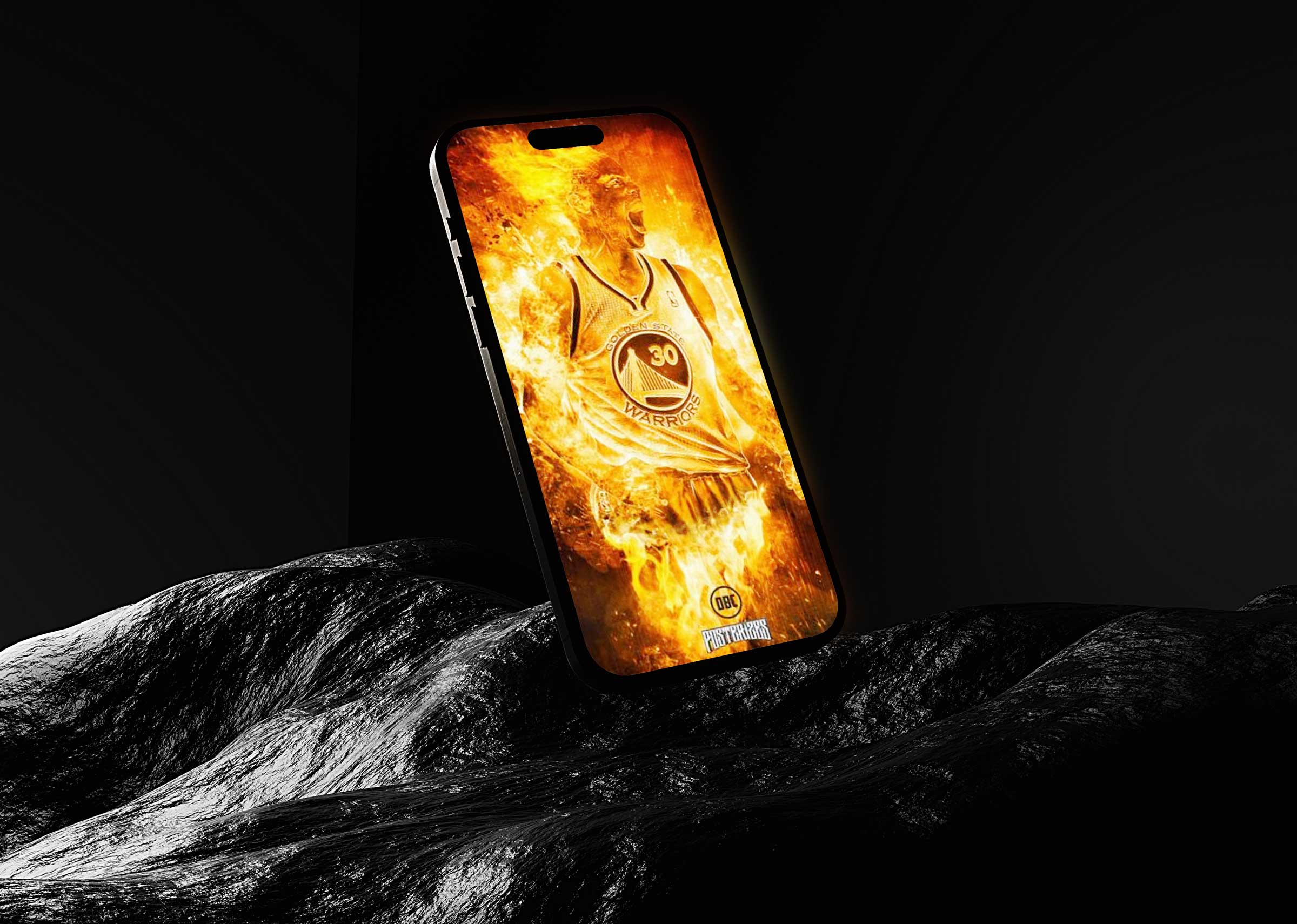
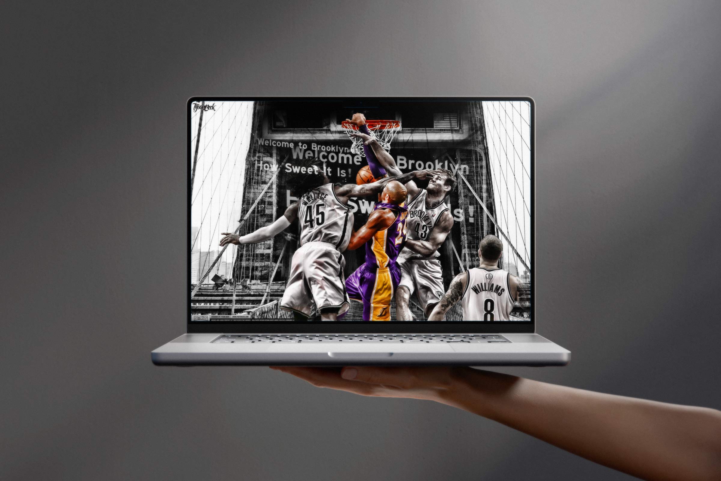
Prior to developing the website I would often post my creations on my Deviantart profile and as a Lakers fan, I would often create wallpapers after a big Kobe dunk. One of the ones that comes to mind is Kobe's 2011 playoff dunk on Emeka Okafor against the Hornets in the first round where I made the artwork right after the dunk and it saw a huge amount of downloads the next week. Similarly Tyson had created some content around some of Blake Griffin's big dunks that resonated on a similar level. At its inception, Posterizes was a focused basketball art collective and design community and making these designs for fun on our own independently.

Over time, it expanded into something far more expansive: a global network of creators and fans bound by a shared visual language and a mutual respect for craft and a true business hub. The platform attracted hundreds of thousands of loyal followers from every corner of the world, transforming a niche interest into a participatory culture that celebrated contribution as much as consumption. For many, it became a first touchpoint with sports design, a place to learn, share, and be seen. For me, it stands as enduring proof that when you invest in people, process, and purpose, a small collective can evolve into a movement with lasting cultural impact. We captured fleeting moments and gave them a durable visual afterlife, and to this day there really has never been anything else like it. What we built was temporary in format but permanent in impact.
.jpeg)
At my core, I believe storytelling and authentic community building sit at the center of my content sensibilities, and few projects embody that ethos more clearly than the origin story of the Posterizes art collective. What began as a passion project evolved into a global creative movement, rooted in the simple but powerful idea that sports fandom could be expressed through design with the same depth and emotion as any other art form. Posterizes was never only about images. It was about the narratives embedded in those visuals, the shared references they carried, and the sense of belonging they created among fans and designers who recognized themselves in the work. Watching the platform grow from a loose network of contributors into a cohesive creative force reinforced my belief that when people feel seen and invited to participate, they invest not only their attention but their identity. We designed for emotional recall, not passive visual consumption and this attracted serious artists excited to contribute.
It would not be hyperbole to describe the collective as an Avengers level assembly of the sports design media landscape. We brought together elite talent from across continents, time zones, and stylistic traditions, united by a commitment to producing the highest caliber NBA inspired artwork on the web. This convergence of perspectives elevated the standard of the entire category, proving that fan driven design could rival, and often surpass, official league visuals in creativity and cultural resonance. More importantly, the work became a catalyst for genuine community, where sharing, remixing, and celebrating each other’s creations mattered as much as the finished pieces themselves. In building that environment, we demonstrated that excellence and openness are not opposing forces but complementary ones, and that a global creative network can thrive when it is bound by shared passion rather than gatekeeping. The work traveled because it respected the intelligence of the audience.

The digital strategies and content standards I helped establish as a founding member of Posterizes have left a visible imprint on the broader sports media landscape. We championed a model that prioritized shareable, platform native design, high resolution accessibility, and consistent visual authorship at a time when many publishers still treated digital art as disposable filler. By standardizing formats, encouraging attribution, and optimizing artwork for multi device distribution, we helped set expectations for how sports visuals should live and travel online. The fingerprints of that approach can be seen in the work of former contributors who have gone on to shape creative at major publishers, global brands, agencies, and league affiliated platforms. Their success is not incidental. It reflects a shared foundation built on craft, cultural fluency, and an understanding that digital audiences reward authenticity and precision. Each drop was a time stamp, turning moments into personal collectibles.
Posterizes ultimately functioned as a springboard, not only for its core contributors but for the thousands of emerging designers who discovered the platform and felt empowered to create their own work. By making high quality sports art visible, downloadable, and discussable, we lowered the barrier to entry and reframed participation as something attainable rather than exclusive. The legacy of the collective is measured less in page views than in the proliferation of voices it helped unlock across the global design community. Many amateur designers who first engaged as fans evolved into practitioners, developing portfolios, securing freelance opportunities, and contributing back to the ecosystem that inspired them. In that sense, Posterizes did more than publish artwork. It cultivated a pipeline of talent and a culture of generosity that continues to ripple through sports media and design today. The community grew because the work felt authored from inside the culture.
During the basketball deprived months of the NBA lockout in 2011 I had a chance to discuss launching an innovative new art collective website with a good friend of mine Tyson Beck. The two of us had been designing NBA artwork on various websites and forums throughout the years and recognized the need for a centralized place for high resolution wallpapers for multiple device sizes. This white space in the market existed as the propagation of NBA artwork had become quite fragmented on the internet.

We had initially met while posting our own designs and content on various basketball forums throughout the internet. The primary one was the KB24 official forums where die hard Lakers and Kobe fans would share content and videos with each other. Having previously seen our work on websites such as West Coast Remix, Inside Hoops, or RealGM forums we knew that there was a desire for this type of design content out there, but no central location to get them. Tyson approached me to develop a new brand and we worked together to create and name Posterizes and turn it into the premier NBA wallpaper destination on the internet. Posterizes became a living archive of basketball’s mythmaking in real time. We treated the NBA calendar like a publishing schedule with emotional peaks but before that it was a chaotic wasteland.
Posterizes started with a very unsexy observation that only becomes obvious once you’ve lived inside the forums: the ecosystem had talent, but it did not have a home. Great edits were treated like contraband. A JPEG would show up in a thread at 2 a.m., get screenshotted, reposted, compressed, re-watermarked, and then reappear three days later in a different corner of the internet with the soul flattened out of it. Fans had to become detectives to find anything worth keeping, and even when they did, the file was usually the wrong size, the crop was cursed, or the resolution belonged to a different decade of screens. What we were seeing was not a lack of creativity. It was a lack of stewardship. The culture was rich, but the infrastructure was broke and there was no place to call home. We had a love of the sport and a reverence for the art that was being made.
So we built the thing we wished existed as users and as massive passionate fans of the game itself, not as marketers. We treated the experience like a retail floor for digital craft: clear categories, predictable quality, zero friction at the point of download, and a sense that every click was taking you somewhere curated, not somewhere random with spammy ads and hot moms in your area. We wanted fans to feel taken care of, like the site understood the difference between “I need something quick” and “I want something I’ll keep.” We cared about the boring details because the boring details determine whether art actually lands in someone’s life. File naming, aspect ratios, device breakpoints, clean previewing, fast paths from discovery to ownership. When you do that right, the work stops being content and starts behaving like a personal object.

The fragmented nature of basketball artwork on the internet was the primary impetus behind creating a centralized destination where fans could reliably access high resolution wallpapers for every device. The typical experience meant sifting through endless image results, uncovering promising work in obscure forums, creating accounts to unlock downloads, and then discovering the file was outdated, poorly cropped, or incompatible with modern screen resolutions. We recognized that friction as a systemic failure in the user journey, one that prevented high quality design from reaching the audiences who valued it most. By standardizing formats, resolutions, and download pathways, we removed barriers that had long separated great artwork from everyday use. This approach positioned accessibility not as a technical afterthought but as a core pillar of the product experience along with a soul rooted in art. Fans returned for the feeling, the artwork simply gave it form.
In solving for access, we also established the operational backbone required to support real demand at scale. A structured taxonomy, consistent metadata, and device-specific outputs ensured that users could quickly find and deploy artwork without compromise. The platform evolved into a reliable utility as much as a gallery, embedding itself into the daily habits of fans who returned for both quality and convenience. This infrastructure allowed us to respond confidently to surges in interest without degrading performance or user trust. With the foundation in place, the site was prepared to meet moments of peak fandom with precision rather than improvisation.

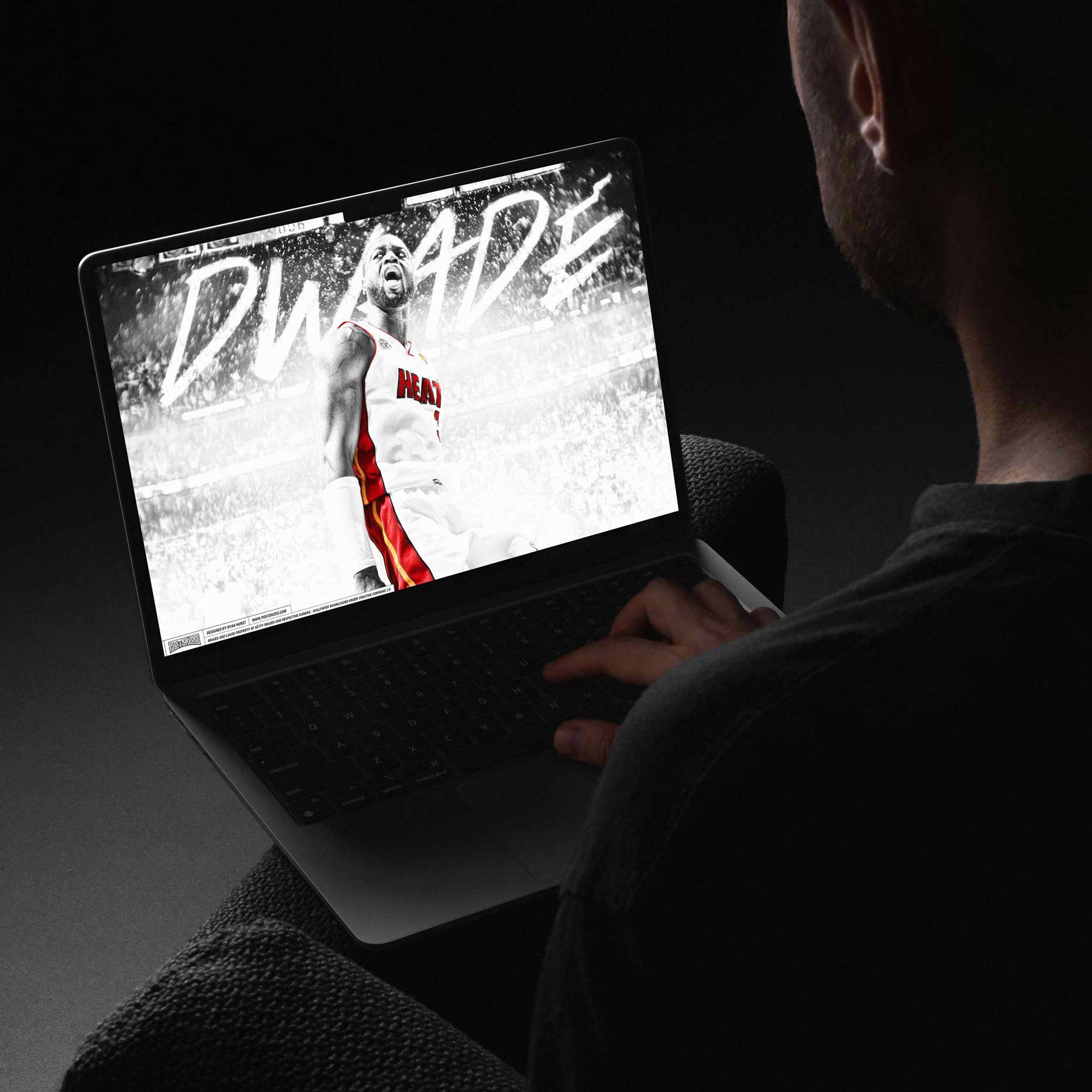
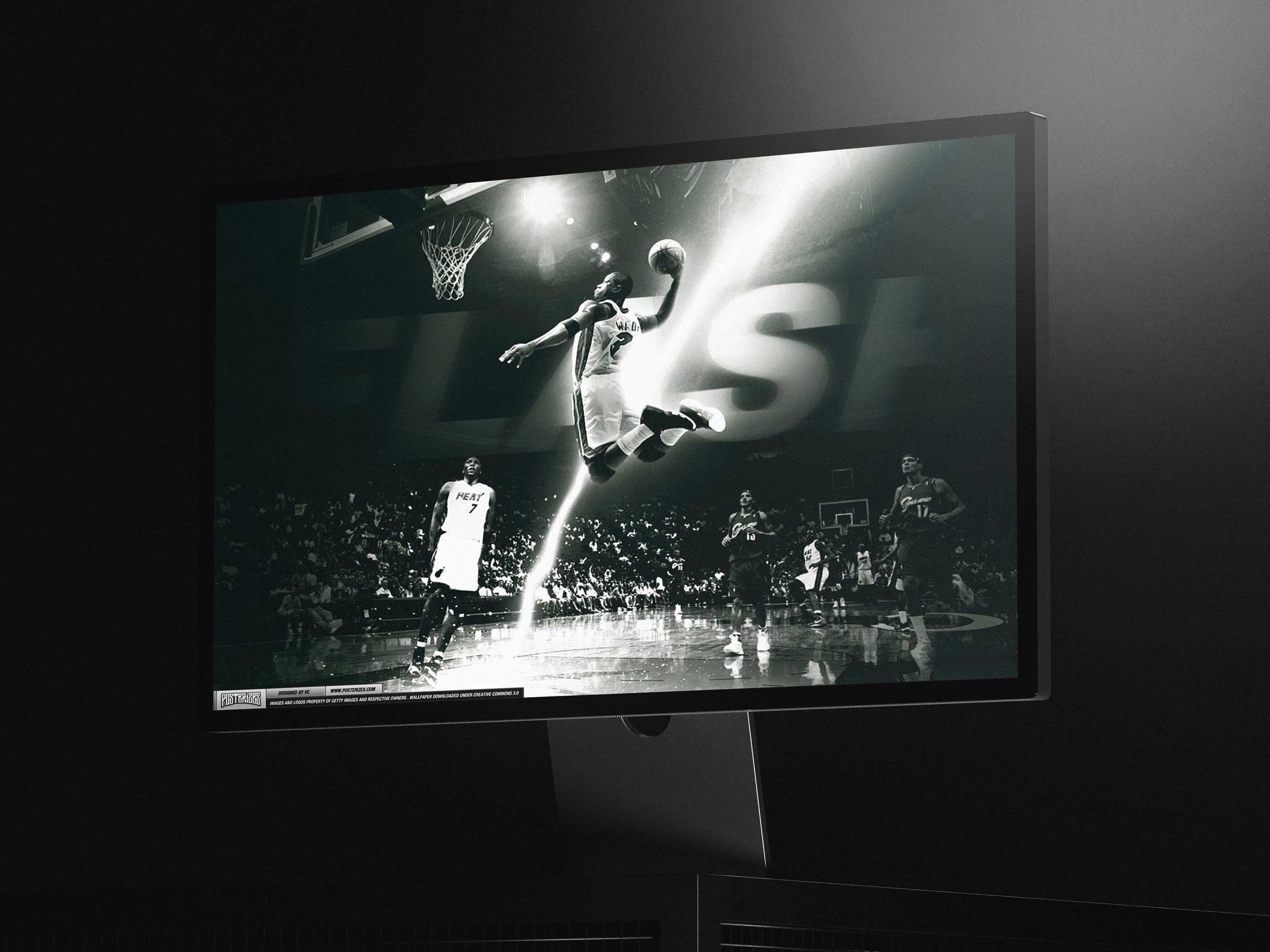
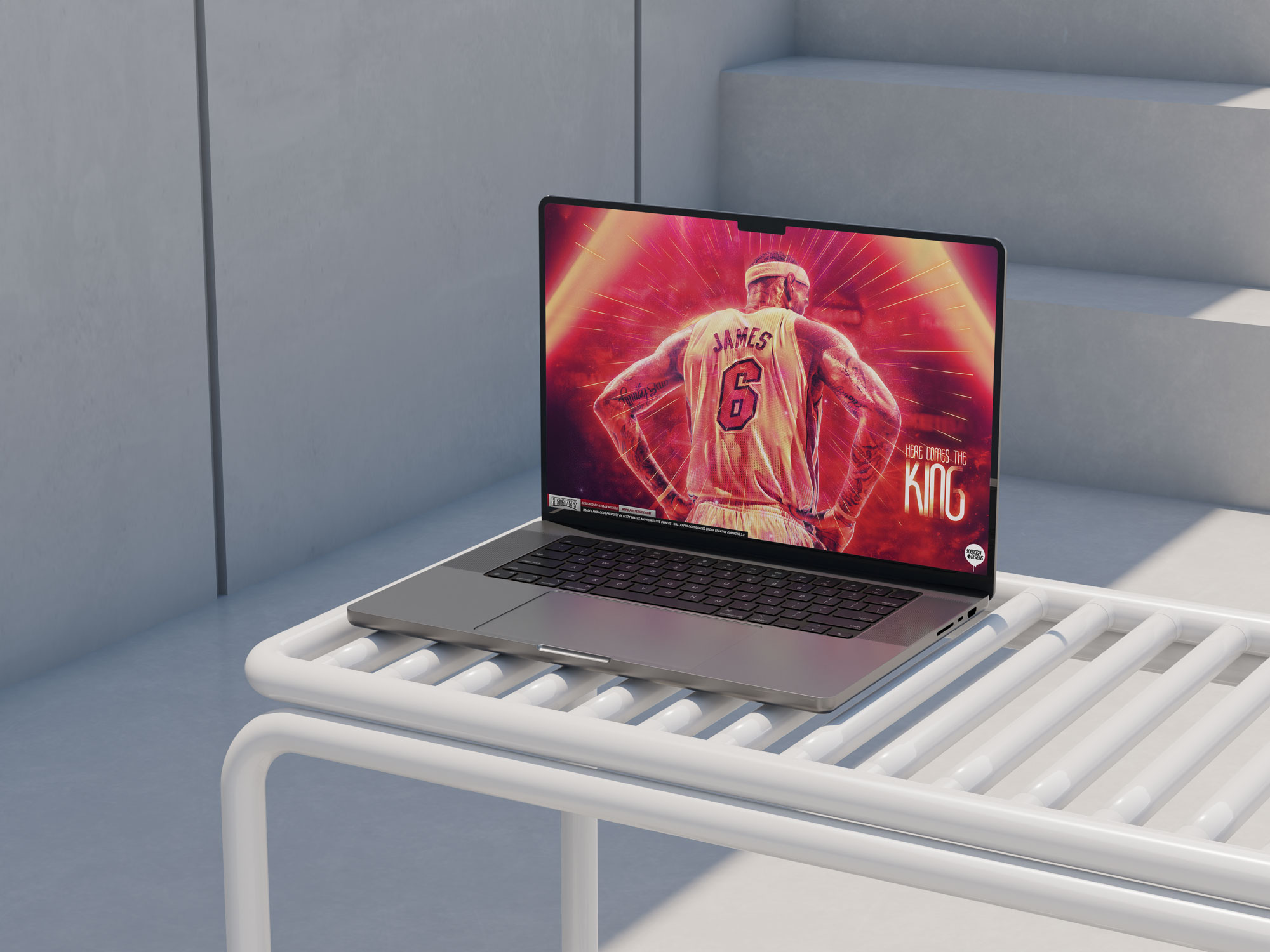
At the time, the Miami Heat were the gravitational center of the basketball universe, and our content strategy responded accordingly. With the LeBron, Wade, and Bosh era dominating headlines, highlight reels, and global fan attention, demand for Heat imagery surged across search and social, making them a natural focal point for wallpaper drops. We leaned into that cultural heat not out of favoritism but out of responsiveness, recognizing that fandom spikes create windows where design can travel further and embed itself into daily routines. By producing a high volume of Miami-centric visuals during that peak, we met the moment fans were living in, turning real-time relevance into sustained engagement. The result was not only elevated traffic but a deeper understanding that cultural momentum should inform creative prioritization. It was an early lesson in designing at the speed of fandom rather than the pace of editorial calendars.

The deeper thesis was not “let’s publish cool designs.” It was “let’s give fandom a visual wardrobe.” Fans do not experience a season as a straight line. They cycle through moods. Swagger after a statement win, spite after a loss, nostalgia when an era is ending, optimism when a rookie shows promise, vindication when a narrative flips. We wanted the library to reflect that emotional range, so you could dress your phone the way you dress your day. That forced us to think beyond stars and headline moments. We made room for role players, rivalries, cities, inside jokes, and those tiny micro narratives that only real fans clock, the stuff that feels invisible to mainstream coverage but is everything to the people who actually care. The catalog became a mirror for how fandom truly behaves.
We wanted to create something with a clean and simple user interface that would make these type of things easily accessible and would be something that folks could find in a relatively simple manner. Because of this Tyson and I knew that one of the biggest keys to successfully launching a website like this would be making sure we had our search engine optimization and just a clean easy to use UI that would make downloading artwork very straight forward of utmost importance. The website design was straight forward and clear to get the right size for your device and navigation, hashtags and categories to make it easier to find the right wallpaper.

From the outset, we approached the product experience with the mindset that discoverability is design, not a marketing afterthought. We structured page hierarchies, metadata, and file naming conventions so that search engines could understand and surface our work with precision, allowing fans searching for teams, players, or moments to land directly on relevant, high quality artwork. The goal was to intercept intent at the exact moment it formed and reward it with clarity rather than friction. This meant optimizing load performance, minimizing unnecessary steps, and ensuring that the path from search result to device wallpaper felt immediate and intuitive.
Equally important was resisting the temptation to overdesign. We deliberately stripped away visual noise so the artwork could remain the hero, using restrained typography, predictable navigation, and modular layouts that scaled as the library grew. This restraint created cognitive ease, allowing users to browse quickly, compare options, and download without second guessing file quality or compatibility. In a landscape where many wallpaper sites felt cluttered or ad saturated, simplicity became a differentiator that signaled respect for both the art and the audience. Over time, that clarity translated into repeat behavior because users knew exactly what to expect each visit. As the catalog expanded, the clean UI also functioned as an organizing system for taste. Consistent grid logic, device specific filters, and related artwork modules helped users move laterally through the library, discovering adjacent teams, rivalries, and stylistic variations without feeling lost. This transformed the site from a single purpose download hub into a navigable ecosystem that encouraged exploration. By aligning interface logic with fan behavior, we turned casual visits into longer sessions and longer sessions into habit.
Ultimately, the combination of disciplined SEO, frictionless UI, and performance minded engineering allowed us to punch above our weight. We were a small, passion driven team operating without the resources of major publishers, yet the product experience felt credible, intentional, and built for scale. That credibility mattered because it signaled that the work deserved a place on the most personal screens people own. When fans entrusted us with that real estate, it validated the belief that thoughtful design and accessibility can turn niche creativity into daily ritual. When the experience is that seamless, the brand earns trust without ever asking for it.
As such, one of the first discussions we had around the inception of the website and art collective was simply the name of the site. We wanted to go with something that would pop up high on search results as we knew one of the biggest funnels for traffic would be google image search. One of the things that I had noticed over the past few years of working on wallpapers and basketball artwork casually was that you would generally see a high amount of user interest and engagement after big moments such as game winners or dunks. This would allow us to capitalize on momentum already being generated by chatter from league accounts by amplifying their strong signal with our high level additional value adding content that consumers would be primed to download. Great art needed infrastructure, systems, and velocity to actually travel. Because of this I suggested we consider Posterized or Posterizes as a name for the website, as users would be looking up youtube videos of these dunks and we could capitalize on that momentum and optimize our SEO results to get users on the site and then actually being able to retain those eyeballs because we have high quality art to offer them.
When we finally moved from theory to execution, the launch itself was intentionally lean but highly considered. We built the first iteration of the site on WordPress, focusing on clarity of taxonomy, clean category structures, and image optimization so that search traffic could flow directly into highly relevant landing pages. There was no splashy marketing campaign, no paid acquisition strategy, just a deliberate alignment of timing, metadata, and content drops around live NBA moments. The first wave of uploads was coordinated to coincide with active storylines in the league, which meant that from day one the site felt responsive rather than archival. We stress tested resolution standards, file naming conventions, and download flows to ensure that the user experience matched the promise of the name. Once the switch was flipped, traffic began to compound quickly because the foundation had been engineered for discoverability and retention, not vanity. In many ways, the launch was less about debuting a website and more about activating a system we had quietly designed to move at the speed of the sport.
Fans have a predictable impulse after a defining sports moment to immediately search for it, share it, replay it, and find a way to make it their own. By recognizing that surge of post-moment intent, I understood that timing was not a bonus but the strategy itself. People were not only watching a game winner or a poster dunk, they were actively looking for assets that allowed them to extend that feeling beyond the broadcast and into their daily digital lives. By tapping into this observation, I knew that there was a market for rapid release artwork that could capitalize on the inherent increased social capital that comes during a viral sports moment. If the internet was the ocean, and a big moment in sports media was a wave, we would simply ride the momentum of that wave to help amplify the engagement and visibility of artwork that we knew fans would enjoy. I always thought the site effectively turned devices into galleries, and fans into their own mini curators.

In the beginning, we self-hosted and absorbed every lesson that came with it, from unexpected traffic spikes crashing pages to the constant balancing act between speed and storage limits. Running lean meant we felt every surge in real time, especially after major NBA moments when downloads flooded in faster than our infrastructure could comfortably handle. As the audience expanded and the stakes grew, it became clear that passion alone would not sustain scale. Partnering with Gary Lee of LakersNation.com marked a pivotal upgrade, giving us access to more robust, dynamic hosting that could support larger concurrent audiences without sacrificing performance. That transition was more than technical; it signaled that the project had outgrown its scrappy beginnings and required professional-grade support. With stronger infrastructure in place, we could confidently lean into peak traffic moments instead of bracing for them. It was another step in turning a passion-driven collective into a platform built to handle real demand.
The social DNA behind Posterizes was something I aggressively championed from day one because I understood that distribution was not a downstream step, it was the product strategy. Social platforms were where basketball culture was being metabolized in real time, so if our work was going to matter, it needed to be designed for circulation, conversation, and replay value. That meant building a publishing cadence that matched the emotional velocity of the NBA calendar and formatting every drop to behave natively across the platforms that shaped taste at the time, from forums and Tumblr to Facebook albums, Twitter, and early Instagram. We treated engagement signals as live research, using what fans saved, shared, and commented on to refine our creative briefs, content taxonomy, and release timing. Each post was a micro bet on relevance, and each share extended the life of the artwork beyond the moment that inspired it. The platform didn’t chase culture, it helped define how culture looked.
The website ran on WordPress as a base platform, but social was the engine that fed it and drove all the eyeballs beyond basic SEO optimizations and google traffic. I operated as the de facto social media manager before that title even had cultural weight, owning the strategy end to end across Instagram, Twitter, and Facebook. Every drop was packaged differently depending on platform behavior, square crops and carousels for Instagram, conversation hooks for Twitter, album sequencing for Facebook, all designed to drive traffic back to the site for high resolution downloads. When a moment was hot, we moved fast, pushing previews into feeds within hours and converting attention into site sessions while the emotional temperature was still elevated. I tracked engagement patterns, optimized posting windows, tested caption tones, and treated each platform as a distinct distribution channel rather than a copy paste megaphone. The goal was not vanity metrics, it was controlled redirection, turning social velocity into measurable download growth. I ran the operation soup to nuts, pairing instinct with iteration until the loop between feed and website felt seamless and repeatable.

What made the model durable was pairing that social flywheel with a strong SEO backbone and a web experience built for retention. Social created spikes, but search created compounding value, capturing high intent traffic from fans actively looking for players, teams, and defining moments and then converting those visits into deeper sessions through team pathways, related artwork modules, and frictionless downloads. We engineered the site to behave like a library and a recommendation engine, not a static gallery, so a single entry point could lead to ten more discoveries. The combination of social velocity and search discoverability turned Posterizes into an always on destination that could win both the feed and the long tail. That is what made it genre defining in the sports media space, because we were not only publishing art, we were building a system that kept the art alive. Every release strengthened trust that the brand understood the moment.

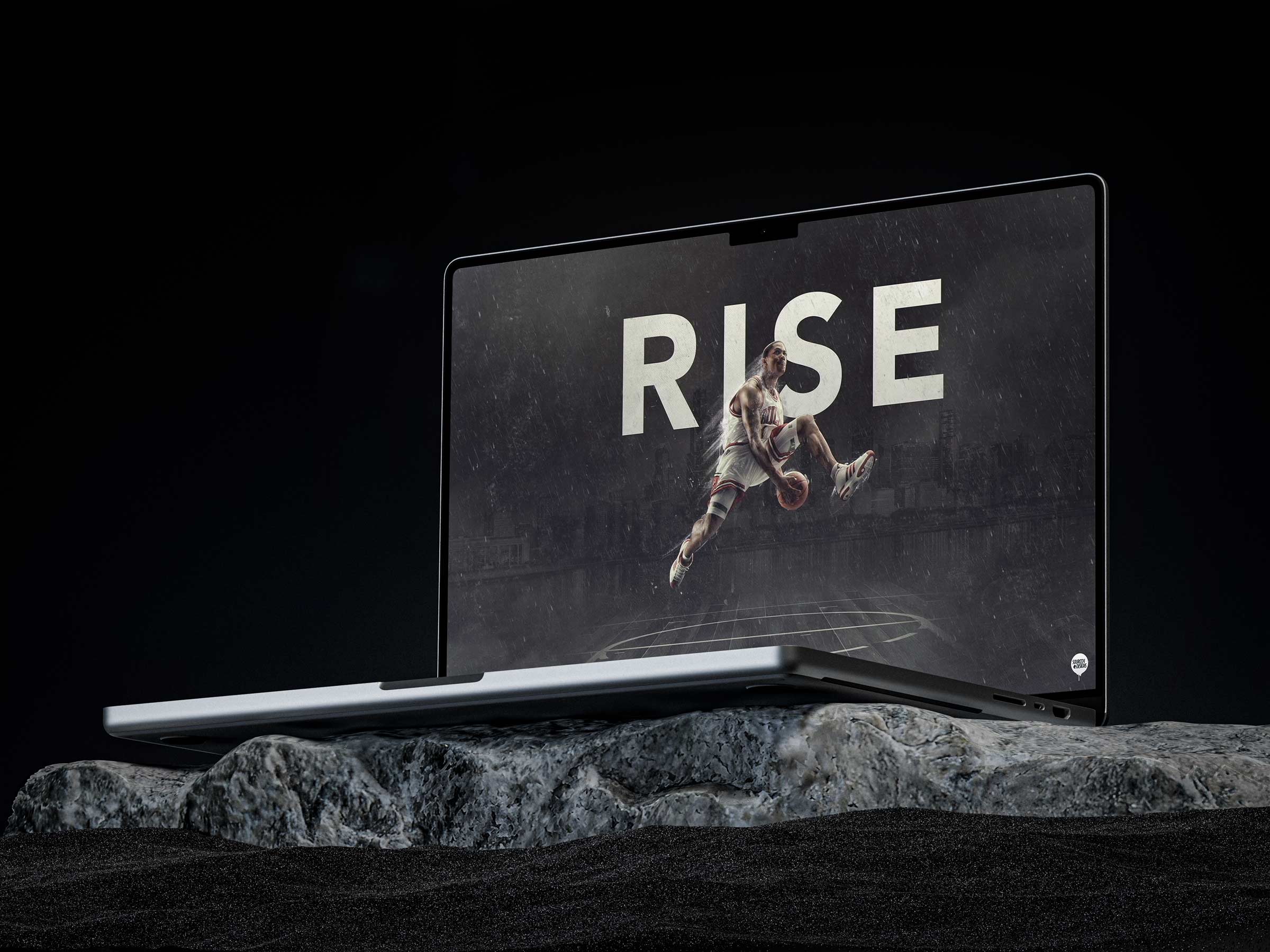
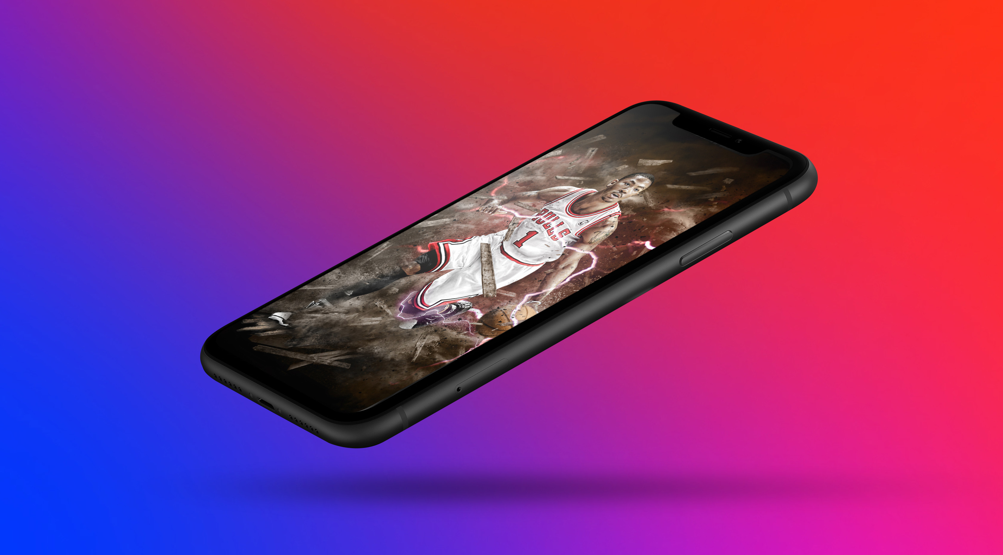
What deepened retention was realizing we were not serving a generic wallpaper need, we were serving identity formation. Users were not downloading assets as utilities, they were adopting them as signals of taste, allegiance, and personal mythology. In product terms, the wallpaper acted like a wearable, a lightweight way to broadcast affiliation without saying a word. That framed our work as a personalization layer for fandom, which changed how we thought about breadth versus depth in content strategy. Instead of only chasing the biggest stars, we built a catalog that honored role players, rivalries, cities, and micro narratives that fans emotionally over indexed on. This is why the platform could sustain repeat behavior, because it met fans where their loyalty actually lives, in details. Posterizes became a ritual: check the site, see what dropped, rotate the lock screen, and carry the moment forward. How often can you say you run a site where fans actually go back to their old favorites over new drops?
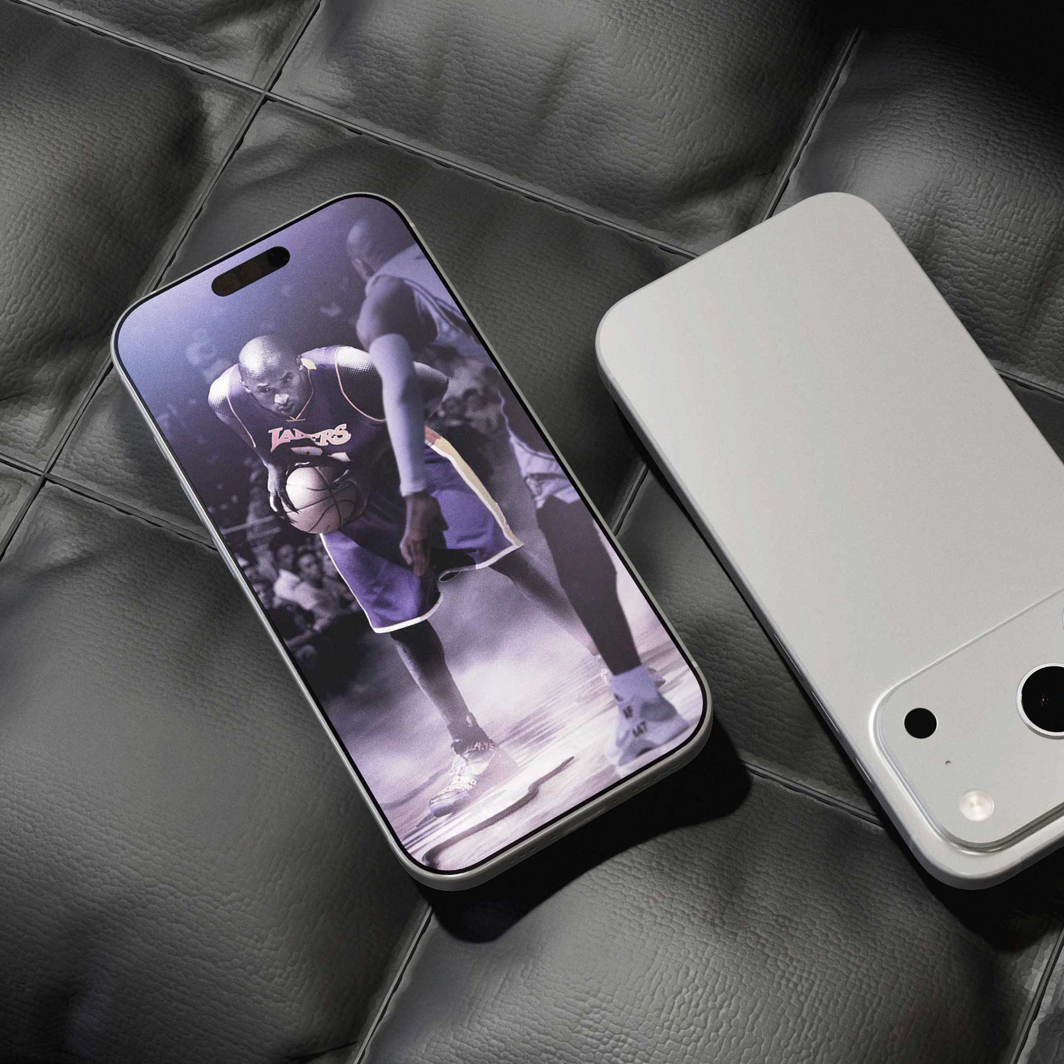
Most importantly, we optimized for permanence in a world designed for forgetting. Our content was built to be kept, not consumed and discarded, because a wallpaper is an intimate artifact that sits on someone’s most personal screen and gets seen dozens of times a day. That forced a higher bar for craft, clarity, and emotional resonance, and it also created a deeper kind of loyalty than typical media engagement. Fans were not simply liking a post, they were adopting it, setting it, and carrying it through the week as a visual badge of identity. That repeated choice is why the work endured, and why Posterizes functioned less like a content feed and more like a cultural utility for people who wanted to live inside the game. The system rewarded participation, turning spectators into active cultural contributors.
Posterizes worked because we built a retention loop that connected sport, emotion, and utility into one repeatable habit. A big game moment created emotional heat, then our artists converted that heat into a visual artifact overnight. Social distribution delivered the spike, but the site converted attention into ownership through high quality downloads and device ready formats. Once the wallpaper lived on a user’s lock screen, it became a daily reminder and a persistent brand touchpoint. That daily touchpoint increased the likelihood of returning for the next playoff moment, rivalry drop, or star performance. We reinforced the loop with internal linking, team pathways, and related modules that turned a single search landing into a browsing session. Over time, the platform became less like a gallery and more like a personalized library fans maintained throughout the season. That is why the community stayed loyal even as platforms and algorithms shifted.

My role as co founder extended beyond creative contribution into building the operating system that made the collective sustainable. I acted as a hybrid of creative director, editorial lead, community architect, and product minded strategist, shaping both the taste level and the mechanics of how the work shipped. I set quality bars for composition, typography, and cultural accuracy while also defining the cadence and drop strategy tied to the NBA calendar. On the platform side, I partnered with Tyson to make sure the site experience honored the work, designing for discoverability, speed, and repeat usage rather than one off downloads. I also owned key parts of distribution, ensuring each release was formatted and positioned for the behaviors of forums, Tumblr, Facebook albums, and emerging Instagram norms. In practice, this meant treating every post as both a piece of art and a growth asset, engineered to travel without losing authorship. That full stack lens is what allowed Posterizes to feel like a brand, not a folder of wallpapers.
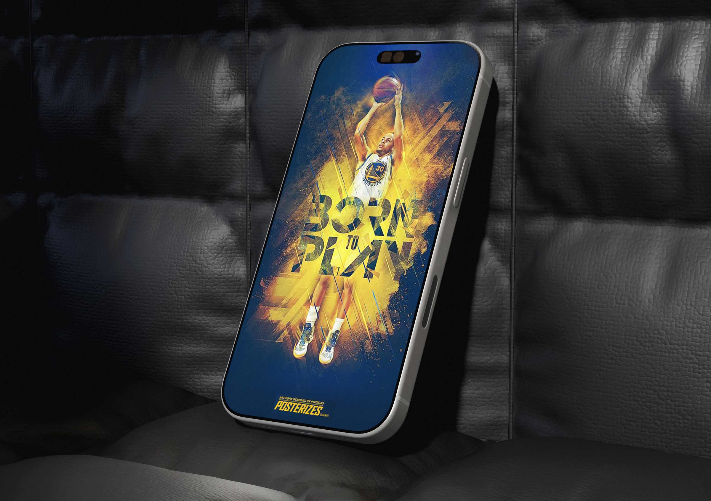
By really allowing our sweet spot to fall at the intersection of sports culture and design craft, Posterizes was able to flourish in an era when high-end, calendar-tied digital artwork was largely unheard of. We pioneered a unique approach to covering defining NBA moments by memorializing them and treating them as collectible visual artifacts rather than disposable content. Game winners, playoff runs, MVP campaigns, and iconic player gestures were translated into stylized wallpapers that fans could carry on their devices as daily reminders of the moments that moved them. The platform taught me how to lead without hierarchy across distributed talent.
This approach reframed fandom from passive consumption into personal curation, giving supporters a way to signal allegiance and aesthetic taste simultaneously. The work resonated because it respected both the emotional gravity of sport and the visual literacy of a generation raised on design-forward culture. As a co-founder, I helped shape the brand’s visual language, release cadence, and editorial eye, ensuring each drop felt timely yet timeless. The result was a platform that turned the NBA calendar into a living gallery, where every major moment had the potential to become art. Culture moved fast, but our systems were built to move faster with intention.

The rapid adoption of Posterizes revealed a latent appetite for premium sports visuals that lived beyond broadcast and social feeds. Fans returned not only for the teams and players they loved but for the anticipation of how each moment would be interpreted through composition, color, and typography. Limited releases and real-time drops created a ritualistic rhythm, aligning the brand with the emotional peaks of the season and reinforcing a sense of community among collectors. Our wallpapers spread organically across forums, blogs, and early social platforms, transforming user devices into a distributed exhibition space that amplified reach without traditional marketing. This grassroots momentum built a rabid following because the work felt made by fans who understood the stakes, not by outsiders chasing trends. Posterizes proved that when design honors the mythology of sport, it can deepen connection and extend the life of a moment far beyond the final buzzer. In doing so, we helped set a precedent for how digital art, fandom, and cultural timing could converge into a sustainable and influential creative model.
From the beginning, my core belief was simple: basketball deserved to be interpreted, not just reported on. I saw a gap between the emotional intensity fans felt during games and the flat, transactional way most digital media packaged those moments afterward. Tyson and I were not outsiders looking in; we were forum natives who understood how culture actually moved online, where edits carried as much weight as articles. Our unfair advantage was proximity to both the craft and the community. We weren’t trying to retrofit design onto fandom, we were designing from inside it. Posterizes was built on the conviction that if you elevate the visual language of a culture, you elevate the culture itself. Building Posterizes changed how I think about leadership. I learned that creative direction is less about imposing taste and more about articulating a shared standard clearly enough that others can execute independently. I became comfortable operating at the intersection of art and systems, understanding that inspiration must be supported by infrastructure to scale. The project also taught me that community building requires long-term consistency rather than momentary hype. Most importantly, it reinforced that the most durable brands are built on belief before monetization or investment and commercialization.

Watching Stuart Scott redefine what sports journalism could look and sound like made a deep impression on us. He was not just reporting on the game, he was living inside its rhythm, blending cultural fluency, personality, and authenticity in a way that felt inseparable from the athletes he covered. That spirit resonated with what we were trying to build in our own lane. While he was pushing the boundaries of broadcast storytelling, we felt we were carving out a parallel frontier in sports art and design journalism, treating visual interpretation as a legitimate form of coverage rather than an accessory to it. We weren’t content to decorate the game; we wanted to document it through a new aesthetic vocabulary that belonged to our generation. There was pride in knowing we were not imitating existing models but inventing one that felt culturally honest. In our own way, we believed we were expanding the definition of how sports could be narrated, not just through words and highlights, but through craft and design.

We eventually landed on Posterizes as the name because the verb form carried both conceptual clarity and SEO advantages, signaling action, transformation, and shareability in a way that aligned with how audiences were already searching for and describing stylized sports artwork. The term suggested a process, not just a product, reinforcing the idea that design was an active reinterpretation of culture rather than a static output. From a discoverability standpoint, the uniqueness of the word helped us own search results and build a distinct digital footprint, laying the groundwork for sustained organic growth. What began as a pragmatic naming decision quickly became a semantic anchor for the brand, shaping everything from our tone of voice to how contributors described their own work within the ecosystem.
This data informed mindset extended far beyond naming. We treated the early stages of Posterizes as a series of small, low risk pilot tests, experimenting with formats, distribution methods, file resolutions, and community engagement tactics to understand what resonated. Download metrics, sharing patterns, and contributor participation all served as signals that guided the platform’s evolution, allowing us to iterate with intention rather than assumption. By the time we formally launched the site and collective, we were not guessing at demand. We had validated behaviors and built early trust with a growing audience. That experimental, feedback driven approach set the project on a strong trajectory, proving that even passion fueled creative communities benefit from a foundation of strategic testing, measurable insights, and a willingness to adapt.
Focusing on the search engine optimization aspect of building a website like Posterizes, one of the first things Tyson and myself focused on was building a robust library of content that would allow for passive hits on the website and act as a hook for users to delve deeper into the artwork and find more content. While looking at keywords that drove traffic to the site, I noticed that there were two major buckets that people were looking for when it came to wallpapers, specific player designs and art which was a crowded space with a myriad of sources and team artwork which offered a far more sparse subset of options for users.
Because of this, one of our primary early priorities was building a robust network of team specific wallpaper pathways that functioned as both a discovery layer and a retention mechanism. We recognized that a significant portion of traffic was arriving through long tail, team based search queries, so we designed modular site experiences that dynamically surfaced relevant artwork tied to those intents. Instead of treating a single wallpaper download as a terminal interaction, we engineered recommendation modules that introduced adjacent teams, players, and stylistically similar pieces, effectively turning search landings into exploratory sessions. This approach reduced bounce rates by giving visitors an immediate sense of depth and personalization, reinforcing that the platform could serve as an ongoing destination rather than a one off resource.

From an SEO and behavioral standpoint, the strategy created a compounding effect. As users navigated through related team pages and engaged with multiple assets, session duration increased and search engines registered stronger relevance signals, which in turn improved rankings for adjacent queries. We also observed that fans who arrived for a specific team often expanded their engagement to rivals, playoff matchups, or players they followed across franchises, revealing natural pathways for content clustering. These insights informed our taxonomy, internal linking structure, and tagging system, allowing us to refine how artwork was categorized and surfaced. Over time, the wallpaper network became one of our most effective acquisition and retention loops, not only increasing hits across related search results but converting casual visitors into repeat users who returned for new drops, seasonal updates, and evolving team narratives. We weren’t chasing virality, we were building rituals around the season.
As these team and player art discovery pathways matured, the site began to feel less like a download hub and more like a living map of the league. Fans arriving for a Lakers wallpaper could easily drift into Celtics rivalries, playoff matchups, or standout player performances that contextualized the moment they cared about. This mirrored how people actually experience basketball, through storylines rather than isolated assets. By structuring navigation around those narrative threads, we encouraged exploration without adding friction. Session times increased because the experience felt intuitive, not engineered. The platform started to anticipate curiosity instead of reacting to it. In doing so, we transformed search traffic into sustained engagement rooted in the emotional logic of fandom.
One of the major incentives in building out Posterizes was to create a premium content and artwork offering in a space that didn't really have that type of content readily available for users. As such my north star for the collective was to have an artistic vision that forms the backbone for every piece that made it onto users feeds. In terms of the actual concept of a wallpaper, the thinking behind this was that users had this piece of art in their lives on a constant basis. No different than having a piece of artwork hanging above your mantle in your home that you walk by on a regular basis, having a desktop or phone wallpaper is something that you see daily every time you use that piece of tech.
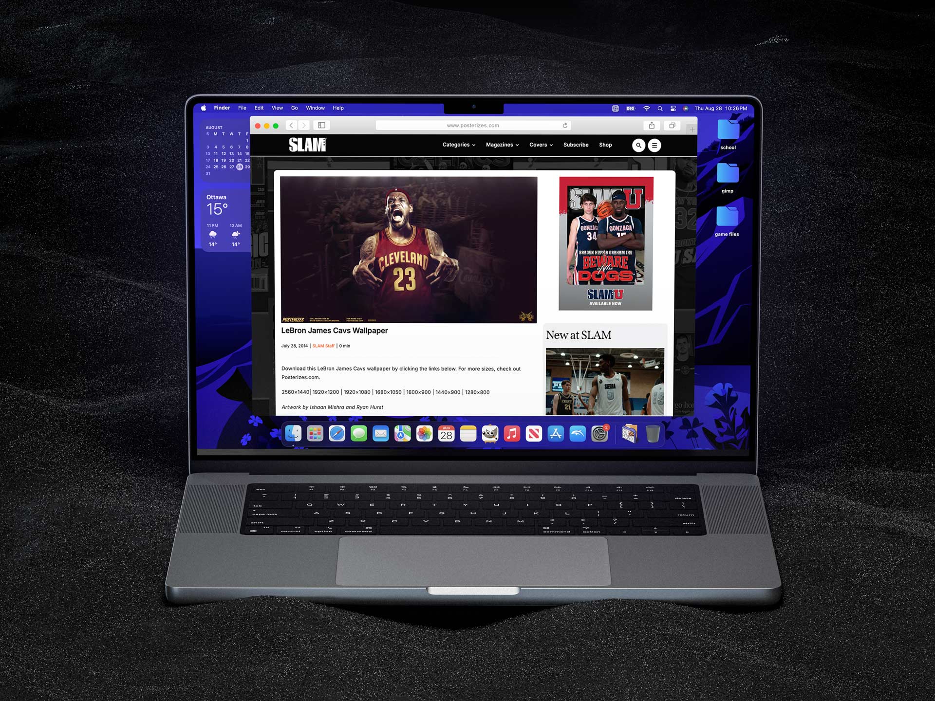
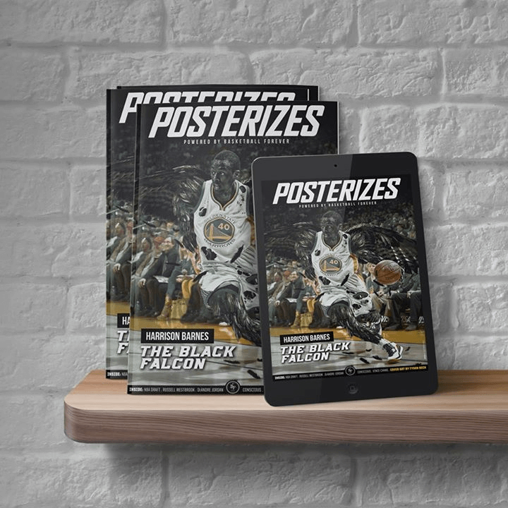
As the Posterizes community continued to grow, I began looking for ways to connect the work with platforms that already had deep credibility within basketball culture. One of the most meaningful partnerships that emerged was with Slam Magazine, where I negotiated an arrangement for us to serve as their official high resolution wallpaper provider for readers. Working directly with editor Ryne Nelson, we established a cadence where our designs would be featured on Slam’s platform for fans to download and use, turning the artwork into something functional that could live on thousands of screens across the community. The collaboration created a natural crossover between two audiences that already shared the same love for the game, giving Slam fresh visual content while allowing our work to reach an even broader and more engaged readership. It was a simple idea but incredibly effective, a mutually beneficial relationship where both sides brought something meaningful to the table and the culture around the art continued to expand.
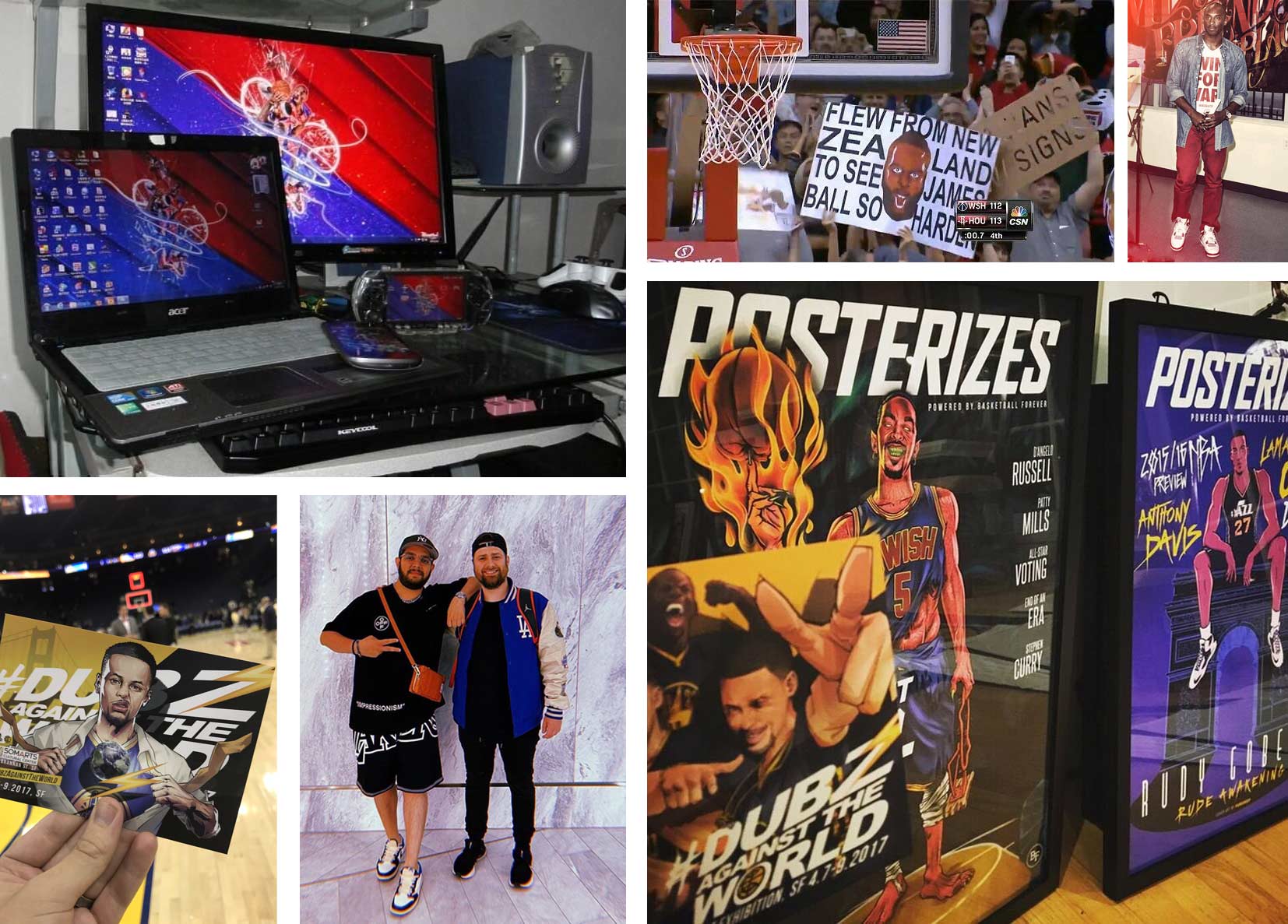
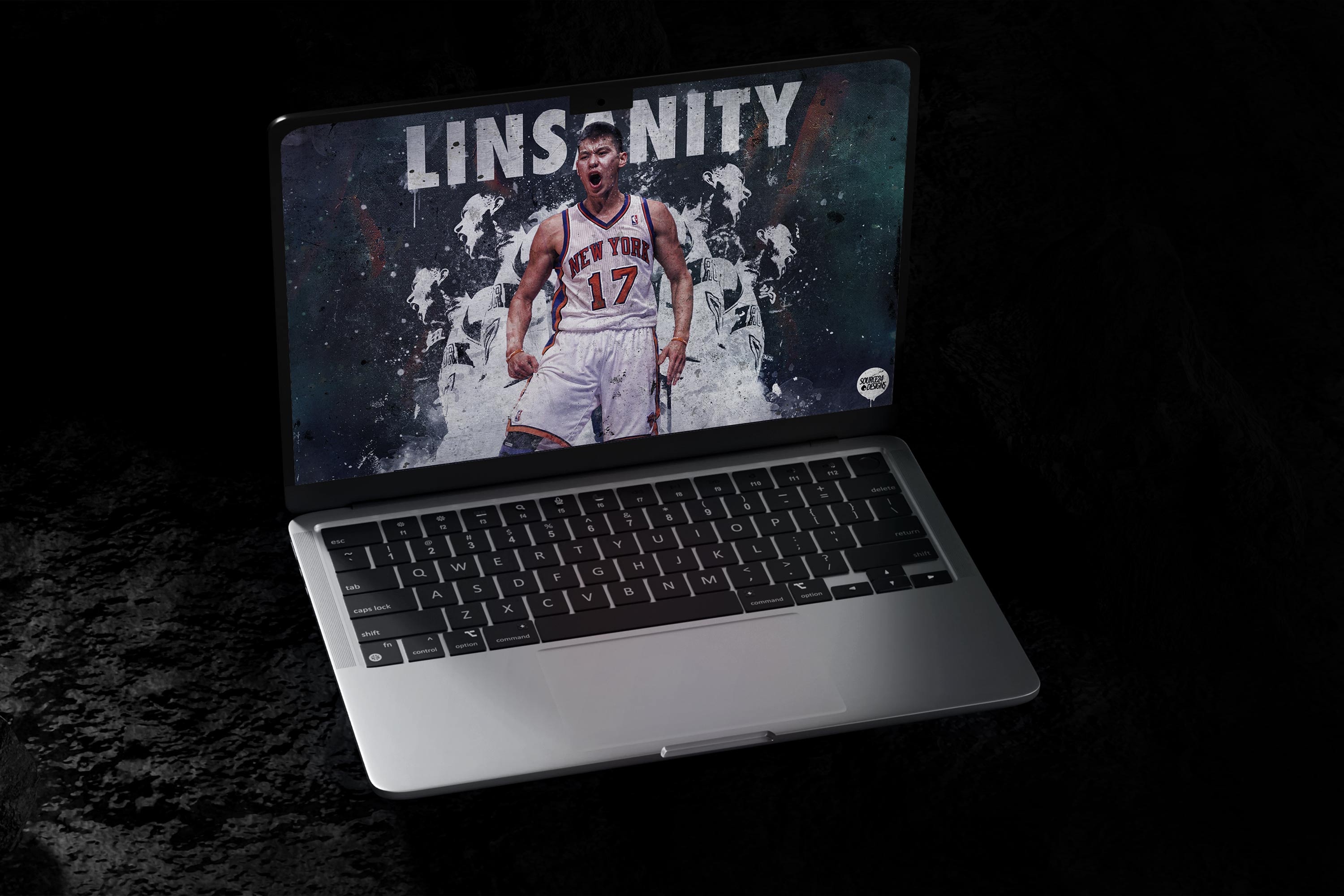
One of the most surreal parts of the movement was realizing the work was escaping the internet and taking on a life of its own. Fans would regularly print our wallpapers as full size posters and bring them into arenas, holding them up courtside or in the stands like handmade banners. During the height of Linsanity it felt like our designs were everywhere, circulating through Tumblr, forums, and social media before showing up physically inside arenas and on street corners. One moment that still sticks with me happened when Dwight Howard signed with the Houston Rockets. Within hours of landing in China there were fans at the airport holding signs printed with Posterizes designs, and soon after Dwight changed his Twitter profile picture to a jersey swap created by our own Ryan Hurst. This was before teams, agencies, and brands had entire social teams ready with instant graphics the moment a transaction broke. Seeing Ryan’s image appear on SportsCenter later that day was a surreal reminder of how quickly fan driven creativity could move through the culture. It was the same energy behind moments like the Win for Ware campaign, where the community rallied around a cause and the artwork spread across the basketball world almost overnight. Those moments made it clear that the work wasn’t just decoration, it had become part of the conversation around the game itself.

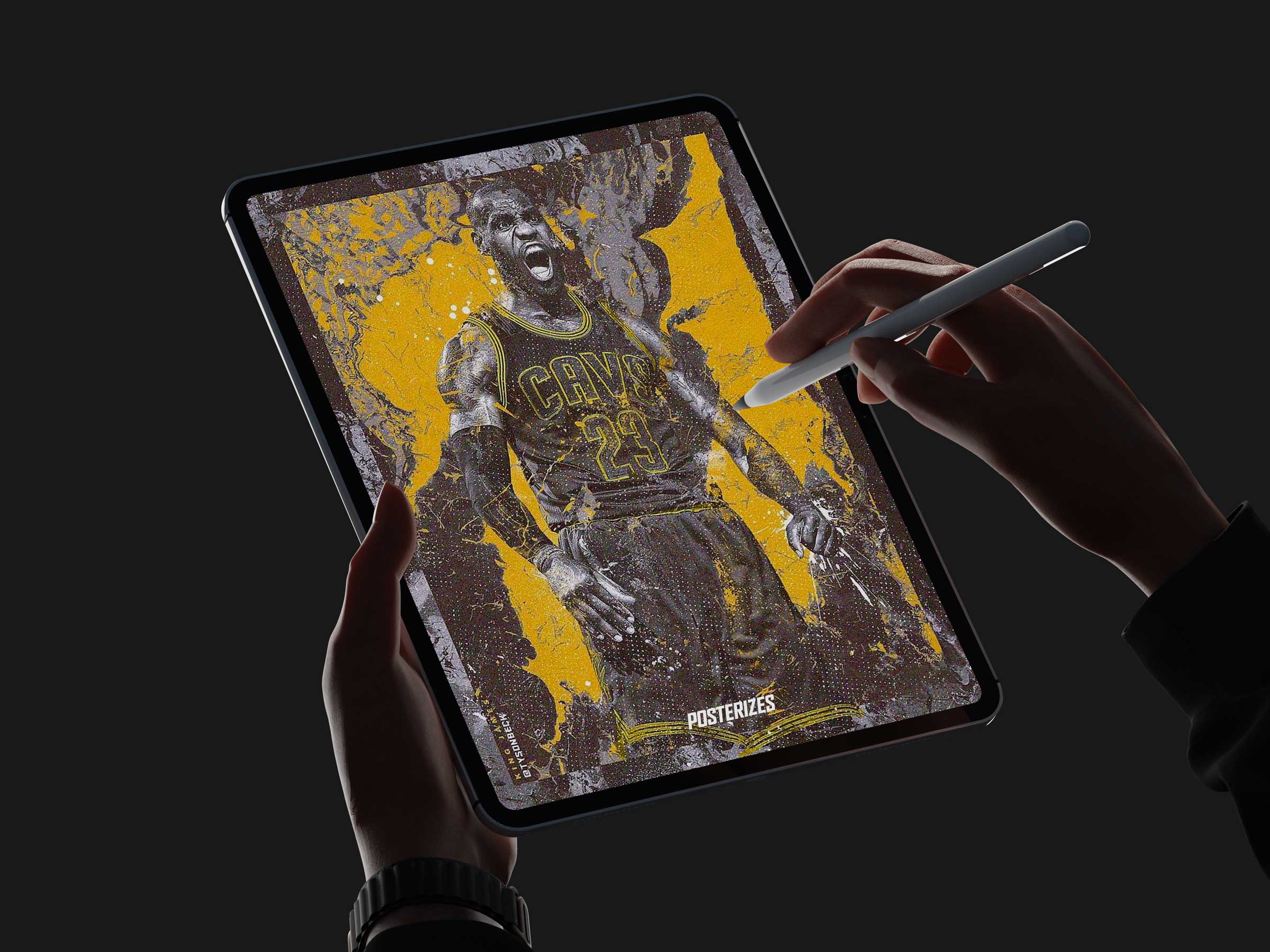
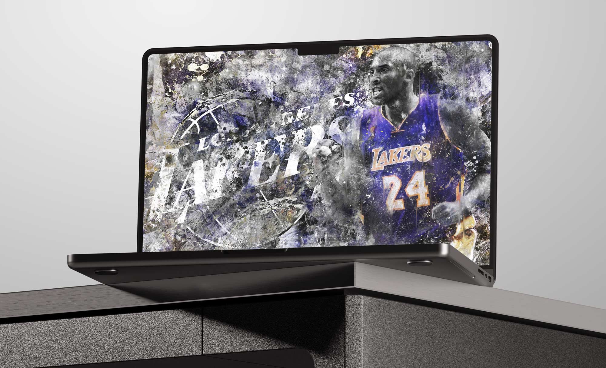
Admittedly, the platform’s early visual output featured a disproportionate number of Kobe Bryant wallpapers, a reflection of both my own Lakers allegiance and Tyson’s parallel fandom, which naturally shaped our initial creative instincts. While this passion helped fuel momentum and attract a core audience, we were conscious that an overrepresentation of any single player or franchise could narrow the platform’s appeal and undermine its global ambitions. What began as obsession matured into infrastructure, from serving just myself and Tyson to serving all NBA fans who were searching for their own wallpapers and ways to signal fandom and show how a ppssionate they were about their favorite players and teams. It showed that when craft, timing, and belief align, culture does not just get documented, it gets shaped.
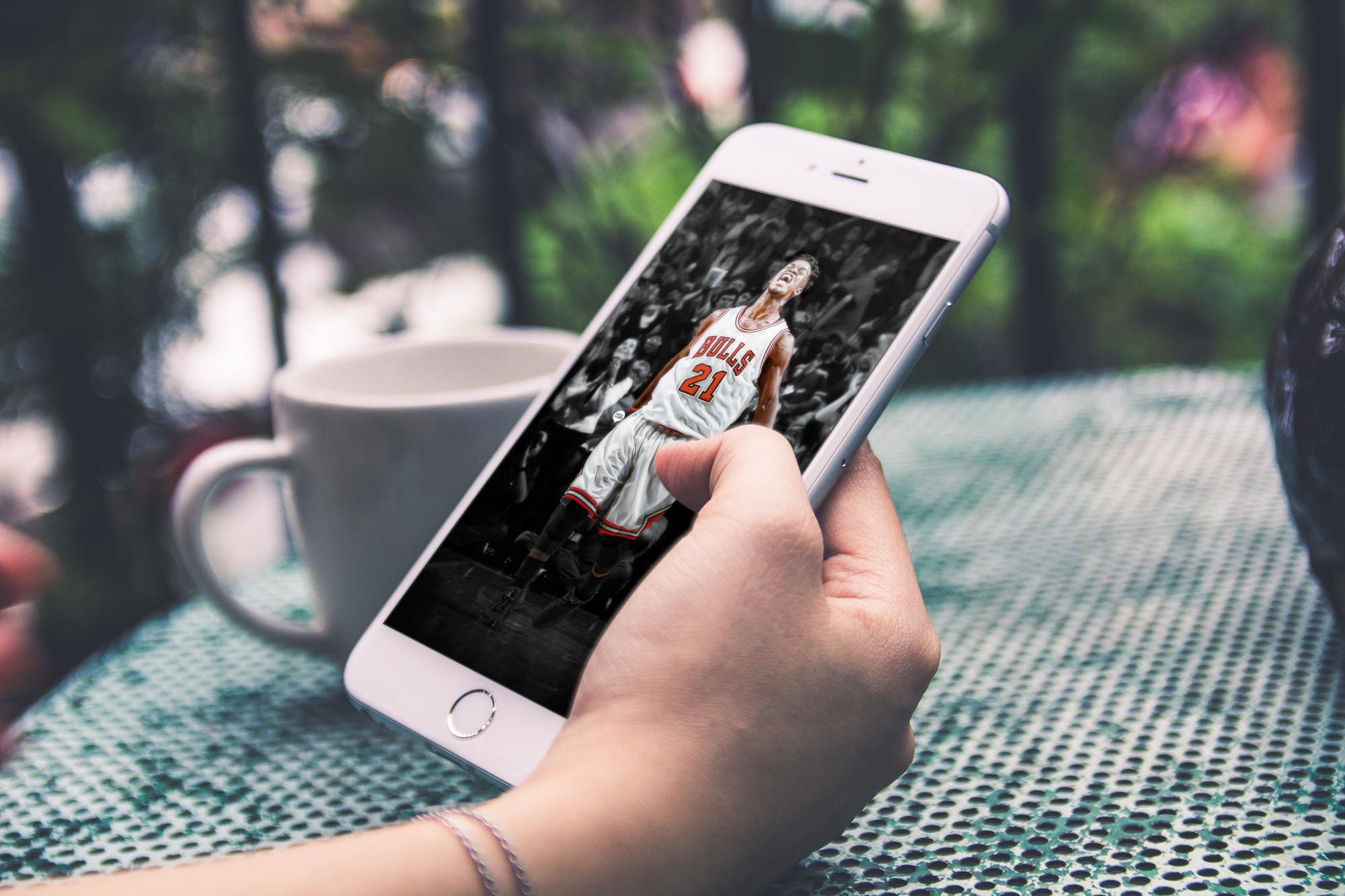
To counterbalance that bias, we made a deliberate effort to recruit artists who were deeply rooted in other team cultures, from Bulls loyalists in Chicago to Mavericks supporters in Europe and emerging Thunder fans in Oklahoma. This diversification was not merely cosmetic but structural, ensuring that the collective’s output reflected the full emotional spectrum of the league rather than a single narrative. By empowering contributors to champion their own teams and heroes, we transformed fandom diversity into a strategic advantage that broadened reach and deepened authenticity. Over time, this approach helped Posterizes evolve from a Lakers-leaning passion project into a truly league-wide visual chronicle shaped by the voices of its community. What began with purple and gold instincts ultimately matured into a platform where every fan could see their allegiance reflected with equal care. The imprint remains wherever sports design is taken seriously.
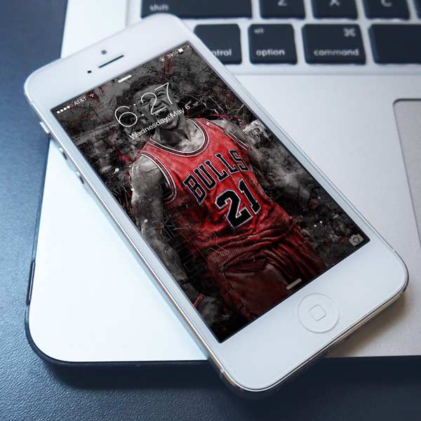
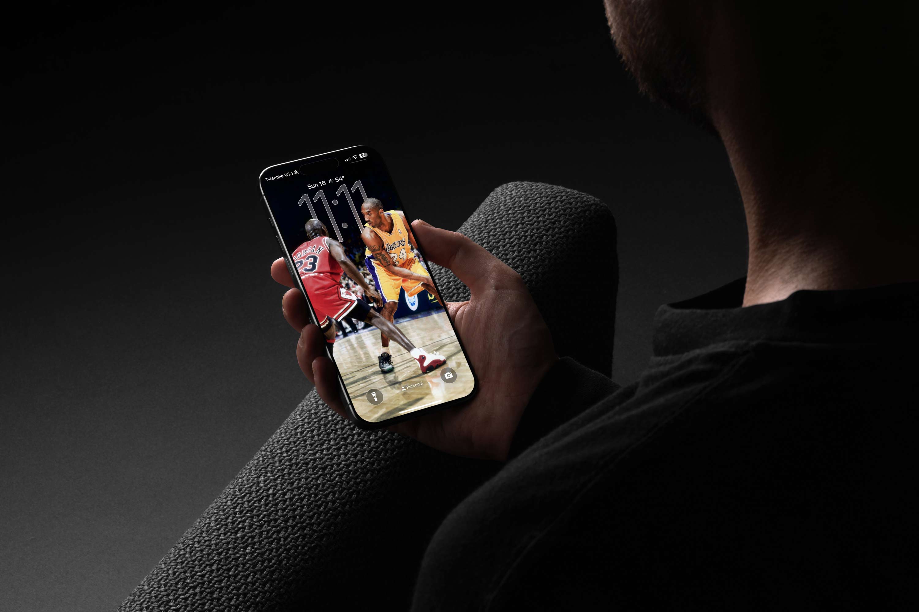
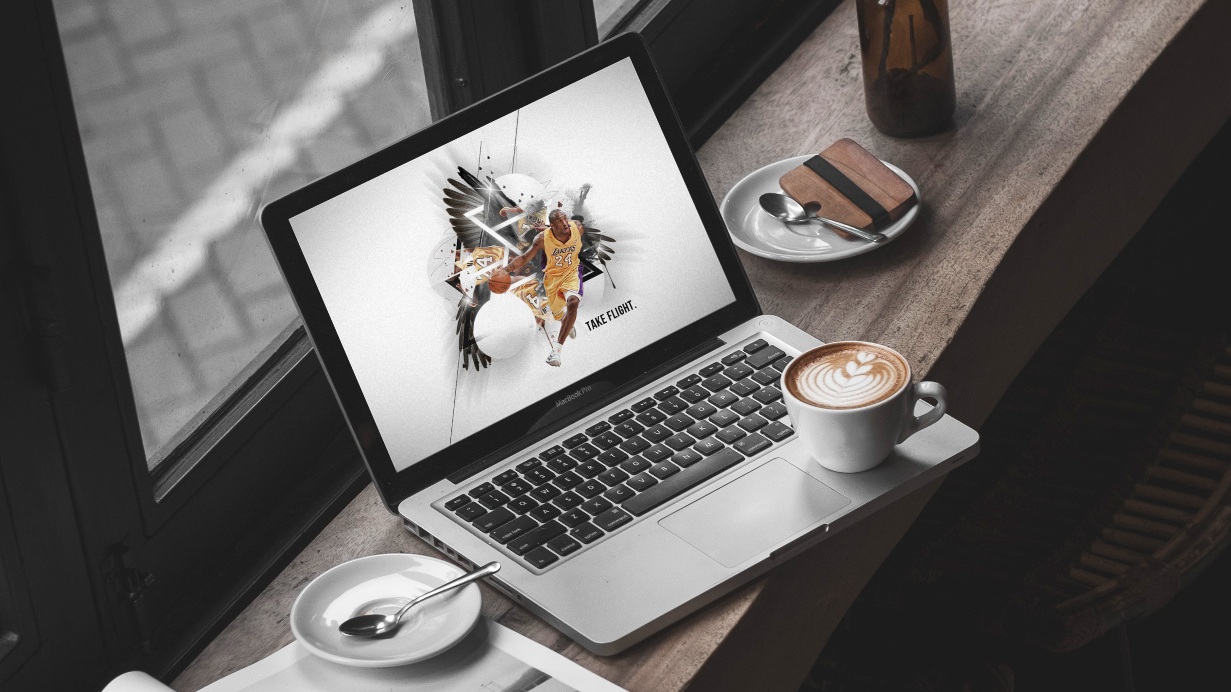
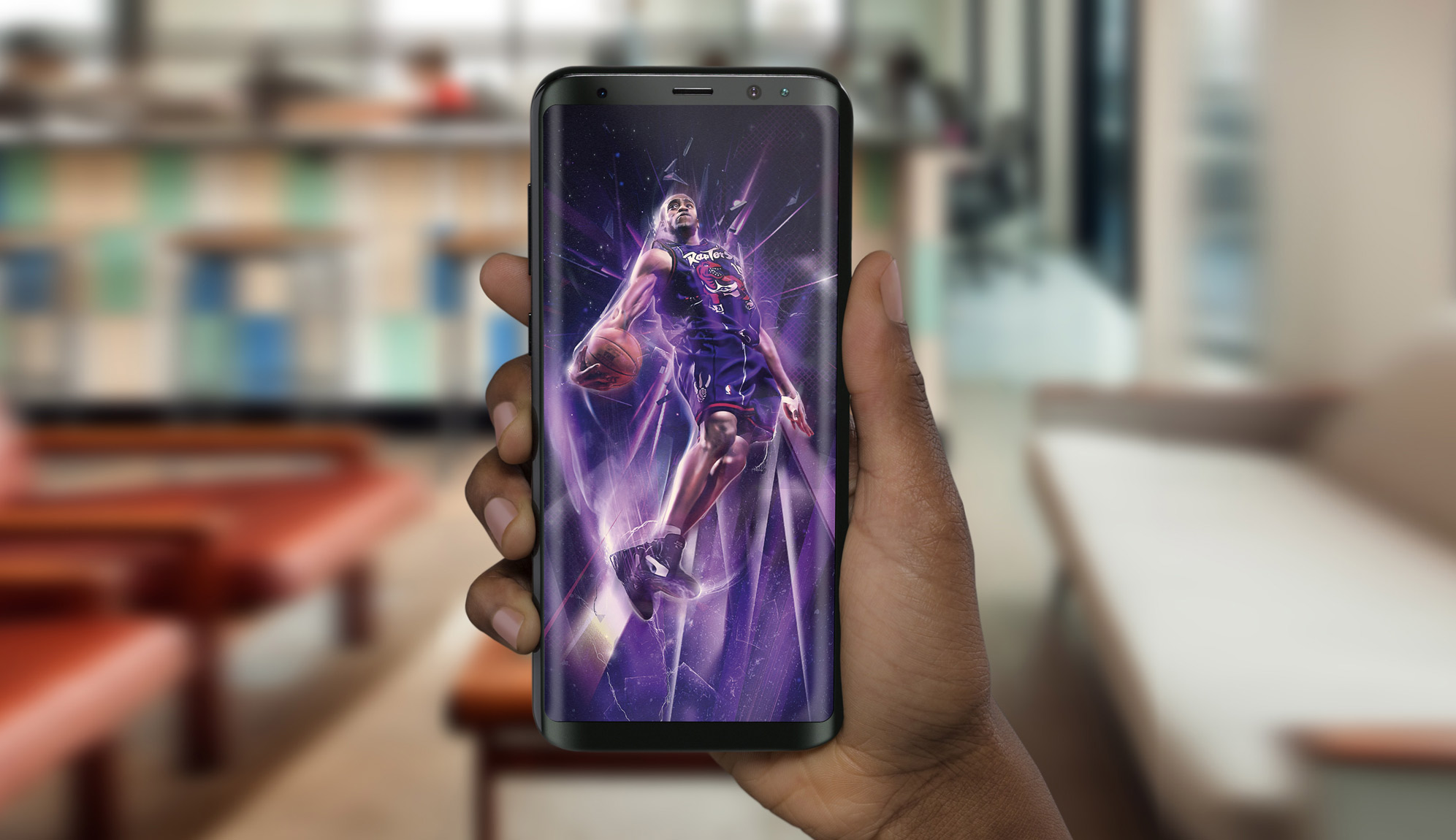
I really don't think this fact gets talked about enough, which is why I hammer it home so much. A person's lockscreen is sacred ground, it is super valuable real estate as far as I am concerned. You look at it every time you open your phone. You see your lock screen more often than you see your most used apps. This means our content would have to be high quality and something our users would want to keep using and feel inspired looking at. The real product was belonging, with artwork serving as the entry point. We made premium visual storytelling feel accessible without flattening its edge. It was a blueprint for creator led sports media before the term existed. What started scrappy became a standard others quietly began to copy. The legacy is the talent it unlocked, and the standards it normalized.

Beneath the frameworks, cadences, and distribution mechanics, Posterizes was driven by a genuine reverence for art and the people who make it. I have always seen myself as a patron as much as a practitioner, someone committed to creating space, visibility, and dignity for creative labor even within a domain as commercially charged as sports media. Many of us came from fine art, illustration, photography, and experimental design backgrounds, and we approached each drop with the same intentionality we would bring to a gallery piece. The fact that the canvas was digital and the subject was sport did not diminish the artistic impulse; if anything, it expanded the audience for work that might otherwise remain niche. We treated typography, composition, and color with the seriousness of craft traditions while embracing the velocity of the internet as a new exhibition space. In that sense, Posterizes functioned as a bridge between high art sensibilities and mass cultural moments. It proved that devotion to craft can coexist with accessibility, and that digital sports art can carry the same emotional and aesthetic weight as work shown on a white wall.

This meant adhering to an uncompromising standard for both the artists I curated and the work that ultimately earned a place on the desktops and mobile devices of our users. Every submission was evaluated not only for technical execution but for conceptual clarity, cultural fluency, and its ability to hold up under daily use on the most personal screens people own. We were acutely aware that a wallpaper is not glanced at once and forgotten, it is lived with, revisited dozens of times a day, and therefore must sustain visual interest without fatigue. That understanding informed a premium content sensibility that became the defining differentiator for Posterizes in a landscape crowded with inconsistent quality and poorly formatted assets or lazy edits that weren't high quality or optimized for customer needs.
Rather than aggregating a fragmented mix of images of varying quality scraped from across the random corners of the web, we delivered a tightly curated high quality library unified by a coherent visual point of view and production standard. Each piece was optimized across a controlled set of device-specific resolutions, ensuring fidelity, proper cropping, and compositional integrity regardless of screen size or aspect ratio. This systems-driven approach allowed us to maintain aesthetic consistency while still showcasing a diverse range of artistic voices, proving that cohesion does not require uniformity. By prioritizing craft, usability, and intentional curation, we positioned Posterizes not as a repository of wallpapers but as a design-led destination where every download reinforced trust in the brand’s taste and standards.

A key strategic unlock was recognizing that the audience was not a terminal endpoint but a talent pipeline waiting to be activated. Instead of treating fans as passive consumers scrolling through finished pieces, we treated them as future contributors observing the standards in real time. Attribution was prominent and intentional, artist names traveled with the work, spotlights unpacked process, and recurring features made improvement visible rather than abstract. That visibility created aspiration with a blueprint attached. People could see not only what great sports design looked like, but how it was constructed, how typography balanced image, how moments were framed, how timing amplified relevance. The barrier between admiration and participation began to shrink because the path was legible. When emerging designers shipped something strong, we amplified it, reinforcing a culture where effort met opportunity and I made sure to mentor all the younger designers in the collective and still do across their careers.
Over time, that dynamic produced a genuine flywheel. Fans experimented with edits inspired by what they saw, shared them within the community, received critique, refined their craft, and eventually earned placement alongside established contributors. That progression normalized growth in public, which accelerated skill development across the board. What began as a wallpaper destination quietly operated like a distributed creative academy, but without tuition, gatekeeping, or rigid hierarchy. Contributors who cut their teeth inside that ecosystem carried its standards into agencies, brands, and media companies, extending the aesthetic influence far beyond the site itself. The impact endured because we built a scene, not just a platform, and scenes propagate through people long after URLs go dark.
Before templates standardized the look of sports graphics across the industry, there was visual experimentation. Type treatments were riskier. Color grading was moodier. Composition was less optimized for sameness and more driven by instinct. Posterizes flourished in that era because originality was still rewarded over conformity. We were not designing inside a predefined system, we were helping define what the system might become. That freedom allowed the collective to influence rather than imitate. Maintaining a high bar came with tradeoffs. We could have published more frequently by lowering standards or aggregating widely, but we chose restraint. That decision limited short term growth but protected long term credibility. Taste, when applied consistently, is exclusionary by necessity. Not every piece made it through, and not every trend was chased. Over time, that discipline became one of the brand’s most valuable assets.
At its core, Posterizes was fueled by something far more elemental than distribution strategy or platform mechanics. It was built on genuine love of the game and a belief that sport deserves interpretation, not just documentation. Basketball has always carried rhythm, improvisation, and style, and digital art became our way of translating that movement into visual form. The same way a player reads a defense and creates space, an artist reads a moment and reconfigures it through color, type, and composition. There is an improvisational quality to both disciplines, a tension between structure and instinct that produces something uniquely expressive. What we were participating in was a kind of interpretive aesthetic anthropology, observing how modern fandom metabolizes sport and then reflecting it back through design. Digital tools did not dilute artistry; they amplified it, enabling creators across continents to channel raw emotion into shareable artifacts with immediacy and polish. The energy was contemporary, networked, and collaborative, but the impulse underneath it was timeless: to honor the game by reimagining it, and to turn passion into something visible, lasting, and alive.

One of the least discussed advantages of Posterizes was the accidental 24 hour newsroom we built through geography. With artists spread across continents, the sun never really set on production. A game could end in Los Angeles and someone in Europe or Asia would still be awake, processing it visually in real time. That created a relay system where inspiration passed across time zones instead of stalling. It also subtly changed the tempo of the work because urgency did not require burnout. The global footprint was not just aesthetic diversity, it was operational continuity. In practice, it allowed us to design at the speed of the league without centralizing control in one city.
Long before remote creative teams became normalized, Posterizes operated as a fully distributed creative studio. There was no headquarters, no shared office, no daily standup culture. Coordination happened through trust, clarity of taste, and mutual respect for deadlines tied to the NBA calendar. The absence of physical proximity forced precision in communication and expectation setting. That model proved that cohesion does not require co location if the standards are clear. In hindsight, it foreshadowed the decentralized creative networks that now dominate digital industries.
We also treated contributors like stakeholders, not content suppliers. Attribution was non negotiable, crediting was designed into the mission, and features like artist spotlights and magazine profiles were built as deliberate career accelerators, not vanity content. That posture changed the energy of the community because the platform was giving back leverage, not extracting labor. Fans learned names, followed artists across platforms, and began commissioning work directly, which turned Posterizes into an ecosystem rather than a destination. In practical terms, we were building a trust economy where the audience rewarded authorship, and authorship rewarded the platform with consistent excellence. That flywheel made the collective feel alive, because it was always producing new work while simultaneously increasing the value of the people producing it.
From there, something larger began to emerge. What started as a fan-driven art collective gradually became a proving ground for professional creative development. Artists were not just uploading isolated pieces; they were building visible bodies of work tied to culturally resonant NBA moments. Brands, agencies, and teams began to notice. The platform functioned as an informal incubator where contributors refined craft under real-time pressure and public scrutiny. In effect, Posterizes blurred the boundary between “fan art” and commercial design. It demonstrated that proximity to culture, when paired with discipline, could create legitimate career pathways.

One of the most important realizations was that recognition alone was not enough to sustain meaningful participation because when you build a tribe it is deeperthanthat. What truly energized contributors was the feeling that their voice carried weight within the collective and that their work was part of a shared cultural record rather than a fleeting post. We built structures that foregrounded process, elevated attribution, and invited conversation, allowing artists to contextualize their decisions and engage directly with peers who understood the nuances of the craft. In doing so, publication became a dialogue rather than a transaction, it was about belonging.
This shift reframed the platform from a distribution channel into a creative commons defined by mutual respect and curiosity. Contributors approached each drop with greater intentionality, pushing stylistic boundaries and refining their techniques because they knew the audience included fellow practitioners, not passive consumers. The result was a standard of care and experimentation uncommon in volunteer-driven environments, where ownership translated into pride, and pride translated into better work.
That sense of ownership changed the emotional contract between the platform and its contributors. When people feel that their voice matters and their process is valued, they invest more than effort, they invest identity, pride, and long term commitment. We saw artists push beyond safe formulas, explore new techniques, and mentor emerging voices because the environment rewarded generosity as much as output. The result was not only stronger individual pieces but a network effect where shared standards and mutual respect raised the floor for everyone involved. Over time, this psychological shift transformed Posterizes from a publishing outlet into a creative home, one where the work endured because the relationships behind it did. Community became the medium, and the artwork its most visible expression.
Making the download process easy and giving our users a number of high quality options that treated these digital products like pieces of art was what enabled a high growth rate but more importantly an extremely positive customer affinity. Over time, the art collective would actually involve to include writers for the editorial side of the magazine, or video editors who would help develop videos that would sit along side pieces of artwork as a way to elevate our storytelling. My job was to bring these talented folks together and to foster collaborative undertakings while helping develop the community further to introduce new young artists to this developing industry.

In the early days, sourcing high resolution photography was its own underground operation. Before we had any formal media access, we became obsessive digital detectives, combing through Yahoo News articles, team recap pages, forgotten CDN links, and cached server directories looking for the cleanest possible image files. We learned how to reverse engineer URLs, strip compression parameters, and trace thumbnails back to their original upload paths, slowly becoming Google Image kung fu masters out of necessity rather than ambition. Getty and USA Today galleries felt like guarded vaults, and until we eventually gained legitimate access through academic library credentials and institutional media licenses, we relied on pure persistence and ingenuity to get what we needed. It was never about cutting corners, it was about refusing to let technical barriers dilute the quality standard we had set for ourselves. If the moment deserved to be immortalized properly, we were going to find the raw material to do it justice. Creativity did not wait for permission; it found a way through whatever infrastructure existed at the time.
From early on, video and design began to evolve together in a natural feedback loop. The raw material of basketball culture already existed in motion: highlights, buzzer beaters, slow motion dunks, pregame tunnel moments, and the small gestures that give the game its rhythm. My process often started by collecting those fragments, freezing a single frame that carried the emotional charge of the moment, and translating it into something graphic that could live beyond the broadcast. A crossover dribble or a game winning shot might become the compositional anchor for a wallpaper, layered with typography, color, and iconography that pushed the moment into a new visual language. In that sense the designs were not simply illustrations of the game but reinterpretations of its most electric seconds, distilled into images that fans could carry with them on their screens.

The relationship flowed the other direction as well. As the community grew, filmmakers and editors working on basketball videos would often reach out looking for artwork that could anchor their projects, whether it was a poster for a YouTube highlight reel or a visual identity for a mix they were producing. Sometimes I would create a wallpaper specifically to accompany a music driven montage, designing the image to echo the tone and rhythm of the edit. Other times collaborators would use existing Posterizes pieces as title cards, thumbnails, or promotional artwork for their videos. That exchange created a fluid ecosystem where motion and graphic design fed into one another, each medium amplifying the other. The highlights inspired the visuals, the visuals helped frame the storytelling around the highlights, and together they expanded the way basketball culture could circulate online. I found myself straddling both worlds as I honed my expertise in both static and motion design capabilities along with video editing.
The two pillars that formed the infrastructure of Posterizes were rooted in developing a strong social voice with a number of ways to interact with our fans and curating a constant stream of high quality artwork by onboarding and collaborating with a killer crew of top level design and art talent from around the world. I was then able to use my social media prowess and pair it with a content calendar to maximize our ability to publish this artwork at a high clip and at a consistent basis throughout the season so that we could grow and develop a following. This meant commercial level work at the pace of social media, no small task when you really look at the combination of quality of work and the speed to market for any brand doing this type of content at the time, let alone one as small and bootstrapped as us.

This coming together of modernized editorial communication and sophisticated premium content offered consumers high quality artwork based around sports and capitalizing on the emotion of a game or play or specific player in a way that could be captured digitally as a moment in time relived every time you see that content as your desktop or mobile device wallpaper. As a content strategy, getting the content in front of fans was key, because we knew that as authentic fans ourselves, that the visual stories we were telling would resonate and had the elements a hardcore fan would understand or appreciate. We used SEO like a distribution engine, not a marketing checkbox.

This essentially meant paring the storytelling of the artwork with a quality distribution system using social as a fulcrum. Building a social following and building a worldwide team were similar endeavors as both required a keep eye for bringing together a community of creators and basketball connoisseurs. This shift reframed the relationship between fan and content, transforming passive spectators into curators of their own visual environments.
The artists that I would seek out would often times simply be fans of the game who loved certain players and while they weren't necessarily the best english speakers or would consume much other western content, they knew the universal language of basketball. Reaching out to these folks and bringing them into the fold really allowed for a diverse range of styles that would speak to a league with it's own cast of extremely unique stars. One of the biggest strengths of Posterizes was in it's diversity of talent as each artist brought their own flavor to the table in terms of overall aesthetic. Search intent shaped our architecture, and architecture shaped retention.
Certain things became abundantly clear to me relatively quickly after launch in terms of customer segmentation and brand affinity. The primary demographic visiting the site was overwhelmingly mobile first, users arriving with a clear intent to find high resolution wallpapers they could rotate regularly to reflect mood, allegiance, or recent moments in the season. This behavior reframed our understanding of the product. We were not simply publishing artwork, we were supplying a form of daily identity signaling that lived on the most personal screen a person owns. What began as shared obsession evolved into infrastructure for an entire creative subculture.
The lock screen and home screen became premium real estate, and our success depended on earning that space through quality, clarity, and emotional resonance. Recognizing this shifted our priorities toward mobile optimization, faster load times, and frictionless downloads, ensuring that the path from discovery to device was as seamless as possible. In doing so, we aligned the user experience with the ritualistic nature of wallpaper switching, where fans returned not just for new content but for a renewed sense of connection to the game. Every workflow decision protected the drop cadence that kept fans returning.

This insight also revealed deeper patterns around brand affinity and repeat engagement. Users who adopted one wallpaper were significantly more likely to return for playoff drops, rivalry moments, or standout performances tied to their favorite players. The act of changing a wallpaper became a form of participation in the season’s narrative, allowing fans to mark time through visuals rather than statistics. We leaned into this behavior by structuring releases around emotional peaks and ensuring that new artwork felt timely yet collectible, reinforcing the habit loop of checking, downloading, and sharing. Mobile usage also underscored the importance of file fidelity and resolution flexibility, as fans expected artwork to look pristine across varying screen sizes and aspect ratios. By treating mobile not as a secondary platform but as the primary canvas, we strengthened both retention and loyalty. Ultimately, understanding that our audience carried our work in their pockets clarified the responsibility we had to deliver art worthy of daily presence. We designed the pipeline so quality and speed could coexist under pressure and the ups and downs of an NBA schedule.
Therefore, optimizing for mobile became of utmost importance. However, this also meant juggling two very difficult things, as you want to maximize page load times for users on variable cellular internet connections that may intermittently change in download speed, and providing high fidelity images that will look beautiful when they are used as artwork on their devices. Predicting user behavior became a key aspect in the growth strategy and how we implemented the artwork on site for a smooth download experience.

By utilizing asynchronous loading, which is a design pattern commonly used in computer programming to defer initialization of an object until the point at which it is needed, we were effectively able to deploy the site based on user flow patterns. This limited too many images from loading at first so that the ones that the users would focus on would take priority. On a heavy site like this it was important to optimize image loading to give users a faster and smoother experience while on the site, but not compromise the quality of the downloads too much as that should be higher quality. This was a constant balance that had to be maintained.

Similarly, in order to cater to retina displays and the desire for users to be able to zoom into and customize the framing of the wallpapers on their individual devices as a form of expression and also for the variability in lock screen layout from device to device, I also standardized templated resolution options which allowed for perspective zoom options and eventually live display options. Providing users with a smooth experience from a UI and UX perspective but then balancing that with the reality that these assets needed to be heavier from a file size standpoint to do justice to the actual art was a difficult dichotomy but one that required a fair level of compromise and understanding exactly how our audience functions and what they value because of the deep relationship we had built. That early timing advantage let us build credibility before the space got crowded.
Posterizes was never a free for all, even though it felt open. We built lightweight governance that protected the brand’s taste without suffocating the artists inside it. That meant codifying what “Posterizes quality” actually looked like: how typography should behave, how negative space should breathe, how a player’s likeness could be stylized without becoming corny, and how a piece should read at a glance from a lock screen distance. We created informal style guides, critique rituals, and a shared visual vocabulary that let a contributor in Melbourne ship something that still felt unmistakably like Posterizes. The goal was coherence, not sameness. The result was a catalog that felt curated, not crowded, and a brand people trusted enough to let live on their devices every day.
One of my most consequential contributions was developing a content distribution strategy for the times that centered on cultural timing, sports tentpoles, and the rapidly expanding social media landscape. Rather than treating distribution as a downstream function, I reframed it as an editorial and design consideration from the outset, aligning publishing cadence with the emotional peaks of the sports calendar such as playoffs, trade deadlines, draft nights, and historic performances. This approach allowed us to meet audiences in moments when attention was already concentrated, transforming passive consumption into participatory sharing.
As the platform matured, we became intentional about monetization without compromising cultural trust. The goal was never to plaster banners on the experience, it was to fund infrastructure, compensate contributors, and unlock higher ambition storytelling formats. We approached partnerships as brand adjacency, collaborating with tools and companies that served the same creative audience rather than forcing irrelevant sponsors into the ecosystem.
Over time, I became increasingly attuned to the invisible emotional contract between platform and audience. Fans were trusting us to interpret moments that mattered to them, which meant our role extended beyond curation into cultural stewardship. We were deciding which plays deserved permanence, which players merited visual mythmaking, and how the aesthetics of the era would be remembered through design. That responsibility shaped my editorial judgment and reinforced the importance of taste as a leadership function rather than a personal preference. In many ways, Posterizes became an archive of feeling as much as an archive of imagery, preserving how a generation experienced the game in real time through the interpretive lens of our collevtive artists.
We optimized formats for platform-native behavior, ensuring that typography, aspect ratios, and headline structures were engineered for velocity across feeds rather than static presentation. The result was a system that extended the life of a story beyond its initial publish, enabling it to circulate as a cultural artifact rather than a disposable update. By treating distribution as a design problem, we increased reach, deepened engagement, and strengthened the publication’s relevance within the daily rituals of sports fandom. It was an early demonstration of how editorial authority and platform fluency could coexist without diluting either.

Launching Posterizes, inspired by the tight-knit ecosystem of sports forums where designers shared their work, gave me a living prototype for how community, timing, and visual culture could intersect online. Those forums functioned as informal incubators, surfacing talent and setting aesthetic trends long before mainstream outlets took notice, and I recognized that the same dynamics could scale through social platforms. Posterizes translated that grassroots energy into a structured distribution model, pairing high-craft sports artwork with the immediacy of social sharing and the rhythm of the sports news cycle.
By seeding content into communities and fandoms already primed for participation and asking for more art, we created a feedback loop where fans became amplifiers, critics, and collaborators in the lifecycle of each piece. This approach informed my later work by proving that cultural legitimacy cannot be manufactured; it must be earned through proximity to the communities that shape the conversation. The lessons from Posterizes reinforced the value of designing for circulation rather than mere publication, ensuring that content travels with meaning intact. In many ways, it foreshadowed the creator-driven ecosystems that now define modern sports media. We built trust through consistency, then leveraged trust into momentum. Having requests and fulfilling them for the fans was almost wish fulfillment and a form of fan service.

To understand Posterizes properly, you have to situate it in the strange in-between era of the early 2010s. Social platforms were no longer toys, but they hadn’t yet calcified into algorithmic empires dictating aesthetic sameness. Feeds were still porous, discovery still communal, and reputation still built through consistency rather than paid reach. In that climate, a small, obsessive collective could meaningfully influence how a culture looked. We were operating before “content strategy” became a corporate department and before “creator economy” became a monetized buzzword. What moved the needle was taste, timing, and proximity to the community. Posterizes belongs to that brief window when the internet still allowed independent scenes to cohere organically and define their own standards.

At its heart, the strategy was to meet fans where emotion was already peaking, then deliver work that felt native to those moments and communities. We identified the digital gathering points where basketball conversation actually lived, forums, Tumblr dashboards, Facebook groups, Twitter threads, early Instagram, and we showed up there with assets designed to be shared, saved, and debated. Timing mattered as much as craft, so we treated the NBA calendar like a programmable distribution map, tracking tentpoles like rivalry games, nationally televised matchups, playoffs, awards cycles, and trade deadline chaos. The goal was not to interrupt the conversation, it was to contribute something fans would instantly recognize as made from inside the culture. That approach let us borrow the momentum of the moment while adding a layer of authorship that felt collectible rather than disposable. When the game gave the internet a wave, we were ready with something worth riding it.
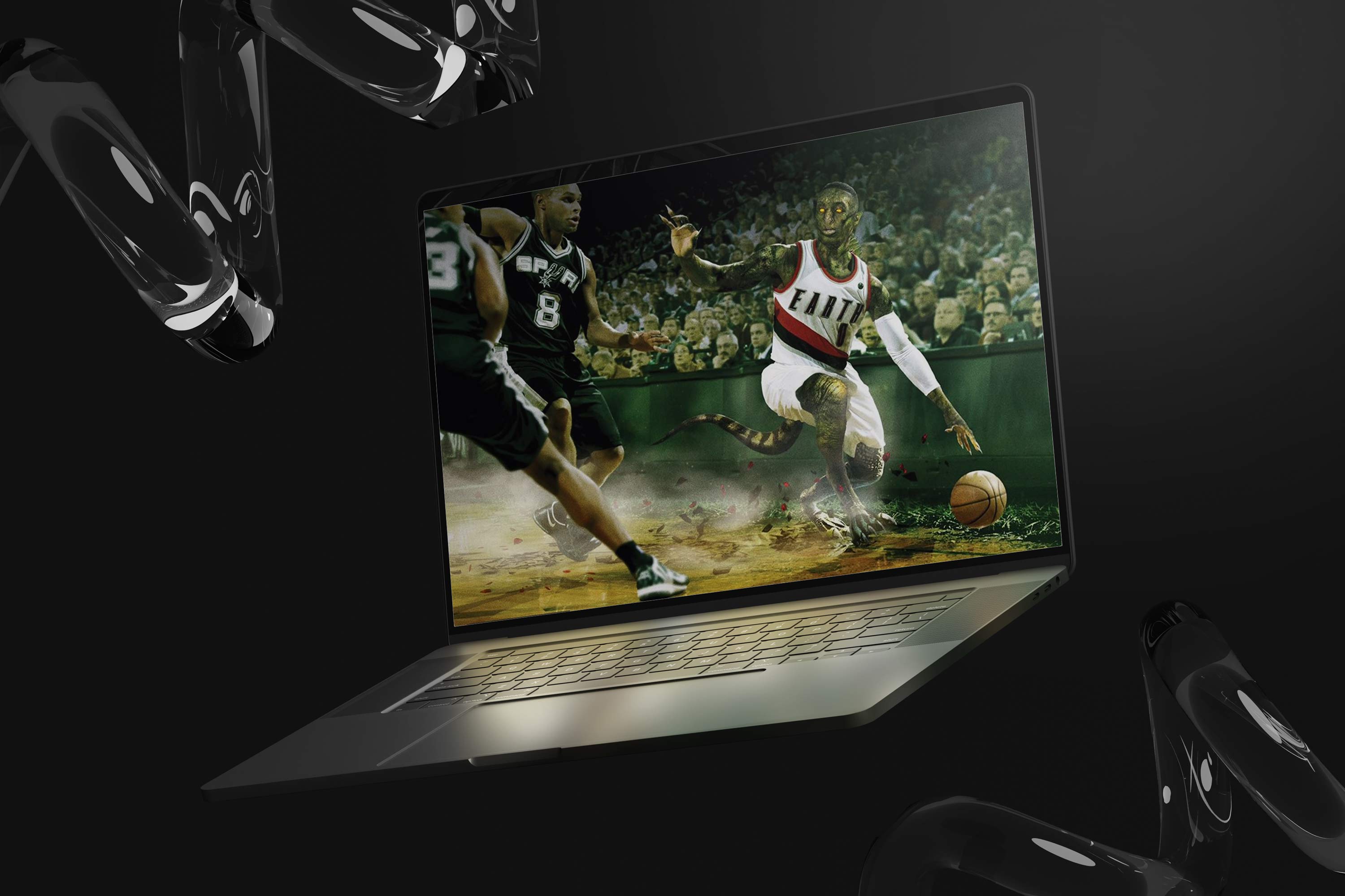
To make that repeatable, I curated an audience engagement system that paired real time cultural observation with a structured creative pipeline. I mapped the season’s emotional peaks against artist capacity, skill sets, and stylistic strengths, then shaped briefs and drop plans that could flex based on what the league delivered that night. Some pieces were prepped in advance around predictable narratives, while others were designed for rapid response, built to ship overnight without sacrificing taste or execution. I basically tried to look at upcoming storylines and games and seed the artists with images and photos of those teams and players and let them work their magic.
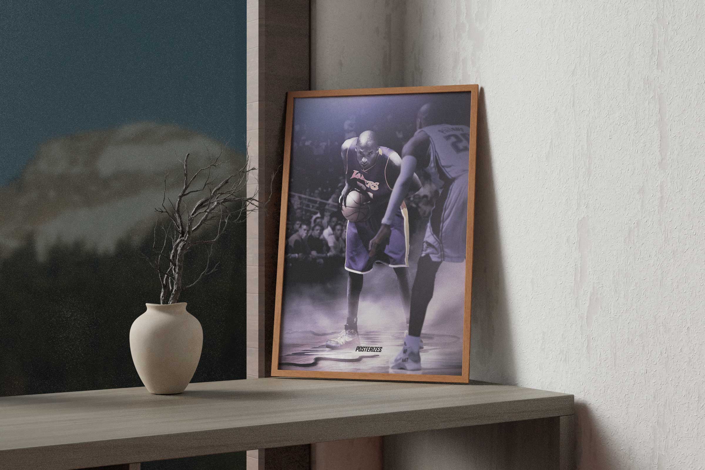
This created a reliable cadence that trained the audience to return, because they knew we would interpret the moment with speed and intention. Operationally, it also gave our artists clarity and purpose, turning scattered inspiration into coordinated releases that felt synchronized across time zones. The result was a system where community attention, creative production, and distribution mechanics reinforced each other, allowing Posterizes to stay culturally present throughout the season instead of only spiking around rare events. We proved niche communities can become global when the culture is authentic.
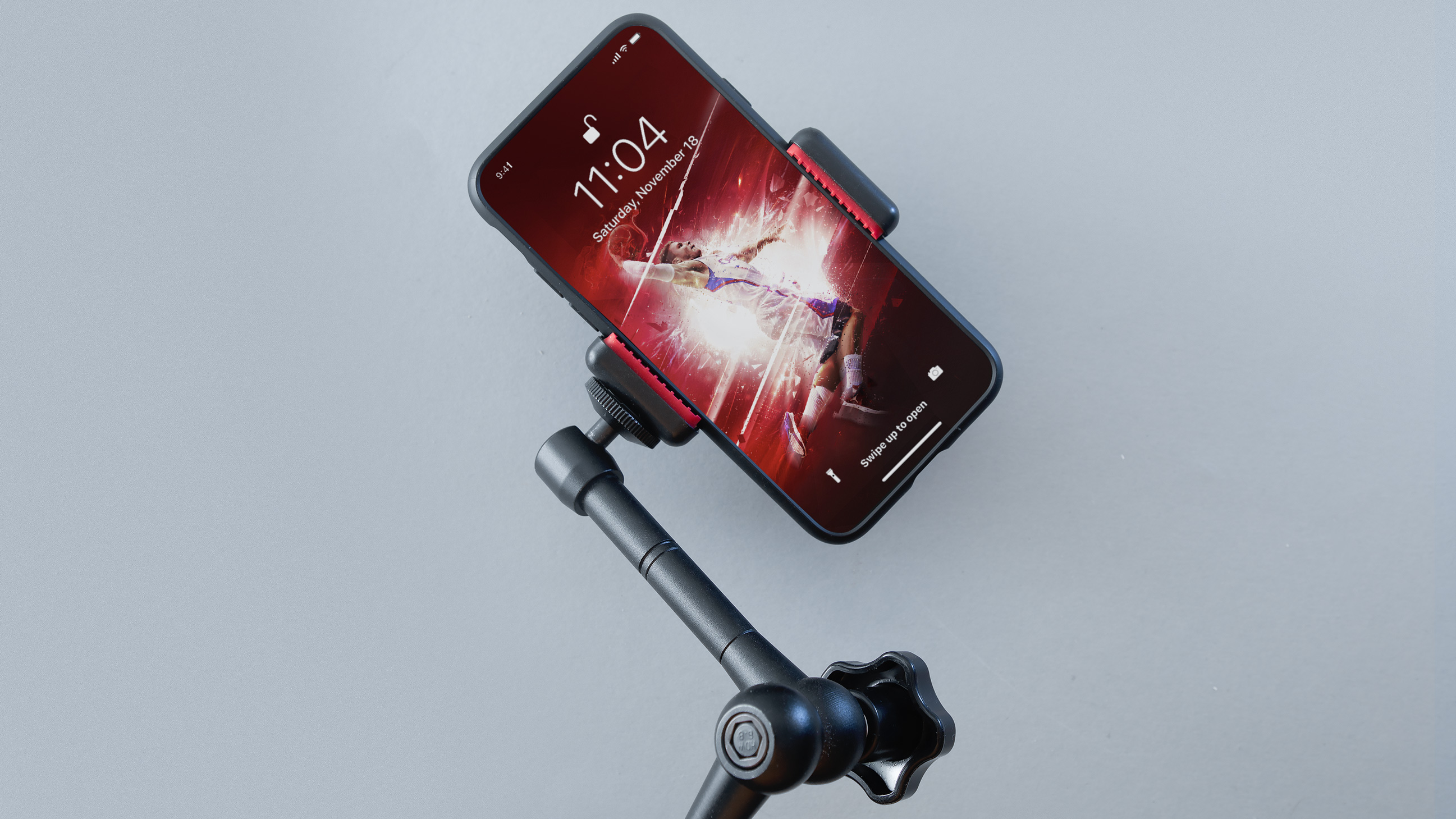
Knowing that certain big name players would have these moments meant the ammo would be loaded right at the moment we needed to fire off a new piece of content. Then pairing this with social momentum and getting the content on the same forums that inspired the creation of the site where fans would be discussing the recently finished game allowed for us to become an important part of the conversation. This would eventually also grow to include rapid response turnaround artwork around moments like Kobe dunking on CP3 where we were able to turn around content overnight to share with fans the next morning. This was further aided by the international aspect of the collective which allowed for us to have creators around at all different times of the day to be inspired by the game to create and share. The give and take of this dynamic between social media and our artists and the actual content distribution strategy allowed for a highly engaged community.
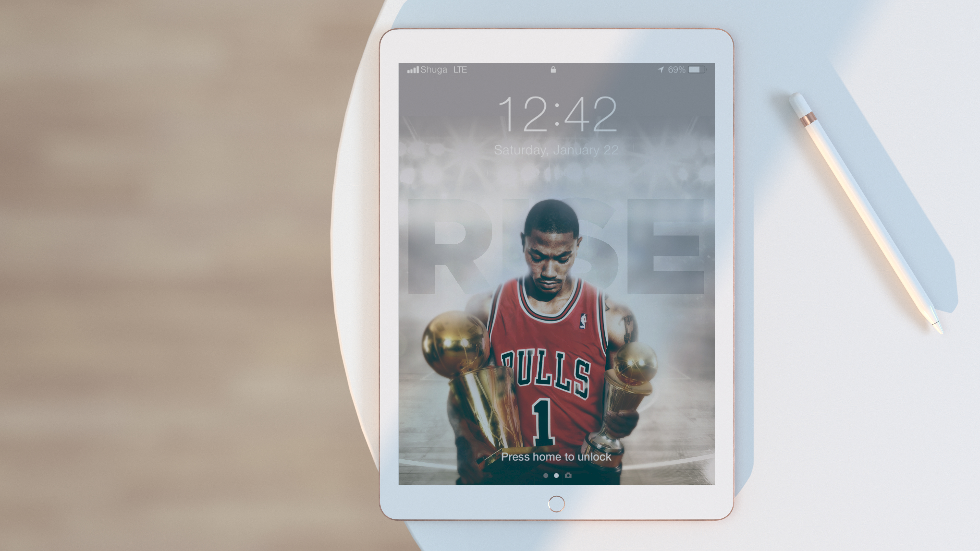
Beyond reacting to moments, we learned to design anticipation. By establishing a predictable cadence around key points in the NBA season, we trained audiences to expect interpretation as part of the spectacle. The wait between games, awards, and playoff rounds became fertile ground for speculation and creative projection. Fans began to imagine what a moment would look like through our lens before it even happened. This transformed Posterizes into a parallel narrative layer that lived alongside the sport itself. Anticipation, not novelty, became the engine of repeat engagement as our posts became more electric and reactive.
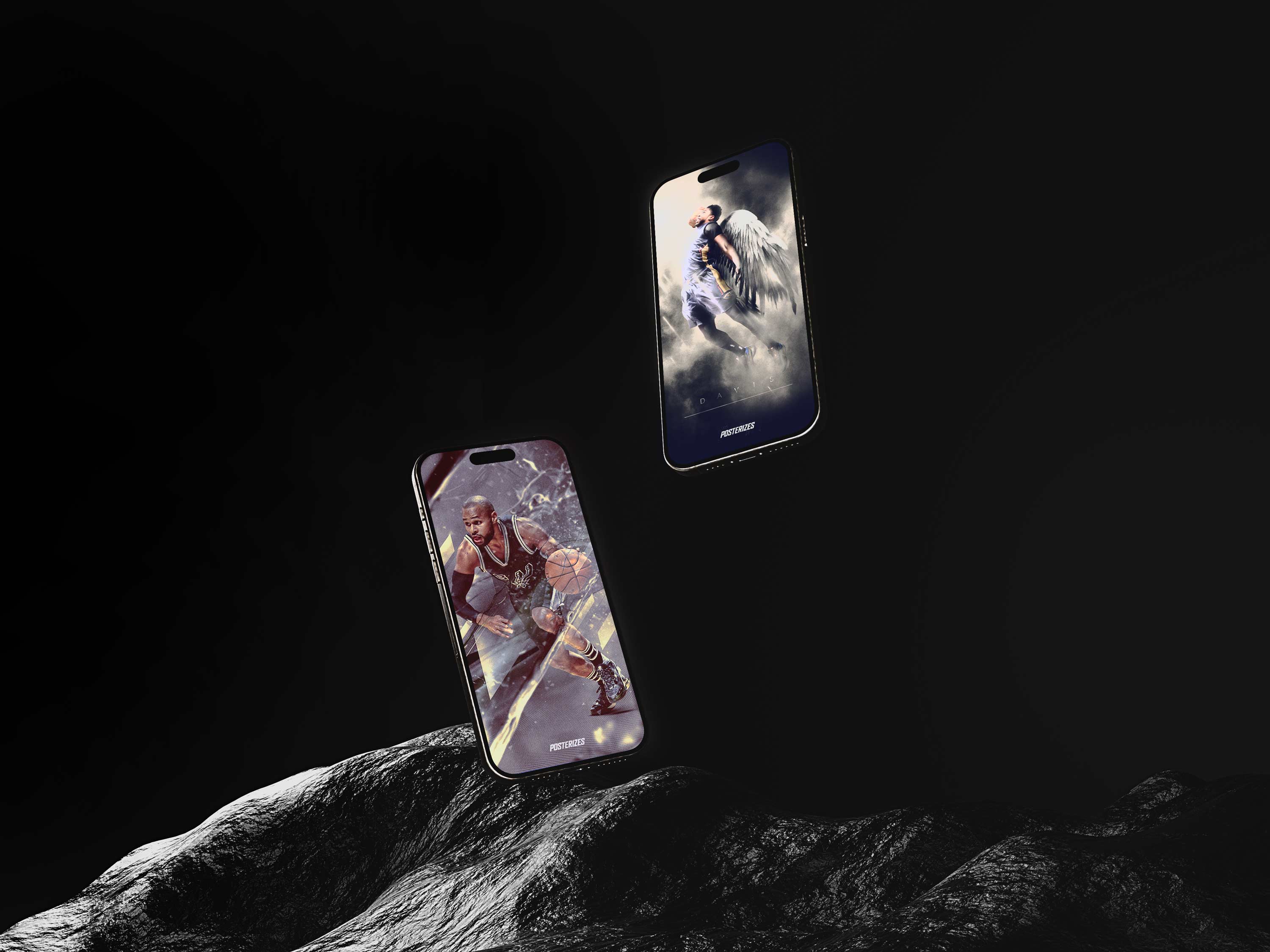
Writing the copy for Posterizes became its own form of craft, one that demanded the same sensitivity to timing, tone, and composition as the artwork itself. After speaking with artists about their intent, studying the news cycle, and mapping each drop to the broader programming calendar, I shaped descriptions that connected the visual to the moment that birthed it. The goal was never to simply caption an image but to frame it, giving fans a narrative entry point that deepened their emotional connection to the piece and to the game. Teammates often told me the writing read like poetry, not because it was ornamental, but because it distilled context, culture, and craft into a few deliberate lines. In stitching together artist perspective, league storylines, and fan sentiment, I helped ensure each release landed as a complete artifact rather than a standalone file, reinforcing that meaning travels farther when it is named with care. The archive stands as evidence of what intention can compound into and made me a better writer overall.

The ambition was to become a visual utility for fandom, a place where any fan could find a wallpaper that matched not only their team allegiance but their emotional state in a given moment. Some days called for triumph, others for grit, nostalgia, rivalry, or quiet loyalty during a rebuilding season. By building a catalog that spanned superstars, role players, iconic moments, and subtle narratives, we allowed fans to curate their devices the way they curate playlists, selecting visuals that reflected mood, identity, and context. This expanded the role of sports art from decoration to emotional interface, turning screens into spaces where personal feeling and collective memory could coexist.
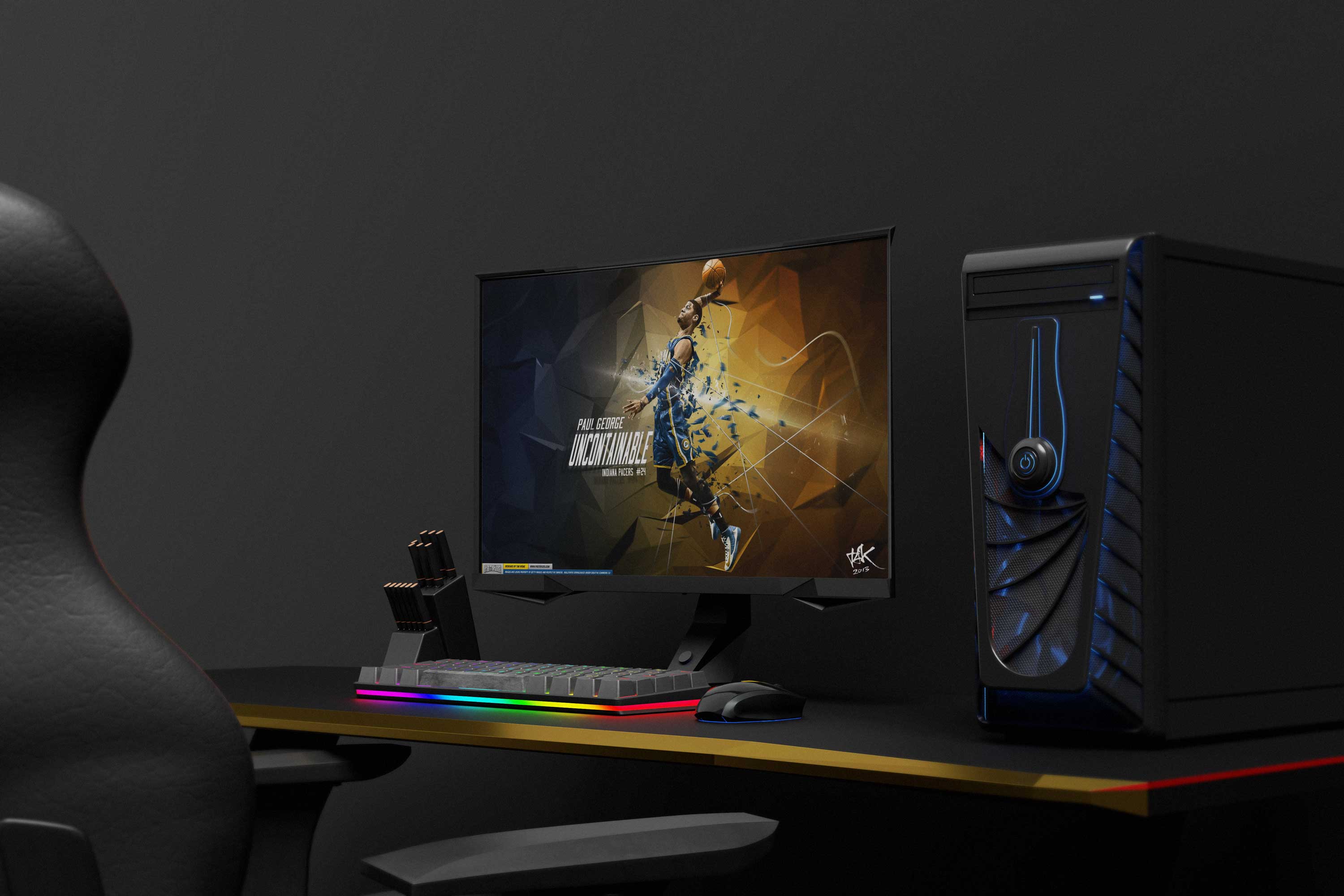
One of the strangest validations of Posterizes’ reach came in the form of imitation. At a certain point, our artwork started showing up everywhere we didn’t put it. Bootleg posters on eBay. Random Amazon listings. T-shirts and street signs being sold outside arenas before big games. You would walk through Times Square and spot a stylized Kobe, Jordan, LeBron, or Curry piece that looked suspiciously familiar, a composition, a color treatment, a typographic structure born inside our collective now reproduced on canvas, hoodies, or laminated prints. It was frustrating at times, sure, but it was also revealing. Nobody bootlegs what doesn’t move culture. The fact that vendors were monetizing versions of our visuals without credit meant the aesthetic had crossed into mainstream visual language. We had reached the point where the work no longer needed attribution to be recognizable, which is both the cost and the proof of influence.
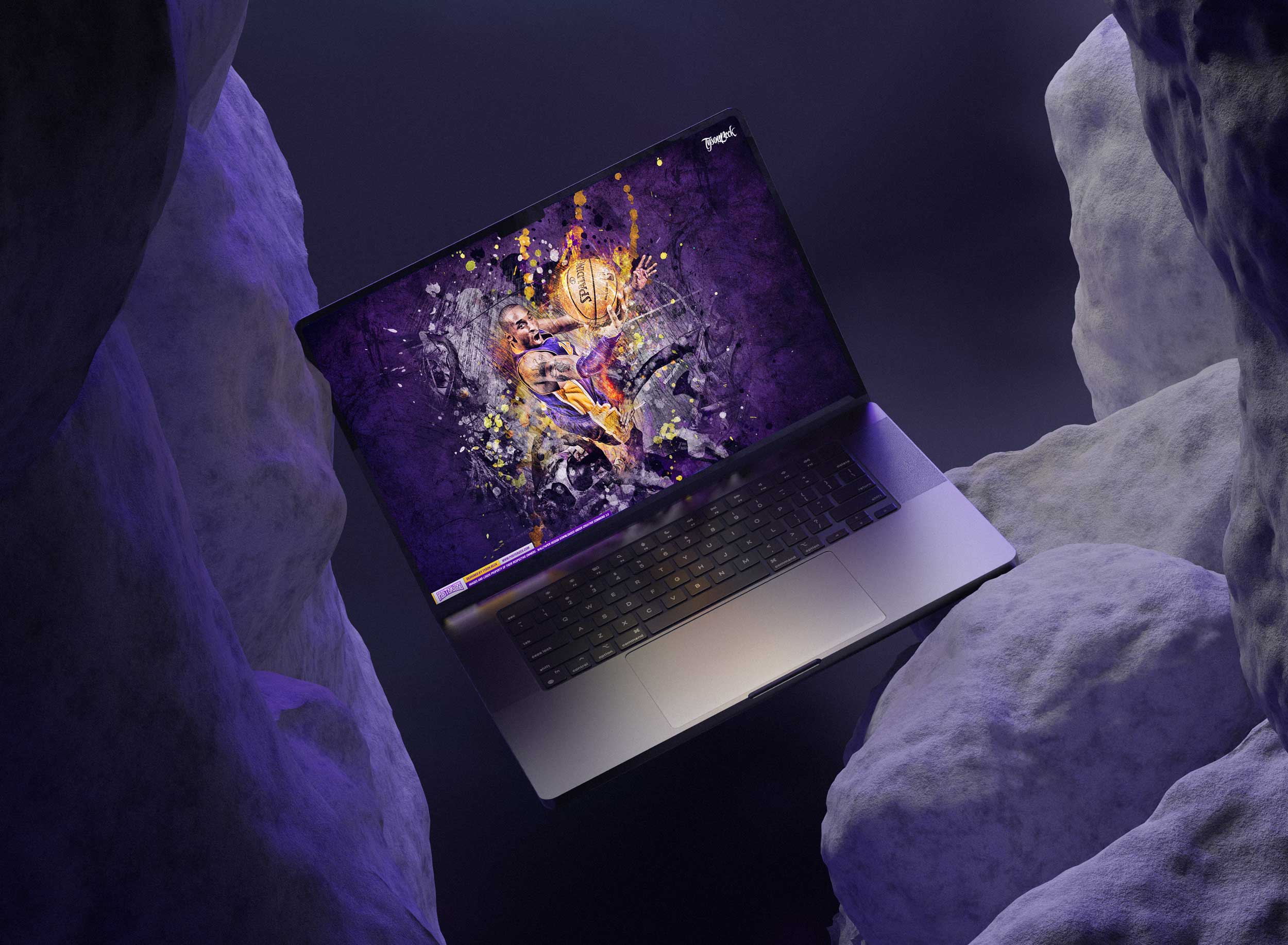
Expanding the purview of Posterizes to include commercial opportunities and an editorial point of view was a major point of growth as we developed a more curated roster of high end creators looking to collaborate on bigger and better opportunities. This was one of the major reasons we expanded the wallpapers to include a digital magazine extension which would allow for writers to pair editorial aspects of storytelling with our visuals. Contextualizing these pieces of art with writing gave users a deeper experience and also allowed for a more tangible asset that the artwork could serve as a touchpoint for. It reframed digital space as something worth curating, not cluttering.
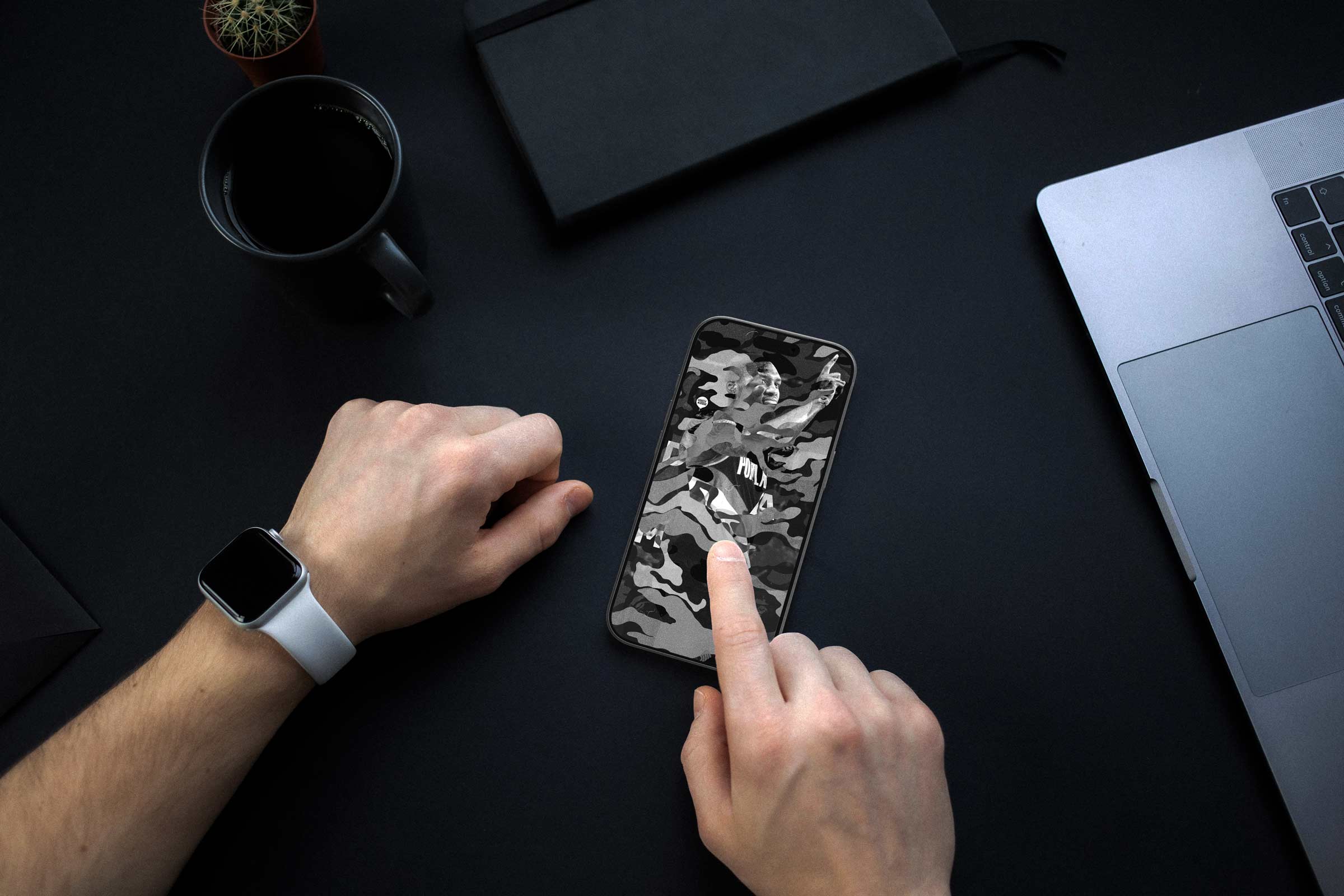
The platform’s influence is most visible in how expectations shifted among both fans and creators. Users began to assume that wallpapers should be device ready, credited, and culturally timely, standards that were far from universal at the time. Contributors internalized similar expectations, carrying those practices into professional contexts that extended far beyond the collective. In this way, Posterizes functioned less as a destination and more as a calibration point for quality. Its legacy lives in norms that now feel obvious but were once rare. The moment passes, but interpretation endures, it started with obsession and ended as infrastructure.
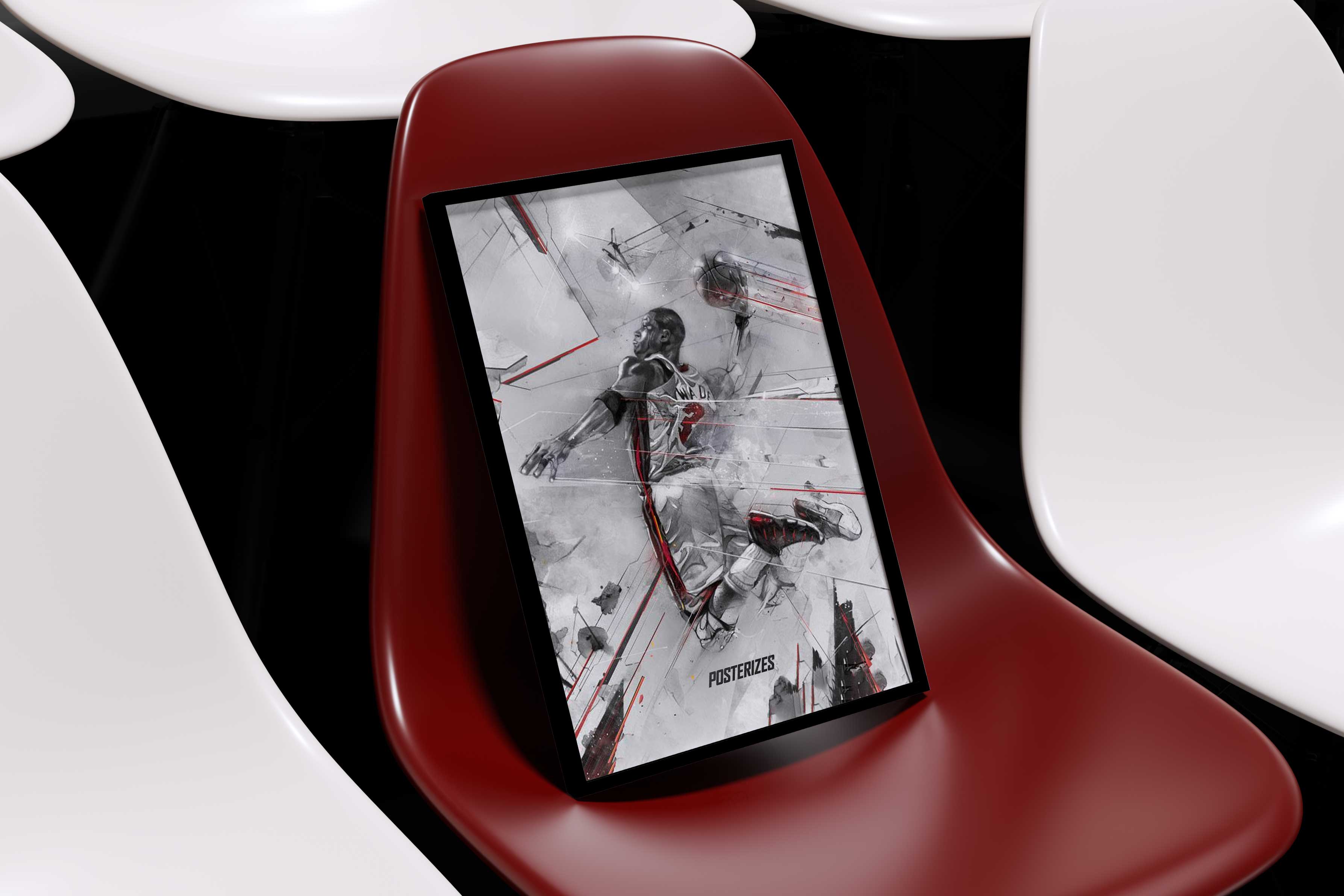
As Posterizes matured from scrappy collective to structured media property, the integration with Basketball Forever became a natural strategic extension rather than a transactional partnership. Because I was co founder of Basketball Forever, the alignment was not forced, it was organic and philosophically consistent. Basketball Forever already had a highly engaged global audience hungry for culturally rich basketball content, while Posterizes offered premium visual storytelling and a growing editorial voice. By integrating distribution, cross promotion, and monetization pathways, we were able to channel traffic, sponsorship conversations, and brand interest in a way that gave the magazine financial footing without compromising its creative integrity. Basketball Forever helped fund writers, contributors, and operational costs through website integrations and shared audience leverage, creating a feedback loop where content strengthened both ecosystems simultaneously. It was an early lesson in building vertically integrated media infrastructure, where community, distribution, commerce, and creativity lived under one strategic umbrella. Rather than competing for attention, the two platforms amplified each other, proving that when ownership, vision, and audience are aligned, synergy is not a buzzword but a structural advantage.
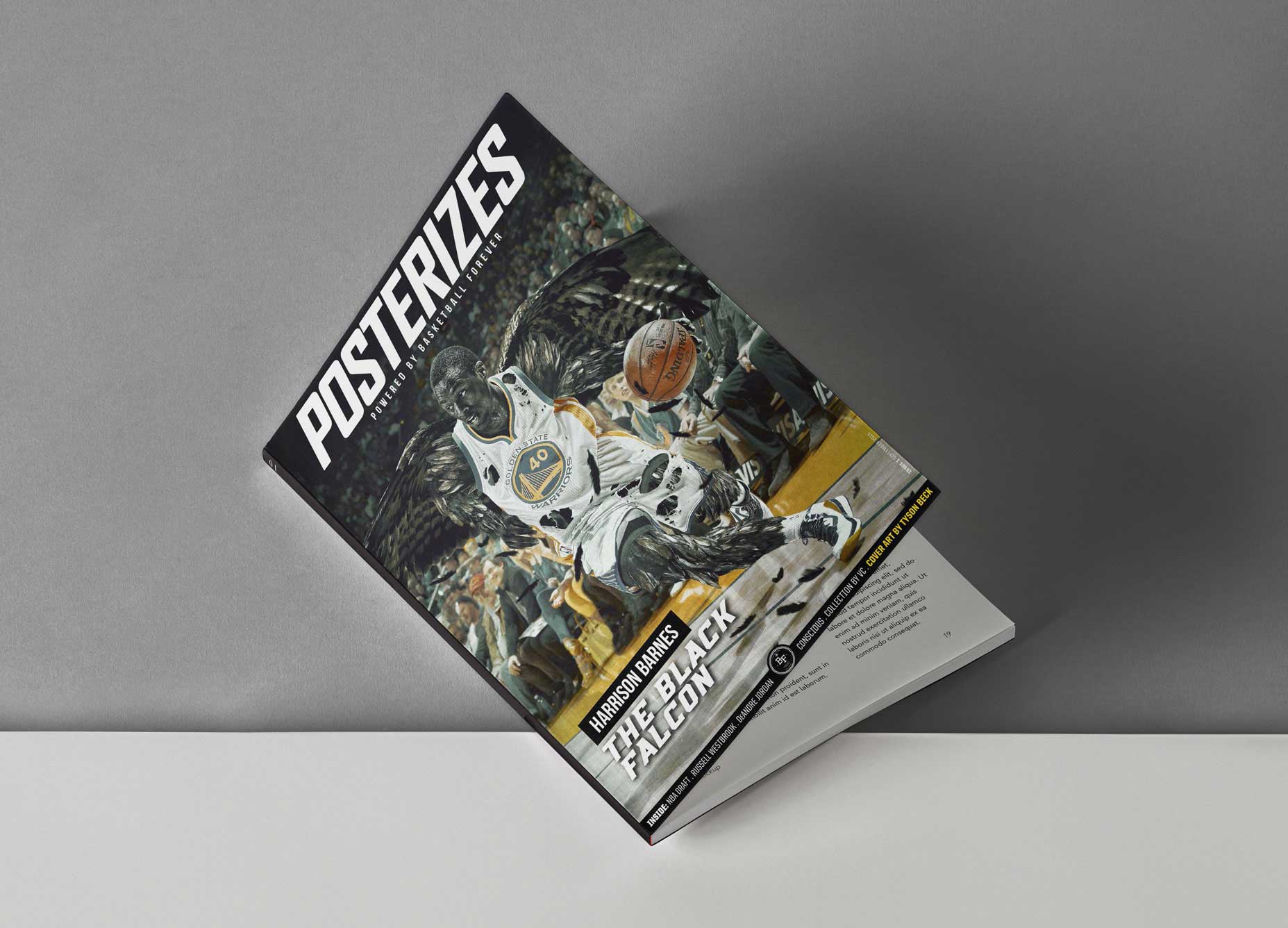
Long before the recent wave of boutique athlete publications and franchise-driven media platforms, the Posterizes magazine operated as an early proof of concept for what player-adjacent, design-led storytelling could look like. At a time when most coverage still flowed through traditional sports journalism pipelines, we created a publication that treated athletes as cultural protagonists rather than statistical subjects, pairing long-form interviews with experimental visuals that reflected the aesthetics of fandom as much as the realities of the league. This approach anticipated the direct-to-fan publishing models that teams, agencies, and players now use to control narrative, build personal brands, and activate global audiences without intermediary gatekeepers. By centering authorship, visual identity, and community participation, the magazine demonstrated that there was an appetite for media experiences that lived somewhere between art book, fan zine, and cultural journal. In hindsight, it functioned less as a side project and more as an early signal that the future of sports media would be vertically integrated, design conscious, and owned by the voices closest to the game.
The debut issue of the Posterizes digital magazine marked a turning point in how we framed sports design as both editorial and collectible culture. Featuring Harrison Barnes on the cover at a moment when his ascent symbolized the league’s next generation, the issue blended long-form storytelling with high-resolution artwork, artist process features, and cultural commentary that treated basketball as a design language rather than a highlight reel. We wanted readers not only to view the work but to live with it, to download, archive, and revisit the issue as a time capsule of where the game and its visual identity stood in that era. By pairing a rising NBA talent with a global roster of artists, the magazine signaled that Posterizes was not merely documenting fandom but actively shaping its aesthetic vocabulary. I’ve made the full issue available to read and download so audiences can experience firsthand how we approached permanence in a medium built for scroll velocity. Don’t miss the interview with my guy Vince Chang, whose perspective captures the soul of sports design he is a true OG of the game and a key member of our group as you will read later.

The magazine functioned as a flag in the sand, a temporal marker that anchored our creative output to a specific cultural moment while giving the work a sense of permanence that social feeds could not provide. In a landscape defined by scroll velocity and algorithmic amnesia, the act of publishing a cohesive issue signaled editorial intent and curatorial rigor, allowing us to frame our creations within a broader narrative about sport, design, and identity. Each issue became a snapshot of where the culture stood at that point in time, documenting aesthetic trends, athlete influence, and emerging voices in a format that could be referenced, archived, and built upon. This helped position Posterizes not merely as a content stream but as a publication with a point of view and a historical record.

The magazine also expanded our legitimacy by integrating a wider ecosystem of writers, critics, and contributors whose perspectives added depth and credibility to the platform. By pairing visual work with thoughtful editorial, we elevated the discourse around sports design and demonstrated to potential partners that we operated with the standards of a serious media property. This credibility was instrumental in opening doors to brand collaborations, as advertisers and sponsors could see a clear alignment between our audience and their target markets. The inclusion of advertisements was intentional and selective, designed to feel native to the creative community rather than disruptive to the reading experience. Partnerships with adjacent companies such as Sportsfonts allowed us to provide tangible value through coupon codes and resources, empowering creatives to access tools that could elevate their own work and eventually contribute back to the platform.
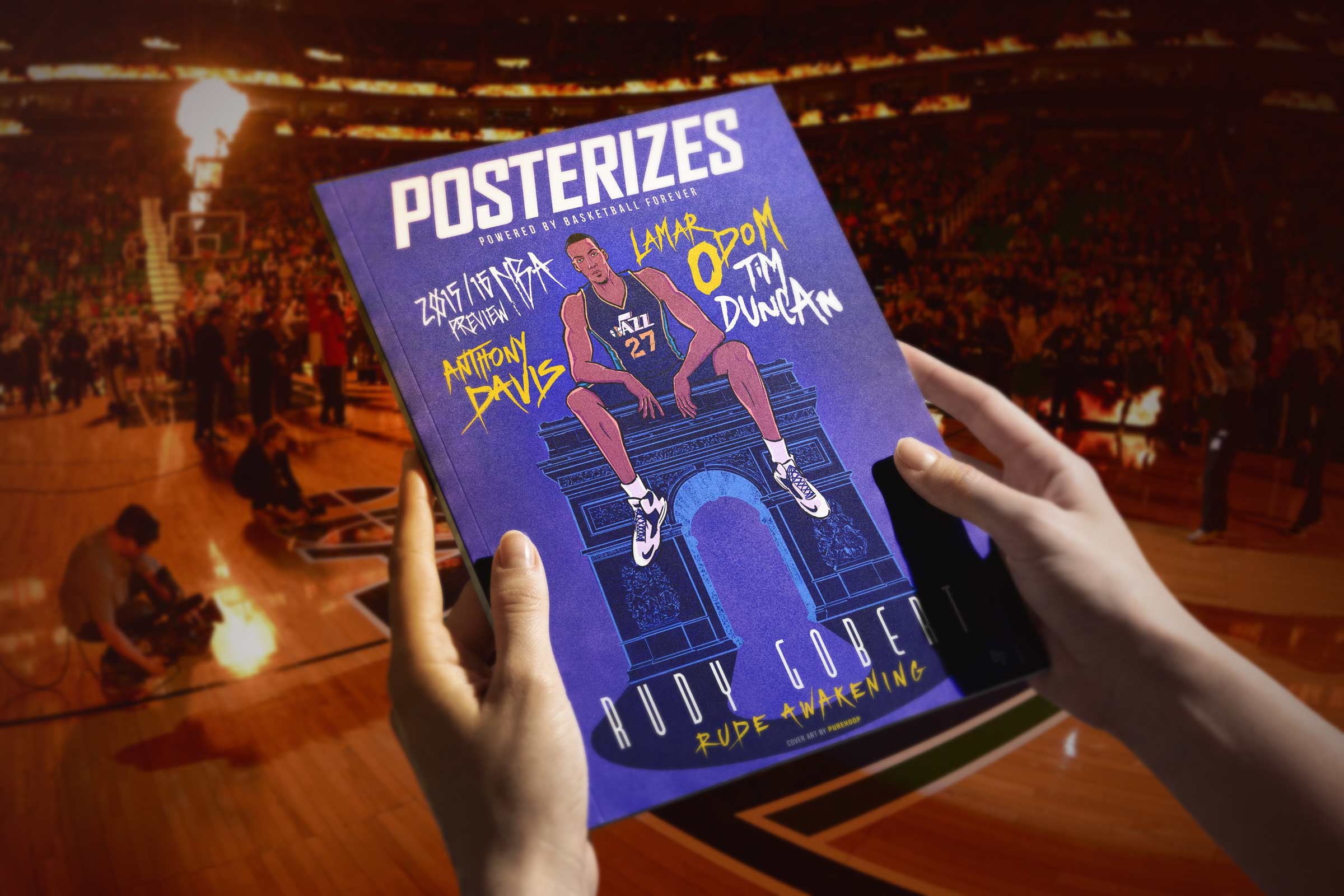
At its core, the magazine was a community building instrument. It created a feedback loop where inspiration led to creation, creation led to contribution, and contribution strengthened the collective identity of the sports design sphere. By spotlighting emerging artists alongside established voices and providing pathways for skill development, we cultivated an environment where participation felt attainable rather than gatekept. The long term vision was not simply to publish content but to nurture an interconnected network of creatives who saw Posterizes as both a stage and a support system. In doing so, the magazine helped transform a loose collection of designers and fans into a recognizable community with shared references, resources, and ambitions. We shipped culture fast, but we kept our standards slow and deliberate.
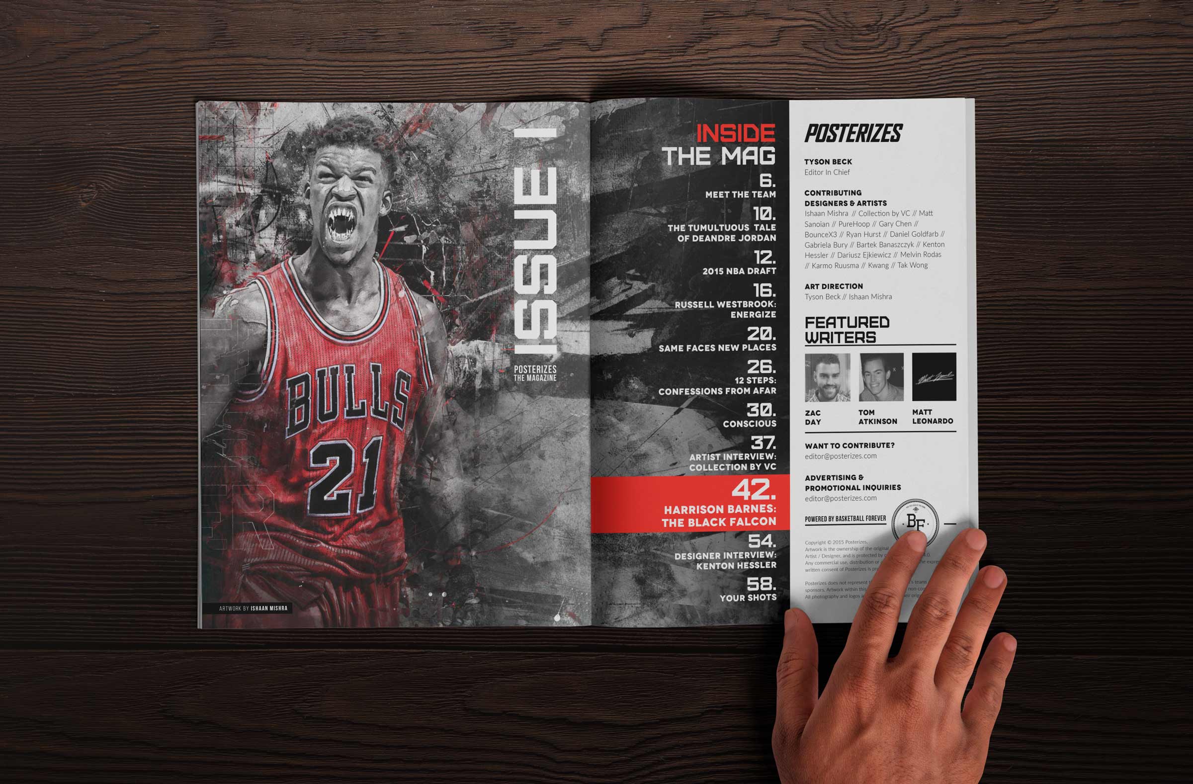
The Posterizes Kickstarter where we raised a just a little over $3K for hosting cost fundraising campaign marked a pivotal moment in the evolution of a community driven design movement that had already proven its cultural value but lacked a sustainable economic model. For years, the Posterizes collective had produced hundreds of high quality NBA inspired artworks and wallpapers, distributing them for free and amassing more than ten million downloads worldwide. The campaign was not framed as a cash grab but as a bridge to the next phase: a replatformed website, a free bi monthly digital magazine, and a premium education layer designed to support the very designers the platform had inspired. By setting a modest funding goal and surpassing it, the campaign validated that the community was willing to invest in the ecosystem that had given them so much creative fuel. It also demonstrated that niche sports design culture had matured into a global network of fans and practitioners hungry for deeper engagement.

What made the initiative especially compelling was its hybrid model, balancing free access with optional premium tiers that offered tutorials, assets, and industry insights for aspiring designers. This structure acknowledged a core tension in creative communities: the desire to keep culture open while still compensating contributors and sustaining infrastructure. The introduction of a digital magazine featuring player interviews, artist spotlights, and process breakdowns positioned Posterizes as both a fan destination and an educational resource. Securing Harrison Barnes as the inaugural cover athlete signaled legitimacy and hinted at future access to NBA talent, further elevating the platform’s credibility. In many ways, the campaign foreshadowed today’s creator economy playbooks, where community, content, and education intersect to form durable value loops.
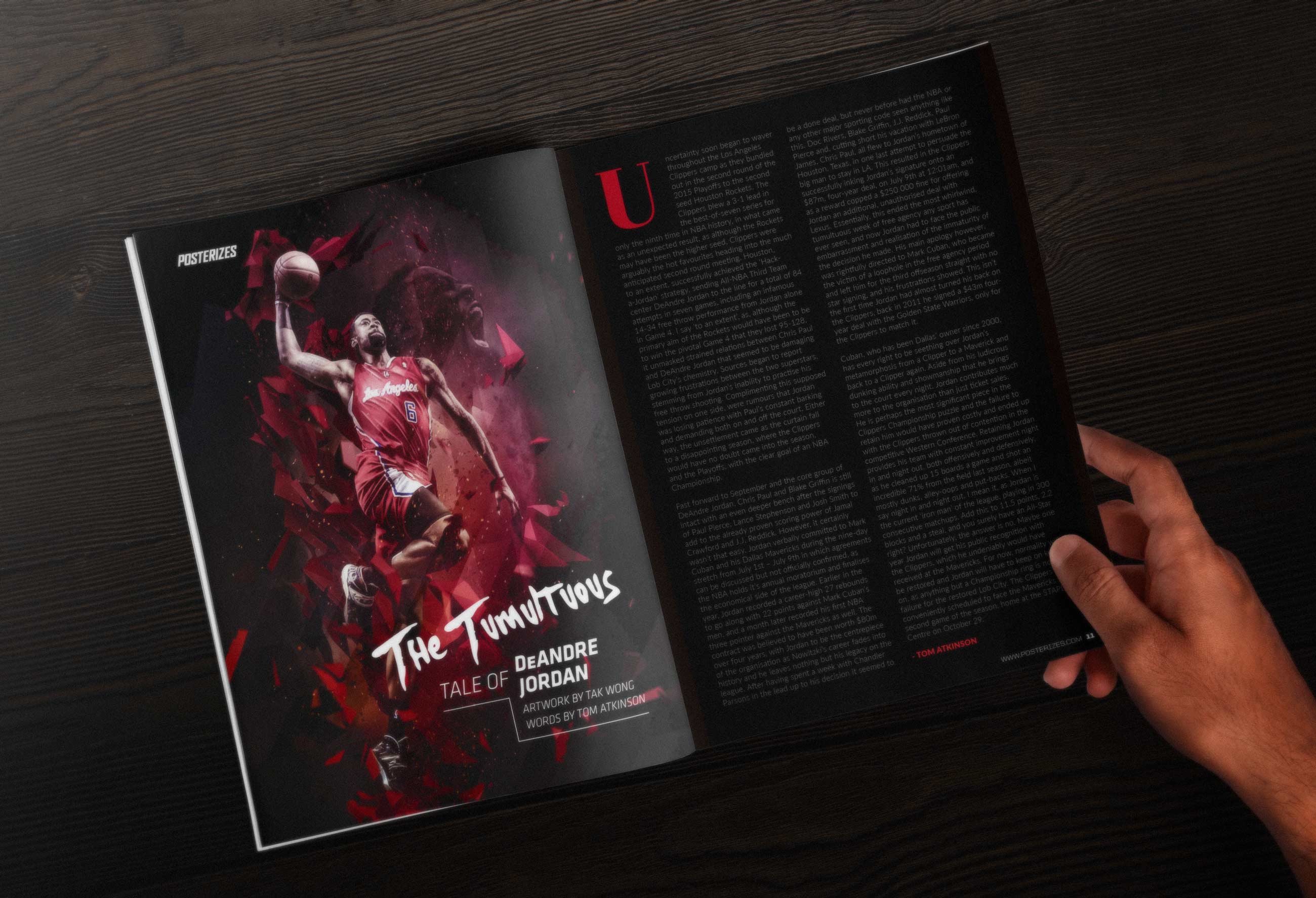
From a strategic standpoint, the campaign illustrated how design led communities can translate cultural capital into financial support without eroding trust. The funds were earmarked not for profit extraction but for operational costs, contributor support, exclusive interviews, and the development of premium learning resources. This transparency reinforced the collective ethos and strengthened the bond between creators and fans. The tiered rewards, ranging from premium access to custom artwork and advertising placements, created multiple entry points for participation, allowing supporters to engage at levels aligned with their interests and means. It was an early proof point that sports design could function as a self sustaining micro economy rather than a passion project subsidized by unpaid labor. And since I like ya, heres issue two and three.
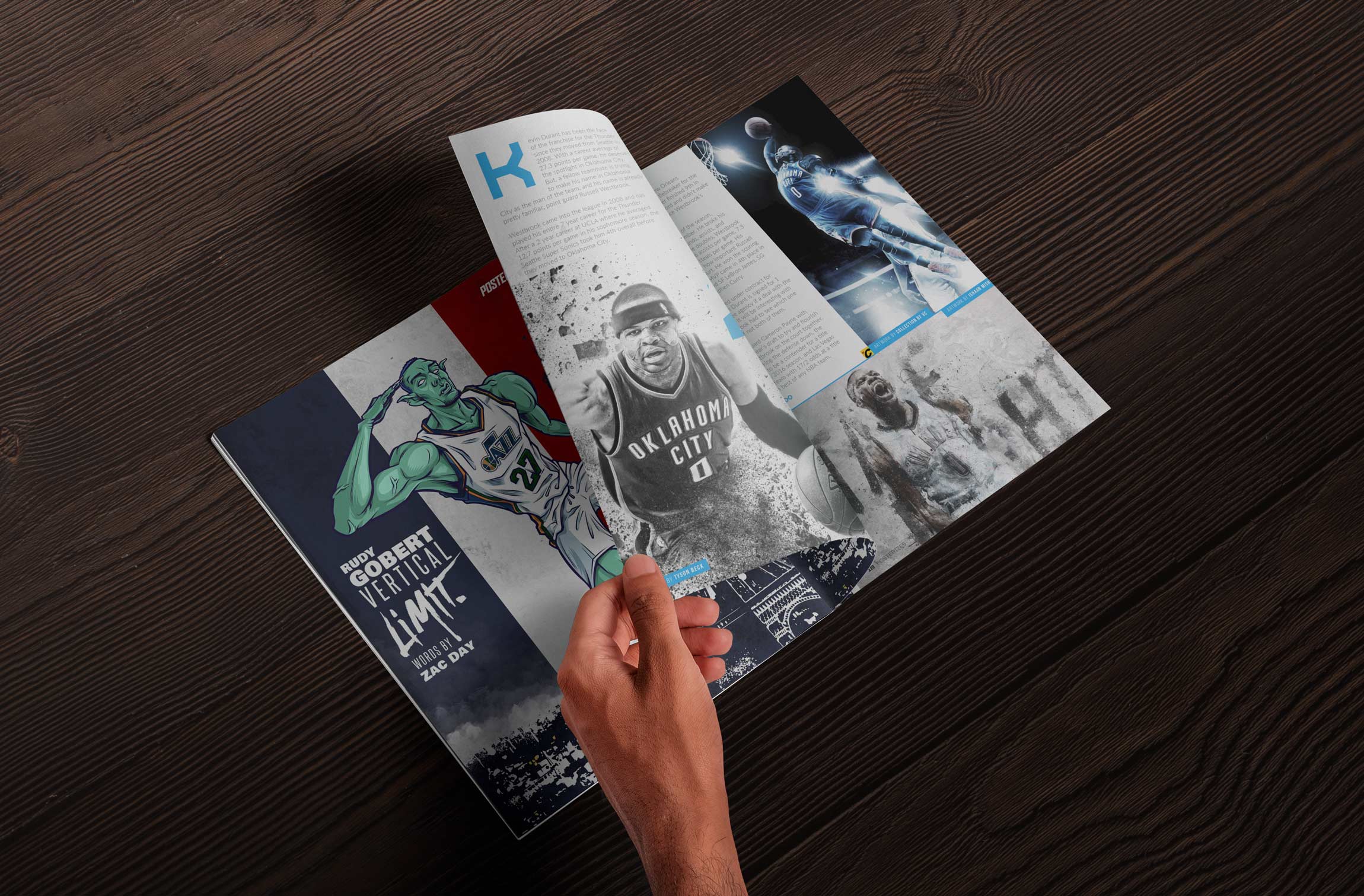
The magazine was where everything we had been building quietly crystallized into something more intentional and archival. Online, the work moved at the speed of the season, reactive, electric, immediate. The magazine slowed that energy down just enough to frame it. It allowed us to sequence artwork with long form interviews, artist spotlights, and reflective essays that gave the visuals context and permanence. Instead of a single drop competing in a feed, pieces lived inside a curated narrative arc, surrounded by commentary that elevated both the craft and the culture. It signaled to contributors and readers alike that sports design deserved editorial gravity, not just engagement metrics. In many ways, the magazine formalized Posterizes from a high velocity digital platform into a documented creative movement with its own canon.
Through Basketball Forever we secured an official media credential for NBA All-Star Game, which still feels insane considering the entire journey started with us turning players into stylized wallpapers on the internet. That pass put us face to face with Paul George, DeMar DeRozan, Klay Thompson, Steph Curry, LeBron James, Andre Drummond, DeMarcus Cousins, Russell Westbrook, Chauncey Billups, Kobe Bryant, Jimmy Butler, and Anthony Davis during media sessions and All-Star activations across the weekend. Standing there with a credential around my neck, interviewing the same athletes we had once obsessively illustrated and designed around, felt like a glitch in the matrix. A few years earlier we were scouring Getty previews and box scores to create art inspired by their moments, and now we were asking them questions face to face. The full-circle nature of it hit hard, especially talking to Kobe at his final All-Star appearance. It was proof that passion executed with consistency can compound into access you never imagined when you were just a fan behind a screen a mere few years ago dreaming of moments like these and now you had your heroes right in front of your eyes.

One of the most fun moments from that All-Star weekend was pulling up on guys like Carmelo Anthony and Paul George with a completely different kind of question. Instead of the usual media prompts, we asked them if they’d want to be in Space Jam 2 and then showed them custom artwork our guy Julian, known on Instagram as Bam.Bam.Bam.99, had created imagining them in that universe. The reactions were priceless. You could see the shift instantly, from standard press mode to genuine curiosity and amusement as they looked at stylized versions of themselves rendered like animated stars. Both of them cracked smiles, leaned in, and engaged with the piece in a way that felt authentic rather than rehearsed. It was a reminder that when you approach athletes through creativity instead of cliché, you unlock a different kind of interaction. In that moment, art wasn’t just content, it was a bridge to connect with these larger than life players.
What hit me walking out of those interviews wasn’t just that the players smiled at seeing themselves through our lens, it was the realization that we were no longer outsiders interpreting the NBA from a distance. Standing there in Toronto during All-Star Weekend, credentialed, respected, and engaging stars with artwork we had created, it became clear that we had quietly become part of the ecosystem itself. The same league we once obsessively watched, designed around, and reverse-engineered through pixels was now inviting us into its biggest cultural moment of the year. Players recognized the visuals. They engaged with the concepts. They understood the references. That shift, from fan-made reinterpretation to acknowledged creative voice within the league’s orbit, was profound. It marked the moment when Posterizes and Basketball Forever stopped feeling like scrappy internet projects and started feeling like cultural contributors operating inside the very world that inspired us.

That moment in Toronto clarified something bigger than access or validation. If players were reacting to artwork we created, if fans were carrying our visuals into arenas and tagging us in their stories, then the surface area of our impact was no longer confined to a website. It lived on phones, in locker rooms, on timelines, and inside the rituals of everyday fandom. The NBA ecosystem is not only arenas and broadcasts, it is the thousands of micro touchpoints where identity gets expressed and refreshed daily. We were operating in one of the most intimate of those spaces without fully naming it yet. The real arena was the lock screen. And once you understand that, the design stakes change completely. From timelines to lock screens to arenas, our work quietly traveled everywhere the game did.
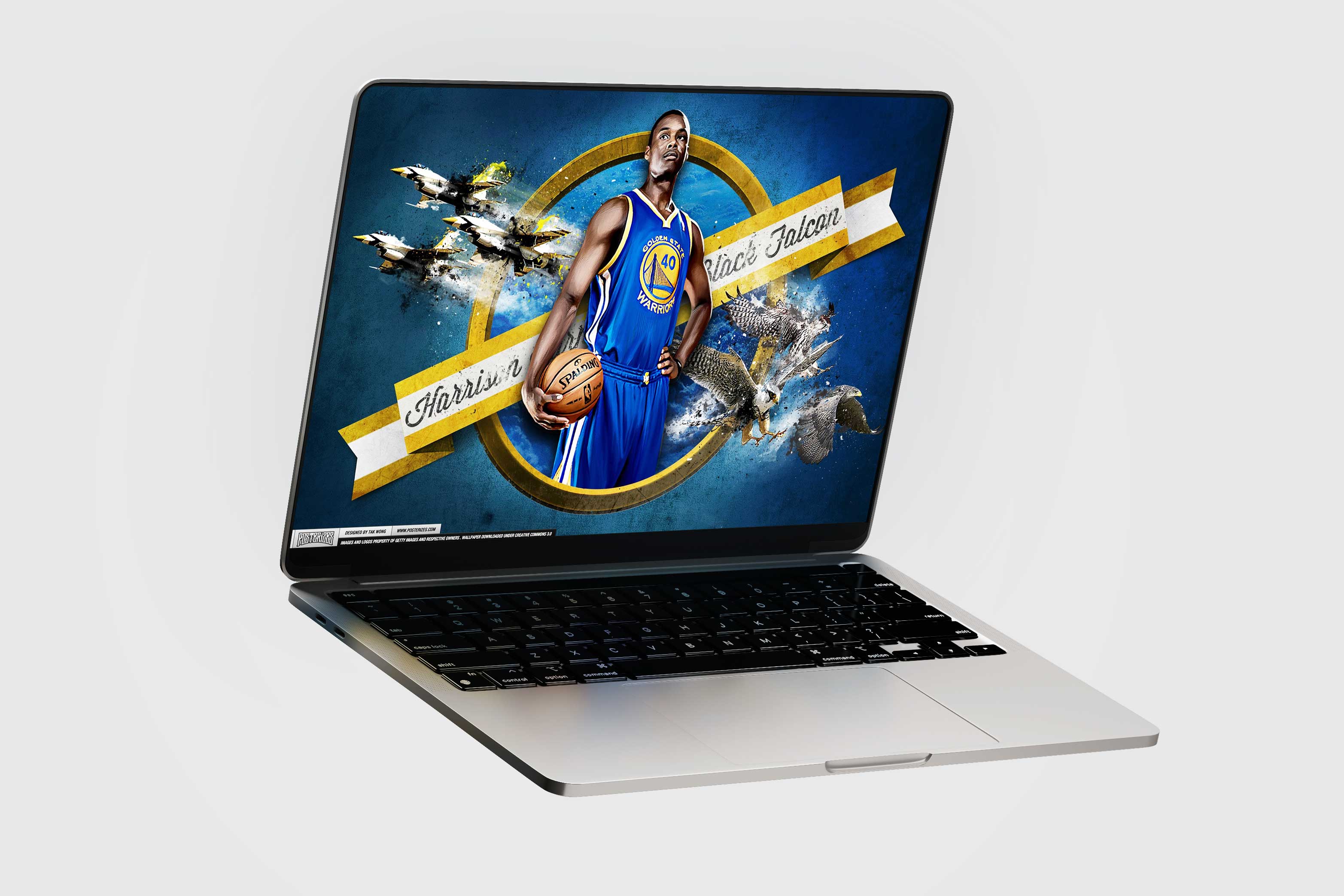
Even Apple has long understood the cultural and emotional weight of wallpapers, treating them as a centerpiece of every major iOS release rather than an afterthought. Each new operating system arrives with meticulously art-directed backgrounds designed to showcase display technology, signal aesthetic direction, and give users an immediate sense of renewal the moment they unlock their device. That level of care reinforces the idea that the lock screen is not merely functional space but a canvas for identity and mood. We operated from the same premise, recognizing that if one of the most design-driven companies in the world invests heavily in wallpapers, it is because they shape daily experience in subtle but powerful ways. By delivering high-craft sports visuals for that same surface, we positioned Posterizes within a lineage of design thinking that treats personal screens as intimate galleries rather than disposable real estate.
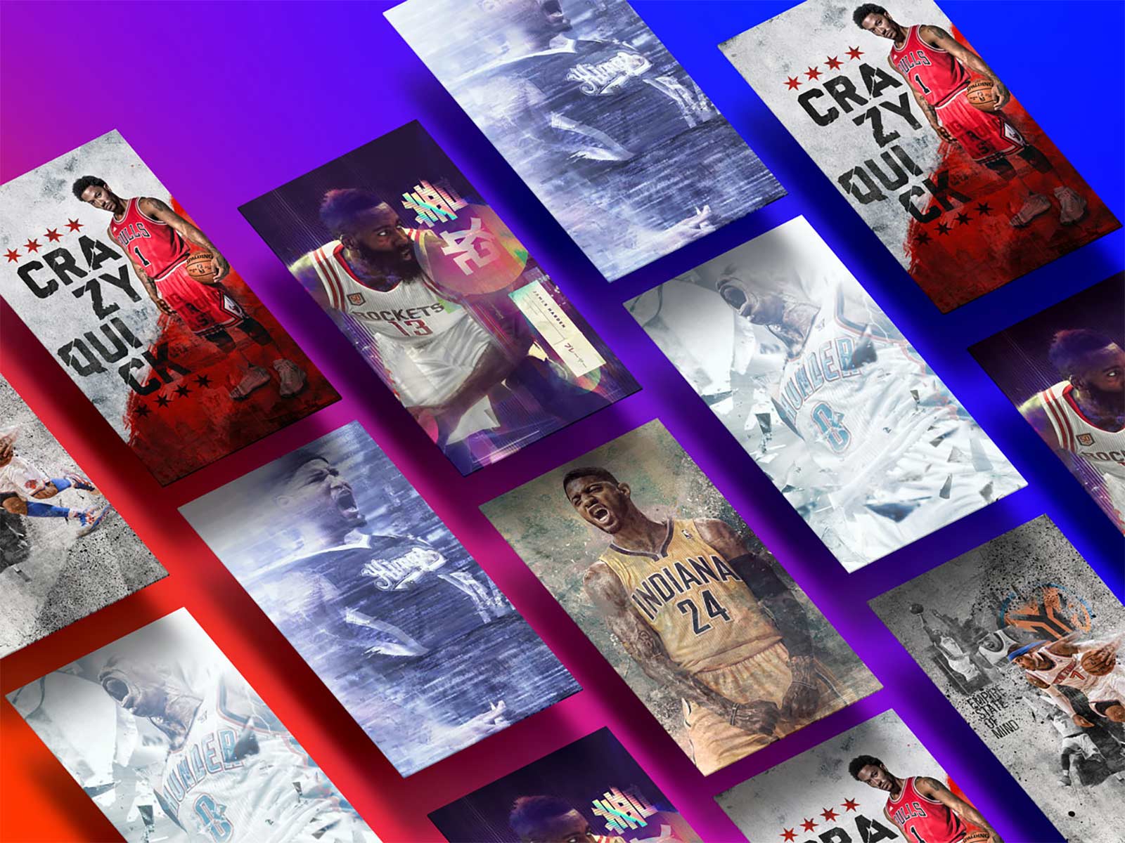
The broader significance of the Posterizes campaign lies in how it reframed fandom as participation. By inviting supporters to fund infrastructure, contribute content, and access professional development resources, the platform blurred the line between audience and creator. This participatory model influenced later sports media initiatives, including community driven content strategies and creator networks that prioritize co authorship over top down publishing. In retrospect, the campaign was less about raising a few thousand dollars and more about formalizing a philosophy: that the future of sports culture media belongs to ecosystems where fans, artists, and athletes collaboratively shape the narrative. We treated distribution like a design system with inputs, outputs, and feedback, it is the relationship between the artist and their fans.

What began as a small, tightly knit circle of designers sharing work across forums quietly became the seed of a much larger editing movement that would later flourish on Instagram and other visual platforms. The workflows, stylistic conventions, and quality thresholds we established through Posterizes set an early benchmark for what polished, culturally fluent sports edits could look like in a digital feed. As social platforms matured and new creators entered the space, many adopted the compositional techniques, typography treatments, and moment-driven storytelling we had been refining in real time. The result was an ecosystem where the language of sports editing felt increasingly cohesive, not because it was dictated, but because a shared standard had emerged from the culture itself. In that sense, we were not only publishing artwork, we were helping define the grammar of a global visual community that continues to evolve today. The value was never in the volume, it was in the velocity of meaning.

Getting the artwork out there also allowed us to amplify the legitimacy of the brand and over time led to more and more industry insiders noticing the work that many within our art collective were doing. The ultimate goal of the collective was to act as a springboard for the creators within our ranks to get more opportunities to collaborate with brands and companies in the space. Using Posterizes as a spotlight to feature some of the most talented artists in the space we were able to leverage our audience to garner more of these opportunities both as a collective and also on an individual basis. The community did the marketing because the work earned organic advocacy.

One of the most surreal moments of the entire journey happened the night Kobe made his final visit to Madison Square Garden. I had tweeted that I was heading to the game, not thinking much of it, and sometime around halftime a young artist who followed Posterizes managed to track me down in the press box area. He was wearing a Melo Knicks jersey, eyes wide, slightly nervous but determined, and introduced himself as a designer who had been inspired by the work we were publishing. He asked for my autograph, which genuinely caught me off guard because I had never once imagined that creating sports artwork on the internet would lead to someone seeking me out like that. He fired off questions about typography, composition, process, how to get better, how to break in, how to build a following, and I remember feeling this strange mix of pride and disbelief. I felt old in that moment, like an unc getting tapped on the shoulder by the next generation, but it was also one of the coolest validations I have ever experienced. We stayed in touch, and to this day I still mentor him, which is a reminder that Posterizes was never just about downloads or traffic but about sparking real creative ambition in real people. That night at the Garden made it clear that what we built carried weight beyond the screen, and that kind of impact is the real legacy.
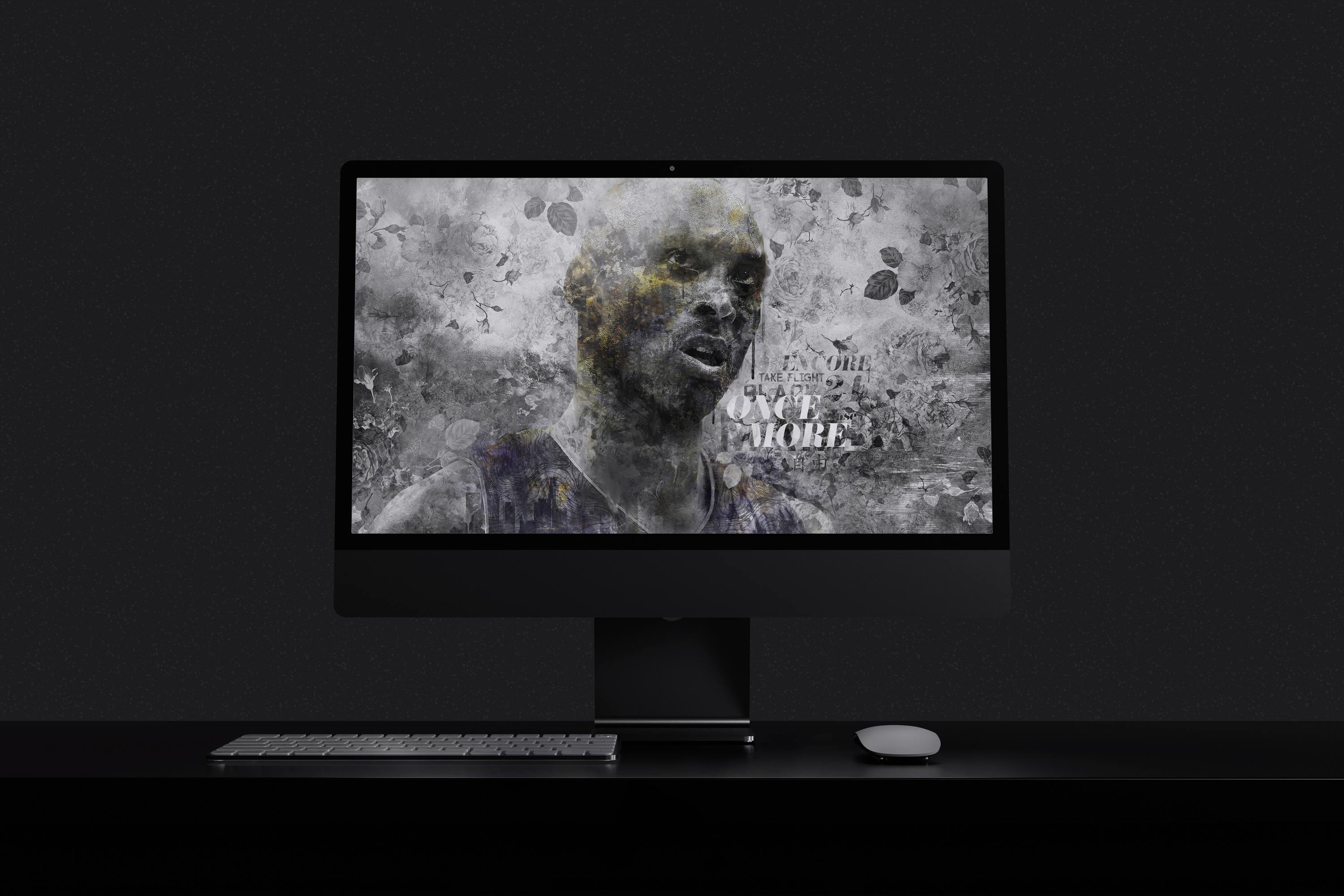
The artists in our collective would go on to work with some of the biggest names in the industry, and building a platform that connected these creatives to an audience far beyond their immediate circles became one of the most fulfilling aspects of founding Posterizes. Many of them had the talent and vision but lacked distribution, visibility, or a credible stage on which to showcase their work. By curating and publishing their pieces alongside pivotal NBA moments, we gave their voices cultural context and immediate relevance. The platform functioned as both a gallery and a launchpad, allowing emerging designers to build portfolios that spoke directly to brands, agencies, and teams. Watching contributors secure freelance contracts, full-time roles, and collaborations with major sports properties validated the belief that access can be as transformative as skill. We were not merely aggregating artwork but cultivating a network where creative momentum could compound through shared visibility and mutual support. That sense of collective ascent became one of the most meaningful legacies of the project. The global roster made the platform feel bigger than any single scene.

As opportunities for our contributors multiplied, the ecosystem we helped spark began to outgrow the need for a centralized hub. Artists who first gained traction through Posterizes were now fielding direct commissions, building independent followings, and shaping visual culture across sports media and apparel. Rather than diluting the brand by scaling indiscriminately, we made the deliberate decision to sunset its broader operations while honoring the community it had galvanized. The closure was less an ending than a graduation, a recognition that the mission of exposure and connection had succeeded beyond our initial expectations. We remained deeply appreciative of the industry impact, from influencing how sports moments are visualized to proving that fan-driven design could hold commercial and cultural value. The relationships formed through the platform continued to endure, evolving into collaborations, friendships, and creative alliances that outlived the site itself. In stepping back, we allowed the movement to live on through the people it empowered, which ultimately felt like the most authentic measure of success.
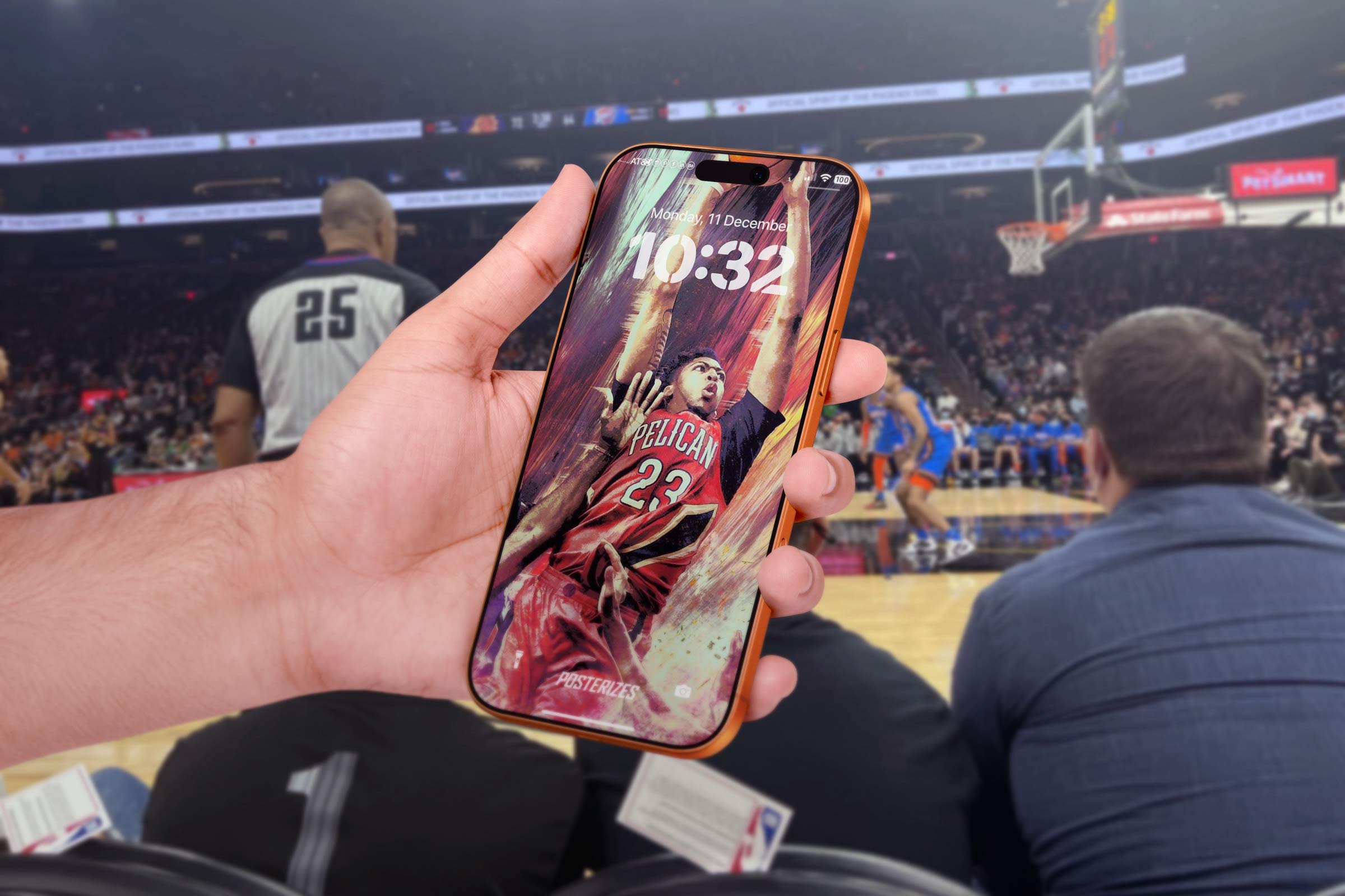
Looking back now, Posterizes feels inseparable from a particular golden era of the internet, a moment when small, obsessive teams could outmaneuver institutions through taste, speed, and proximity to culture. Much like the early Silicon Valley builders chronicled in Fire in the Valley, we were less concerned with permission and more focused on possibility, hacking together a platform that treated fandom as a creative act rather than a spectator sport. We operated with a pirate ethos, not in defiance for its own sake, but in pursuit of a more honest expression of basketball’s visual mythology. The tools were scrappy, the infrastructure improvised, yet the ambition was unmistakably global. In an environment where official league visuals felt polished but distant, Posterizes offered something closer to the pulse, work made by people who stayed up for West Coast tip-offs and argued in forums at 3 a.m. That intimacy translated into credibility, and credibility translated into adoption across continents. What we built did not feel like a startup chasing a market, it felt like a movement documenting its own existence in real time.
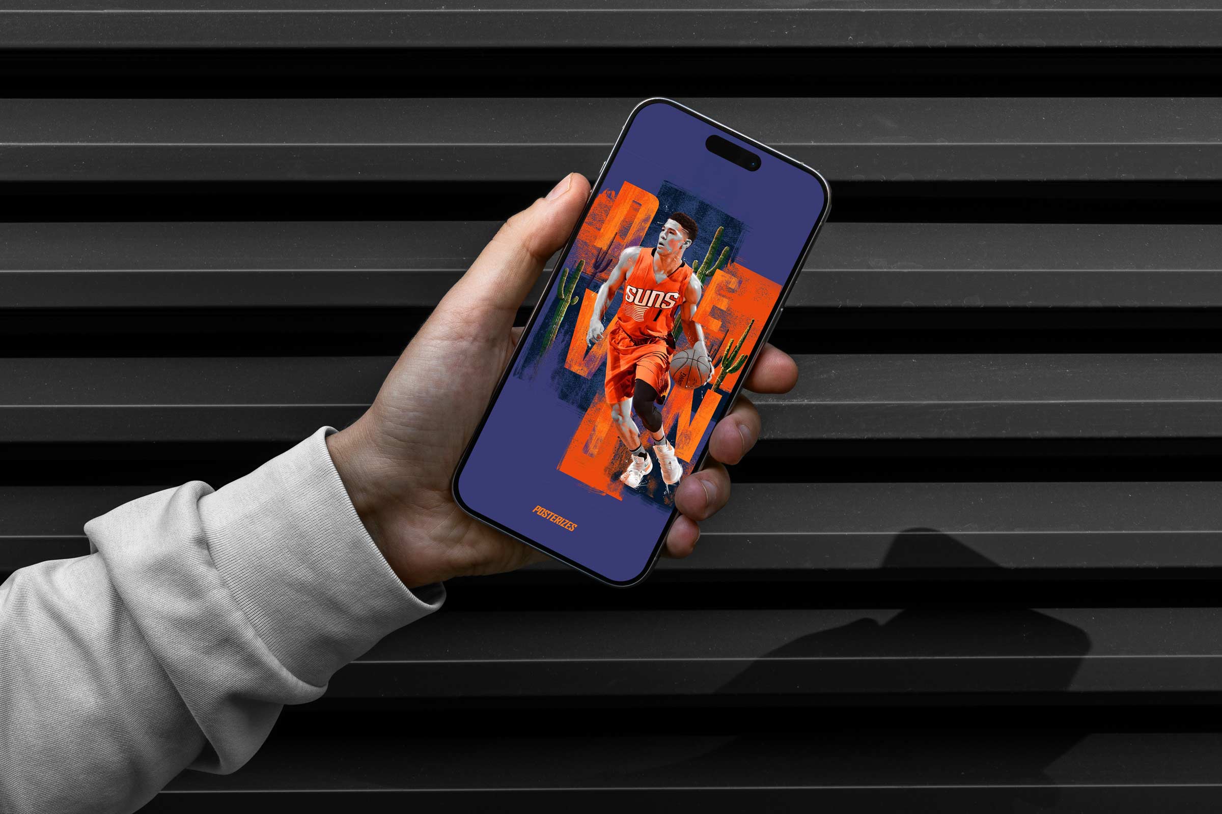
Another dimension that deserves emphasis is the structural shift the platform created for creative economics within sports design. Posterizes operated before monetization infrastructure was widely accessible to independent creators, yet it demonstrated that niche visual communities could generate tangible downstream opportunity without compromising integrity. Artists built portfolios in public, brands discovered talent organically, collaborations formed across continents, and galleries emerged from what began as wallpaper drops. The collective functioned as a value network long before that terminology became fashionable in startup circles. Attention, when paired with attribution and consistent quality control, compounded into real leverage for contributors. For many artists, Posterizes shortened the distance between passion and profession. It reframed sports design from a hobbyist side lane into a viable creative pathway within the broader media ecosystem.

In retrospect, the project anticipated many of the dynamics that now define creator economies and design-led media: distributed teams, platform-native formats, community ownership, and culture as the primary growth engine. Before “design systems” became a boardroom phrase, we were codifying visual language across time zones so a drop from Melbourne could sit seamlessly beside one from Toronto while sitting next to one from a Brazilian artist who spoke a different language entirely. Before “UGC strategy” entered marketing decks, we were nurturing a network where fans became contributors and contributors became industry voices. Posterizes proved that when you align craft, timing, and community, you can build cultural gravity without paid acquisition or institutional backing. It functioned as both a proving ground and a signal, showing brands, leagues, and publishers that the future of sports media would be participatory, visually literate, and globally networked. The ripple effects are visible today in everything from athlete-driven media ventures to the ubiquity of stylized sports edits across social feeds. We did not set out to be foundational, but the blueprint emerged through practice.
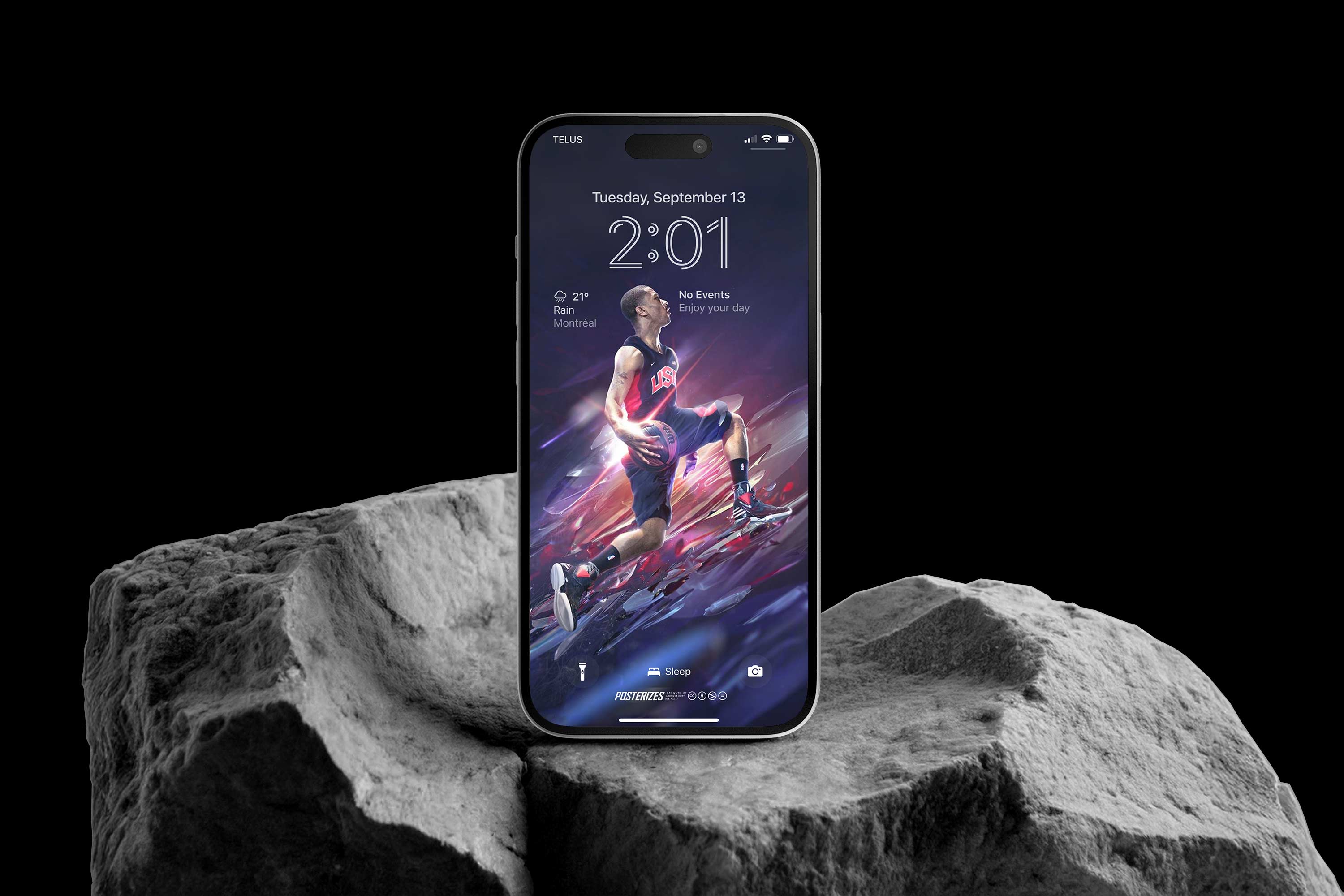
Most importantly, Posterizes captured a fleeting moment when the web still felt like open terrain and culture moved faster than corporate playbooks could track. There was a sense that if you cared enough and moved quickly enough, you could define a category before it even had a name. We were not optimizing for venture funding or exit strategies; we were optimizing for resonance, for the feeling that a fan in Warsaw or Manila could unlock their phone and see themselves reflected in the work. That emotional immediacy is what made the platform endure beyond its operational life. Even as tools evolved and platforms shifted, the core insight held: fandom is identity work, and design is one of its most powerful languages. In that sense, Posterizes belongs to the lineage of scrappy, culture-first projects that quietly reshape industries by proving a different way is possible. It was less a website than a signal fire, and people across the world answered.
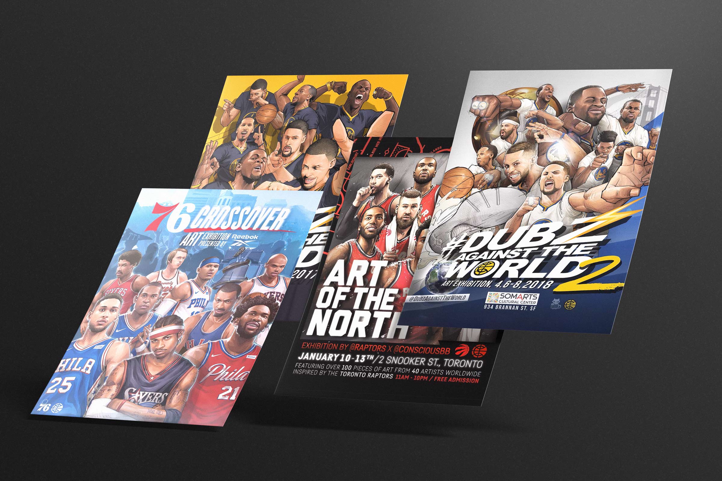
What made that realization especially powerful was the way those digital relationships began to materialize into lived experiences. For years the Posterizes community existed as a constellation of usernames, comment threads, and late night exchanges of PSD files, a global studio that operated across time zones but rarely shared the same physical room. Artists pushed each other from bedrooms, dorm rooms, and small apartments scattered across continents, united more by a shared obsession with the game than by geography. When the opportunity finally emerged to gather around the work itself, it created a moment of recognition that the culture we had been building online had genuine weight. People who had spent years trading feedback through Instagram comments or email chains could suddenly stand in front of the same piece of art and experience it together. The shift revealed something deeper about the project itself: Posterizes was never only a website or a feed, it was a community of makers slowly realizing that the language they were developing could extend beyond the screen. In that sense the exhibitions were not merely events but proof that the energy we had been cultivating digitally could occupy real space, draw real crowds, and create the kind of shared cultural memory that only happens when people gather around something they love.

From there, the move into physical space felt less like an expansion and more like an inevitability. If the magazine gave the work permanence, the galleries gave it presence. Seeing prints scaled, framed, and hung on walls confirmed that what began as digital artifacts could command real space and real attention. You already know Vince as a core member of the collective, but what he did with Conscious Basketball was give our distributed scene a physical heartbeat. Like I had said, he had staged early Taipei shows where it was a lower cost of living to see if these type of art exhibitions were feasible and Dubz in SF was when we came in and expanded things. The first few were proof that the visual language we had been refining online could hold space in the real world, scaled up, printed with care, and experienced communally. Posters that once lived on lock screens now demanded attention on gallery walls, forcing a new level of compositional rigor and material consideration. These shows validated that sports design could function as contemporary art without losing its cultural fluency, and they gave contributors who had only known each other through avatars the first glimpse of a shared physical reality. From the website to the magazine to this, it was all about evolution.
Vince started with experimental pilots, Conscious Taipei (2013) through Conscious 2 and Conscious 3, where you could feel the curatorial voice sharpening. These were no longer gatherings of good work. They were statements about basketball as a global visual language. The Visitors Are Among Us (2015) and Conscious FOCUS (2016) expanded the premise, framing the game not only as spectacle but as identity, migration, and community. What made these exhibitions distinct was their refusal to sanitize fandom. They honored the grit, the mythology, the street-level aesthetics, and the emotional volatility that define how people actually live with the sport. In many ways, they were the physical mirror of Posterizes’ ethos: made by fans, for fans, with the craft standards of people who take both design and basketball seriously. The exhibitions were the logical progression of a community that had matured beyond screens, turning a global, distributed collective into something you could stand inside of. What started as wallpapers on personal devices evolved into shared physical experiences where artists and fans gathered in the same room, connected not by bandwidth but by proximity.

Dubz Against the World in 2017 marked a turning point, and the sequel in 2018 cemented it. San Francisco, at the height of the Warriors dynasty, was the perfect crucible. Steph’s gravity, Klay’s precision, Draymond’s fire, KD’s inevitability, the team had become a global symbol of modern basketball, and the exhibitions captured that moment with the urgency it deserved. For many of us, this was the first time the Posterizes crew was physically together in one place. Years of late-night drops, shared briefs, cross-time-zone critiques, and mutual admiration suddenly had faces, voices, and handshakes. Standing in a room surrounded by work from people you had only known through pixels was surreal. It felt less like a meetup and more like a reunion of a team that had been playing together remotely and finally stepped onto the same court. Conscious Basketball was the brand that Vince had started that the first few galleries were through, and starting with Dubz we truly partnered to take it to the next level, I even did a BR wall at the second one where we showcased some motion graphics like my slim reaper edit on the big screen as well.
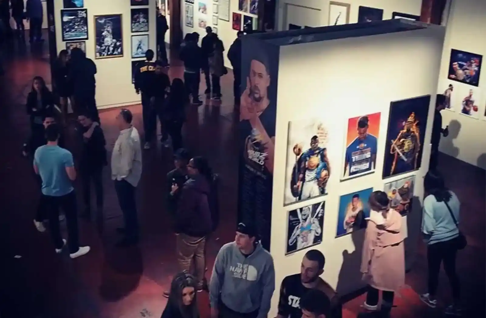
Dubz Against the World represented one of the first moments where the Posterizes ecosystem and the broader basketball art movement fully stepped into the physical world at scale. Held at the SOMArts Cultural Center in San Francisco, the exhibition brought together more than 30 artists to celebrate the Golden State Warriors during one of the most electrifying dynastic runs in modern NBA history. The 20,000 square foot venue transformed into a playground for Dub Nation, combining gallery installations with music, sneakers, arcade games, highlight reels, and food trucks that kept the atmosphere closer to a cultural festival than a traditional art show.
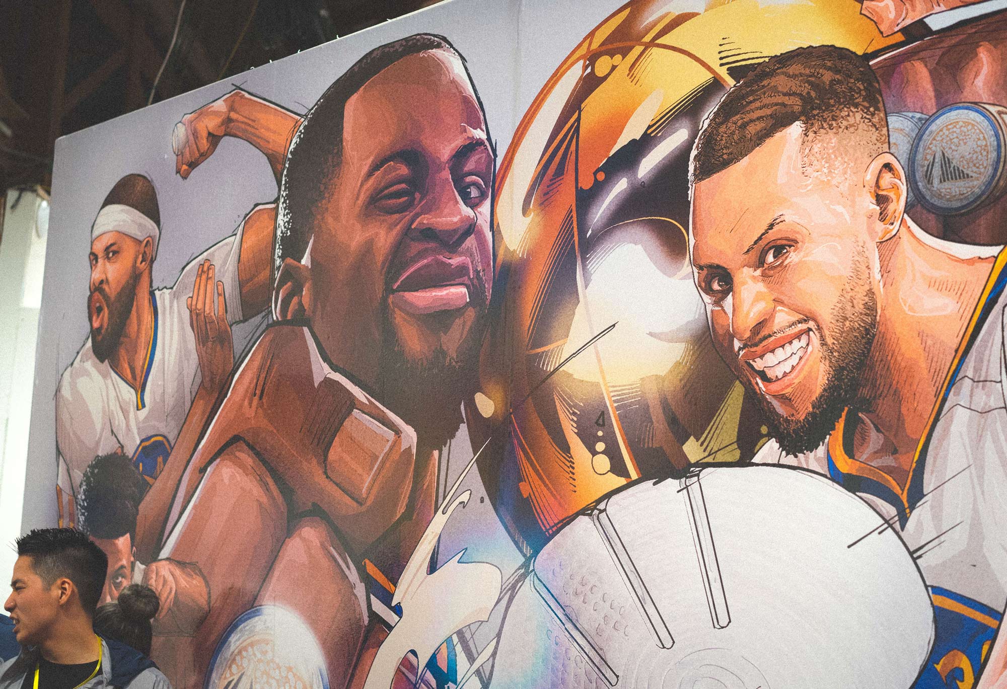
Walking through the space you could feel how naturally basketball art fit within the Bay Area’s creative ecosystem, where design, street culture, and sports fandom had always overlapped. Fans encountered reinterpretations of Steph Curry, Klay Thompson, and the Warriors’ meteoric rise rendered through digital illustration, poster art, mixed media pieces, and experimental graphic styles that had been incubating online for years. For many of us involved in Posterizes, the exhibition confirmed something we had long suspected: the language we had been developing through wallpapers and social media had the ability to command real physical space. What had once lived quietly on lock screens now stood printed large on gallery walls, drawing crowds of fans who saw their team’s mythology reflected back through a new creative lens.
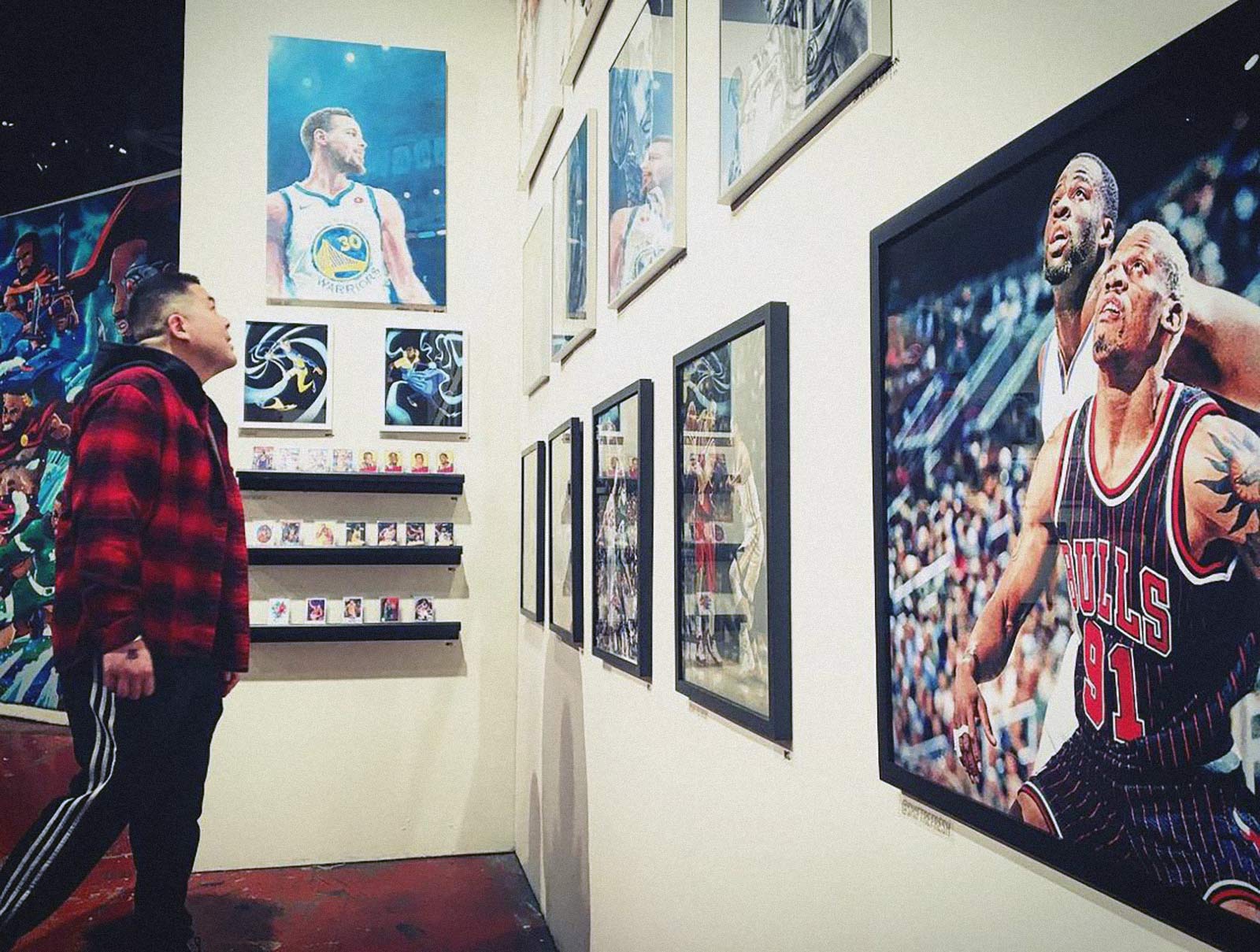
The momentum only grew with Dubz Against the World 2, which returned to the same SOMArts Cultural Center in San Francisco from April 6–8 and expanded the scale of the concept even further. The second edition featured roughly 50 artists from around the world, alongside Bay Area contributors who had been part of the Warriors’ vibrant fan culture during the team’s championship era. Organized by Conscious Basketball and Kitzy Studios, the exhibition built on the success of the first show while refining the idea of what a basketball art experience could be. Visitors moved through installations that combined gallery pieces with live music, sneaker culture, interactive experiences, and broadcasts of classic Warriors highlights, creating an environment that felt equal parts sports celebration and contemporary art event. Peep a couple of the original Posterizes artists Tyson Beck and Ryan Hurst along with the legend VC in the video below.
The shows were family-friendly and open to the public, drawing fans who might never have considered themselves gallery goers but who immediately connected with artwork inspired by their favorite team. In many ways the Dubz exhibitions captured the spirit of the Warriors’ dynasty itself, a period when basketball felt innovative, joyful, and globally influential. For the Posterizes community and the artists orbiting it, these events were more than exhibitions; they were proof that the visual culture of basketball had matured into something capable of filling real rooms with real people who came not only to watch the game, but to experience it through art.
What made the Dubz shows especially meaningful was their community dimension. Partnering with organizations like the Boys & Girls Clubs embedded the exhibitions within the social fabric of the city, reinforcing that basketball culture is inseparable from youth access, mentorship, and opportunity. The work on the walls was aspirational, but the programming around it made the impact tangible. Kids who might never have considered design as a path were suddenly surrounded by artwork that treated their heroes as subjects worthy of craft and reverence. The exhibitions functioned as both cultural celebration and creative invitation, demonstrating that sports design was not an elite niche but a viable language for storytelling and self-expression. What we captured were not just highlights, but how a generation felt about them.
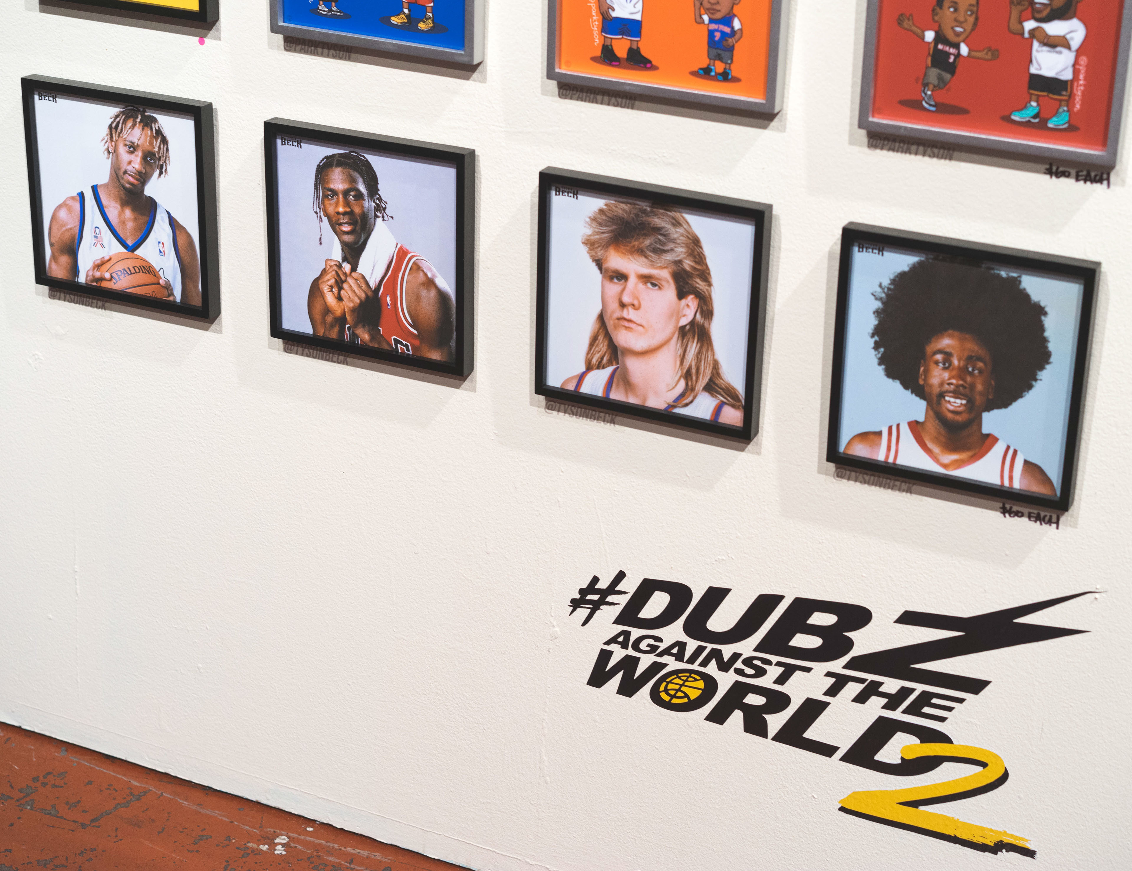
The success of the Warriors exhibitions confirmed that the creative language developing around basketball fandom had the ability to transcend the internet and thrive in physical space. What had started as a grassroots movement driven by artists sharing work through Posterizes and social media was now filling galleries and cultural venues with fans eager to experience the game through art. As the idea gained traction, other cities and franchises began recognizing the power of this visual ecosystem and the communities that had formed around it. That momentum carried north to Toronto, where the Raptors partnered with Conscious Basketball to create Art of the North, an exhibition that expanded the concept even further by bringing together dozens of international artists to celebrate the team and the city’s uniquely global basketball culture. If the Warriors shows proved that basketball art could command a room, Art of the North demonstrated that it could also reflect the identity of an entire city.
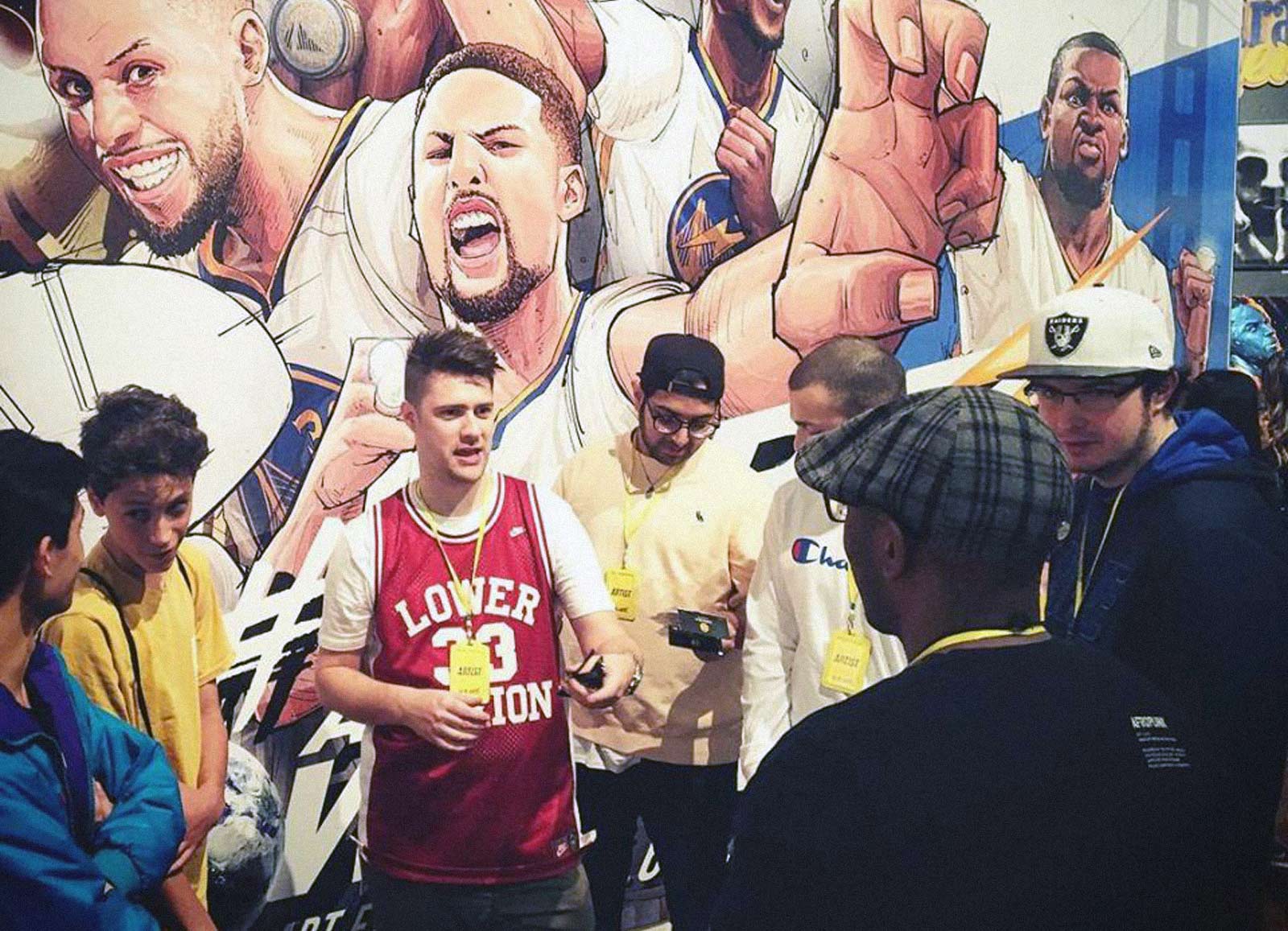
By the time Art of the North launched in 2019 in collaboration with the Toronto Raptors, the model had matured into institutional partnership without losing its soul. This was not a brand slapping logos onto walls. It was a franchise recognizing that design culture had become integral to how fans experience identity and championship memory. The Raptors’ ascent and eventual title gave the exhibition emotional weight, and the work reflected a city discovering its place in basketball history. It showed that the Posterizes sensibility, global, craft-driven, culturally literate, could translate across markets while still honoring local narrative.
The Raptors recognized that basketball fandom had become a cultural ecosystem that touched art, design, and streetwear, and they leaned into that energy by helping bring the exhibition to life. For artists involved in Posterizes and the broader community, seeing the work presented in this context carried a particular resonance. Pieces that might once have lived quietly on a phone lock screen were now printed large, carefully lit, and positioned within a curated gallery environment. The transition forced artists to think differently about composition, texture, and scale, encouraging a level of craft that went beyond the constraints of digital distribution. What had begun as a grassroots creative movement was now being acknowledged by one of the most forward-thinking organizations in professional sports.
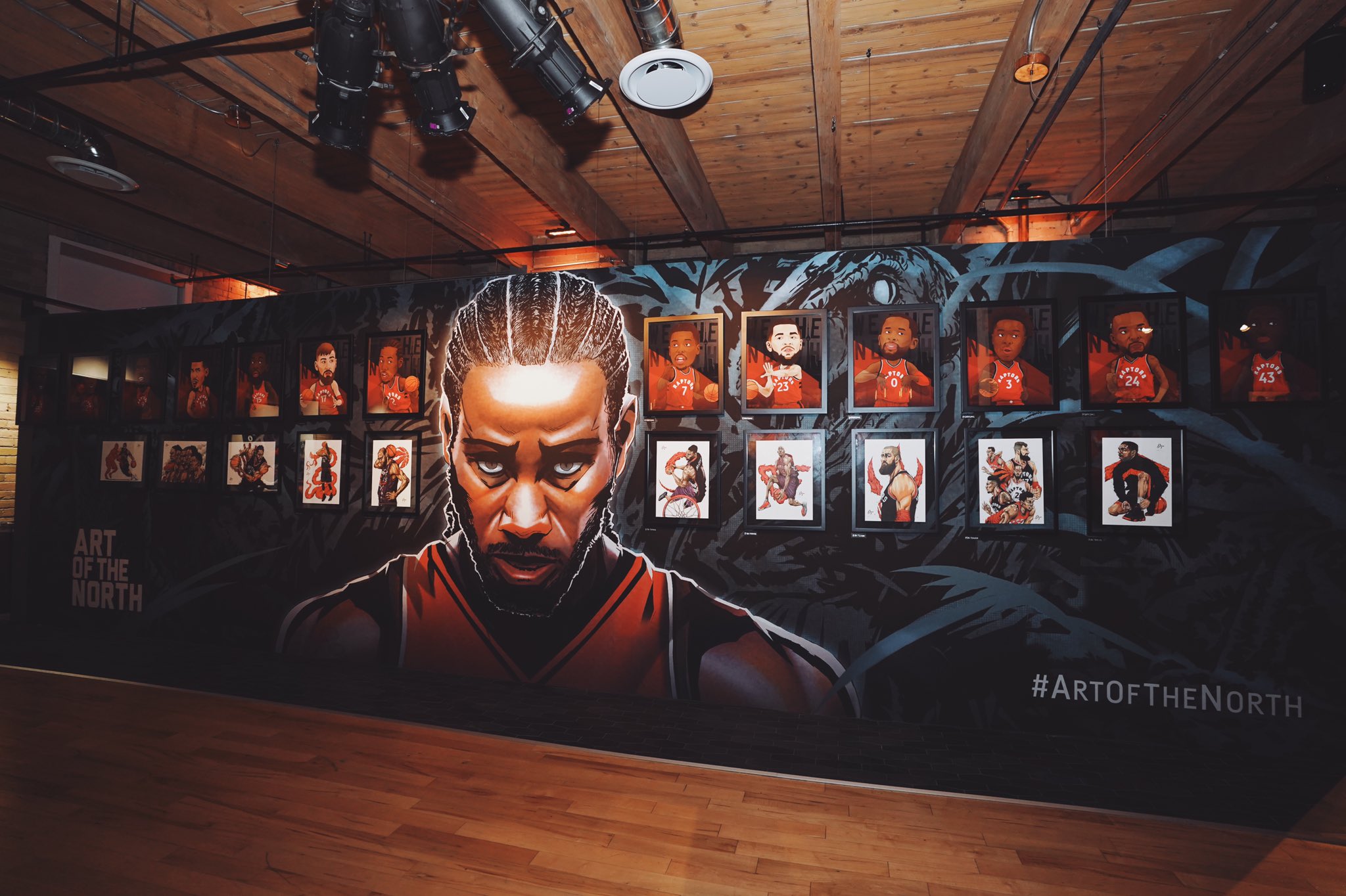
Art of the North as a gallery show represented a significant evolution in how the basketball art movement we had been cultivating online could manifest in the physical world and with official team partnership as well. Hosted in Toronto at The Lounge at Live Nation in Liberty Village, the exhibition brought together more than 100 Raptors-inspired works created by 40 international and local artists, transforming the space into a living celebration of the team’s cultural impact. Each show was bigger than the previous and applied the learnings from the last one. The show reflected something that had become increasingly clear over the previous decade: basketball was no longer confined to arenas or television broadcasts but had expanded into fashion, music, design, and contemporary art. Through sculptures, digital illustrations, photography, sneakers, and mixed media pieces, the exhibit demonstrated how the visual language of the sport had evolved alongside the global fandom surrounding it.
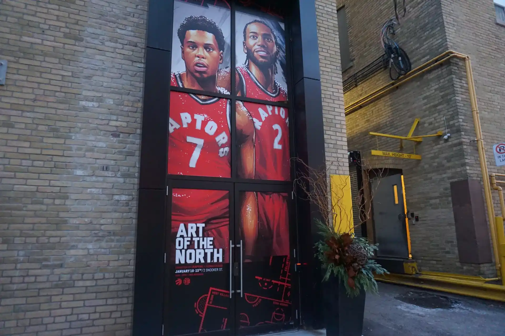
What made Art of the North especially meaningful was the way it illustrated the global nature of basketball culture. Artists from around the world contributed work inspired by the Raptors, a team that itself represents one of the most international fanbases in the league. The pieces on display ranged from playful reinterpretations of players like Kyle Lowry and DeMar DeRozan to intricate visual narratives referencing the team’s history and the personalities that shaped it. We even had the Raptors Assistant coach participate. Fans moving through the exhibition could see how individual artists embedded hidden references, inside jokes, and subtle details that only true followers of the team would recognize. That layered storytelling mirrored the way fandom itself operates, where every highlight, rivalry, and player moment becomes part of a shared mythology. By bringing these works together in one place, the exhibition demonstrated that basketball art had grown into a legitimate cultural category rather than a niche internet subculture. It was further proof that the visual language the Posterizes community had been developing online could resonate just as strongly in physical spaces.

Seeing my own work hanging in those exhibitions was surreal in the best possible way, a quiet, grounding moment after years of watching pieces travel only as pixels across screens. Standing in the room, observing how people moved toward certain compositions, how they leaned in to read type, how they photographed details I had agonized over, it reframed the work for me as something lived with rather than scrolled past. To be there with all my creative talented peers was amazing.

There was a deep sense of gratitude in knowing that art born from late nights, playoff adrenaline, and shared briefs with friends across time zones could exist at architectural scale and resonate with strangers. It reminded me why we held the bar so high, because when the work leaves the screen, it has to carry its own weight. More than anything, it left me energized and eager for the next show, the next wall, the next room where this global conversation can gather again in person. The legacy lives wherever sports design is treated as culture, not decoration. This whole progression from website to social to magazine to actual art gallery shows with real teams was an insane glow up.
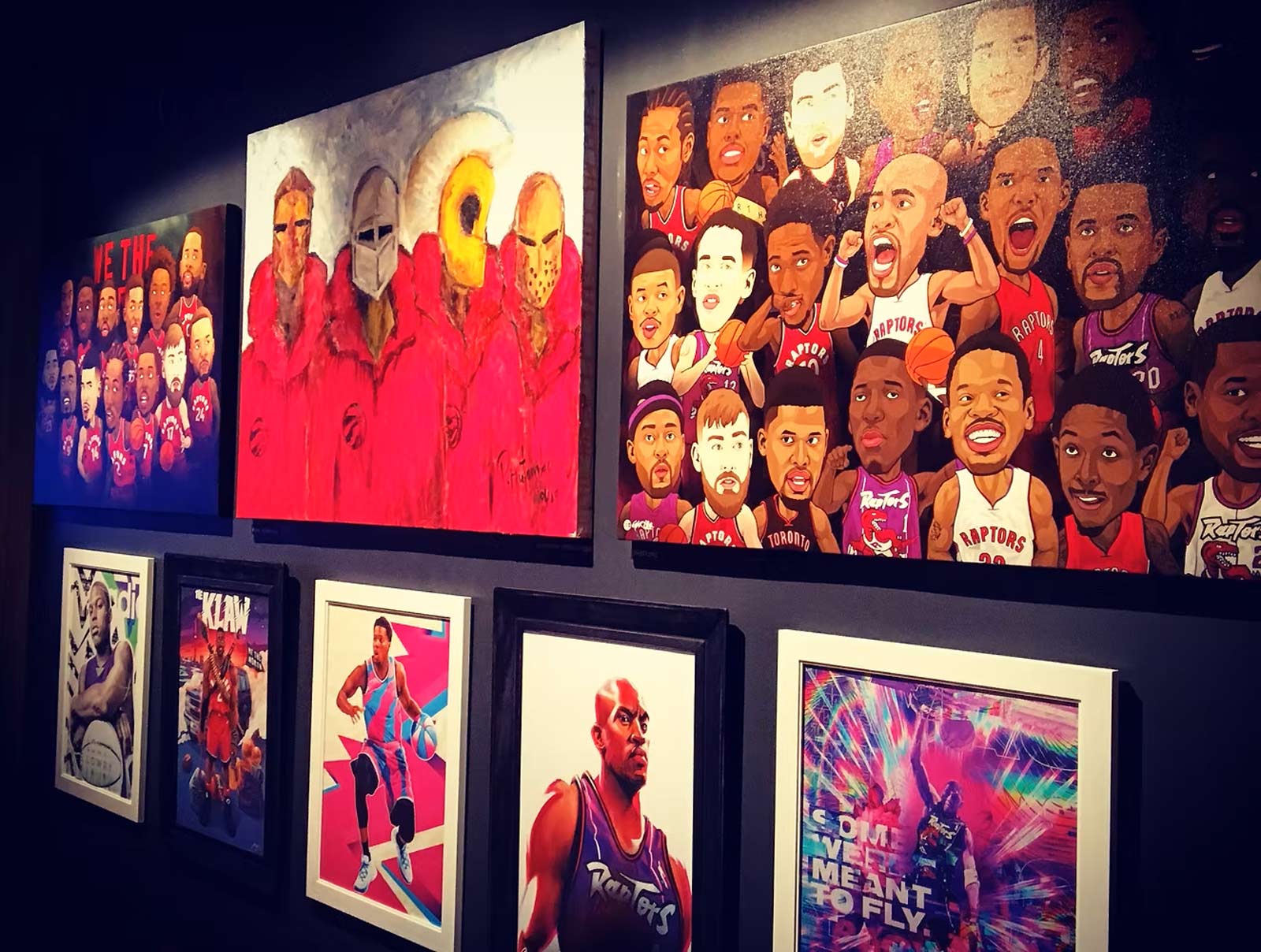
Perhaps most importantly, Posterizes belongs to a specific evolutionary chapter of the internet. It thrived in a pre-algorithmic moment when discovery was still communal, feeds were chronological, forums carried influence, and independent taste communities could meaningfully define aesthetic standards. Quality could rise through resonance rather than paid amplification. That environment allowed a small, globally distributed collective to influence how sports visuals were interpreted at scale without institutional backing. As platforms later optimized for sameness and templated virality, that window narrowed, making what we built feel even more singular in hindsight. Posterizes stands as proof that when alignment, craft, and timing intersect inside an open internet, culture can be shaped from the edges rather than dictated from the center. It was not just a website. It was a signal flare in a formative era of digital culture. The highlights were televised, but the mythology lived on our screens and now forever on our walls.
That same year, the 76ers Crossover exhibition extended the arc into Philadelphia, culminating in recognition at the Clio Sports Awards. The award matters, but what it represents matters more. It signaled that experiential sports art had crossed from subculture into industry acknowledgment. What we had been doing for years, treating moments as artifacts, building community through authorship, designing for emotional permanence, was no longer fringe. It was a validated medium. Seeing that recognition attached to a show connected to our extended network felt like the industry finally catching up to a movement that had been quietly building since forum days.
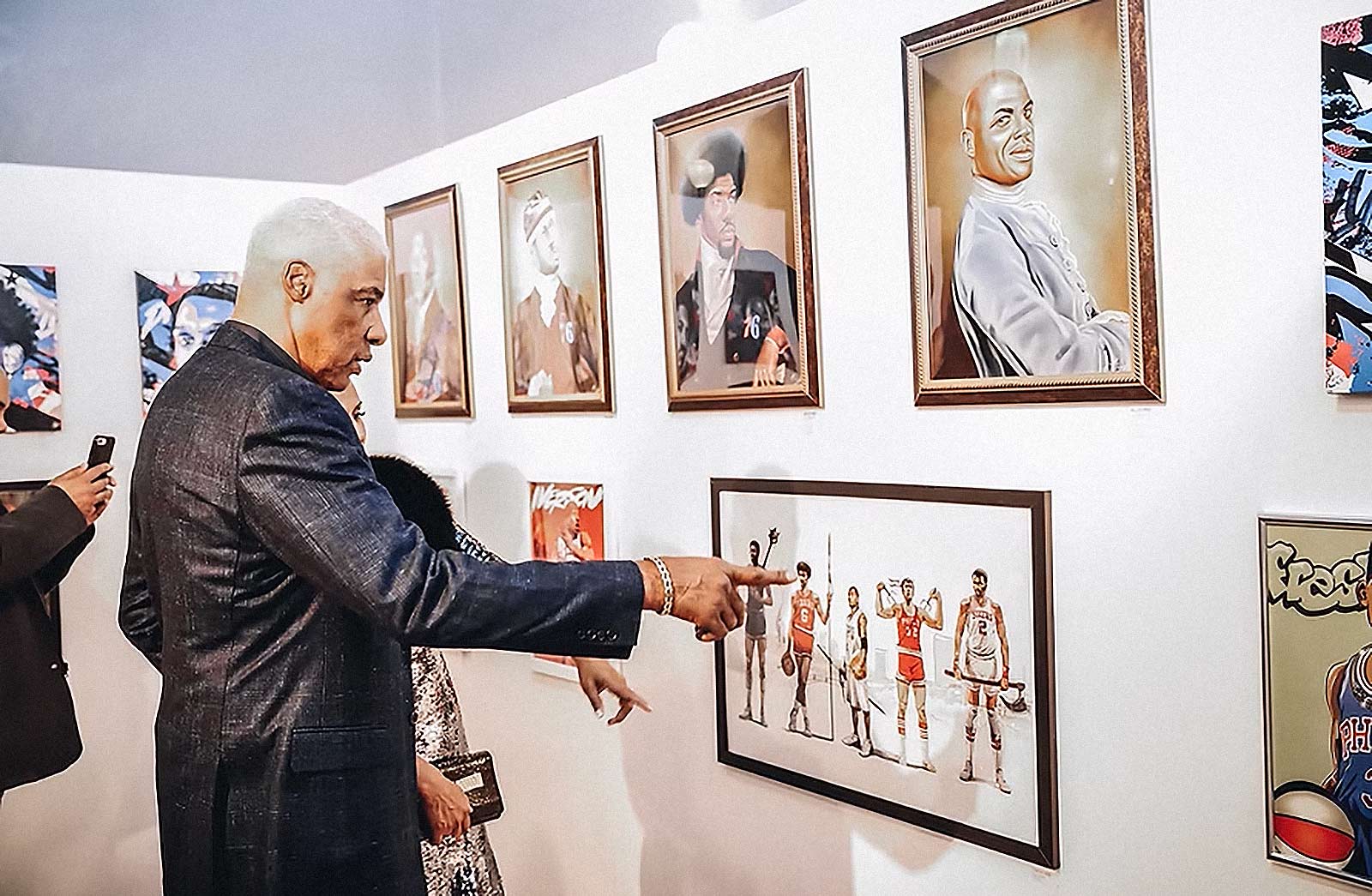
The scale of the 76ers Crossover exhibition underscored how far the movement had traveled from its digital beginnings. More than 200 pieces of artwork from artists around the world filled the rooms of the Fitler Club in Philadelphia, transforming the venue into a visual archive of basketball culture interpreted through a global design lens. What had started years earlier as wallpapers circulating across phones and laptops was now presented as a curated gallery experience that celebrated the intersection of sport, art, and city identity. Philadelphia itself provided the perfect context, a city whose basketball lineage runs from Wilt Chamberlain to Julius Erving to Allen Iverson and Joel Embiid, each era carrying its own mythology and visual language.
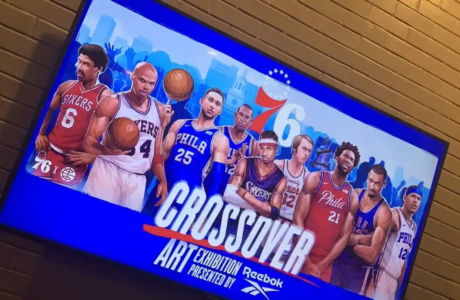
The exhibition leaned into that history while expanding it, inviting artists to reinterpret the franchise and the sport itself through contemporary design sensibilities. Walking through the space felt like witnessing a timeline of fandom rendered in color, typography, and composition. It was a reminder that the emotional narratives surrounding basketball are not only written on the court but also in the visual culture that grows around it. Getting Sixers legends like Dr. J the icon or Elton Brand or even current players at that time in Ben Simmons or Thybulle before his bubble vlogs blew up.

Equally important was the way the event bridged global participation with local authenticity. While Conscious Basketball sourced artists from across the Posterizes and sports design community worldwide, the Sixers organization made a deliberate effort to highlight creators rooted in Philadelphia itself. Local artists were commissioned to reinterpret the team’s City Edition jerseys as canvases, reinforcing the idea that sports identity is always intertwined with place and community.
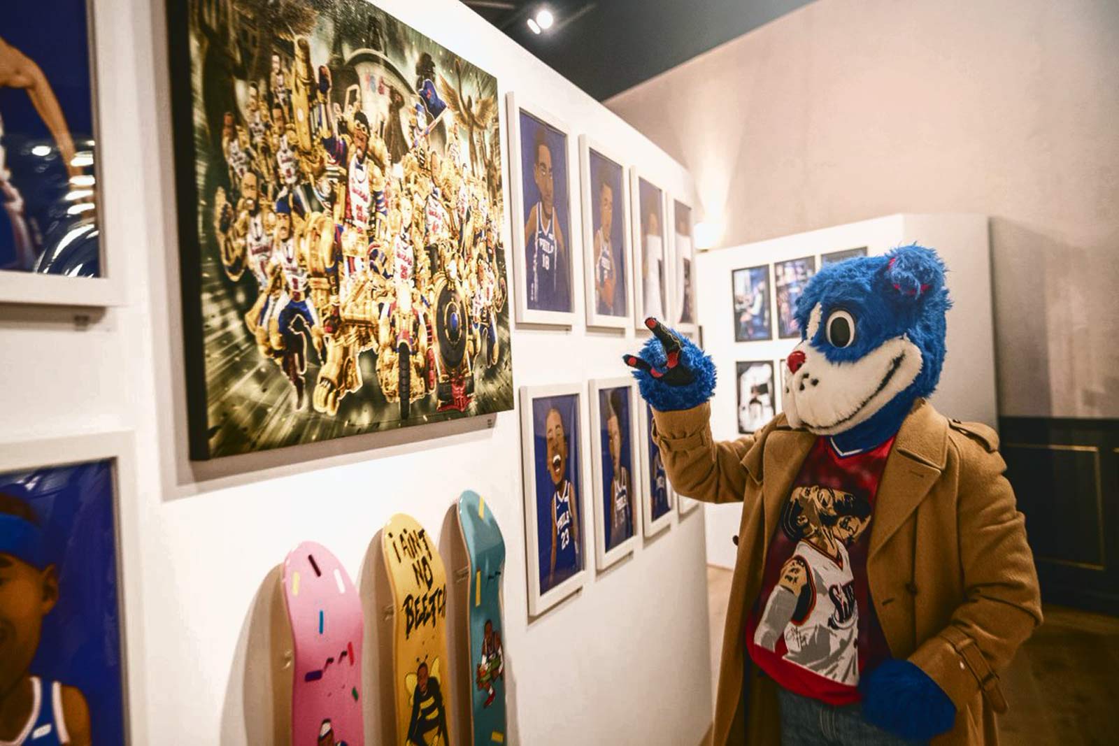
This approach reinforced a central idea behind the platform: basketball fandom is inherently creative, and the symbols of the sport from uniforms to logos can evolve into powerful vehicles for artistic expression. Alongside these installations were additional activations such as Mark’d Sneaker Design, where artists customized Reebok footwear live, and sculptural works produced by the same studio responsible for the statues along the Legends Walk outside the team’s Camden training facility. Together these elements expanded the exhibition beyond prints on walls, turning it into a multi layered exploration of how the aesthetics of the game translate into design, fashion, and object making.

The exhibition also highlighted something that often gets lost in the spectacle of professional sports: the creative lives of the athletes themselves. Rookie guard Matisse Thybulle, already known for his photography practice, presented a collection of photographs publicly for the first time as part of the show, revealing another dimension of personality beyond the court. Complementing that work was a series of photographs by Sixers staff photographer Alex Subers capturing players in everyday environments connected to their personal interests from music to gaming to yoga. These images helped humanize athletes who are often seen only through the lens of competition, reinforcing the idea that basketball culture extends far beyond the hardwood. When the exhibition concluded, the artwork was auctioned through the team’s digital platform with proceeds supporting the Sixers Youth Foundation, closing the loop between creativity, community, and impact. In doing so, the show demonstrated how a sports organization could leverage the visual language of fandom not only to celebrate the game, but to give back to the communities that sustain it.

The exhibition validated something we had long believed but rarely had the opportunity to demonstrate publicly: that sports design could stand comfortably within the gallery context without losing the immediacy that makes it resonate with fans. It also represented another milestone in the evolution of the movement Vince and Conscious Basketball had been nurturing through earlier shows in Taipei and beyond. What began as experimental gatherings to test whether sports-inspired artwork could attract an audience had matured into fully realized cultural events backed by NBA organizations themselves. In that sense the 76ers Crossover exhibition felt like both a culmination and a new beginning, proof that the language our community had been developing online could command space in the real world while continuing to evolve.
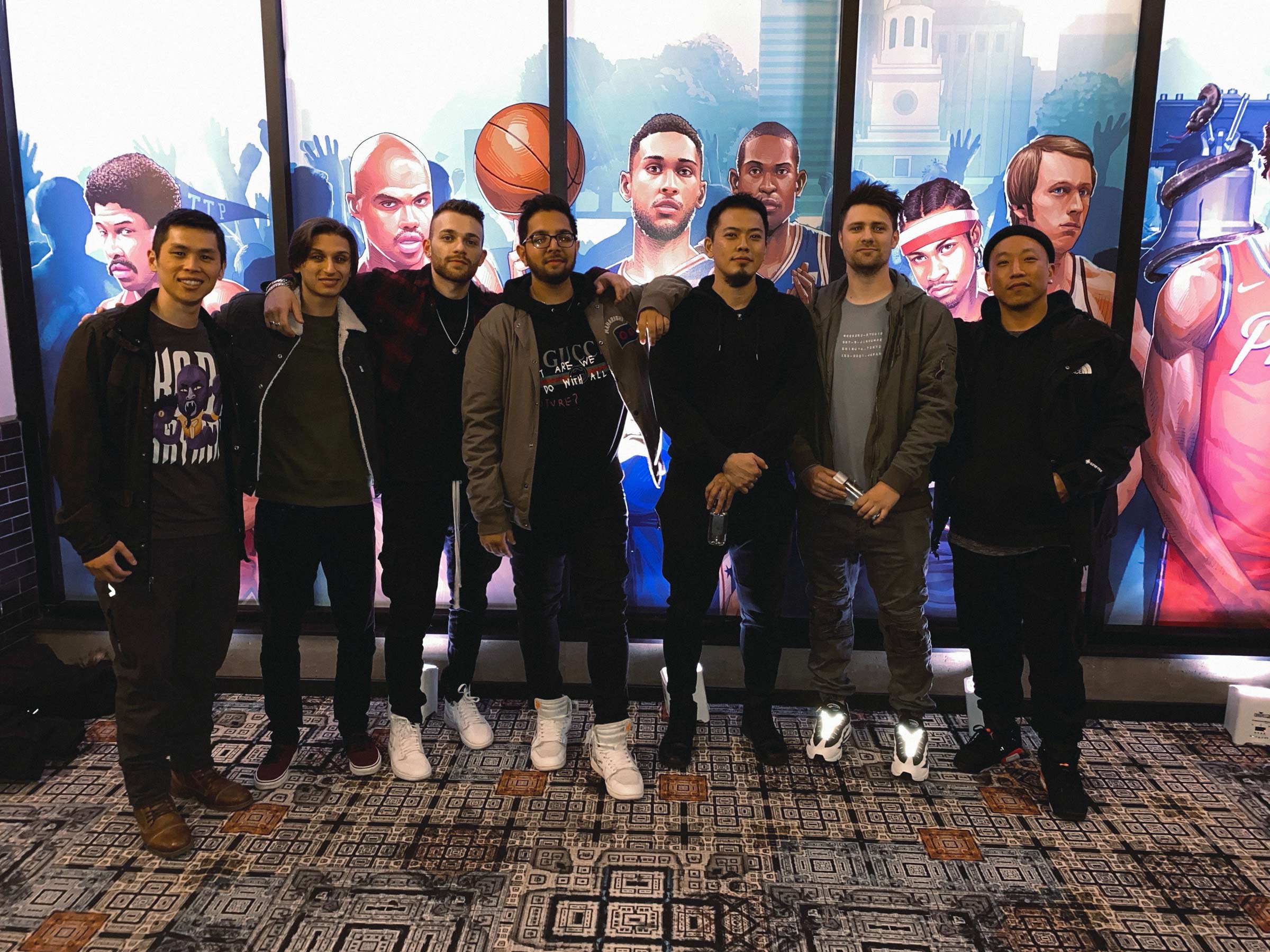
The throughline across all of these exhibitions was embodiment. Posterizes proved that a distributed collective could create cultural gravity online. Conscious Basketball proved that gravity could pull people into the same room. Meeting in San Francisco during the Warriors’ dynasty run, seeing the work at scale, watching kids engage with it, and witnessing franchises and institutions take it seriously, all of it confirmed that we had not simply built a website. We had helped midwife a scene. A generation of sports designers found each other, found an audience, and found legitimacy, not through permission, but through consistency, craft, and community.

Looking back, those walls were more than displays. They were evidence that the language we developed together could live anywhere: on a phone, in a feed, on a mural, in a gallery, in a city’s memory. And the most special part was never the awards or partnerships. It was the moment you could stand in a crowded room, look around, and realize that people from Taipei, Toronto, Melbourne, Delhi, Paris, and San Francisco were all there because they believed the same thing: that basketball, when filtered through design, becomes a universal story worth telling well. It was less a website and more a signal that independent culture could scale, and these galleries made that tangible.
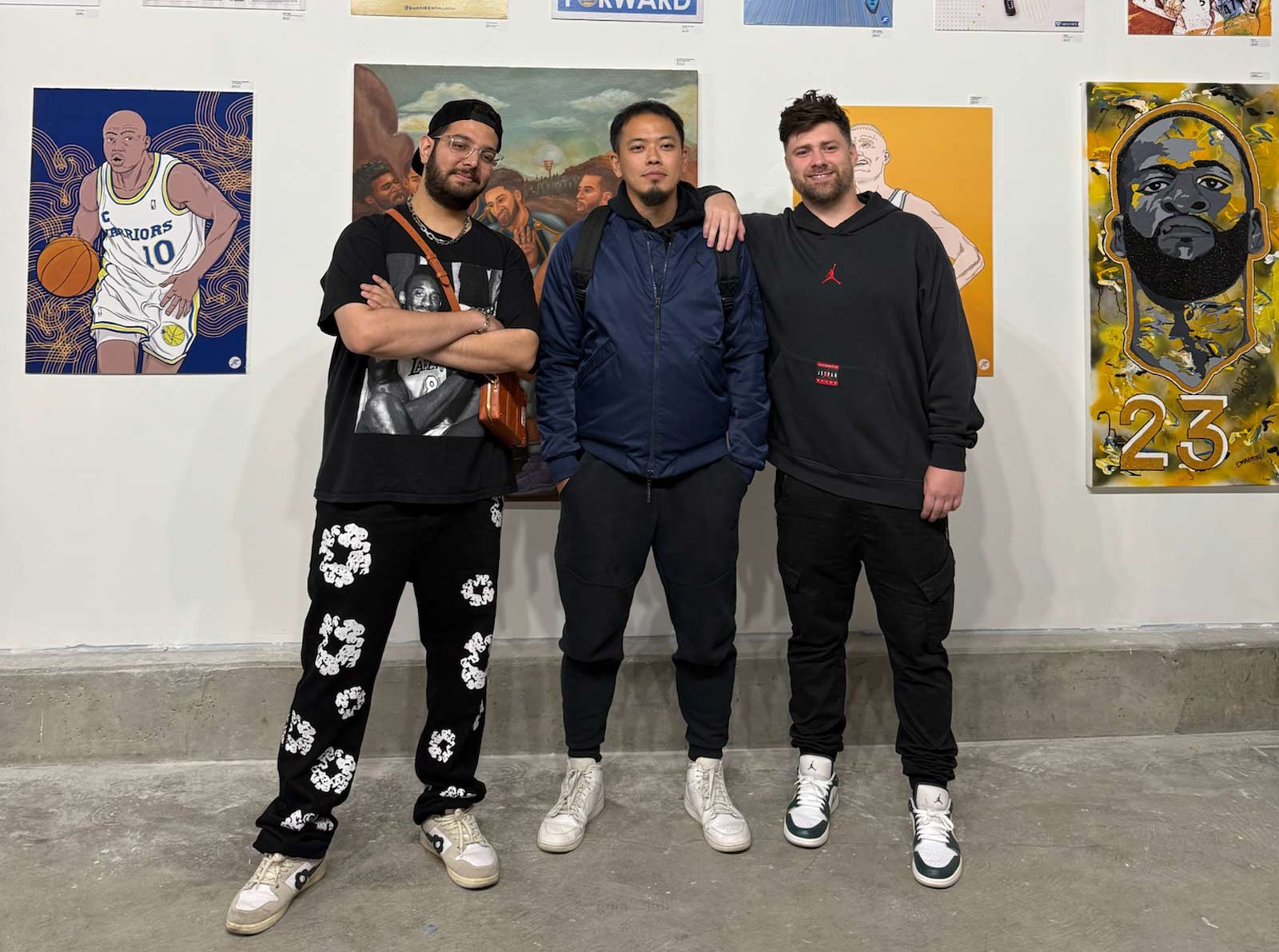
Experiential work lives in a different register than most design. It is not meant to sit quietly on a screen or exist as a static artifact but to unfold in time, through space, through people. A gallery filled with basketball art, the hum of a crowd, the moment someone stops in their tracks in front of a piece that speaks to them. Those are the things you cannot fully design yet somehow hope to create conditions for. What makes these environments powerful is that they become shared memories rather than objects. Vince Chang recognized that early and helped transform what Tyson and I had started online into something far bigger than we ever imagined, opening doors that allowed the movement to grow beyond our wildest dreams and into real cultural spaces around the world. Long after the walls come down and the prints are packed away, what remains is the feeling of being there, the conversations sparked between strangers, the quiet moment of recognition when someone realizes they are part of something larger than themselves. In that sense experiential design is less about constructing a room and more about shaping a moment in culture, a fleeting intersection of art, fandom, and community that lingers in people long after the lights go out. Very grateful to have been a core architect of this sports art movement.
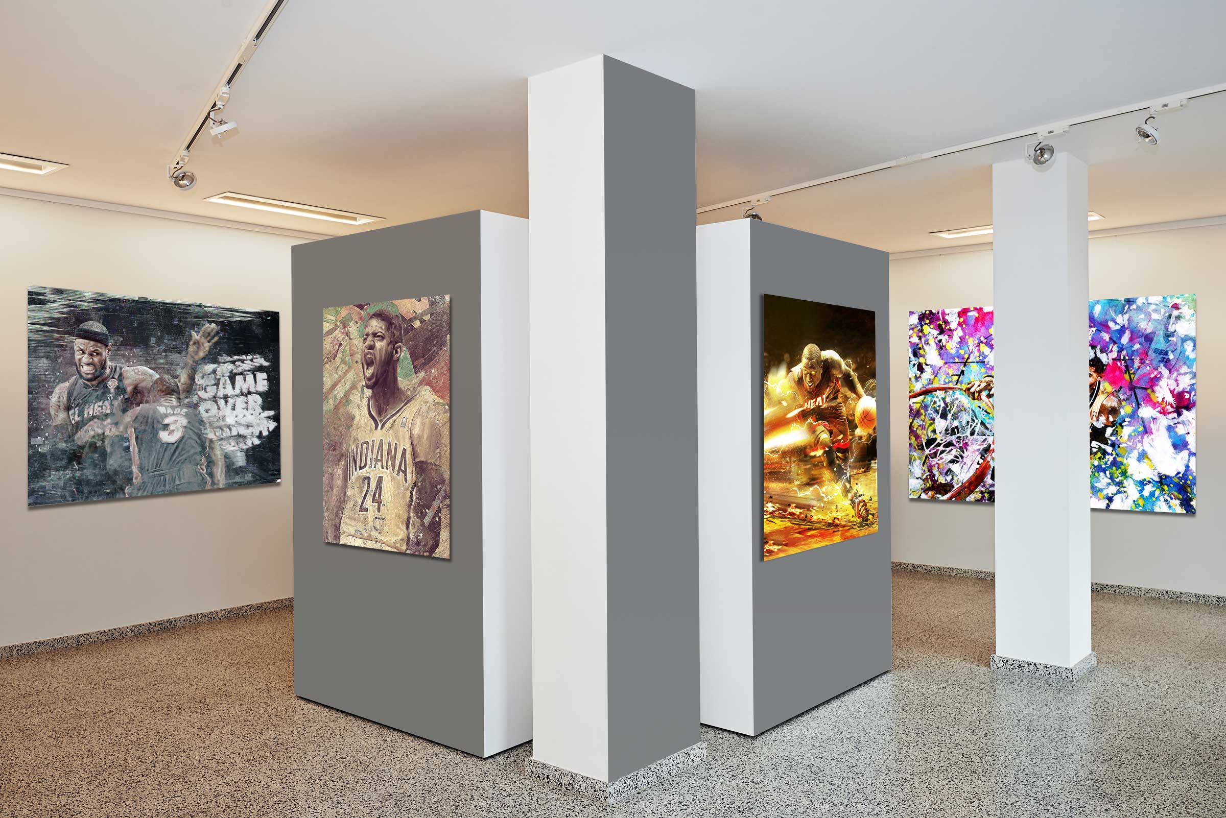
There was something untamed about those early days, a frontier quality to the internet where taste still moved faster than institutions. The wallpaper space in particular felt lawless and disposable, a churn of low resolution images and anonymous reposts that evaporated as quickly as they appeared. Then you had two obsessives who cared a little too much about the way a moment should look. Not because it would monetize well, but because it deserved reverence. A dunk was not just a highlight, it was choreography, tension, release. And in that wide open digital expanse, we treated those moments like they were worth framing properly. The wild west of wallpapers did not need more noise, it needed intention. We turned screens into canvases and fans into curators. We did not chase the algorithm; we built something the algorithm had to respect.
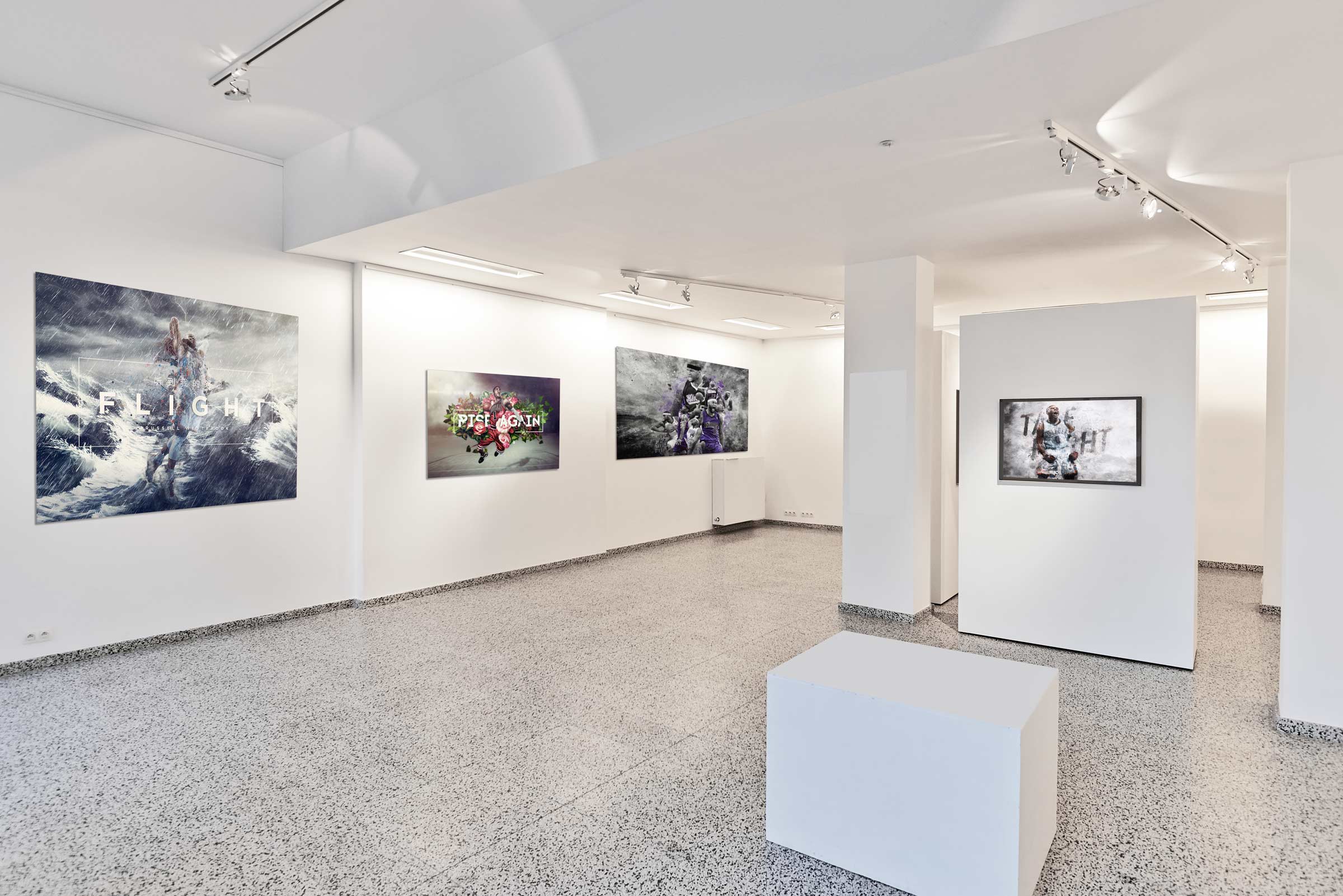
What made it electric was not just the work, but the people orbiting it. Tyson and I were less founders and more instigators, nudging a scattered design community into alignment around a shared standard. Designers from different countries, different visual traditions, different fandom allegiances all converged around the same pulse. There was pride in the craft, but there was also camaraderie, a recognition that everyone was pushing against the same mediocrity that had defined the space. Nobody was asking for credentials. If you could interpret the game with honesty and precision, you belonged. That meritocracy of passion created a current you could feel even through a screen.
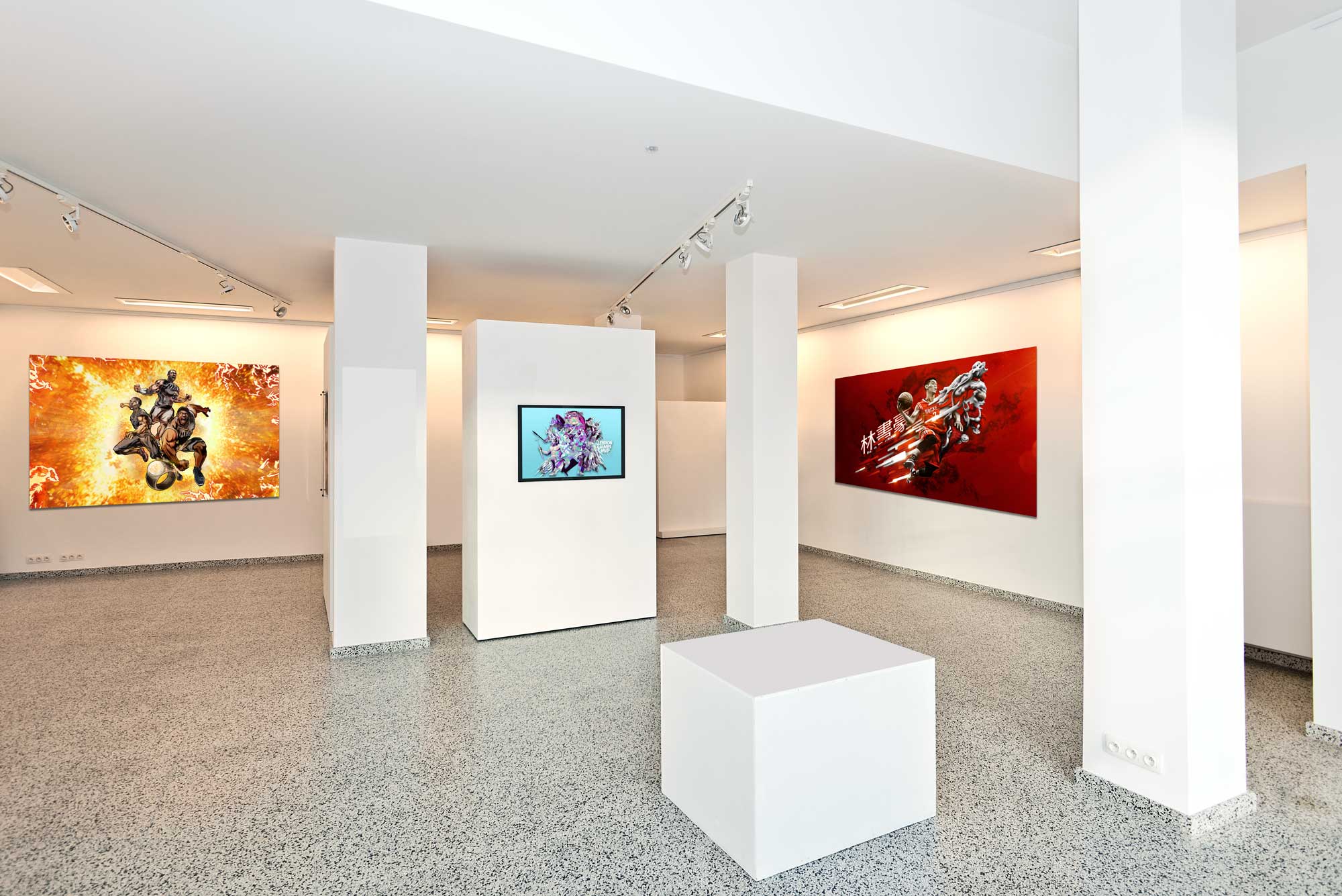
And underneath it all was the game itself, endlessly generous, endlessly dramatic. Basketball has rhythm, improvisation, swagger, heartbreak, and the best art has the same ingredients. We were not trying to control the narrative of the sport, just to honor it through reinterpretation. Each piece became a small act of devotion, a way of saying this mattered enough to translate carefully. It was chaotic and global and stitched together by bandwidth and belief, but that was its charm. In hindsight, it reads like inevitability, but at the time it felt fragile and alive, a scene forming in real time because enough people cared deeply about getting it right.
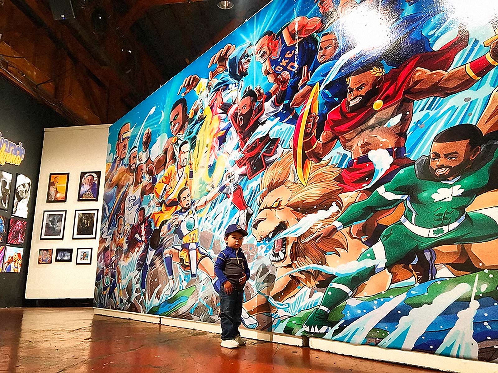
Kobe Bryant once said, “The most important thing is to try and inspire people so that they can be great in whatever they want to do.” That sentiment always echoed in my mind while walking through these exhibitions and watching how people experienced the work. Every so often you would see a kid standing completely still in front of one of the massive pieces, staring up at a portrait of Jordan, Kobe, Curry, or LeBron like they had just discovered a new universe. In those moments the entire purpose of the show became clear. These exhibitions were never simply about prints on a wall or artists celebrating their favorite players. They were about the spark that happens when a young fan realizes that the culture around basketball can live through creativity, imagination, and storytelling just as much as it does on the court. Seeing those kids move through the gallery, wide eyed and curious, you couldn’t help but see a younger version of yourself in them. That feeling, watching someone experience that moment of inspiration for the first time, is what made the entire journey feel meaningful.
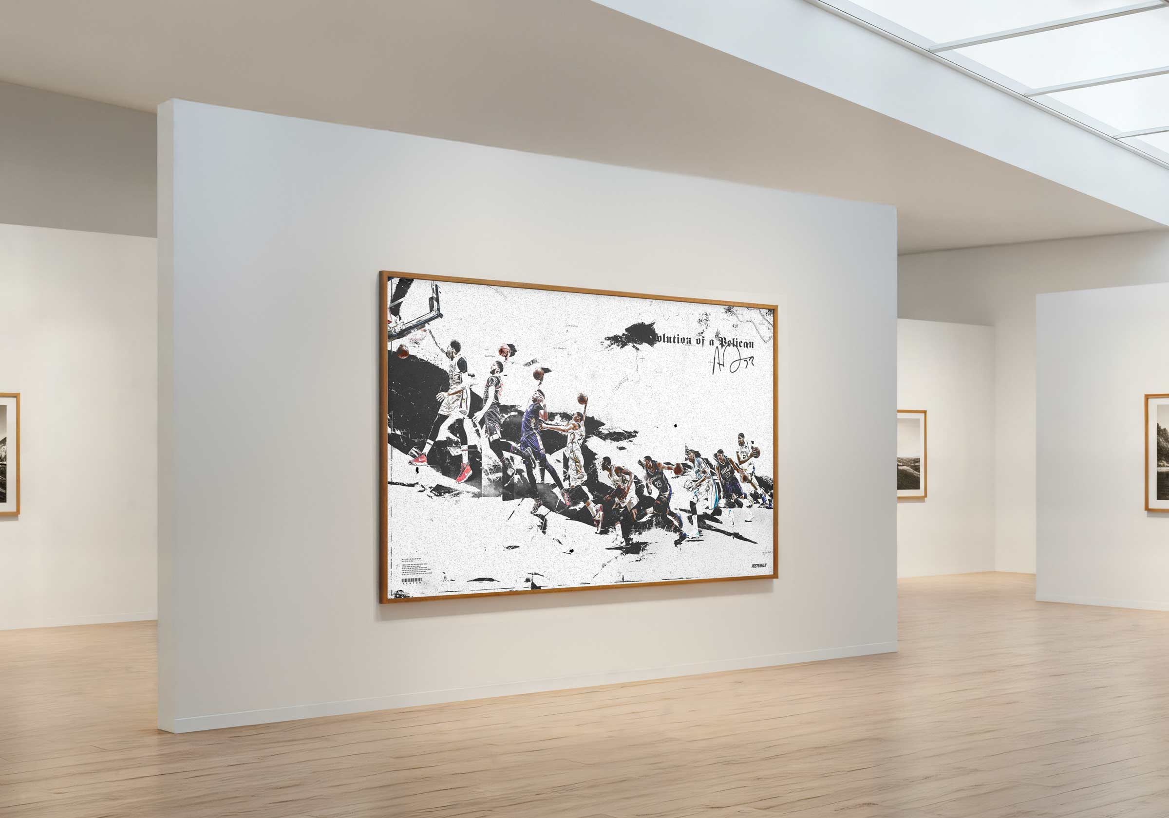
The real breakthrough came when the collective began behaving less like a website and more like a living publishing system for basketball culture. Instead of chasing isolated viral hits, we built a rhythm that mirrored the emotional tempo of the NBA season itself. Major performances, playoff runs, trades, and rivalries became creative prompts that triggered coordinated releases across our network of artists. Each drop functioned like a visual headline, translating the drama of the league into design artifacts fans could live with long after the final buzzer. This cadence transformed Posterizes into a kind of parallel media layer running alongside traditional coverage. Where journalists documented the game through words and statistics, we documented it through composition, color, and typography. The result was a creative ecosystem that allowed design to operate as a legitimate form of sports storytelling rather than a decorative afterthought.
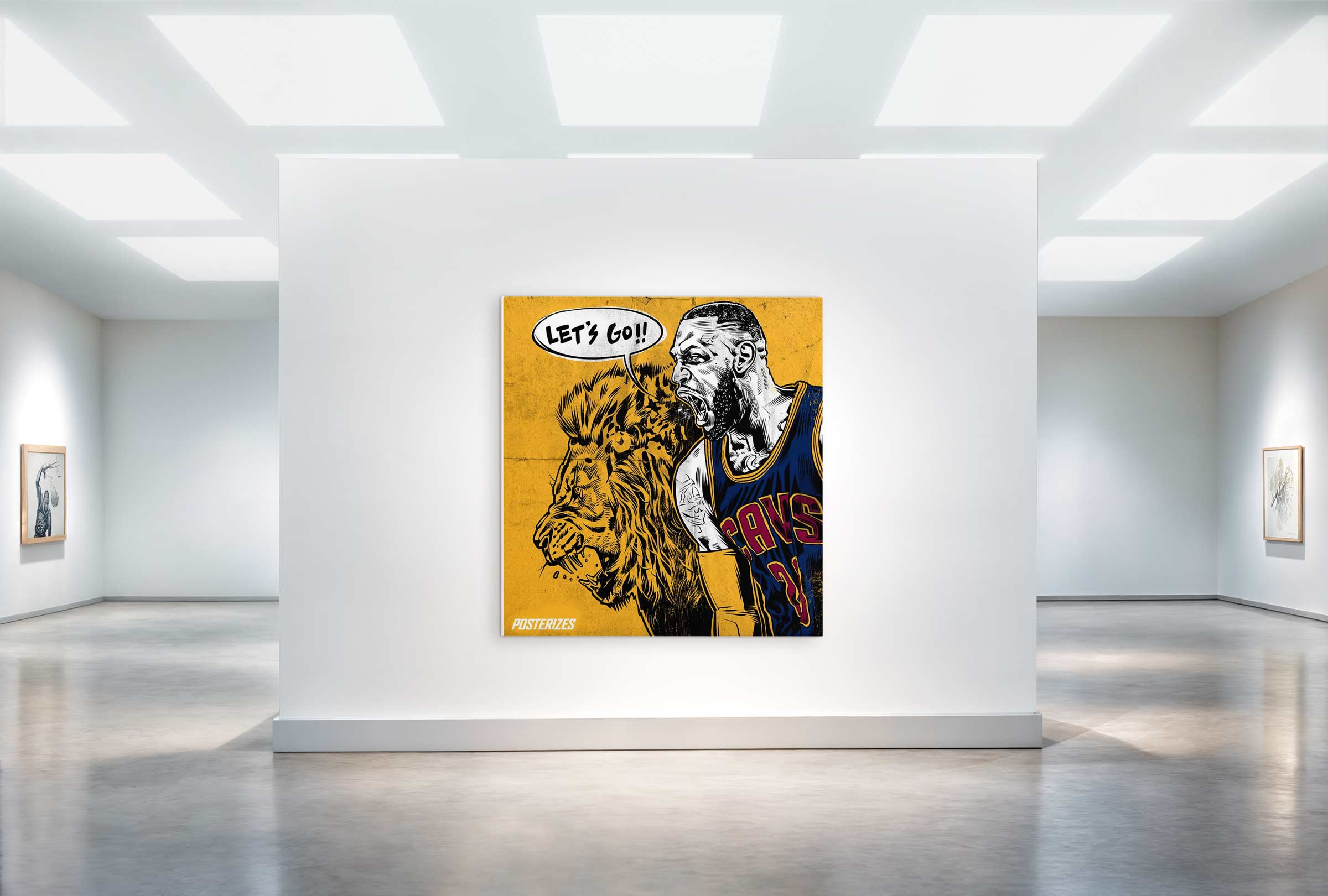
At the operational level, building Posterizes meant architecting systems that could support both spontaneity and consistency across a distributed creative team. Artists were contributing from multiple continents, each bringing their own visual traditions and production workflows, yet the output still needed to feel cohesive. I developed lightweight art direction frameworks that balanced freedom with recognizable brand DNA, establishing shared expectations around typography, framing, and narrative tone. This structure allowed artists to push stylistic boundaries while still producing work that felt unmistakably part of the collective’s voice. In many ways it functioned like a decentralized studio long before remote creative teams became commonplace. Contributors operated independently, but they were aligned through taste, timing, and a shared reverence for the game. That balance between autonomy and coherence is what allowed the platform to scale creatively without losing its identity.

Equally important was understanding that distribution was not a marketing step but a core design problem. Every artwork was conceived with circulation in mind, optimized for the behaviors of the platforms where basketball culture actually lived. Tumblr reblogs, Facebook album sharing, Twitter conversations, and the emerging visual grammar of Instagram all shaped how pieces were framed and released. By tailoring assets to the native dynamics of each platform, the artwork traveled further and retained authorship as it spread through the internet. What might begin as a wallpaper download quickly became a conversation starter, a repost, or the visual centerpiece of a fan thread debating a player’s legacy. In that sense Posterizes was not only publishing images but designing moments of cultural participation. Each release was engineered to extend the life of a play or performance beyond the broadcast and into the daily rituals of fandom.
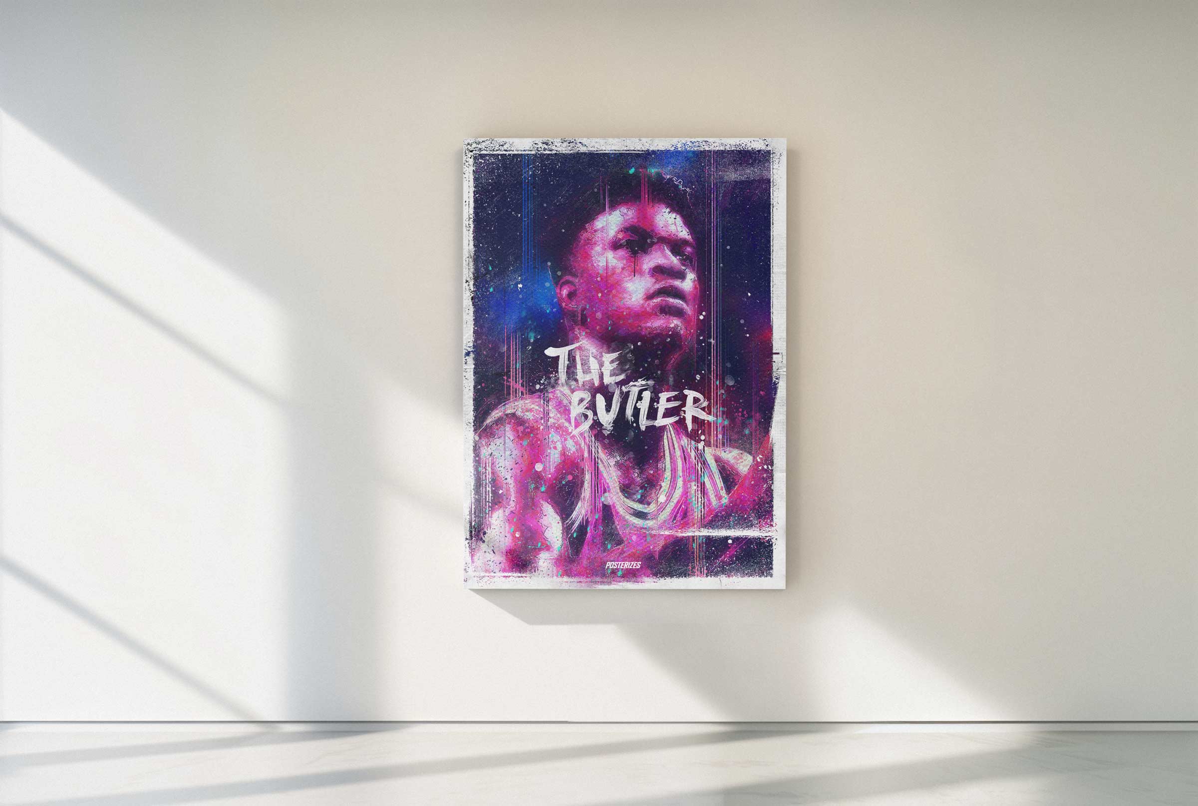
The longer the project ran, the clearer it became that Posterizes was quietly redefining how sports art could exist within the broader media landscape. What began as a grassroots creative experiment evolved into a cultural reference point for designers, fans, and brands trying to understand how visual storytelling could operate at the speed of the internet. Our contributors went on to shape creative direction at agencies, sports publishers, apparel brands, and digital platforms, carrying the collective’s aesthetic DNA into the next generation of sports media. The platform itself proved that when you combine craft, timing, and community, independent creators can influence the visual identity of a global sport without institutional backing. In retrospect, Posterizes functioned as both a gallery and a laboratory, a place where the future language of basketball design was being prototyped in real time. The project started as an outlet for obsession, but it ultimately became infrastructure for an entire creative scene.
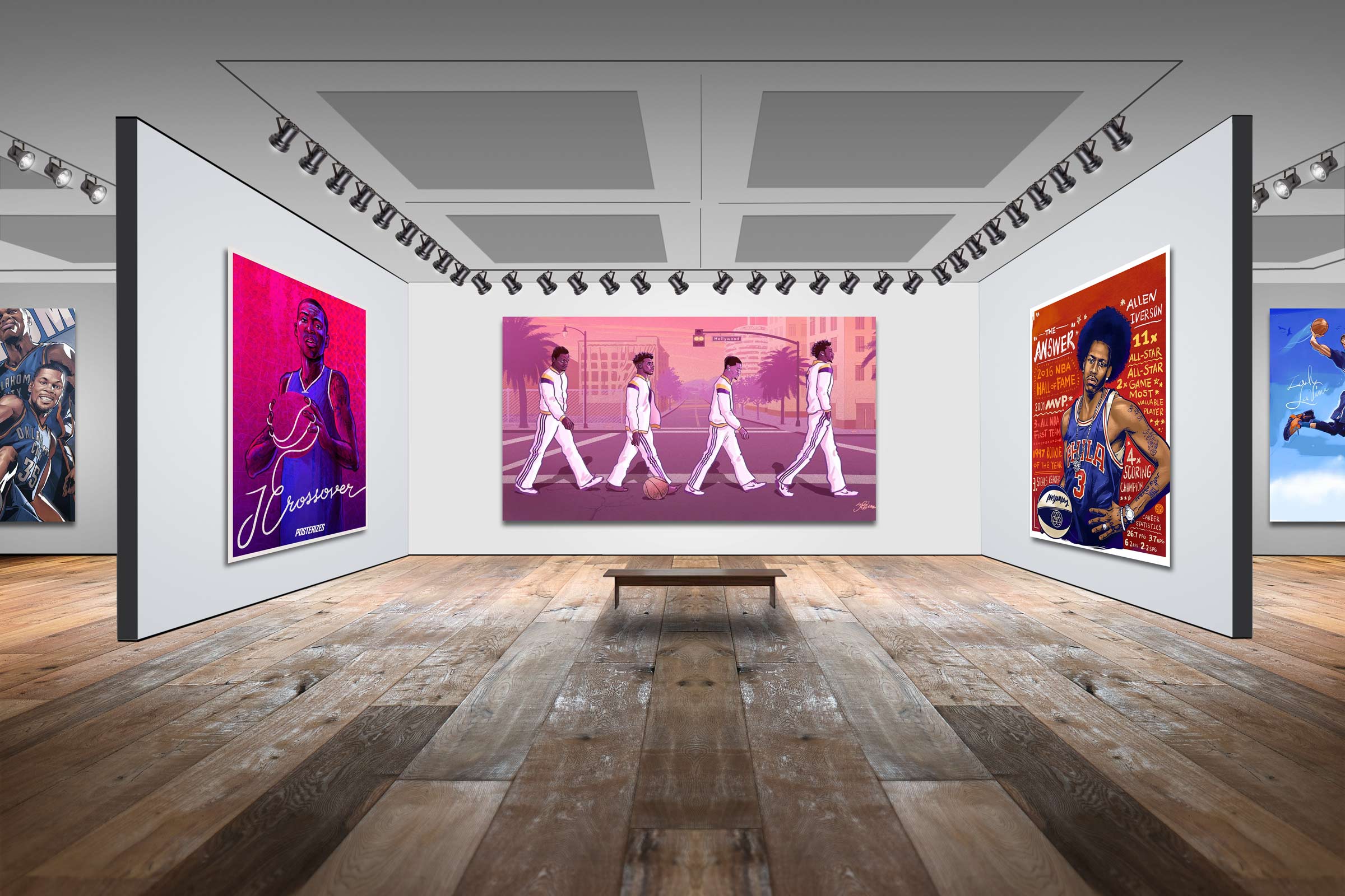
Threaded through all of this was me, a college kid running between classes while quietly building a global art collective from a dorm room. I was equal parts curator, copywriter, social strategist, recruiter, archivist, and late night image optimizer, toggling between critique threads and coursework like it was one continuous studio session. I believed deeply in the work, not as content but as culture, and I treated every wallpaper drop, magazine issue, and social post as a small act of authorship in a space that had not yet been formalized. The throughline was obsession with craft and an almost irrational conviction that sports design deserved infrastructure, respect, and permanence. I was not chasing virality as much as I was chasing resonance, building systems that allowed artists to feel seen and fans to feel represented. What began as fandom evolved into stewardship, and that shift shaped the way I approach creative leadership to this day.

I remember one morning in college walking into class half asleep, sliding into a seat somewhere in the middle rows, laptop still buzzing in my backpack from a late night working on Posterizes. A few minutes before lecture started, the student sitting a couple rows in front of me opened his laptop and there it was, one of my Dirk wallpapers stretched across his screen in full resolution. I froze. He had no idea the person who helped concept and publish that piece was sitting directly behind him. It was one of those surreal, small world moments where the internet collapses into real life and fandom becomes tangible. After class I tapped him on the shoulder, asked about the wallpaper, and when he told me he downloaded it from Posterizes I laughed and told him I was one of the founders. We ended up talking for almost an hour about design, basketball, and Dirk’s footwork, and that random exchange turned into a friendship that still exists today. All from a wallpaper quietly living on a college laptop.

Posterizes is the reason I have a design career decades later. It was the proving ground where I learned how to build a brand from nothing, how to rally talent around a shared vision, and how to translate cultural timing into creative output that actually moves people. Long before titles or budgets, it taught me how to think in systems, how to distribute ideas with intention, and how to treat design as both craft and catalyst. Every role I’ve stepped into since traces back to those early nights building pages, writing copy, pushing posts, and obsessing over pixels with Tyson and the crew. Posterizes was not a side project. It was the foundation.
One of the wildest full circle moments came when I realized that my Dallas Mavericks NBA Championship wallpaper was not only circulating online but physically printed and hanging in Mark Cuban’s office. You can spot it in a video tour at around the twenty six second mark, framed and living on the wall of a billionaire who actually owns the team we were celebrating. That is when it hit me that this was never disposable social media output. The work had crossed over into permanence. I know that Shaquille O'Neal has my Kobe artwork in his home, and Harrison Barnes owns pieces Tyson created, which still feels surreal to say out loud. These were the same players and executives we once admired from a distance, now choosing to live with art born from our collective. It is humbling and slightly unbelievable to think that something built in dorm rooms and late night Photoshop sessions now hangs in offices, homes, and private spaces of the people who define the game. That kind of staying power is the real measure of impact.

One of the deeper truths about Posterizes is that it did not simply respond to basketball culture, it quietly helped shape how a generation visually remembers it. Every era of the NBA carries its own iconography, from printed bedroom posters of the Jordan years to glossy sneaker campaigns of the 2000s. The 2010s became the age of digital reinterpretation, and our collective became part of that era’s aesthetic memory. Fans did not just recall highlights, they remembered stylized compositions, bold typography, surreal color grading, and emotionally amplified visuals that lived on their lock screens for months at a time. Those designs became embedded in daily life, shaping how moments were internalized long after the final buzzer. In that sense, Posterizes was not decorating history, it was co-authoring its visual archive. We helped define what that decade of basketball looked like through the eyes of the internet-native fan.

Posterizes was an early proof point that I could build a culturally resonant brand system from scratch, then scale it through a disciplined operating model. It taught me how to create taste at the top, then translate that taste into scalable formats, templates, and release mechanics. It also trained me to lead creatives through clarity instead of control, which is the core skill of modern creative direction. The work demanded cross functional thinking, because success depended on design, editorial, engineering constraints, and growth strategy working together. I learned to treat metrics as signals without letting metrics dilute the creative point of view. Most importantly, it showed me that community is not an audience you talk at, it is a network you build with. That mindset is directly transferable to any global consumer platform where identity, expression, and culture drive engagement. In hindsight, Posterizes was not a side project, it was a full stack rehearsal for leading at scale.
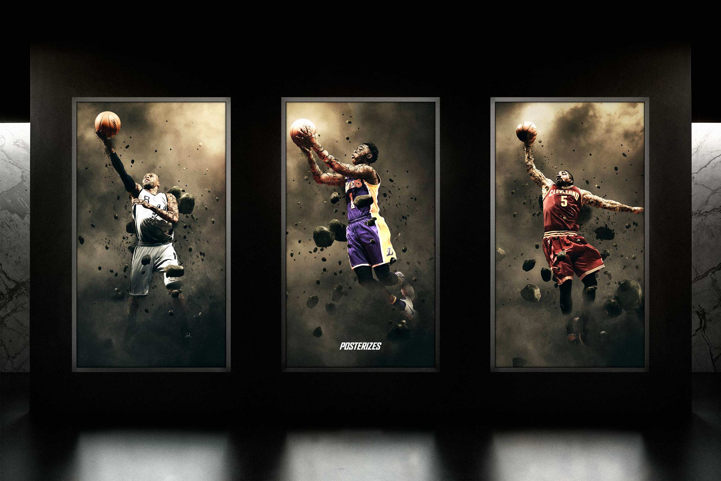
For what it's worth, Posterizes was not simply a website or a collective. It was proof that fandom is creative energy waiting for structure. By pairing craft with infrastructure and community with clarity, we demonstrated that grassroots design culture could scale globally without losing authenticity. The standards we set became expectations others later adopted as baseline. Its impact is visible not only in the careers it launched, but in the visual language now considered normal across sports media. What began as a solution for fragmented wallpapers evolved into a cultural blueprint. The momentum was cultural before it was commercial. The infrastructure may dissolve, but the imprint does not.

At a certain point, Posterizes stopped being about wallpapers, traffic, or even basketball. It became about authorship in a world that increasingly flattens individuality. It proved that when people are given structure without being stripped of voice, something richer than content emerges. What we built was not a product in the traditional sense, it was a permission slip for creative participation at scale. It showed that fandom is not passive consumption but a form of identity construction, and that design is one of its most powerful dialects. In a media landscape obsessed with speed and volume, we chose care and cohesion. That choice compounded. The real legacy is not in the files we exported, but in the standards we normalized and the confidence we helped cultivate in others. It showed that obsession, when organized, becomes leverage.
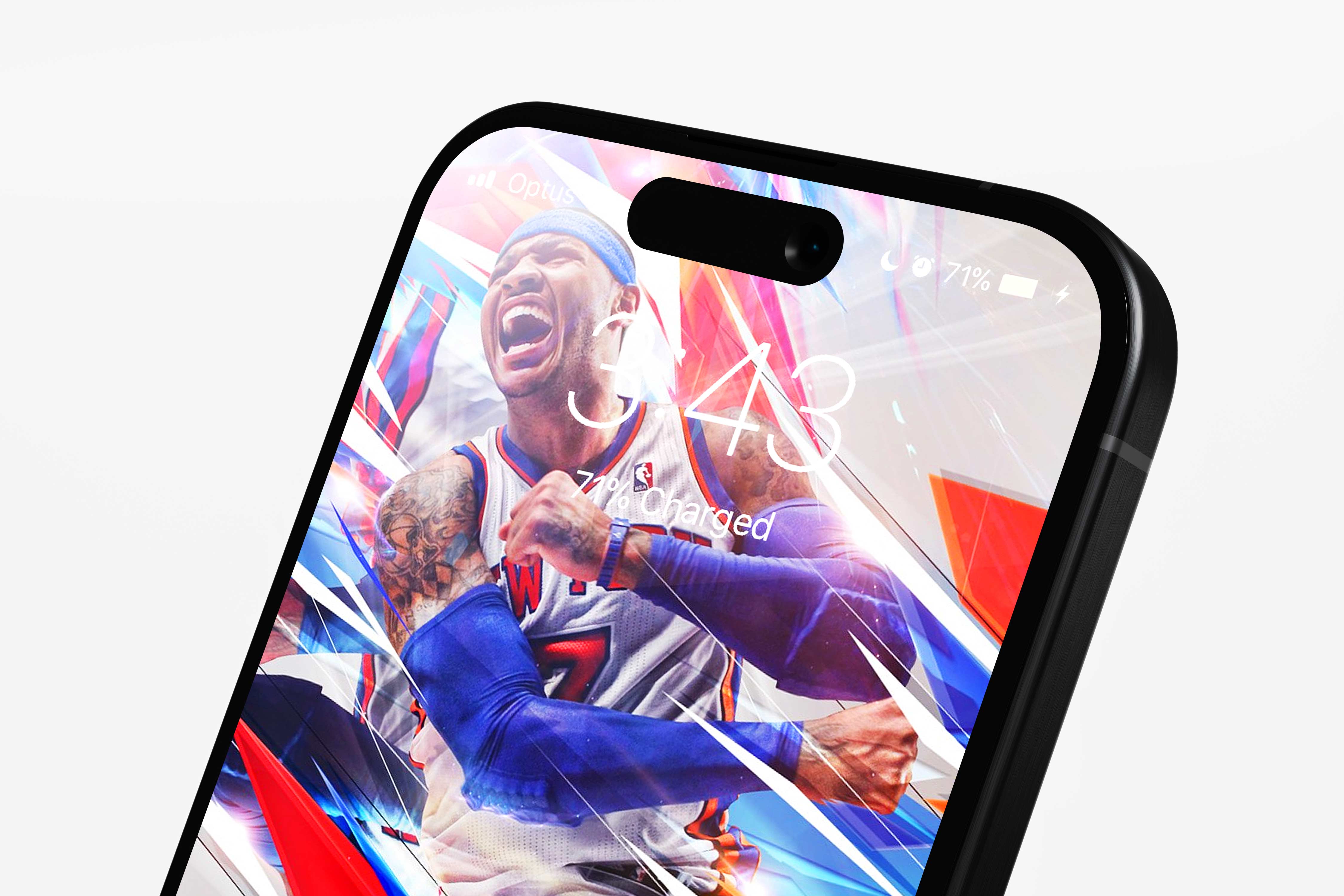
Looking back, I see Posterizes as a rehearsal for a larger belief about culture and systems. Creativity does not thrive in chaos alone; it thrives when chaos is given scaffolding. Community does not form because a platform exists; it forms because people feel seen within it. The project reinforced that taste, when applied consistently and generously, becomes infrastructure. And infrastructure, when built around passion rather than extraction, becomes durable. What started as two fans trying to solve a fragmentation problem became proof that small, aligned groups can influence the aesthetic direction of entire industries. In the end, Posterizes was less about sports design and more about demonstrating that when craft, timing, and belief intersect, culture moves. It showed that design can move culture, not just decorate it.

Posterizes worked because it combined three forces rarely aligned at once: cultural fluency, operational discipline, and uncompromising taste. Many fans had passion but lacked systems. Many platforms had systems but lacked soul. We operated inside both worlds simultaneously. Speed without sloppiness, scale without dilution, community without chaos. That balance is difficult to manufacture. It was earned through iteration. Posterizes emerged in a narrow window when the internet still rewarded independent scenes and before algorithmic homogenization flattened visual experimentation. That timing allowed a small, obsessive collective to meaningfully influence visual norms before the space professionalized and became super corporate and commercial, this was truly the origin story and the wild west.
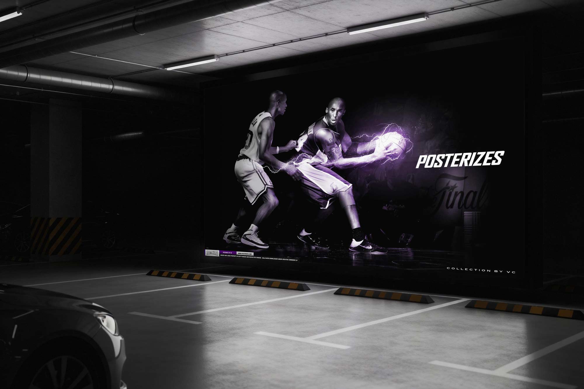
At the time, most wallpaper destinations and websites that were around relied on aggregation, inconsistent resolution standards, and heavy ad saturation that degraded the user experience. Official league imagery prioritized photography over stylized interpretation, leaving little room for fan-authored mythology. We positioned Posterizes between those extremes: curated rather than scraped, expressive rather than corporate, premium without being paywalled. Quality control was non-negotiable. Where others optimized for volume, we optimized for taste. That distinction created trust. And keep in mind this was all before MKBHD released his famous wallpapers app.
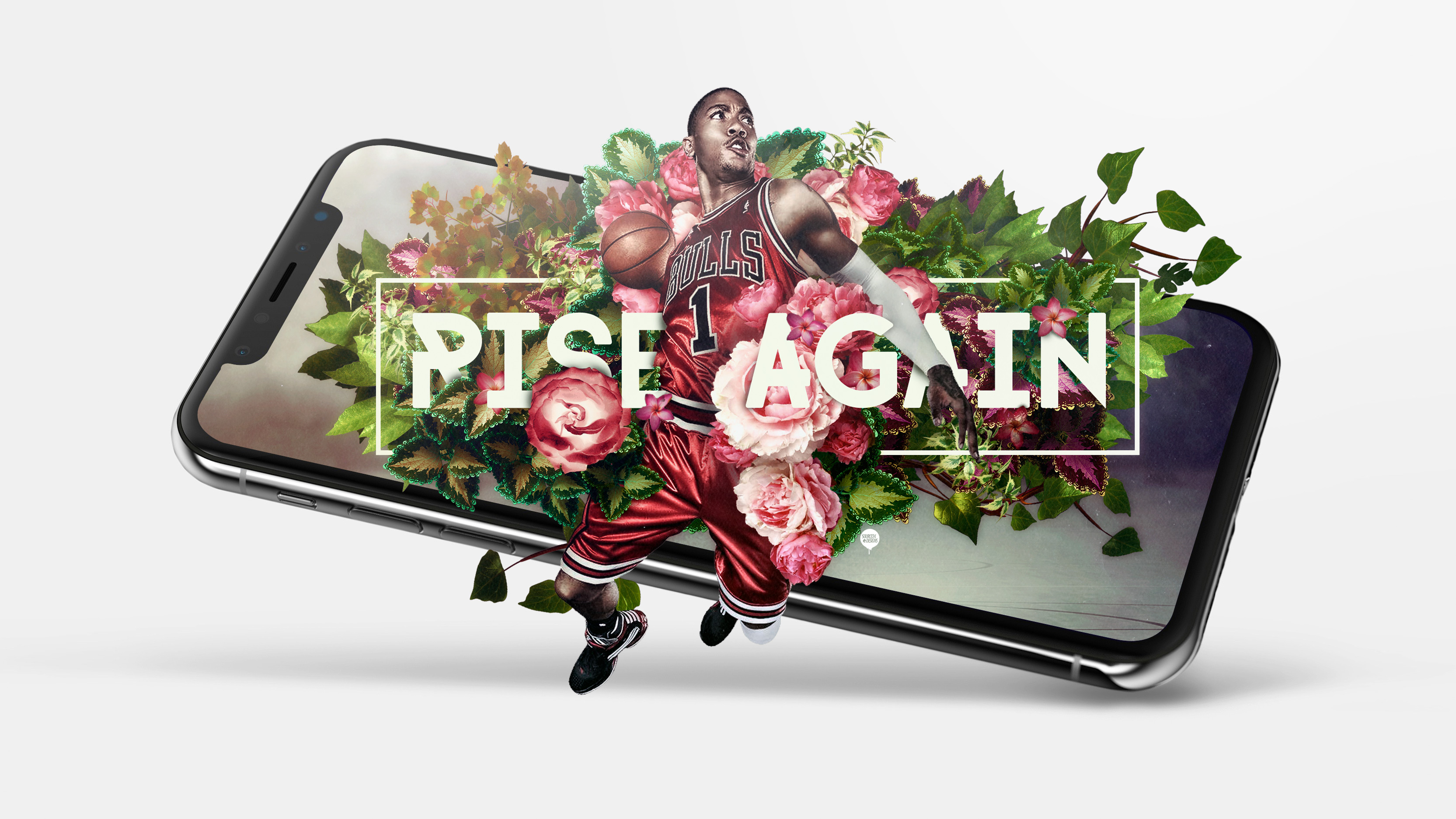
More so than anything, I think the legacy of Posterizes lives on in the work of the creatives on the team that collaborated together in this endeavor, so shoutout to all the artists involved: Tyson Beck, Tak Wong, Ryan Hurst, Matt Sanoian, Vince Chang, Chad Gersky, Chris Francis, Caroline Blanchet, Roger Huang, Saimonas Lukoskas, Melvin Rodas, Gary Chen, Daniel Goldfarb, Kenton Hessler, Dariusz Ejkiewicz, Karmo Ruusma, Kwang, Gabriela Bury, Bartek Banaszczyk and so many more who contributed or were a part of the collective in some form or another. It really was a one of a kind coming together of artists who all contributed to the sports art landscape and hopefully inspired many more to do the same as the industry grows and more and more artwork is created around this sport. Posterizes is glad to be a part of that evolution and a platform that helped grow and establish it to what the landscape has ultimately become today. The legacy is visible in today’s sports design language, not our metrics alone.

In the end, Posterizes achieved the rare outcome most community platforms claim but never reach: it made itself less necessary by empowering people beyond it. Once contributors developed independent audiences and direct pipelines to brands, teams, agencies, and publishers, the mission shifted from building the hub to supporting the network. That is a more meaningful definition of success than indefinite growth, because it proves the platform created real leverage for the individuals inside it. Looking back, Posterizes was a case study in building cultural gravity through consistency, taste, and community design rather than paid acquisition. It validated that fandom plus craft plus timing can create durable business value without turning the culture into a commodity. The relationships formed became long term creative alliances that continue to show up across the sports media landscape. The platform’s legacy is visible in the work people ship today, and in the standards audiences now expect as normal.
Key Collaborators: Tyson Beck, Tak Wong, Ryan Hurst, Matt Sanoian, Vince Chang, Chad Gersky, Chris Francis, Caroline Blanchet, Roger Huang, Saimonas Lukoskas, Melvin Rodas, Gary Chen, Daniel Goldfarb, Kenton Hessler, Dariusz Ejkiewicz, Karmo Ruusma, Kwang, Gabriela Bury, Bartek Banaszczyk, Jimmy Mitchell, Jack Perkins
Tools: Adobe Creative Suite, Adobe Illustrator, Adobe Photoshop, Adobe After Effects, Figma, Cinema4D, Blender, Final Cut Pro
Deliverables: Wallpapers, Digital Magazine, Artwork, Prints, Art Gallery, Video Content