

I was brought in alongside Will Leivenberg to help build the brand foundation for The Cool Down, a climate-focused media company founded by former Bleacher Report CEO Dave Finnochio. The mandate was to create a modern, commerce-enabled, social-first media brand that could make climate action feel accessible, practical, and even optimistic for everyday consumers rather than overwhelming or guilt-inducing. Working in close partnership, Will and I defined the core brand messaging, positioning, and ethos, shaping a voice that balanced urgency with empowerment and reframed sustainability as a series of attainable lifestyle choices rather than abstract global sacrifice. From there, I led the development of the brand’s visual identity and design system, translating those strategic principles into a cohesive look and feel that could scale seamlessly across web, social, video, and broadcast environments. My work focused on building a flexible, modular design language that felt contemporary, friendly, and commerce-ready, enabling the platform to move fluidly between editorial storytelling, product recommendations, and partner integrations without losing trust or clarity. This included establishing typography, color systems, motion principles, and layout frameworks optimized for mobile-first consumption, as well as templates and guidelines that empowered internal teams to produce high-volume content while maintaining brand consistency. We were intentional about avoiding the visual tropes of traditional environmental media, instead creating a tone that felt fresh, solution-oriented, and culturally relevant, helping audiences see sustainable choices as desirable and achievable within their existing lifestyles. The result was a scalable brand ecosystem designed to support a new category of climate media, one that merges storytelling, commerce, and community to drive measurable behavior change while remaining approachable and optimistic in the face of a complex global challenge.

Angel investors include The Ringer founder Bill Simmons, former Credo Beauty CEO Dawn Dobras and music and marketing entrepreneurs Rick Farman and Richard Goodstone.
My primary challenge in leading the creative direction and branding for The Cool Down was developing a comprehensive Brand Guidelines Kit that could anchor the company’s market fit while scaling across a rapidly evolving media landscape. This included defining brand positioning, designing the logo and visual identity, establishing a color palette and custom typography, creating bespoke iconography, and building a motion and broadcast package that unified the brand across video, social, web, and experiential touchpoints. Beyond the tangible assets, I provided overarching art direction and strategic positioning, ensuring every visual and narrative decision reinforced a clear, differentiated presence in a crowded climate and sustainability space. More than a media company or lifestyle brand, The Cool Down was conceived as a rallying cry: to cool down the earth and, equally important, to cool down the polarized climate conversation. The brand needed to feel like an open invitation rather than a moral directive, encouraging participation across political, cultural, and socioeconomic lines. Designing for inclusivity in a historically fragmented and often adversarial category required careful calibration of tone, language, and visual warmth. The challenge was to create a system that felt optimistic and empowering without trivializing the urgency of the issue, positioning the brand as a trusted guide for practical action rather than an arbiter of guilt or purity. To futureproof the brand, I developed a robust, modular design system capable of functioning seamlessly in situ across digital platforms, social feeds, broadcast environments, live activations, and emerging channels. The system was intentionally multi-pronged: flexible enough to support high-volume content production and commerce integrations, yet structured enough to maintain coherence as the organization scaled. By building a framework that could evolve with new formats, partnerships, and audience behaviors, the brand was equipped not only for immediate launch but for long-term growth, ensuring The Cool Down could remain culturally relevant, operationally efficient, and visually consistent as it expanded its mission to make climate action approachable for everyone.


.jpeg)
.webp)

When I look for design projects to take on, one of the most important filters is whether the mission genuinely resonates with my values and the kind of impact I want my work to have in the world. That alignment was immediately clear when I had the opportunity to collaborate again with former Bleacher Report CEO Dave Finocchio on his new venture, The Cool Down. Dave has always been drawn to building platforms that sit at the intersection of culture, technology, and behavior change, and this project carried that same DNA, this time focused on disrupting the climate media landscape. The Cool Down set out to create a unified destination that could cut through the noise, misinformation, and fragmented storytelling that often make climate issues feel overwhelming or inaccessible to everyday audiences.
What drew me in was the ambition to reframe climate not as an abstract crisis but as a set of practical, actionable choices embedded in daily life, from energy use and consumer habits to policy awareness and community action. The platform’s goal of becoming a one stop hub for credible information, solutions, and lifestyle shifts required a brand system that felt trustworthy without being alarmist, optimistic without being naive, and inclusive without diluting urgency. Designing for that balance meant thinking beyond aesthetics and into behavioral design, creating a visual and narrative language that invited participation rather than shame, and that empowered users to feel like contributors to progress rather than spectators to catastrophe. The result was an identity built for credibility, scalability, and sustained cultural relevance.
Working on The Cool Down also represented a continuation of a long-standing creative partnership built on mutual trust and a shared appetite for building category-defining brands. Dave’s clarity of vision and willingness to invest in design as a strategic lever made it possible to push beyond surface-level branding into a fully integrated ecosystem that could scale across editorial, product, social, and experiential touchpoints. In a media environment saturated with performative sustainability messaging, our aim was to build something grounded, useful, and culturally fluent, a platform that could make climate action feel less like a burden and more like a collective movement people actually wanted to be part of. From a creative direction standpoint, the mandate was to build an ecosystem that could metabolize complexity and output clarity, ensuring that each artifact, whether a social tile, explainer animation, or commerce module, reinforced a cohesive worldview.

The core concept really hinges on using social and web to launch a media coverage arm that then builds an audience by which a sustainable marketplace can be created. As climate change becomes more mainstream, more money will flow toward eco-friendly goods which creates an opportunity in becoming a trusted source for climate change content, so that one day The Cool Down can be a trusted voice in sustainable purchase recommendations and climate e-commerce.
As can be seen in the launch video which I created from scratch above with some help from my old friend Mikey Navarro on the sound design, we really are at a tipping point moment with the climate change conversation, especially when you look at the geo-political factors around war, inflation and the pandemic all push us towards more sustainable forms of societal living. Having previous experience building Bleacher Report, Dave knew I could be trusted to bring the right vision.
The Cool Down emerged at a moment when the media ecosystem was saturated with alarmist headlines, fragmented data, and performative sustainability messaging that left audiences informed yet immobilized, aware of the crisis but unsure how to participate in solutions. What was missing was a trusted, mainstream bridge between climate awareness and practical action, a platform that could translate complex environmental issues into tangible lifestyle choices, cost savings, and community impact. As climate change increasingly intersects with everyday consumer decisions such as energy use, transportation, home upgrades, and purchasing behavior, the market for clear, actionable guidance has expanded beyond niche environmentalists to include homeowners, renters, families, and value driven shoppers seeking both economic and ecological benefits.
We addressed this gap by positioning climate not as a distant catastrophe but as an immediate quality of life issue tied to health, affordability, resilience, and long term financial security. In doing so, it unlocked a massive addressable audience and advertiser category spanning clean energy, sustainable goods, home efficiency, mobility, and circular economy solutions, all of which require consumer education to drive adoption. By reframing climate action as accessible, aspirational, and economically rational, The Cool Down helped shift the narrative from sacrifice to empowerment, creating a media model that aligned public interest with market incentives and positioned sustainability as a default rather than an exception. This system turned climate complexity into an interface people could navigate with confidence.

Dave tapped me in through my former colleague Will Lievenberg who I worked with on the Just Women's Sports rebrand and the BR Media Lab and I was tasked with essentially being the de-facto creative director for the brand in those early startup stages and building up it's ethos, pillars and visual look and feel while Will developed it's messaging. Having a bit of a sandbox to enjoy experimentation and initial brand exercises, Will began researching target audiences while I figured out the finer aspects of brand design. Dave, Nina, Anna and the entire founding team at The Cool Down was a pleasure to work with and seemed to really resonate with our approach.
I created the video above, with the iconic Rage against the Dying of the light poem to showcase the mission and purpose of the brand and it acted as a north star while developing the branding, finally getting to complete the outro once I had finalized the look and feel. It does a great job of showcasing the passion and inspiration behind this company and the whole branding, it really is meant to feel like a dynamic lightbulb moment. In the end, the brand balanced urgency and optimism without slipping into performative moralism. The work positioned The Cool Down as a translator between daily life and planetary consequence. One critical dimension of the project involved translating brand philosophy into an operational design framework that could function across a fragmented and constantly shifting digital media environment. Climate storytelling touches editorial, commerce, data visualization, social distribution, and partner integrations, so the design system needed to operate less like a static style guide and more like a scalable infrastructure layer for content production.
I approached the identity as a modular toolkit composed of repeatable components, adaptive grid logic, and flexible container systems that could support high-velocity publishing without sacrificing brand cohesion. This architecture and broad design system with functional elementsallowed editorial teams, product managers, and social producers to move quickly while still maintaining a consistent visual language across touchpoints. Every artifact, whether a news graphic, product explainer, affiliate module, or newsletter tile, was engineered to inherit the same typographic hierarchy, color logic, and compositional rhythm.
The goal was to reduce operational friction while simultaneously elevating the perceived credibility and clarity of climate communication. In practice, the brand system became a connective tissue between storytelling and action, ensuring that complex topics could move fluidly from awareness into practical guidance and measurable behavioral change. By embedding these principles directly into the design infrastructure, The Cool Down was positioned not simply as a publisher but as a platform capable of scaling influence, trust, and real-world impact across an evolving climate economy and crowded space where it is trying to gain traction and stand out to raise investment.
Since the beginning, media businesses have been in the game of building audience segments and mobilizing those audiences to do something. Most American media has learned how to mobilize audiences on various platforms to click or view ads. To buy stuff. But in the wake of the climate crisis, there are certainly better uses of our time online and purchasing power, especially in an era of click to buy and fast fashion. In order to make this daunting and often anxiety inducing subject more accessible and actionable, we needed to be very practical in our design thinking as well. It became a modular operating system for storytelling, commerce, and behavior change - a unique balance.
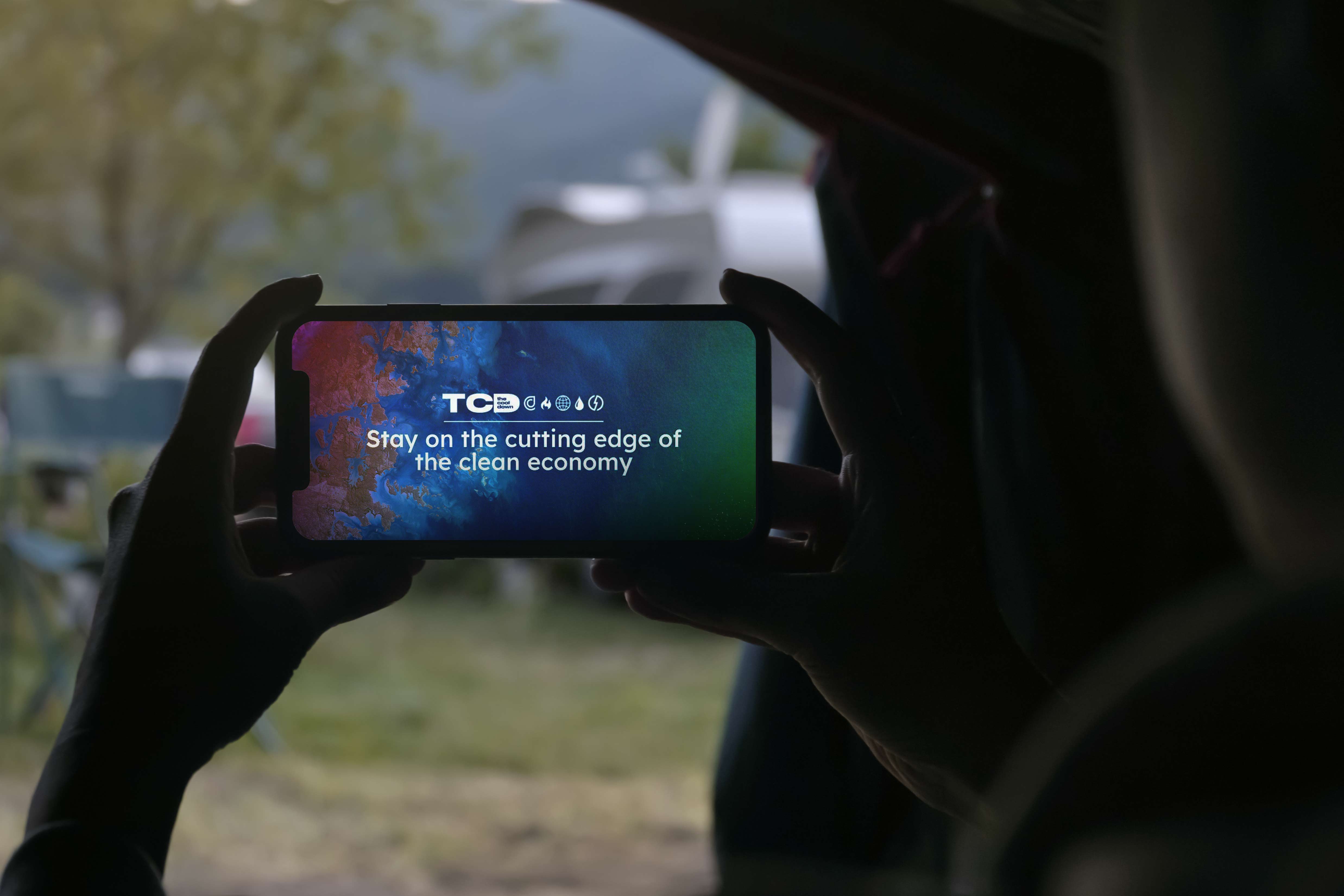
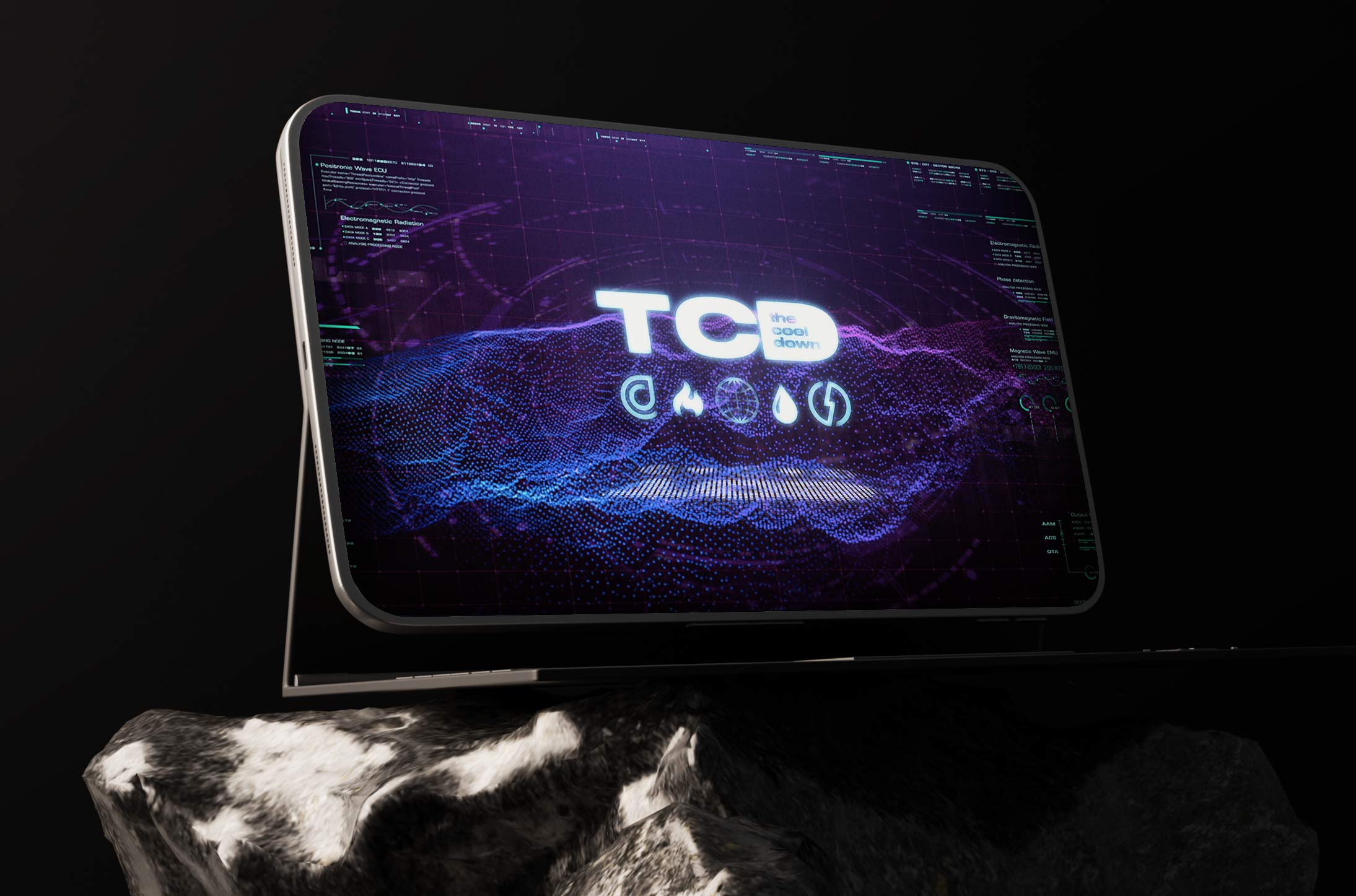
Humanizing a fragmented space meant taking a strong and evocative typeface that would have a sense of gravitas but it wouldn't be too overwhelming of a presence. It was a tough balance to strike and needed to do a lot of heavy lifting for any logo, and I felt like something more robust might be needed compared to other executions. The Cool Down enters as a social voice that curates content and builds audience while informing them. This is the positioning of the brand and where my initial ideation began when I was coming up with logo concepts and sketching out how to bring this to life. Every touchpoint reinforced trust, legibility, and a sense of practical momentum.

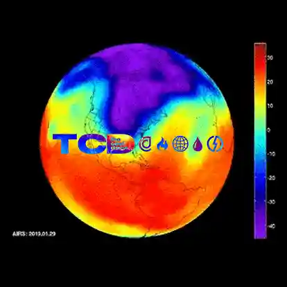
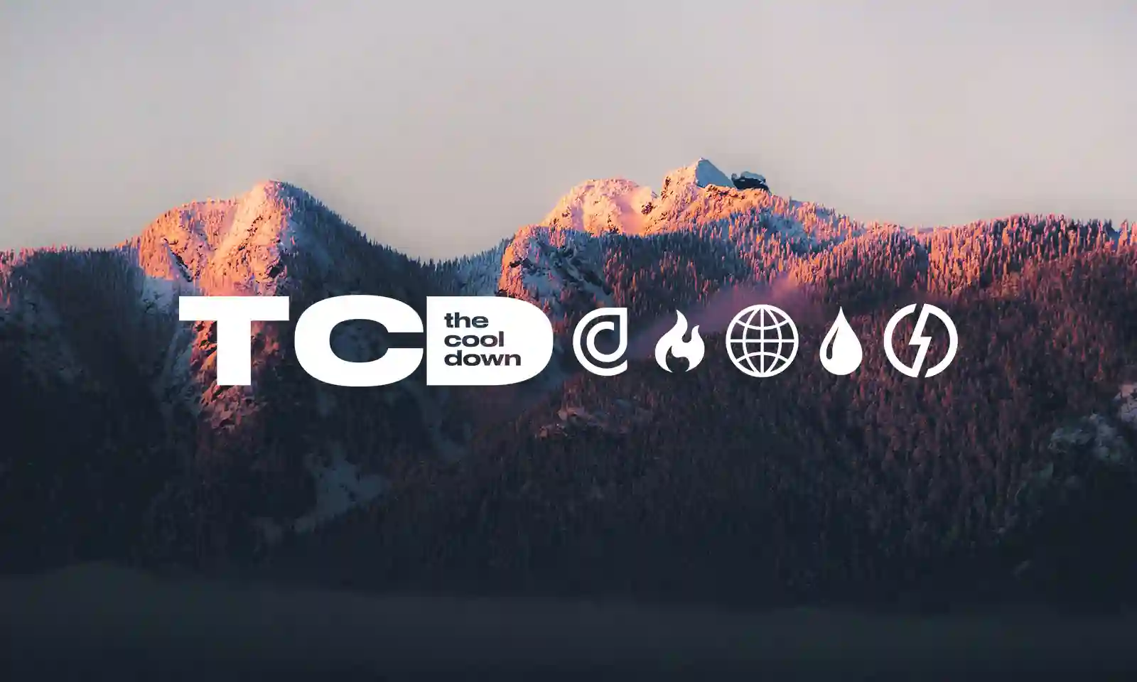
A lot of the inspiration was drawn from meteorology and climate science, in an effort to take the more dry and less engaging informational material and turn it into a design language to help humanize the subject. I took cues from everything from the old Walt Disney World logos which harken to the era of Tomorrowland and the monorail to the clean features of the UN logo and it's ubiquity. I also tried to take some cues from media companies like The Next Web to showcase that we are a trusted news source. However there was also something very cool about how MTV used their logo as a clipping mask for music video content to give it some flair and personality, so I was definitely also inspired by that. The foundation we built gave the team leverage, velocity, and long-term coherence and so this initial logo development phase was so key.
Beyond editorial and social expression, I approached The Cool Down as a systems design challenge, building a framework where content, commerce, and community could operate as interdependent layers rather than siloed functions. The platform architecture was informed by modular thinking, ensuring that product recommendations, educational explainers, and partner integrations could coexist within a unified narrative flow.
This meant designing UI patterns and design systems and content containers that allowed users to move frictionlessly from inspiration to action without cognitive overload. Every touchpoint was evaluated through the lens of behavioral design, asking how visual cues, microcopy, and hierarchy could reduce decision fatigue and encourage incremental lifestyle shifts. The result was a brand experience engineered not only to inform but to activate. We treated design not as surface treatment but as strategic infrastructure, capable of shaping perception, reducing friction, and guiding behavioral momentum at scale for a brand that was launching in a space like the climate industry for a new player. Ultimately, the ecosystem made sustainability feel aspirational, attainable, and economically rational.

At the core of The Cool Down was an editorial backbone engineered for scale: journalist-driven news and solution coverage designed to win on search, earn trust, and convert intent into action. Anna brought the newsroom rigor and editorial sensibility to build credibility, while Dave applied the Bleacher Report and House of Highlights playbook of audience-building, distribution, and repeatable formats, extending that DNA into newsletters and social channels that could compound attention week after week. The ecosystem was built to move fluidly from SEO-first discovery and evergreen guides into high-retention owned channels, then into affiliate-driven recommendations and partner integrations that translated education into measurable revenue without compromising integrity. My role was to unify those moving parts into one coherent system, using design as strategic infrastructure: a visual language, information hierarchy, and modular template kit that made complex climate topics feel legible, made the product and commerce layers feel trustworthy, and gave the team operational leverage to publish at velocity across web, social, and email while staying unmistakably on-brand.
A critical component of the strategy involved redefining what authority looks like in climate media, shifting away from institutional distance toward informed relatability. Rather than positioning the brand as an omniscient voice, we developed a tone that felt like a trusted guide walking alongside the audience, translating complex policy, science, and supply chain realities into digestible, actionable insights. The brand was supposed to be both informative and approachable, a difficult balance to achieve in social media.
This required close collaboration with editorial and research teams to ensure accuracy while maintaining clarity and momentum in the user experience. Visual storytelling played a key role in this translation layer, using diagrams, iconography, and motion to demystify systems like energy grids, circular economies, and carbon footprints. In doing so, the brand established credibility without alienating audiences who might otherwise disengage from overly technical discourse. This positioning allowed The Cool Down to function as both a media platform and a behavioral interface, aligning storytelling with measurable impact across audience segments. In doing so, the brand established itself not merely as a participant in the climate conversation but as a cultural operating system for how that conversation is experienced, understood, and acted upon.
From a motion design perspective, I established principles that treated animation as a functional storytelling device rather than decorative flourish. Transitions were designed to mirror natural cycles, such as flows, loops, and gradual transformations, reinforcing the brand’s thematic connection to ecological systems. Micro-interactions were intentionally subtle, providing feedback that felt organic and responsive rather than mechanical. This approach extended to video packaging and broadcast graphics, where kinetic typography and gradient movement created a sense of forward momentum without overwhelming the content. By embedding meaning into motion, the brand could communicate urgency and optimism simultaneously. It proved that design can be infrastructure, not decoration, in category creation.
In shaping the brand’s commerce layer, I focused on trust signaling and transparency as primary design drivers. Product modules were structured to foreground impact metrics, certifications, and lifecycle context in a way that felt informative rather than performative. Visual badges and comparison frameworks helped users quickly understand why a recommendation mattered, while maintaining a neutral, non-judgmental tone. This approach recognized that sustainable consumption is often constrained by cost, access, and habit, and sought to empower users with context rather than prescribe purity. The commerce experience thus became an extension of editorial integrity, reinforcing the brand’s role as a practical ally to anyone looking to make a difference in their lives, even in small ways.
I also prioritized designing for cultural adaptability, ensuring that the system could scale across regions, demographics, and evolving climate narratives without losing coherence. The visual language was intentionally flexible, capable of accommodating localized imagery, vernacular expressions, and region-specific solutions while maintaining a consistent core identity. Rather than imposing a rigid aesthetic, the design framework was built to absorb cultural nuance, allowing editors and creators to reflect the realities of different communities while still operating within a unified brand system. This meant developing modular typography, adaptable color hierarchies, and layout structures that could support everything from grassroots sustainability stories to global climate reporting without feeling visually fragmented. By structuring the identity around adaptable components rather than fixed templates, the system empowered teams to produce culturally relevant storytelling while preserving brand clarity. The result was a design language that could travel across platforms and geographies without losing its sense of voice or purpose.
This foresight positioned The Cool Down to grow beyond a single-market perspective and engage audiences navigating vastly different environmental realities. Climate communication operates across a spectrum of experiences, from urban infrastructure and consumer behavior to rural land use and emerging clean technologies, and the design system needed to be capable of reflecting that diversity. By building elasticity into the brand architecture, we effectively future-proofed the identity against the rapidly shifting landscape of climate discourse and policy. Editorial teams could highlight region-specific solutions, cultural practices, and community initiatives without forcing them into a narrow visual mold. At the same time, the consistent structural backbone ensured that every story still felt unmistakably part of the same ecosystem. The work acknowledged a fundamental truth about sustainability: the movement is global, but the lived experience of it is deeply local. Effective communication in this space requires a system that can honor both realities simultaneously.
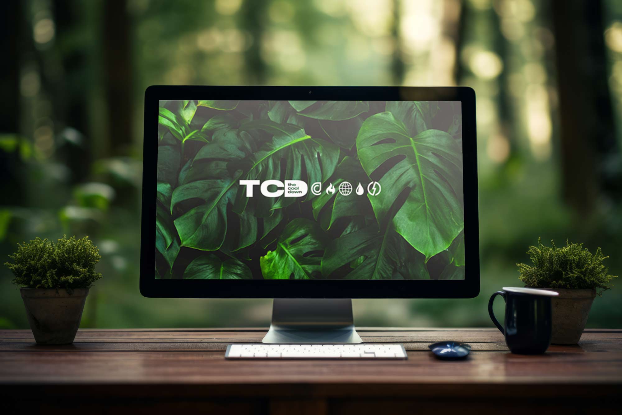
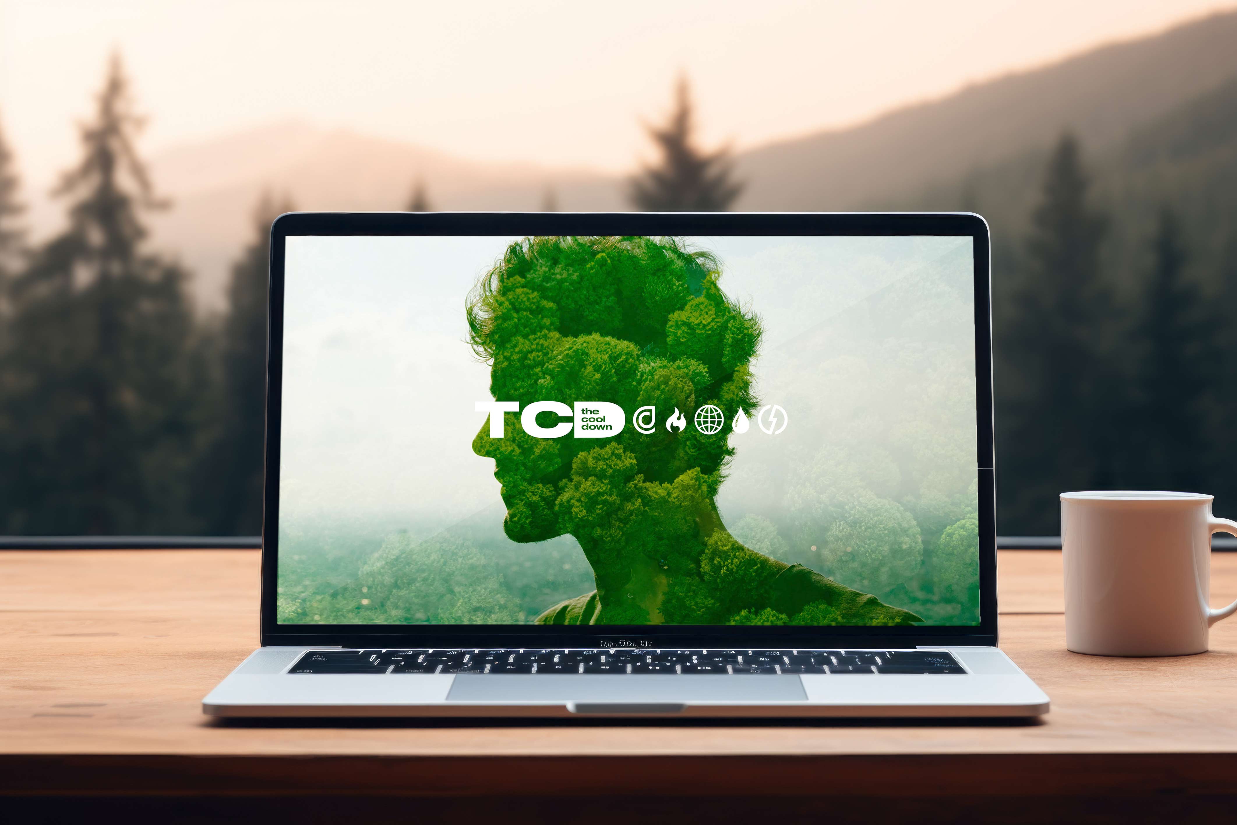
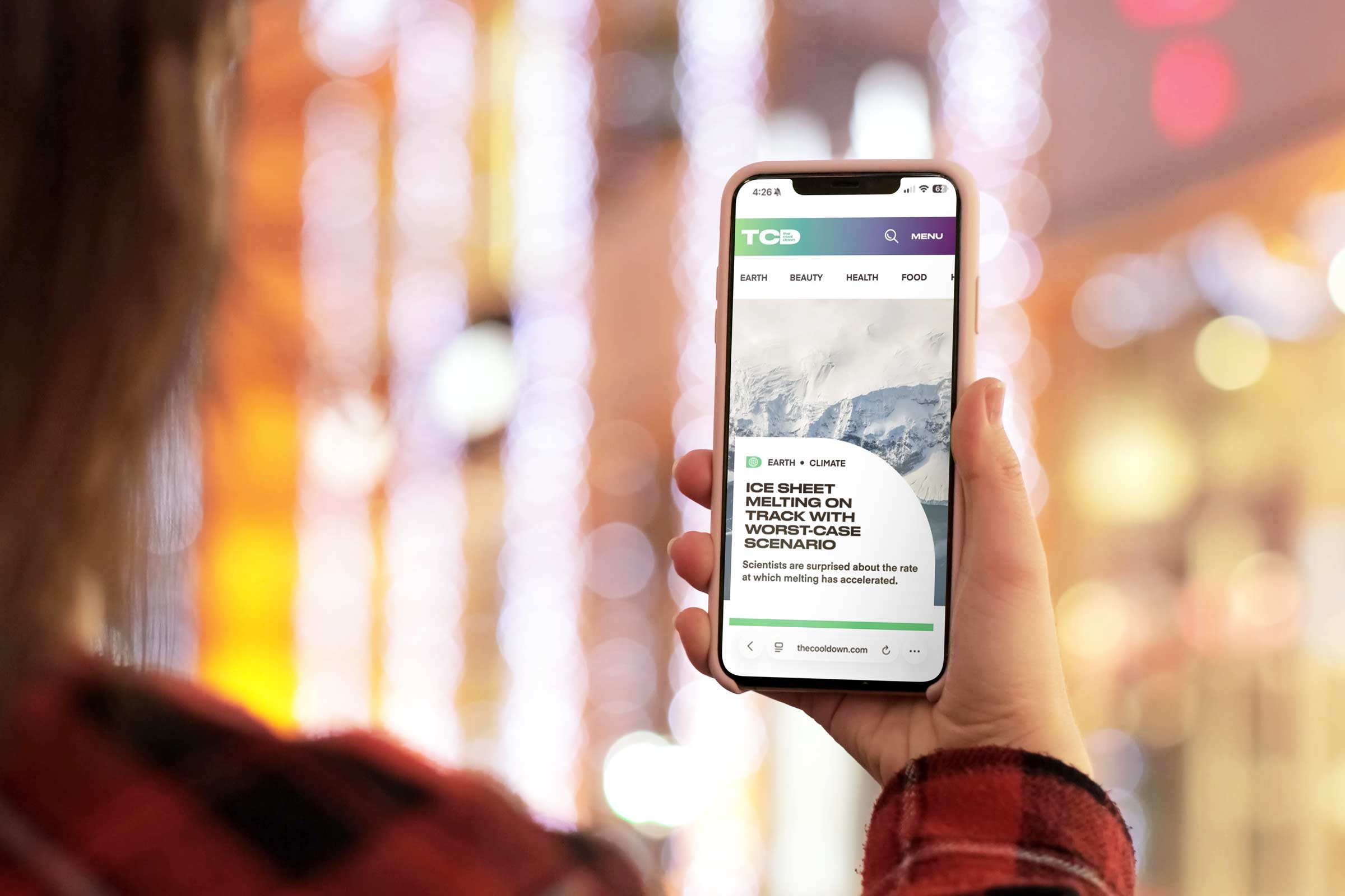
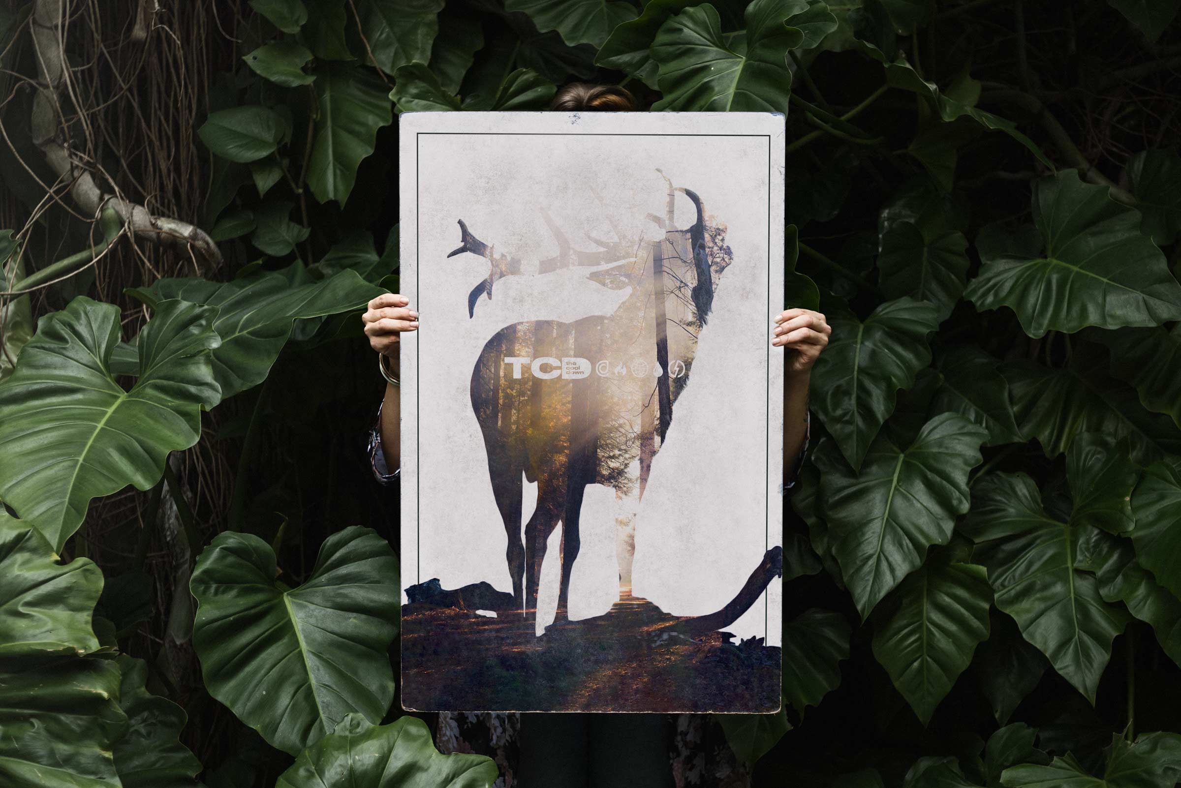
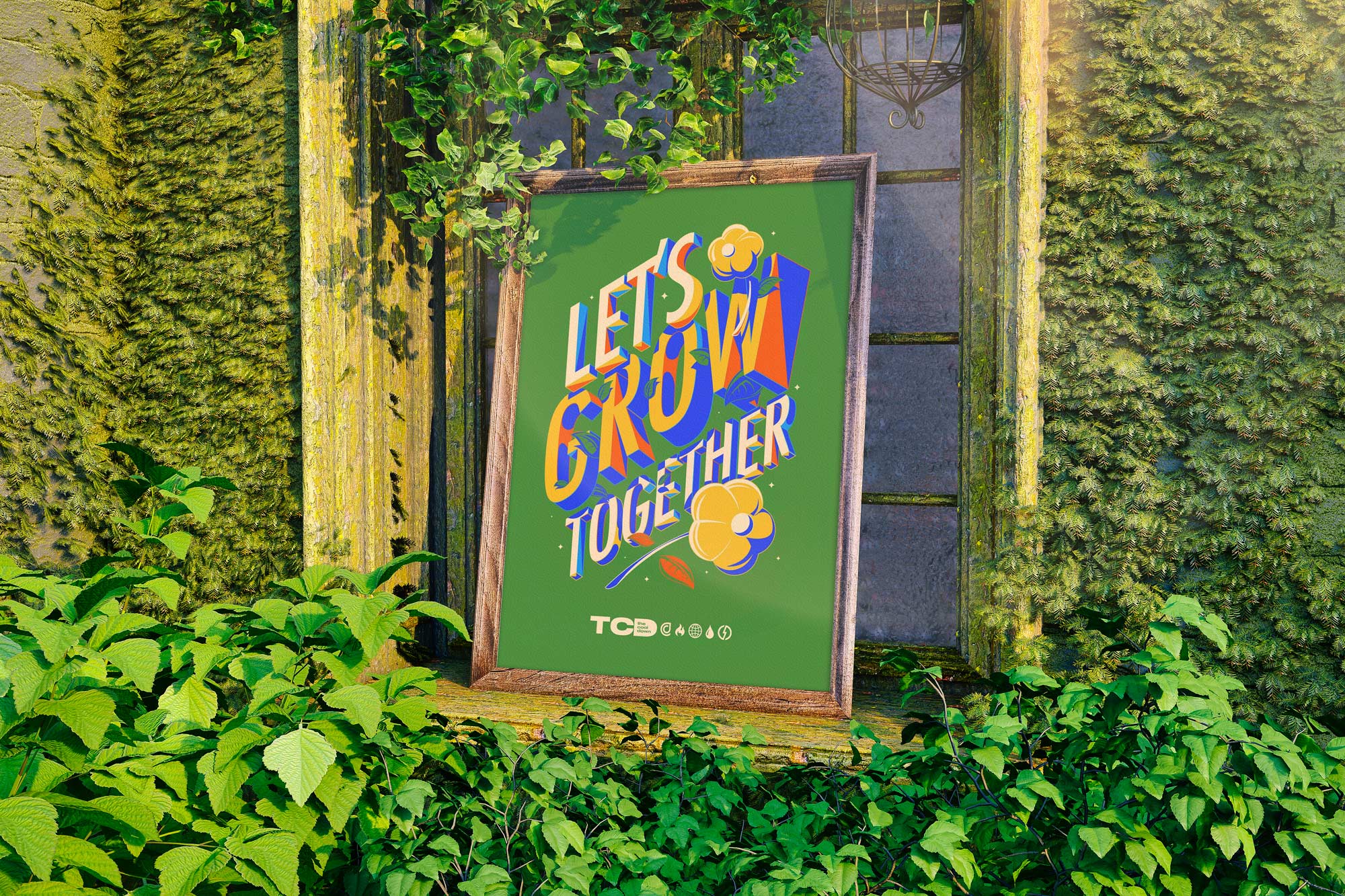
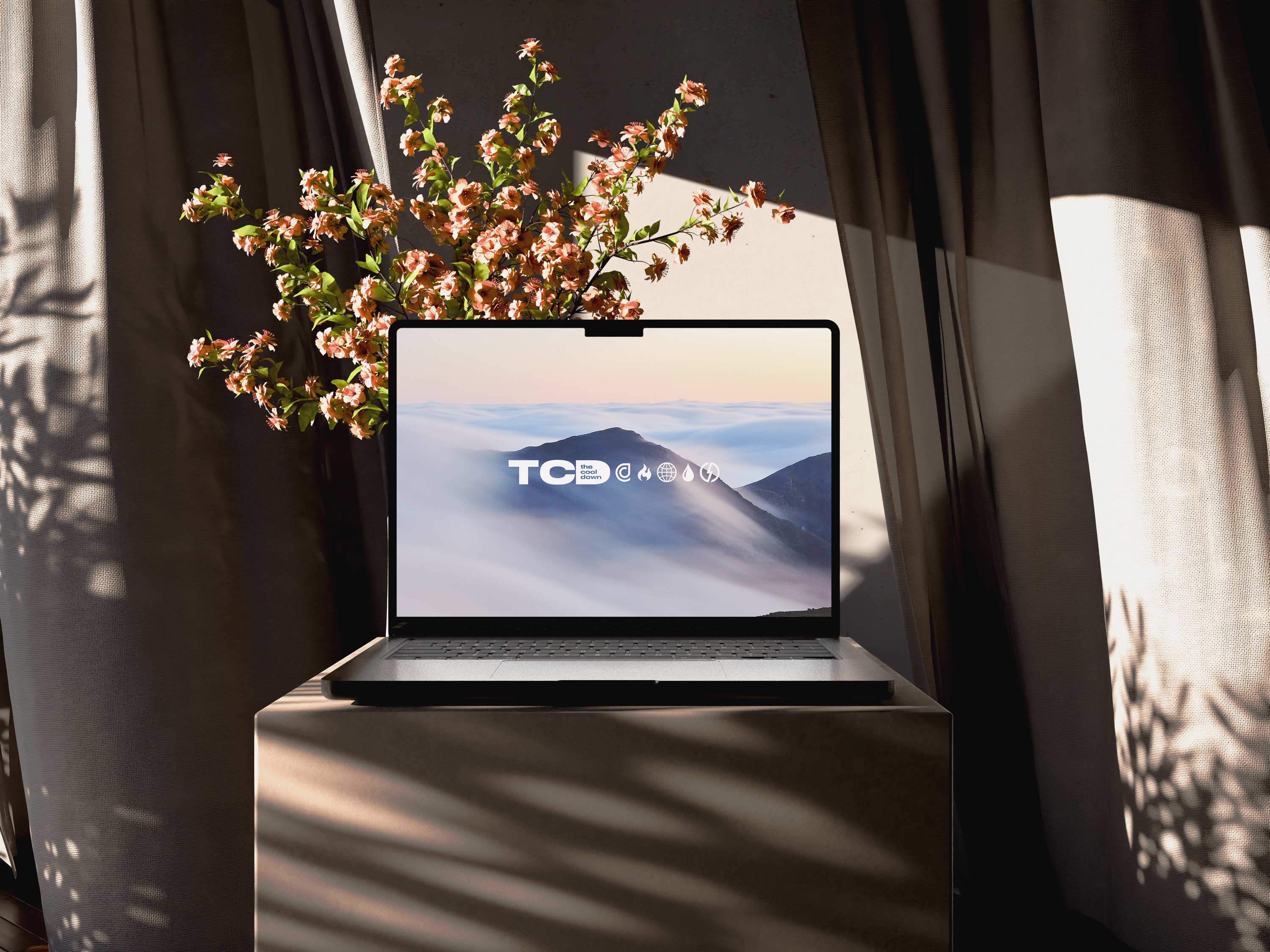
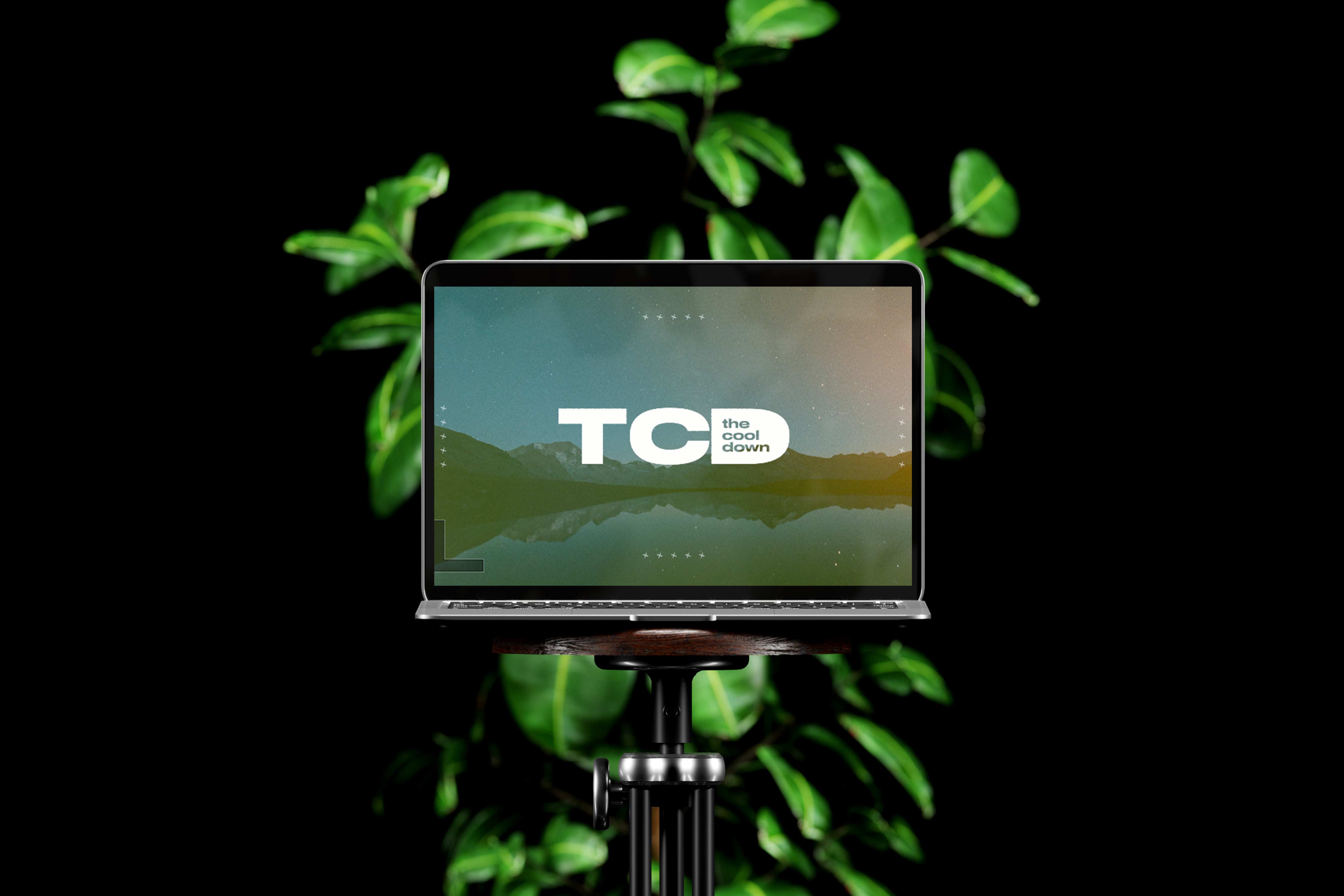
The intentional use of verdant imagery, dense greenery, and high-fidelity nature photography infused The Cool Down with a palpable sense of vitality, positioning the brand as a living, breathing ecosystem rather than an abstract media property. By curating visuals that emphasized texture, depth, and biophilic richness, from dew-laden foliage to layered forest canopies and sun-washed landscapes, we established a sensory language that conveyed renewal, abundance, and forward momentum.
This lush visual register counterbalanced the often sterile or catastrophic imagery associated with climate discourse, replacing fear-based cues with signals of resilience and regenerative possibility. The chromatic interplay between deep greens, earthen neutrals, and luminous gradient overlays created a dynamic energy that felt both grounding and aspirational, reinforcing the brand’s commitment to optimism without sacrificing credibility. In practice, these images functioned as emotional entry points, lowering cognitive barriers and inviting audiences to see themselves as participants in a thriving natural world rather than observers of its decline. The result was a visual atmosphere that felt restorative and energizing, aligning the brand’s aesthetic with its mission to make climate action feel not only necessary but deeply desirable.
Data visualization became another cornerstone of the experience, transforming abstract metrics into intuitive visual narratives that could drive understanding and retention. Rather than presenting raw numbers, we developed graphic treatments that contextualized data within everyday scenarios, bridging the gap between global trends and personal impact. Color scales, icon arrays, and progressive disclosure patterns helped users explore information at their own pace, fostering a sense of agency rather than overwhelm. This approach aligned with the broader goal of making climate literacy feel attainable and relevant. Design, in this sense, functioned as a translator between complexity and clarity and allowed the brand to function in a cinematic yet informative realm.
Ultimately, my role as a design leader was to ensure that every element of The Cool Down’s ecosystem worked in concert to reduce friction between awareness and action. The brand was never conceived as a passive content destination but as an enabling environment where users could see themselves as participants in a larger movement. By aligning visual identity, product thinking, and narrative strategy around that principle, we created a platform capable of evolving alongside the climate conversation while maintaining a consistent, human-centered core. The work reflects a belief that design, when executed with rigor and empathy, can transform daunting global challenges into pathways for collective progress. I worked closely with the core startup team and Will to launch the brand and develop its look and feel for years to come.
At the highest level, the creative positioning for The Cool Down was anchored in reframing climate engagement from a narrative of sacrifice to one of agency, ingenuity, and cultural relevance. Rather than competing in a crowded field of alarmist messaging, we deliberately occupied the whitespace between lifestyle aspiration and systems literacy, positioning the brand as both a trusted translator and a taste-maker for a more sustainable future. This required constructing a semiotic framework where visual cues, tonal calibration, and interaction design collectively signaled optimism without naivety and urgency without coercion. The brand’s voice was engineered to operate with editorial credibility while retaining the fluency of contemporary culture, enabling it to move seamlessly between policy discourse, product discovery, and everyday habit formation.
From a systems perspective, the identity was engineered as a modular toolkit rather than a fixed set of assets, enabling rapid content velocity without compromising brand coherence. Grid logic, typographic hierarchies, and componentized layout patterns were designed to flex across editorial storytelling, shoppable content, and partner integrations, creating a unified interface between media and marketplace. Social templates all had a consistent layout logic and usage of shapes and space ratios.

We leveraged tokenized color variables, responsive type scales, and adaptable container frameworks to ensure consistency across mobile, desktop, and emerging surfaces, effectively futureproofing the brand against platform fragmentation. Motion principles further extended the system, introducing subtle kinetic behaviors such as gradient shifts, parallax layering, and easing curves that conveyed energy without overwhelming the content. This approach allowed the brand to feel alive and adaptive, mirroring the dynamism of the climate conversation itself. In practice, the system reduced production friction while elevating perceived sophistication, enabling teams to execute at scale with precision. The platform was going to live across app, web, digital and social and needed to feel robust and flexible.
The brand’s visual foundation was anchored in an expansive, research-driven moodboarding process that synthesized references across climate science, outdoor apparel, contemporary editorial design, and data visualization systems to construct a cohesive yet future-forward aesthetic territory. Rather than defaulting to the overused visual clichés of environmental media, we mapped a spectrum that ranged from NASA satellite imagery and viridis data gradients to the tactile materiality of technical fabrics and the modular grid systems of modernist publishing. The Cool Down needed a comprehensive branding system and I was the right person to provide it.
The Cool Down was built at the intersection of culture and climate, translating ESG from a compliance framework into a living, breathing content ecosystem that people actually want to engage with. Rather than leading with jargon or institutional tone, we approached sustainability through storytelling, behavior change, and everyday utility, making topics like energy efficiency, consumer choices, and environmental impact feel immediate and actionable. From a creative and systems perspective, it was about designing a platform where content could educate, inspire, and convert at the same time, aligning audience growth with brand partnerships in categories like clean energy, mobility, and sustainable products. The result was an ESG-native media engine that did not treat sustainability as a niche, but as a cultural shift, positioning The Cool Down as both a trusted voice and a scalable bridge between mission-driven storytelling and measurable business outcomes.
This cross-disciplinary synthesis enabled us to articulate a brand world that felt simultaneously credible, culturally fluent, and commerce-ready. Each reference was interrogated not for surface appeal but for semiotic value, asking how color, texture, and composition could encode trust, urgency, and accessibility within a single frame. The resulting moodboards functioned as strategic alignment tools across design, editorial, and product teams, ensuring that every downstream execution laddered up to a shared visual thesis. This rigor created a brand language that was not only aesthetically compelling but operationally scalable across touchpoints and formats.
What ultimately differentiated the brand was its ability to reconcile emotional resonance with analytical clarity, a balance achieved through deliberate visual storytelling frameworks. We treated every composition as an ecosystem of signals, where imagery, typography, iconography, and color worked in concert to guide attention, establish hierarchy, and reinforce meaning. Moodboard inspiration from biophilic design and human-centered wayfinding informed our use of negative space and visual pacing, creating moments of cognitive rest that made dense information more digestible. By integrating subtle cues such as directional gradients, environmental textures, and contextual iconography, we built a visual rhythm that encouraged exploration rather than overwhelm. This orchestration transformed the brand from a static publisher into an experiential platform, one that invites users to navigate climate content with curiosity and confidence. The result is a branding system that feels not only contemporary and culturally attuned but strategically designed to sustain long-term engagement and trust. The brand invited participation through clarity, warmth, and deliberate inclusivity.

The colors, use of grids and typography and textures all really set the stage for the logo system I came up with, the initial mood boards were a north star for logo design. Especially when you look at the rise of gorpcore and the recent integration of practical tech wear and gear into the streetwear scene there is a ton of inspiration I felt like would work well as I developed this logo. Furthermore, the cross section of sustainability you get from brands like Patagonia and functionality from a North Face, but then also integrate the hype beast element with the Supreme collaboration just felt like the right intersection for TCD to sit at, young, accessible and ridiculously cool but with a nod towards nature and color and an empowering informational background that would reinforce this positive relationship with our consumers.

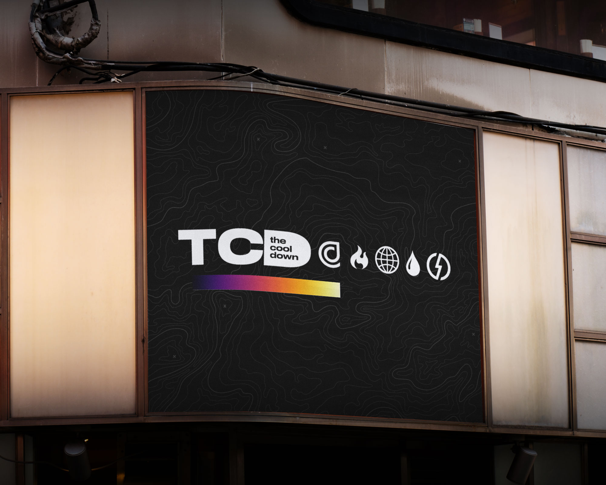
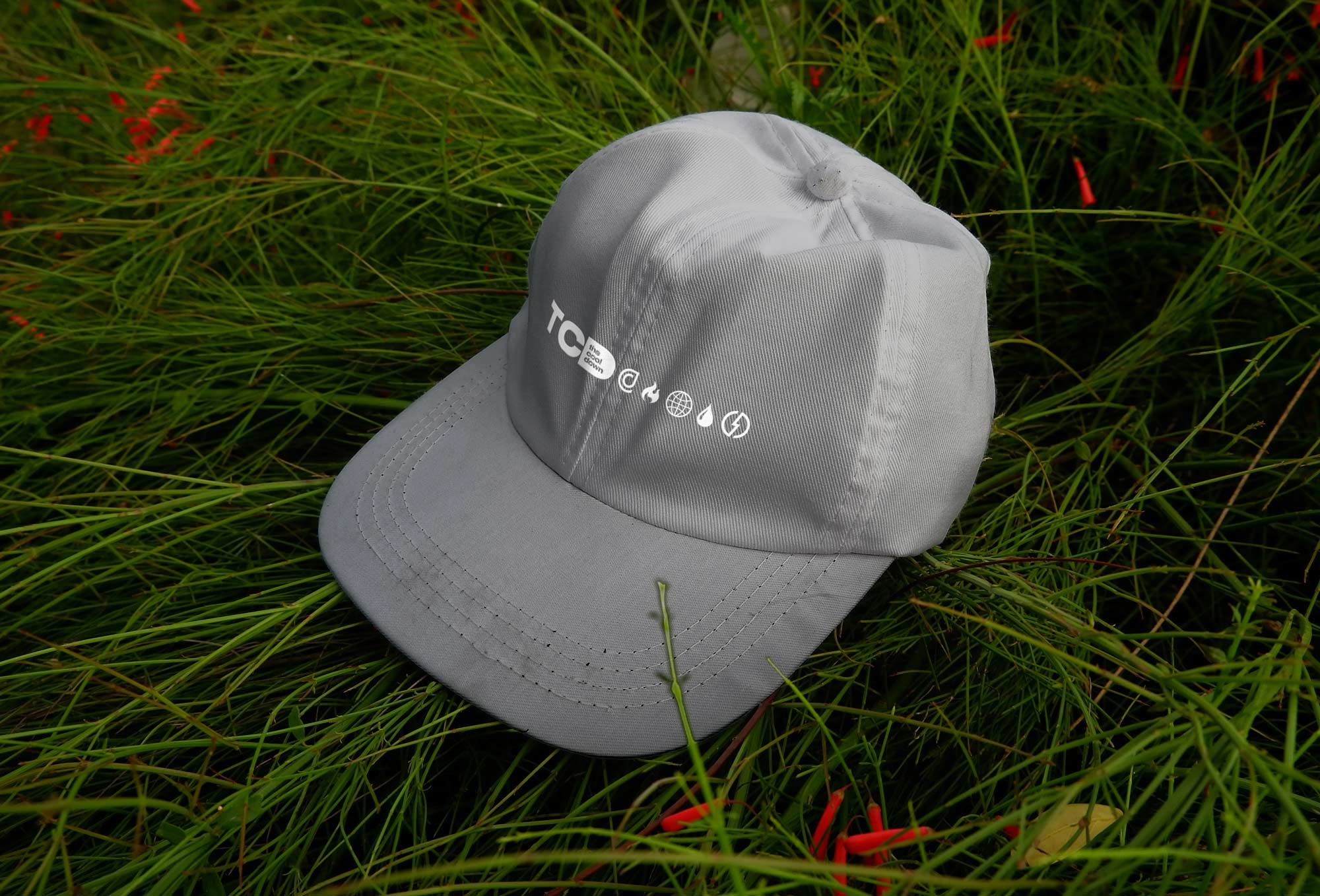
The Cool Down is aiming to reach a mainstream American audience by making the topic of climate more accessible and less focused on often-politicized doom and gloom and the system helps contextualize and act as a navigation tool along as a branding element. It has enough gravity to sit alone and look great on a hat or t-shirt but also feels like it can function on social media to help organize and inform. The pictograms were a way to help categorize news and fulfill that mission of making climate content more readily available and easy to find, I like to think of the logo almost like a compass. The outcome was a future-ready toolkit engineered for distribution, iteration, and growth.

The concept of the pictograms came as I wanted to make something that could really look out at the media landscape that is climate news and coverage, super fragmented and full of misinformation and political interests and make it far more easy to navigate, and because of this I think of our design system almost as a compass or an indicator. One example I kept using was the vegetarian, halal and kosher symbols on food packaging as a way to give implicit information through design that is both meaningful and functional.

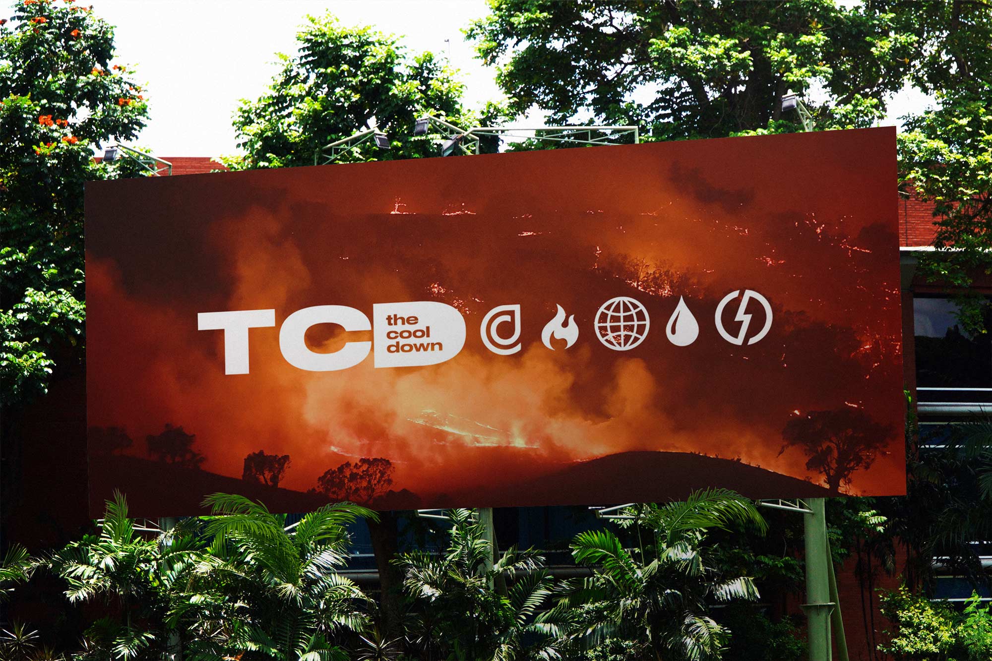
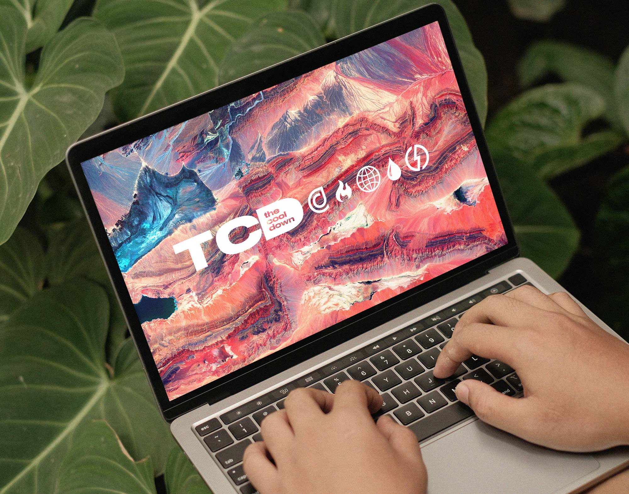
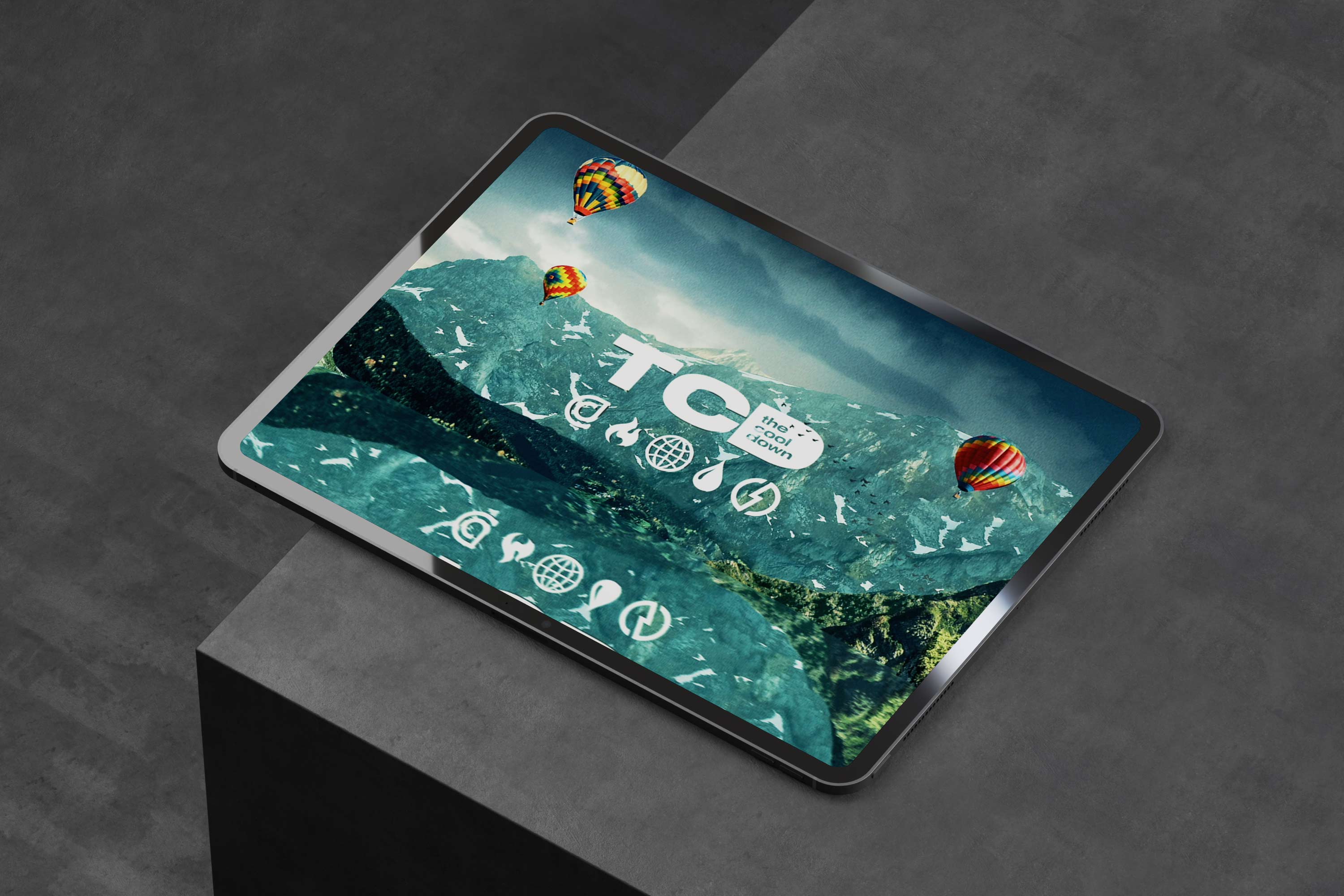
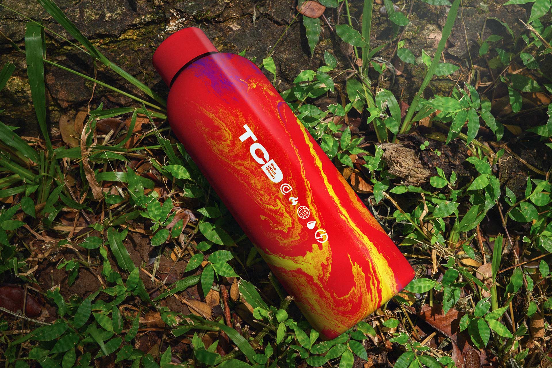
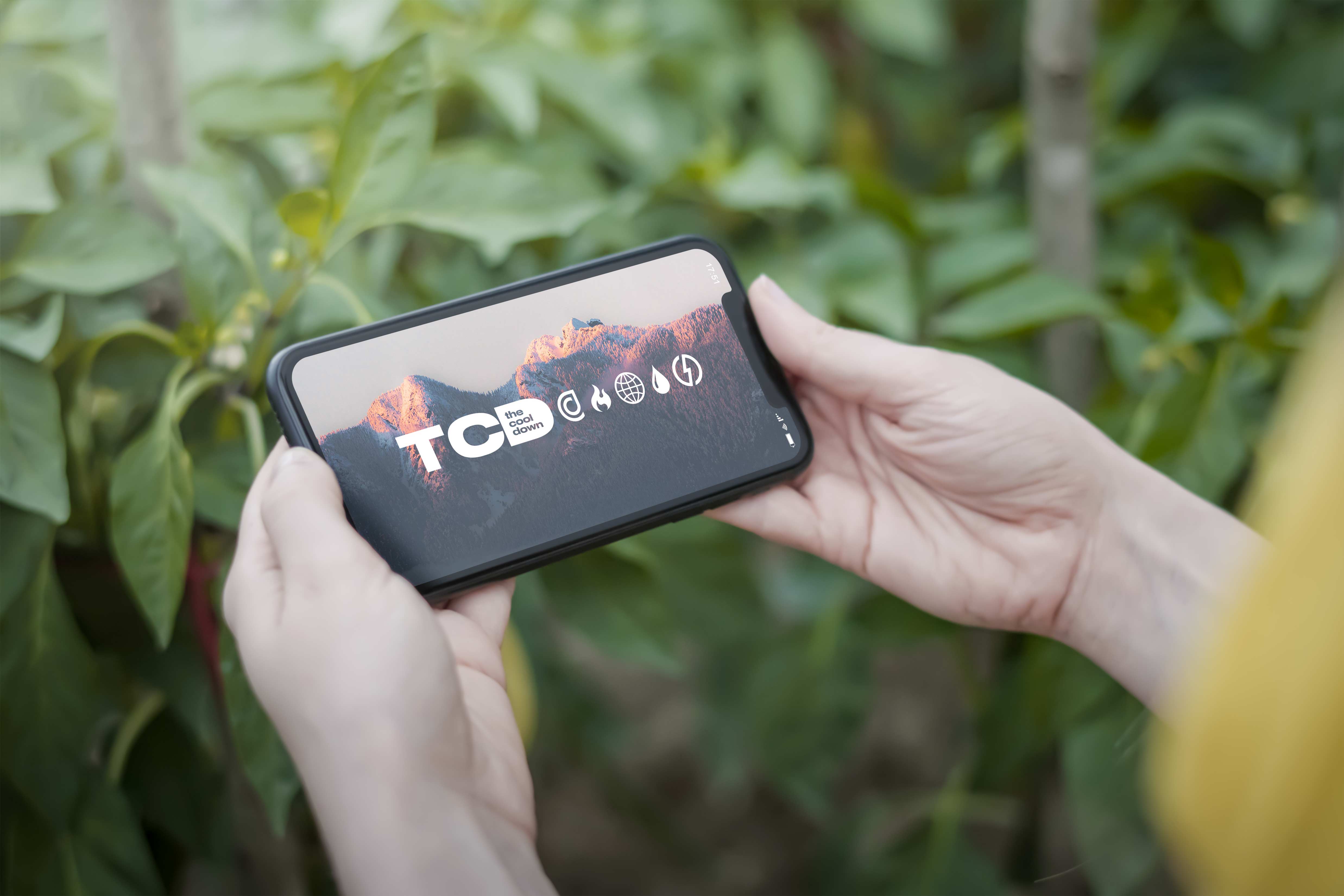
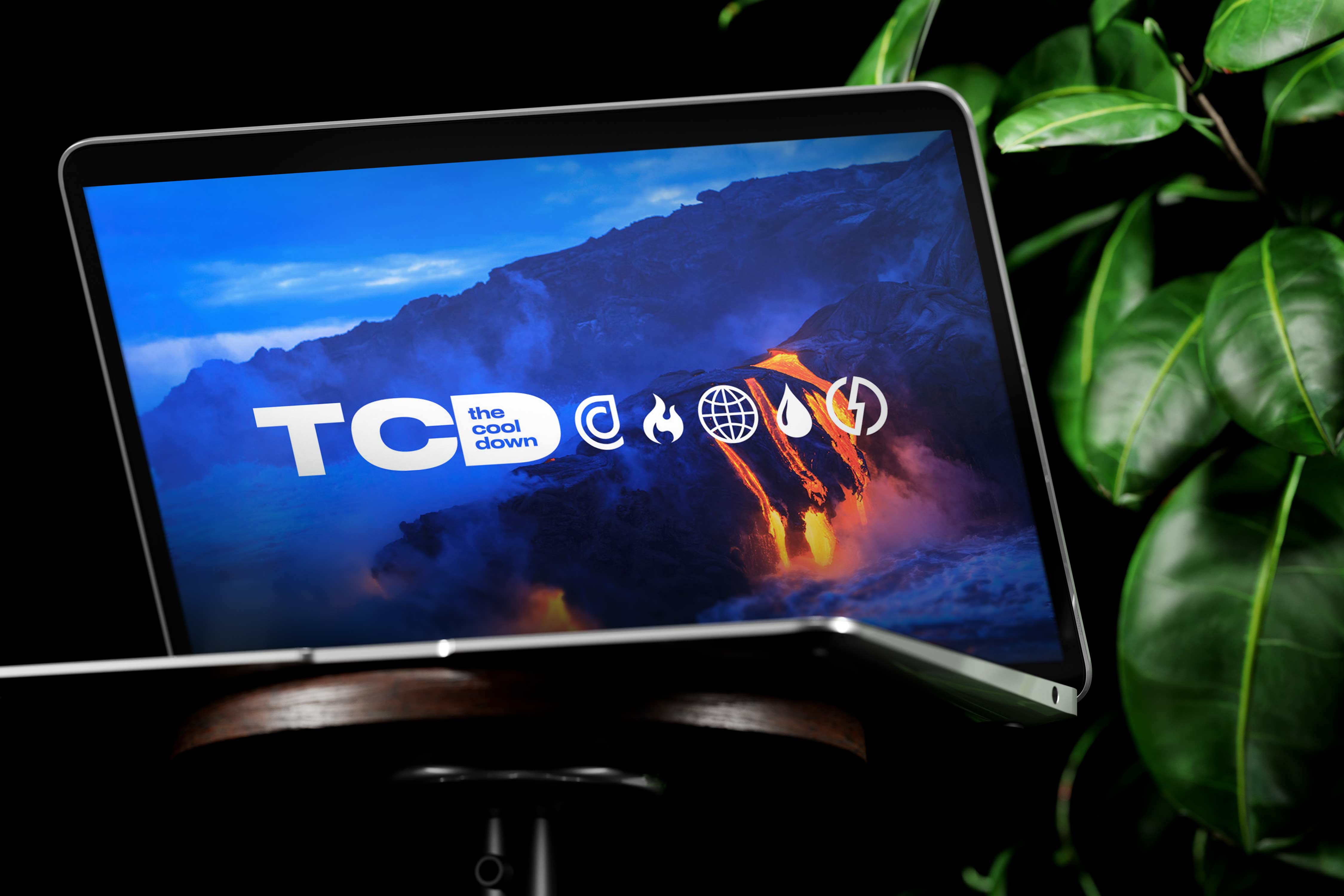
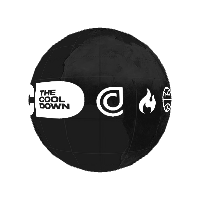
The first key icon really is the globe logo to indicate the critical global nature of both the climate crisis but also The Cool Down and how it wants to be an all encompassing brand that is accessible to consumers worldwide. It was important to know and check our privilege as the nations with the largest carbon footprint and with the greatest contribution to the causes accelerating global warming. The globe helps anchor and center the logo system with the idea that we are a worldwide brand. There are not political borders when it comes to who will be affected and showcasing this in the logo felt important to me.
.jpeg)
To the left and the right side of the globe icon you will see fire and water, the two essential elemental icons I felt like would represent the important systems that govern our planet's fragile ecosystems. For the fire logo, that really is mother nature personified and the imminent danger of the situation. The flame is a literal representation of the forest fires in California or the Tsunami's in South Asia and so many other natural disasters.

The flame icon represents how climate change is affecting the weather patterns and rare natural disasters and events that change all of our lives. The flame icon represents many of the effects of climate change out of our control that we have to deal with while the raindrop icon showcases how we can be empowered by lifestyle choices to move the needle against such seemingly helpless emotions around a topic like this.
.jpeg)
Showcasing this on one side and then the water symbol to represent how humanity is an integral part of this system. The drip icon represents solutions and lifestyle change oriented thinking that is what makes it easy for consumers to take action against such danger and fear and doom and gloom around these disasters that can feel so outside of our control. The fire and water icons bookend our globe as the most tangible aspects of what the company would cover and form the inner sanctum of the logo system. I also think in many ways the logo system helps reinforce that this is a multi pronged issue, not one size fits all and that it affects everyone in different ways.
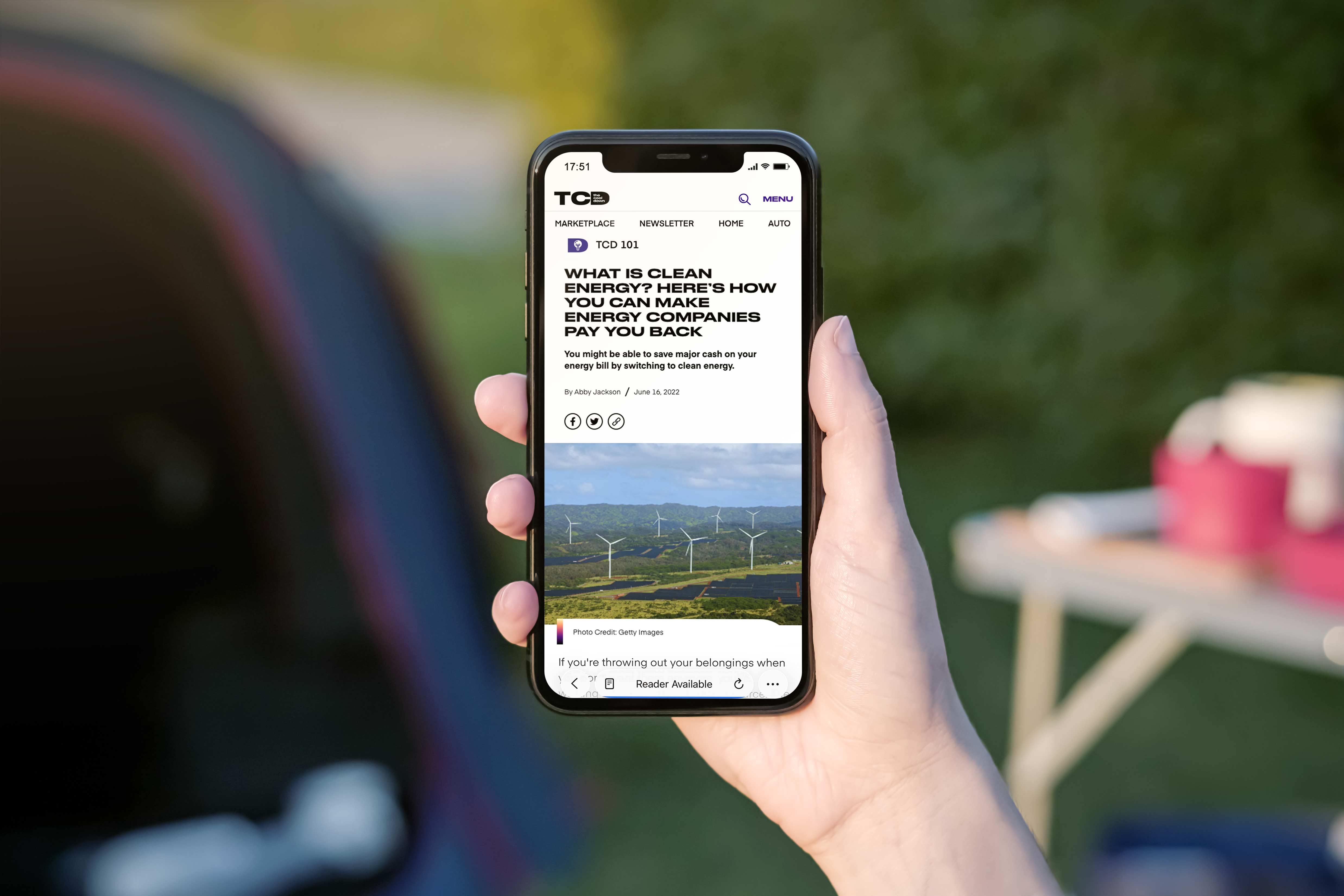
As we move further out in the logo system you will see the leaf and the lightning bold icons which are extremely important in the oncoming technological and environmental context that we try and preach at The Cool Down and integral to building a planet that is here for multiple future generations to come. The bolt stands for power and energy focused issues that TCD would cover, ways to practically target energy saving as renewables and resources to help expand access and replace our aging grid. Especially the website and how it would use search engine optimization to give people entry point to make going green as frictionless as possible.
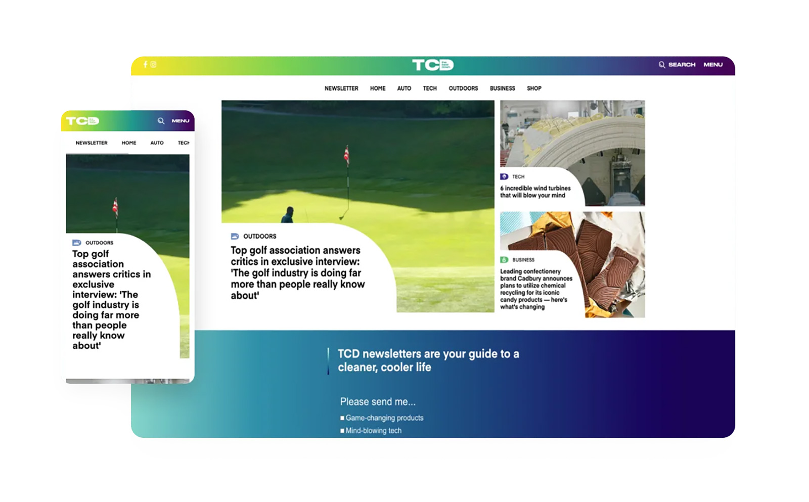
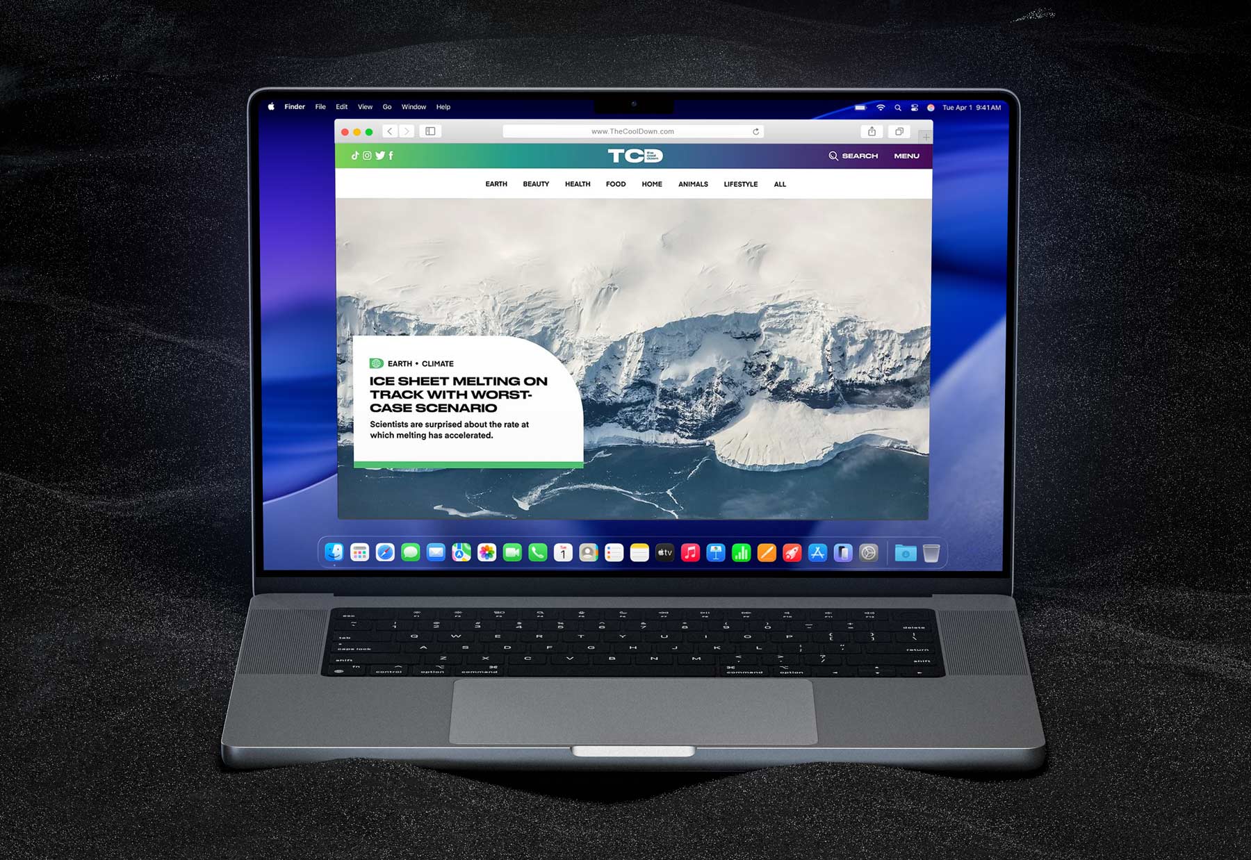
The website, which was developed in collaboration with Cat Oshiro and built on wordpress, focuses on providing insightful and actionable information related to climate change, sustainability, and eco-friendly living, catering to both individual consumers and businesses. It is the only climate brand that reaches 1 in 8 Americans every month. The website’s purpose is to serve as a platform for spreading a positive message about sustainability and providing accurate information to help individuals and businesses make more informed and eco-friendly decisions. This approach replaced doom-scrolling with decision-making and measurable adoption pathways.

Embedding this organizing principle into the logo system was a strategic decision rooted in how the brand would operate within a complex B2B ecosystem. As governments, utilities, and corporations accelerate sustainability initiatives, they require partners who can translate policy, incentives, and emerging technologies into clear consumer pathways. The mark’s bolt motif functions as a visual shorthand for activation and progress, signaling both urgency and optimism while reinforcing a science- and technology-forward posture. The whole idea for me was the really bring in lots of thought to the design system as an organizing principle for the whole ecosystem.

It communicates that TCD is not merely an information source but a facilitator of action, helping audiences navigate rebates, infrastructure shifts, and behavioral change with confidence. This semiotic clarity strengthens credibility with institutional partners while remaining approachable for everyday users, a balance that is critical in climate communication. By anchoring the identity in a symbol that conveys motion, energy, and agency, the system aligns brand perception with the practical outcomes partners expect. The logo becomes less a decorative asset and more a navigational beacon within a rapidly evolving green economy.
That same logic extended into the website and mobile experience, where the identity system informed both interaction design and technical implementation. The bolt evolved into a modular UI device, guiding wayfinding, highlighting calls to action, and structuring content hierarchies across responsive breakpoints. On mobile, where immediacy and clarity are paramount, the symbol anchors thumb-friendly navigation patterns and reinforces continuity between brand expression and functional utility.
Responsive logo behavior ensures legibility and recognizability across screen sizes, from full lockups in desktop headers to simplified marks within app icons and progressive web app environments. This adaptability allows the brand to maintain coherence while optimizing performance, load times, and accessibility across devices. The semantic structure of the site, paired with this visual system, improved SEO by aligning iconography, taxonomy, and metadata with user intent around electrification, incentives, and climate solutions. In practice, the identity, interface, and codebase operate as a unified system, ensuring that whether a user encounters TCD through a government portal, a corporate partner, or a mobile search result, the experience feels seamless, credible, and purpose-built for a world in transition.
.jpeg)
While from a marketplace perspective and eventual revenue standpoint, the lightning bolt has a very practical use case in the system, however I felt like similar to the globe's role in anchoring the design work in a diverse and inclusive vibe the final icon is the leaf icon that sits next to the letter forms. The leaf stands for nature, sustainability and the environmental aspects of what we cover, and it really has a sense of reverence for the planet that we are protecting. It cleverly gives us a chance to showcase the C and the D lettering within the leaf to connotate "Cool Down" and is strong enough to stand on it's own almost like a stamp.

When it came to my initial color explorations I wanted to pull directly from images of nature so I went ahead and did a ton of photography research and started finding common colors across the imagery that really resonated with the brand mission. A number of purples, oranges and greens came through as consistent themes and I knew that I wanted to stick with this vibe as the colors came together. FInally I had a stroke of inspiration come from the world of data analysis.
%20copy%20(1).jpg)
Inspired by the world of viridis color map data visualization, the extended color palette is built to be used as gradients. The colors individually are brash and bold and act as a rallying cry but when paired together and used as a gradient, that is when the magic really begins to show. For inspiration, as can be seen in the mood board below, I built upon the existing colors with a lot of bright oranges and greens with some eclectic sources to pull from.
.jpg)
Everything from the shades of Nocta puffer jackets Drake wears in music videos and the meteorological design language of NASA and NOAA along with the trendy thermal dresses that the likes of Kylie Jenner were rocking and even the flames of the forrest fires burning in California were elements in the crucible for this color palette and helped give the logo system some vibrancy and excitement. It translated values into usability, and usability into repeatable consumer behavior.

Like I said, the gradient is really what makes this sing more than anything because when paired with a black backdrop and some typography it ads a burst of energy to any composition or layout we put together. It works extremely well for TCD's purposes and acts as a gradient implementation of the famous Python Matplotlib colormaps designed by Stéfan van der Walt and Nathaniel J. Smith. Viridis and Magma provide a series of color maps that are designed to improve graph readability for readers with common forms of color blindness and/or color vision deficiency. The color maps are also perceptually-uniform, both in regular form and also when converted to black-and-white for printing.
.png)
Being perceptually-uniform gives the gradients a balance and harmony as the colors are all equidistant from each other, which is why it is so advantageous for data visualization. Every color your computer can display is describe by a combination of red, blue, and green intensity values scaled from 0 to 255. This is why we refer to the computer as 256 bit color. These gradients spread the spectrum of color evenly to really make them super flexible design tools.

Druk Wide Medium carries the weight of the message, its compressed geometry and industrial confidence giving headlines the presence of a rallying cry rather than a marketing line. It anchors The Cool Down with conviction, allowing single words and short phrases to feel declarative and urgent, as if they belong in the public square rather than a feed. In contrast, Eina introduces a human counterpoint. Its open apertures, generous spacing, and contemporary neutrality create a reading experience that feels conversational and inclusive, ensuring that longer passages, quotes, and data invite participation instead of fatigue. Together, the pairing establishes a cadence between proclamation and dialogue, mirroring the brand’s mission to move people from awareness to action without alienation.
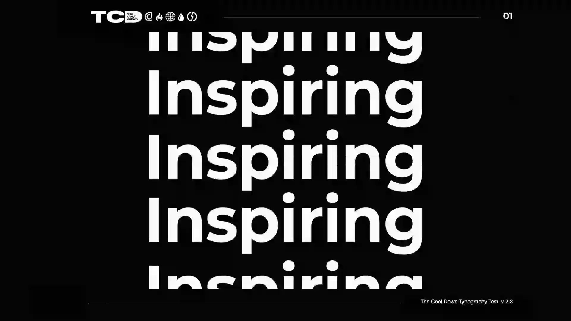
The system emerged through active typographic exploration rather than static selection. We tested weight contrasts, tracking adjustments, and responsive scaling across social tiles, mobile articles, and environmental graphics to understand how tone shifts with context. Hierarchy models for callouts, captions, and attribution lines were refined to hold urgency without visual noise. By treating type as an evolving toolkit rather than a locked palette, the identity can absorb new formats, motion treatments, and community contributions while maintaining clarity and trust. The result is a typographic foundation that does more than transmit information. It shapes how the message feels, bridging scientific gravity with everyday readability so the work resonates across audiences, mediums, and moments. The typography can be seen in use in the wild in the branded content video created for Tesla (With the familiar Adam Lefkoe on the VO) where Druk helps bring home the overall car commercial aesthetic in a modern built for social way.
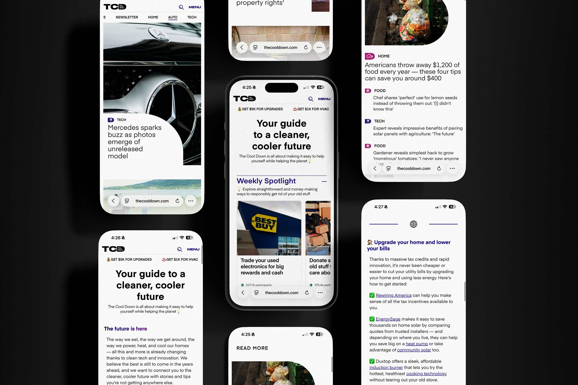
Typography hierarchy is meant to be used on social, print and web with Druk being reserved for headlines and large spaces, while Eina is used for body copy in bold weight and regular is used for any attributions. *Druk condensed is preferred for numbers on social graphics where space is an issue, otherwise Druk Wide can be used if more impact is needed. This would give us an ample number of weights to be able to create a fresh social set of templates which was the next step of this branding exercise. The system helped audiences feel oriented, not overwhelmed, in a fragmented media landscape. Clear typography to deliver a super understandable and friendly message was imperative.

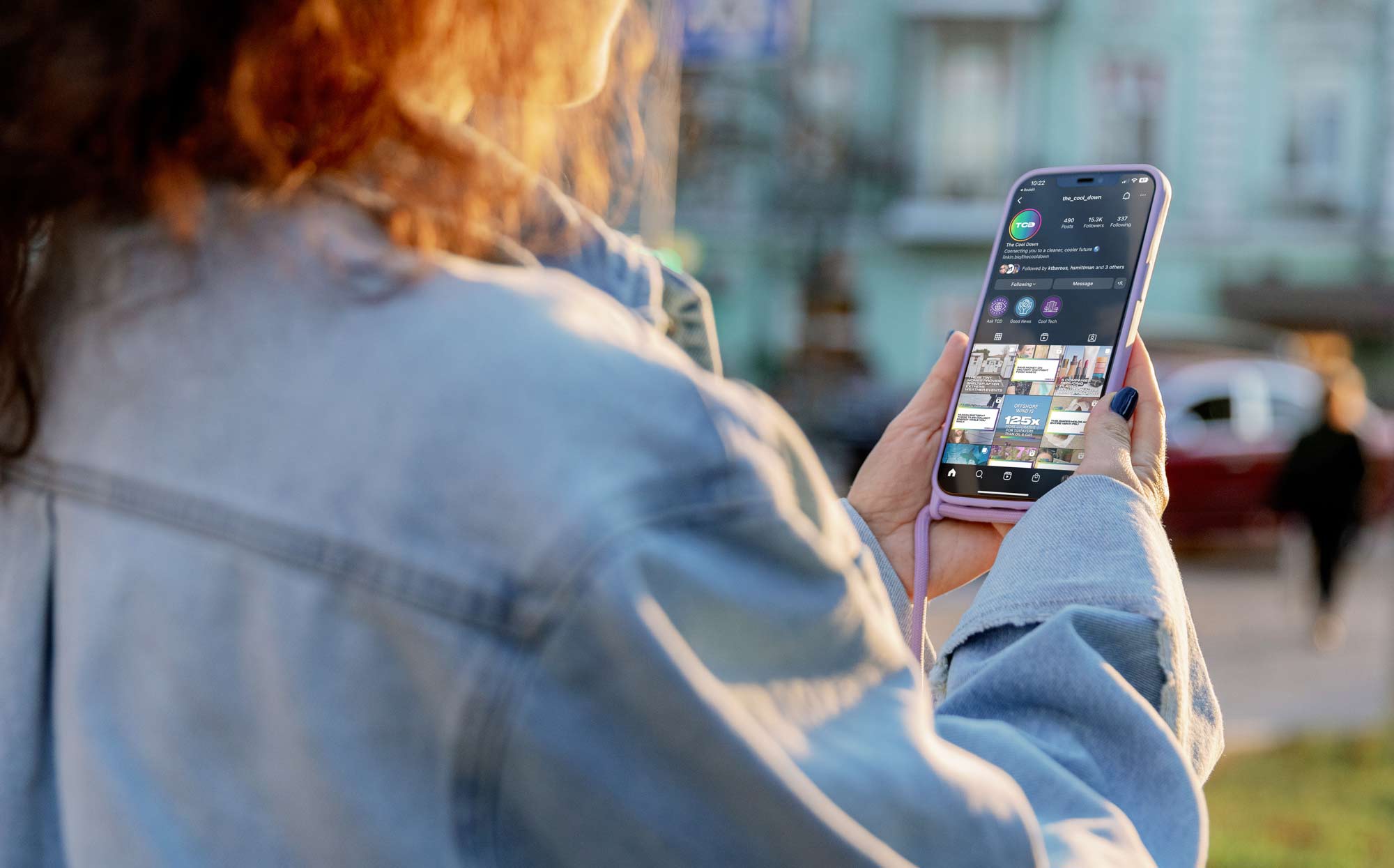
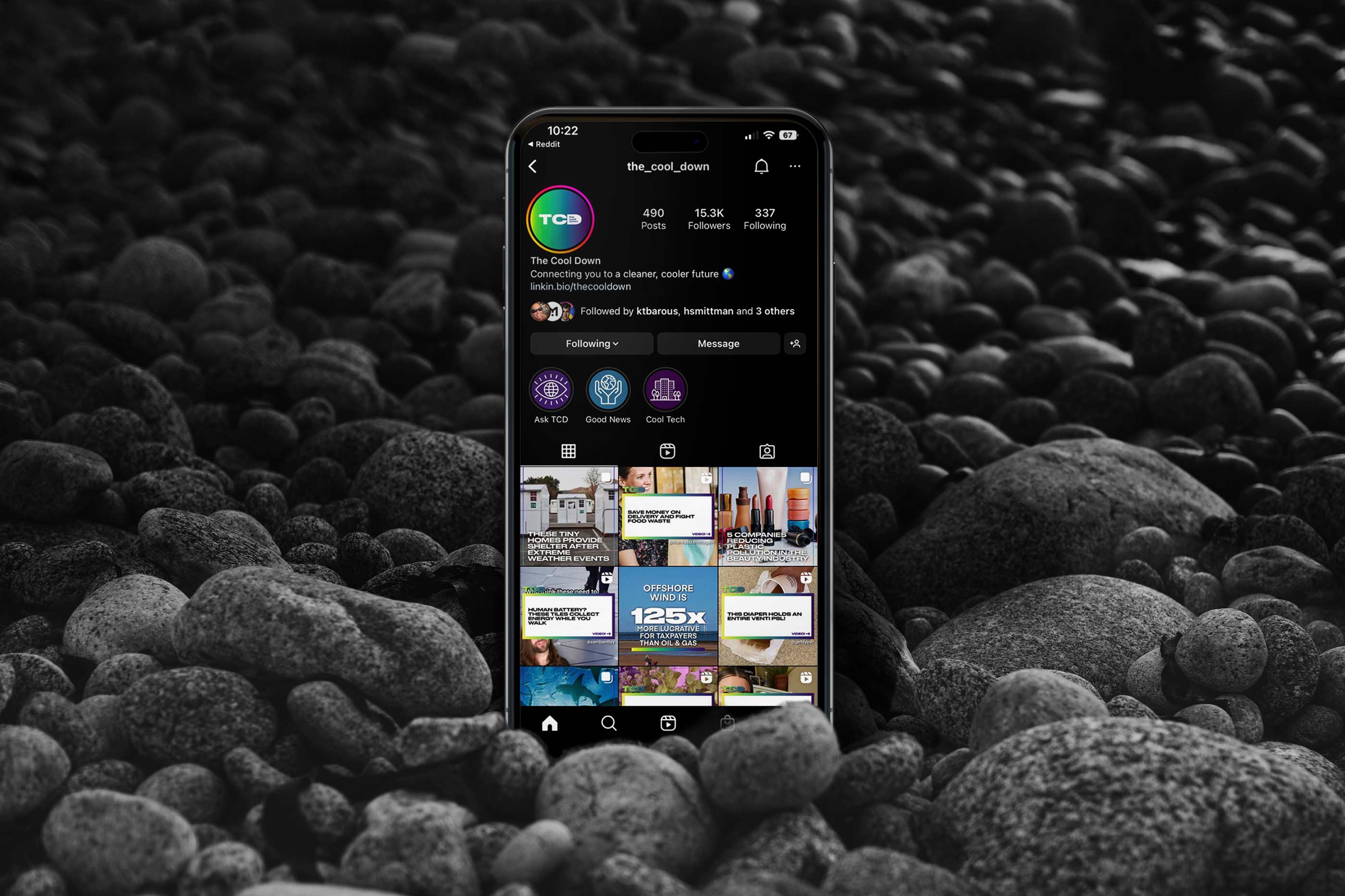
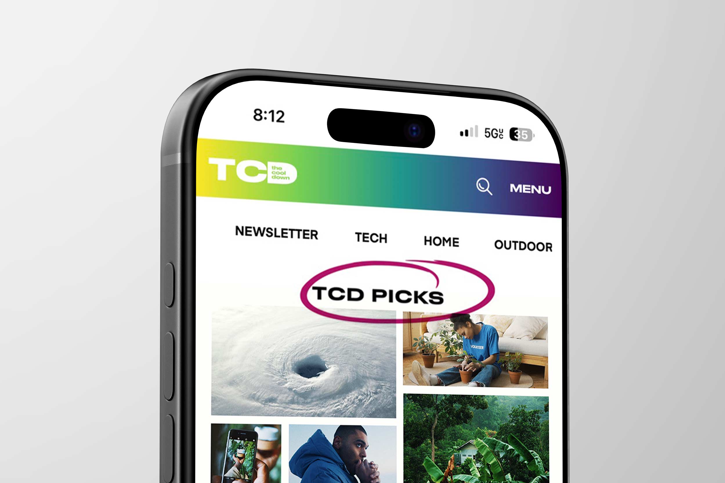
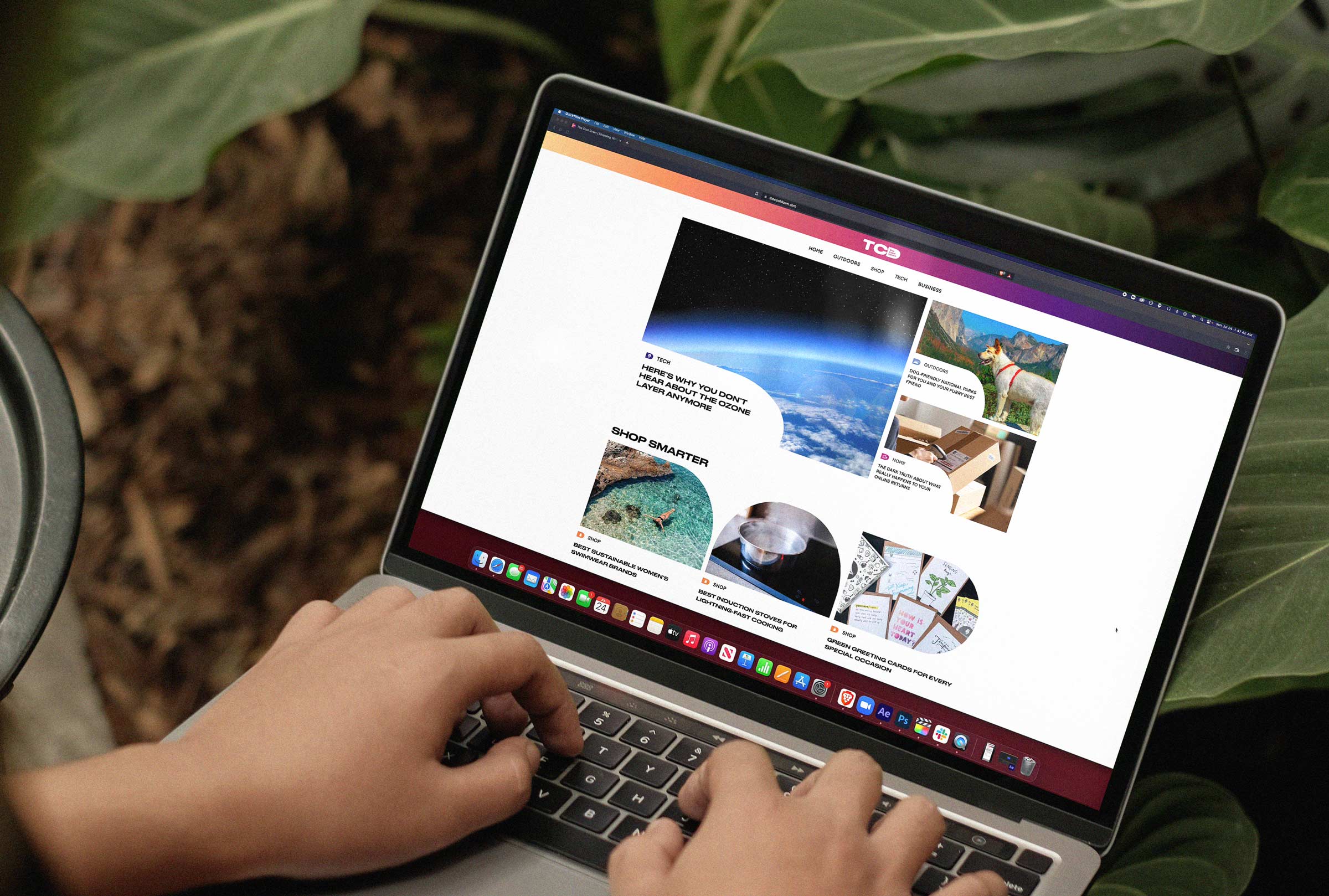
On social the templates had to be versatile enough to fit all different kinds of news coverage from quotes and new product innovations to guides and recommendations. The social templates needed to be able to handle more fun relatable content and user generated posts as well as serious and scientific content. To do this I used a combination of image led templates that I created with rounded corners to give them a bit of a friendlier vibe. The gradient was used to divide sections and small underline and marker stroke elements were used for emphasis. In practice, it turned climate literacy into everyday action through thoughtful orchestration of these bite sized social tidbits.

The flipped letterform of “D” from the logo becomes an arch shape that serves as a vehicle for imagery. Meant to be used as a clipping mask for images on social templates as a way to reinforce the brand. Text bubbles act as a vehicle for communicating dense climate change and pollution information in an easy to digest manner. Heavily used on social to make it seem more conversational. All these little details added up to create a very flexible modular system that can continue to evolve and grow as new challenges and opportunities arise on social. This is a design system built to help get traction on social and go viral with news coverage. Beyond the visual system, we strategically defined a distinctive social voice and tonal framework, pairing culturally fluent copywriting with flexible template options to ensure every post felt native, coherent, and instantly recognizable across platforms. The brand’s credibility came from rigor, restraint, and an unpretentious voice along with clear and informational branding.

We deliberately architected the content engine around UGC and influencer first storytelling, recognizing that peer validation and lived experience outperform brand voice in categories that require behavioral change and financial commitment. Product reviews, installation walkthroughs, cost breakdowns, and day in the life energy savings diaries became foundational formats, translating abstract sustainability concepts into tangible, repeatable actions. By elevating creators who were already documenting their transitions to heat pumps, EVs, induction cooking, or solar adoption, we built a trust layer that traditional editorial alone cannot replicate. This approach transformed the platform into a living knowledge base, where community proof points reduced perceived risk and accelerated decision making.
From an operational standpoint, UGC functioned as a scalable content backbone that fed both organic distribution and paid amplification. High performing creator posts were ingested into structured content modules, tagged by vertical, lifecycle stage, and intent signals, then redeployed across newsletters, product hubs, and performance campaigns. Influencer partnerships were structured less as one off sponsorships and more as longitudinal narratives, allowing audiences to follow real upgrade journeys over months, which materially improved retention and repeat engagement. Hacks, tips, and myth busting micro content provided snackable entry points, while long form reviews and side by side comparisons captured high intent users deeper in the funnel. It established a distinct lane between institutional distance and influencer superficiality.
This creator led ecosystem also created a flywheel effect for commerce and data. Authentic reviews generated richer first party signals around price sensitivity, feature prioritization, and regional barriers, which informed both editorial strategy and partner product roadmaps. Influencers became de facto product educators, reducing customer support burdens for brand partners while increasing conversion confidence. In aggregate, leaning into UGC was not a stylistic choice but a strategic infrastructure decision, one that allowed the platform to scale credibility, lower content production costs, and maintain cultural fluency as new technologies and incentives entered the market.
We architected the commerce and revenue model around high intent verticals such as home electrification, appliances, EVs, solar, battery storage, smart thermostats, and energy efficient retrofits, categories where consumer consideration cycles are longer but lifetime value and commission structures are materially higher. By aligning editorial taxonomies with affiliate marketplaces and brand partner SKUs, we created a closed loop ecosystem where discovery, education, and conversion lived within the same content journey, reducing friction and improving attributable revenue. Native integrations and sponsored content were mapped to upper and mid funnel education, while performance driven placements such as product comparison modules, savings calculators, and incentive explainers captured lower funnel intent and drove measurable CPA outcomes. This verticalized approach allowed us to bundle media, commerce, and data into full stack partnerships, positioning the platform not as a publisher but as a demand generation engine embedded directly into the clean economy. The design language made complex information feel immediate, legible, and emotionally resonant.
Central to this traction was GreenScreen, the proprietary data stack that fused quantitative performance metrics with qualitative sentiment analysis to surface real behavioral signals rather than abstract intent by looking across website and social to create maximum impact. By integrating engagement data, tonal classification, and content taxonomy, GreenScreen enabled the team to identify which narratives, formats, and calls to action genuinely motivated lifestyle change. This insight loop informed everything from headline construction and visual framing to marketplace curation and newsletter segmentation, allowing the brand to iterate with precision rather than intuition alone. Instead of relying on static polling or generalized personas, we designed the platform to respond dynamically to lived consumer behavior, creating a feedback system that continuously refined both content strategy and user experience. The result was a media ecosystem that felt attuned and responsive, reinforcing trust by delivering information that aligned with what audiences were actively seeking in their daily lives and solutions for brands that were looking for primed and curious consumers with genuine interest.
Distribution strategy further amplified impact, with a multi-channel approach spanning web, Instagram, and flagship newsletters like Here on Earth and Play It Cool, each calibrated to distinct audience mindsets and engagement rhythms. The weekly innovation digest functioned as a narrative engine for optimism and discovery, while the product-focused guide bridged editorial authority with commerce enablement, helping readers translate awareness into purchasing decisions. This dual-track model exemplified the brand’s broader mission to merge storytelling with utility, positioning The Cool Down not only as a source of information but as a facilitator of tangible climate action. From a design and systems perspective, this required building flexible content frameworks that could maintain visual and tonal cohesion across formats while adapting to the behavioral context of each channel. The final identity carried authority, accessibility, and cultural fluency in equal measure.
Sponsored content and branded video became a cornerstone of the monetization engine, designed not as interruptive advertising but as high utility storytelling that aligned with audience intent and platform behavior. We developed a repeatable content pipeline that moved from insight mining and trend analysis to concepting, production, distribution, and performance optimization, ensuring that partner integrations felt native, culturally fluent, and measurably effective. By packaging editorial features, short form video, and social cutdowns into modular deliverables, we created scalable sponsorship tiers that allowed brands to enter the ecosystem at multiple investment levels while maintaining creative integrity. Performance data from engagement, completion rates, and downstream actions fed back into the system, enabling iterative optimization and strengthening long term partner relationships through transparent ROI reporting. This approach transformed content from a cost center into a revenue generating flywheel, where compelling storytelling, audience trust, and advertiser value reinforced one another in a sustainable growth loop.

There is so much incredible nature photography available that establishing a clear, disciplined framework for image selection became essential to maintaining consistency, credibility, and emotional impact across the platform. Without strong guardrails, even the most beautiful imagery can feel generic or disconnected from the story being told. For me, the key lay in curating visuals that reflected diverse ecosystems, geographies, and communities while prioritizing compelling compositions, unexpected perspectives, and moments of real human interaction with the environment. High contrast scenes, dynamic lighting, and layered depth helped create visual tension that could hold attention in fast-moving digital feeds while still honoring the authenticity of the subject matter.

From there, the design system served as a lens to amplify rather than overpower the photography, using typography, gradients, and color accents to surface key details and guide the viewer’s eye. Strategic type placement created contrast and hierarchy without obscuring the image, while restrained gradient applications introduced warmth and brand recognition without feeling artificial or overly polished. The goal was always to let the photography breathe while subtly framing it within a cohesive visual language, ensuring that every image felt unmistakably part of The Cool Down’s world while retaining the raw, emotive power that makes nature photography so universally compelling.

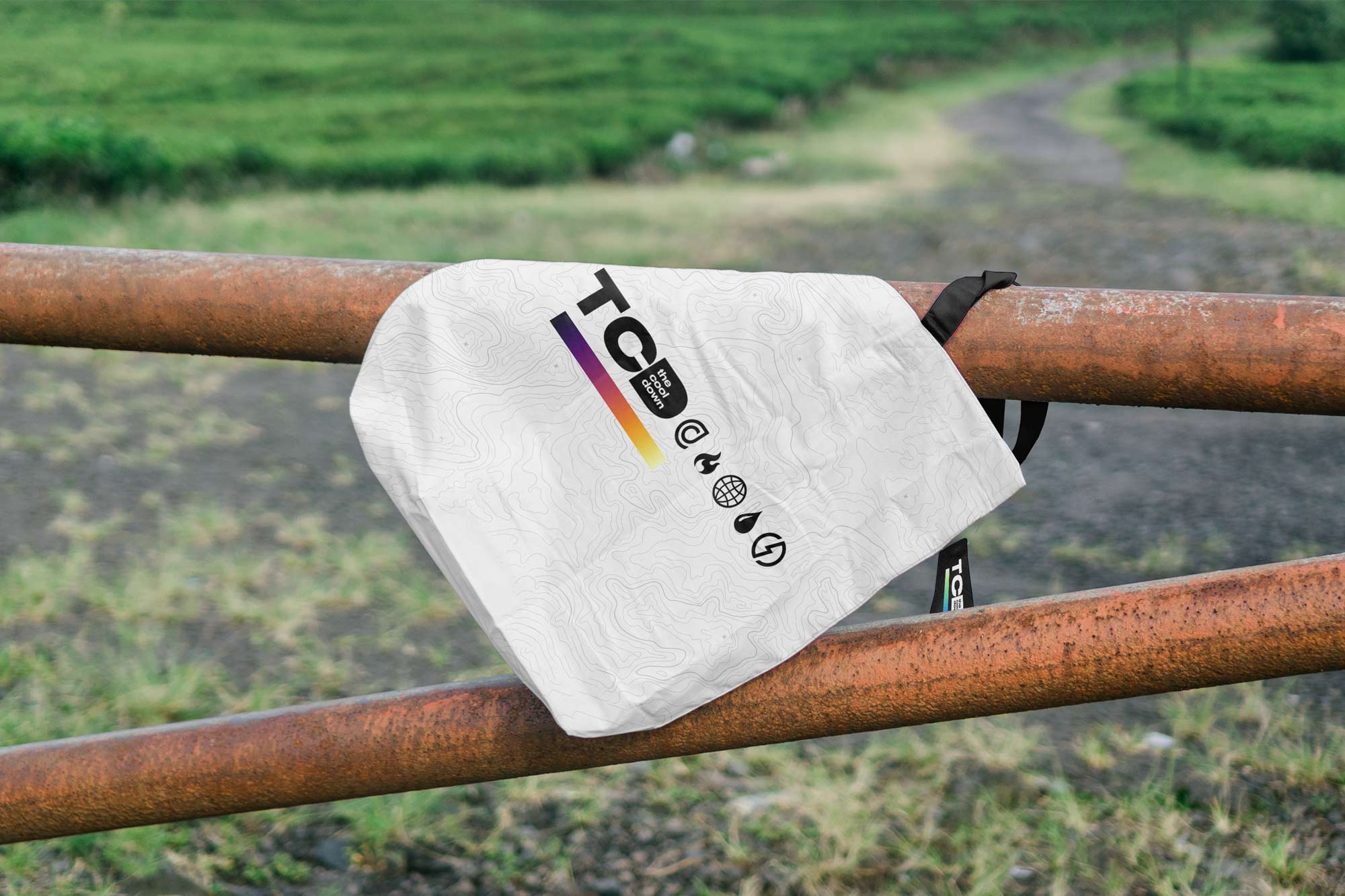
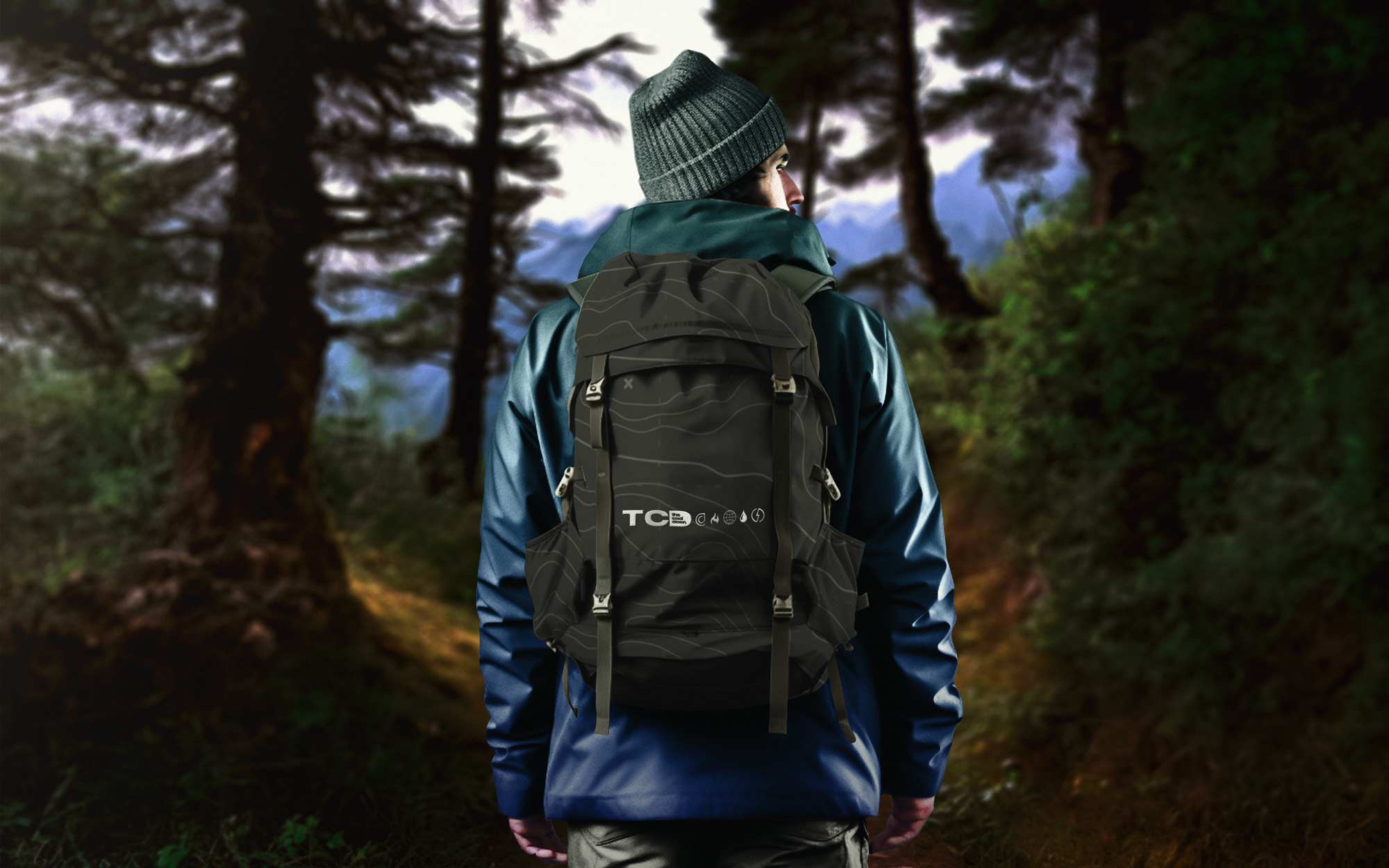
Sustainable merchandise became an extension of the brand’s ethos rather than an afterthought, requiring a supply chain strategy that prioritized material integrity, ethical labor, and lifecycle transparency without compromising on premium look and feel. We sourced organic cottons, recycled poly blends, and low impact dyes through vetted vendors who could provide traceability documentation, ensuring every tote, tee, and patch reflected a commitment to environmental and human health. Packaging was right sized and plastic free, using FSC certified paper stocks and soy based inks to reduce waste while maintaining a tactile, high end unboxing experience that reinforced perceived value. By consolidating production with partners who specialized in small batch runs and on demand fulfillment, we minimized overproduction and deadstock, aligning inventory practices with circular economy principles. The result was merchandise that functioned as both a revenue stream and a proof point, demonstrating that premium brand expression and responsible sourcing can coexist in a modern, resilient supply chain.
A large part of the future vision of the company involves building a sustainable marketplace for all sorts of climate friendly products and so creating a simple but effective early strategy and game plan for merchandise and e-commerce done in a sustainable and scalable way was also a key deliverable I wanted to include in this exploration. The paradox of choice means that too many options can leave consumers feeling stuck and treading water instead of taking action, and we wanted to help make the brand a beacon of hope.

From the jump, being able to use the logo on gear was a key feature of marketing it to the right audiences and turning The Cool Down into an influencing voice in that space so that an audience and trustworthy relationship could be established with the brand. The logo lends itself to simple and clean pieces as seen below:

However, just because the logo was capable of being used on so many items in this format didn't mean that it wasn't also worth doing some more fun and colorful explorations targeted at Gen-Z with a bit more personality and expression. The illustrations convey optimism and energy while the gradient dip dye of the hoodies is a more sustainable way to produce the merch but also leads to pieces with unique patterns and pops of vibrancy that feel very youthful and exciting.

At the end of the day it comes down to authenticity. The climate crisis impacts all of our lives; through the air we breathe, the food we eat, and the safety and security of our communities. It’s real, and it demands urgent action. But the story of our future is still being written, and we all have a part to play. Within this crisis, opportunity and optimism are gaining momentum and that is what I wanted the merch and the design system to help convey and help navigate. If the design system is a compass then it is hopefully pointing towards better days rather than worse. Designing the system and including these moments of joy were important to me to maintain sanity thoughout.

The Cool Down channels that positive energy, welcoming people everywhere to join a movement for a safer, cleaner world for the next generation. It’s a rallying cry, to cool down the polarized conversation, and ultimately, the planet. The Cool Down is an invitation for everyone to participate and make an impact. I was glad I had a chance to shape the social templates the brand design and logo playbook for such a young company that will hopefully make a massive impact.

On the ad tech side, we operationalized a hybrid monetization stack that blended CPM based brand campaigns with CPC and revenue share models, enabling diversified income streams resilient to market fluctuations. Appliance and HVAC partners leveraged interactive configurators and eligibility tools to pre qualify leads, while auto and EV brands integrated range calculators and total cost of ownership visualizations to move users from awareness to consideration within a single session. Solar and home energy providers benefited from geo targeted content and utility rate overlays, allowing us to deliver hyper relevant offers tied to regional incentives and grid conditions. These integrations transformed traditional affiliate marketing into a high fidelity performance channel, where first party behavioral signals informed retargeting cohorts and lookalike modeling for partner campaigns. This meant that brands got great leads, and customers found solutions for problems they actually needed help with, a rare win-win.
From a sales perspective, this framework unlocked enterprise level deals by packaging vertical dominance rather than isolated placements, enabling multi quarter commitments across content, commerce, and data licensing. We spoke the language of incremental lift, blended CAC, and media efficiency ratios, demonstrating how culturally fluent content reduced acquisition costs compared to search and social benchmarks. By proving that education led to conversion in complex categories like heat pumps or induction ranges, we reframed sustainability from a values based purchase to a financially rational upgrade path. The result was a monetization architecture capable of scaling into nine figure revenue potential, grounded in trust, utility, and measurable outcomes rather than vanity metrics.
Beyond brand and systems design, I worked closely with Dave and Anna in the earliest stages to stand up The Cool Down’s influencer and TikTok engine, recognizing that creator-led storytelling would be critical to normalizing climate action and driving behavioral change at scale. I helped define the social content model, build the initial creator network, and recruit Mikey Navarro to lead social, ensuring the platform launched with a culturally fluent voice and an operational backbone capable of producing high-velocity, trust-driven content. As an early key shareholder, I was deeply invested in aligning audience growth, creator strategy, and brand integrity, helping shape a social ecosystem that not only expanded reach but reinforced The Cool Down’s role as a credible, action-oriented guide for millions navigating sustainable living.
They personally asked me to design the investor pitch deck they would take to market, a reflection of the trust they had in my ability to translate vision into clarity and momentum. They knew from our past work together that I don’t simply present information, I shape narratives that help investors see inevitability, not risk. I crafted a deck that distilled the company’s mission, market timing, audience potential, and commerce pathway into a cohesive story that made the opportunity legible and compelling, helping secure early funding and align stakeholders around a shared trajectory. For me, the deck was not a standalone artifact but a strategic instrument, one that framed The Cool Down as a category-defining platform and reinforced the role design can play in unlocking capital, confidence, and long-term growth.
.jpg)
Perhaps the final and most impactful piece of the puzzle I had a chance to unlock and work on for The Cool Down was the building and design of their investor deck as they went to market to raise capital. We actually got an article on Business Insider titled, "Check out the pitch deck that helped a pair of media veterans raise $5.7 million to launch climate-focused media startup The Cool Down" I was able to find effective ways to showcase the brand's positioning and communicate their vision to help them raise nearly 6 million dollars, which is a testament to the design work that went into this, along with the focus and the marketing alignment.
In addition to shaping the brand and design system, I helped position The Cool Down within a clear business and launch framework that aligned with its $5.7M seed round led by Upfront Ventures, alongside participation from Revolution’s Rise of the Rest Seed Fund, Jetstream, Swingbridge, and Niche Capital, and support from angel investors including Bill Simmons, Dawn Dobras, Rick Farman, and Richard Goodstone. Working with co-founders Anna Robertson and Dave Finocchio, we launched with journalist-driven climate content across the website, Instagram, and TikTok, building early audience momentum with a lean team of roughly ten full-time staff and a network of freelancers. From a strategic standpoint, we intentionally deprioritized traditional advertising in favor of affiliate partnerships and data-informed product recommendations, laying the groundwork for an editorially curated climate marketplace spanning categories such as induction stoves, deodorants, and heat pumps. This approach ensured the platform could evolve from a trusted content destination into a commerce-enabled ecosystem, using engagement insights to guide product curation and reinforce its role as a practical, credible guide for everyday climate action.
Being named to Fast Company’s World’s Most Innovative Companies list in 2023 marked a pivotal inflection point for The Cool Down, validating the brand’s thesis that climate media could be both mainstream and action-oriented without sacrificing credibility or accessibility. Achieving this recognition less than a year after launch underscored the effectiveness of the platform’s audience-first design strategy and its ability to translate complex environmental issues into practical, behavior-driven content. The $5.7M seed funding and Fast Company’s 2023 World’s Most Innovative Companies recognition validated The Cool Down’s model at an early stage, accelerating growth and positioning the platform as a high-credibility, commerce-ready climate media brand that was perfectly poised for strategic acquisition.
Surpassing 20 million content views and reaching more than 5 million monthly unique readers demonstrated not only scale but resonance, proving that a solutions-focused editorial model could break through the fatigue and fatalism often associated with climate coverage. The honor positioned the company alongside category-defining innovators, reinforcing its credibility with partners, investors, and audiences while accelerating momentum across editorial, commerce, and product initiatives. For me as a design leader, it affirmed that the brand system we built was not merely aesthetic but infrastructural, capable of supporting rapid growth, cross-platform distribution, and a trust-based relationship with consumers seeking actionable guidance.

The Cool Down’s monetization model was intentionally architected as a hybrid ecosystem that balanced editorial integrity with commerce enablement, allowing revenue to scale without eroding audience trust. Rather than relying solely on programmatic advertising, which often commoditizes attention and undermines user experience, the platform prioritized high-intent revenue streams such as affiliate commerce, brand partnerships, sponsored solution guides, and marketplace integrations. This approach aligned monetization directly with user value by surfacing vetted, climate-friendly products and services that readers were already seeking, transforming the platform from a passive media destination into an actionable decision engine. By embedding commerce within content in a transparent, utility-driven way, TCD cultivated a relationship with its audience rooted in credibility and practical benefit, which in turn drove higher conversion rates and repeat engagement.
Within just a few years of launch, this model generated more than $3 million in annual revenue, a milestone that validated both the commercial viability of climate media and the strength of the platform’s behavioral design framework. Affiliate partnerships with sustainable brands, utilities, and home-efficiency providers created recurring revenue tied to real consumer savings and upgrades, while sponsored content packages enabled mission-aligned companies to reach an audience already primed for action. The newsletters played a critical role as high-performing conversion channels, with curated product recommendations and incentives translating directly into measurable commerce outcomes. From a systems perspective, the modular design language and templated content frameworks I helped establish allowed these revenue units to scale efficiently across formats while maintaining brand cohesion and user trust. This operational leverage meant the team could expand monetized offerings without fragmenting the user experience or diluting editorial voice.
This early revenue traction was a key catalyst for the company’s decision to raise additional capital, positioning TCD not as a speculative media startup but as a proven, commerce-enabled platform with clear paths to profitability and scale. Demonstrating sustainable revenue growth alongside strong audience engagement gave investors confidence in the durability of the model and its potential to expand into a full-fledged climate marketplace. The platform’s ability to connect content, data insights, and purchasing behavior made it an attractive acquisition target for organizations seeking to integrate climate intelligence with consumer commerce. Ultimately, the monetization strategy did more than generate revenue; it proved that aligning mission with measurable consumer value could create a defensible business, paving the way for both fundraising success and eventual acquisition.

Working on The Cool Down gave me a front-row seat to what it actually takes to build a company that is not only creatively compelling but structurally investable. Learning directly from Dave, I saw how storytelling, market positioning, and business fundamentals have to move in lockstep, how you translate vision into a narrative that resonates with investors while backing it up with real traction, unit economics, and a clear path to scale. It was not abstract advice, it was watching the mechanics of fundraising in real time, from shaping the pitch to understanding how to frame the problem, the opportunity, and the timing in a way that creates conviction. I learned how to think in terms of capital efficiency, how to identify signals that trigger investor interest, and how to build a brand that feels inevitable rather than speculative. That experience fundamentally shifted how I approach creative work, seeing it not only as expression, but as leverage in building something durable, fundable, and aligned with long-term enterprise value. Not only did Finko have the network, he also had the foresight and vision to know where to deploy attention and brainpower.
The November 2025 acquisition of The Cool Down by Palmetto just four years after I concepted that initial logo, marked a category-defining convergence between clean lifestyle media and clean energy infrastructure, transforming a trusted content platform into a direct conduit for measurable climate action. At its core, the deal validated the thesis that education, inspiration, and commerce are most powerful when tightly integrated, allowing audiences to move seamlessly from awareness to implementation. By pairing The Cool Down’s editorial authority and behavioral insight engine with Palmetto’s home energy marketplace, the combined ecosystem eliminated friction between intent and execution, enabling readers to translate curiosity about sustainability into tangible upgrades like solar, heat pumps, and home batteries. This was not a traditional media exit but a structural evolution, positioning content as the front door to a vertically integrated clean energy economy.
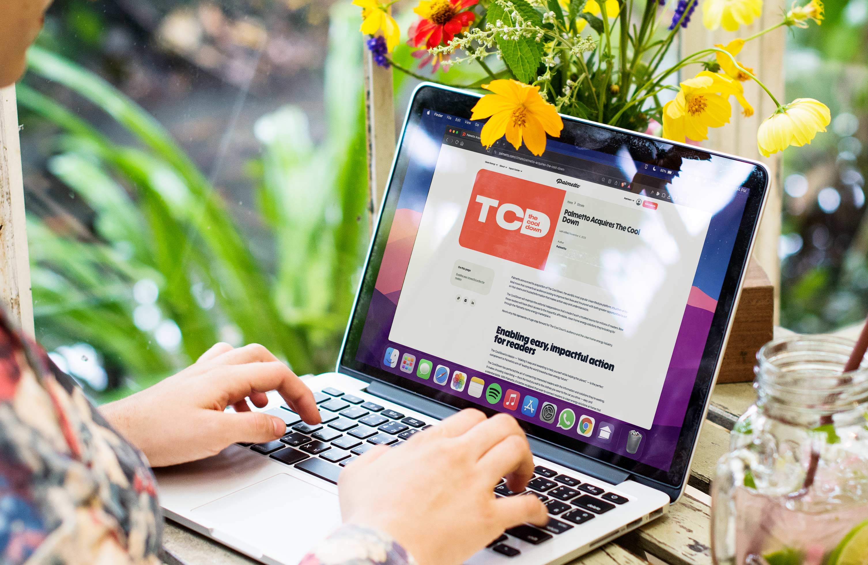
The acquisition of The Cool Down by Palmetto validated the core premise behind the brand, pitch decks, and strategic foundation we built with Anna and Dave: that a trusted, design-led media platform could evolve into infrastructure for the clean energy economy. By translating complex climate issues into clear, actionable pathways, the system we created proved its ability to move audiences from awareness to adoption, making the platform commercially meaningful beyond traditional media metrics. Palmetto’s decision to integrate The Cool Down into its home energy marketplace confirmed that our positioning as a bridge between consumer intent and real-world solutions was not aspirational but operational, demonstrating that thoughtful design, credible storytelling, and a commerce-ready architecture can create enterprise value while accelerating measurable climate action.
From a strategic standpoint, the acquisition underscored the value of The Cool Down’s trust architecture, data intelligence, and conversion pathways, all of which had been deliberately designed to guide users toward practical, cost-saving solutions. The platform’s ability to normalize clean living across everyday decisions, from apparel to transportation to home efficiency, created a high-intent audience whose motivations aligned directly with Palmetto’s mission to accelerate energy independence. Maintaining editorial independence was critical to preserving that trust, ensuring that recommendations remained credible while expanding the range of actionable solutions available to readers. This balance between integrity and integration demonstrated a new model for mission-driven media, where influence is measured not only in reach but in adoption.
Industry-wide, the move signaled a maturation of the climate economy, illustrating how media platforms can evolve into infrastructure partners that drive both behavioral change and revenue growth. For Palmetto, acquiring The Cool Down strengthened its position as a comprehensive home energy marketplace, while for the platform’s audience, it unlocked clearer pathways to affordability, resilience, and long-term savings. The acquisition also reinforced the commercial viability of climate-focused content, proving that purpose-driven storytelling, when paired with intelligent design systems and commerce frameworks, can scale into defensible, high-impact businesses. In many ways, it set a precedent for how the next generation of media brands may operate, not as observers of change but as active participants in building the systems that make change possible.
.jpeg)
Key Collaborators: Will Lievenberg, Anna Robertson, Ryan Alberti, Travis Hunter, Joe Yanarella, Tim Coughlin, Nina Tooley, Mikey Navarro, Cat Oshiro
Tools: Adobe Creative Suite, Photoshop, Illustrator, After Effects, Figma, Cinema 4D, and Sketch, Sony Vegas, Microsoft Excel, Google Docs
Deliverables: Video Graphics Package, Visual Identity, Overlays, Typography, Logo, Photography, Brand Strategy