

In early 2021 I was brought in alongside Will Leivenberg to lead a comprehensive rebrand and visual refresh for Just Women’s Sports under CEO Haley Rosen, at a pivotal moment when the platform was scaling from a niche media startup into a category-defining voice. As the fastest-growing media platform dedicated to women’s sports, JWS delivers news, analysis, and cultural storytelling across exclusive interviews, podcasts, video franchises, newsletters, and social-first content, rapidly cultivating a deeply engaged audience that sees the brand as both a newsroom and a community hub. Our mandate was to evolve the identity into something bolder, more contemporary, and system-driven, capable of flexing across editorial, social, broadcast, and partnership touchpoints while reinforcing the core ambition of becoming the definitive one-stop destination for women’s sports fandom. The timing of the rebrand aligned with significant business momentum. JWS had recently raised $6 million at a $36 million valuation, led by Joe Tsai’s Blue Pool Capital, signaling strong institutional confidence in the commercial future of women’s sports media. Tsai, co-founder of Alibaba and owner of the Brooklyn Nets, New York Liberty, and multiple NLL franchises, was joined by a coalition of influential investors including David Blitzer, Washington Spirit owner Michele Kang, Billie Jean King, Dapper Labs, SC Holdings, Will Ventures, Thirty Five Ventures, and Drive by DraftKings. This investor mix underscored a broader industry shift: women’s sports were no longer treated as an ancillary vertical but as a high-growth ecosystem spanning media rights, sponsorship, commerce, and fan engagement. The refreshed brand system was designed to meet that moment, positioning JWS as a modern sports authority with the cultural fluency and visual confidence to match the scale of its ambition.
.jpg)
“The business case for women’s sports has never been clearer, and Just Women’s Sports is positioned to be the leading media platform in the space" - Brooklyn Nets Owner Joe Tsai
As a nascent sports media brand entering an already crowded and highly competitive landscape, Just Women’s Sports faced the dual challenge of establishing editorial authority while also signaling operational maturity to partners, leagues, and advertisers. The market included formidable incumbents such as ESPNW and Bleacher Report’s HighlightHER (Later BR W), yet these offerings often functioned as vertical extensions within larger ecosystems rather than fully realized platforms built around the lived experiences and fandom behaviors of women’s sports audiences. This created a meaningful whitespace. There was an opportunity to build a brand that did not treat women’s sports as a category add-on, but as the center of gravity. The strategic objective became clear: articulate a professional, future-facing voice that balanced journalistic credibility with cultural fluency, positioning JWS as both a trusted newsroom and a lifestyle brand embedded in the daily rhythms of its community. My remit was to architect a scalable, system-driven brand foundation that could support rapid growth across media formats, commercial partnerships, and experiential touchpoints. This included the development of comprehensive brand guidelines and a modular design system engineered for cross-platform consistency, enabling seamless deployment across podcasts, motion packages, social templates, editorial layouts, photography direction, typographic hierarchies, color systems, merchandise, and omnichannel environmental signage. Beyond visual identity, I provided creative advisory on core content vehicles, ensuring that each franchise expressed a cohesive narrative language while remaining flexible enough to evolve with the audience. The goal was not merely aesthetic refinement but operational efficiency: a toolkit that empowered internal teams to produce high-quality, on-brand content at scale without diluting the integrity of the visual system. In reimagining the brand, I introduced a refined visual grammar that balanced boldness with clarity, leveraging confident typography, an athletic yet editorial color palette, and a motion language that conveyed momentum without sacrificing legibility. The system was designed to perform across contexts, from social feeds and broadcast lower thirds to apparel drops and live event environments, ensuring that every touchpoint reinforced recognition and trust. This holistic approach allowed JWS to present itself with the polish of an established media institution while retaining the agility of a startup. The resulting identity did more than refresh the brand’s appearance; it established a durable framework that could carry Just Women’s Sports into its next chapter of growth, partnerships, and cultural leadership. This was one of those projects that I was not only proud to be a part of, but it also was a fun creative endeavor.
.jpg)


.jpg)
.jpg)

In a world where women’s sports have long been underfunded, underpromoted, and undervalued, Just Women’s Sports exists to bring overdue visibility to the athletes, narratives, and cultural moments that shape the women’s game. For decades the sports ecosystem has been built around men’s leagues, creating a persistent misconception that women’s sports exist on the margins. The assumption has often been that the level of competition, the skill, the drama, and the entertainment simply cannot compare. Yet this perception has been reinforced less by reality and more by exposure. When only about four percent of sports media coverage is dedicated to women’s sports, audiences are rarely given the opportunity to witness the full depth of the competition or the personalities driving it. Just Women’s Sports was created to close that gap by documenting the rivalries, the breakthroughs, and the generational figures who are redefining the landscape.
Working on this project mattered to me because women’s sport has existed for decades in a paradox. The excellence has always been there, yet the infrastructure of visibility has not. Media coverage, investment, and cultural attention have historically followed men’s leagues, leaving generations of extraordinary athletes under documented and under recognized. Designing for this project felt like participating in a corrective gesture. It was an opportunity to contribute to the archive of the game and help give visual permanence to stories that deserve the same care, craft, and cultural memory afforded to men’s sport. If design has a responsibility, it is to shape what the future remembers. This work was about ensuring that the women who defined their sports are seen not as an exception to the story of sport, but as central to it.
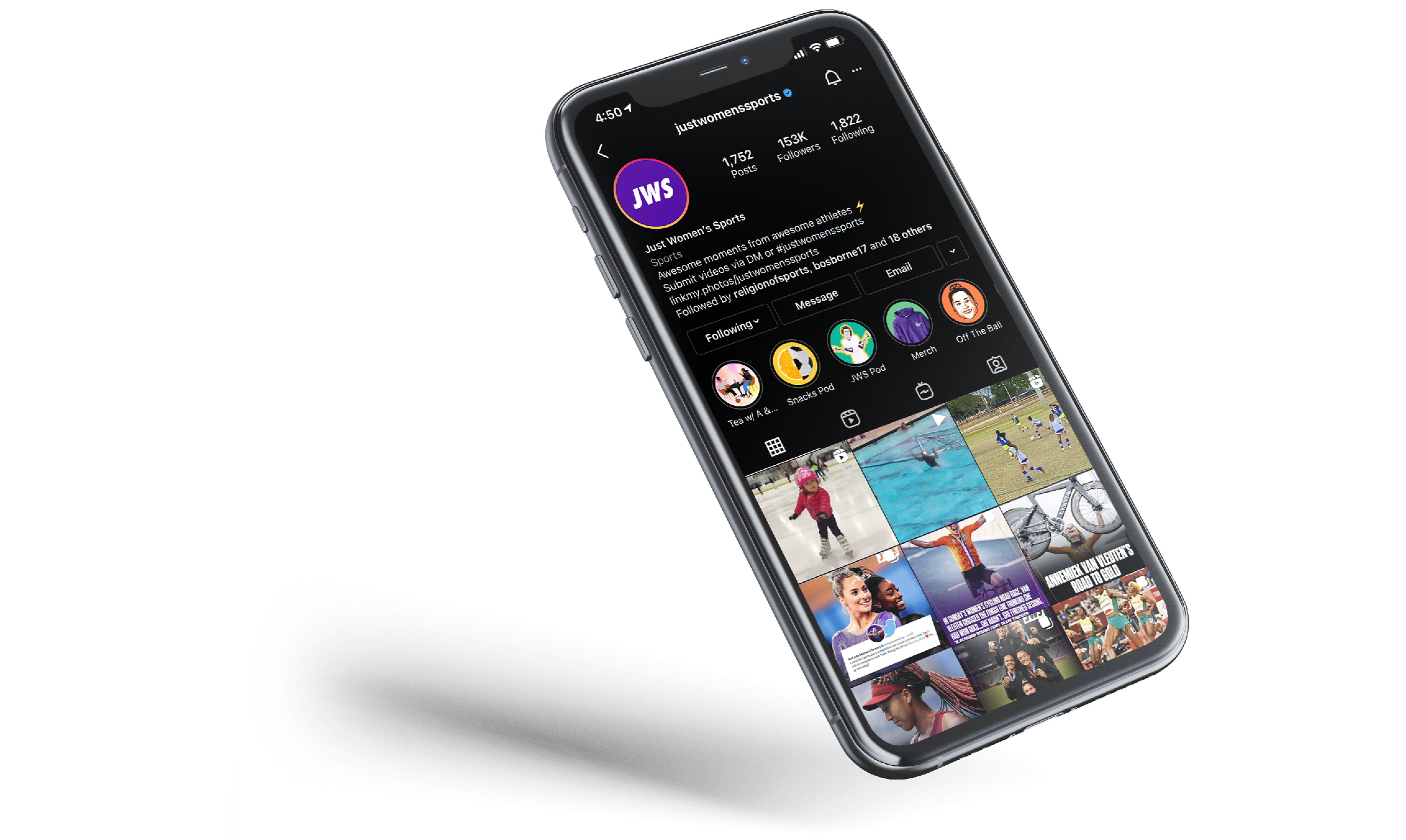
Without airtime and awareness, the public misses out on phenomenal play and female athletes lose out on sponsors, fans, and dollars. Just Women’s Sports exists to shine a light on the stories, athletes and moments that define and fuel the women’s game. Every current sports fan is a future women’s sports fan. JWS is the gateway, and I had the unique opportunity to come in in the early stages of the startup to help shape how it would look. Launched in early 2020 by Haley Rosen, a former professional soccer player, JWS started life purely as an Instagram account but now operates its own branded platforms providing news and analysis through exclusive interviews, podcasts, videos and other content. Women's sports is filled with amazing stories and athletes that deserve a platform.
From a creative director’s lens, Just Women’s Sports operates as a purpose-driven content engine and brand platform architected to correct a systemic market inefficiency in sports media, where decades of underinvestment have suppressed demand signals rather than reflected them. In a landscape shaped by legacy broadcast economics and male-skewed rights deals, the brand reframes women’s sports not as a niche vertical but as an undervalued growth category with premium storytelling IP, high-affinity audiences, and untapped sponsorship inventory. Our strategic mandate centered on building an always-on, multi-platform content ecosystem that amplifies athlete narratives, cultural moments, and data-backed performance metrics to drive audience acquisition, retention, and brand equity. This meant treating distribution not as an afterthought but as a core design principle, engineering content formats that are native to each platform while maintaining a cohesive brand voice. Every touchpoint, from short-form social to long-form storytelling, was designed to ladder up into a larger narrative architecture that positions the brand as both a publisher and a cultural authority.
Execution required a balance between immediacy and intentionality, where speed of publishing coexisted with a long-term vision for IP creation and monetization. We developed a modular content system that could scale across breaking news, athlete-led storytelling, and franchise formats, enabling consistency without sacrificing creativity. Partnerships were approached as strategic amplifiers, aligning with brands and sponsors that recognized the asymmetry between current valuation and future potential. At the same time, we invested in building owned channels and community loops that deepen engagement and increase lifetime value, ensuring the audience is not only reached but retained. The result is a flywheel where content drives culture, culture drives community, and community unlocks commercial opportunity, positioning Just Women’s Sports not only as a media brand, but as an early mover in a category poised for exponential growth.

One of the first things I did when kicking off this rebrand was to really immerse myself in footage and imagery of women's sports to get an even stronger hold on my own fandom and history of the game. This process proved to be extremely fruitful as the iconic imagery of women who have been pioneers and game changers, trailblazing their way into these leagues and breaking down new industries with their sheer strength of will really set the tone for how the brand needed to speak to this sense of excitement, hope and hype that these photos engendered. I always love collage as a form of expression and it is one of my favorite mediums.
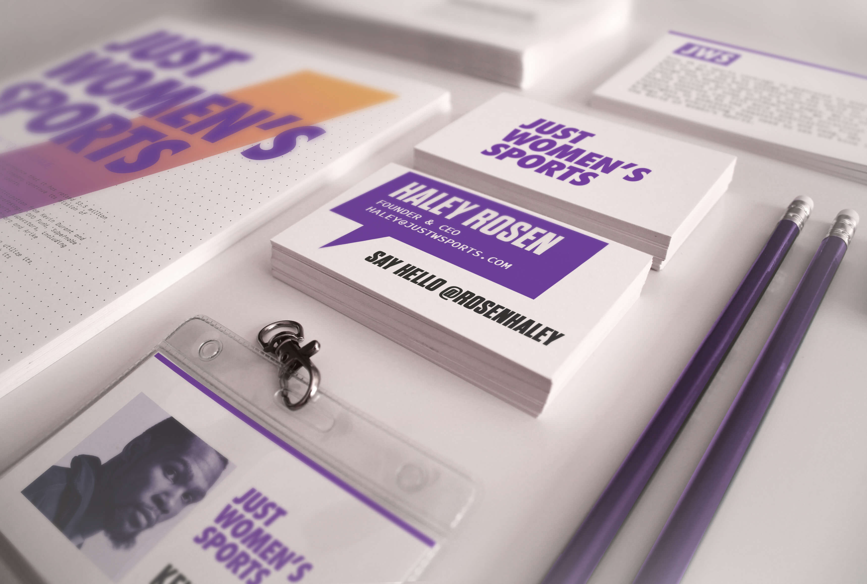
I created a collage of the images to really help set a tone and north star for the brand as we developed the look and feel as one of our first projects this lead to a north star. This key visual would go on to live as the youtube banner, the backdrop for step-and-repeat photo opportunities at events, the back of all the business cards and a lot more while really helped create a tangible piece that represented the true diversity and human side of women's sports. What emerged was a very unique spectrum of pretty much all sides of the human experience. Intersectionality within the realms of fashion, entertainment, sneakers, music, film, video games and way way more felt natural in this context, while still having a focus on the athletes and their personalities. It almost functioned as a moodboard for this rebrand as we moved forward.
As CEO of Just Women's Sports Haley Rosen says in her TED talk, there is a $200 Billion addressable market out there for Women's Sports, and they wanted to position themselves at the center of that opportunity. investors include Billie Jean King, Joe Tsai, Hilary Knight, Kevin Durant and Rich Kleiman of 35 Ventures and Abby Wambach. Just Women’s Sports recently announced a $6 million in a funding round and is now valued at $36 million. Rosen approached myself and Will Leivenberg to build, execute, and manage a cohesive, efficient, and results-driven marketing strategy in order to hit the company’s top-line goals in a refreshed and more professional manner befitting of this funding round as they look for more funding and an expanded purview as the biggest women's sports media company around.
The tagline, "Hype not guilt" is a great way to describe the paradigm shift in presenting marketing messages around women's sports as you take it away from the ecosystems perpetuated by a largely white imperialist patriarchal media landscape. From patriarchal ideologies to systemic inequality, myriad historic factors have served to stifle the growth of women’s sports and women within sports, giving rise to stark disparities between male and female athletes. And what you saw from the main players in the sports media space was the end result of media conglomerates with their large firehose of audience taking a one size fits all approach to the content in a way that was a detriment to the core audience. Women's sports were and are being covered as a second thought.
What was missing in the category was not talent, demand, or cultural relevance but a cohesive brand operating system that could translate momentum into market share. Women’s sports had highlights and heroes, yet lacked a unifying media grammar capable of packaging excellence into scalable, monetizable formats that brands could confidently underwrite. My focus was to close that translation gap by engineering a brand infrastructure that made investment feel inevitable rather than altruistic. This meant designing for repeatability, recognizability, and revenue, not one-off virality. We built a system where every asset, from a stat card to a docu-series opener, laddered up to a singular perception of authority. Consistency became currency. Familiarity became trust. Trust became spend.

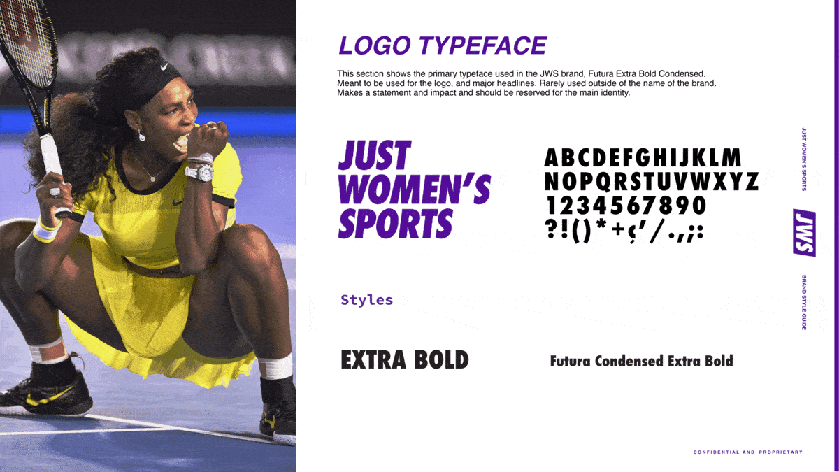
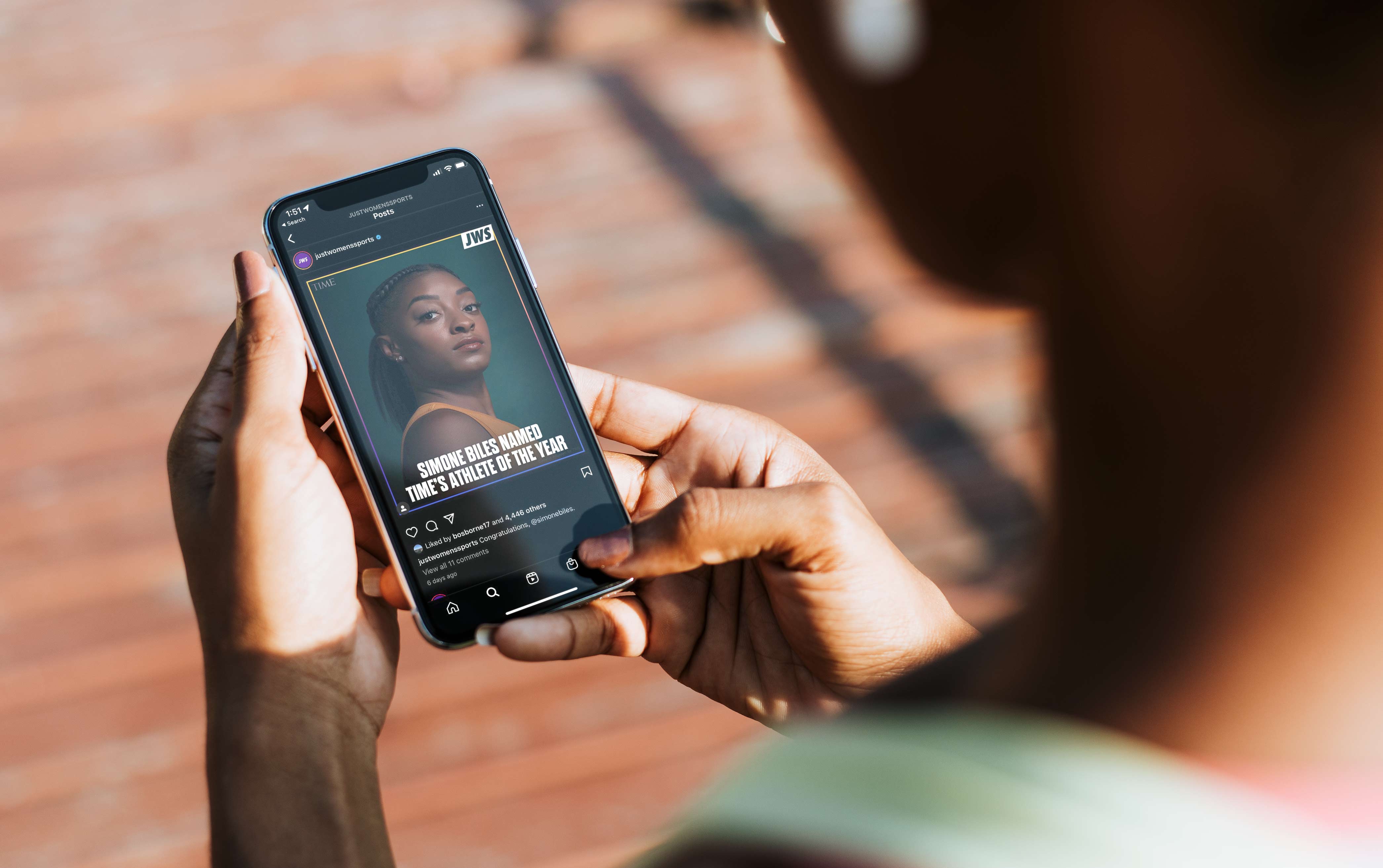
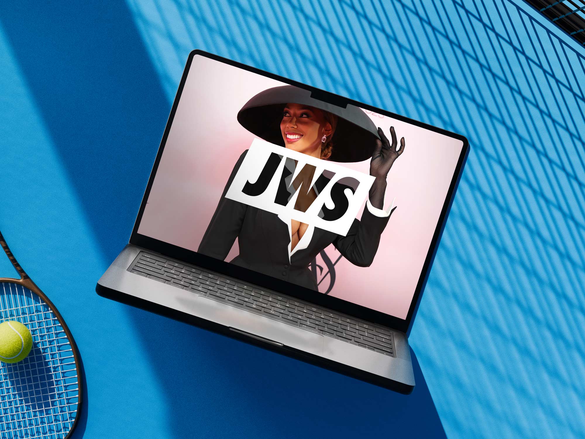
The JWS box logo is built around a condensed Futura Extra Bold Italic wordmark, enclosed within a tilted rhombus that signals motion, urgency, and competitive edge. The form draws lineage from Nike’s original wordmark energy and the cultural authority of Supreme’s box logo, while channeling the systematic rigor of the Bleacher Report lockups I developed, where containment creates instant recognizability across broadcast, social, and live environments. The forward lean of the typography, paired with the slight angular tilt of the container, evokes acceleration and progress, positioning the brand as both rooted in sport and oriented toward the future. It is a mark designed to perform at speed, scale, and across surfaces, equally at home on a lower third, a jersey patch, or a stadium ribbon board.
The identity system framed JWS not as a league or publisher, but as a modern content company built for distribution, where the mark functions like a media bug, a social avatar, and a broadcast lockup, reinforcing that the product is storytelling at scale rather than a single sport or platform.The emphasis on hype over guilt represents a strategic departure from advocacy-based messaging that can inadvertently frame women’s sports as a moral obligation rather than an entertainment product. By foregrounding excitement, the brand aligns itself with the emotional engine that drives all sports fandom: joy, rivalry, and shared spectacle. This approach transforms support into desire, which is far more sustainable as a growth driver. Energy converts. Obligation dissipates.
A critical unlock was reframing fandom from passive viewership to participatory culture, recognizing that the modern sports audience does not sit back but co-authors the narrative through shares, memes, commentary, and identity signaling. We leaned into this behavioral shift by creating modular content primitives that fans could remix, screenshot, and circulate without degradation of brand integrity. The design system was built less like a style guide and more like a toolkit for cultural propagation. Every post functioned as both media and merchandise, a badge of affiliation in the social feed economy. The goal was ubiquity without dilution. When fans carry the brand, distribution becomes exponential. Community becomes infrastructure.

Another gap was the absence of a premium aesthetic language that treated women’s sports with the same cinematic gravitas historically reserved for men’s leagues. Too often coverage defaulted to either apologetic earnestness or lifestyle gloss that obscured athletic dominance. We rejected both. The visual direction emphasized velocity, physicality, and scale through assertive typography, high-contrast compositions, and motion behaviors that echoed broadcast sports packages rather than lifestyle media. Athletes were framed as protagonists, not subjects. Competition was the spectacle. Performance was the narrative engine. The result was a brand that felt less like advocacy and more like inevitability. JWS was positioned in the perfect place for a hungry audience that wanted to consume it's content.

Commercial partners needed a safe yet electric environment, one that balanced brand suitability with cultural edge. We architected sponsorship surfaces that felt native to the fan experience rather than interruptive, integrating partner messaging into data visualizations, athlete storytelling, and community activations. Instead of slapping logos onto inventory, we created narrative adjacency where brands could align with progress, excellence, and equity without performative signaling. This approach transformed branded content from obligation into opportunity. Partners were not buying impressions. They were buying proximity to a movement. Alignment replaced insertion.

We also identified whitespace in data storytelling, an underutilized lever in women’s sports coverage that limited both credibility and betting, fantasy, and analytics integrations. By systematizing stat visualization and performance metrics into compelling, shareable formats, we elevated analytical discourse and unlocked adjacent revenue pathways. Numbers became narrative. Leaderboards became drama. Data became a bridge between casual fans and obsessives. This shift positioned JWS not only as a storyteller but as an information authority, expanding its relevance across media, wagering, and second-screen ecosystems. Insight drives engagement. Engagement drives ecosystems and builds long term audiences on social and on web over time.
We also recognized whitespace in newsletter strategy and social distribution, two surfaces that are often treated as promotional outputs rather than core editorial products. For JWS, that meant building coverage formats that could extend the life of a story beyond the site itself, translating reporting, interviews, and tentpole moments into recurring touchpoints that audiences could subscribe to, share, and return to daily. The newsletter became more than a recap vehicle. It became a habit-forming layer of the brand, a direct line to the audience that deepened loyalty, increased retention, and created a more owned relationship outside the volatility of platform algorithms.

In parallel, the social team transformed coverage into a living stream of culture, shaping platform-native posts, reactive storytelling, and editorial packaging that allowed major moments to travel with speed and clarity across feeds. Meanwhile we did merch drops and seeded athletes as well. This created a flywheel where reporting fed social, social fed newsletters, newsletters fed site traffic, pics flooded socials and each surface reinforced the others. The result was a more durable media ecosystem, one where distribution was not an afterthought but part of the product itself. Coverage became compounding. Audience became community. And every touchpoint worked harder over time.

The brand’s voice required calibration to occupy a narrow but powerful lane: confident without condescension, celebratory without cliché, culturally fluent without trying too hard. We codified a tonal framework that mirrored group chat energy, locker room respect, and newsroom credibility in equal measure. Copy became choreography, guiding emotional tempo across platforms while preserving clarity and punch. The voice did not ask for attention. It commanded it. Humor was sharp but never exclusionary. Pride was present but never preachy. The tone signaled belonging before it signaled branding.

From an experiential standpoint, we saw untapped potential in translating the digital identity into physical environments that could anchor community and drive commerce. The system was designed to scale into pop-ups, live broadcasts, locker room tunnels, and merchandise drops without losing coherence. Color, typography, and motion extended into spatial storytelling, turning events into immersive brand encounters rather than sponsorship backdrops. Fans did not attend activations. They entered the brand. Physical space became media. Presence became memory. Memory became loyalty.

The core model of growing a following for them was based on driving sections of their larger more disparate demographic that followed their main accounts towards a vertical they had interest in, but over time what would happen with this tactic is that you get a very low engagement rate as the people following the account only have a passing interest in the subject rather than those who would seek out the account and find it of their own accord or through their own social graph. Because of this, the posts would be riddled with low quality, often times very toxic and misogynistic commentary that would turn off the core users and fans who didn't sign up to be exposed to that. This was the main disconnect where the content was not serving the needs of the customer, leaving the market ripe for disruption.
The Just Women's Sports model is radically different, it celebrates the athletes and their stories and the comment sections cultivate a fun, supportive and empowering environment due to its carful building of an engaged and interested follower base. For women’s sports to become mainstream, two key things need to happen: The games need to be accessible. One of the biggest things we hear is that people don’t know how, when or where to watch women’s sports games. Women’s sports need to be just as accessible as men’s sports. They can’t be buried on ESPN7 or scattered across multiple streaming services. Nor can they be pushed back to time slots during which only dedicated fans will tune in. They need to be readily available for both existing fans and potential fans.
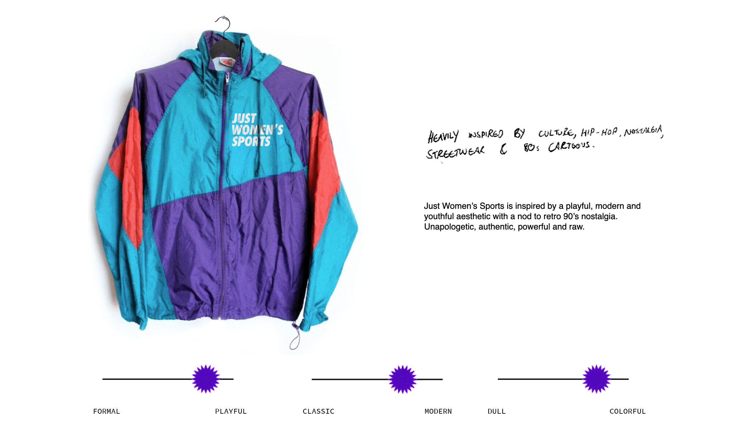
There is a big market opportunity to engage and educate fans around the exciting, important and overlooked female demographic in sports, sports betting and gaming, and Just Women’s Sports is at the forefront of creating more parity in the industry. With this in mind, one of the first things that really acted like a totem for inspiration was a classic 90s Nike athletic windbreaker in bright vibrant colors. It evoked a sense of nostalgia, emanated coolness, and just felt sleek and fresh. It was playful yet modern and bursting with color, and it would become a place I would look to for inspiration as I developed the logos and color palette.

Just Women’s Sports is building on the foundation of earlier pioneers by creating a media platform that celebrates and elevates the incredible athletes and stories in women’s sports, the logo needed to make a bold statement and using a font like Futura Extra Bold Condensed, popularized by Nike, and owning it with it's own differentiated spin was something that stood out as an interesting statement. It allowed the logo to feel simultaneously familiar and fresh, with the 7% tilt of the diagonal being representative of the coverage given to Women's Sports at the time of the founding of the company. It was this forward title that looks towards a future of more equitable coverage.
One underexplored (Jist like how Austin Butler said cringe is an underexplored emotion on Subway Takes) strength of the playbook lies in its insistence that the brand is for fans of women’s sports, not exclusively for women, a distinction that reframes inclusivity as expansion rather than segmentation. By positioning the audience as sports fans first, the brand avoids the marginalization trap that has historically relegated women’s sports to niche status. This framing broadens the total addressable market while preserving authenticity, allowing new audiences to enter without feeling like outsiders to a cause. It is an invitation rather than a gate. Belonging scales.
The social voice guidelines provide a sophisticated tonal balance that resists both corporate neutrality and activist didacticism, opting instead for a voice that is celebratory, witty, and culturally fluent. By emphasizing “show, don’t tell,” the brand avoids over-explaining its legitimacy, allowing the quality of play and storytelling to speak for itself. This restraint signals confidence and respects audience intelligence, a critical factor in building trust with digitally native fans. Tone becomes proof of concept. Confidence builds credibility. This interplay between strategy and creative and design allowed for a very streamlined brand toolkit.

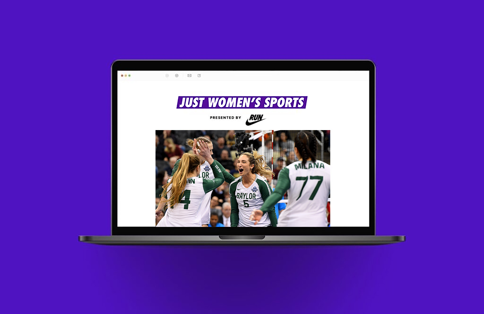
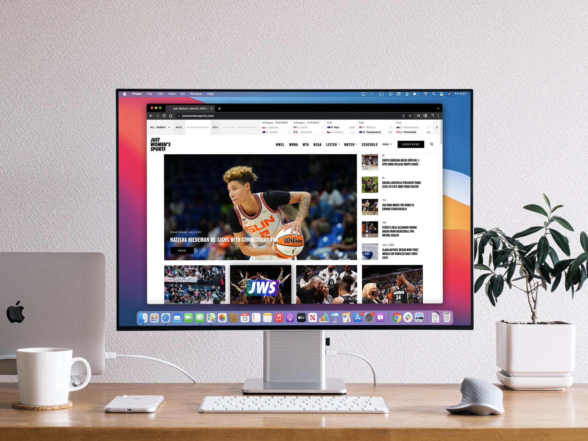
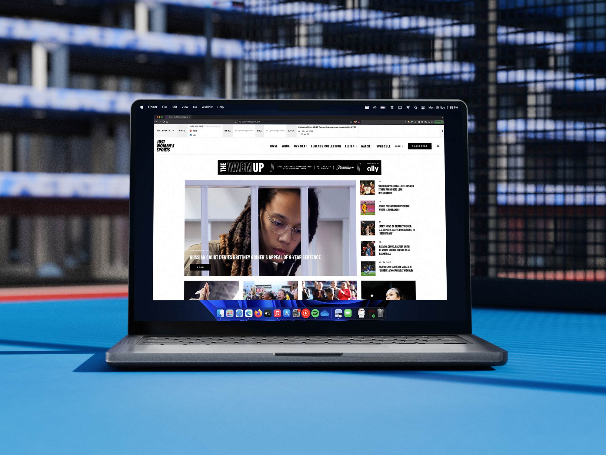
JWS set out to build a comprehensive destination for women’s sports, delivering highlights, statistics, schedules, and editorial coverage across U.S. basketball and soccer while expanding visibility for tennis, golf, softball, volleyball, surfing, and other underrepresented leagues. The ambition extended beyond the website, encompassing social platforms, podcasts, video series, and selective branded content integrations that could fund growth without diluting editorial integrity. To support that breadth, the brand needed more than a visual refresh; it required a unifying system that could hold multiple sports, formats, and storytelling modes under one coherent identity.

Prior to this effort, the experience felt fragmented, with inconsistencies in typography, layout logic, and content packaging that made it difficult for audiences to recognize JWS as a singular, authoritative voice. We approached the challenge as an ecosystem design problem, mapping how content moved from live game moments to social clips to long-form storytelling and partner activations. The goal was to ensure that whether a fan encountered JWS through an Instagram carousel, a podcast cover, or a stat graphic, the experience felt unmistakably part of the same brand universe. Establishing that cohesion was essential not only for audience trust but for signaling to leagues, sponsors, and athletes that JWS was building durable infrastructure for women’s sports media.

The framework I developed in close collaboration with Will, alongside critical input from Haley and Chief of Staff Sivan Raya, became the operational backbone for that unification. We defined a modular design system that standardized grids, typographic hierarchy, color logic by sport, and motion principles, allowing the brand to scale quickly without sacrificing clarity or craft. This system enabled rapid publishing across multiple leagues while preserving a consistent visual language that reinforced recognition and credibility. By codifying patterns for stats cards, highlight templates, podcast artwork, and social series, we reduced production friction and empowered internal teams to create at the pace of live sports. Having clear templates and guidelines helped with speed to market.

The structure also created clear guardrails for branded content, ensuring partnerships could integrate seamlessly without feeling visually or editorially dissonant. Over time, the design system evolved into a strategic asset, enabling JWS to onboard new leagues and content formats with confidence rather than reinvention. What began as an effort to organize a fragmented brand ultimately became the foundation for a scalable media platform dedicated to elevating women’s sports with the consistency and respect they deserve. In a world with social and website and the content appearing in increasingly fragmented mediums this became of utmost importance.
One of the central elements of the design system was the way that the colors worked within shapes. The shape, or dash functions as a visual motif, for placing quotes, images, speech bubbles, repeated background patterns and more. It is intended as a visual flourish to be placed in the background or used to house other content or typography, acting as a vehicle rather than being presented on its own and is integral to bring all of the elements together in a cohesive manner.

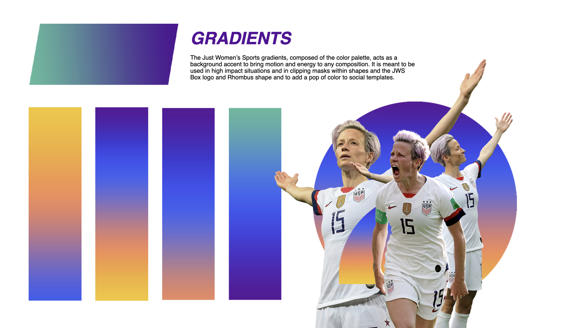
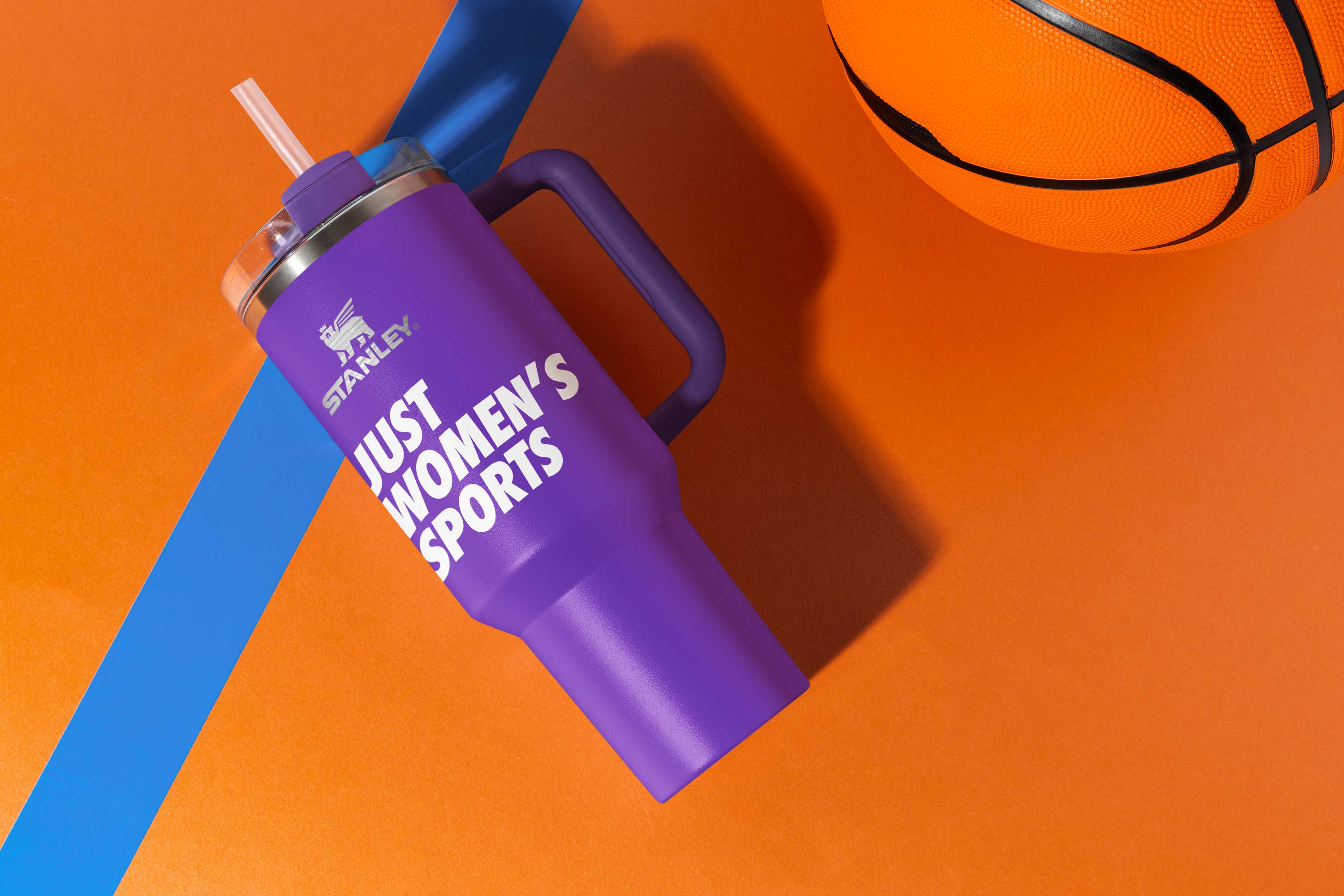
Drawing inspiration from that initial north star of the sports windbreaker, purple was always a key color that felt really integral to the DNA of Just Women's Sports. Along with it I wanted a set of cooler tones and warmer pops of brightness that would work together to create a sense of lightness and optimism. This evolved further in the exploration of gradients which really brought the photography to life. The gradient usage acts like an accent to really add a sense of kinetic energy to the compositions and when used in conjunction with the JWS Rhombus shape, it really was able to shine.
From a typography stand point it was all about creating options with balance. With such an iconic logo typeface in Futura Extra Bold Condensed, a softer complementary secondary font in Source Code Pro for medium body copy and legible accent typography. Useful for attributions, captions, and when writing a paragraph and especially for use on the website. However on social, knowing that there was a need to optimize for mobile screen, going with a strong legible condensed typeface like Dharma Gothic enabled a high level of flexibility. Trade Gothic is meant to be used for headlines and quote cards as well as for numbers on stat cards and for bigger and bolder typography.
Another undeniable piece of evidence of the appetite for this type of content came in the form of social media, the great equalizer. Women’s sports have always been caught in a chicken/egg dilemma. The gatekeepers would devote a fraction of the time, energy and investment given to men’s sports, then use the resulting lag in interest to justify continued tiny investment. While in the past, gatekeepers decided which games to put on TV and which athletes to put on magazine covers, fans now get to decide for themselves which athletes they want to follow on social media. And the results are impossible to deny. Developing a great social strategy was of key importance and a challenge that me and Will had a great time taking on.
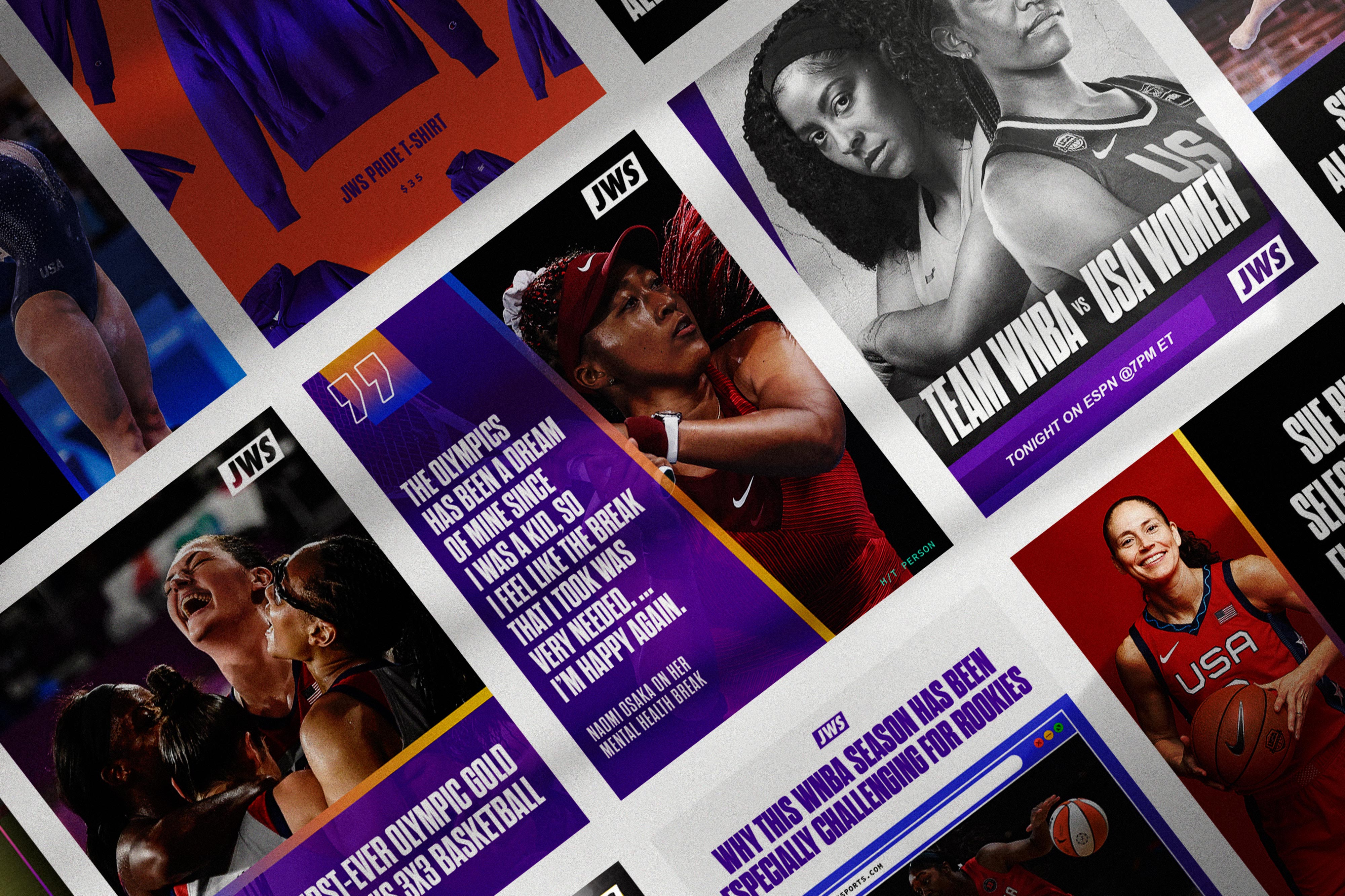
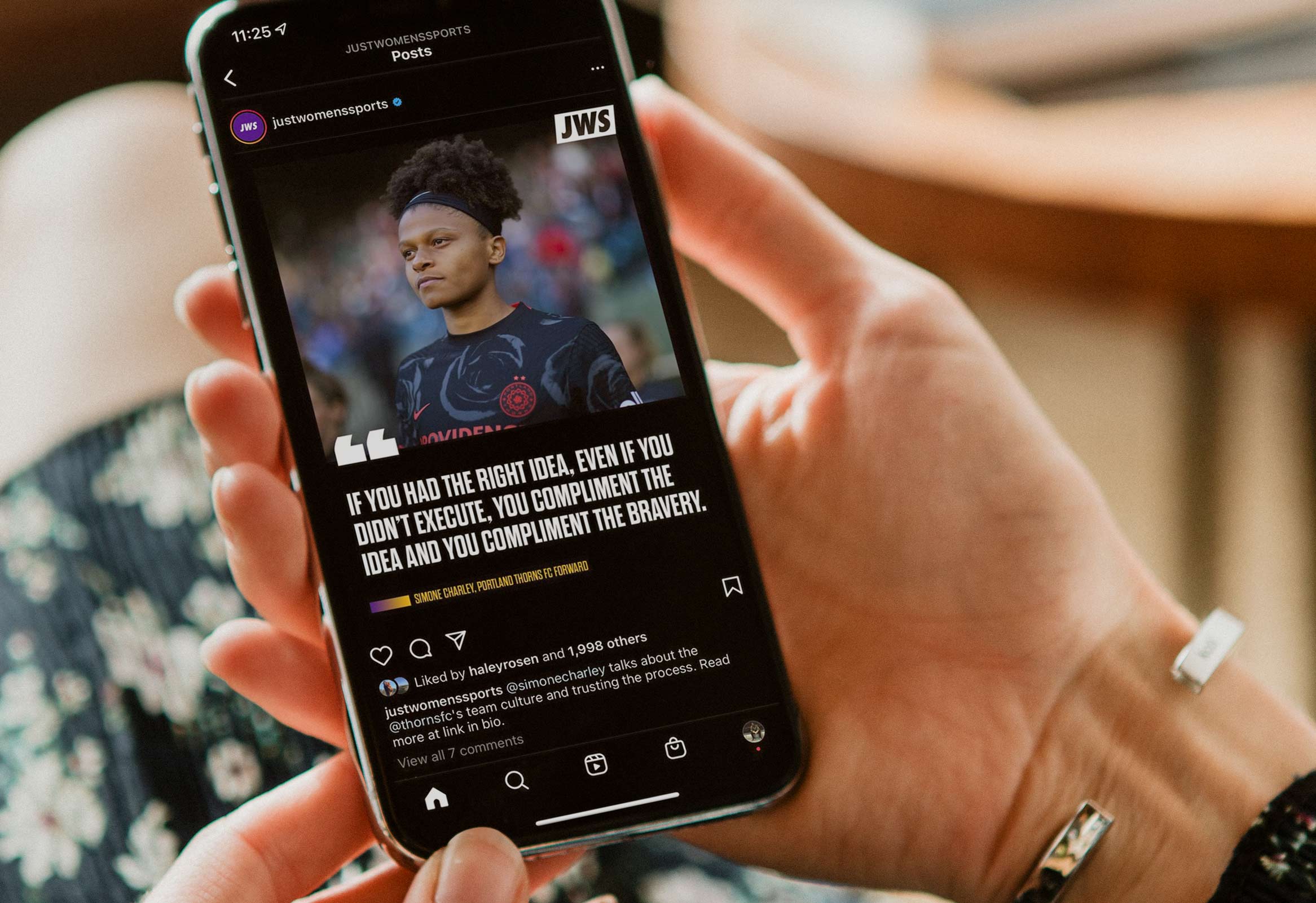
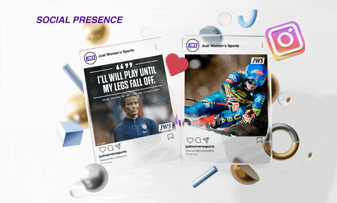
Along with developing and copywriting a core brand marketing strategy and narrative from scratch, building out a refreshed logo system, and color palette I also worked with Matt Sanoian to create a robust set of social templates that Just Women's Sports could use across their social media channels to create breaking news coverage, quote cards, merchandising vehicles, score updates, power rankings, infographics and much much more. This system took the core elements of the typography, color and voice and created tangible examples of the brand in the wild where fans could engage with them.
.jpeg)
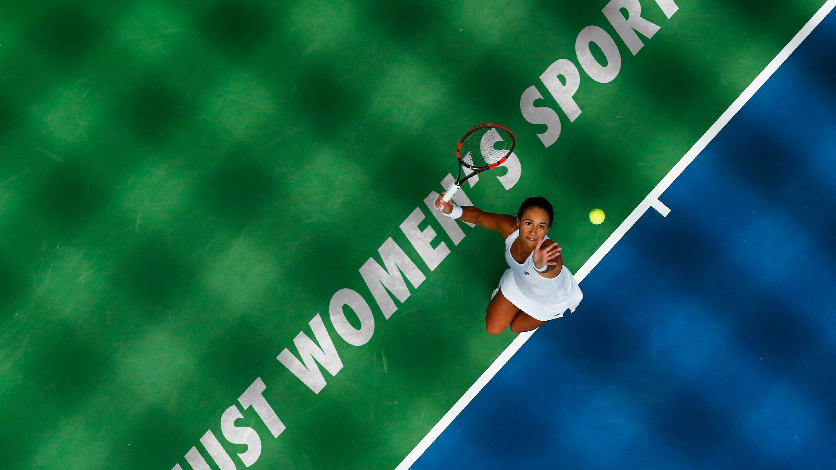
The playbook’s commitment to speed to market reflects a deep understanding of the attention economy, where cultural relevance is measured in minutes rather than hours. Rapid response templates and modular systems enable the brand to participate in real-time conversations without sacrificing coherence or accuracy. This operational agility ensures that women’s sports are present in the same temporal arena as men’s sports coverage, countering historical delays that diminished visibility. Timing shapes perception. Presence signals parity. Like a serve from Serena ripping past the net, the designs and social templates were built for speed to market and ease of posting.
The modular template ecosystem functions as a true content operating system, enabling scale without aesthetic drift while preserving the brand’s distinctive voice across every touchpoint. From rapid news cards and matchday alerts to multi-slide explainers and athlete spotlights, each format is engineered to maintain visual coherence while accommodating varying depths of storytelling. The system establishes a predictable rhythm of typography, color hierarchy, and spatial logic that allows audiences to recognize the brand instantly, even mid-scroll. This structural clarity reduces production friction for internal teams and partners alike, making high-velocity publishing sustainable without sacrificing craft. JWS needed to be lean in it's early years to prove the concept and drive funding to continue to expand.
By embedding guardrails rather than rigid rules, the templates invite creative expression while preventing fragmentation across campaigns, seasons, and social surfaces. The result is an ecosystem where content feels unified whether it is announcing a roster move, celebrating a record-breaking performance, or unpacking the cultural context around women’s sports. In a landscape defined by speed and saturation, this balance between flexibility and discipline ensures the brand scales with intention.
This flexibility allows the brand to meet audiences across attention spans, from snackable highlights designed for fleeting moments to immersive editorial arcs that reward deeper engagement and sustained curiosity. Each template acts as an entry point into a broader narrative system, guiding viewers from quick updates to richer storytelling without disrupting visual continuity. Over time, this repetition of structure creates cognitive ease, allowing fans to process information faster and associate the experience with reliability and trust. Consistency builds memory structures that anchor the brand in the minds of audiences navigating an endless feed of competing signals. Memory, in turn, builds loyalty by transforming recognition into emotional familiarity and habitual return. As fans come to rely on the templates as navigational cues, the brand becomes less a publisher of posts and more a dependable companion to the rhythms of the season. Through this disciplined yet adaptive framework, the social presence evolves into a living archive of moments that collectively reinforce identity, community, and long-term cultural relevance.
Emoji and iconography guidelines, while seemingly minor, reflect a nuanced understanding of digital vernacular and its role in signaling cultural belonging. By standardizing elements such as the purple heart and lightning bolt, the brand embeds subtle markers of identity that reinforce community cohesion across platforms. These micro-signifiers function as social glue, enabling fans to recognize one another within fragmented feeds. Symbols create shorthand. Shorthand builds tribes and especially on social this was key.

My background placed me at a rare intersection of sports culture, social distribution, and brand system design, making me uniquely equipped to lead a rebrand of this magnitude for Just Women’s Sports. At Basketball Forever, I learned how to build a global fan community from the ground up, translating the language of the game into a social-first content engine that prioritized authenticity, speed, and cultural fluency over legacy media polish. At House of Highlights and B/R Kicks, I operated inside the attention economy at scale, refining the mechanics of thumb-stopping visuals, athlete-driven storytelling, and hype cycles that convert moments into movements. HighlightHER sharpened my understanding of the nuances and responsibilities of covering women athletes with respect, parity, and cultural awareness rather than tokenism. The Cool Down expanded that lens further, proving how purpose-driven media can mobilize audiences when design, narrative, and mission align into a cohesive system.

These experiences collectively trained me to see fandom as infrastructure, content as currency, and brand as behavior rather than decoration. JWS required exactly that synthesis: the ability to honor the athletes, galvanize a community, and build a scalable media architecture that could carry commercial ambition without compromising cultural integrity. In many ways, the project felt less like a pivot and more like a culmination, a moment where every prior system I had built, every audience I had nurtured, and every cultural signal I had learned to read converged into a singular mandate.

The first step in getting the eye balls is to cultivate a following that get relevant information from JWS before anyone else, this meant creating a system of templates that could easily and efficiently be optimized and updated and posted at a rapid pace. JWS was competing with the largest players in the space, so it was important to provide any first movers advantages we could to offset the budget disparity. The next step is for the conversation to change among those controlling where advertising dollars are spent. People are seeing the numbers, the growth and the momentum building around women’s sports, and it’s becoming harder and harder to deny. When you pair these new, appealing vehicles with the opportunity for sponsors to be attached, you get an ecosystem in which a media company can form and thrive.
There were core brand pillars that helped define the vibe of the social templates and the most important one was to champion the game. To treat sports like SPORTS instead of putting women's sports in it' own category. We’re not ignoring athletes’ drip in the tunnel pre-game or their fight for social justice post-game. Sports culture matters. But these athletes are always athletes first. Furthermore, developing a social voice and tone, along with guidelines for things like emoji use was important to maintain the right balance of irreverence and wit while respecting the sport and the women that were out thereputting their bodies on the line.

At Just Women’s Sports, social, podcasts, and YouTube were not treated as separate distribution channels but as a unified storytelling ecosystem, and my role was to ensure the design language made that cohesion immediately legible to audiences wherever they encountered the brand. I helped develop a flexible visual system that could move fluidly from square social posts to vertical video thumbnails to long-form YouTube covers and podcast artwork without losing recognizability or editorial clarity. The goal was to create a consistent tone that felt authoritative yet accessible, pairing bold typography, confident color blocking, and athlete-forward imagery with motion and audio cues that signaled credibility in a space that had historically underinvested in women’s sports. On social, this meant designing templates that allowed rapid publishing while preserving brand integrity; on podcasts, it meant crafting cover systems and audiograms that translated voice into visual rhythm; on YouTube, it meant thumbnail strategies that balanced platform performance with long-term brand equity. By aligning these touchpoints, we built a recognizable cadence where fans could move from an Instagram post to a podcast episode to a YouTube feature and feel the same editorial intent guiding the experience. My work focused on making that continuity feel effortless, so the audience’s attention stayed on the athletes and stories rather than the mechanics of the platform.
The content templates are meant to say that "we’re edgy, not assholes" and that JWS' voice is rooted in a very youthful tone, swagger, style and energy. Guilt doesn’t move the needle. Excitement does. The energy of sports is contagious, and the mission of these templates is to capture, harness and amplify that energy for women’s sports fans everywhere. The copywriting needed to feel polished, but relatable. When Taurasi hits a game winner, what do you text your WhatsApp or iMessage group thread? Bring that same energy to the voice of JWS. Witty, celebratory, clear and on-point.
The best way to engage a diverse audience is to first, invest in a diverse team, and second, to showcase the diversity of the game. We value the colorful threads that make up the fabric of culture, and choose to celebrate how that shines bright in women’s sports today, and always. This means having a content and creative system that is flexible for different platforms and is able to adapt to the voice and tone appropriate for each channel. Just like the athletes we cover, we want to be the best whether that is on a social platform like Instagram or on the web or even IRL at experiential activations.
The rebrand called for an intellectual and cultural framework equal to its visual ambition, one that understood representation not as optics but as a redistribution of attention and value. Rather than treating visibility as benevolence, we approached it as recognition of excellence long obscured by structural bias, reframing fandom as an act of witnessing and participation. Difference was not a segmentation challenge to be smoothed over but a generative force that enriched the system, informing a design language capable of holding multiplicity without fragmentation.

The legacy of athlete-activists who fought for equity across courts, boardrooms, and broadcast deals served as a strategic compass, reminding us that media, policy, and commerce are interdependent levers. From a marketing leadership perspective, this positioned the brand not as a corrective footnote but as a recalibration of market logic. Equity moved from moral appeal to competitive advantage. Representation translated into demand. From reels to run clubs irl the brand had to be flexible and nimble.

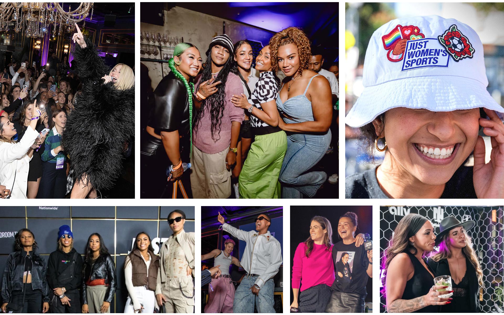
Experiential became a cornerstone of the Just Women’s Sports growth flywheel, transforming passive audiences into active communities through IRL touchpoints that reinforced brand affinity and cultural legitimacy. In a category historically deprived of physical fan infrastructure, we positioned events not as ancillary marketing moments but as core distribution channels capable of driving earned media, social amplification, and partner value. The creative system ensured that whether in a flagship store, a city park, or a nightlife venue, the brand presence felt unmistakably cohesive and culturally attuned. By designing for shareability, modularity, and narrative depth, we transformed events into media engines that extended reach far beyond the room. Experiential became a strategic moat. Community became currency. Presence became power.
The design system was engineered to perform across environments ranging from retail flagships to outdoor runs to nightlife takeovers, ensuring visual consistency while allowing for local cultural nuance. By codifying spatial branding, signage hierarchies, and modular assets, we enabled rapid deployment across markets without diluting brand integrity. This approach reframed experiential from one-off execution to scalable media surface. Each activation functioned as both content engine and community node. The result was a feedback loop between physical presence and digital reach. Experiential became infrastructure, not ornamentation.
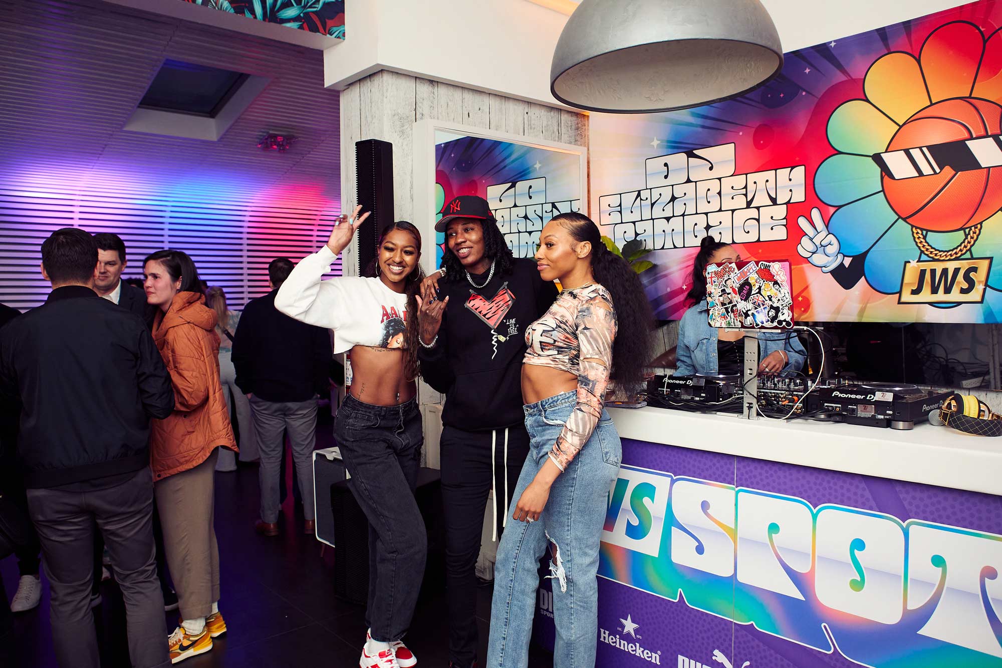
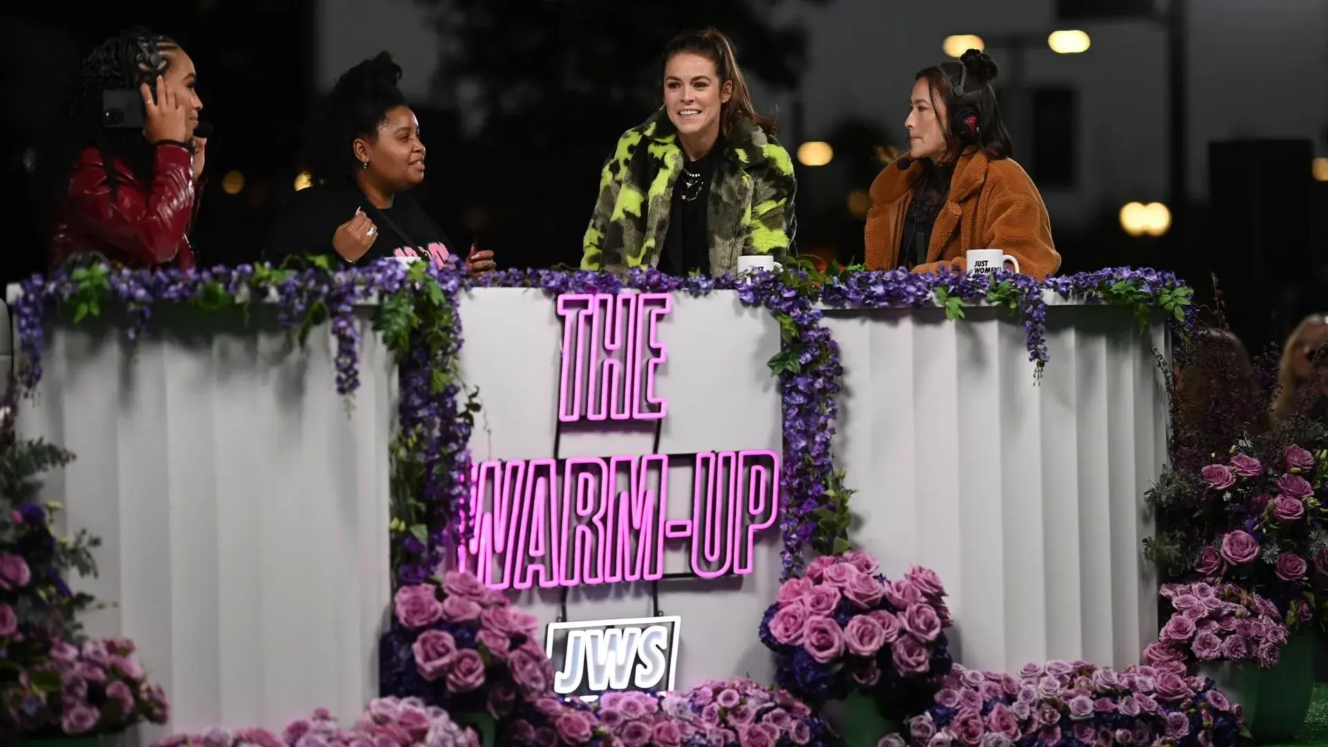
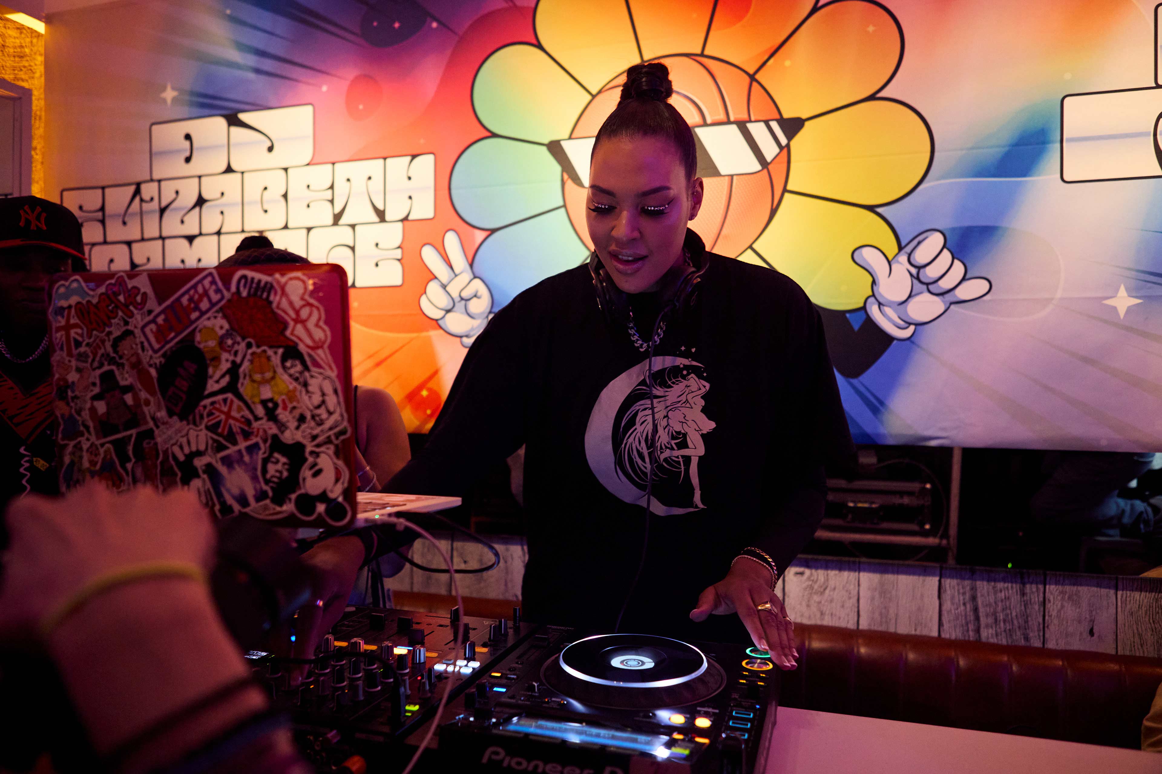
Watch Party activations emerged as a strategic wedge into underserved fan rituals, particularly for leagues like the WNBA and NWSL where communal viewing spaces have historically been limited. We designed these gatherings to operate as cultural safe havens and brand theaters, combining broadcast viewing with athlete appearances, DJ sets, and social capture zones optimized for shareability. Environmental graphics, neon signage, and floral backdrops created high-impact visual anchors that translated seamlessly into social content, extending the life of each event far beyond its physical footprint. By embedding sponsor integrations organically into the environment rather than as intrusive overlays, we increased partner ROI while preserving authenticity. The Watch Party format proved replicable across cities, enabling JWS to establish a national footprint through a network of localized fan hubs. Each event generated first-party audience data and strengthened CRM pipelines. The format validated experiential as a growth lever. It turned viewership into belonging.
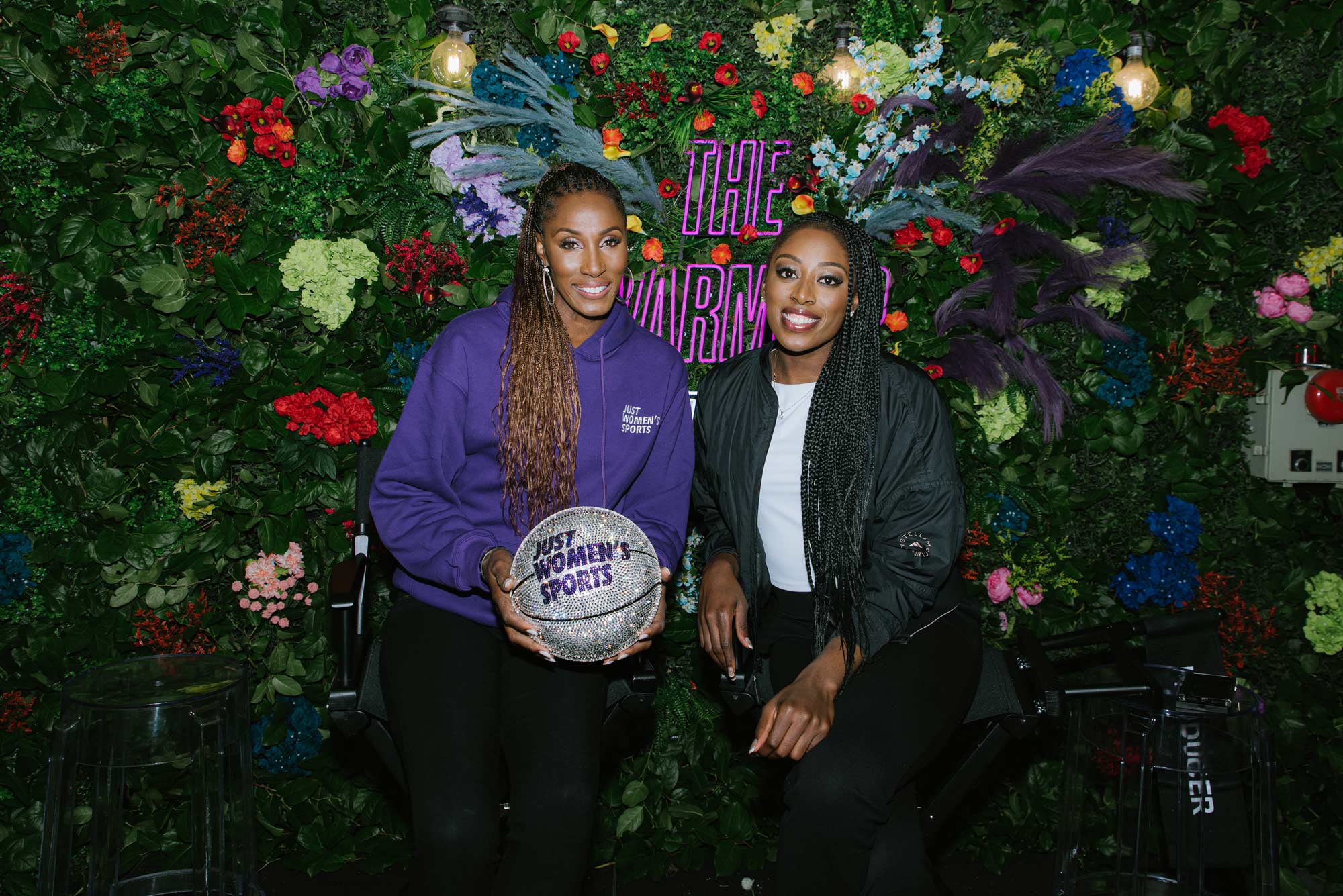
All-Star Weekend activations functioned as apex moments within the sports calendar, offering JWS a platform to assert cultural authority alongside legacy media incumbents. Our creative strategy focused on spatial storytelling, transforming pop-ups and lounges into immersive brand worlds that celebrated women athletes with the same spectacle traditionally reserved for men’s sports. Through dynamic LED installations, gradient motion backdrops, and athlete-led panels, we engineered environments optimized for both live engagement and social virality.

The design language emphasized bold color transitions and modular typography that scaled from step-and-repeat moments to large-format displays. This allowed for rapid adaptation across venues while maintaining a cohesive visual identity. By centering athletes as storytellers rather than photo ops, we deepened emotional resonance. These activations generated premium sponsor inventory and high-value media impressions. All-Star became a proving ground for parity in presentation.
The playbook’s insistence on “sports first” serves as a philosophical anchor that protects the brand from drifting into lifestyle trivialization or token coverage. By treating women’s sports with the same analytical rigor, statistical depth, and competitive framing afforded to men’s leagues, the brand normalizes excellence rather than exceptionalizing it. This is not amplification for its own sake; it is calibration toward parity. Coverage becomes correction. Correction becomes culture.
We treated brand architecture as civic infrastructure for a movement rather than a campaign wrapper, prioritizing systems that could absorb growth without losing coherence. The goal was endurance, not bursts of relevance, ensuring the identity could stretch across leagues, generations, and emergent sports while maintaining a consistent signal of authority. Aligning editorial, partnerships, and product around a shared narrative spine reduced friction and clarified decision making at every level of the organization. When teams operate from a common story, execution accelerates and fragmentation recedes. The work became less about managing outputs and more about stewarding meaning. Structure enabled scale and we did our best to build something meaningful.

From an executive vantage point, the opportunity extended beyond audience growth to redefining how value is measured in sports media. Traditional metrics privileged reach while undervaluing affinity, trust, and cultural impact, all of which drive long-term sustainability. By elevating sentiment, participation, and retention as core indicators, we reframed community health as a primary asset rather than an ancillary benefit. Investors responded to this reframing because depth of relationship signals durability in volatile attention markets. The shift repositioned fandom as an ecosystem rather than a funnel. Loyalty became the true unit of growth.
We consciously rejected inherited visual codes that equated authority with hyper-masculine aesthetics or scarcity narratives, opting instead for a language of momentum, clarity, and collective energy. The system asserted legitimacy without borrowing validation from legacy paradigms that historically excluded the very athletes we centered. This approach functioned as semiotic realignment, expanding the visual vocabulary of power within sports media. Strength was expressed through precision and presence rather than aggression. Authority emerged from coherence. The result felt inevitable rather than oppositional.

For brands, the rise of women’s sports has opened an entirely new frontier for storytelling. As audiences become more fragmented and traditional advertising loses its impact, companies are searching for narratives that feel authentic, culturally relevant, and emotionally resonant. Women athletes offer exactly that. Their stories often unfold at the intersection of sport, identity, community, and perseverance, giving brands an opportunity to engage with fans in ways that feel more human and less transactional. Rather than simply attaching logos to events, branded content in this space allows companies to participate in the broader cultural movement surrounding the growth of the women’s game. It becomes less about sponsorship and more about storytelling that aligns a brand with progress, ambition, and the evolving identity of sport itself.
The emergence of NIL rights has accelerated this shift even further. By allowing athletes to control and monetize their own name, image, and likeness, NIL fundamentally changed the economics of sports storytelling. Athletes are no longer limited to institutional partnerships mediated entirely by leagues or schools. They can collaborate directly with brands, media platforms, and creators, opening the door to more personal and creative forms of content. For women athletes in particular, this has been transformative. NIL has created pathways for visibility and revenue that previously did not exist, enabling a new generation of players to build their own platforms while giving brands access to voices and communities that were historically overlooked. The result is a far more dynamic landscape where storytelling, commerce, and culture intersect in ways that benefit athletes, audiences, and the brands willing to invest in the future of the game.
Designing the Just Women’s Sports podcast graphics with Lorrie Cartago was a collaboration grounded in trust built over multiple chapters of our careers. I first discovered her work while she was producing motion for the Golden State Warriors, where the pace, polish, and performance demands of a championship organization were evident in every frame. I brought her onto the Bleacher Report Snapchat team to help us meet that same speed and clarity, and when JWS needed a podcast graphics system that could feel editorial, premium, and native to vertical platforms, she was the natural partner. Together we developed a modular motion language built on kinetic type, athlete imagery, and flexible layouts that could scale across social, promotional cutdowns, and sponsor integrations without diluting the brand voice. The success of that collaboration led me to hire her again after her time at Disney, this time onto my video production team at TikTok, continuing a creative partnership defined by shared standards and mutual respect. Now that we have both moved on, that body of work stands as proof that investing in people with proven championship instincts yields systems that endure beyond any single platform or role. The podcasts have become a core content backbone for JWS and this design work proved crucial in that growth.

Intersectionality informed both narrative strategy and commercial architecture, recognizing athletes as multidimensional actors whose influence spans culture, business, and community life. By foregrounding these layered identities, we expanded the aperture for partnerships beyond endemic sports categories into sectors aligned with lifestyle, wellness, finance, and technology. This was not dilution but ecosystem design, where relevance multiplies across touchpoints. From a marketing strategy perspective, the move unlocked new revenue pathways while maintaining cultural integrity. Athletes became nodes of connection. The network generated value.

Designing for women’s sports demanded a departure from the visual grammar that has historically defined men’s sports media, where aggression, scarcity, and hyper-masculine tropes dominate the semiotic field. Instead of leaning on collision imagery, clenched jaws, and war metaphors, the system prioritized momentum, precision, and collective energy as expressions of competitive excellence. This shift did not soften the portrayal of sport; it clarified it, allowing athleticism to be read through skill, speed, and tactical intelligence rather than spectacle alone. The result was a visual language that felt authoritative without borrowing validation from male-coded aesthetics. Power was communicated through clarity of form and confidence of composition. Authority emerged from restraint.

Typography played a critical role in this differentiation, with condensed, forward-leaning forms signaling urgency and motion without resorting to bombast. The italicized wordmark angle introduced kinetic tension, suggesting forward progress rather than brute force, a subtle but meaningful recalibration of how dominance is visualized. Supporting type systems balanced legibility with editorial sharpness, allowing statistics, narratives, and commentary to coexist without hierarchy collapse. This created a reading experience that mirrored the pace of the game while maintaining journalistic credibility. Information became part of the spectacle. Data carried drama.

Color strategy further distinguished the brand from the chromatic conservatism of legacy sports media, which often relies on team colors or patriotic palettes to signal legitimacy. The unapologetic use of a singular, ownable purple established immediate brand recall while rejecting gendered clichés such as pastels or ornamental treatments. Black and white grounded the system, enabling high-contrast storytelling that elevated the athlete rather than the graphic container. Gradients were deployed sparingly to introduce motion and depth, ensuring they functioned as energy cues rather than decoration. Color became infrastructure. Recognition became instantaneous.

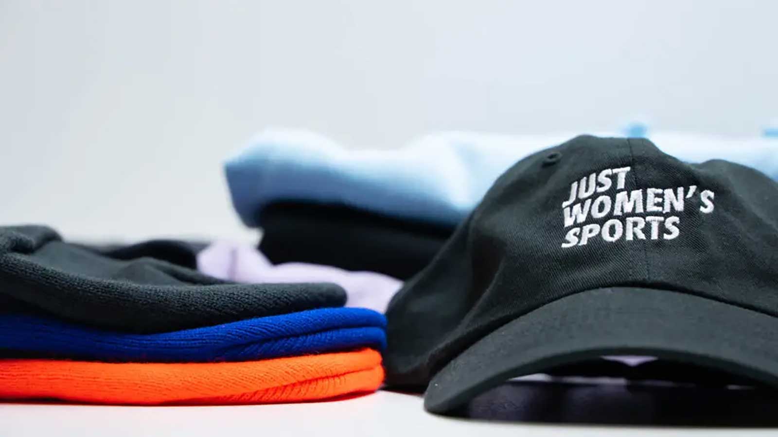
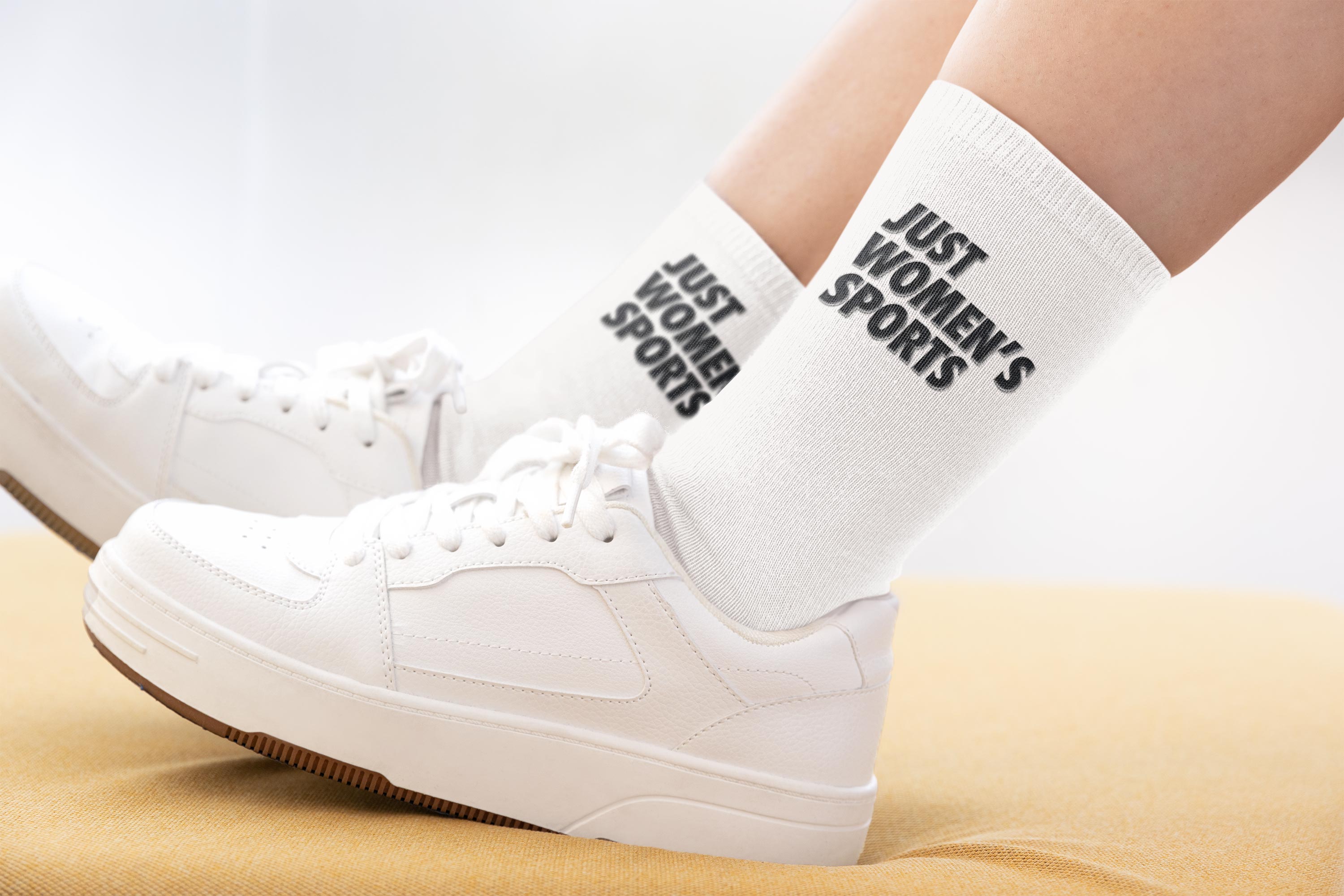
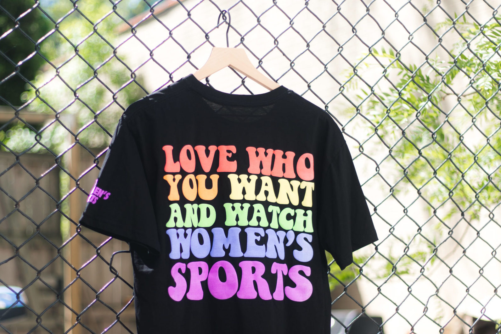
Merch at Just Women’s Sports was never an afterthought or a revenue add on, it was the physical expression of belief, a way to translate a long overlooked emotional investment into something you could wear, carry, and live in. In a landscape where women’s sports have historically been underrepresented, every hoodie, tee, and cap became a signal, not only of fandom but of alignment with a movement that deserved to be seen, funded, and celebrated. We approached it as brand storytelling in tactile form, where typography, color, and messaging carried the same intentionality as our content, allowing fans to quite literally wear their heart on their sleeve. There is something powerful about turning passive support into visible identity, about walking through the world and recognizing someone else who shares that same belief system without a word being spoken. It deepens the bond between audience and brand, transforms community into culture, and gives people a way to participate in the growth of the sport itself, not as spectators but as advocates, as carriers of its energy, and as proof that the demand has always been there waiting to be honored. Vibrant, but bold and fashion statements.
Operational tempo was shaped by the realities of contemporary fandom, where relevance is measured in minutes and cultural moments dissipate quickly. We engineered workflows that enabled rapid publication without sacrificing accuracy or tonal integrity, embedding guardrails that preserved trust at scale. Infrastructure replaced heroics, allowing teams to respond with confidence rather than improvisation. Speed became a function of preparation, not pressure. The system absorbed velocity. Momentum sustained itself and JWS was there to capitalize on web and on social.

Community governance was treated as a design challenge, not a moderation afterthought, recognizing that discourse quality directly impacts brand equity. By establishing clear tonal norms and rituals of celebration, we cultivated environments where participation felt generative rather than extractive. Fans were not passive consumers but co-authors of the cultural narrative, and their sense of safety translated into advocacy and retention. From an executive standpoint, healthy communities reduce churn and amplify organic reach. Belonging compounds. Trust scales. JWS was building a true fan ecosystem where wearing the merch felt like a show of pride.
Education functioned as a growth strategy, positioning the platform as both storyteller and guide for audiences navigating an evolving sports landscape. By demystifying leagues, access points, and rules with the same care given to highlight culture, we lowered barriers to entry without diluting expertise. This expanded the addressable audience while reinforcing credibility with core fans. Knowledge became an onboarding tool. Clarity invited participation. Participation fueled fandom.

JWS not only fills a major void, but does so with an energy and ethos that empowers fans and drives engagement with authentic connection and community built through multiple content vehicles. This unique and holistic coverage of women's sports required a social strategy that could adapt to the diversity of stories the brand would cover. After doing a market analysis there were a few things that became clear. It became important to show the audience rather than to tell or preach to them. We already know women’s sports are dope and the content makes it clear that that’s a given and not something we have to constantly reaffirm. Furthermore, it was important to be inclusive and open JWS is fun but not sarcastic, feminine but not girly, strong but not masculine, supportive of women but never disparaging of anyone.
.jpeg)
Another exciting development around Just Women's Sports was with the updated guidance and laws around the NIL and the ways that college athletes could monetize their likeness and image. This paradigm shift in the ways that the country looked at student athletes allowed for JWS to step in with its "SQUAD" program which I did the creative direction, merch, logo and design development for. This brand new pathway for empowering student athletes in a fresh and art forward way that felt true to their generation was a true fit for the brand and something the entire team felt passionate about bringing to life.
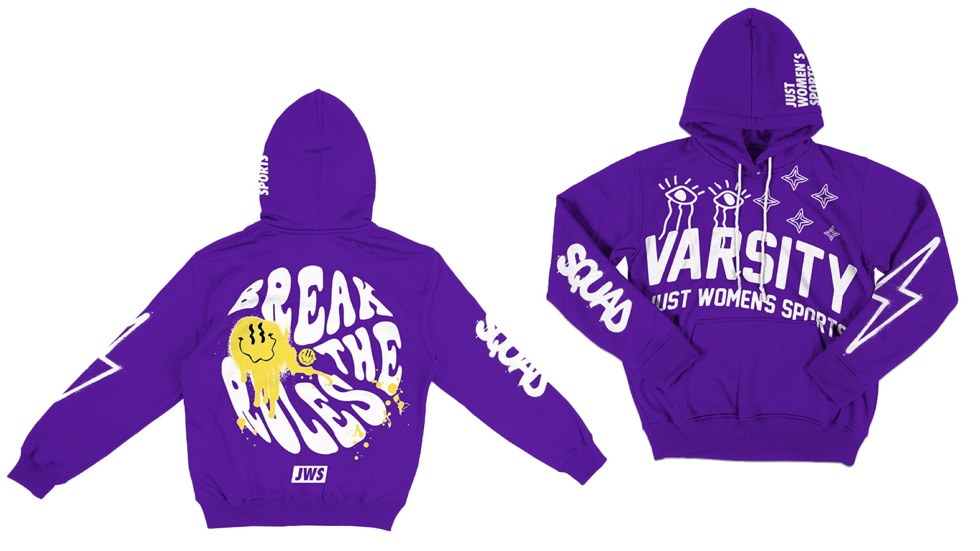
The Just Women’s Sports Varsity Squad is a one-of-a-kind program that gives select college athletes the opportunity to work in tandem with JWS to elevate and grow women’s sports coverage. Athletes have the chance to build their brands with an assist from industry insiders while simultaneously using their voices to promote JWS’ mission. As part of the program, every year, 13 student-athletes will learn about the media profession while working to elevate and grow women’s sports coverage alongside JWS. These athletes will also have the chance to build their brands with an assist from industry insiders as they use their voices and platforms to promote JWS’ mission.
.jpeg)
I really believe a lot of mainstream sports media is built around men’s sports. If you look at a lot of the major networks in the US, they focus on the NFL, NBA, MLB or things like F1 and these are all men’s sports leagues. They have audiences that are there for men’s sports brands that want to sponsor men’s sports. For us, I think that there’s a real opportunity to go do that and build that for women’s sports and set up a structure that is set up for women’s sports to just dominate and bring in brands that want audiences there for women’s sports. The diversification in audience as well as the content is key in building a coalltion that represents fadnom acrurately.
When Haley and Sivan brought me and Will in to take a crack at refreshing and revamping the entire brand, it was an opportunity I didn't take lightly. I am deeply passionate about cultivating a space for women's sports to thrive, and I was able to dive this passion into the work, and I think it shows in the final product. This really is a unique opportunity to shape a brand that will be present in the women's sports mix for a long time.
.jpg)
The collaborative process really created an in depth framework that JWS could use throughout its collateral on multiple levels. I got to see this come to fruition when JWS partnered with my former colleague from Bleacher Report and House of Highlights, Starr Nathan to produce this amazing video series for the Legends collection merch drop that I provided creative advisory for. This was both from an e-commerce perspective, as they sourced their blanks and built out the fulfillment system with Detroit Soft goods, but also with design and art direction.

The video series took the brand guidelines and really brought them to live on a video canvas in a unique way that really showcases what the guidelines are capable of when pushed. Starr is one of the most talented film makers I know, and for her to take the brand and turn it into such a powerful touchpoint for true women's sports fans speaks to the chance we have to do something really memorable. The collection itself is fun too, bringing the design language to life on march. On the design side, JWS tapped Donny Brock to take our brand guidelines and build a cohesive packaging language for the drop. Built around a refined, minimal design language, the collection blends contemporary retail sensibility with narrative-driven branding that celebrates the enduring cultural impact of these icons.
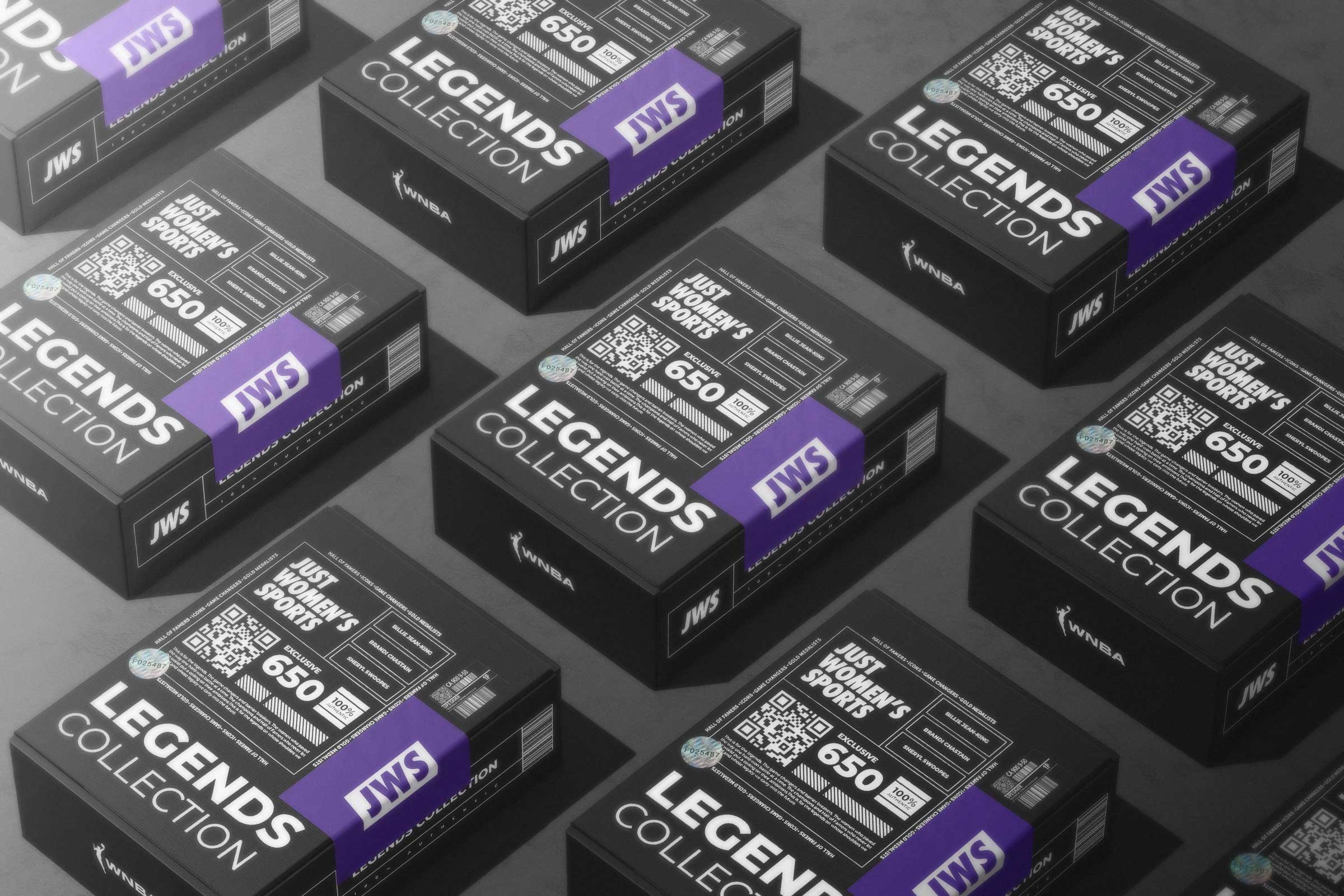
The collection found its audience almost immediately, moving quickly through the WNBA Store and drawing the attention of the wider sports industry with coverage in Sports Business Journal. Voices who helped define the game, including Sheryl Swoopes, recognized the spirit behind the work. Soon the pieces began appearing on figures whose own stories shaped the landscape of sport, worn by leaders such as Dawn Staley and Brandi Chastain. In that way the collection moved beyond a simple release, becoming a quiet tribute to the lineage of women whose presence, talent, and conviction continue to reshape what the game can be. The response revealed how hungry the culture is for stories that honor the lineage of women’s sport, with the collection resonating across media, athletes, and fans as a reminder that the history of the game is still being written.
This type of coverage makes you ask what if it had been like this from the start. Born of a lack of media coverage, chronic underfunding and archaic attitudes towards female participation, the question itself speaks to what might have been. Within it lies the inescapable feeling that women’s sport would be far further down the road to commercial maturity had decades of institutionalized sexism and gender stereotyping not served to inhibit the potential of female athletes across the board. But with the opportunity now at hand, content examples like the Legends collection with a unique ecommerce integration and content plan show what a media company positioned directly for an audience that loves women's sports is capable of.
At the crux of this project was really an opportunity to make a mark on a growing market, but also to put your money where your mouth is and really take tangible action to create a more equitable landscape for sports media. Working on Just Women's Sports is something that I am really proud of and represents a tangible chance to mitigate the deleterious effects that years of audiences cultivated on a traditional, outgrown, toxic masculinity filled model and brings them to a fresh oasis of content and experiences built just for them. Why go for hand me downs when you can have something that is truly your own? Why capitulate to men's sports when the women's game can truly make a space just as vibrant and exciting. This was the push for JWS and turning it into a major media brand similar to the Nike's of the world.

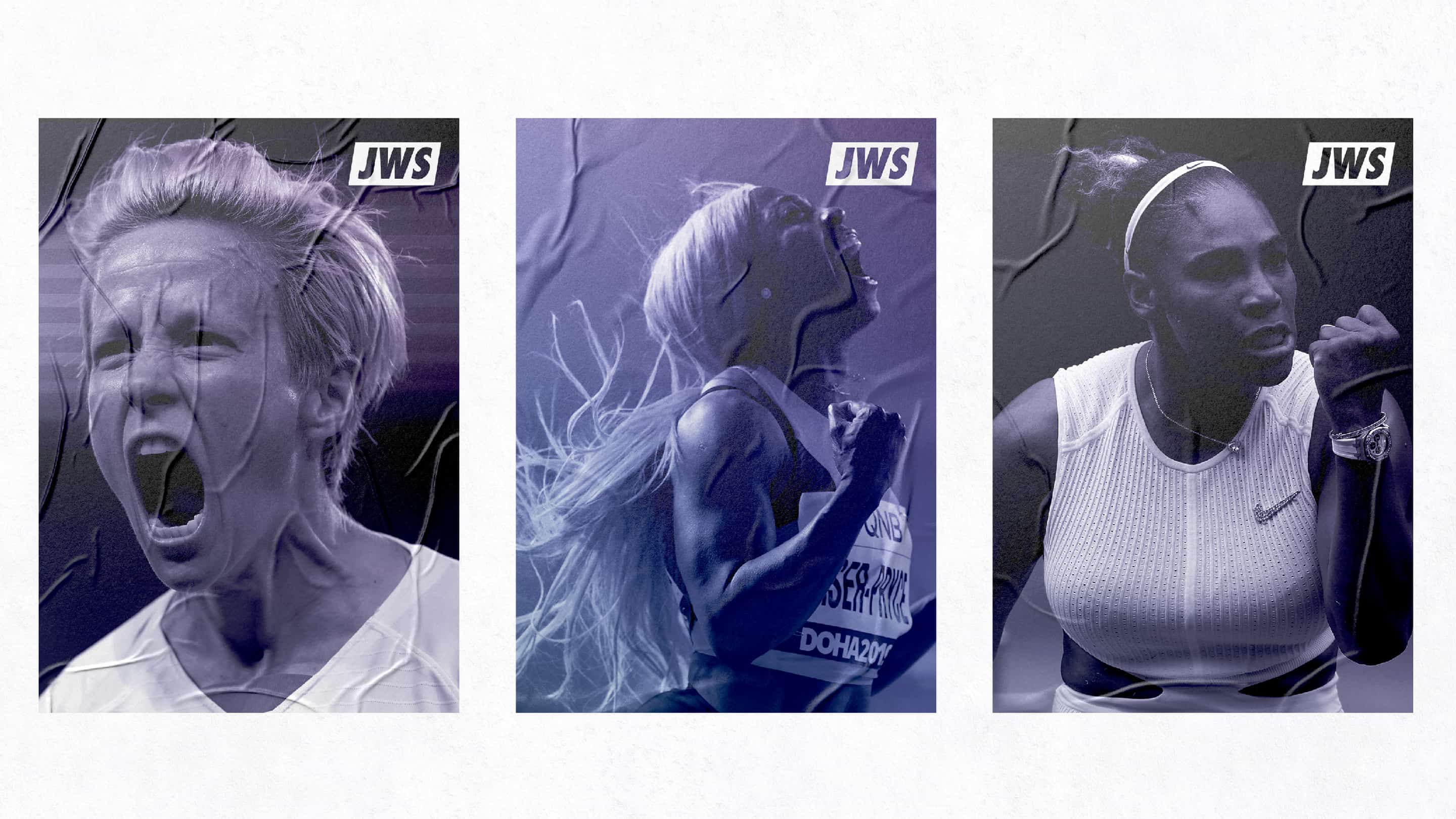
At it's core I wanted Just Women's Sports to come off as a human centric brand. Photo direction guidelines reveal a deliberate move away from posed heroism toward candid, emotionally resonant imagery that captures the texture of competition and community. By prioritizing authenticity, dynamism, and unexpected moments, the brand positions athletes as lived-in cultural figures rather than distant icons. This approach fosters identification and intimacy, strengthening the parasocial bonds that underpin modern fandom. The camera becomes a witness. The audience becomes invested. The work needed to imbue the passion for the game into the branding, and it was difficult to do so but we found a way that works and helped build a good foundation for JWS as they found their footing in the media space.
One of the final things I really had a chance to shape in this creative advisory role was the investor deck and materials as the company went to market to woo investment. This all culminated in a massive $6 million raise, led by Joe Tsai’s Blue Pool Capital at a $36 million valuation. Tsai, co-founder of e-commerce giant Alibaba and owner of the NBA’s Brooklyn Nets, WNBA’s New York Liberty and a pair of NLL franchises was joined by David Blitzer, Washington Spirit owner Michele Kang, Billie Jean King, sports NFT marketplace Dapper Labs and investment firm SC Holdings, as well as returning investors Will Ventures, Kevin Durant’s Thirty Five Ventures and Drive by DraftKings. Athletes including Allyson Felix, Abby Wambach, Sam Kerr, Paul Rabil and Apolo Ohno also joined the round, which brings the company’s total capital raised to $10 million. This stage of building the brand and proving the audience profitability allowed for capital to come in and scale the whole operation.

By leveraging social-first distribution, creator collaborations, and culturally fluent motion design systems, we translated athletic excellence into thumb-stopping formats optimized for algorithmic lift and cross-platform resonance. We positioned the brand voice to dismantle the “less than” myth through authoritative copy, dynamic visual identity, and proof-point storytelling that reframes parity as inevitability rather than aspiration. At the same time, the key was the audience itself being as engaged as it was, the comment section was always super vibrant and you got a sense that the people consuming the media were starving for something that fed their appetitie for more women's sports content.

A great example of this shift was the rise of The Sports Bra, the first sports bar in the United States dedicated exclusively to women's sports. Founded in Portland by former chef and basketball player Jenny Nguyen in 2022, it emerged during the same cultural moment that organizations like Just Women's Sports were helping expand visibility and fandom around women's athletics. What began as a single neighborhood bar quickly became a national symbol of the growing commercial and cultural power of women's sports, inspiring similar venues across the country and later expanding through franchising. The connection is also personal for me: the Portland location features my collage celebrating women's sports on its front door, making it a tangible example of how the movement extended beyond media coverage and into physical community spaces. The Sports Bra's success demonstrated that fans were hungry for places built specifically to celebrate women's athletics, helping validate a market that many traditional sports and media institutions had long underestimated.

With women’s sports historically receiving only 4% of total coverage, we treated the gap as a whitespace opportunity, deploying scalable templates, modular graphics, and rapid response content pipelines to outpace legacy media and capture share of attention. The result is a high-performance content flywheel that converts visibility into commercial viability, unlocking new revenue streams across sponsorships, branded content, commerce integrations, and experiential extensions. Ultimately, Just Women’s Sports is not merely a media property but a category-defining brand system designed to normalize investment, elevate perception, and future-proof the women’s game within the broader sports and entertainment economy.
The rebrand unfolded at a cultural inflection point, coinciding with the 50th anniversary of Title IX, a milestone that reframed women’s sports not as a charitable cause but as a generational shift in participation, viewership, and commercial potential. This moment created a rare alignment between policy legacy, audience readiness, and investor appetite, allowing Just Women’s Sports to position itself as the connective tissue between past progress and future scale. Rather than treating Title IX as historical nostalgia, we leveraged its anniversary as a forward-looking narrative device that signaled unfinished work and untapped opportunity. The brand’s tone and visual confidence reflected this posture, honoring the legacy while refusing to be constrained by it. From a strategic standpoint, timing became leverage. Cultural momentum became market momentum.

A central market failure JWS addressed was not quality of play but accessibility and discoverability, a gap repeatedly cited by fans who simply did not know when or where to watch women’s sports. We treated this not as a programming issue but as an information architecture problem, designing content systems that foregrounded schedules, highlights, and contextual storytelling in formats optimized for rapid consumption. By making access points visible and frictionless, the brand functioned as an onboarding layer for new fans while deepening engagement for existing ones. This approach reframed coverage as service design, where clarity and convenience are core value propositions. When access improves, fandom expands. When fandom expands, markets respond.
The expansion into newsletters, podcasts, and owned content franchises marked a deliberate shift toward audience sovereignty, reducing reliance on volatile platform algorithms while increasing retention and lifetime value. Newsletters in particular became a high-intent touchpoint, transforming casual scrollers into subscribed community members with predictable engagement patterns. This owned media ecosystem allowed JWS to control cadence, deepen storytelling, and deliver sponsor integrations within trusted environments. From a growth perspective, this was not channel diversification but risk mitigation and revenue stabilization. Ownership builds resilience. Direct relationships build durability and the women's sports audience was tapped in and excited for us.
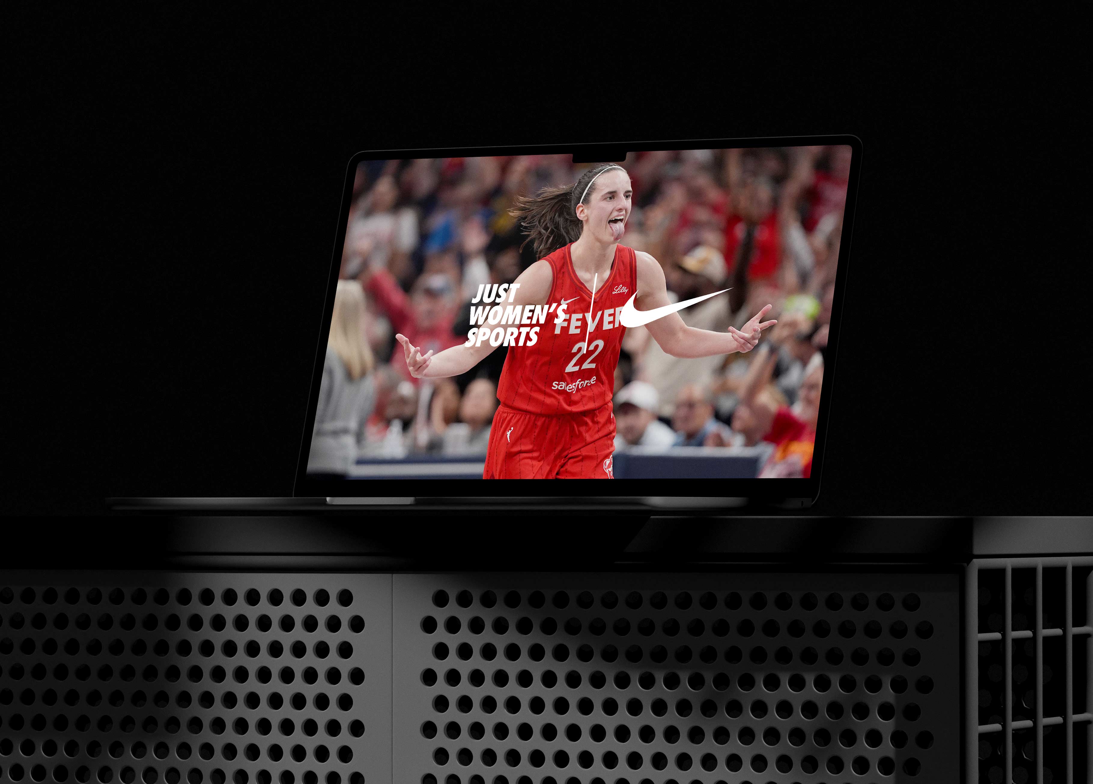
Industry validation from business-of-sports authorities such as Boardroom reinforced the brand’s positioning as a legitimate media enterprise rather than a passion project, signaling to advertisers and investors that women’s sports media had crossed from advocacy into viable asset class. This external recognition amplified internal strategy, helping to translate cultural relevance into commercial credibility. By aligning storytelling excellence with business rigor, JWS demonstrated that smarter marketing, not altered athletic performance, was the key to mainstream adoption. The narrative shifted from “why support women’s sports” to “why weren’t we investing sooner.” Perception changed. Capital followed. Investment also enabled expansion into original programming and athlete-led content, including podcasts and highlight-driven shows that extended the brand beyond news into personality-driven media. From a creative systems standpoint, this required scalable templates that could flex across hosts, sports, and distribution formats while maintaining recognizability and ensuring everything felt uniquely JWS.
Just Women’s Sports’ funding trajectory mirrored the market awakening to the commercial viability of women’s sports, beginning with a $3.5 million seed round in 2021 and accelerating to a $6 million raise backed by an all-star coalition of investors including Billie Jean King, Kevin Durant’s Thirty Five Ventures, Blue Pool Capital, Drive by DraftKings, and athlete-operators like Allyson Felix and Abby Wambach. This capital was not speculative. It was a response to measurable audience demand, with JWS reaching 110 million monthly users, generating over 2 billion yearly impressions, and cultivating a 4.5 million owned audience across newsletters, podcasts, and memberships. The funding enabled expansion into original programming, live events, commerce, and partnerships, transforming the brand from a digital publisher into infrastructure for the women’s sports economy. My role in establishing scalable creative systems ensured that as investment accelerated, the brand could absorb growth without fragmenting identity or diluting trust. Design functioned as operational glue across investor decks, sponsorship pipelines, and fan-facing platforms. The numbers validated the mission. The mission justified the numbers. Together, they signaled a category inflection point.
Just Women’s Sports was never simply a rebrand or a content platform. It was a category correction unfolding in real time, where capital, culture, and community converged to validate what fans had always known. From seed funding to growth rounds, from a 4.5 million owned audience to billions of yearly impressions, the numbers told a story of demand that had been ignored rather than absent. My contribution lived at the intersection of that awakening, building creative systems capable of carrying the weight of venture expectations while preserving the intimacy that makes fandom durable.
The work demonstrated that design is not ornamental. It is operational. By aligning visual language, audience pathways, and experiential touchpoints, we transformed scattered moments into a unified brand experience that investors could fund, partners could trust, and fans could claim as their own. JWS emerged not as an alternative to legacy sports media but as a blueprint for what the future of sports coverage looks like when equity and excellence are treated as inseparable. The platform did not wait for permission from incumbents. It set new expectations. And in helping architect that shift, I did not simply contribute to a brand. I helped define the conditions for a market to recognize its own potential. The identity, content frameworks, event toolkits, and partnership templates were designed not as campaigns but as infrastructure, enabling JWS to scale across leagues, formats, and geographies without losing coherence. In a media landscape prone to fragmentation, we built continuity. In a market defined by underrepresentation, we built visibility. In a category dismissed as niche, we built proof.

Key Collaborators: Will Leivenberg, Haley Rosen, Rachel Quonn, Kat Mantiziakis, Lorrie Cartago, Matt Sanoian, Sivan Raya, Pete Schwedel, Donny Brock
Tools: Adobe Photoshop, Adobe Illustrator, Adobe After Effects, Figma, Final Cut Pro
Deliverables: Brand Guidelines, Video Package, Logo, Social Templates, Podcast Graphics, Merch, Event Templates