

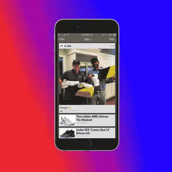
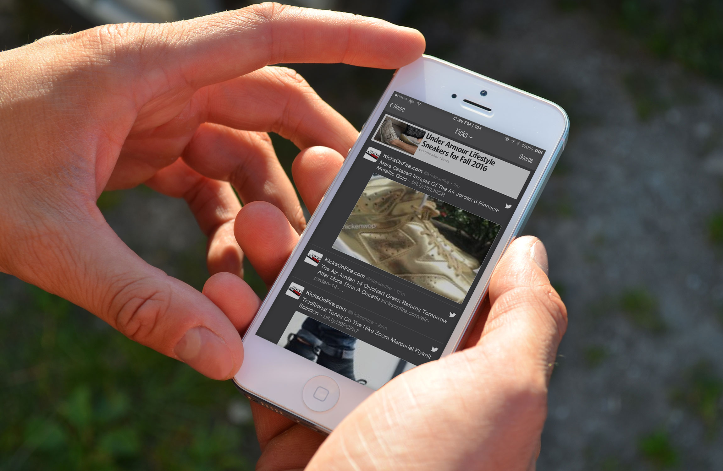
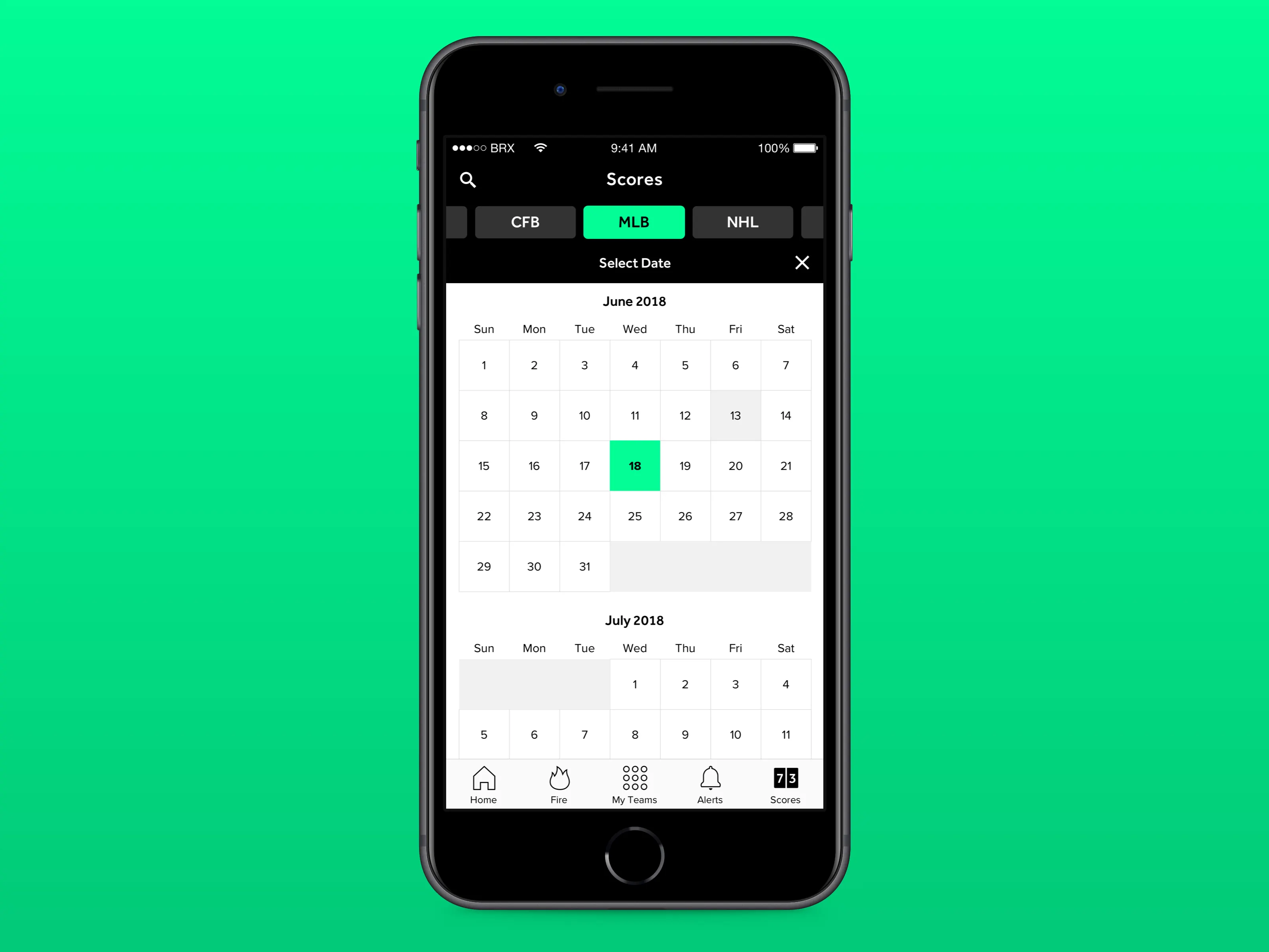
The Team Stream app, which evolved into the unified B/R app, was conceived as a real time command center for fandom, a single destination where breaking news, live scores, instant alerts, viral videos, and deep editorial could coexist in a personalized, always on environment. The product strategy balanced utility with storytelling. On one hand, fans needed frictionless access to the teams and leagues they followed. On the other, we wanted to immerse them in original content that reflected the full spectrum of sports culture, from animations and Social Moments to long form features, rankings, and culturally driven video. I worked alongside a cross functional group of engineers, product managers, and designers to shape the early UI and UX, focusing on clarity, speed, and modularity so the experience could scale across devices and evolve with user behavior. That included designing stream identities and iconography that made navigation intuitive while reinforcing brand consistency, ensuring that each team feed, league hub, and content vertical felt distinct yet unmistakably B/R. Beyond the core experience, I helped incubate some of the app’s most engaged substreams, including the Kicks section, which grew from a niche sneaker feed into a standalone portfolio brand with its own voice, partnerships, and commerce potential. We also developed app exclusive features designed to reward downloads and deepen retention, from 360 video experiences that placed fans inside locker rooms and on sidelines to mobile social games and interactive editorial formats that leveraged touch, motion, and vertical storytelling. These initiatives transformed the app from a passive consumption tool into an interactive platform where fans could explore, play, and participate. By blending service journalism, culture first content, and experimental mobile experiences, we positioned the B/R app not merely as a companion to sports, but as an indispensable layer in how a new generation experiences the game and interacts with their favorite athletes both on and off the pitch.
2 Time Webby Award Winner for Best Mobile Sports App in the World
Launching Team Stream as a first of its kind community for sports fans meant solving a deceptively complex product challenge. We were not building a single use utility. We were designing an ecosystem where casual fans, fantasy obsessives, international viewers, and culture driven younger audiences could all find relevance without friction. The core tension was density versus clarity. Sports fans crave information at scale, yet mobile environments punish clutter. Our task was to architect a user flow that allowed personalization without overwhelming the interface. Following teams, leagues, and players had to feel effortless. Alerts needed to be timely without becoming noise. Navigation had to be intuitive for a first time user while still rewarding power users who wanted to go deep. This required continuous user testing, behavioral analysis, and iterative prototyping to ensure the experience adapted to the way different demographics consumed sports in real time. From a product design and development standpoint, the work demanded tight integration between design, engineering, editorial, and data teams. We built modular components that could scale across thousands of team streams and content types while maintaining performance and visual consistency. Every design decision was pressure tested against load times, notification latency, and content hierarchy. Push notifications, live score modules, video playback, and social embeds all had to function seamlessly under peak traffic during major sports moments. As usage grew and fans began spending over 200 minutes per month in the app, the stakes increased. Retention depended on delivering value in seconds. We refined onboarding flows, optimized feed ranking logic, and introduced personalization layers that made the app feel less like a static product and more like a living service tailored to each fan’s rhythm. Marketing the app required translating utility into emotional relevance. We were not simply promoting features. We were positioning Team Stream as an essential companion to the sports experience itself. Campaigns emphasized immediacy, community, and personalization, showing fans that the app could keep them connected whether they were at work, in transit, or watching games with friends. Social integrations, influencer partnerships, and cross promotion across Bleacher Report’s massive digital footprint helped drive adoption, while in app exclusives and real time experiences encouraged habitual use. The challenge was not just getting downloads. It was embedding the app into daily behavior. By aligning product design with cultural storytelling and strategic distribution, we helped transform Team Stream from a novel concept into a foundational platform for modern sports fandom and an app and brand that pretty much anyone would recognize if you were to ask them walking down the street.


The B/R App, formerly known as Team Stream, was conceived not as a single-purpose sports utility but as a real-time operating system for fandom, a product designed to sit at the center of how modern audiences experience sports culture. The platform delivers breaking news first, but its true differentiation lies in how that information is packaged and experienced through culturally fluent storytelling, premium content distribution, and participatory social features that transform spectators into active contributors. By merging service journalism with community interaction and culture-first programming, the app reframed Bleacher Report from a publisher into a daily destination where fans could gather, react, and co-create the narrative of the sports world in real time.
During my tenure, I worked across both the app and web ecosystems, helping define early interaction models, visual systems, and content frameworks that balanced speed with personality and utility with emotional resonance. These foundational decisions established a scalable product language that allowed Bleacher Report to evolve alongside shifting fan behaviors while maintaining a cohesive and unmistakable brand presence across platforms. In this capacity, I operated at the intersection of product strategy and creative direction, helping translate business goals and fan behaviors into scalable experience frameworks. I partnered with product, engineering, and editorial to design Team Stream’s core experience, developing modular UI patterns, navigation systems, and engagement features that scaled across millions of fans.
Working across both the Bleacher Report website and app during a period of rapid industry change was a formative experience that shaped my approach to product design and creative leadership. Sports media was shifting from destination-based publishing to always-on, mobile-first ecosystems where speed, personalization, and participation defined relevance. Contributing to the evolution of these platforms gave me a front-row seat to how design decisions influence usability, business models, audience behavior, and cultural perception. The opportunity to shape interaction patterns, visual systems, and cross-platform continuity taught me to think beyond individual features and toward durable product languages that scale with shifting fan expectations. More than a single project, this work became a proving ground where I learned to balance editorial integrity with growth goals, creativity with performance constraints, and brand expression with real-world user behavior, lessons that continue to inform how I design platforms intended to live at the center of people’s daily habits.

At a broader industry level, Team Stream helped redefine what a sports media product could be in an era increasingly shaped by platform fragmentation, algorithmic feeds, and shrinking attention windows. While competitors optimized for transactional updates or broadcast extensions, we architected the experience around participation, identity signaling, and cultural fluency, recognizing that modern fandom is performative as much as it is informational. The product strategy treated every alert, stream, and share surface as an opportunity for self-expression, allowing users to curate a living profile of allegiances that evolved with trades, seasons, and storylines.
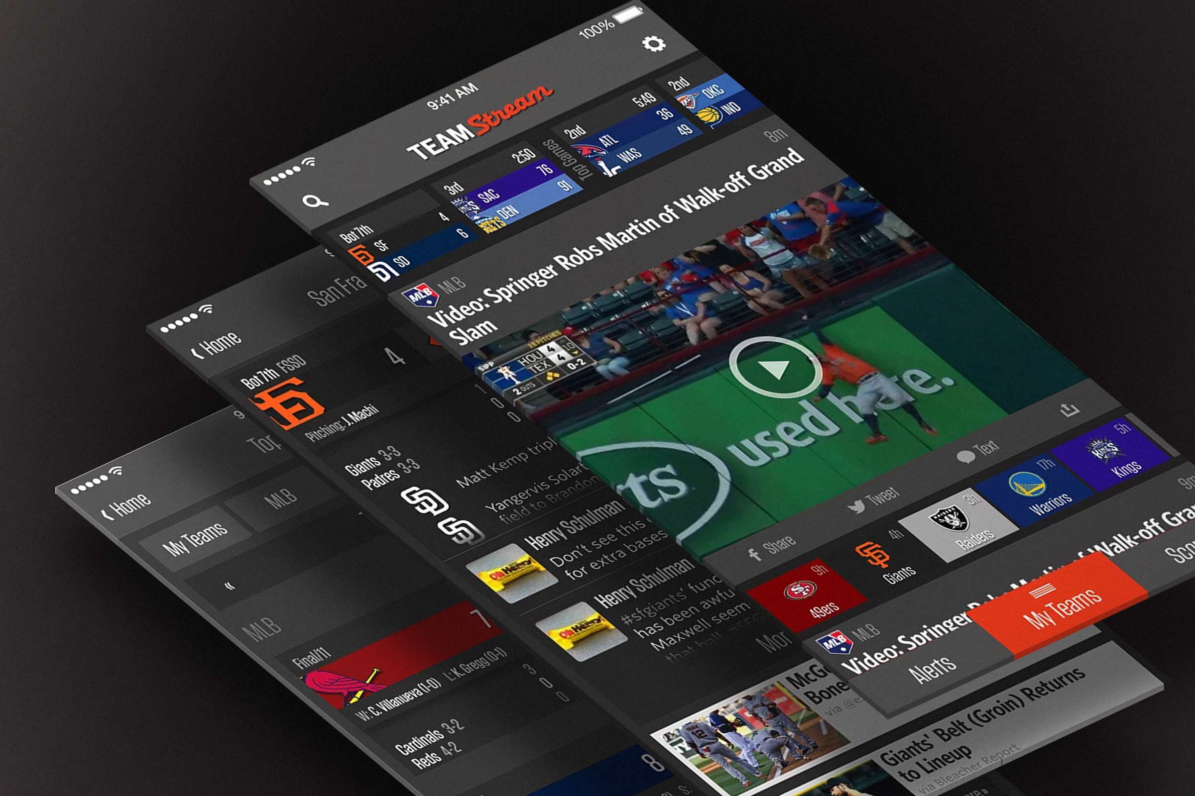
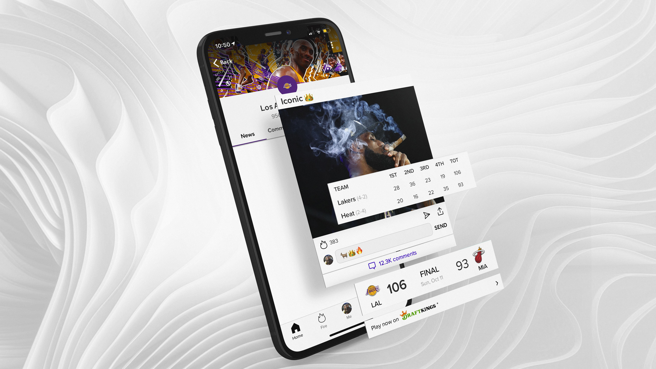
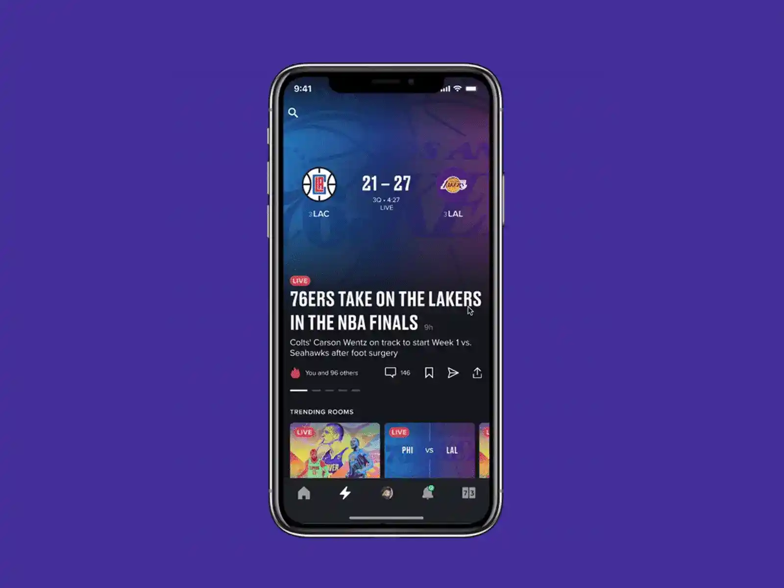
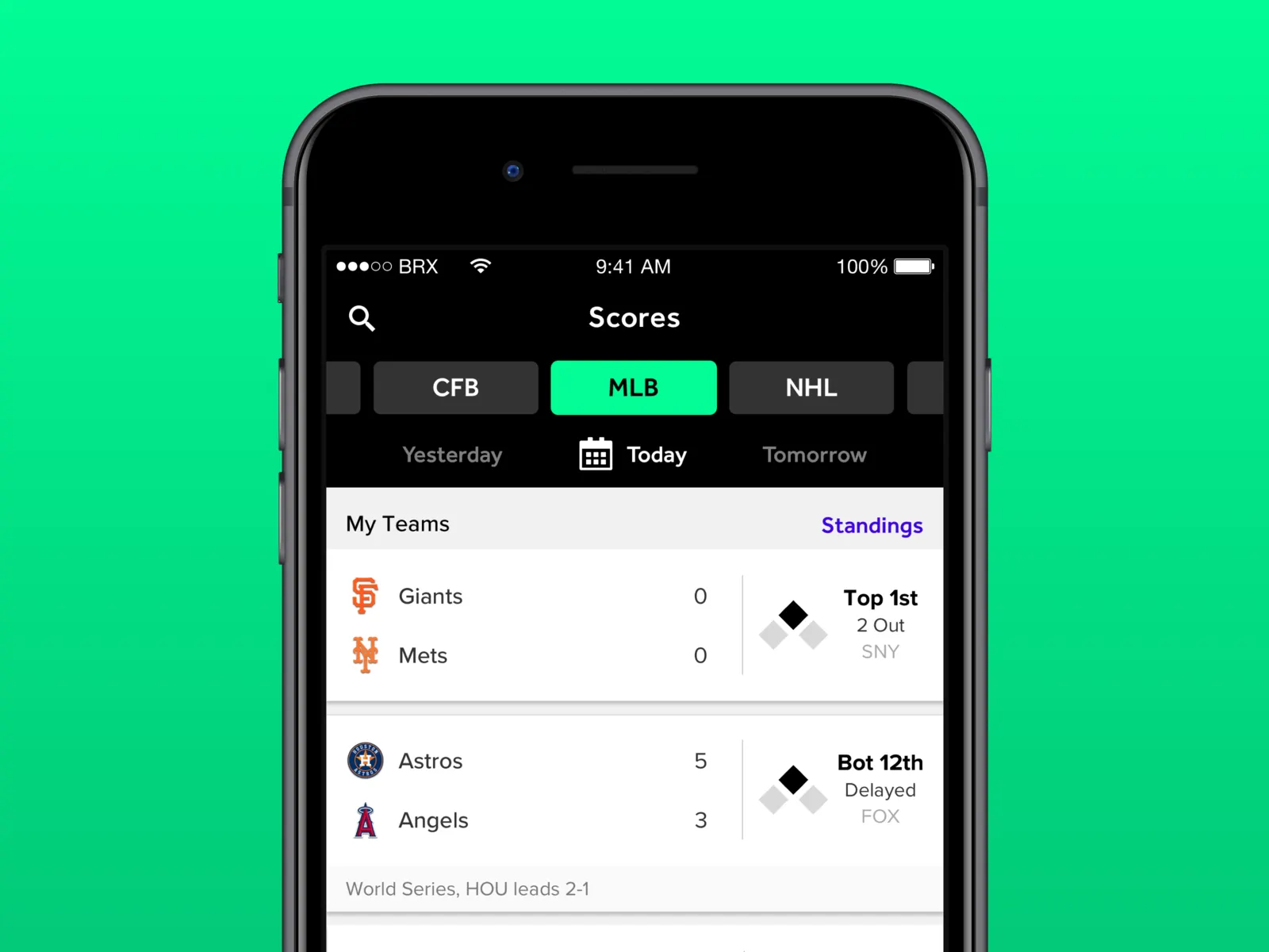
This approach reframed personalization from a convenience feature into a core engagement mechanic, where relevance was measured not only by timeliness but by emotional resonance and social currency. As a result, Team Stream anticipated the convergence of media consumption and identity construction that now defines sports discourse across digital ecosystems. The design language, interaction patterns, and notification hierarchy were calibrated to support ambient awareness without overwhelming the user, striking a balance between urgency and utility that many later products attempted to replicate. In doing so, we positioned the app not as a passive feed but as an active layer in the daily rituals of fandom. The card based news delivery UI was also a key innovation along with the scores module, and teams drawer.
This strategic posture influenced how sports media organizations approached real-time distribution, community scaffolding, and owned-audience development in the years that followed. Platforms that once prioritized homepage hierarchies and static editorial flows began adopting feed-based architectures, granular push strategies, and social integrations that mirrored the behavioral logic we operationalized. By treating the app as a platform rather than a channel, we enabled Bleacher Report to convert distributed social engagement into durable first-party relationships, insulating the brand from the volatility of third-party algorithms and referral traffic. The data exhaust generated through user preferences, notification interactions, and sharing behaviors created a feedback loop that informed both editorial prioritization and commercial packaging. This closed-loop ecosystem strengthened long-term brand equity by aligning product experience with advertiser value, demonstrating that relevance and revenue could be mutually reinforcing. Team Stream ultimately functioned as a category-shaping prototype for mobile-first sports media, where speed, personalization, and cultural participation formed the backbone of sustainable growth. Its legacy persists in the design patterns and audience strategies that now define the competitive baseline for digital sports platforms.
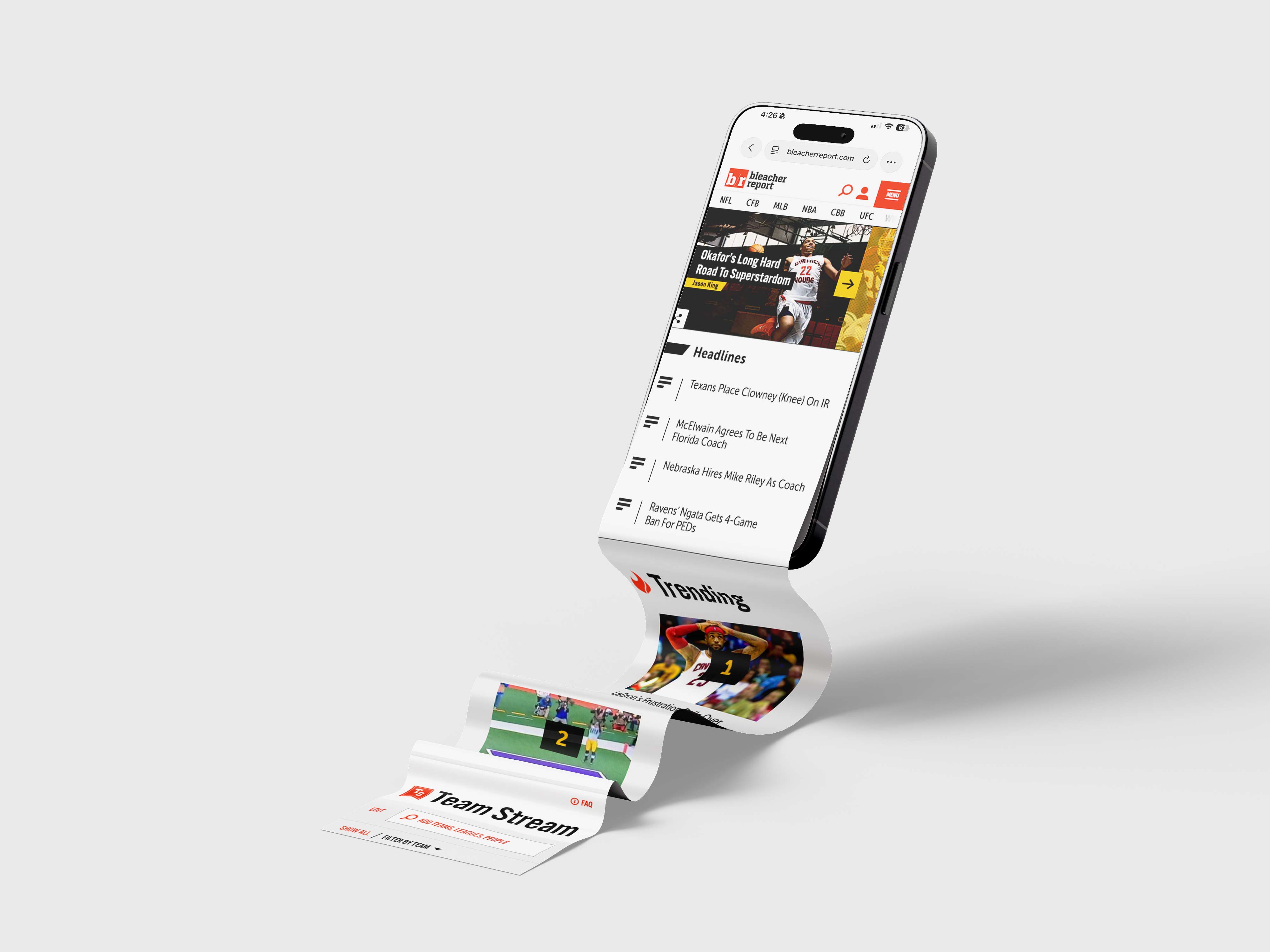
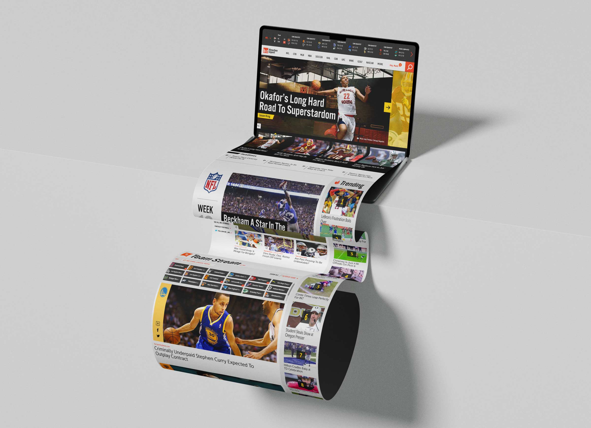
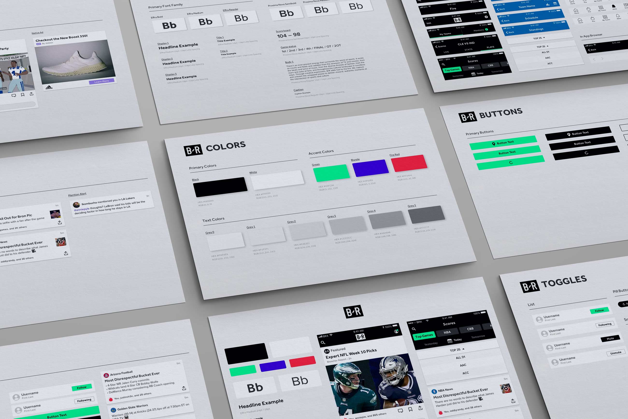
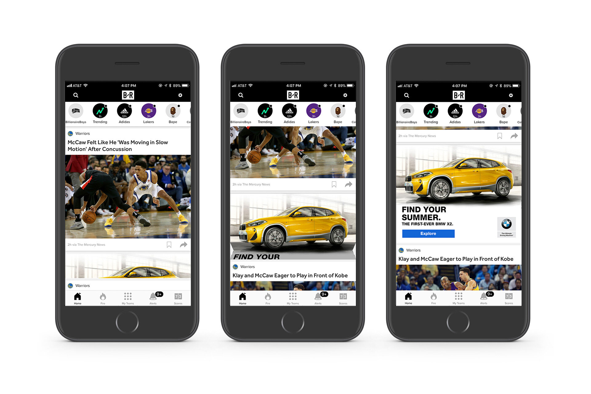
I played a key role in shaping the Bleacher Report website redesign in partnership with Code and Theory, grounding the platform in a modular, system driven approach to UI and UX that could scale across devices, leagues, and content types. My focus centered on layout architecture, information hierarchy, and interaction patterns that reduced cognitive load while increasing content discoverability and session depth. I led the development of the hero framework, Trending module, and Team Stream surfaces, ensuring that each behaved not as isolated components but as part of a unified content ecosystem. The homepage needed to feel editorially bold while still structurally disciplined, so we designed flexible grid systems and adaptive modules that could respond dynamically to breaking news, tentpole moments, and league seasonality without breaking visual continuity.

Working closely with Bennett and the product design team, I helped define the foundational card modules that powered articles, video, and live updates across the platform. Before refinement and production build, I developed early prototypes that explored scale, density, metadata prioritization, and image ratios to ensure the system could flex from desktop to tablet to mobile without fragmentation. We applied responsive design principles and atomic design theory to build a robust component library, enabling rapid iteration while maintaining brand cohesion. I collaborated directly with engineers to translate design intent into performant front end execution, refining breakpoints, grid behavior, lazy loading logic, and asset prioritization to improve both perceived speed and real performance.
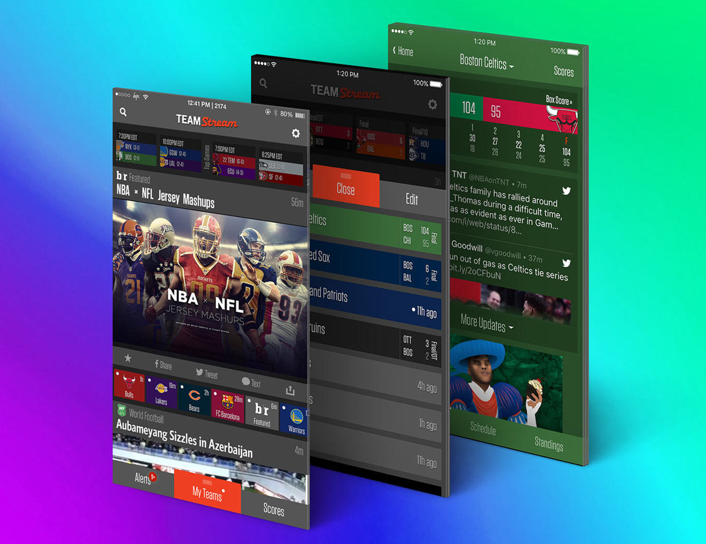
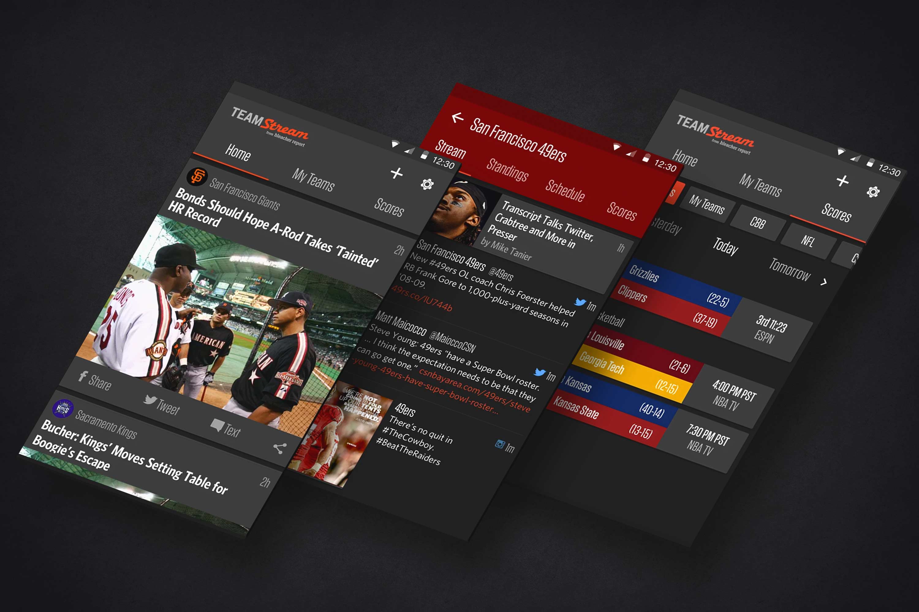
For Team Stream, I focused on evolving a personalized content model that surfaced team specific feeds, push notifications, and real time updates through a clean, card based interface optimized for glanceability and habitual return. The experience was informed by behavioral analytics and structured A B testing, allowing us to validate navigation decisions, refine onboarding flows, and sharpen value signaling around personalization. By observing how fans actually consumed sports news, often in short bursts throughout the day, we refined the product to prioritize immediacy and relevance, ensuring the most important highlights, rumors, and breaking moments surfaced instantly. The visual language balanced editorial credibility with social native immediacy, using typographic hierarchy, motion, and microinteractions to guide attention without overwhelming the user. Each element was designed to reinforce the idea that Bleacher Report could function as a real time companion to fandom rather than a static destination for post-game recaps. The community around the game was the focus and that allowed the storylines to flow and the fans to flood in to us.
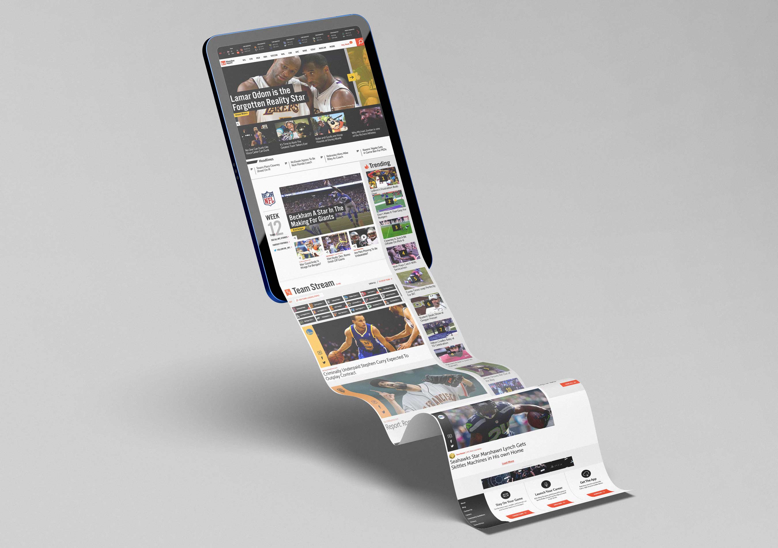
Equally important was ensuring that this personalized experience translated seamlessly across devices and contexts. Fans might check a score on their phone during a commute, read deeper analysis on a laptop at work, browse highlights on a tablet at home, or follow live updates on a desktop during a game. Because of this, we designed the system to scale fluidly across mobile, web, iPad, desktop, and laptop environments while maintaining consistent hierarchy, interaction patterns, and visual rhythm. Responsive grid systems, adaptive typography, and flexible card structures allowed the interface to feel native on each screen while still operating as part of a unified product ecosystem. We regularly tested designs across a wide range of devices to ensure readability, motion behavior, and content density felt intuitive regardless of screen size or viewing distance. The result was not simply a redesign, but a scalable product framework that strengthened Bleacher Report’s position as a product led sports media platform capable of evolving with both culture and technology.

What began as a pure news aggregation engine gradually evolved into something far more participatory. The early version of the app was optimized around velocity and personalization, a stream of headlines, scores, and alerts tailored to your teams. Over time, it became clear that the real energy was not only in the content itself, but in how fans reacted to it. The introduction of posting, profiles, and visible user handles shifted the product from a one-way feed into a social domain. Comment threads stopped being secondary metadata and became the heartbeat of the experience. Fans were not merely consuming takes, they were producing them. By elevating comments, enabling lightweight posting, and giving users identity through profiles, the app moved from being a news utility to becoming a community surface. Engagement depth increased because conversation created context. Hot takes, rival banter, live-game reactions, and meme culture turned static articles into dynamic arenas. The product insight was simple but powerful: sports fandom is inherently social. The moment we treated comments not as a feature but as infrastructure, the app began to feel less like a feed and more like a living, reactive sports community that was alive rather than stagnant or too stiff and corporate, we wanted to be the young and fresh sports brand.

Team Stream, originally introduced in the early 2010s as a pioneering team-personalized sports app, evolved into the unified Bleacher Report app through successive redesigns and feature expansions. My involvement spanned a key transformation phase of this evolution, from shaping interaction models and visual systems to later refinements that deepened personalization, performance, and community features. This continuity allowed me to help influence not only individual features but also the underlying product language that enabled the app to scale without losing coherence. As the platform matured, each iteration built upon the last, transforming a fast, team-centric news tool into a culturally fluent ecosystem that fans returned to daily. In some areas I led design execution directly, such as stream identities, navigation patterns, and interactive features. In others, I influenced direction through prototyping, user testing, and design critiques that shaped the final implementation. This hybrid scope reflects the collaborative reality of large-scale product development while underscoring my responsibility in defining the experience framework that guided the app’s evolution.

Bleacher Report operates at the intersection of sports, culture, and digital behavior, delivering not only scores and headlines but also the surrounding ecosystems of music, sneakers, gaming, and internet discourse that define contemporary fandom. With more than one billion engagements in 2019, the B/R App earned the mindshare of millions by occupying the most valuable real estate in modern media: the fan’s phone. The app is opened an average of four times per day, making it the most frequently used sports app in the United States, while a 145 percent year-over-year increase in engagement reflects its evolution into a platform rather than a destination. The platform became a daily ritual for fans seeking immediacy, community, and cultural relevance and were hooked by how quickly our teams were responding to their hunger for sports.

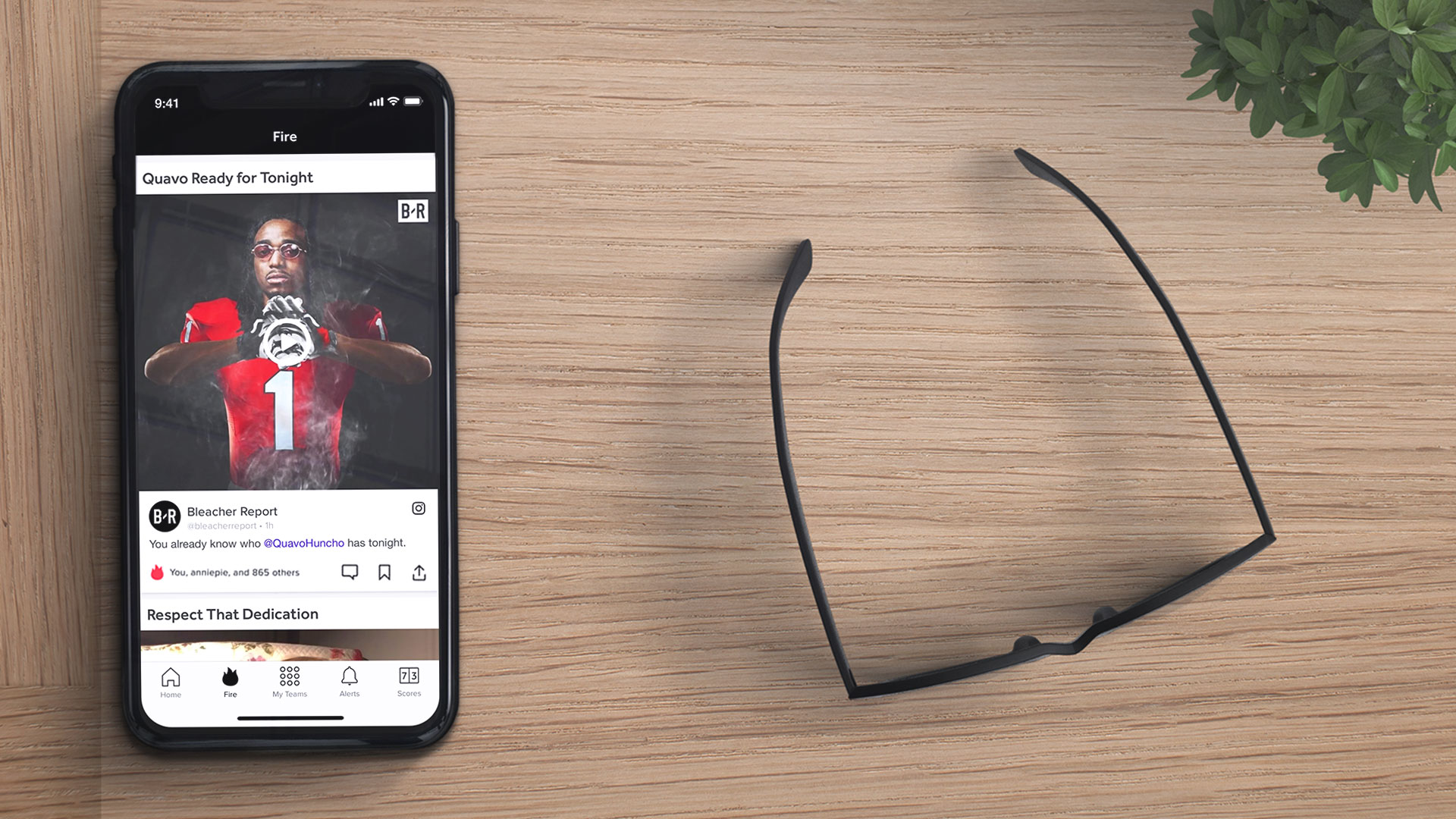
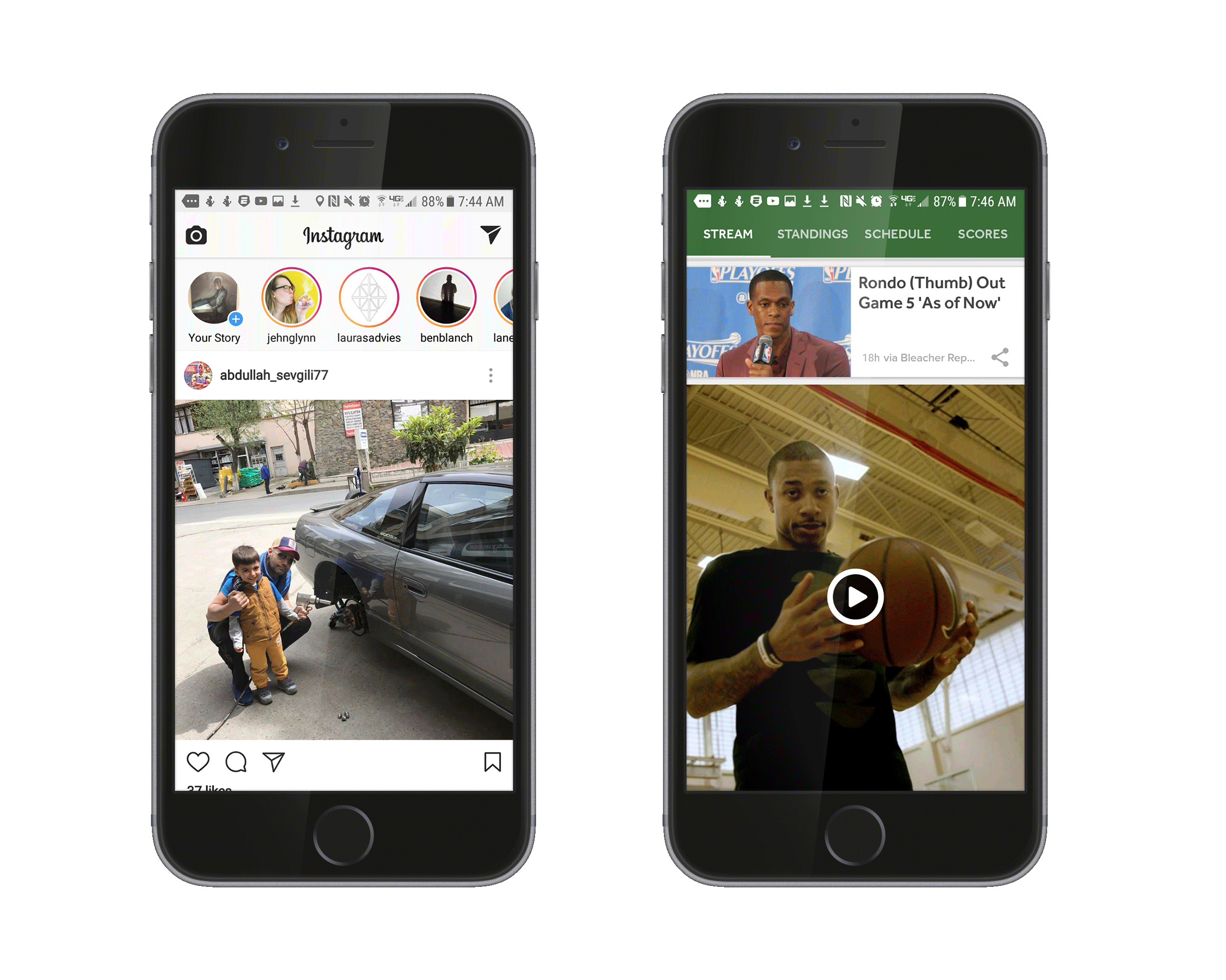
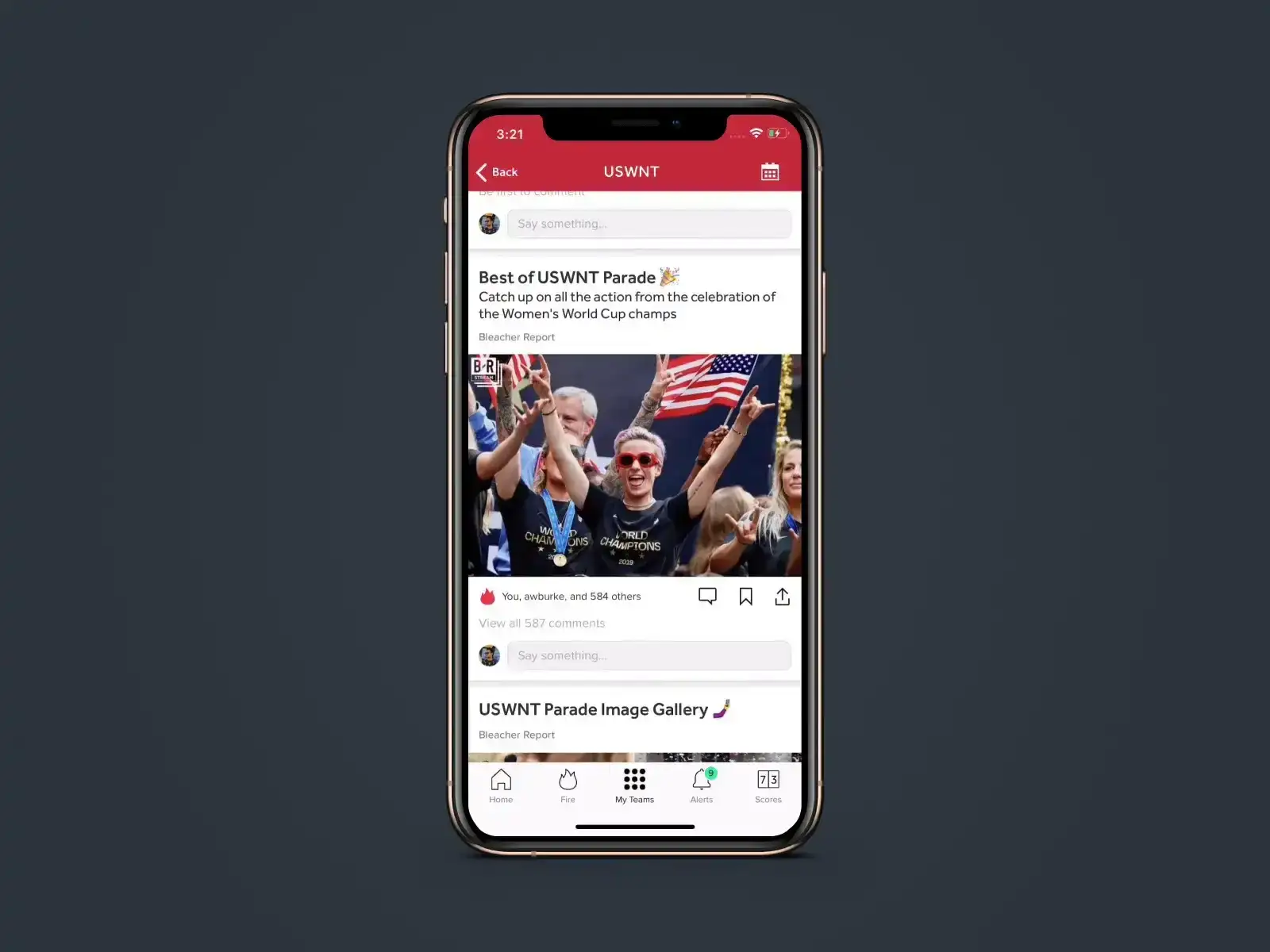
The app became a critical distribution engine for Bleacher Report’s original content, with push notifications serving as the connective tissue between creation and consumption. For tentpole drops like new episodes of Game of Zones, we designed alerts that functioned less like transactional pings and more like premiere announcements, using tone, timing, and rich media previews to generate anticipation and immediate viewing. By integrating episode launches directly into team streams and the Fire feed, the app transformed content releases into shared events that fans experienced simultaneously, often driving spikes in concurrent usage and social chatter. This strategy ensured that original programming did not live in isolation but circulated through the same real-time ecosystem as trades, highlights, and memes, reinforcing the app’s role as the central hub where sports culture and storytelling converged.

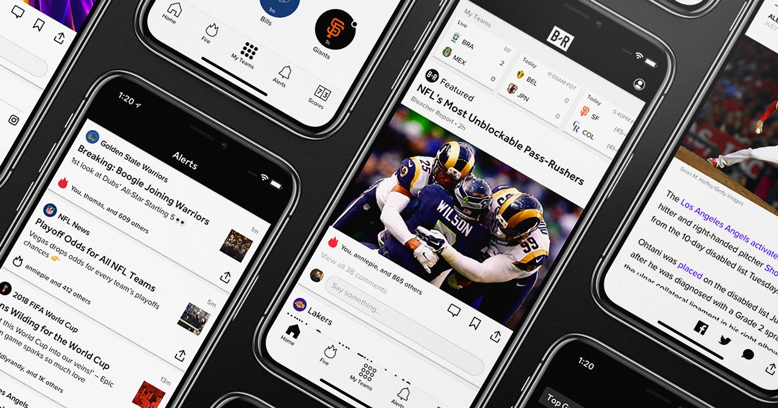
A key focus was ensuring behavioral continuity across app, mobile web, and desktop, allowing fans to move between contexts without relearning the product. Rather than treating platforms as separate experiences, we defined shared interaction primitives such as card hierarchy, team context indicators, and notification language. This consistency enabled the web experience to function as an extension of the mobile app rather than a diluted replica, reinforcing brand coherence and reducing friction across devices. Following a team is not merely a content preference but an identity signal. The product leaned into this by making team affiliation visible across surfaces, from feed composition to notification language and profile context. This reinforced a sense of belonging and allowed users to see themselves reflected in the experience, transforming personalization from a utility into a form of self-expression. This is what differentiated the app and was our unique value proposition, rather than the corporate one size fits all approach.
Push notifications evolved from functional alerts into a primary expression of the brand’s voice and value. By balancing speed with personality and cultural awareness, notifications became both utility and social currency, enabling fans to feel informed and connected in real time. Designing for this surface required close collaboration between editorial, engineering, and design to ensure clarity, tone, and performance under peak conditions. The result was a notification system that reinforced habit formation while extending the app’s presence beyond the screen. Performance improvements did more than reduce load times; they reshaped user behavior. Faster video playback and seamless scrolling removed decision friction at the exact moment users choose whether to engage or move on. By making rich media feel native to the feed rather than a separate destination, we increased dwell time and normalized video as a default mode of consumption. This alignment between technical optimization and behavioral design turned performance into a strategic advantage rather than a backend concern and was an example of design, engineering and programming really collaborating.
Designing for millions of users introduced a different order of responsibility, one where a seemingly minor adjustment to notification hierarchy or feed weighting could ripple outward and reshape how entire fan bases experienced a trade, an injury, or a last-second buzzer beater. At that scale, intuition alone is reckless; every decision demands instrumentation, longitudinal testing, and a governance model that treats clarity as a feature rather than an afterthought. The work required a kind of quiet discipline, an acceptance that the best design often disappears into muscle memory while still carrying enormous behavioral consequence. We were not crafting screens, we were tuning a living system whose outputs were measured in emotion, habit formation, and cultural velocity. That reality forced rigor in taxonomy, restraint in visual noise, and a relentless focus on semantic consistency so that users could navigate chaos with confidence. Like a well-run kitchen during service or a precisely milled aluminum edge, the experience had to feel inevitable, as if it could not have been any other way.
The scale also reinforced a truth that top-tier creative leadership must internalize: you are not designing artifacts, you are designing behaviors at population level. One-off solutions collapse under the weight of real usage, so the mandate becomes building systems that are durable, extensible, and legible across cultures, sports, and contexts that you cannot fully predict. Edge cases are not anomalies; they are future norms waiting for adoption curves to catch up. This demanded a modular architecture, clear pattern libraries, and decision frameworks that allowed regional teams to adapt without fragmenting the core experience. The role of a design leader in this environment is equal parts conductor and editor, orchestrating coherence while removing anything that does not serve the whole. Over time, this approach shifts your compass away from novelty and toward stewardship, where long-term platform integrity outweighs momentary visual flair. The result is a product that feels calm under pressure, culturally fluent without pandering, and resilient enough to evolve without losing itself. That is the quiet ambition of platform design at scale: to create systems that hold their shape in the wild.
This growth was driven by new interaction paradigms, content formats, and personalization frameworks that I helped design and operationalize, transforming the experience from a transactional news feed into a habitual layer embedded within daily life. By aligning product design with cultural fluency and distribution strategy, we strengthened the feedback loop between social platforms and owned channels, converting casual engagement into sustained usage and long-term brand affinity. The experience ultimately strengthened emotional connection, turning daily check-ins into lasting fan loyalty.
As the app evolved, so did my role and perspective. I entered the project focused on visual systems and interaction clarity, but the scale and complexity of the platform required me to expand into strategy, systems thinking, and cross-functional leadership. I learned to evaluate design decisions through the lenses of performance, trust, and long-term maintainability, not just aesthetics. This evolution mirrored the product’s own trajectory, transforming from a collection of features into a cohesive platform. The experience solidified my belief that great product design is less about individual screens and more about shaping the conditions under which meaningful interactions can occur.

Some of the most valuable insights came not from dashboards but from observing how fans talked about the app in comment threads, group chats, and social media. They screenshotted notifications to prove they broke news first. They argued in threads as if they were in a stadium. They treated the app as a shared space rather than a tool. Witnessing this behavior reframed success metrics from abstract numbers to lived experiences. It reminded me that behind every session is a person seeking connection, validation, or the thrill of being part of the moment. To this day the experiences I had working closely with product and engineering taught me lessons I hold dear today.

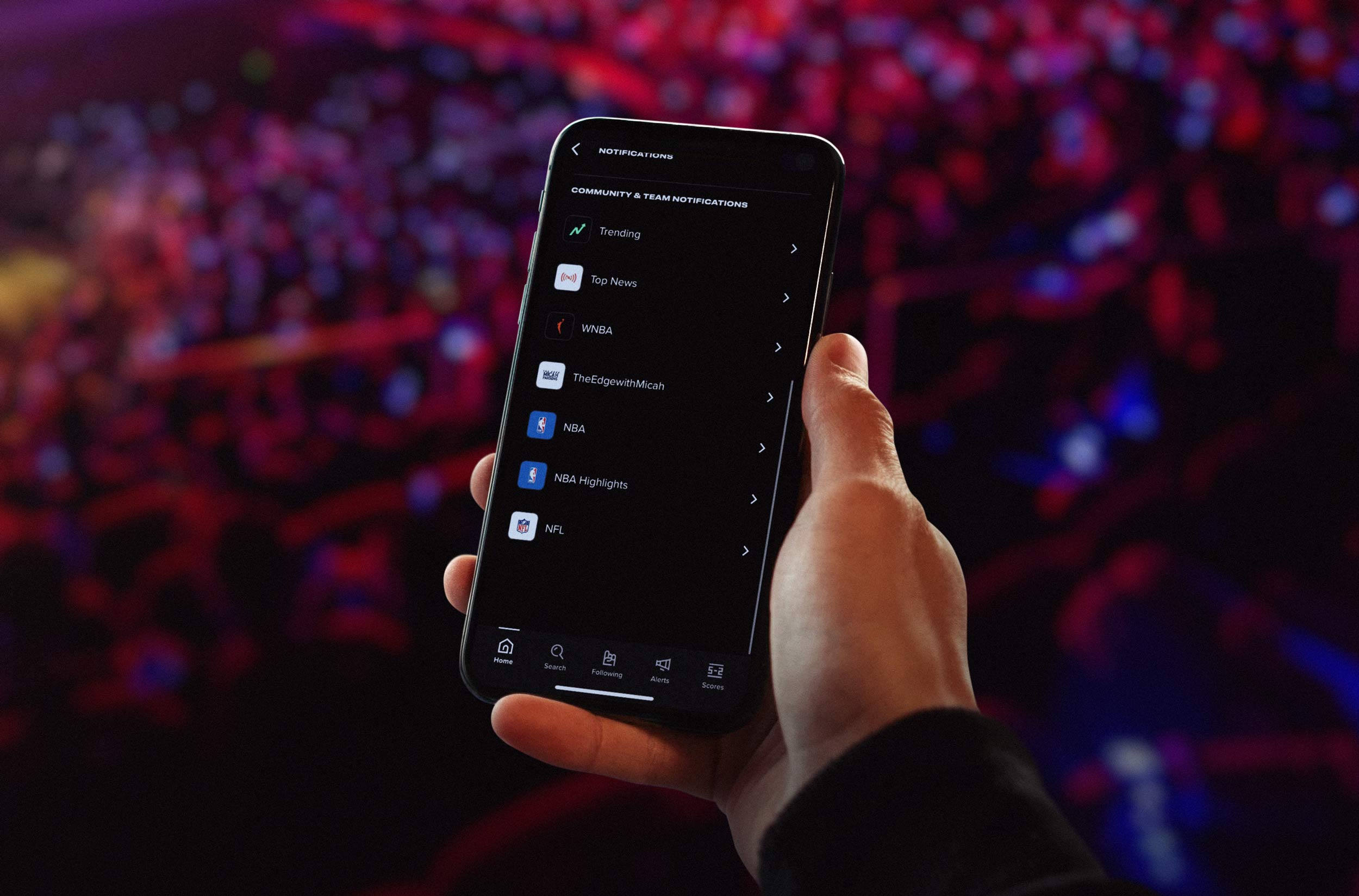
Team Stream’s source-agnostic aggregation model prioritized fan utility over publisher exclusivity, enabling us to deliver breaking news faster while maintaining trust through clear attribution. We expanded push notifications beyond transactional alerts to include highlights, quotes, and culturally relevant moments, transforming them into a storytelling surface and a form of social currency among fans. The introduction of player streams extended personalization from teams to individual athletes, supporting fantasy sports behaviors and deepening engagement across more than 500 global team streams. These innovations established interaction patterns that competitors would later adopt, reinforcing Bleacher Report’s role as a category leader in real-time, fan-first sports media.
At a strategic level, the B/R App was built around a singular mandate: remove friction between fans and the sports they love while deepening their sense of belonging within the broader culture surrounding the game. We architected a deeply personalized system that allowed users to dictate what they see, when they see it, and how they are notified, shifting control from publisher to audience and redefining expectations for sports media products. Fans follow teams, leagues, and players to generate a dynamic feed shaped by both algorithmic signals and editorial judgment, ensuring relevance without sacrificing context or credibility.
This hybrid curation model became a defining differentiator in a crowded marketplace, enabling the platform to deliver tailored experiences at scale while preserving a coherent editorial voice. The ability to send rich-media notifications with speed, personality, and cultural awareness positioned push alerts as more than functional updates; they became a core expression of the brand and a primary driver of retention, engagement, and emotional connection. In doing so, the product transformed real-time information into social currency, reinforcing Bleacher Report’s role as an indispensable companion throughout the rhythms of a fan’s day.
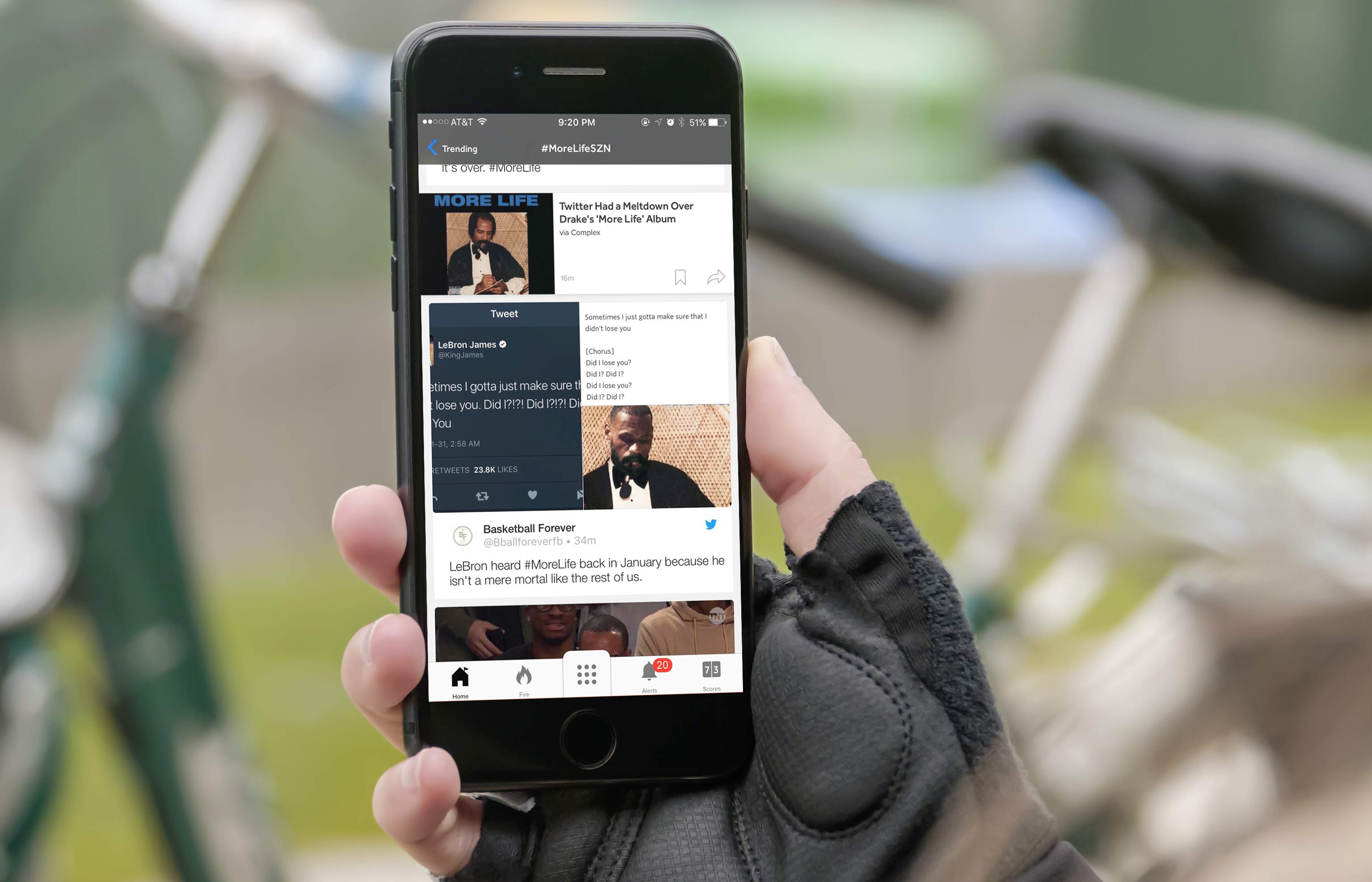
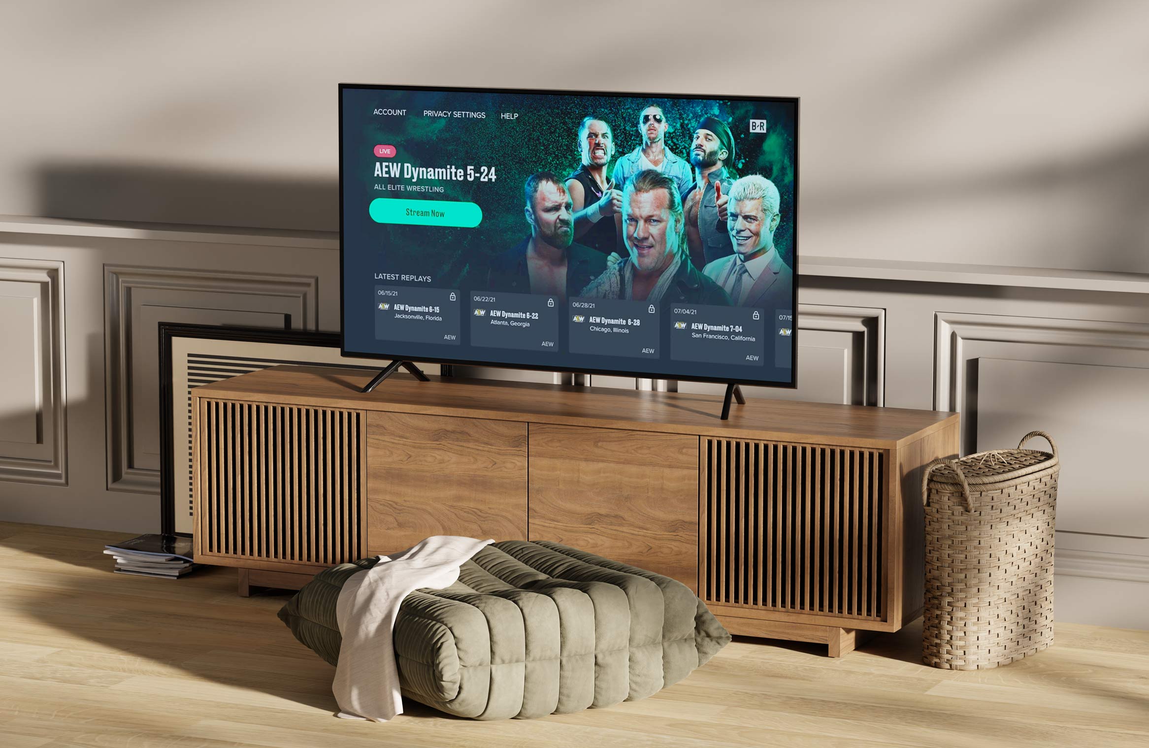
The Sports Alphabet spot was the purest expression of Team Stream’s promise translated into culture. We took the idea that the app is a real time command center for fandom and made it visceral by turning the lock screen experience into a rapid fire, A to Z sprint through sports language, memes, and moments. Built across 26 distinct animation styles, the commercial mirrored how the B R ecosystem actually feels in motion: fast, eclectic, referential, and relentlessly current. I helped shape the creative direction and craft the updated sports lyrics so every letter landed with the same tone we engineered inside Team Stream notifications and streams: culturally fluent, fan-native, and instantly shareable. The result functioned as both brand anthem and product thesis, positioning Team Stream not as a generic sports utility, but as the place where sports culture hits first, spreads fastest, and stays alive long after the final buzzer.
Underneath the surface, the app functioned as a system of repeatable components rather than a collection of bespoke screens. Streams, cards, alerts, and share modules were designed as interoperable units that could adapt to new content types without requiring structural redesign. This system-first approach enabled rapid experimentation, from integrating social embeds to launching new verticals like Kicks, while maintaining visual consistency and performance. By prioritizing patterns over pages, we created a flexible foundation that allowed the product to evolve alongside fan behavior. Integrating culture into the feed was not an expansion of scope but a recognition of how fandom actually operates. Music releases, sneaker drops, and internet memes function as connective tissue between games, sustaining engagement during off-hours and off-seasons. By curating athlete reactions, social commentary, and cultural context alongside traditional sports coverage, the app mirrored the lived experience of fans. This approach extended relevance beyond game windows and positioned Bleacher Report as a culturally fluent platform rather than a narrowly defined sports outlet.
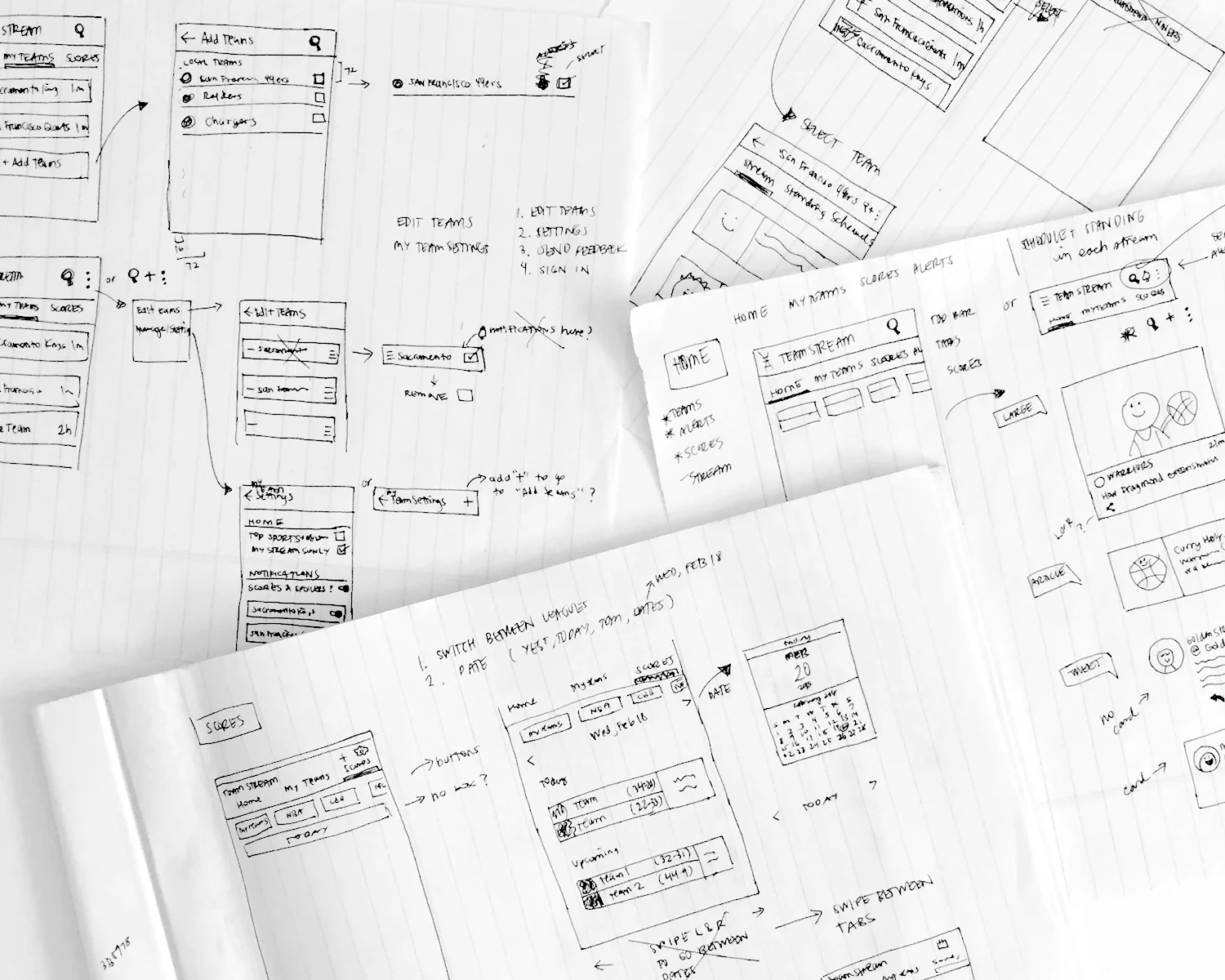
Working alongside Cat Oshiro on the iOS and Android redesign was one of the most materially collaborative phases of the Team Stream evolution. Cat’s early sketches mapped the structural logic of the app at a systems level, defining tab hierarchies, team management flows, and notification controls that could scale across hundreds of team streams. My role was to translate that structural clarity into interactive prototypes that tested pacing, gesture behavior, and content density in real usage scenarios. Together, we moved fluidly between paper, Sketch, and InVision builds, validating how navigation patterns such as floating action buttons, tabbed team views, and alert overlays would behave under real-time content load. This phase of the project reinforced a core belief that has shaped my career: the most durable product experiences are born from the interplay between rough ideation and rigorous prototyping. Cat’s sketches provided the architectural skeleton, Bennett’s product direction defined the behavioral goals, and my prototypes functioned as the connective tissue that translated intent into lived experience. Together, we were not simply redesigning screens. We were constructing a system that could adapt to the emotional volatility of sports fandom while remaining performant under extreme real-time demand.

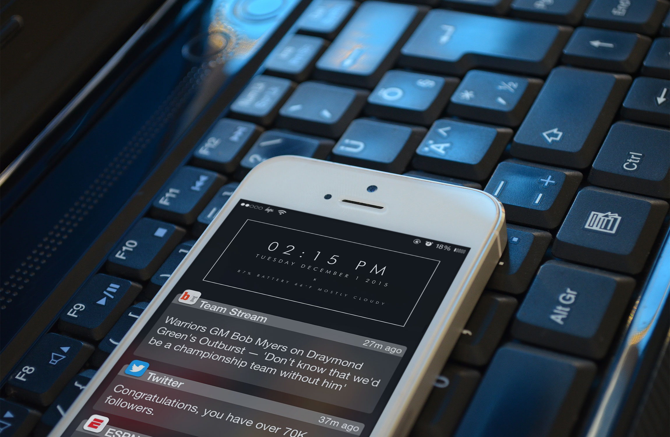
According to Comscore, 4.8 million people in the U.S. used Bleacher Report’s mobile app in March 2019, up from 3.7 million in March 2018. One of the main reasons people use Bleacher Report’s app is to get customizable push notifications on breaking news involving their favorite sports or teams. These push notifications can provide a form of social currency if someone finds out about a blockbuster trade before any of their friends, which is why Bleacher Report has seen a lot of people screenshot its push notifications and share them to Instagram. Team Stream Curates content and sends breaking news push notifications for well over 500 teams around the world.
Our users select the teams and topics they’re interested in following when they download the app, anything from NFL football to Premier League soccer or America’s Cup sailing. Turning this data point into a feature of the app drove even more downloads. In multiple blue sky sessions within the Design team, I was able to contribute big picture concepts that would be integrated in different forms as ways to build more of a community aspect to the app. From it's early stages and being hands on in developing design and UI decisions, to taking a step back and thinking more holistically about features and ideas that turn the app into more of a platform for debate, communication, and sharing was a huge aspect of my involvement in the Team Stream app. This system enabled rapid growth while preserving a cohesive, recognizable brand across every touchpoint.
The relationship between web, social, and app experiences formed a deliberate growth loop. The website captured broad discovery through search and social referral, while the app converted that attention into personalized, habitual use through alerts and tailored feeds. Social content amplified reach and funneled audiences back into owned channels, where deeper engagement and community features lived. Designing for continuity across these surfaces ensured that users could move fluidly between them without friction, reinforcing brand trust while strengthening the feedback loop between distribution and retention. Rather than forcing users to leave the app to verify sources or view social context, we integrated native embeds and attribution directly into the stream, allowing fans to consume and react without friction. This design reinforced trust through transparency while preserving scroll momentum, turning the feed into a real-time pulse of the sports world. By prioritizing speed, clarity, and inline context, the experience transformed news consumption into an active, socially informed behavior.

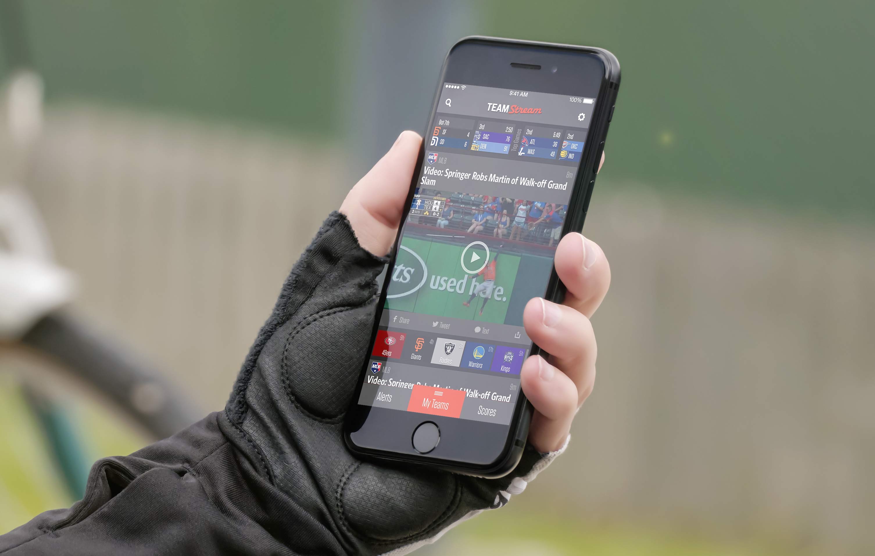
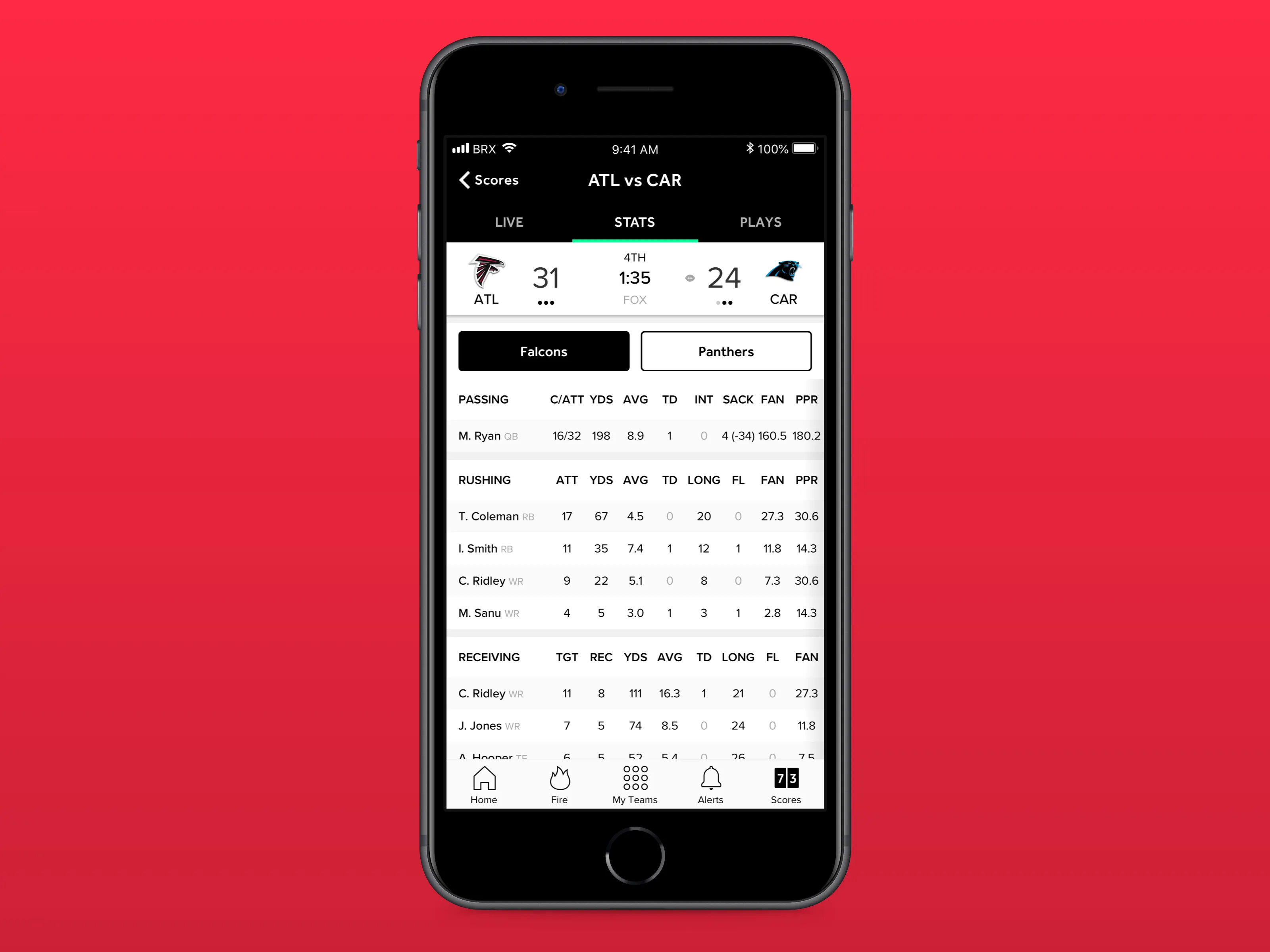
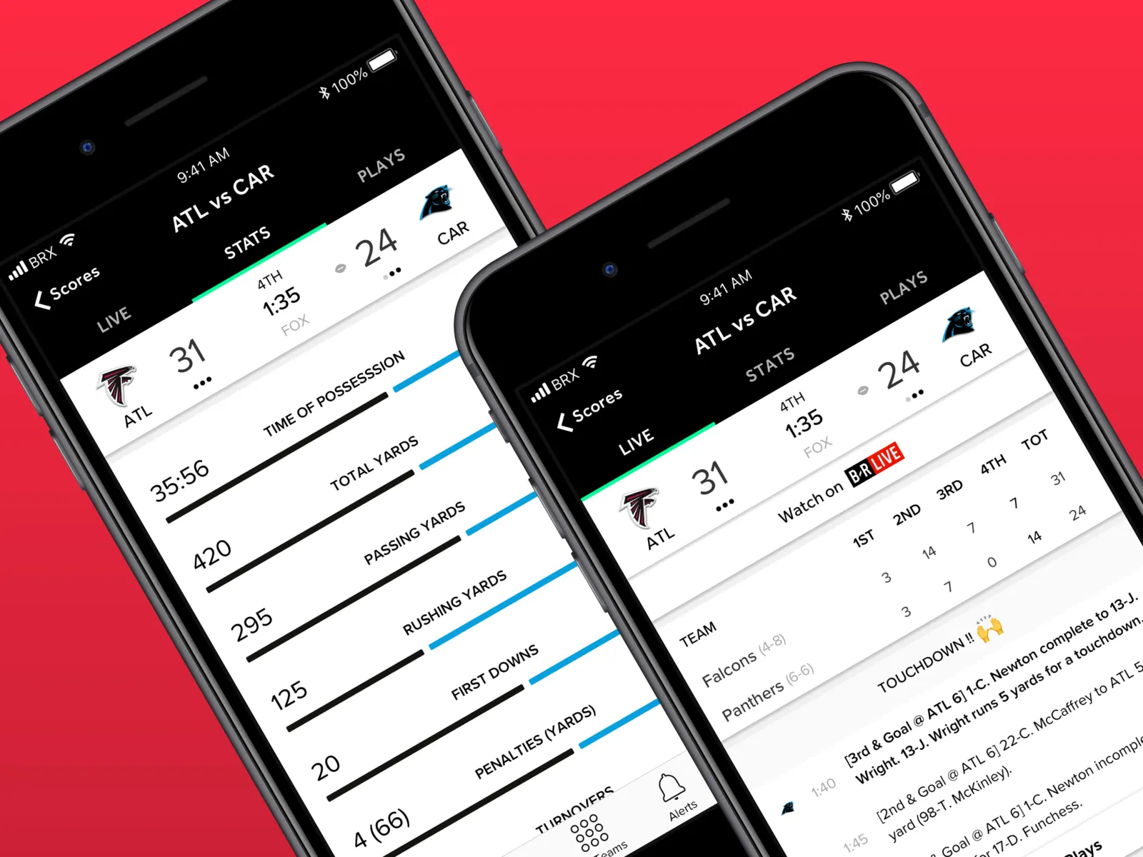
The other key feature of Team Stream is the speed with which we inform users of breaking news. Within minutes of a story breaking on the field or on Twitter, our users will receive a push notification describing what happened and why it’s important. We regularly beat our top competitors in the speed department, and we feature a wider variety of content in our push notifications. Not just trades, injuries and scores, but also quotable moments and highlights of game-breaking plays. (Shoutout to NBA Street Vol. 2) Designing for sports means designing for spikes. Trade deadlines, playoff games, and breaking scandals produce traffic patterns that dwarf normal usage, and the interface had to remain stable and legible under extreme content velocity. We prioritized lightweight card rendering, deferred media loading, and modular layout behaviors that maintained scroll performance even as the feed density increased. This ensured the product felt responsive during the exact moments when fans depended on it most.
Sports culture operates on the same temporal rhythm as internet memes, where relevance can expire within hours. The interface needed to support rapid content turnover without disorienting users. By emphasizing scannability, clear timestamps, and visual hierarchy, we enabled fans to quickly understand what was current, what was trending, and what had already passed, aligning the product’s tempo with the cadence of online sports discourse. While rooted in U.S. sports culture, the platform served a global audience with different leagues, time zones, and consumption habits. We accounted for this by designing time-relative indicators, adaptable score modules, and league-agnostic card structures that could support everything from Premier League matches to NBA trades without redesigning the core experience.

Working on Team Stream meant designing for a tempo unlike any other product category. Sports do not follow predictable release cycles; they erupt. A trade breaks mid-commute. A scandal unfolds during a workday. A game-winning shot detonates timelines in seconds. The interface had to absorb these shocks without collapsing into noise. This required a design philosophy rooted in elasticity: layouts that could expand under breaking news, notification systems that could escalate urgency without overwhelming users, and feed behaviors that could surface the most relevant context while preserving continuity. Designing at this speed reshaped how I think about product resilience, teaching me that stability is not the absence of change but the ability to remain legible under pressure.
I consistently championed the push notification as more than a utility for awareness. It was a frontline expression of voice, a micro-format where brand personality either resonates or gets ignored. By working closely with our programming team, I pushed for a tonal shift that mirrored how our audience actually spoke in comment sections and group chats, incorporating emojis, slang, and meme vernacular that were already circulating on Twitter and Instagram. This wasn’t about chasing trends but about linguistic alignment, ensuring that when we broke news or highlighted a moment, it felt native to the culture rather than translated from a corporate register. As that voice sharpened, we saw a measurable lift in open rates, engagement, and downstream social sharing, validating that authenticity in tone can be as impactful as speed in delivery.
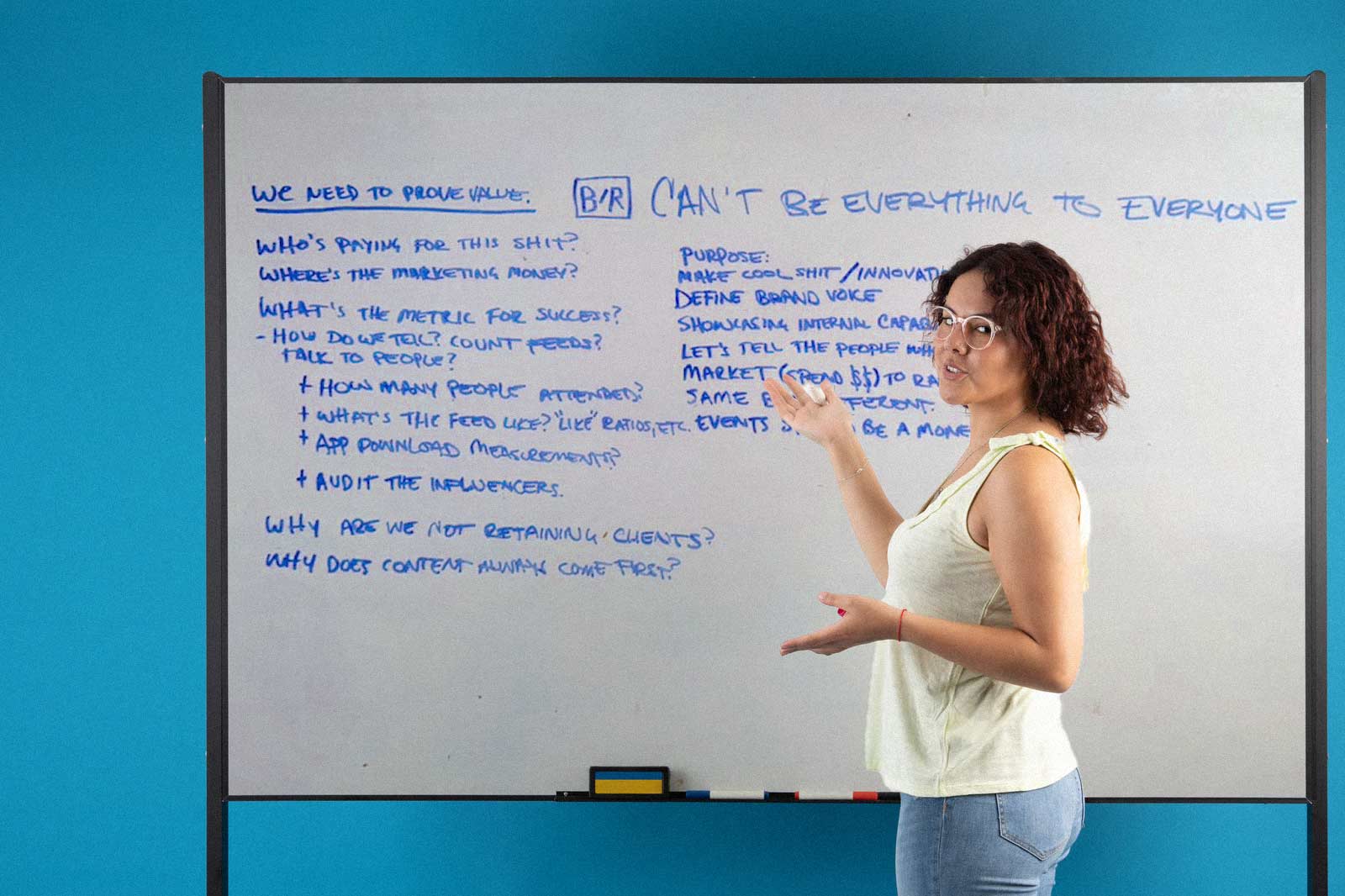
Throughout the process, I facilitated a series of whiteboard strategy sessions designed to pressure-test assumptions and align cross-functional stakeholders around a clear product direction. These working sessions operated much like agile sprint kickoffs, where product, design, marketing, and editorial teams could externalize thinking, map dependencies, and rapidly iterate on ideas in real time. We used the whiteboard as a living system map, diagramming user journeys, defining north star metrics, and identifying the key behavioral loops that would ultimately drive engagement and retention. By visualizing the ecosystem this way, we were able to move beyond abstract discussion and instead ground the conversation in tangible product hypotheses and measurable outcomes. The sessions often revolved around framing core questions around value creation, distribution strategy, and how success should be instrumented across both qualitative community signals and quantitative platform analytics. From there we translated those insights into actionable design frameworks, outlining MVP feature sets, prioritizing roadmap initiatives, and identifying where experimentation could unlock new growth vectors. This collaborative process between our creative teams and product design and engineering created shared clarity across the squad while ensuring that design decisions were informed by both user behavior and business strategy. In practice, these sessions became the connective tissue between creative instinct and product rigor, allowing us to iterate quickly while maintaining a disciplined focus on scalable impact.
That evolution helped us build a true feedback loop between the app, its integrations, and our social platforms, creating an ecosystem where each surface reinforced the others. The app anchored the experience with curated streams, timely alerts, and deeper written stories, while social channels extended the conversation through original content, reactive posts, and community participation. Together, they formed a balanced system where users could move fluidly between consumption and contribution, headline and highlight, notification and narrative. If Bleacher Report aimed to be a top destination for sports news, the app had to serve as the structural backbone, supported by a cohesive voice that made the transition from social feed to in-app experience feel seamless, familiar, and culturally fluent.

Sports fandom was undergoing a structural shift. Fans were no longer waiting for postgame analysis or highlight shows to shape their opinions. They were reacting in real time across Twitter, group chats, and emerging social platforms, turning every play, trade, and cultural moment into a live conversation. The traditional aggregate feed, built for passive consumption, could not keep pace with this velocity. The product needed to evolve from a static news utility into a responsive surface that matched the speed, emotion, and participatory nature of modern fandom. Early iterations of the app treated content as universal and interchangeable, but fandom is deeply identity-driven. A Lakers fan does not experience the sports world the same way as a Knicks fan in the middle of a losing streak. Recognizing this, we reframed the feed not as a neutral stream but as a personalized arena shaped by allegiance, mood, and moment. Every design decision, from team prioritization to visual accents, reinforced the feeling that the app belonged to the fan and their teams rather than to a generic sports hierarchy.
In many ways, the whole point of all of our social media content was to long term drive brand affinity in our audience and increase the likelihood that we can convert them from casual fans to longtime users of our owned and operated platforms. And it is really this type of a long term relationship that can be built with fans that makes Bleacher Report the choice for so many young people who have grow up with the app and the social presence we have built.
.jpeg)
The Bleacher Report app is also the first sports app of its kind with seamless social functionality - which builds community and engagement. I helped launch the “fire” stream which are our version of facebook likes or reddit upvotes, suggested how we build out community and direct or group messaging features, helped beta test reddit AMAs (Ask-Me-Anythings) and then port over an elevated version that could be experienced natively within the app, and perhaps most importantly helped design and build out much of the UI and UX that makes it one of the smoothest sports apps on the planet. These features exist in tandem with comments, replies, and expanded profile customization. Every social feature we build is designed to develop a community of sports lovers who want to find their fan counterparts and engage with their favorite sports, athletes, and trends.

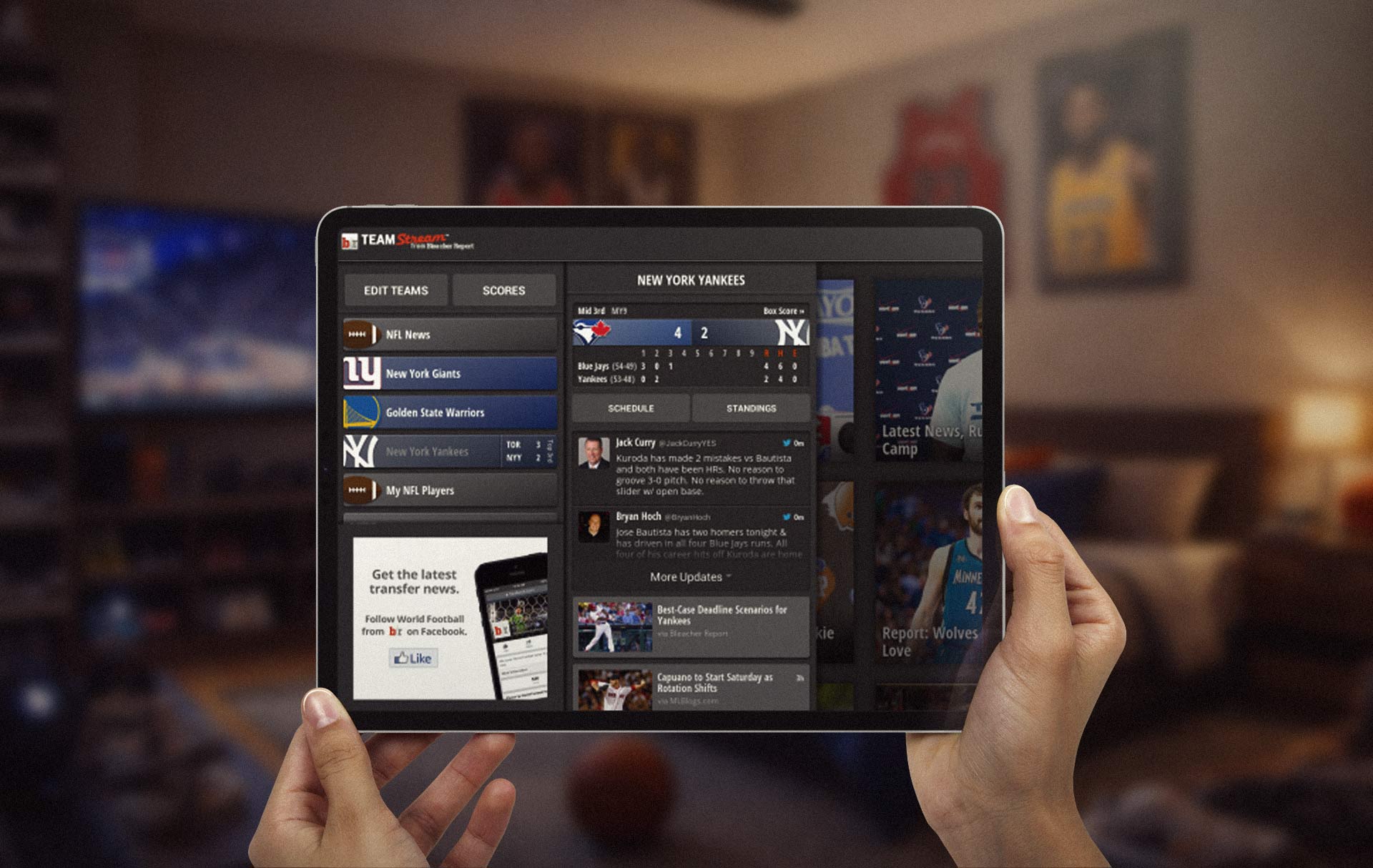
Bleacher Report’s website functions as the high-bandwidth hub of the ecosystem, while the Team Stream app translates that same content architecture into a personalized, mobile-first experience that prioritizes speed and team affinity. The web platform emphasizes breadth with league-wide coverage, multimedia storytelling, and SEO-driven discovery, whereas the app narrows the aperture to a user’s selected teams, surfacing real-time alerts, scores, and shareable moments in a feed optimized for thumb-scrolling. The responsive web experience bridges these contexts by mirroring the mobile layout patterns such as card-based streams, tabbed navigation, and persistent share actions, ensuring visual and behavioral continuity across devices. This interplay allows fans to fluidly move between desktop depth and mobile immediacy without relearning the interface, reinforcing Bleacher Report’s core promise of delivering culturally relevant sports content wherever fandom happens.
When users open the app, they’re immersed in their favorite sports and put in contact with fellow fans. Relevant content is surfaced and personalized to them. Images are tight and bright. Text is conversational and light. Videos stream as you scroll through threads. Alerts yell the news first, and often do so with HD video or rich media that add to the story. No other sports app on the planet takes as much attention to detail, builds meaningful community, or tells the news faster than the B/R App. The app experience is closely tied to our social accounts and the content I would produce as a part of our moments team would often be a promotional piece to drive users to our app.

Team Stream has done something entirely new in the mobile sports app space. By being ‘source agnostic’, that is, programming content from other news outlets right along with our own, we’ve been able to provide a best-in-class user experience. And by looking everywhere for news – scouring every resource available to us – we’ve been able to see things and react to them quicker than our competitors. We don’t care who breaks a story. They’ll get credit from us when we send our push notifications, while other outlets are waiting for their own editorial team to write a story before they tell fans. Team Stream has been the disruptor that other, more established companies, have emulated in their apps in terms of speed and functionality. We set the standard and were at the vanguard as far as notifications and app programming speed.
Over my tenure at Bleacher Report I helped oversee many iterations and evolutions of the mobile app, from it's early inception as Team Stream to the many stages of refinement and upgrades, which culminated in our complete design overhaul and revamp to today. I got to play a role in defining some of the early look and feel of some of the features of the app. Working in concert with our app developers and engineering team under Chris Nguyen and app programming and emerging media lead Bennett Spector. The overall transformation of the app into the most convenient social sports platform available to fans was a long but fulfilling one.
As the platform matured, it became clear that sports did not exist in a vacuum. The same fans debating a fourth-quarter play were also reacting in real time to cultural moments that shaped locker rooms, tunnel walks, and postgame soundtracks. Expanding coverage to include music, fashion, and internet culture allowed the product to mirror the actual texture of fandom. When Drake dropped a new album, for example, the app did not treat it as entertainment news on the periphery. Instead, it aggregated athlete reactions, embedded tweets, surfaced locker room song selections, and highlighted how tracks were already bleeding into warmups, IG stories, and postgame interviews. This approach reframed culture as part of the sports narrative rather than an adjacent category. By curating social reactions and weaving them into the feed, the app captured the speed and collective voice of the moment. Fans could see how players, teams, and fellow supporters were responding in real time, turning a music release into a shared, cross-domain event. The result was a feed that felt culturally fluent, recognizing that modern sports fandom is as much about the soundtrack, the fits, and the memes as it is about the final score and what happened between the lines during the game as what gets tweeted about afterwards.
More than 3.5 million people use the Bleacher Report app each month, and it remains the most engaging and frequently used sports app in the United States, with fans opening it an average of 4.5 times per day. Community members spend more than two hours per month in the app on average, exceeding our closest competitor by 50 percent and signaling a level of habitual engagement rarely achieved in sports media. These metrics reflect a product designed not merely for utility, but for daily relevance, where speed, personalization, and cultural fluency converge to make the experience indispensable to modern fandom. Designing this user experience took many iterations and work.
From the earliest stages of Team Stream’s evolution, I helped define and future proof the product roadmap by contributing to strategy, UX architecture, and cross-functional development decisions that would support long-term scale. This included shaping interaction models, prioritizing personalization frameworks, and advocating for performance and content systems that could adapt to shifting fan behaviors. By aligning design decisions with business objectives and audience insights, I played a role in guiding the app’s transformation from a notification-driven tool into a platform capable of capturing and creating the moments that define sports culture. This work influenced the app’s current trajectory as one of the most impactful products in the sports media landscape, demonstrating how thoughtful product design and creative direction can translate engagement into lasting brand affinity and category leadership. I was able to make a large impact in the early stages of the app development cycle that had lasting effects years on.
The first step was to update the basic layout of the website and translate that to the app redesign as we wanted to prioritize the concept of an infinite feed. As the wireframes evolved over time I was responsible for developing the look and feel of an image heavy visual social platform that felt user friendly and put content and headlines front and center and allowed for consumers to easily switch between different "streams" of sports content. Prior to the concept of the dock that I suggested we were using a tray that would hold all the different teams. This was behind two clicks, and the dock allowed for quick switching as it was always on the top of the app design UI. Through a SWOT analysis the two major things that we saw our users wanted was access to scores, and the ability to quickly move through different stories around their favorite teams or what was trending in the sports landscape. I helped create and refine our user flows as more testing was conducted and we landed on a smoother overall experience.
The eventual goal for Bleacher Report was to evolve from more than just a news aggregation and curation application and become the definitive sports media platform. A place where fans could gather and talk trash and stay up to date with games, share clips with their friends, participate in interactive contents, and truly become a part of a community. To achieve this lofty goal one fo the major directives that I was asked to tackle was how to make the actual app design feel friendlier and more approachable. Something that felt like a more natural gathering place rather than just a port of our mobile web layout for the site. This elevated experience would be key in positioning Bleacher Report as the future of sports media, as we would be interactive with fans rather than just it being a one way conversation. It isn't just about informing our fans or keeping them updated, but allowing them a space to interact with other like minded individuals.
Our commitment was to serve the best interest of our fans, no matter the disruption this may bring to the media landscape. This sensibility had to be translated to a mobile first experience that was unique compared to everything else on the market. The ways B/R connects to its community will continually evolve. Our goal with the app was to combine a passion for sports culture with an unwavering commitment to utilizing technology, creativity, inclusiveness and calculated risk-taking. As a way to build brand awareness and fan engagement we actually were able to organize Kasey Kahne to drive the No. 5 car with a new paint scheme at the Quicken Loans 400 at Michigan International Speedway, featuring Team Stream as a sponsor as a part of our marketing budget and Turner's relationship with Nascar as we were building the new designs as a way to drive more eyeballs to the eventual launch. The more eyeballs on us the more fans we could get into our ecosystem and become lifelong bleacher report subscribers.

From the website redesign we realized that the most engaged content had to be surfaced first. In order to do this we had to give users in the app more control. In concept meetings with some of the engineering team and our director of emerging media, I was able to get a sense of what customer segments primarily used the app for whether it was scores or news or interacting with their fellow fans and found innovative technical and visual solutions that would put higher levels of control in front of our users.
Customer obsession is a major focus for any project that I tackle, and catering to how our users would be interacting with their teams and most important subjects was a topic that we did a heavy amount of research around. The overall goal for the Team Stream app to go from being a publisher based media app where we curate news stories and provide update notification and scores to become more of a social platform where you could dictate your community experience based on the sports teams and topics of interest in the overall cultural ecosystem that you subscribe to. Essentially we wanted to take some of the best parts of other experiences - the instant updates you get on a platform like twitter, the high quality visual content you get on instagram, paired with the community and conversation of a platform like reddit all told through the perspective of the ultimate sports fan. The idea would be to take away as many of the barriers between the sport and the consumer.
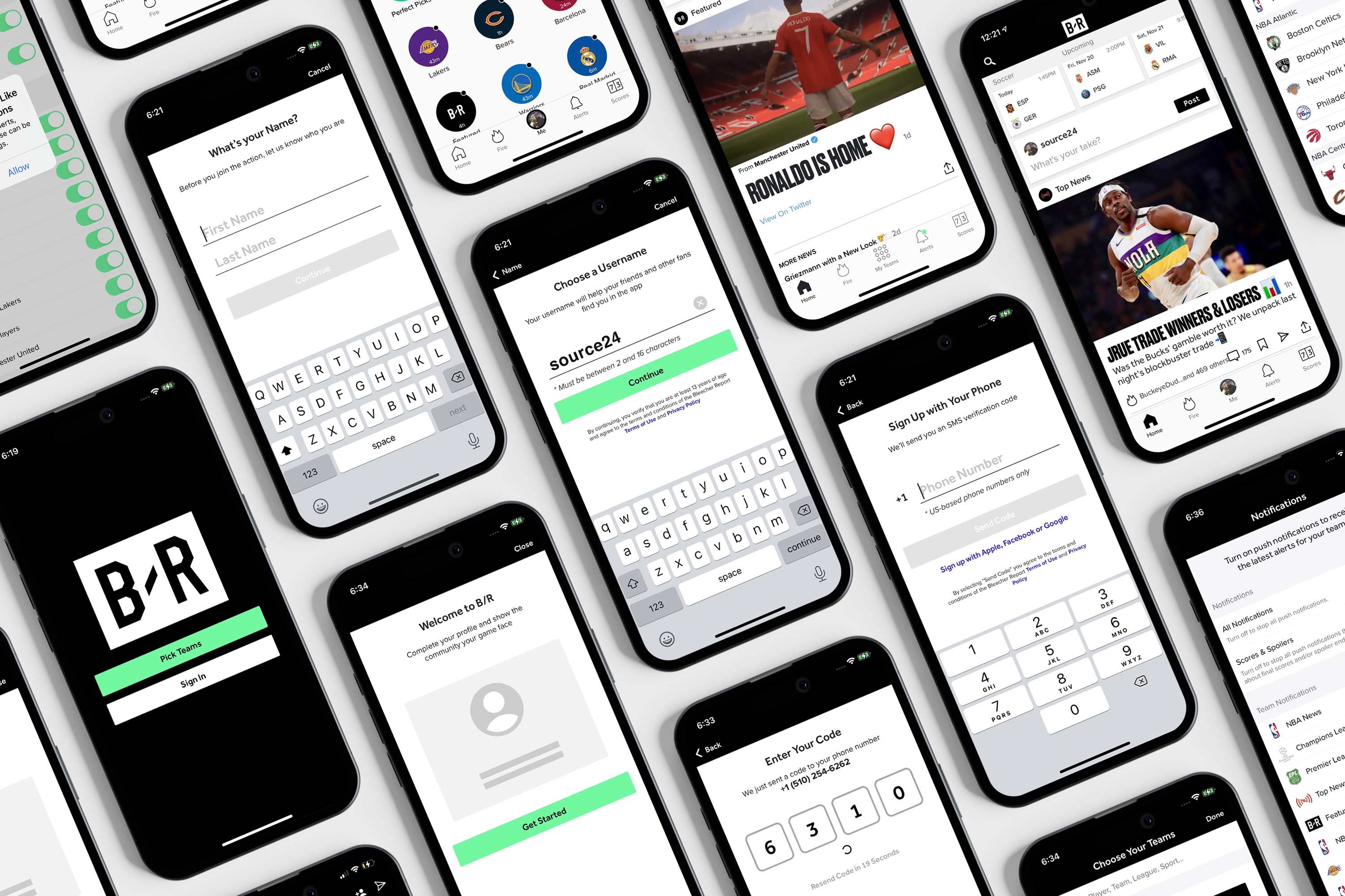
Like I mentioned earlier, when I was brought into Bleacher Report, the then Team Stream app was still in its early stages, closer to a shell for its mobile web version of the website rather than a fully fledged and robust iOS and Android application. As such, I had an opportunity to play an integral role in shaping the user interaction and design of the app as it has moved through it's different iterations through the years. Some of the features that I was able to implement are now mainstays of the in app experience and rank as our most consistently highest reviewed features in the app store. Through a process of wireframing and truly examining the overall user experience for the app I was able to help streamline things to make it a more efficient and fun user journey. This led to a 10 fold increase in app downloads and stream subscriptions as we continued to elevate the features within the app and drive more eyeballs and get people to make it a part of their regular fandom and daily routines.
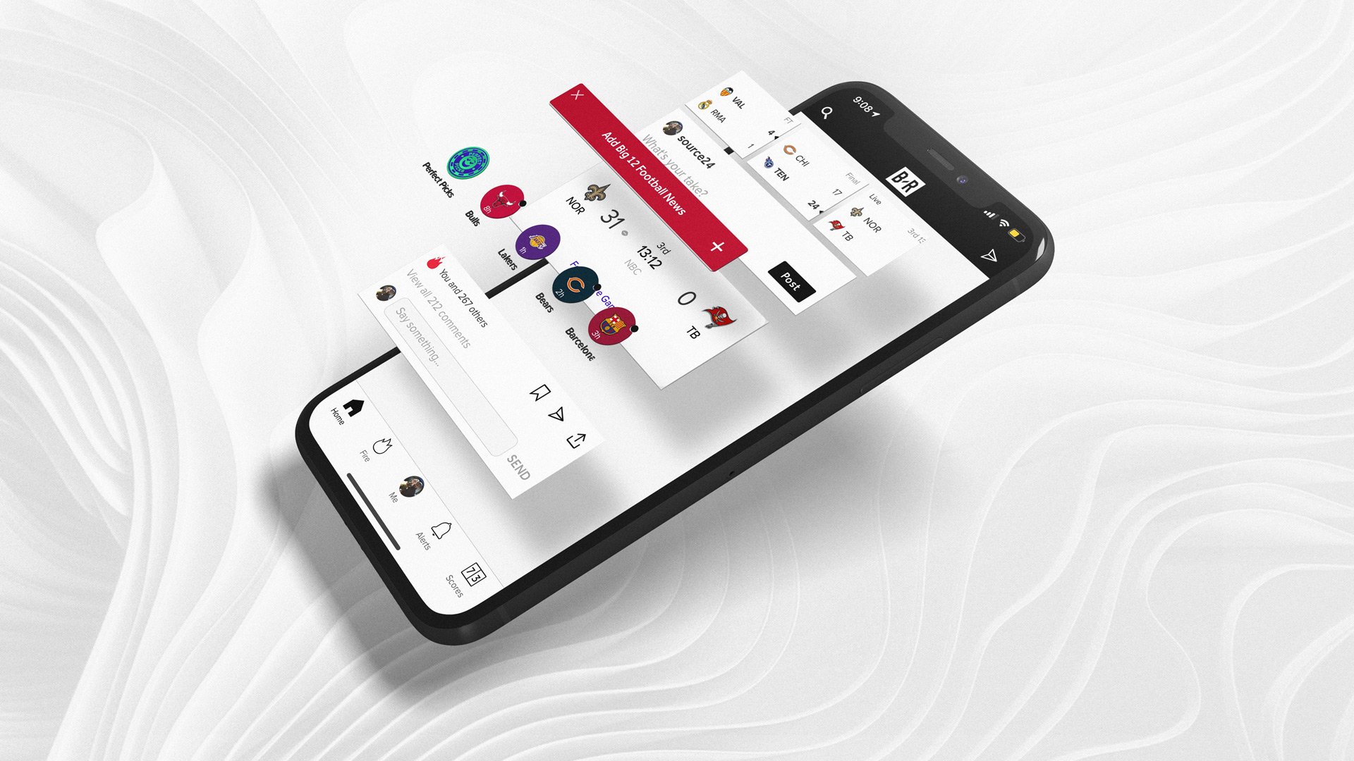
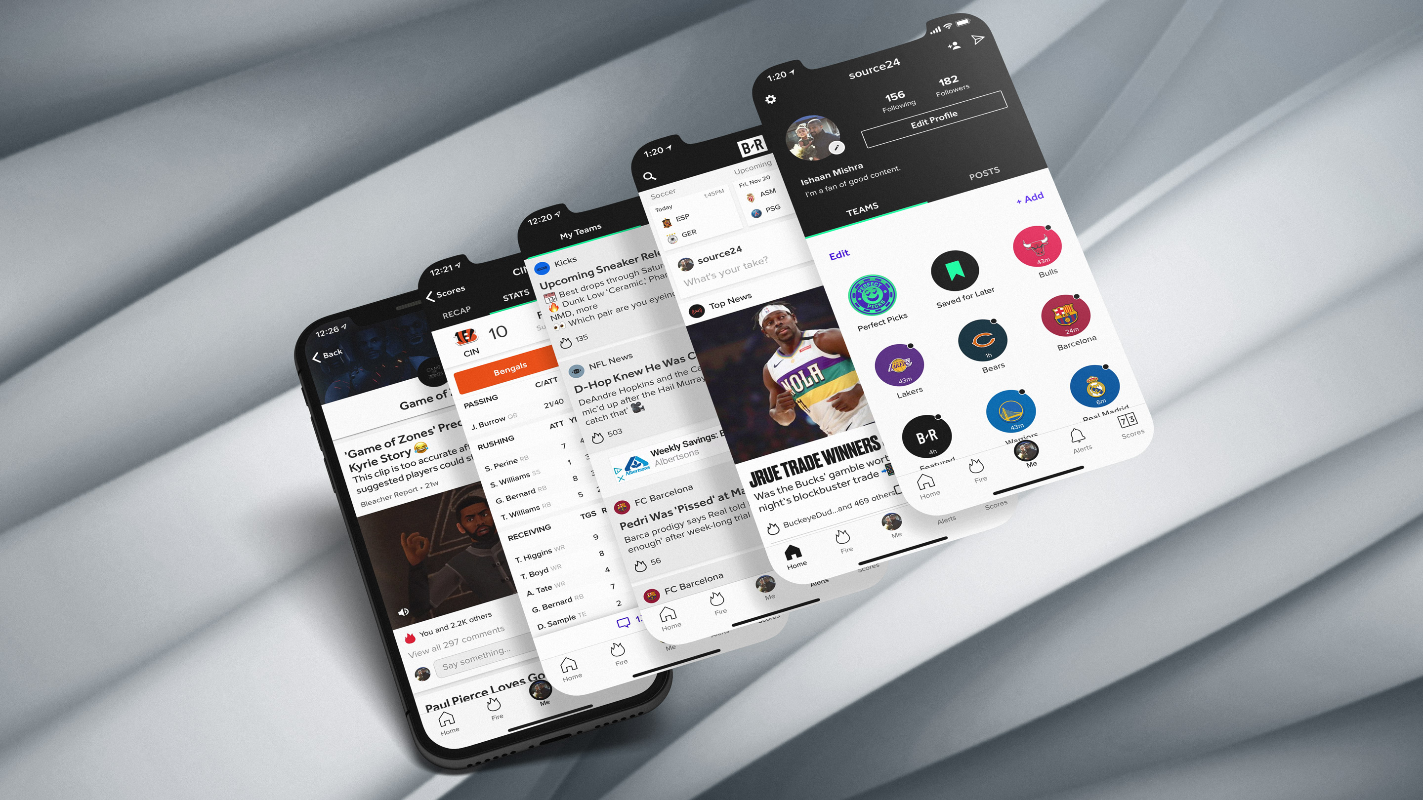
One of the key interaction innovations I introduced was a horizontal, left-to-right team slider embedded mid–infinite feed, allowing users to pivot instantly between fandom contexts without breaking scroll momentum. Instead of forcing fans to back out to a menu or reload a new screen, the slider surfaced their followed teams as swipeable chips that re-skinned the feed in place, updating stories, scores, and reactions to reflect that team’s universe. This preserved the cognitive flow of the infinite scroll while enabling rapid identity shifts, from Knicks Twitter chaos to Warriors discourse in a single gesture. The pattern acknowledged that modern fans hold multiple allegiances and moods, and by making team switching frictionless, the product transformed the feed from a static stream into a dynamic, personalized portal that could morph in real time to match the fan’s current emotional investment and based on what games were currently in season.
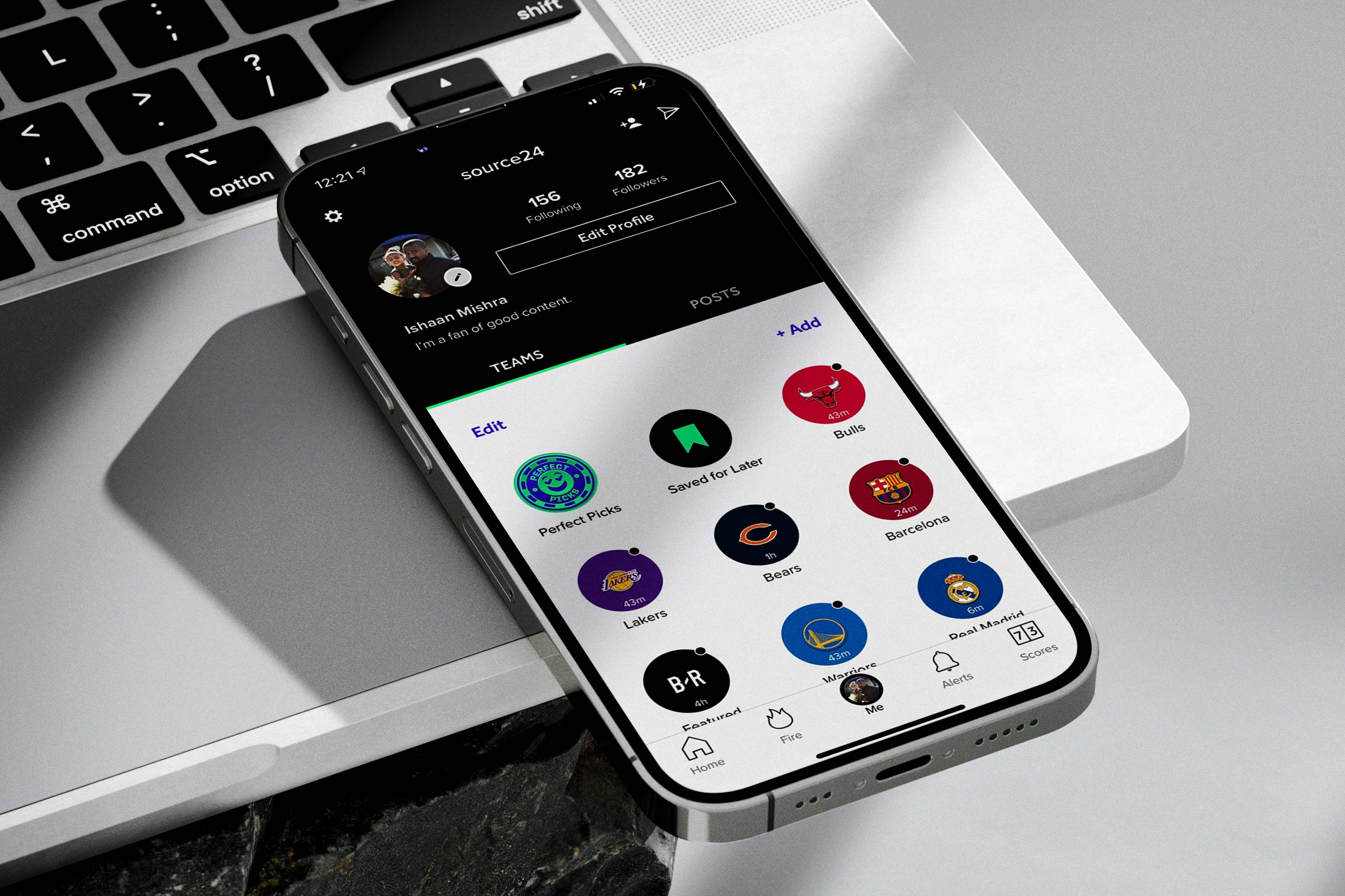
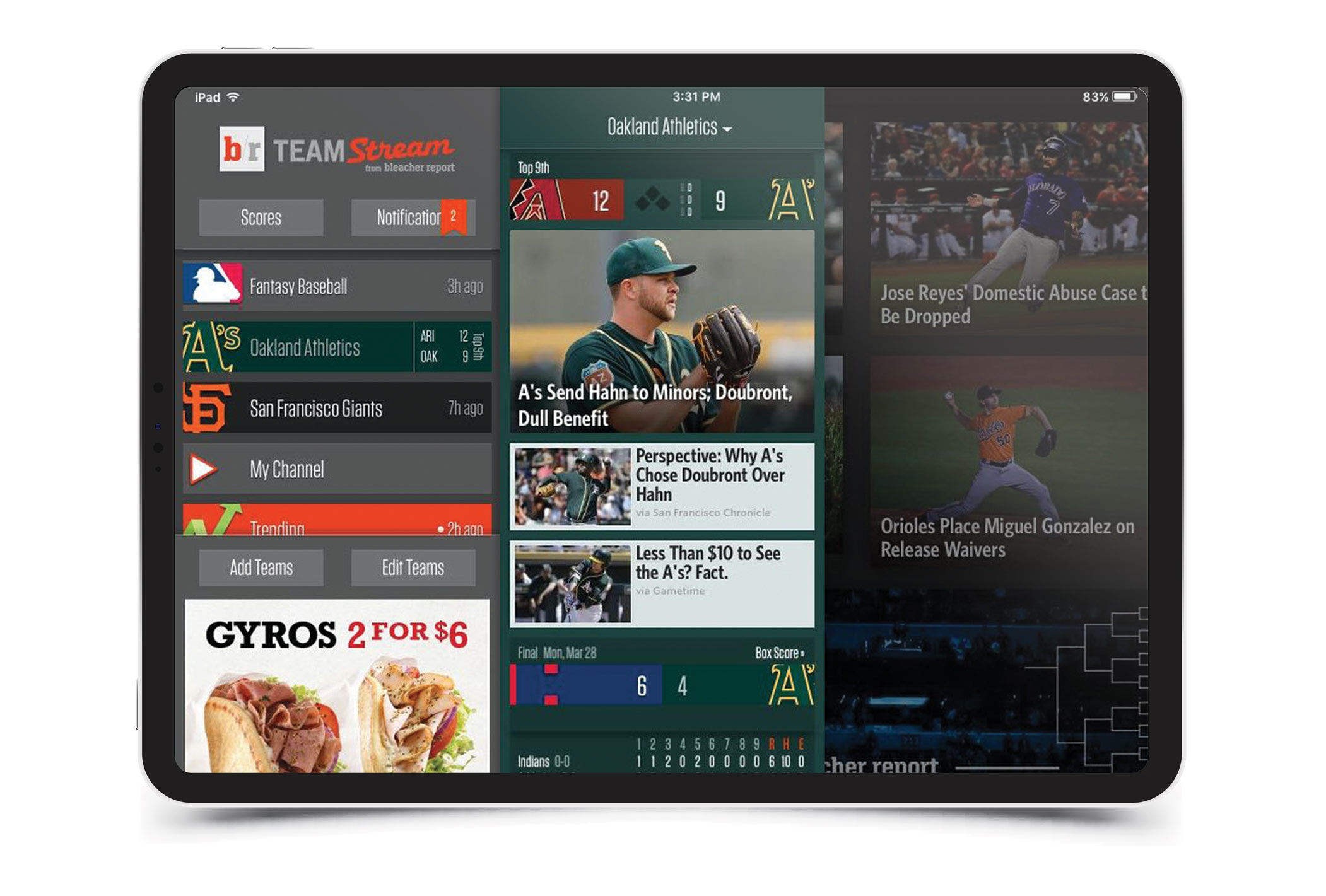
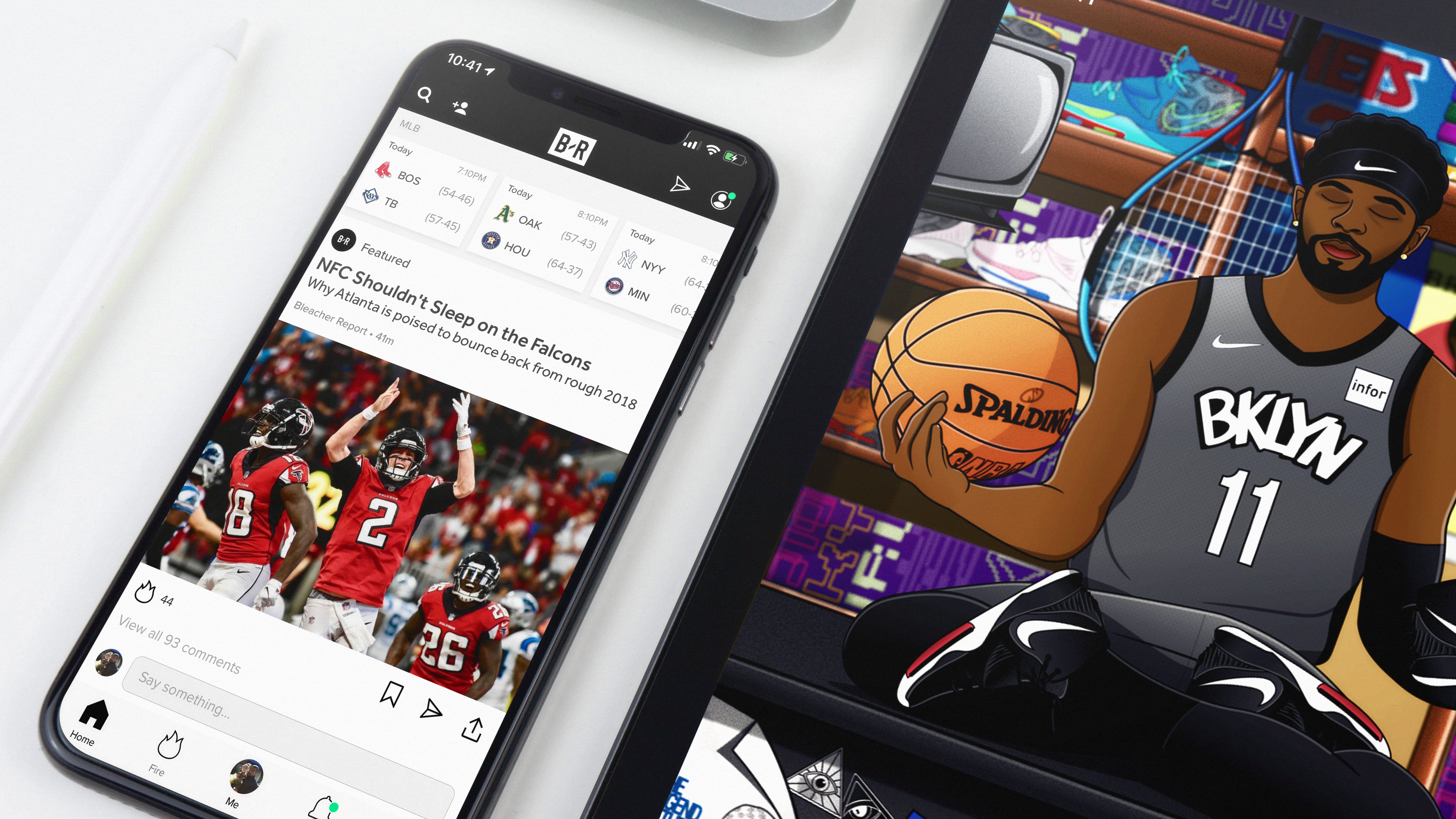
One of the first things I had a chance to provide some design support around was the Team Stream HD app for iPad which offered a personalized dashboard on the homescreen, with the headlines, top stories and tweets from the teams and topics users had deemed their favorites on the homescreen. Our unique value proposition was that we allowed users to select which teams, athletes and sportswriters you want to follow, including athletes from the NFL, College Football, MLB, NBA, NHL, College Basketball Tips, Soccer, Tennis, Golf, MMA, Boxing, WWE and NASCAR. In this sense, team stream became the foremost sports news aggregator app in the marketplace. This new User Experience Design infrastructure also required the design of new icons and UI elements for the app which I got to lead the charge on. This included some of our most subscribed streams such as the trending tab, the breaking news stream, and the featured stories stream. These three streams accounted for a massive chunk of all app traffic, so building them out to feel cohesive and streamlined was essential and having a hand in building them and ensuring that they were operating at a high level was key.
Video architecture became a major area of focus as the app continued to grow and the company was looking for more premium revenue streams. I was behind the art direction and app integration of our Team Stream Now realtime news update show which was shot live in studio and produced daily sports content at a high clip with high quality video and image assets. In doing so, we ended up launching apps for both AppleTV and XBox that would feature this robust video content as it became a staple of the Bleacher Report editorial playbook. Bleacher Report used Cloudinary as a speed to market SAAS digital cloud service to automatically transcode videos into a streamable format, adjust their quality and resolution, implement adaptive bitrate streaming and deliver them through a fast, reliable content delivery network.
These features ensure that viewers experience a smooth playback irrespective of device requirements or internet connectivity on the iphone or ipad app. Not only did I design and creative direct al the motion graphics for the Broadcast Package around this higher visibility high resolution linear video offering, I also worked with our programming and engineering teams to develop a robust TV streaming solution that would help us drive millions of linear views month over month. This transition from a largely text based article generation publisher to a multimedia content space was key in the transformation of the app as well as Bleacher Report as it transitioned into its next stage of development. Video was a key aspect of this world and an important solution for our sports coverage.

Designing for Bleacher Report meant designing for an ecosystem of screens rather than a single device. The product had to feel equally native whether a fan was reading a rumor on their phone during a commute, watching highlights on a tablet at home, or casting video to a television during a game. Our interface system needed to scale fluidly across phones, laptops, tablets, and large displays while maintaining clarity, speed, and visual hierarchy. We leaned heavily into material design principles and tactile UI thinking, using subtle shadows, layered surfaces, motion transitions, and textured visual cues to create an interface that felt responsive and alive across form factors. Typography, spacing, and card structures had to adapt intelligently to different screen densities and viewing distances so that the experience remained legible whether it was thumb scrolling on a small screen or lean back consumption on a larger display. Testing this properly required an almost obsessive level of iteration. At one point we literally had a closet in the office filled with different phone models, tablets, and screen sizes so we could constantly validate how the product behaved in the real world. Designers and engineers would pull devices out of the stack throughout the day to check responsiveness, motion behavior, loading patterns, and how imagery and highlights rendered across different resolutions. That hands on process ensured the design system was not theoretical but battle tested, allowing the Bleacher Report experience to feel cohesive and intentional no matter how or where fans chose to engage with the content.

As the team stream app evolved into the Bleacher Report app and new branding was implemented, the underlying architecture that I had helped develop became streamlined as we integrated more community features into the workflow. The app itself is a news platform for all things sports related. The navigation design is generally done with an horizontal bar at the bottom, taking users to the most important corners of the app. The interactions are brief but meaningful, the general visuals are clean but full of personality to encourage a community atmosphere. The idea was to allow fans to express and follow different aspects of their fandom while interacting with the sub-communities within each niche. Overall the transformations and utilities really were well thought out throught the development.
To a large degree, the value proposition for the Bleacher Report Team stream app was that we would do the work for our users in terms of aggregating high quality team focused content for them, and in doing so they would have to search all around the web to find the content they were looking for. It was a time saving measure, and we were acutely aware of this. The issue with this is that you are at the mercy of speed and really don't have a way to make fans stay, and this is why "sticky" content vehicles such as our games or animated series would become such a huge part of the future growth and success for the app. In many ways we had built a thriving website and email and newsletter moat and now the app had become the new walled garden to monetize and build upon.
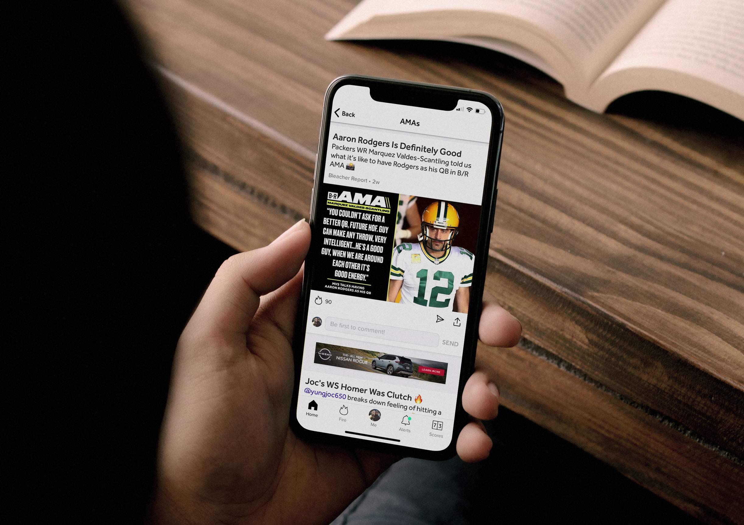
Once we established that we were the go to sports curation service on the internet, we were able to position ourselves ideally to surface our own premium content. With the fastest alerts in the sports app industry, real access to big-name athletes like Russell Wilson, Julian Edelman, and Metta World Peace via B/R App AMAs (Ask-Me-Anythings), community threads that garner constructive conversation, and a seamless user experience for highlights, news, and lifestyle content; the numbers prove that the B/R App makes it as easy as possible to be a sports fan. My role was to find design solutions that would help our users connect with this content and similar sports content we would curate from around the web in a sticky and engaging way.
In collaboration with the product design team, Justin Chen, and under the leadership of Bennett Spector, I contributed to the logo redesign and broader brand refresh that redefined Bleacher Report’s visual identity across app and web. This initiative extended far beyond a mark update. It was a comprehensive effort to modernize the brand’s expression, align it with evolving fan expectations, and ensure consistency across an increasingly complex ecosystem of mobile, social, and broadcast touchpoints. The Android redesign presented a unique challenge because the legacy app had drifted into an uncanny valley between iOS conventions and native Android behaviors and needed a refresh.
Through design critiques, collaborative workshops, a long process of feedback and slow iteration and progress and audience-informed focus groups, we explored how the identity could better reflect the energy, immediacy, and cultural fluency that define contemporary sports media and the spirit of our fans. The rebrand introduced a refreshed logo and visual system that modernized Bleacher Report’s identity and clarified its voice for a mobile-first generation of fans. The new look emphasized speed, cultural fluency, and visual consistency across app, web, social, and broadcast surfaces. It created a flexible foundation that allowed the brand to scale across new content formats, partnerships, and platforms without losing cohesion. This evolution aligned with the brand’s rapid expansion following the Turner acquisition, enabling seamless integration across Turner’s sports and entertainment verticals while positioning B/R as a central hub within a larger media ecosystem.
The scale of the undertaking required close coordination between design, engineering, and editorial teams to ensure the new identity system performed as effectively as it expressed. We developed a flexible visual framework that translated seamlessly across screen sizes, platforms, and content formats, allowing the app to feel cohesive while supporting rapid iteration. By optimizing for mobile-first environments and improving performance across content loading and rendering, the refreshed experience expanded Bleacher Report’s reach to new audiences while materially improving usability for existing fans.
More importantly, the redesign signaled a strategic shift in how the company positioned its product. The app was no longer treated as a companion to the website but as the primary engine of growth and brand perception. The updated visual language, improved performance, and unified experience architecture collectively reshaped how millions of fans interacted with Bleacher Report each day, reinforcing the platform’s role as a central hub for modern sports culture. From shaping early UI and UX foundations and product interaction models to later guiding logo design, brand systems, and market positioning, my work helped evolve Bleacher Report from a functional sports app into a culturally resonant platform for modern fandom. This continuity ensured that every layer of the experience, from interface to identity, reinforced a unified vision of speed, clarity, and cultural relevance. It created a durable design framework that allowed innovation without fragmenting the overall user experience.
The "Trending" stream that I got to work on evolved into the "Fire" stream and then the "Now Happening" stream, which was one of the big changes in the updated version and allowed a constantly updating stream of the most trending and engaged with content to surface to the top. In order to optimize the speed and delivery of content our team also started natively uploading tweets, GIFs and Instagram posts within the app, rather than pulling them from the mobile web. We also focused on developing a robust version of our own mobile video player to speed up load times within the app. From small details like the play button to the scrubbing UI, I played a hand in making sure everything looked cohesive. These decisions became the pillars of the in app experience and have been carried through countless iterations and updates.
Bleacher Report users, on average, spent 151 minutes in its app per month per a 2017 com score report, and increasing this metric, which was more than double the rest of the top sports app in the IOS store, was our prime directive as we built innovative content experiences within the app. This included integrating our mobile games such as Flappy Beard or Mamba to be played within the app. We drove users to these rich experiences by alerting the game to targeted streams. This allowed us to see a huge spike in concurrent users of these rich experiences as we saw the time spent in the app rise at an unprecedented rate. Building in these features in a sandbox with the aid of our UI and UX design teams lead to new innovations such as our folding ad units or expanded community streams for increased engagement. My contributions to these interactive elements of the app architecture led to over 786% increase in viewer retention and watch time for our videos.
Using the app as a unique value proposition we were able to sell omni channel brand activations like the one below to Ford where the content would be exclusively launched within the app, and then spread out on social channels, and this type of a promo would run on TV channels like HLN or CNN after sports update segments to drive eyeballs back to the app. This type of approach that had many different touchpoints to drive eyeballs to a single source really became a strength for our app when we were premiering new content as it became the de facto place to have much of these conversations.
Another example of using this functionality within the app for a more interactive experience was our 360 NFL Free Agency illustration which fans could experience through the app in a mobile iframe that moved in conjunction with their phone gyroscope as they moved around their environment. Similarly, our interactive "All Star lineup generator" was integrated into our app programming strategy and as we alerted it across multiple team sub streams, we saw people using it and tweeting the results out, resulting in a conversation about the way we select teams. This conversation carried through social media until we finally saw the NBA adjust the format of the All-Star game teams. While our app wasn't the sole reason for this change, it lit a spark around this conversation and helped bring the issue to the forefront of the community.
Following the redesign, video performance became a core engagement lever within the Bleacher Report app. By optimizing load speed, adaptive streaming, and inline playback, we reduced average start times to approximately 1.2 seconds across iOS and Android, transforming video from a secondary destination into a native, feed-first behavior. Design played a critical role in this shift by integrating video seamlessly into card structures, prioritizing scannable motion cues, and refining autoplay and control states to feel intuitive within the scroll flow. This removed friction at the precise moment of decision, allowing highlights and short-form content to feel instantaneous and natural, which increased dwell time and normalized video as a default mode of consumption rather than an intentional click away from the core experience.
A guiding principle in the design of Team Stream was reducing cognitive load without reducing emotional intensity. Sports fandom is information-dense and emotionally volatile, especially during breaking moments, and the interface needed to absorb that volatility without overwhelming the user. We prioritized scannable hierarchies, consistent card anatomy, and predictable interaction patterns so fans could parse scores, headlines, reactions, and video at a glance, even under peak traffic. By making the system legible under pressure, we allowed the emotion of the moment to take center stage. The design did not compete with the game; it cleared a path to experience it more fully, ensuring that speed and clarity amplified, rather than diluted, the feeling of being part of the moment.
The introduction of the Fire tab further demonstrated how performance and product design can work in tandem to increase retention. Built around silent autoplay video loops inspired by short-form viewing behaviors, Fire enabled fans to quickly scan the most compelling sports highlights in a continuous, low-commitment format. One-third of the app’s users adopted the feature, and those who engaged with Fire spent 24 percent longer in the app than non-Fire users, signaling its effectiveness as a behavioral anchor within the product. In its first month alone, fans watched more than 150 million video loops through Fire, validating the hypothesis that fast, frictionless video could transform highlight consumption into a habitual, feed-based experience. By integrating performance optimization with culturally attuned interaction patterns, we elevated video from a supporting content type to a central engagement engine within the Bleacher Report ecosystem.
I helped Bleacher Report expand its monetization toolkit by designing innovative ad formats that felt additive to the fan experience rather than interruptive, including an augmented reality collaboration with Panera Bread to launch new wraps and menu items. Instead of relying on static banners, we created an interactive AR unit that allowed users to explore the product in a playful, sports-adjacent context, blending branded storytelling with the app’s culture-first tone. My hybrid background across motion, product design, and experiential campaigns enabled me to translate advertiser goals into native, high-engagement formats that preserved user trust while delivering measurable value to partners. These executions demonstrated how thoughtful ad design could enhance the app’s creative reputation, unlock new revenue streams, and position Bleacher Report as a platform capable of hosting immersive brand experiences without compromising performance or authenticity.
The idea is to make Bleacher Report's team stream app just as addictive as any social platform out there by putting scores, social posts, and original sports content including articles, videos, illustrations, animation, and more all as close to the consumer as possible by removing as many barriers as possible to the content. What is tough with any social platform is that while you may follow your favorite athletes or teams, due to the algorithm and the competing content with your friends and family posts, things can get lost in the shuffle, so having this centralized app has been key. Team stream is your one stop shop, and it filters out all the noise to give you exactly the sports community that you want to take part in. Together, these decisions transformed passive consumption into an interactive, community-driven sports experience.
As we continued to promote the app through social channels, one of our main directives became driving our social audience to the app as a way to bring down our user acquisition cost. I helped develop social templates that capitalized on some of our most engaged content and used it as a way to funnel users to our app. Using UI design elements from the app, we were able to integrate them into the social content in a compelling way that encouraged users to experience the content in app and familiarized them with the design aesthetic. This directive was a huge success as we saw some of our breaking news jersey swaps see insane levels of engagement while simultaneously promoting the app and driving huge bumps in download numbers. For example our Kyrie Irving trade video and Jimmy Graham free agency signing video both lead to record breaking days in terms of app downloads. Having a hand in the content strategy and content creation that emphasized app downloads and growth was an essential factor in developing a multi-pronged set of touchpoints for our users. This balance of speed and clarity allowed fans to stay informed without feeling overwhelmed.
Another feature we looked to integrate was updating our mobile app so that people can share content from the app to Instagram Stories. When people view an Instagram Story featuring content shared from Bleacher Report’s app, they will be able to tap the post either to install Bleacher Report’s app through their phone’s app store or to open the app if it’s already been installed. The app accounts for a large percentage of Bleacher Report’s owned-and-operated audience as well as its owned-and-operated revenue. When people share a post from Bleacher Report’s app to Instagram Stories, a thumbnail of the post will appear in the story, including its title, main image, how long ago it was published, how many comments it has received and how many people have liked the post in the app. Atop the post will appear the caption “Open in Bleacher Report” that people can tap on to install or open the app. This type of social integration within the app was the beginning of a wider scale change to implement more of a community aspect to the app itself. The result was a platform that adapts to fan behavior rather than forcing new habits, we knew people were on instagram and we we made sure to lean into it.
Beyond breaking news, the long-term goal was to make the product a daily ritual. By combining morning recap notifications, midday trade updates, and real-time game alerts, the platform aligned with the natural rhythms of a fan’s day. This temporal layering reinforced habitual use, positioning the app not as an occasional destination but as a constant companion to the sports calendar. To support rapid feature iteration without fragmenting the experience, we established a modular design system that could accommodate new content types, sponsorship integrations, and community features. This system emphasized reusable components, predictable spacing logic, and flexible media containers, enabling teams to ship quickly while maintaining visual and behavioral coherence.
Team Stream arrived at a moment when sports media was shifting from destination-based publishing to real-time, personalized ecosystems shaped by social behavior. Fans were no longer waiting for postgame coverage to form opinions. They were reacting instantly in group chats, on Twitter, and across emerging platforms, turning every play into a live conversation. By designing Team Stream as a personalized, always-on feed that blended breaking news, cultural context, and fan reaction, we helped formalize a new expectation: that sports coverage should move at the speed of the timeline while still living in an owned, trusted environment. This shift reframed the sports app from a utility into a social infrastructure layer, influencing how competitors approached alerts, feeds, and community features in the years that followed.
.webp)
Collaborating with Ryan Smith, Thomas Lei, Randy Suarez, and Carolann Merchant on the PrizePicks integration marked a strategic inflection point in expanding the app from a content and community platform into an interactive, prediction-driven experience. Rather than siloing fantasy projections as a separate utility, we embedded pick-based gameplay directly within team streams and player contexts, allowing fans to evaluate stat lines, make predictions, and track outcomes in the same environment where they consumed news, highlights, and commentary. This design approach gamified the core experience without disrupting editorial trust, introducing lightweight decision loops that increased session depth, repeat visits, and behavioral investment. By ensuring the interaction felt native to existing fan workflows, the integration validated user appetite for participatory mechanics and established a foundational bridge toward future betting expansion, positioning the platform to evolve from passive media consumption into a stakes-aware sports ecosystem.
Partnering with Johannes Leonardo on the “G.O.A.T. App” campaign required distilling the functional strengths of the Bleacher Report app into a cultural narrative that could resonate beyond the product itself. The creative premise was intentionally hyperbolic: alerts so fast they launch Embiid into orbit, dances that ripple across timelines, highlights that transform athletes into animated folklore. These spots reframed product utility as spectacle, turning push notifications and real-time updates into cinematic moments that dramatized speed, relevance, and cultural fluency. My role involved ensuring that the behaviors depicted on screen remained grounded in actual product capabilities, so the exaggeration amplified truth rather than replacing it.
Historically, sports marketing centered on live broadcasts or editorial authority. This campaign inverted that hierarchy by positioning the notification as the primary interface between fan and moment. The creative leaned into the idea that the first place fans encounter a play, meme, or cultural flashpoint is not the television but the lock screen. By dramatizing alerts as catalysts for discovery and conversation, the campaign elevated a traditionally utilitarian feature into the emotional entry point of fandom. This alignment between product design and brand storytelling reinforced the app’s role as the fastest, most culturally aware touchpoint in a fan’s daily media diet.
The “G.O.A.T. App” narrative positioned Bleacher Report not as a sports news provider but as a cultural operating system for fandom. Featuring athletes like Embiid, JuJu Smith-Schuster, and James Harden in surreal, animated scenarios underscored that the app captures more than box scores; it captures the internet’s reaction to the moment. Working across product, brand, and creative teams, I helped ensure that the campaign reflected the platform’s broader ambition to unify highlights, memes, music, and fan commentary into a single, participatory ecosystem. The result was a brand story that mirrored the product’s core promise: if it matters to sports culture, it lives here first.
The chance to contribute to the design and development of the Bleacher Report app was an extremely enriching experience as it allowed me to learn the worlds of User Experience Design and app development. Turning a more traditional news and notification driven app into a full on social experience and driving the engagement and downloads of the best sports app out there was a pleasure to be a part of. The outcome was a seamless ecosystem where personalization enhanced relevance without sacrificing editorial integrity. These design and creative improvements reinforced Bleacher Report’s role as a central hub for modern sports fandom.

The lessons from Team Stream continue to shape how I approach product design today. I prioritize systems that remain legible under stress, experiences that honor identity and belonging, and interactions that support habit formation rather than one-time use. Most importantly, I design with the understanding that digital products are social environments, whether they explicitly include community features or not. This perspective ensures that the work I do is grounded not only in usability but in the human dynamics that determine whether a product becomes indispensable.
Key Collaborators: Chris Nygen, Art Chu, Bennett Spector, Noah Chestnut, Hammed Kohistani, Annie Pyle, Justin Chen, Chris Pedrick, Gregory Wild Smith, Ross Schwaber, Ryan Smith, Drew Paterson, Cat Oshiro, Justin Chen, Steve Marshall, Dave Finochio, Dave Nemetz, Randy Suarez, Thomas Lei, Carolann Merchant
Tools: Photoshop, Illustrator, After Effects, InVision, Figma, Sketch, Google Surveys, Google Drive, Pen & Paper, A/B Testing
Deliverables: High Fidelity Wireframes, Mockups, and Motion Graphics for our Engineering Team
Research Methods: User Testing, A/B Testing, User Interviews, Surveys, Usability Testing
Category: UI, UX, Graphic Design, Brand Positioning, App Development