

I was engaged by the restaurant industry veterans at Dream Hospitality Group to lead the creative vision and build the brand system for their new flagship concept, Sei Less, located in the heart of Manhattan. The mandate extended far beyond aesthetics. This was not about designing a logo or styling a space, it was about defining a point of view and translating it across every surface, interaction, and moment the guest would encounter. I was responsible for shaping the restaurant’s entire visual and experiential identity, from the core mark and brand architecture to the creative direction of wallpapers, interior graphics, spatial storytelling, and the emotional cadence of the room itself. Every element needed to feel intentional, connected, and capable of holding its own within the density and expectation of New York. Working in close partnership with the founders and cross-functional design teams, I developed a cohesive system of ownable branding IP that could scale across environments without losing clarity or character. The goal was not simply differentiation, but inevitability, to create something that felt like it belonged in the city’s cultural fabric from day one. Sei Less was positioned to operate as a destination rather than a moment, a place people return to without needing a reason. This required building a system that could live across physical space, social presence, and memory with equal strength, where consistency compounds over time into recognition and trust. The conceptual foundation drew from the discipline, restraint, and quiet confidence of championship athletes, individuals who do not perform for attention but command it through presence. That ethos informed both the tone of the brand and the behavior of the space. Sei Less was conceived as an elevated, speakeasy-style home away from home, where refinement and intimacy exist in tension with energy and movement. It is a place that absorbs the intensity of the city and translates it into something more controlled, more deliberate, and more personal. Visually and spatially, the environment balances contemporary art, clean modern lines, and understated luxury with traditional hand-carved Asian design elements. This interplay creates a dialogue between past and present, referencing the architectural language of pagodas and historic craftsmanship while reinterpreting those influences through a distinctly modern New York lens. The result is not a replication of culture, but a translation of it, something that feels rooted yet current, familiar yet slightly heightened. Every decision was made to support that duality, building a space that feels timeless without ever feeling static, and contemporary without chasing trend.
.jpg)
"I just do more & Sei Less" - Fabolous ft. French Montana on 'Say Less'
The core challenge was to create a space that could operate on multiple levels at once, balancing identity, experience, and longevity within one of the most competitive hospitality landscapes in the world. It needed to feel exclusive without being inaccessible, expressive without becoming overwhelming, and rooted in cultural reference without slipping into pastiche. The design had to live as both a physical environment and a brand system, something that could translate seamlessly from interiors to social content to word of mouth. At its best, it would not only attract attention but sustain it, evolving with the city while remaining recognizable. This required a holistic approach where architecture, graphics, lighting, and narrative were all treated as parts of a single, cohesive language rather than isolated elements. Curiously tucked behind an enigmatic mural in Midtown, concealed behind a blink and you will miss it door, sits Sei Less, an Asian fusion speakeasy that reveals itself only to those paying attention. Its location places it in close orbit of the Garment District and Madison Square Garden, making it a natural waypoint before or after a game, a show, or a late night in the city. That sense of discovery is central to the experience. The entrance sets the tone for what follows, creating a moment of intrigue that transitions into a space designed for atmosphere, energy, and escape. I was brought in to help shape an environment that felt intimate yet expressive, using branding and visual elements that felt current without clashing against the architectural and cultural fabric of Manhattan. New York is one of the most unforgiving places in the world to open a restaurant. The competition is relentless, the economics are demanding, and the audience arrives with a level of taste that has been sharpened by constant exposure to the best the city has to offer. To succeed in that context, the design cannot rely on novelty alone. It has to feel considered, layered, and enduring. With Sei Less, the challenge was to create something that felt both timeless and of the moment, a space that could hold its own within the lineage of New York nightlife while still offering a distinct point of view. That meant aligning the art direction of the interiors, the rollout of the brand, and even the creative expression of the menu into a single, cohesive identity. The goal was not to build a restaurant in isolation, but to create a place that feels embedded in the rhythm of the city, shaped by the relationships, neighborhoods, and cultural energy that define New York at night.


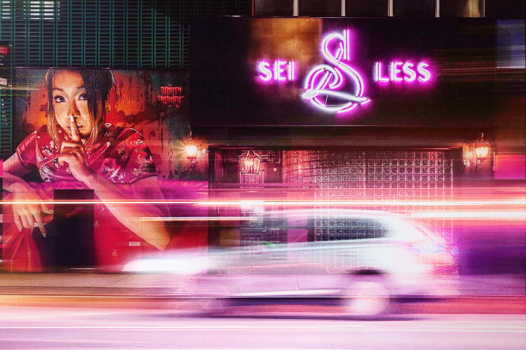
On West 38th Street, in a stretch of Midtown better known for motion than mystery, Sei Less occupies a deliberate pause. The block sits at a crossroads of commerce, entertainment, and late nights, a place people pass through rather than settle into. That tension is precisely what makes it fertile ground for something unexpected. Hidden just off the city’s main arteries, Sei Less was conceived as a quiet counterpoint to its surroundings. A space that absorbs the energy of the street and refracts it inward, transforming the urgency of Midtown into atmosphere, intimacy, and intent.
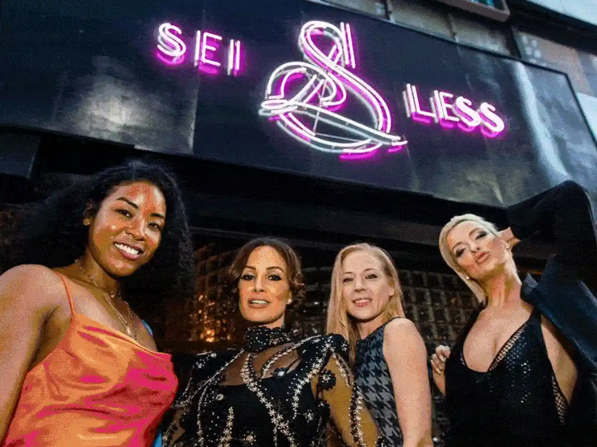
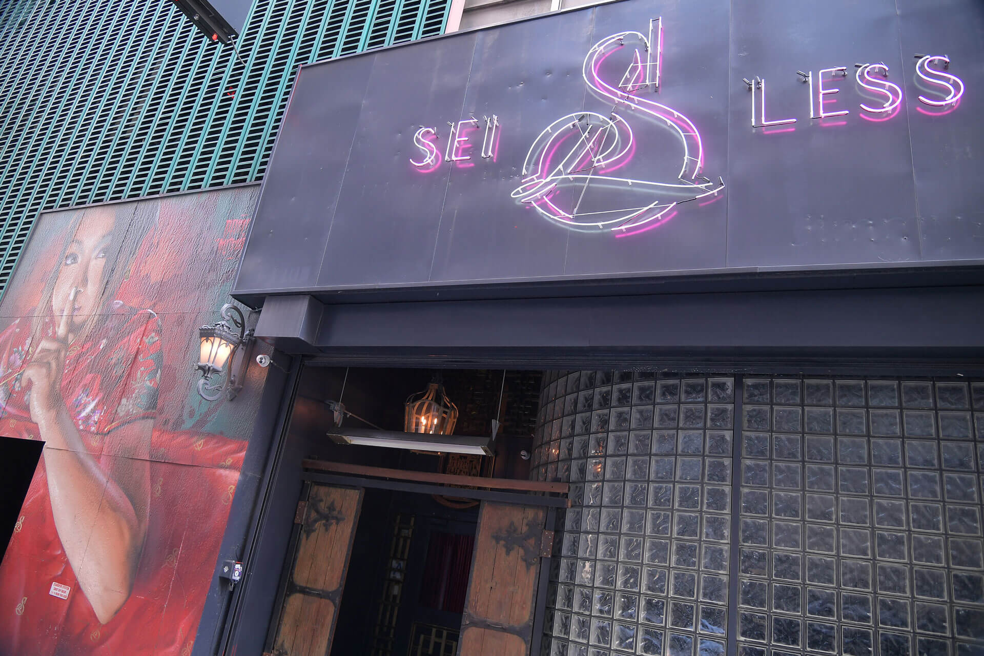
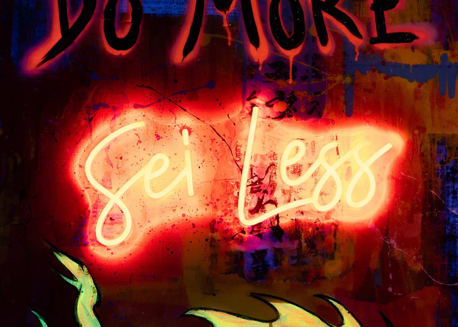
Introducing New York City's best kept secret, a new hidden gem right in the heart of Midtown, around the corner from the Garden is Sei Less, a restaurant I was invited to create the logo and branding for by its co-founders ahead of its grand opening. Building off a rich set of relationships and a history of boutique high end service to upscale clients in the city, the restaurant had a reputation to uphold. I wanted to draw upon the glorious neon tones of the signs you would see in Hong Kong and apply the grunge addled aesthetic of New York city to the mix in a meaningful way that felt like Goodfellas meeting with In the Mood for Love or Chunking Express.
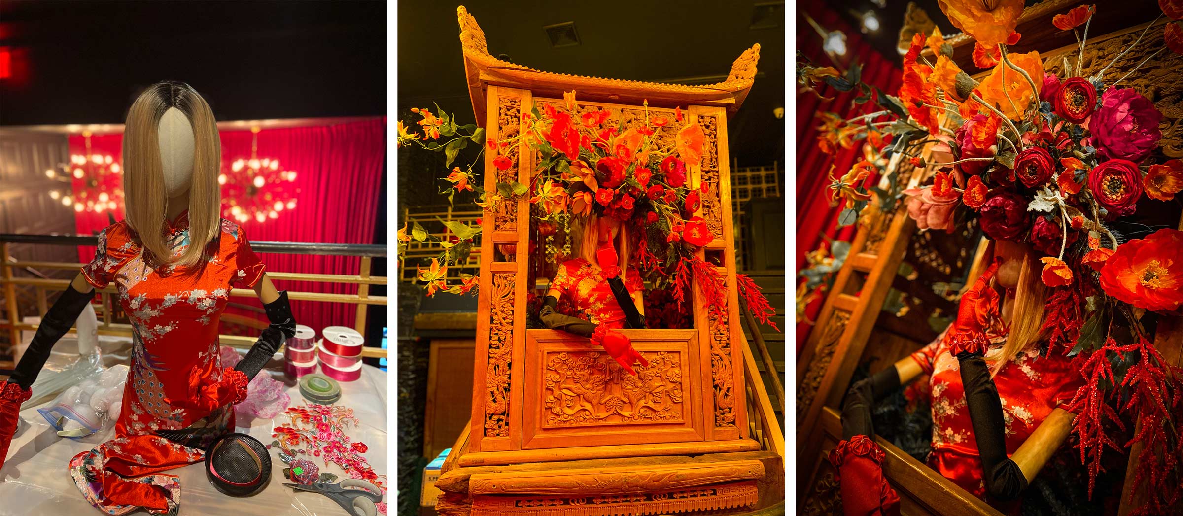
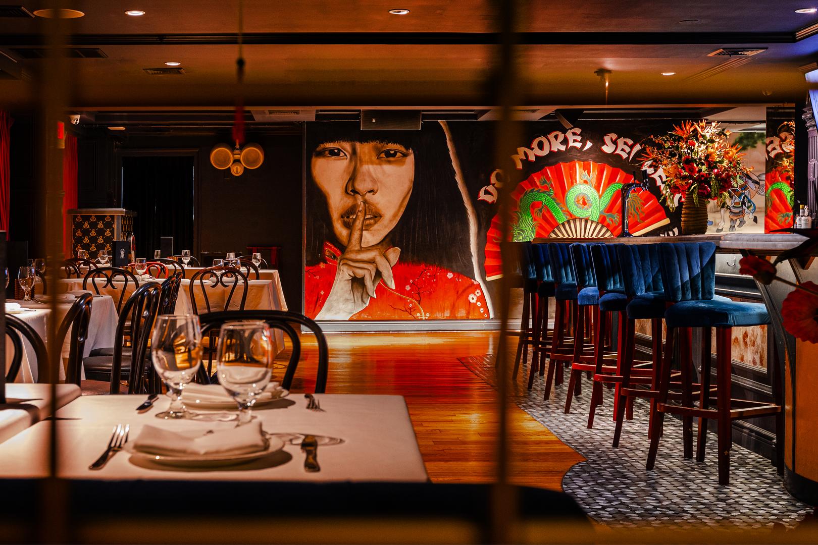
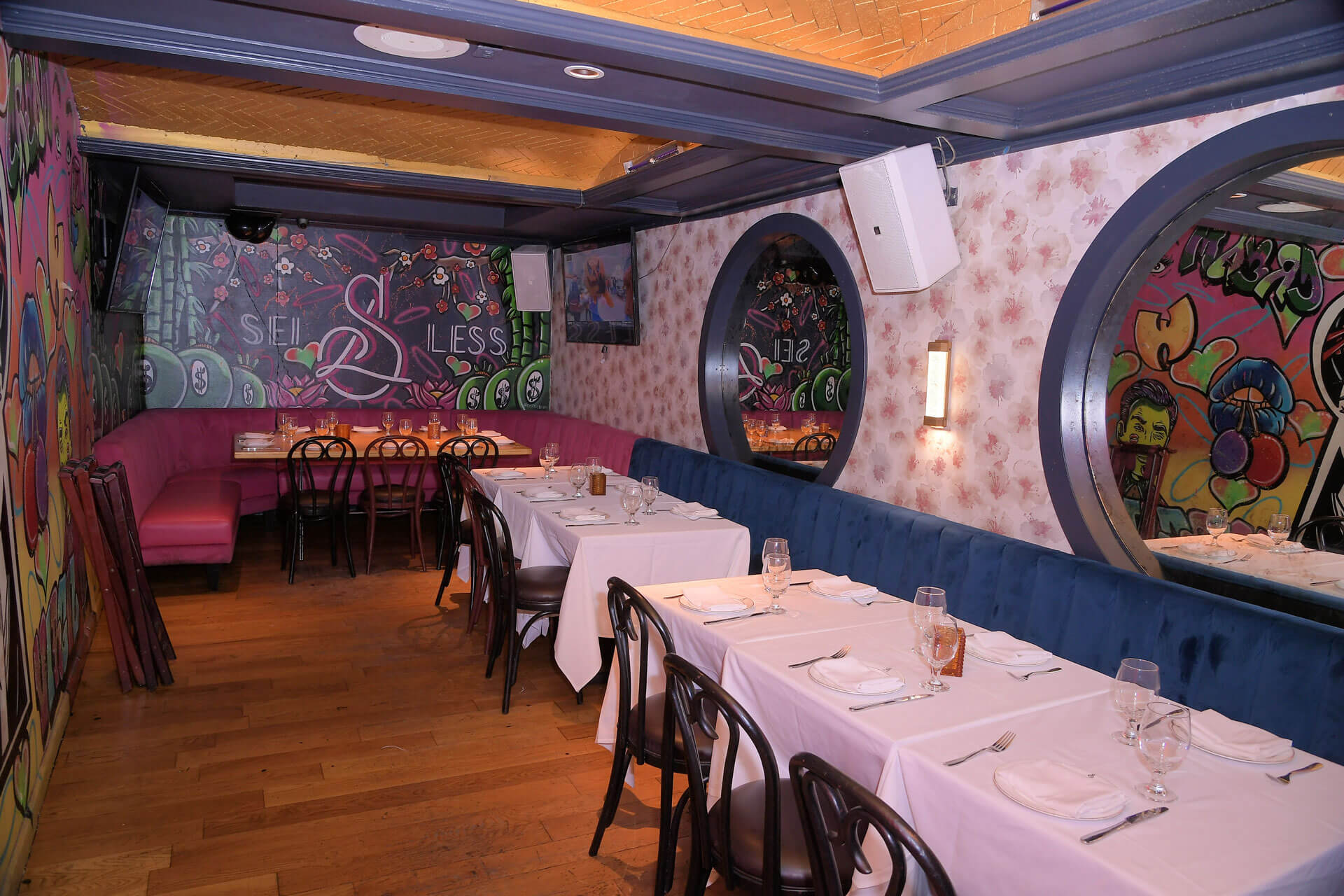
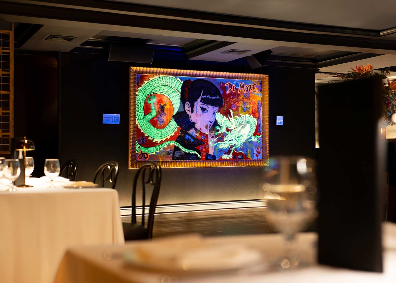
The frenetic blurred cinematography of DuKeFeng meets the epic instrumental haunting melodies of Chinese flavors in one dish. Sei Less collaborated with Sydney based Mural Artist, Damian Mitchell to dream up the sultry mural (inspired by actress Tiffany Chan as our gracious model) that is perched atop the private entrance. Behind its doors was a private and inspired space that allows for people to be themselves and relax, with a design language that speaks to both the deeply respected history of the building and also the freshness of the concept. You have to have a respect for where you have come from to get where you are going.
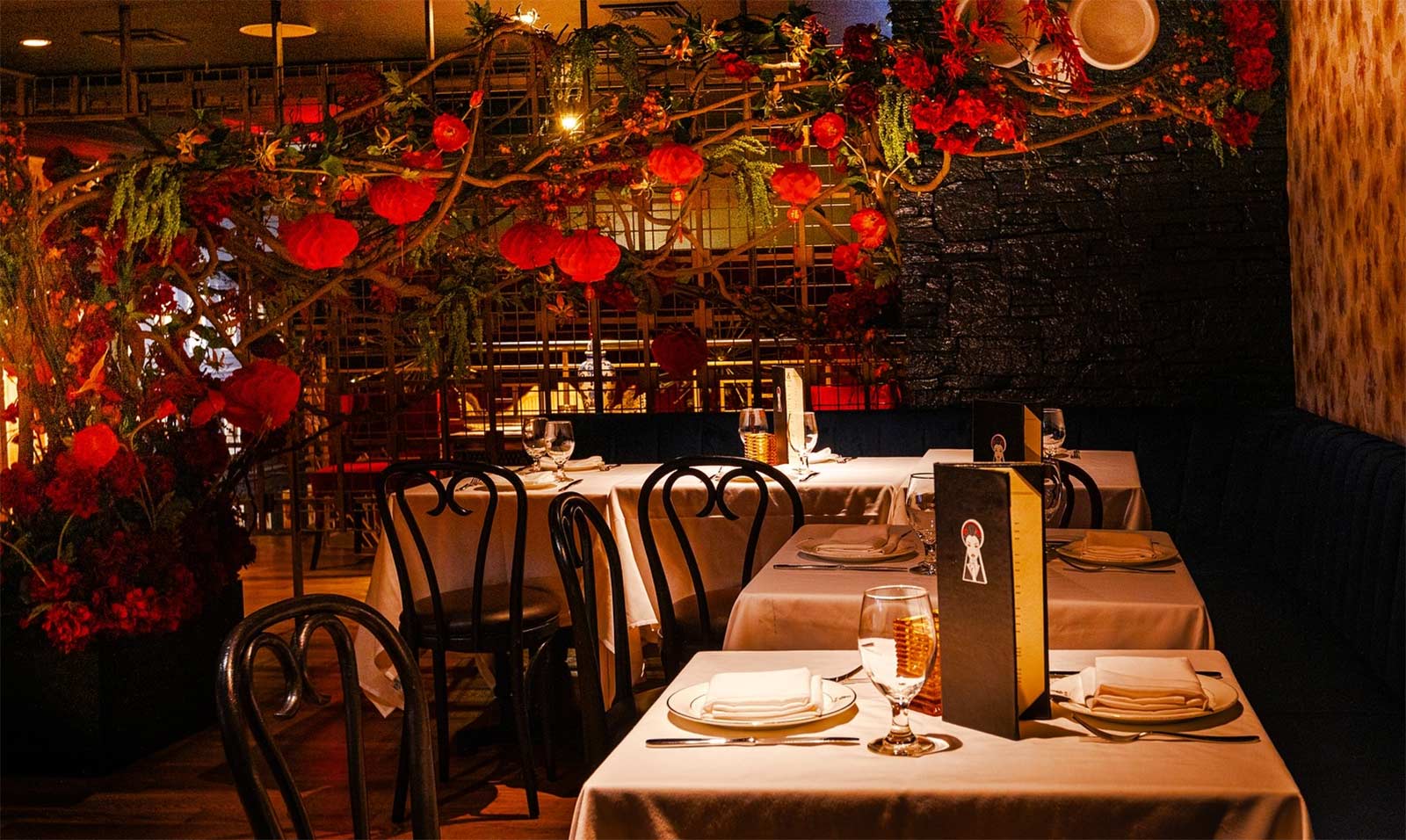
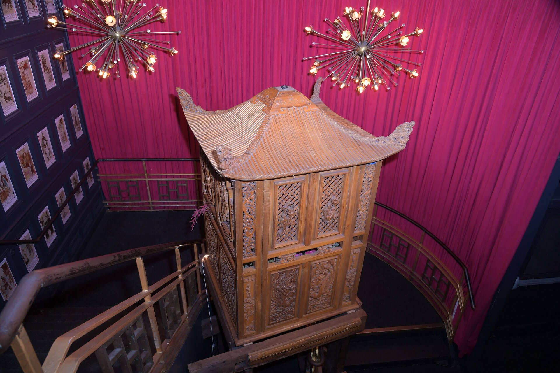
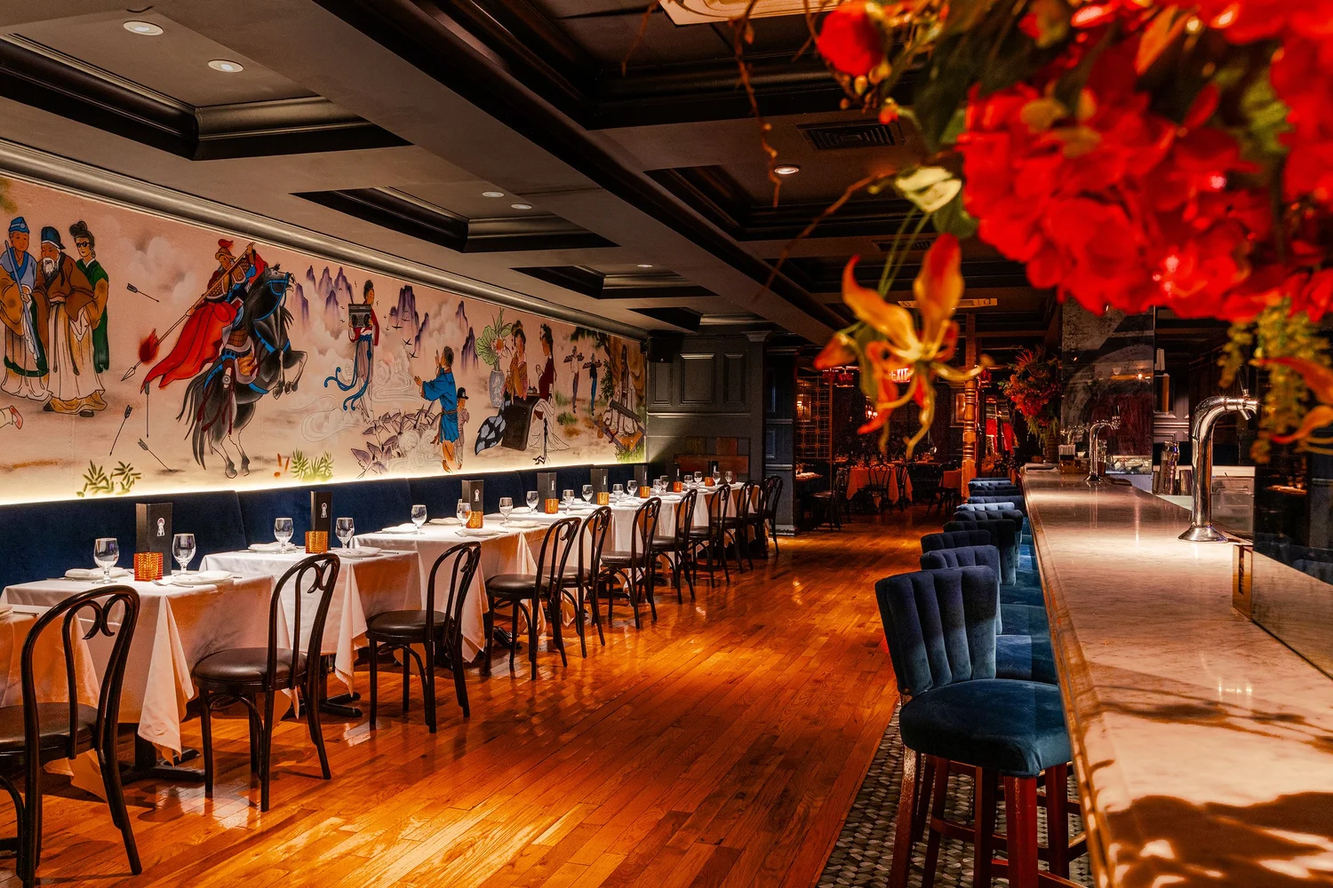
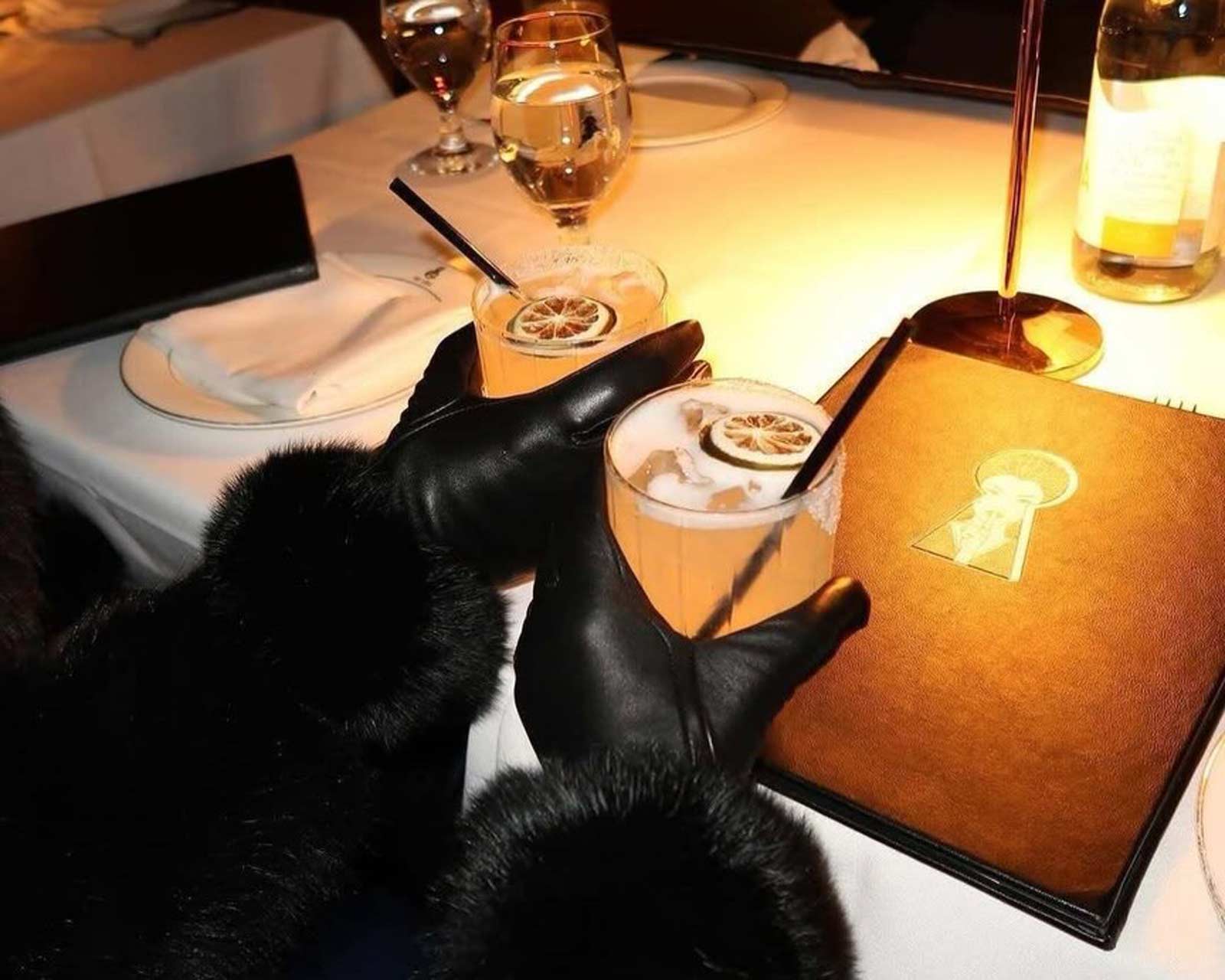
Designed for evenings of enviable cuisine and distinctive revelry, the space accommodates up to 350 guests within an environment that feels immersive and high energy without losing its sense of intention. Neon signage, patterned wallpapers, and lush floral installations define the visual language, creating a layered atmosphere that is vibrant, expressive, and unmistakably contemporary. These elements are balanced with clean architectural lines and traditional, hand carved Asian details, drawing from the influence of pagoda structures while reinterpreting them through a nightlife driven lens. The interplay between bold graphic moments and cultural references creates a space that feels both transportive and immediate, designed to be experienced as much as it is seen. From a creative direction standpoint, the focus was on building a distinct visual identity that translates seamlessly across physical space, social content, and guest memory.
.jpeg)
Sei Less adapts fluidly to the rhythm of the night, offering a range of experiences within a single cohesive environment. Intimate corners create pockets of privacy for quieter, more personal moments, while the broader floor plan supports high energy gatherings, celebrations, and a constant sense of movement. The space is not static, it evolves as the night progresses, shifting from a more composed dining atmosphere into something looser, more social, and more kinetic. This transition is not forced but built into the design through a balance of density, openness, and visual pacing. Guests can find their own tempo within the room, whether that means settling into a tucked away table or engaging with the broader energy of the space. That flexibility allows the environment to serve multiple intentions without fragmenting into separate identities.
Lighting, layout, and spatial sequencing work together to guide how the space is experienced over time. Subtle shifts in illumination, ceiling height, material tone, and visual intensity create a natural progression that encourages movement without ever feeling directed. The result is a room that reveals itself gradually, maintaining a sense of intrigue while supporting intuitive navigation. It operates as more than a restaurant, functioning as a cultural and social hub where design, music, and people converge in a way that feels organic rather than orchestrated. From a design leadership perspective, the goal was to create an environment that not only looks distinctive but performs, one that encourages interaction, shareability, and repeat experience while still feeling effortless and unforced.
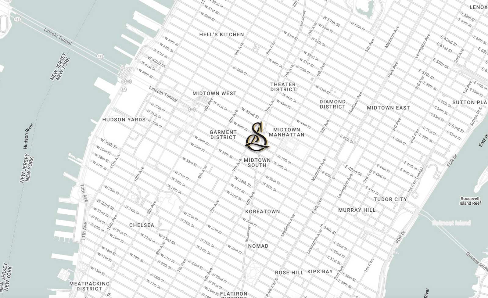
The location also introduced a unique operational and perceptual constraint that informed the design approach in more subtle ways in that it was essentially located right in the middle of the city as broadway cut through Herald Square. Being situated in a high-density, high-velocity part of Manhattan meant that most people encounter the block in transit rather than at rest, arriving with a certain mental pace already set. Instead of competing with that energy, the goal was to intercept it and gradually recalibrate it. The transition from street to interior was designed as a shift in tempo rather than a hard break, allowing guests to decompress without feeling removed from the city entirely. This required careful control of thresholds, from the way sound carries at the entrance to how light levels adjust as you move inward. The result is a space that feels distinct from its surroundings without ever feeling disconnected from them, maintaining a subtle dialogue with the city while establishing its own internal rhythm.
Sei Less occupies a distinct cultural lane within New York, resisting the pull of both downtown irony and uptown formality to settle into a space that feels more instinctive than prescribed. It reflects a version of the city where ambition and taste coexist naturally, where cultural fluency is understood rather than performed. The environment is intentional but never overworked, designed for an audience that recognizes nuance without needing it explained. It draws from the layered identities of the city itself, where different worlds overlap and inform one another, creating a setting that feels both current and grounded in something more enduring.
The brand carries that same sense of quiet confidence, acknowledging the city’s cultural awareness without ever pandering to it. It avoids over signaling, allowing material, atmosphere, and experience to speak with clarity and restraint. This approach creates a balance where the space feels elevated without becoming exclusionary, and relevant without chasing the volatility of trends. From a creative direction standpoint, the intention was to build something that earns its credibility over time, where consistency, taste, and lived experience define the brand more than any overt declaration ever could.
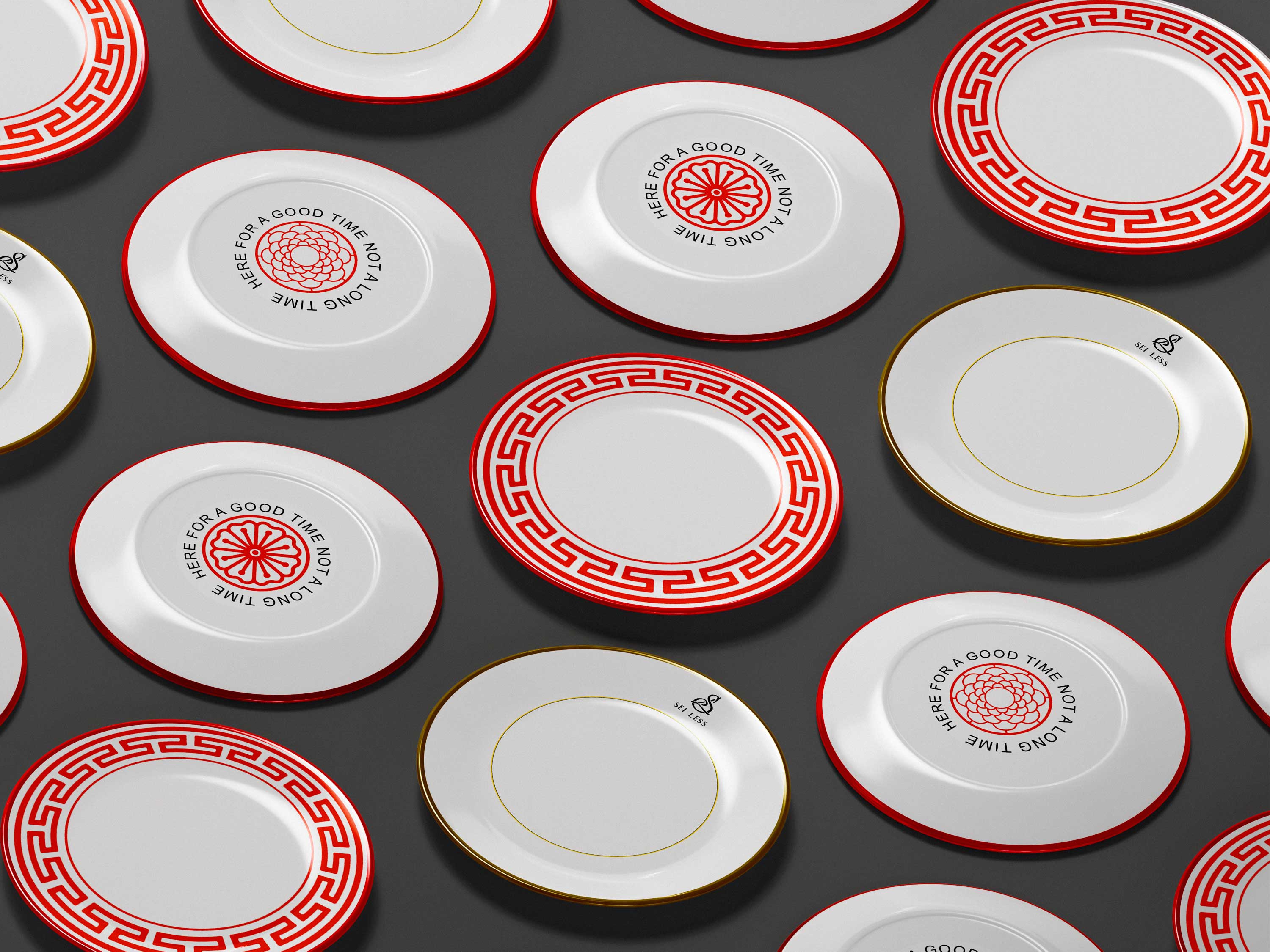
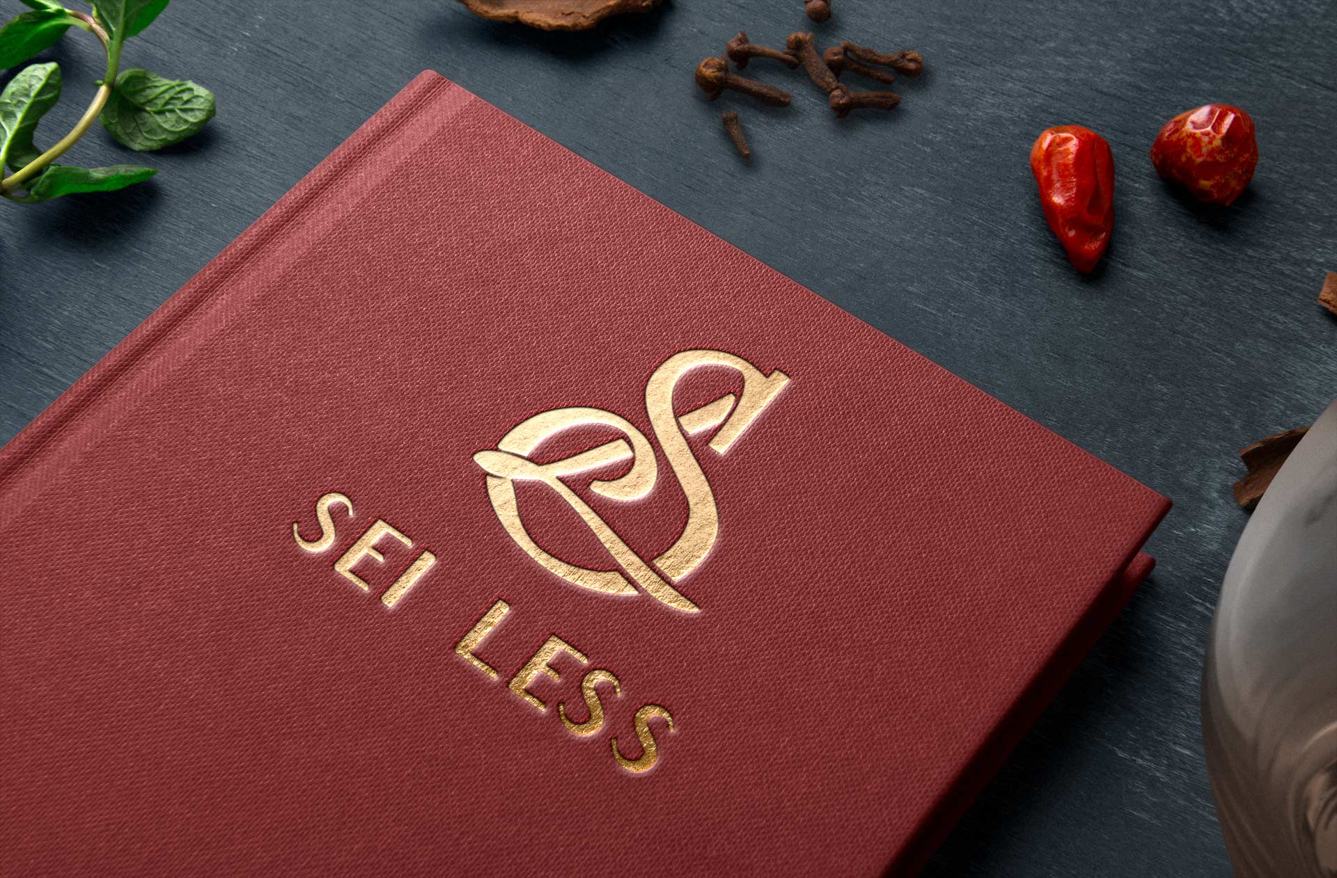
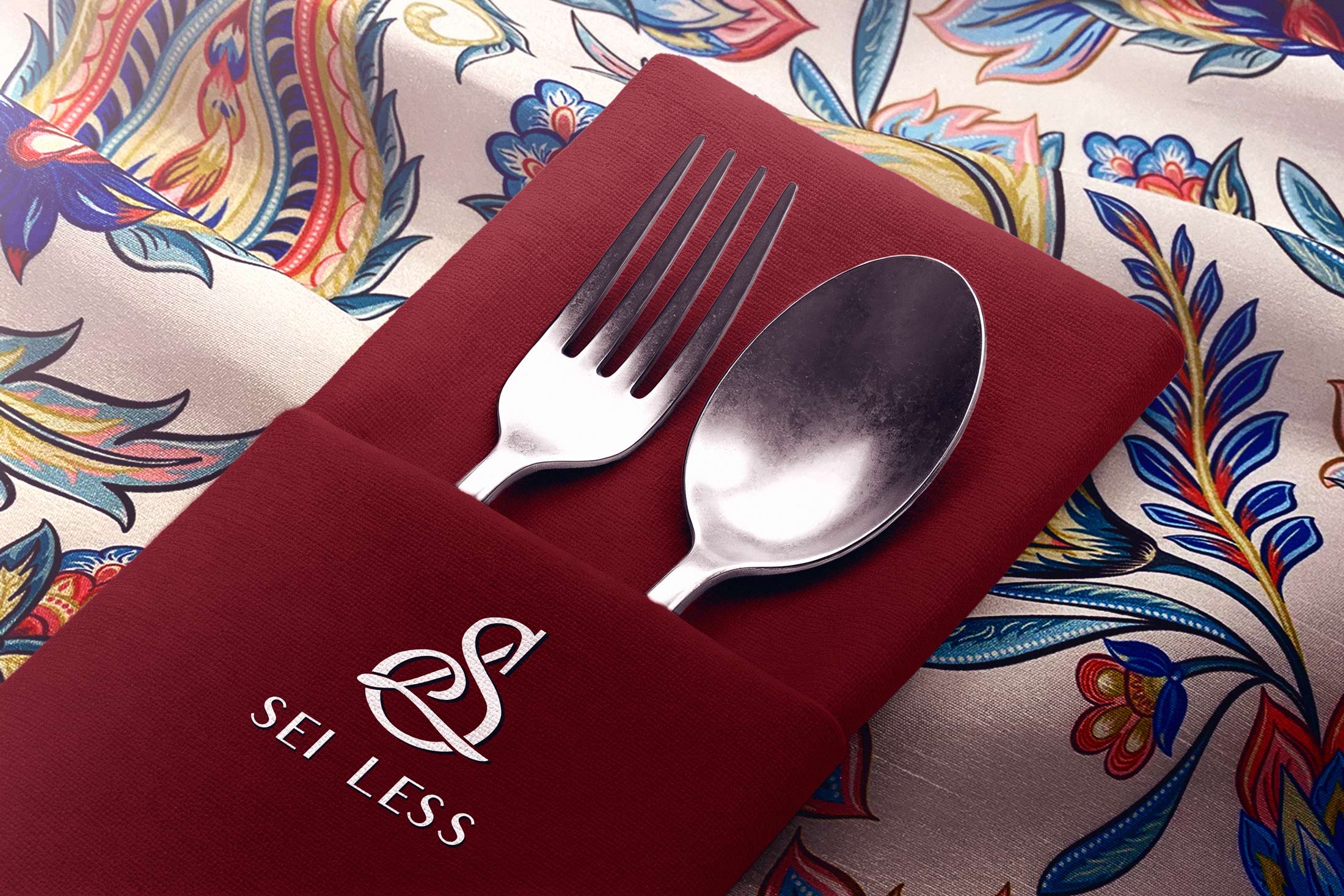
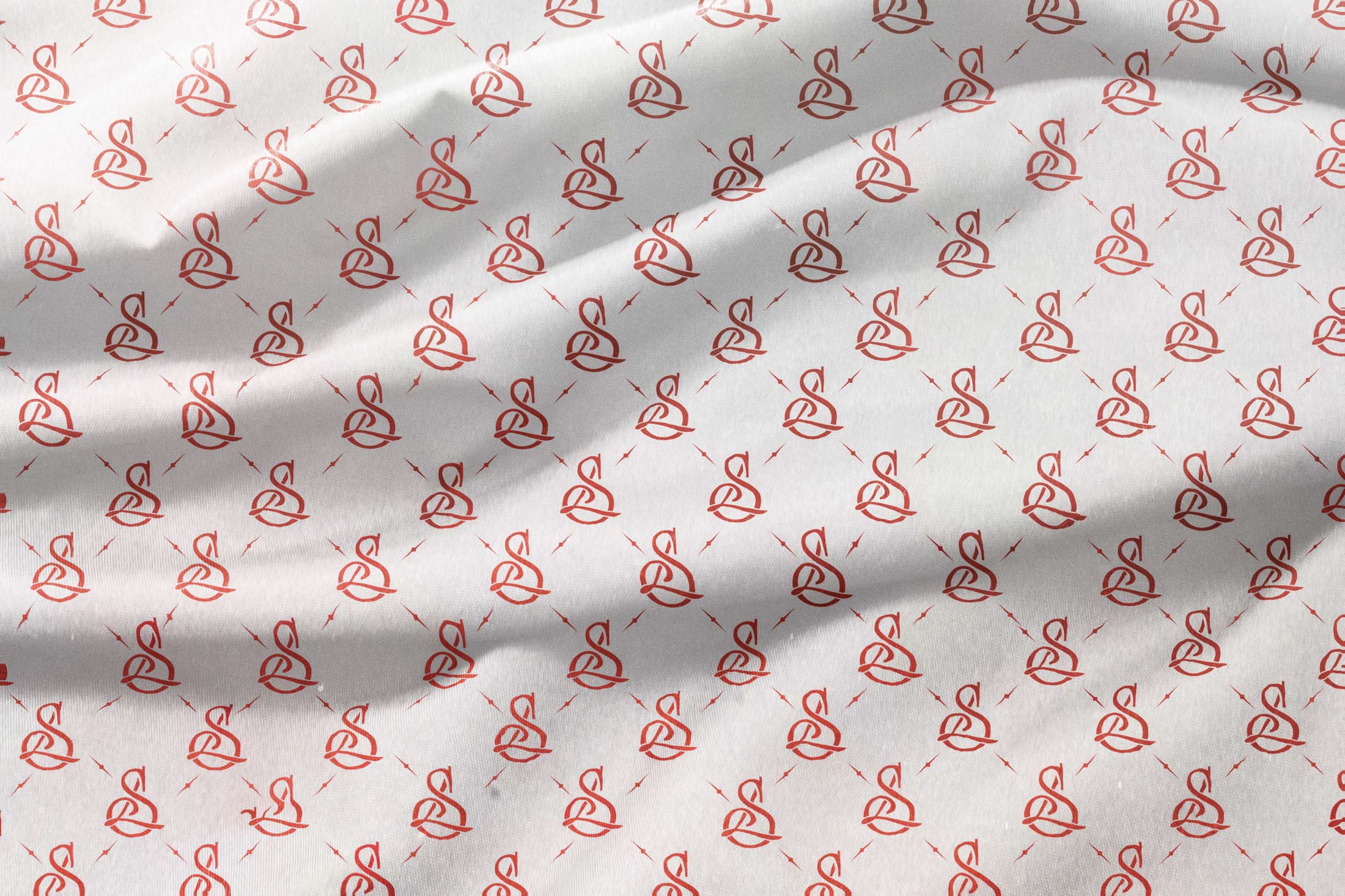
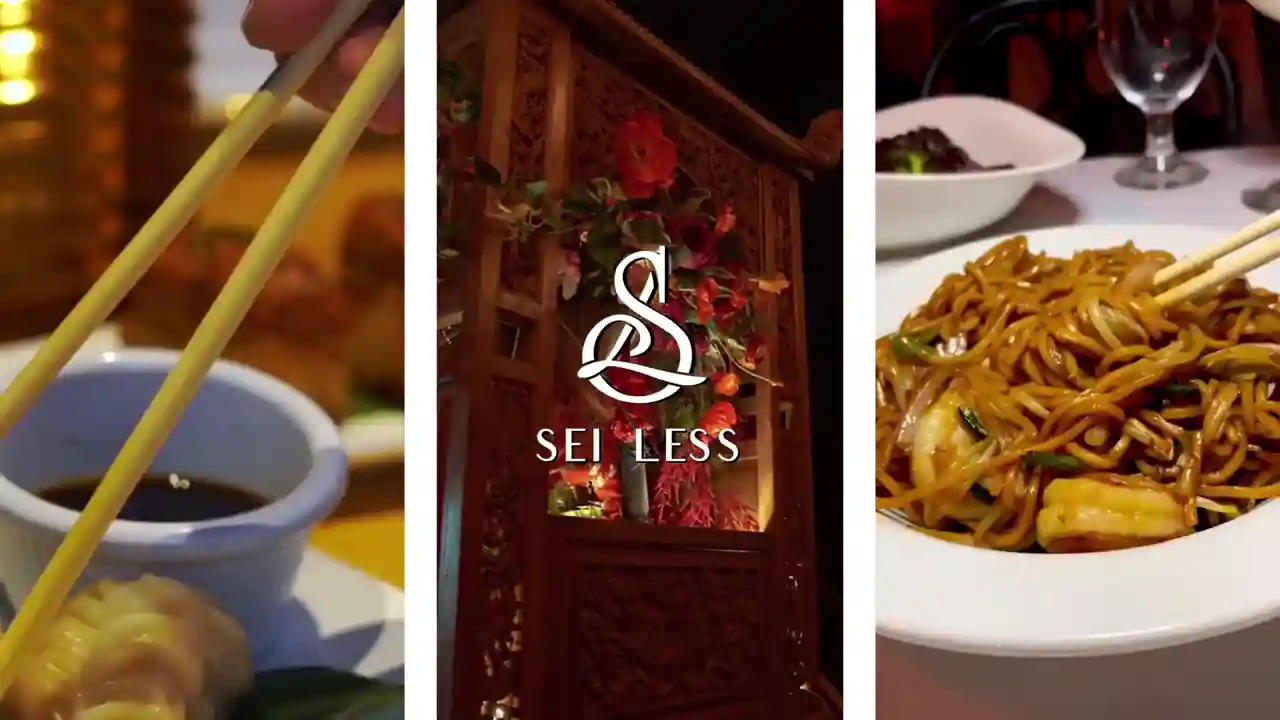
The identity system for Sei Less was built to balance clarity with character, creating a framework that feels both structured and expressive. At its core is a refined monogram and logotype, designed to anchor the brand with a sense of permanence, while a broader set of graphic elements introduces rhythm, texture, and cultural reference. The use of bold red as a primary accent, paired with a restrained base palette, establishes immediate recognition, while patterns inspired by traditional Chinese motifs are reinterpreted in a contemporary, modular way. Typography plays a key role in shaping tone, blending classic forms with a slightly expressive edge that mirrors the brand’s balance of elegance and energy. From a creative direction standpoint, the goal was to develop a system that could scale seamlessly across touchpoints, from menus and packaging to digital and environmental applications, ensuring consistency while still allowing for moments of visual intrigue and variation.

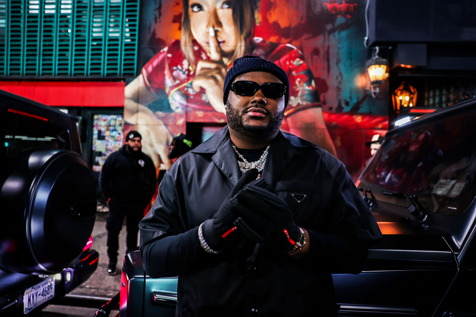
In a city that rarely keeps secrets, Sei Less begins with one. A mural, a gesture, a door you could easily walk past if you were not paying attention. To find it, you look for a woman pressing a finger to her lips, a quiet signal that what lies beyond is meant to be discovered, not announced. Behind that otherwise unremarkable entrance, the space reveals itself gradually, leaning into a kind of discretion that feels increasingly rare in a culture built on visibility. Speakeasies themselves are not new. They emerged out of necessity during Prohibition, operating between 1920 and 1933 when alcohol was banned. But what Sei Less draws from is not the history alone, it is the feeling of access, of knowing where to go and how to enter. This city rooted mafioso energy met with the edge of theYakuza and the cross between a leaky dive bar and a neon lit dim sum joint makes sense.

In a city saturated with overexposure, the return to a closed door, private, and elevated experience carries a different kind of value. It is less about secrecy for its own sake and more about creating intimacy within a highly public landscape. The atmosphere resists over explanation, existing in that familiar New York shorthand where the experience is best captured in a simple understanding. If you know, you know. That philosophy extends beyond the entrance and into the full design of the space. Rather than relying on overt signals, the environment is built on subtle cues, transitions, and moments of reveal that reward attention. Guests are not guided through instruction but through instinct, moving through the space in a way that feels personal and earned. From a creative direction standpoint, the goal was to create a brand that invites discovery, where intrigue becomes a core part of the experience and the memory of finding it becomes as meaningful as being there.

From album release parties, to business meetings, to private events, Sei Less does it all with an air of elegant exclusivity. The team behind Sei Less merges decades of exemplary experience to create a speakeasy vibe that is truly unique and working in conjunction with them I developed a mature, clear and demonstrative design direction that teaches guests about the history of the space, while creating a modern interpretation of the original designs that you traditionally saw at these kinds of restaurants. It was a reinvention of the classic Chinatown flavor with the grit of the Manhattan restaurant industry and a bespoke upscale flare that would serve as an homage to its past and the country from which it is inspired. This delicate balance is at the heart of the restaurant and the visual design language, high end yet historic.
Sei Less began with a clear strategic question rather than an aesthetic one. In a city saturated with high energy restaurant launches, how do you build a place that signals confidence without performing for attention. The answer was not to out design the competition, but to outlast it. The brand needed to feel inevitable rather than impressive, like it had always belonged on that block. That framing informed every creative choice. Instead of asking what would look exciting on opening night, the work focused on what would still feel correct years later once the novelty wore off and only substance remained.
When exploring inspiration for the logo, I wanted to go with a monogram because I felt like it really felt like an upscale vibe with an air of mystery. Initial explorations centered around a serif traditional typeface such as Bookman, which would eventually go on to become the inspiration behind the font guidance, drawing a lot of it's energy from the plastic "Thank You for Shopping" bags you would get at the bodegas down in Chinatown, a real New York energy and aesthetic.

It was in this juxtaposition of high and low where the true concept really stood out, it was an upscale location with hole in the wall street cart style food, an energetic yet private watering hole where the design spoke to higher aspirations. The colors were meant to be taken straight from the royal paintings of ancient China as the rich tones such as Lapis Lazuli and decadent Satin Sheen Gold reinforced the upscale nature, but were balanced with the unfinished raw materials of wood and brick or the grunge and drippy dirty intensity of the graffiti covered tunnels of the city. Sei Less represents the place to be and is meant to be the type of joint any celebrity, athlete or influencer would want to be seen or photographed at by the paparazzi of New York. Fashion week runway on the outside and private sanctuary on the inside.
Launching a restaurant in Manhattan is less about creativity and more about survival on some level. Margins are thin, audiences are discerning, and novelty decays quickly. The brand had to function as a business asset, not a stylistic indulgence. That meant creating an identity flexible enough to support multiple revenue streams, from private dining and events to repeat guests and sustained cultural relevance, without relying on constant reinvention. The design system was built to reduce friction, not add complexity, supporting long term operational consistency rather than seasonal overhauls. I took the advice from Bourdain's Kitchen Confidential to fly the flag high for the pirates.

In practice, that meant thinking beyond visuals and into behavior. Every element needed to earn its place, from how the brand lived on a menu to how it translated across social, signage, and in room experience. The system had to be intuitive for staff, scalable for growth, and durable enough to hold its identity across different contexts without dilution. From a creative direction standpoint, the goal was to design something that compounds over time, where familiarity strengthens the brand rather than eroding it, allowing the restaurant to build equity through consistency rather than chasing attention through constant change.

Take a pinch of fresh exotic flowers plucked from the lively displays of a botanical garden, with just a touch of the vibrant brash street art and graffiti of New York City, add in a handful of that fresh zest for life you get on a brand new exclusive Ferrari Enzo with the cherry red paint job, the flashing lights of the cameras from celebrity row at pretty much any Knicks or Nets game, a little bit of that gnarly vintage streetwear aesthetic you sinn in Noah or Awake or Supreme, and top it all off with the upscale premium flavors and ambience that has found its way to the lyrics of plenty of hip hop songs from Hakkasan to Nobu and Carbone on the tracks of Travis Scott, Lil Baby, Future, Drake, Kanye West or Lil Uzi Vert and round it all out with the hazy smoke and mystery of an underground opium den and you get the ingredients of Sei Less.
I was tasked with creating a brand that felt dramatic, intriguing, and unapologetically fun, something that carried the same energy as a scene you might catch in a Drake video. It needed to feel elevated but not distant, culturally aware but not overly polished, a balance between aspiration and accessibility. My initial approach explored a more graphic, conceptual direction, developing a logo rooted in a schematic interpretation of iconic Chinese characters. While the client did not immediately connect with that execution, it served an important purpose. It opened up the conversation around how far the brand could be pushed and clarified that the opportunity was not in subtlety, but in building something with presence and attitude. This opened up the iconic monogram explorations and the rest is history.
From there, the direction evolved into something more layered and expressive. The brand began to draw from the duality of New York itself, pairing the sensibility of a high end restaurant with the texture and unpredictability of the city’s nightlife and street culture. The goal was to create a visual language that felt both refined and raw, where neon, typography, and spatial storytelling worked together to create a distinct identity that could live across physical space and digital platforms. From a creative direction standpoint, this meant designing a system that could hold contrast without losing cohesion, allowing the brand to feel sharp, memorable, and emotionally resonant for the audience it was built to serve. My mindset throughout was to embrace tension rather than resolve it, using contrast as a tool to build something that felt alive, culturally honest, and trendy.

When the cofounders of the restaurant, Ivi Shano and Dara Mirjahangiry, first approached me and we began talking through the concept, what immediately stood out was how closely our paths mirrored one another. Dara grew up in a Persian household shaped by the expectation of pursuing something stable and traditionally respected, fields like finance, law, or engineering. I had experienced something similar growing up in an Indian family, where success was often defined through academic rigor and conventional career paths. What connected us was not only that shared pressure, but the decision to step outside of it and pursue something more instinctive, more creative, and ultimately more aligned with how we saw the world. There was an unspoken understanding in those early conversations, a recognition of the tension between expectation and identity, and what it takes to move beyond it. I was excited to tackle this challenge which was such a departure from more of the sports design work I had done in the past.
Ivi brought a complementary perspective, shaped by a background in design, photography, and hospitality that leaned heavily into atmosphere and experience. Where Dara was deeply embedded in the cultural fabric of New York across sports, music, and nightlife, Ivi was focused on how those worlds could be translated into a physical environment, how a space could carry energy, mood, and intention. Together, their vision for Sei Less was not to create just another restaurant, but something more layered, a place that felt like a convergence point for different creative communities, built on relationships as much as it was on cuisine. It was conceived as a space where the right people would feel at home, where culture could circulate naturally, and where the experience extended far beyond what was on the plate. Ivi reflected on the process of building the brand identity, noting how the work went beyond simply creating a logo to establishing a cohesive visual system that captured the essence of the space. From the outset, there was a clear alignment around the vision, allowing the creative direction to translate into something both distinctive and culturally resonant.
That alignment made the project feel deeply personal from the start. This was not simply a brief to design a brand or a space, it was an opportunity to help shape something that reflected a shared set of experiences and values. In many ways, Sei Less represents what happens when people move beyond prescribed definitions of success and build something that reflects their lived reality. My role within that was to translate that ethos into a cohesive creative system, ensuring that every touchpoint, from the interiors to the branding to the overall atmosphere, carried that same sense of intention, clarity, and cultural relevance.
If it wasn't a doctor or a lawyer there wasn't as much overt vocal support around it for folks like Dara or myself. So to become an entrepreneur or a restauranteur or even a creative takes a ton of courage to forge your own path. For me, I similarly wanted to develop a creative identity and ethos that respected that shared upbringing against the odds. In order to create spaces and opportunities like this you really have to trust your dreams and your vision, and that is largely how this project came to be, it was that shared vision that spurred it along. When we came together, we were able to build a restaurant identity and design system for a really amazing spot that added to the fabric of NYC.

Something that became evident quite quickly was the importance of taking motifs like traditional patterns and floral arrangements and positioning them throughout the space to really reinforce the overall brand ethos. As the art director of the space, Ivi did a great job of working together with the interior design teams to match the energy of the brand touches on the plates and coasters and menus to work with the decor and atmosphere. Using things like the image of the geisha in a powerful way repeatedly throughout the space really was something we wanted to capitalize on wherever we could to immerse people into the space.

I started talking to the customers to get a better sense of how to really capitalize on the opportunity we had to create a brand that was both exotic while still feeling familiar and instantly recognizable, so finding a strong common character that bridged the gap between these two was key. The eureka moment came in the form of a universal gesture for 'be quiet' derived originally from sign language where you put a single finger up to your mouth to indicate to people to hush. Taking the flipped "L" shape that the hand makes, I was able to tie this to the monogram logo and create the effect of the L being held up to the S as if doing the gesture typographically.
Sei Less was born out of an enthusiastic exploration of Chinese regional cuisines and a genuine desire to share the depth, nuance, and cultural richness behind those flavors. Rather than diluting tradition, the intention was to reinterpret it, offering dishes that remain rooted in authenticity while presenting them through a contemporary lens that resonates with a modern, global audience. That same philosophy carried through into the design language. The space and brand needed to feel like an extension of the menu, honoring heritage while embracing evolution, creating an environment where past and future could coexist without contradiction.
The strength of the Sei Less identity was not in any single element, but in how the system behaved across touchpoints. The monogram, typography, color palette, patterns, and environmental graphics were designed to shift in scale and intensity depending on context while still feeling unmistakably connected. On some surfaces the brand could whisper through subtle material choices and restrained applications, while on others it could assert itself more boldly through signage, menus, digital assets, or spatial moments of emphasis. This gave the identity a range that allowed it to function across the entrance experience, table level details, private rooms, social content, and launch communications without becoming repetitive. Rather than forcing consistency through sameness, the system created cohesion through rhythm, proportion, and tone. That flexibility is what allowed the brand to feel alive across the full guest journey.
Visually, the direction draws deeply from traditional Chinese illustration, using motifs, symbolism, and composition as a foundation, while filtering them through a cinematic sensibility. The emotional tone and color language were heavily influenced by the films of Wong Kar Wai, where intimacy, longing, and atmosphere are conveyed through light, shadow, and texture. At the same time, there is a deliberate tension introduced through references to neo noir futurism, pulling from the techno orientalism of Blade Runner, Ex Machina, Akira, and Ghost in the Shell. These influences bring a sense of density, glow, and layered urban energy, creating a world that feels both nostalgic and forward looking.
The result is a design language that operates in duality. It is at once romantic and electric, traditional and speculative, grounded in cultural reference yet unbound by time. From a creative direction standpoint, the goal was to build a cohesive visual system where these influences could coexist without competing, allowing the space to feel immersive and cinematic while still maintaining clarity and restraint. It is less about referencing any single source and more about creating a mood, a lived in world that feels familiar, yet slightly heightened, as if it exists just beyond the present moment.

I wanted to stay true to the roots of the cuisine but execute the branding with modern design practices that would make it feel fresh and true to the grit and grind of Manhattan. With this, our result is a brand that showcases fun, creative, whimsical illustrations and warm, bold, colors. The aesthetic is inspired by historic Hong Kong-style cafes and their cultural significance in serving affordable, Canto-Western food. The deep reds and foggy neon glow of the lights created an atmosphere of mystery and secrecy, something that would appeal to the clients that we were catering to, the high end cultured patrons who come from this eclectic city.
Sei Less carries a level of internal consistency that allows the space to hold its identity regardless of context. The visual language, material palette, and spatial decisions all reinforce a singular point of view, giving the environment a sense of completeness from the moment it is experienced. There is no reliance on explanation or external reference to establish credibility. The brand reads clearly through proportion, tone, and restraint, allowing it to remain legible across different audiences and different moments in time. That clarity gives the space a kind of permanence, where it feels resolved rather than assembled. Over time, that resolution is what allows the restaurant to move beyond trend and settle into something more enduring.
Drawing from the disparate but related subjects of sport, film, cuisine, and music I was able to put together a refined and cohesive design system that would function as a flexible framework within which the restaurant and all of it's associated spaces could function in a sustainable way. With Yumeji's theme wafting through the air in the background, I explored the rich red tones of the typography from Akira and paired that with the ghostly overdrive inspired techno futurism of Blade Runner.
This contemporary-vibe concept is the brainchild of an ensemble of NYC hospitality tastemakers including Joseph Licul, co-owner of Harbor Rooftop Nightclub; Dennis Turcinovic, former managing partner of Delmonico’s Restaurant Group and co-owner of Harbor Rooftop Nightclub; Dara Mirjahgiry from Jue Lan Club and Philippe Chow; Ivi Shano formerly from Jue Lan Club; and Dream Hospitality spearheaded by George Karavias. NBA players loved Jue Lan and it was a go to spot for many of them every time their team was in town or they were artists on tour and in the New York area. I wanted to make sure that the details reflected in the design and art direction were at the level of the rest of their portfolio, making Sei Less a true crown jewel in the varied group of establishments they run. It was all about building upon the foundation that was there.
I was introduced to Dara and Ivi by a great friend of mine, Lance Fresh as we would often end up at their restaurants after a big game at MSG or Barclays or after the latest Travis Scott concert or sneaker event in the city. Jue Lan Club was a favorite of guys like Kevin Durant and James Harden and Dara had built a long history with a loyal customer base and wanted to make sure that this launch for his new concept was an homage to this history and continued their kinship. As can be seen in the episode of Taylor Rook's "Take It There" Interview Series I had the pleasure of working on while I was at Bleacher Report, Kevin talks about how far back he goes with Dara and this focus on family and creating a trustworthy circle was key to the energy behind the creative as well.

What gives a restaurant staying power is rarely novelty on its own, but the ability to serve different kinds of value to different people over time. Sei Less works as a discovery for first time guests, as a reliable default for regulars, as a private refuge for high profile clientele, and as a culturally charged setting for moments that travel far beyond the room. That versatility is what allows the brand to mature instead of burn out. The experience can hold a date night, a business dinner, a post game meal, or an industry event without feeling like it is betraying itself in any of those modes. Because the identity is rooted in clarity rather than trend, it can stretch across changing audiences and cultural cycles while retaining its center. That is how a place moves from relevance into permanence.
My role spanned far more than visual polish. I led the creative vision across brand identity, environmental graphics, art direction, spatial storytelling, and the development of a cohesive visual language that could unify the restaurant across physical and digital touchpoints. This included shaping the core mark, tone, graphic system, and guest facing applications while working closely with founders, collaborators, and design partners to ensure the concept held together at every level. The responsibility was to make sure the brand could function as both an atmosphere and a system, something emotionally resonant for guests and operationally clear for the business. That meant constantly moving between conceptual thinking and practical decision making. The work lived in the details, but the real job was alignment.

A successful hospitality brand has to accommodate more than one kind of night without losing its identity in the process. Sei Less was designed to hold multiple modes of experience at once, intimate without feeling small, energetic without becoming chaotic, exclusive without feeling stiff. The room needed to support privacy and performance, quiet conversation and public mythology, repeat dining and landmark occasions. That versatility was built into the design from the beginning through pacing, materiality, lighting, and the way different zones within the space carry different emotional registers. The result is an environment that can adapt to the needs of the moment while still feeling governed by a singular point of view. That adaptability is not secondary to the brand. It is one of the reasons the brand works.
Picture the iconic oner from Goodfellas, as you enter through the emergency exist and greet everyone on the kitchen staff as you stroll into the main dining area, vibrant and full of life as you see you closes colleagues rivals and contemporaries, the best of the best all congregated in one space. Sei Less is the perfect venue for any social situation, whether guests are looking for a romantic date night in a dark corner or a place for a larger party. From album release parties to business meetings, to private events, Sei Less does it all with an air of elegant exclusivity and it is in this dance where you really start to see the magic begin to happen.
.webp)
What made the project meaningful was not only the ambition of the vision, but the need to translate that vision into a functioning hospitality environment with real operational demands. The brand had to perform across peak dinner service, private events, nightlife energy, and everyday dining without losing coherence. That required a system that was not only visually distinctive, but durable, intuitive, and flexible enough to support staff, guest flow, and evolving programming. Every guest facing detail had to feel elevated while still working within the practical realities of launch timelines, production decisions, fabrication limits, and the existing architecture of the space. The challenge was to create something atmospheric without becoming fragile, and expressive without sacrificing utility. That tension between ambition and execution is where the real creative direction lived.
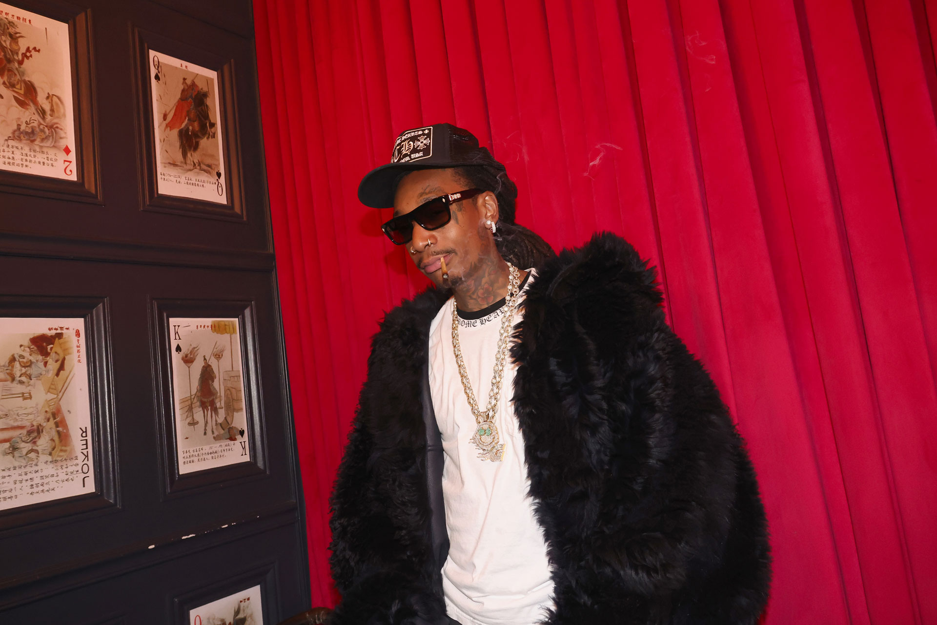
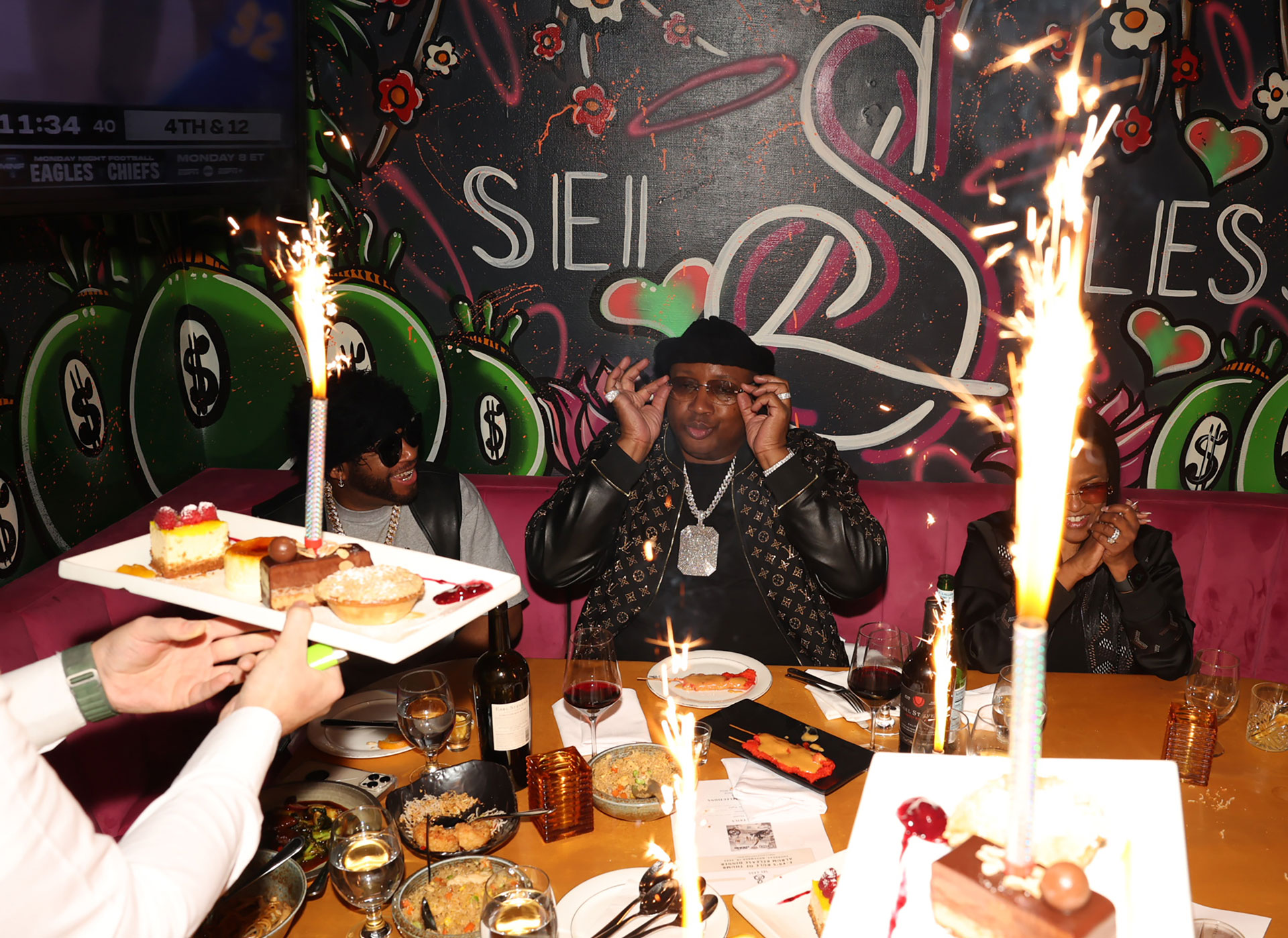
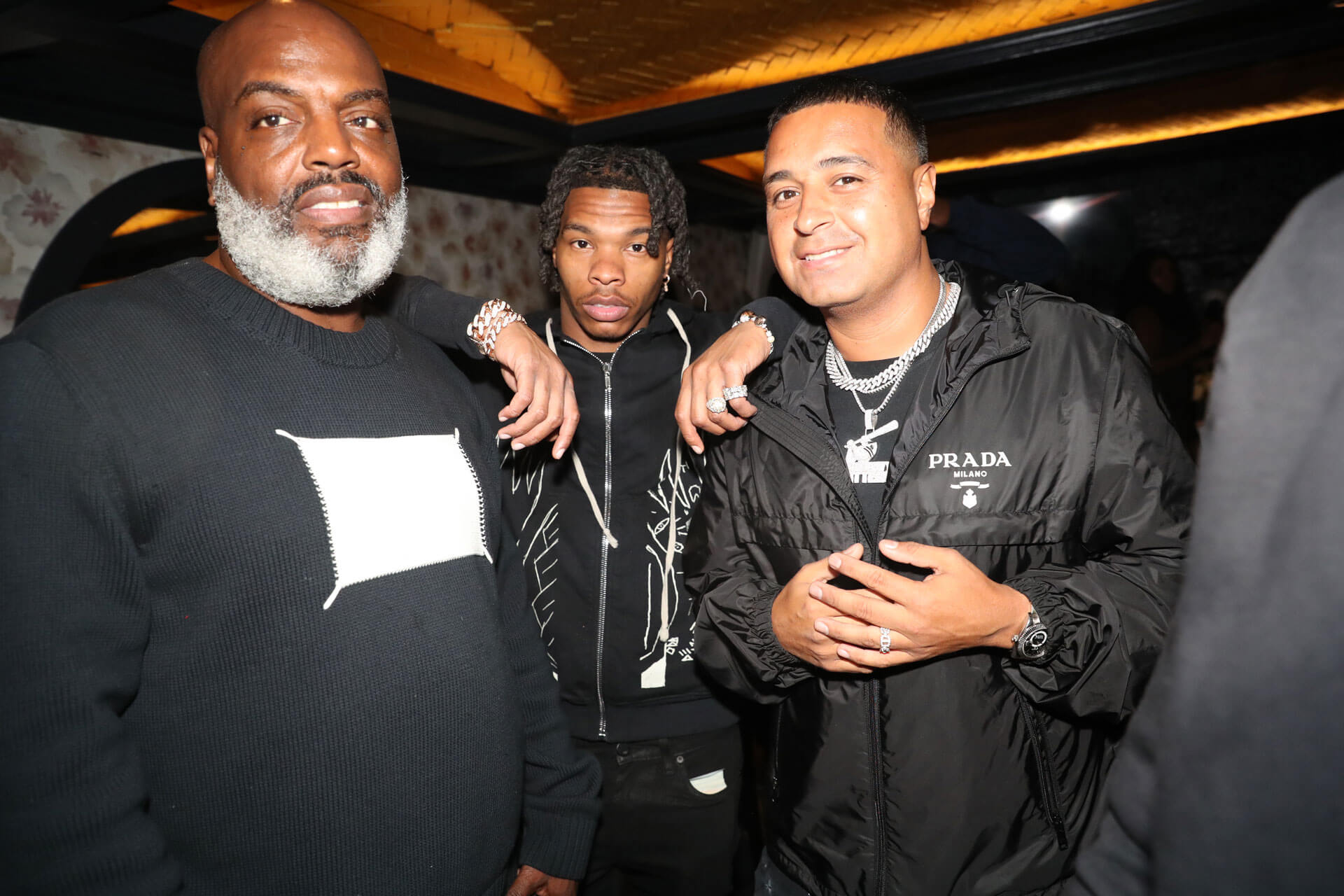
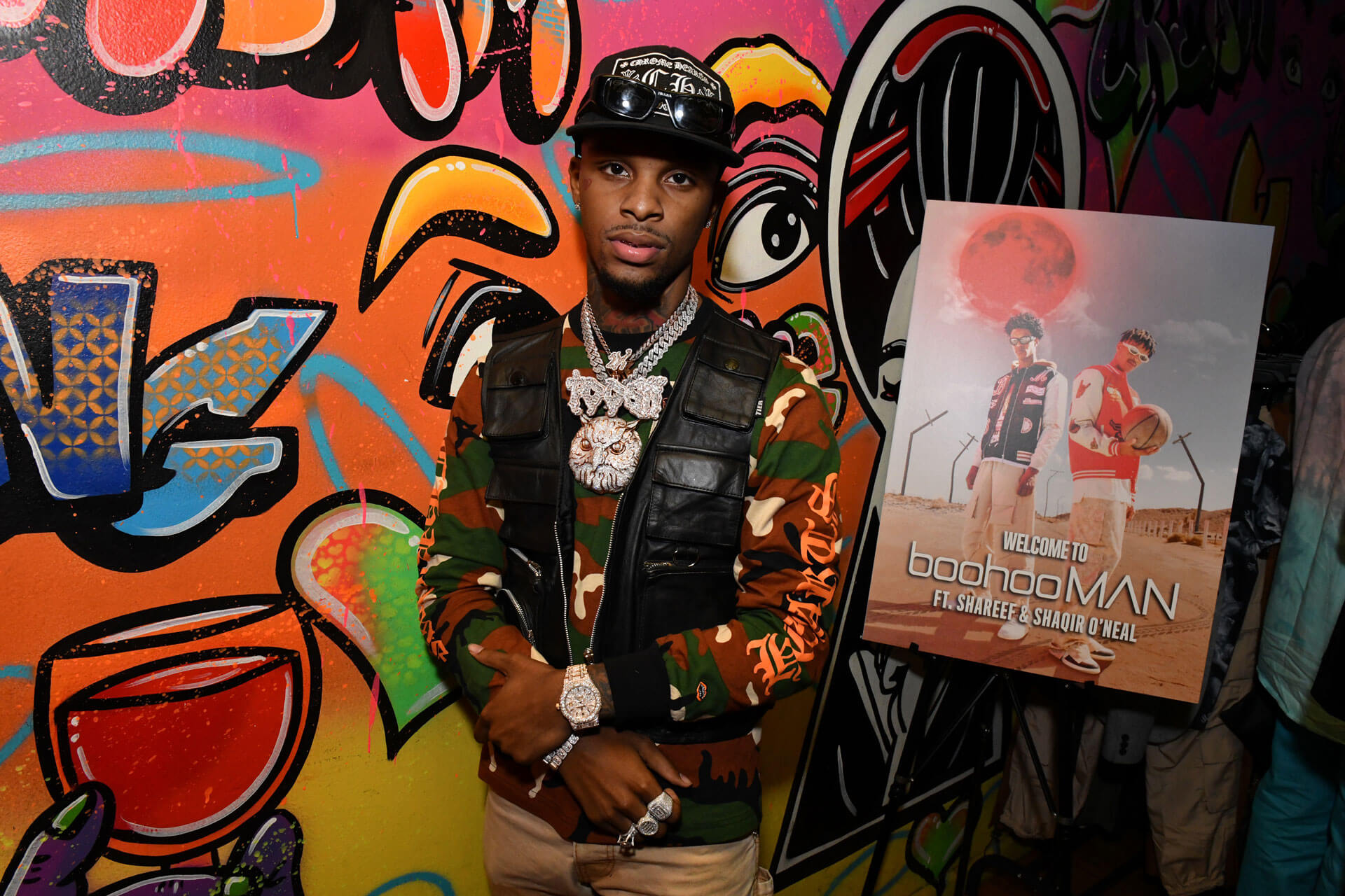
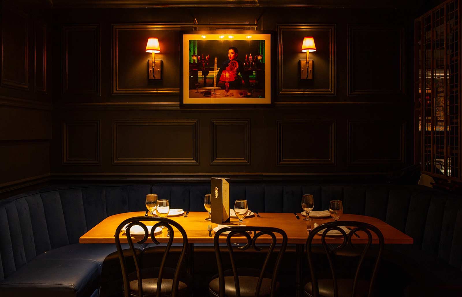
Private dining rooms, layered with rich materials, integrated screens, and carefully controlled lighting, offer a more secluded experience within the larger space. Designed as intimate enclaves, they cater to guests who value discretion without sacrificing atmosphere, from athletes and artists to executives and hosts seeking privacy. Since opening, these rooms have quietly become the backdrop for defining cultural moments, including Gunna’s album release dinner for DS4Ever, James Harden’s birthday celebration alongside Lil Baby and Travis Scott, and Fivio Foreign’s joint Grammy nomination and birthday gathering, reinforcing the restaurant’s role as a trusted setting where culture unfolds away from the public eye. The spot slowly but surely became an oasis for these type of industry events.

In an environment where excess is often mistaken for impact, restraint becomes a deliberate and strategic differentiator. Sei Less does not compete through volume, spectacle, or overstatement. Instead, it operates with precision, shaping an atmosphere that rewards attention, presence, and intuition. The design language is intentional in what it includes and equally intentional in what it leaves out, allowing space for the environment, the people, and the moment to carry meaning. This creates a quieter kind of luxury, one that is felt rather than announced, where every detail is considered but never forced. From a creative direction standpoint, the discipline lies in knowing when to hold back, understanding that what is withheld can be just as powerful as what is shown.
At its core, the brand is built on the idea that confidence does not require explanation. It trusts its audience to recognize quality without needing to signal it overtly, leaning into a cultural fluency that feels natural rather than performative. By saying less, the experience is given room to unfold on its own terms, allowing guests to project their own meaning onto the space rather than being directed toward a single interpretation. This approach not only creates a more personal connection but also ensures longevity, as the brand is not tied to fleeting expressions or trends. From a systems perspective, this philosophy reinforces consistency and clarity, allowing the identity to remain strong and adaptable over time while continuing to resonate with those who understand its language.
The identity was designed as a system first and a logo second. Every element needed to function independently while reinforcing the whole. Typography, iconography, patterns, and materials were all treated as modular components that could appear quietly or assertively depending on context. This allowed the brand to adapt across menus, signage, interiors, and digital without feeling diluted. Consistency came from structure, not repetition.
Color was treated as a behavioral tool, not a stylistic one. Saturation levels were calibrated to respond to lighting shifts throughout the evening. Deeper tones absorb energy early in the night, creating calm. As the space fills and light levels drop, those same colors begin to glow, contributing to a sense of warmth and intensity. This temporal responsiveness allows the environment to evolve naturally without physical changes.
The layout of Sei Less is deliberately linear, encouraging movement without rush. Long sightlines pull you deeper into the room, while subtle shifts in ceiling height, lighting intensity, and seating density prevent the space from feeling monolithic. As you move through it, the restaurant unfolds in layers rather than revealing itself all at once. This creates a sense of progression, almost cinematic in nature, where each section feels distinct yet connected to the whole.
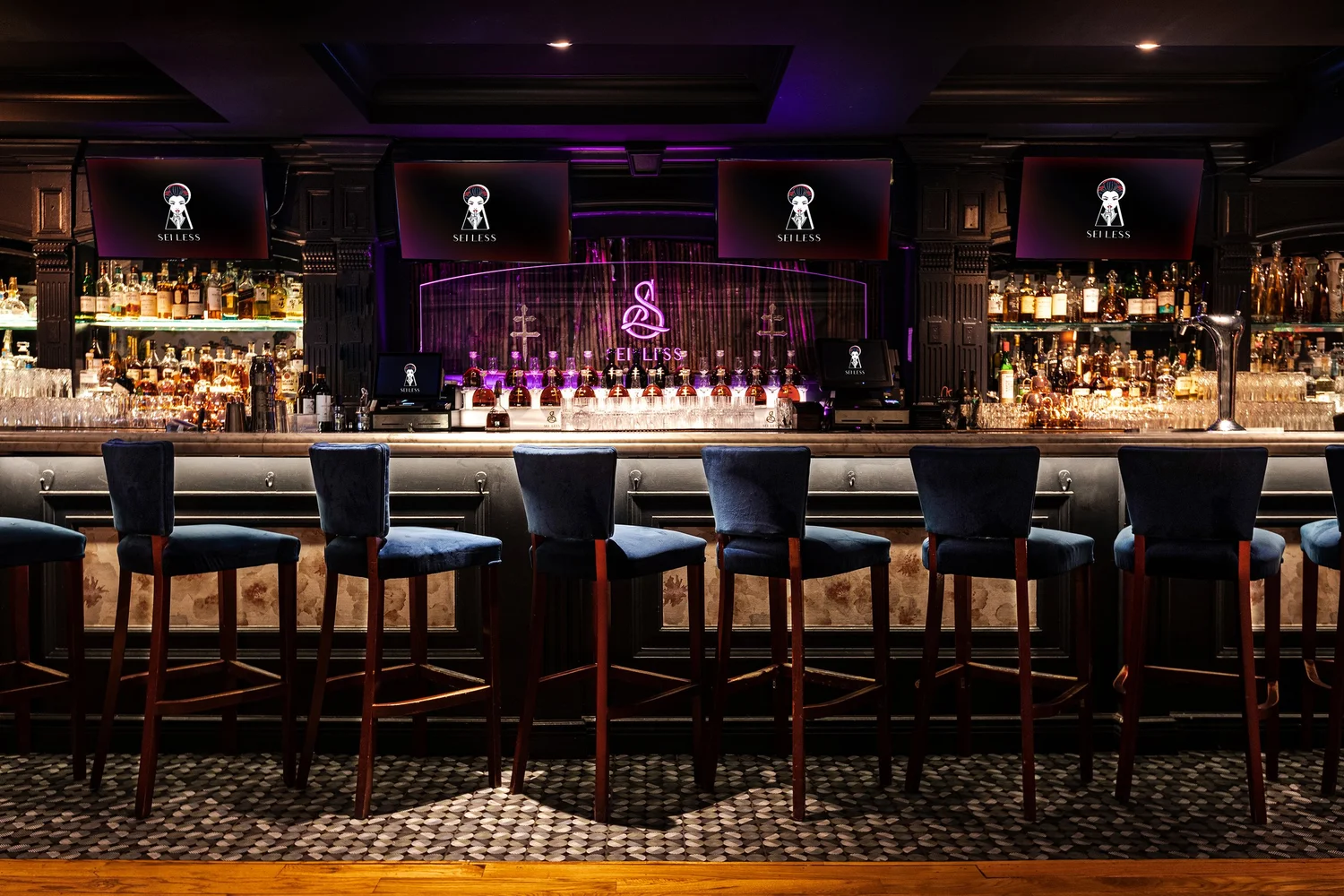
The bar functions as the spatial anchor. Its length and symmetry establish order, while the glow of backlit bottles and the repetition of stools create a visual rhythm that holds the room together. Even when the restaurant is full, the bar reads as calm and composed rather than chaotic. It is designed to be both a destination and a threshold, a place where guests can linger or transition without disrupting the flow of the space.
Artwork and murals are integrated architecturally rather than treated as decoration. They are scaled to the room, positioned to align with sightlines, and framed by lighting that changes their presence as the night progresses. These pieces act as emotional punctuation points, grounding the space in narrative without overwhelming it. The art does not compete with the diners. It observes them.

Material transitions are subtle but intentional. Polished surfaces give way to softer textures, warm wood meets cool stone, and reflective elements are balanced with absorbent ones. This interplay manages acoustics as much as aesthetics, keeping the room lively without becoming loud. The result is a space that feels controlled but never rigid, refined without being precious. A room designed not just to be seen, but to be occupied.

Success for Sei Less is not measured solely by buzz or visibility. It is measured by repeat guests, longevity, and cultural integration. A restaurant that becomes part of a city’s fabric rather than a moment within it. The design supports that outcome by prioritizing clarity, confidence, and cohesion over novelty. Sei Less also benefits from a kind of visibility that cannot be bought or engineered, only earned. Moments involving artists, athletes, and public figures inevitably generate headlines, social chatter, and late night whispers, and that awareness filters outward in subtle but powerful ways. People hear about the room before they ever step inside it.
A photo, a mention, a story passed along secondhand. That cultural gravity brings in diners on ordinary weeknights as much as it does on eventful ones. Guests arrive curious not because they expect spectacle, but because the place has been validated by the kind of organic buzz that signals relevance. The attention creates momentum, and the experience delivers on it, turning awareness into repeat visits and a steady rhythm of regulars who come not to be seen, but because they know they are in the right place.
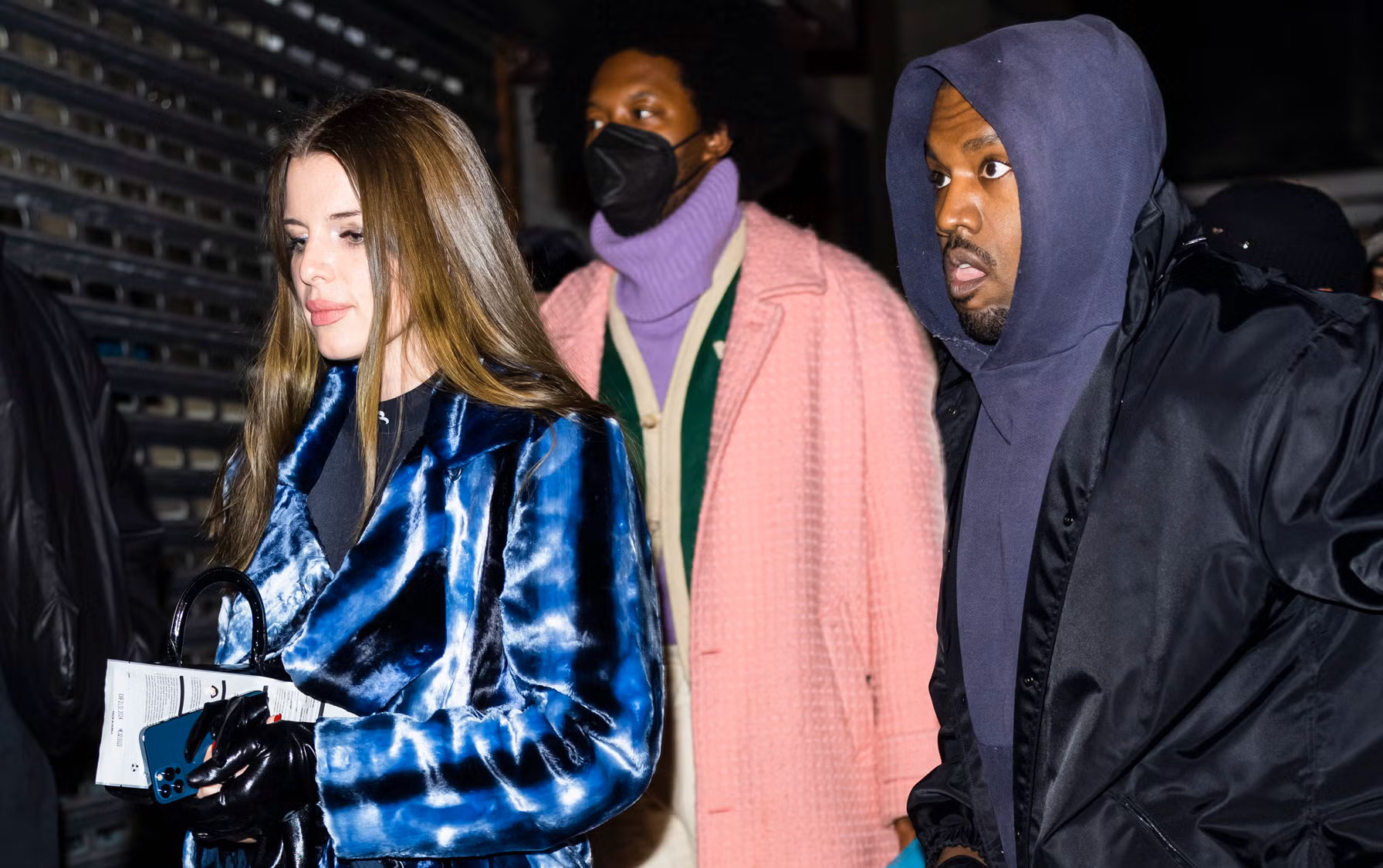
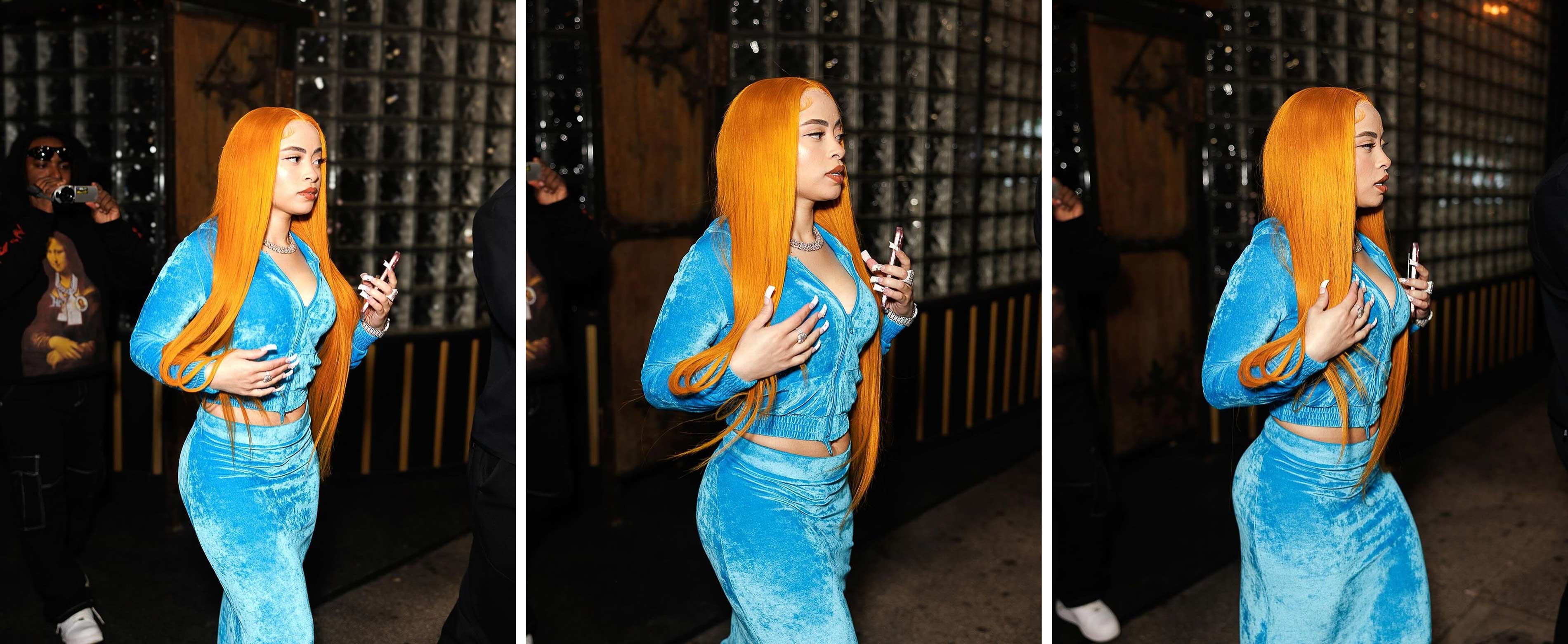
Things really began to take off when the restaurant received a stamp of approval from none other than Ye himself when the private dining room in the back became the site of an impromptu listening party for the most recent Kanye West album Donda 2. In February 2022, West and actress Julia Fox, who were then dating, came to the Midtown Manhattan restaurant to join 2 Chainz and Fabolous, who had been dining in the graffiti art-covered VIP section.

Sei Less closed to the public following West's arrival and it stayed open privately until 5 a.m., as West played then-unreleased material from "Donda 2" for several hours to a small gathering that would include Dave Chappelle, Fivio Foreign, and a group of record industry executives, at any other restaurant this would be the news of the week, but at Sei Less this was just another Tuesday. This is something that really added to the myth of the restaurant and helped weave it into the tapestry that is New York with all of its iconic jaunts. Every spot has to have a story, there have to be moments and photos and histories to tell, the walls have to have something to say.

Sei Less became a hotspot not because it tried to manufacture visibility, but because it understood how visibility actually works in New York. The room attracts people who are already seen elsewhere and gives them a place to arrive without performance. That distinction matters. Being seen at Sei Less carries a different signal than being photographed at a club or announced at a table. It suggests access, timing, and taste rather than thirst. The space allows presence to feel incidental, almost accidental, which is why moments there register as authentic rather than staged. In a city oversaturated with places designed to be documented, Sei Less became notable by offering something rarer: a setting where people could exist fully in the moment, knowing that if they were noticed, it would be because they belonged there.
Sei Less exists in a rare in-between space where culture, power, and privacy briefly overlap. It is not a nightclub pretending to be a restaurant, nor a restaurant masquerading as a cultural venue. Instead, it functions as neutral ground. A place where different strata of New York life momentarily collapse into the same room without needing to perform for one another. Artists, athletes, executives, politicians, and industry lifers all arrive carrying different versions of public visibility, yet inside the space those hierarchies soften. What makes Sei Less unusual is that it does not force that collision. It allows it. The room holds contradictions without resolving them. That restraint is precisely why it became a backdrop for unscripted cultural moments rather than manufactured ones.

What ultimately places Sei Less in the broader cultural conversation is not fame, but timing. It emerged during a period when New York was renegotiating its identity, post-lockdown, post-spectacle, post-peak hype culture. People were less interested in being seen everywhere and more interested in being somewhere that felt correct. Sei Less became one of those places. It offered density without chaos, intimacy without isolation, and cultural relevance without the exhaustion of constant performance. In that sense, its role in the zeitgeist mirrors a wider shift in taste and privacy as well as quiet luxury with safe spaces for expression and enjoyment.
Less broadcast, more presence. Less noise, more signal. The brand did not chase culture. It made space for it to happen organically, which is why the moments that occurred there feel incidental rather than staged. Sei Less is not remembered for what it announced, but for what quietly unfolded inside its walls. Legendary dinners, intimate nights, music video shoots, dates that have led to entire relationships and so much more. This experiential and dining quality has led to some wild stories we still share today.

Another one of my favorite stories in the legend books for Sei Less was that Lil Uzi Vert actually took a private jet from his performance at Rolling Loud and directly went from the airport to the restaurant to celebrate with a meal iced out and in the same exact outfit, truly a jet set lifestyle that reflected the type of stuff that happened regularly at the establishment. This type of larger than life mythology was exactly what made spots like Bemelman's Bar as iconic as they are now, and we hope to replicate that with what we have at Sei Less and the stories that have come about in just the short time since it has been open with many more to come.
For a certain tier of guest, privacy is not a preference but a requirement, and Sei Less was designed with that understanding at its core. The space offers a level of discretion that allows high net worth individuals, celebrities, and privacy minded clients to exist without exposure or interruption. Sightlines are controlled, private rooms are thoughtfully insulated, and the overall atmosphere discourages spectacle in favor of ease. Guests can dine, meet, and unwind without feeling observed or managed, trusting that their presence will remain contained within the room. That sense of safety creates loyalty. It allows influential people to return on ordinary nights, bring their inner circles, and treat the restaurant not as a scene, but as a refuge where privacy and comfort are quietly protected.
In a city defined by scale and spectacle, the proximity of Sei Less to Madison Square Garden gives it a unique civic role. MSG is a global stage, drawing athletes, performers, and audiences from around the world, yet the area immediately surrounding it has historically lacked spaces that match the caliber of the events inside. Sei Less fills that gap. It offers a place where the energy of a sold out arena can resolve into something more intimate and intentional. For New York, that matters. The city thrives when its cultural landmarks are supported by environments that allow people to gather, decompress, and connect at a higher level. Positioned steps from one of the most visible venues on earth, Sei Less becomes an extension of the night itself, a space that completes the experience rather than competing with it.
Sei Less was built with patience in mind. Every decision, from the visual system to the spatial details, was made to support longevity rather than immediacy. The result is a place that feels lived in, trusted, and culturally fluent without ever needing to announce itself. Its success is not defined by a single night, headline, or moment, but by accumulation. The steady return of guests, the quiet word-of-mouth, the way it becomes a default choice rather than a destination. In a city that rewards spectacle but remembers substance, Sei Less settles into the fabric of New York as the kind of room people rely on, return to, and speak about in lowered voices long after they leave.
Sei Less represents the kind of work that only happens when creative vision and operational reality are aligned. It is a reminder that the most impactful environments are not designed to dominate attention, but to hold it. The brand, the space, and the experience operate in concert, allowing guests to move through the night without friction. Nothing feels accidental, yet nothing feels forced. That balance is difficult to achieve and even harder to sustain, which is why the restaurant resonates beyond its walls and beyond its opening moment.
At its best, Sei Less functions less like a venue and more like a constant. A place that absorbs the changing currents of the city without losing its own center. It adapts to different crowds, different nights, and different eras while remaining unmistakably itself. That kind of resilience is rare in New York hospitality. It speaks to a design philosophy rooted in clarity, confidence, and respect for the audience. Sei Less does not ask to be remembered. It earns it through consistency.
Sei Less was also the scene of philanthropy, using its cultural reach and hospitality platform to create moments of genuine impact beyond nightlife and dining. The restaurant has served as a gathering place for community driven initiatives, including a Thanksgiving dinner that brought together justice impacted youth, nonprofit partners, and artists in an atmosphere of dignity and care. By opening its doors for causes rooted in service rather than spectacle, Sei Less demonstrated that influence can be leveraged quietly and effectively. These moments reinforce the idea that the space is not only woven into New York’s cultural life, but also invested in the city’s responsibility to give back, using access, resources, and visibility to create meaningful experiences for those who need them most.
Sei Less endures because it understands the difference between attention and trust. Attention can be fleeting, driven by novelty and noise, but trust is built slowly through consistency, discretion, and care. The restaurant earns that trust night after night by delivering an experience that feels considered, reliable, and quietly elevated. Over time, it becomes less of a destination and more of a reference point. A place people return to without explanation, recommend without qualifiers, and fold into the personal geography of their lives in New York.

The design and the atmosphere work hand in hand to create a cohesive high end experience. Deep blues and reds cover the walls and seating, while areas like the bar and dessert stand feature dark-colored wood. The rich colors make it all feel luxurious. Right as you walk in the door with the Sei Less logo gently beckoning you in to experience dishes that will transport you across the globe, and an ambience it creates plenty of whispers. The space is intimate, inviting and yet still very lush and high end. There is a delicate balance between the atmosphere and the music and the whole vibe of the space.
.jpg)
At times, it feels so much like a movie or music video set that you expect to see one being shot while you are dining there, the best way to think of Sei Less is not as a restaurant but as a night at the theater. The idea was to have the place feel like it had been there for a century while simultaneously feeling fresh and modern with a flair for entertainment and immersion. There is a dramatic flair to the atmosphere and the interior decor visual language, making it the perfect backdrop.
As a part of the immaculate marketing plan and rollout for the restaurant, Dara and Ivi also partnered with the street heat music video team to create a piece of content with French Montana and Fabolous that paid respect to the new hotspot. The fact that the restaurant is able to move into the cultural lexicon so quickly is a testament to those relationships that were built over the years and the trust in the team that was brought together for this. Knowing that there would be such a spotlight on the restaurant, I knew that all the touch points had to look and feel consistent. The ethos that was being cultivated had to fit with the food and branding seamlessly, and that is what we aimed for. The design language was reinforced by the super talented kitchen staff and world class cooks who put together a menu that is unique in its own artistic rights.
Travis Scott and Ice Spice brought Oh Shhh... to life in the very essence of New York’s elite nightlife, filming key scenes at Sei Less, a space synonymous with exclusivity, culture, and the intersection of hip-hop and high-end dining. As the duo took over the restaurant’s private rooms, Sei Less became more than just a backdrop; it was a statement, embodying the cinematic energy of the track. From Travis pouring Cacti on Ice Spice mid-performance to the opulent spread laid before them, every shot was a visual extension of the restaurant’s mystique. With its deep ties to the city's music and sports scene, Sei Less once again solidified itself as the spot where culture happens in real time, a place where icons don't just dine, they make history.

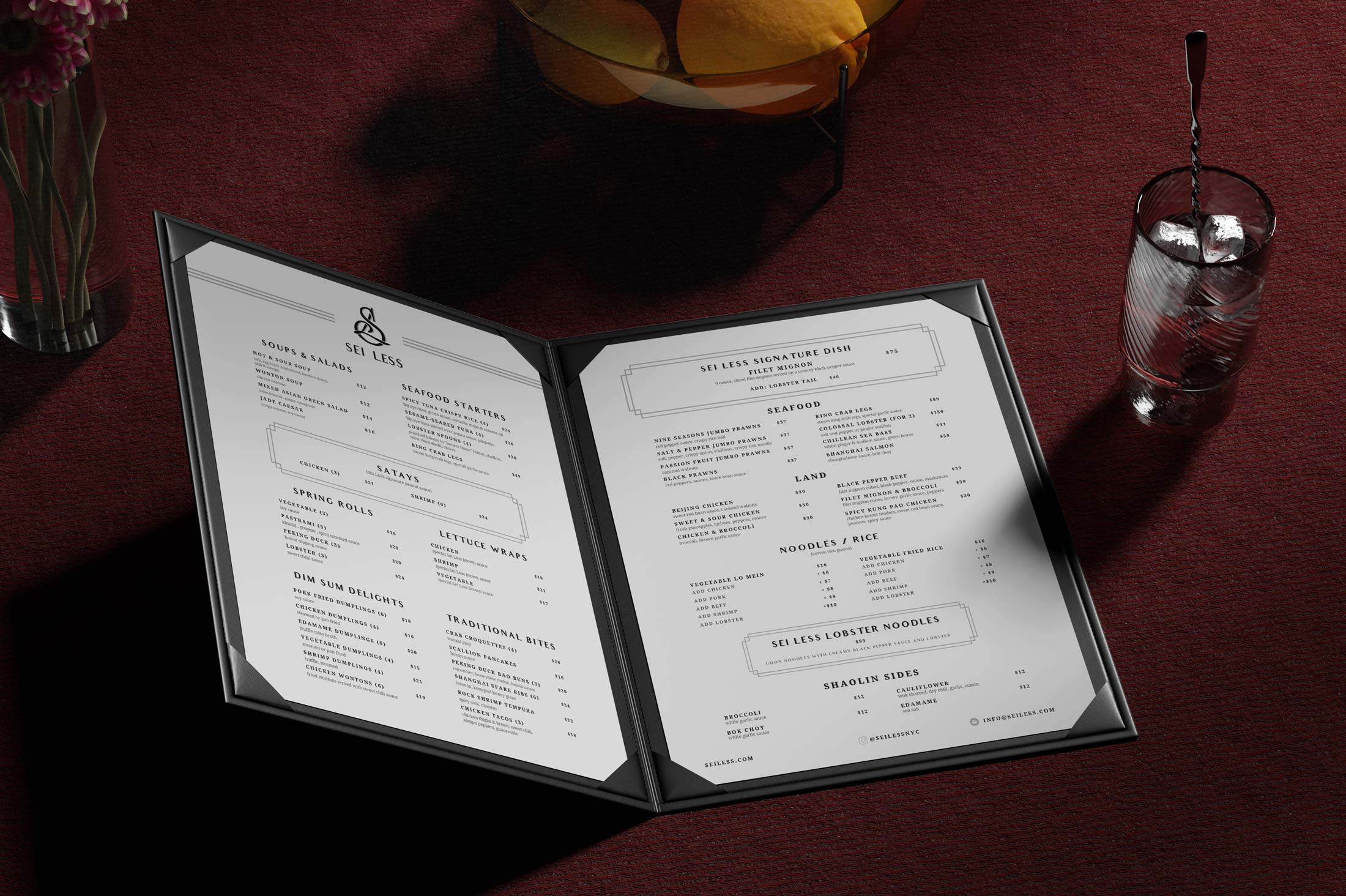
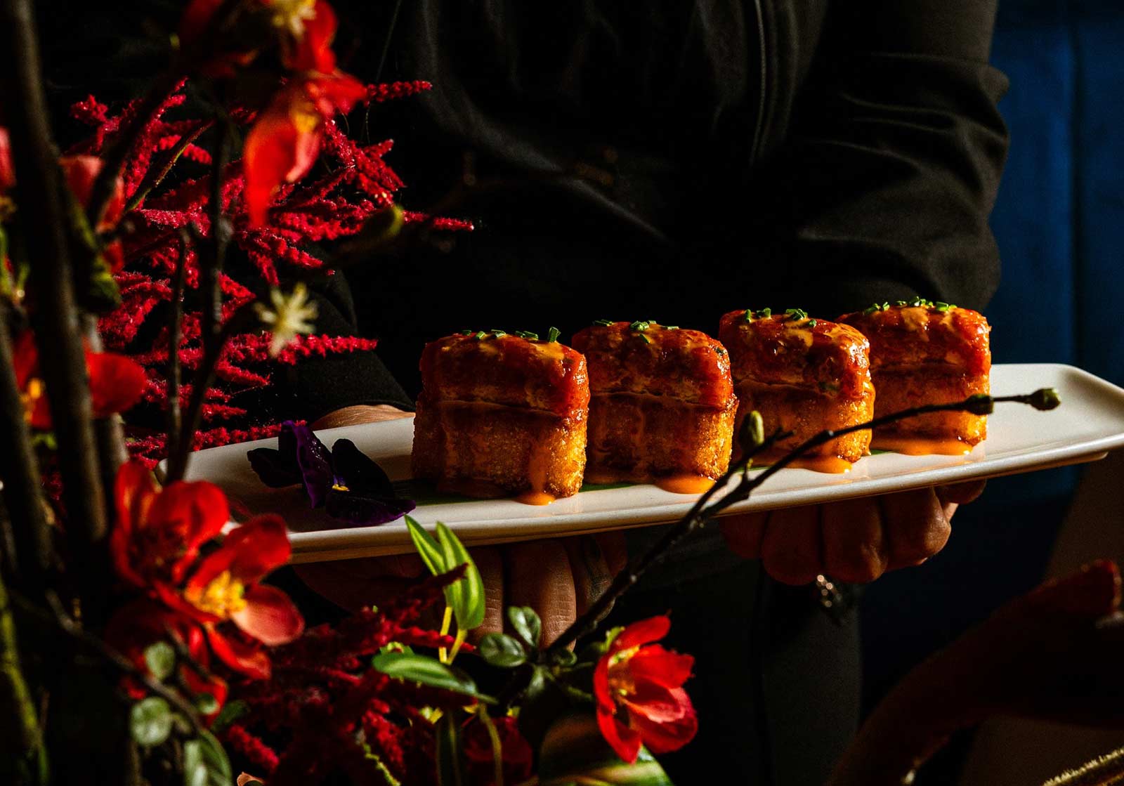
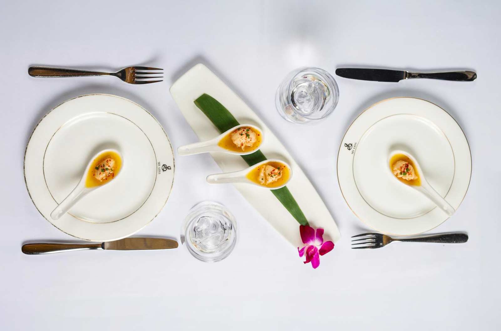
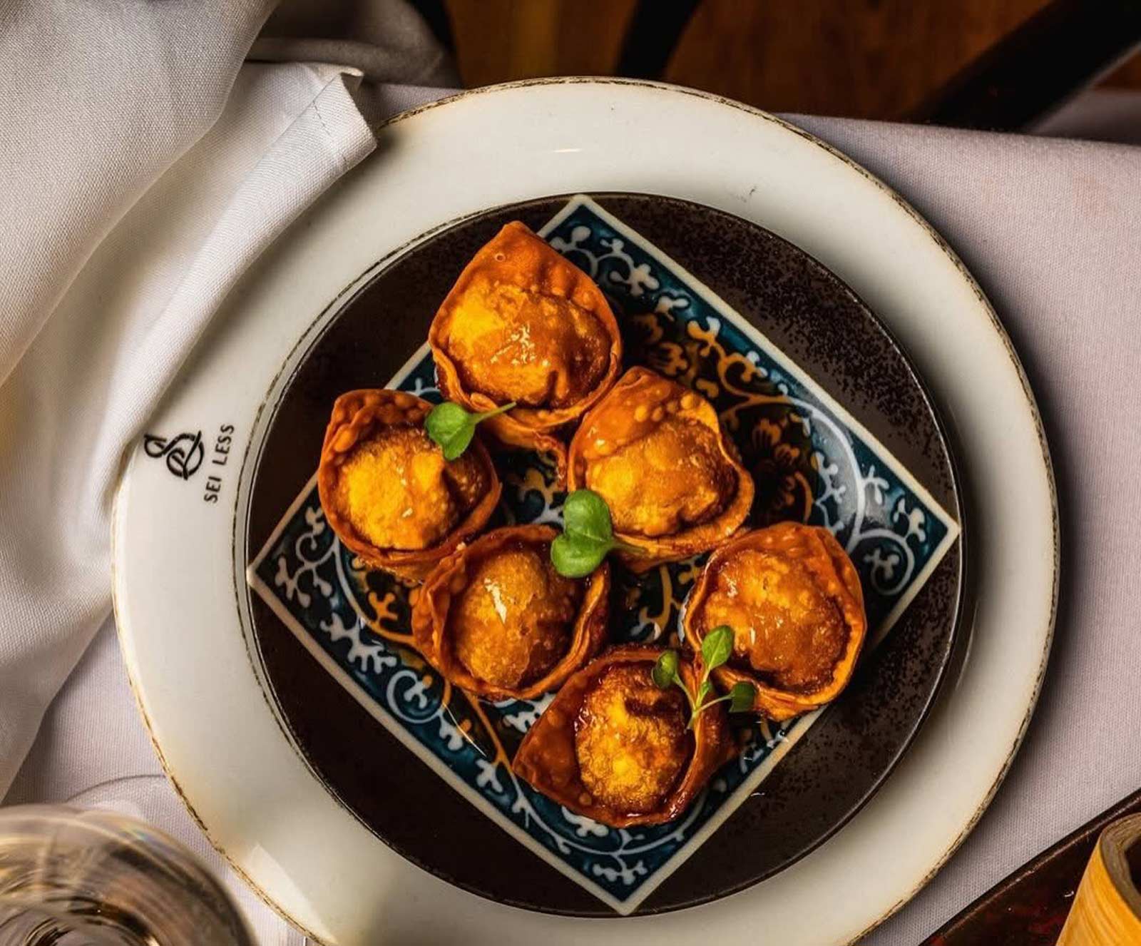
The curated Pan-Asian family-style menu includes signature dishes like Chicken Satay, Edamame Dumplings, and Rock Shrimp Tempura alongside delectable items crafted as a nod to the founding team’s history in NYC like Dry-Aged Delmonico’s Ribeye, and Wutang Salmon. Sei Less really is a restaurant that gives guests a one-of-a-kind cocktail experience, with cocktails like Lychee Martini, Pick Me Up Martini, Yuzu Margarita, and an Elderflower Mojito as well as mocktails, for the sober-curious set, designed to enhance every evening. The whole menu is meant to compliment the design and aesthetic and really is the hero of the show. The whole restaurant really functions as a symphony where all the parts work in concert. Make a reservation sometime and experience it for yourself, you won't regret it!

Timelessness is not achieved by avoiding change, but by building systems that can adapt without losing their core identity. The design of Sei Less was approached as a flexible framework rather than a fixed composition, allowing it to evolve with different nights, audiences, and cultural moments while remaining unmistakably itself. Typography, color, material, and spatial logic were all developed as modular components that can shift in emphasis without breaking the overall language. This versatility ensures that the space does not age out of relevance as trends move on, but instead absorbs those shifts and integrates them naturally. What remains constant is the point of view, a clear, disciplined perspective that anchors every iteration. That is what allows a restaurant to move from being a place people visit to a place people rely on.

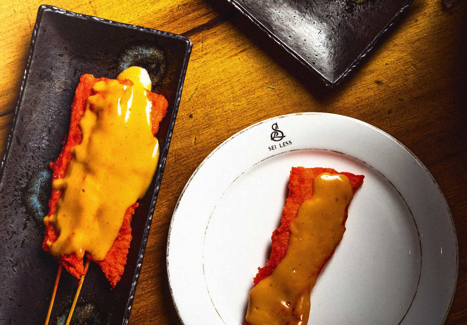
The food at Sei Less is designed to move at the same pace as the room. It favors shared plates and familiar formats, but with execution that feels deliberate rather than casual. Dumplings arrive sculptural and precise, sauces lacquered rather than pooled, textures calibrated so nothing collapses under its own richness. The menu pulls from multiple Asian culinary traditions without flattening them into novelty, instead focusing on balance, restraint, and repetition. Dishes are meant to be ordered collectively, passed, discussed, revisited. The food encourages conversation without demanding attention, which is a harder balance to strike than spectacle.
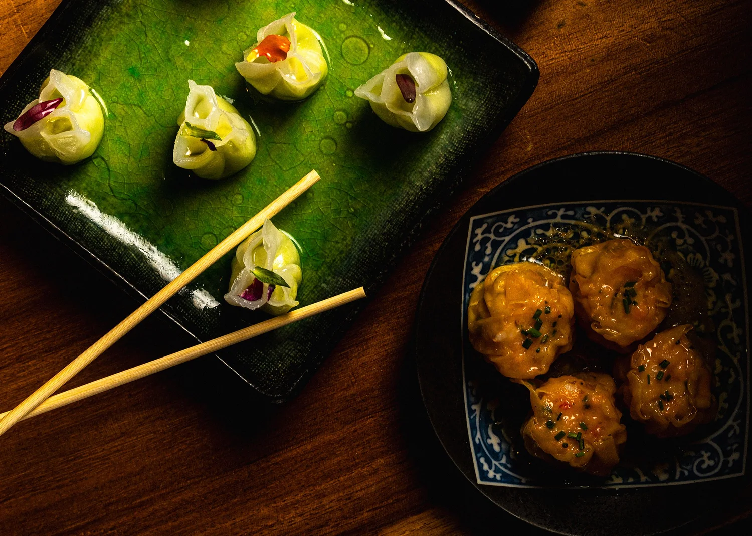
What makes the menu work in this environment is its understanding of context. These are dishes built to hold up under low light, long conversations, and multiple rounds of cocktails. Flavors are bold but not aggressive, layered rather than loud. Heat is used thoughtfully, acidity cuts through richness, and plating remains elegant without becoming precious. The food does not compete with the space or the crowd. It supports them. Like the rest of Sei Less, the menu understands that luxury is not about excess, but about control. Sei Less is an elevated New York hot spot that I would encourage anyone to stop by and try. Restaurant design at this level is not about decoration, it is about behavior.
The best spaces do not tell you how to feel, they create the conditions for feeling to emerge naturally. That means understanding how people move, where they pause, what they notice, and what they remember once they leave. Every decision, from lighting falloff to material contrast to the cadence of visual moments, is made in service of shaping that experience without over-directing it. When done correctly, the design disappears into instinct, and the guest feels something before they can articulate why. That is the difference between a space that is seen and one that is lived in. Sei Less was built to operate in that invisible layer.
Standing out in New York is often misunderstood as being louder, brighter, or more excessive, when in reality the city responds to clarity and conviction. The brands that last are not the ones that try to capture attention at all costs, but the ones that know exactly what they are and remain consistent in that identity over time. With Sei Less, the intention was to avoid the trap of novelty and instead build something with a strong internal logic, where every element reinforces the same idea from different angles. This creates a kind of quiet differentiation, where the space feels distinct without needing to announce itself. In a market saturated with stimulation, restraint becomes its own form of presence.
Sei Less stands as proof that the strongest brands are not built through noise, but through coherence. What endures is not a logo alone, or a launch moment, or even a headline-making guest list, but a complete point of view expressed consistently across space, story, and experience. For me, the project represents the kind of creative direction I care most about: work that is culturally sharp, operationally sound, and emotionally resonant all at once. It required taste, discipline, collaboration, and a willingness to think beyond surface into systems. In a city where attention is easy to get and difficult to keep, Sei Less was built to hold its ground. That is what makes it meaningful to me, not simply as a restaurant brand, but as an example of how thoughtful design can create permanence in a culture obsessed with passing moments.
.webp)
The scale of Sei Less introduced a different kind of problem, not how to fill a room, but how to control how it is felt. A space of this size can easily flatten into something anonymous if it reveals itself too quickly or tries to operate as a single gesture. Instead, the environment was designed to unfold in layers, where each shift in light, density, and visual rhythm subtly recalibrates how the room is experienced. Movement becomes part of the design, with sightlines pulling you forward while moments of compression and release create a sense of progression. You are never given the full picture at once, which keeps the space from becoming static or overly legible. This approach allows intimacy to exist within scale, not in spite of it. The room feels alive because it is constantly being discovered rather than consumed.
Sei Less ultimately stands as a study in intention. A project rooted in trust, restraint, and a deep understanding of how culture actually takes hold in New York. What began as a branding exercise evolved into something more durable: a place with its own gravity, rhythm, and reputation, shaped as much by what it withholds as what it reveals. The work was never about chasing moments, but about creating the conditions for them to happen naturally, night after night. In a city that is constantly reinventing itself, Sei Less earns its place by feeling grounded, confident, and unmistakably present. A restaurant designed not just to open strong, but to endure.
Sei Less was designed with a clear understanding of who the room was for and, more importantly, who it was not. The audience was not defined by demographics but by behavior, taste, and cultural proximity, individuals who move fluidly between industries and cities, who recognize signals without needing explanation. This informed every decision, from spatial pacing to typography to the tone of voice across touchpoints. The brand does not attempt to educate or convince, it assumes awareness and rewards it. That positioning allows Sei Less to operate as a filter rather than a funnel, attracting the right energy instead of chasing volume. In a market like New York, that selectivity becomes a growth strategy rather than a limitation. The result is a space that feels socially calibrated, where alignment happens naturally rather than being engineered.
Beyond aesthetics, the design system was built to drive measurable business outcomes across multiple revenue streams. The layout supports high table turnover without compromising perceived exclusivity, while private dining areas create premium opportunities for high-margin bookings. Brand consistency across physical and digital touchpoints reinforces recall, reducing dependency on paid acquisition and increasing organic return visits. The environment encourages documentation without relying on it, generating social visibility that compounds over time. Operationally, the system reduces friction for staff, ensuring that execution remains consistent regardless of scale or staffing variability. This alignment between design and business allows the brand to function as an asset rather than an expense. The success of Sei Less is reflected not only in cultural relevance but in sustained economic performance within one of the most competitive markets in the world.
This project reflects a broader approach to creative direction rooted in restraint, clarity, and long-term thinking. I am less interested in creating moments that peak quickly and more focused on building systems that accumulate value over time. Sei Less became an opportunity to apply that philosophy within a highly competitive, culturally saturated environment. The work is driven by an understanding that taste is not expressed through excess, but through precision and intentionality. Each decision is made with an awareness of how it will age, not just how it will launch. This perspective allows the work to remain relevant beyond its initial context, adapting without losing its identity. Ultimately, the goal is to create environments that people return to, not because they are new, but because they feel right.
Sei Less was built with patience in mind. Every decision, from the visual system to the spatial details, was made to support longevity rather than immediacy. The result is a place that feels lived in, trusted, and culturally fluent without ever needing to announce itself. Its success is not defined by a single night, headline, or moment, but by accumulation. The steady return of guests, the quiet word-of-mouth, the way it becomes a default choice rather than a destination. In a city that rewards spectacle but remembers substance, Sei Less settles into the fabric of New York as the kind of room people rely on, return to, and speak about in lowered voices long after they leave.
Key Collaborators: Ivi Shano, Dara Mirjahangiry, Ivo Shano, Joseph Licul, Dennis Turcinovic, George Karavias, Lance Fresh, Damian Mitchell, Tiffany Chan
Tools: Adobe Photoshop, Adobe Illustrator, Adobe After Effects, Final Cut Pro
Deliverables: Brand Assets, Guidelines, Menus, Installations, Environmental Elements, Social Templates
Category: Creative Direction, Art Direction, Production, Writing, Marketing, Development, Hospitality