

As Co-Founder and Creative Director of Forever Network, I helped transform what began as a small social media experiment into a global, social-first sports media ecosystem with a distinctive voice and visual identity tailored to the next generation of fans. From the outset, I established the brand’s creative north star, defining its aesthetic language, editorial tone, and platform-native storytelling approach at a time when traditional sports media was still tethered to broadcast paradigms. What started as a focused basketball channel evolved into a multi-sport, cross-platform network reaching tens of millions of fans monthly and generating billions of impressions annually, reflecting the seismic shift toward mobile, short-form, and culturally fluent sports content. In my role, I architected the foundational design system and content framework that allowed the brand to scale without diluting its identity. I led the development of the visual language, motion grammar, and social packaging templates that enabled rapid content production while maintaining a cohesive, premium feel across platforms. Beyond aesthetics, I shaped the editorial voice to sit at the intersection of sport, culture, and internet fluency, ensuring the brand spoke in a tone that felt native to digital communities rather than inherited from legacy media. This included launching the network’s video presence, pioneering platform-specific storytelling formats, and building a content engine optimized for shareability, engagement velocity, and algorithmic amplification. At the time of writing, the network had already achieved extraordinary reach, but its trajectory has continued to accelerate. Basketball Forever alone has drawn tens of millions of monthly fans and delivered massive engagement and video viewership across social platforms, demonstrating the power of a social-first distribution model. More recently, Forever Network has surpassed 10 billion total impressions and expanded into multiple sports verticals, reinforcing its position as one of the most expansive cross-platform sports ecosystems in the world. This growth validates the early creative and strategic decisions I helped put in place, from modular design systems to culturally attuned storytelling frameworks that could travel seamlessly across geographies and platforms. Before transitioning into an advisory role, I played a pivotal part in shaping the company’s formative years through brand development, content experimentation, and strategic positioning. I helped define how a digital-native sports brand could operate with the agility of a startup while building the cultural credibility of an institution.

Over 1.1 Billion+ Video Views Per Month Across All Digital Platforms
Basketball Forever has built a deeply engaged global audience by embracing a simple but powerful premise: fans creating for fans. That ethos became our strategic advantage. Rather than imitating the detached tone of legacy sports media, we operated from inside the culture, speaking the language of group chats, barbershops, comment sections, and late-night debates. This authenticity fostered trust and habitual engagement, allowing us to serve our audience with precision and speed across social platforms. We were not guessing what fans wanted. We were the fans, building content ecosystems that reflected real conversations, real emotions, and real allegiances in a sport that lives as much online as it does on the court. Building Basketball Forever from the ground up meant architecting a basketball media startup that could operate asynchronously across continents while competing with entrenched legacy players such as ESPN, Bleacher Report, and Sports Illustrated. With no broadcast infrastructure and limited resources, we leaned into the structural advantages of digital nativity: distributed workflows, platform-specific storytelling, and a modular design system that enabled contributors around the world to publish within a unified brand framework. I developed a visual and editorial system that could travel across time zones and cultural contexts without losing coherence, allowing the brand to scale rapidly while maintaining a consistent voice. This global, always-on operating model turned geography into an asset rather than a constraint as often happens in similar cases, enabling us to capture regional fandoms, surface local narratives, and feed them back into a global conversation. A core challenge I faced as Creative Director was defining a visual language and editorial tone that could resonate across a vast spectrum of basketball fans, from NBA diehards in North America to emerging hoops communities in Europe, Asia, Africa, and Latin America. Basketball is one of the fastest-growing sports in the world, but fandom manifests differently across cultures. My role was to create a flexible brand system that honored those differences while reinforcing a shared emotional core. This meant designing content formats that could accommodate highlights, memes, historical context, cultural moments, and fan debates with equal legitimacy. The goal was not merely reach but relevance, ensuring that a fan in Manila, Madrid, Lagos, or Melbourne could see themselves reflected in the content stream. At scale, the work became an exploration of the true meaning of fandom in the digital age. We observed that modern fans do not passively consume. They remix, react, argue, archive, and mythologize in real time. By building a constant stream of curated content and creating spaces where fans could see their perspectives validated, we helped transform Basketball Forever from a publisher into a participatory culture engine. The audience was not simply activated for engagement metrics. They were activated as co-authors of the basketball narrative itself. Competing with legacy media was never about matching their resources. It was about redefining the relationship between media and fan, and in doing so, proving that authenticity, speed, and cultural fluency could outmaneuver scale. This is a labor of love and a true pleasure to have been a part of and Basketball Forever continues to be a great community for hoops fans to congregate and connect through.


As a co-founder and creative director of Basketball Forever, a division of the Forever Network, I shaped the look and feel of the entire brand voice while defining the social strategy and bringing legitimacy to the brand within the social space. My contributions would lead to various levels of venture capital funding and brand deals that stood on the shoulders of the visual language and design systems aimed at resonating with a young sports fan audience that were developed under my watch. The work was not simply about building an audience. It was about constructing a new media grammar for sports, one that prioritized authenticity, speed, and cultural resonance. Watching the brand evolve from a concept sketched on my screen into a global platform influencing how millions of young fans experience sport remains one of the most gratifying chapters of my career.
Growing the brand from a few hundred followers to millions across various platforms while building a design language that worked and a brand voice that would evolve over time was a difficult but fun challenge. I was a large part of the initial building stages of the brand and developing it into what it is today, one of the foremost and prolific basketball news providers on social media boasting a global audience of 80 million across multiple platforms. When Basketball Forever was still just a scrappy Facebook page with a passionate following, I saw the latent brand equity others overlooked and treated it like the foundation of a real media company rather than a fan account. It is work like this that defines my edge. I do not just design assets. I identify cultural signals early, build systems that scale, and position communities to become businesses. In a landscape crowded with content, that ability to see around corners and execute with precision is why I am regarded by peers and partners as operating at the very top tier of the game.
Basketball Forever did not simply grow within the existing sports media landscape, it helped redefine it from the inside out. The systems we built around platform-native storytelling, real-time publishing, and design frameworks engineered for infinite scroll have since become table stakes across the industry. What was once dismissed as a fan page evolved into a blueprint that legacy media, startups, and even leagues themselves began to mirror. We proved that proximity to culture could outperform proximity to institutions, and that speed paired with taste could outmaneuver scale. The brand demonstrated that fans no longer wanted to be spoken to, they wanted to be spoken with, and ideally by people who were indistinguishable from themselves. By collapsing the distance between publisher and audience, we created a model where engagement was not extracted but co-authored. In doing so, Basketball Forever became less of a destination and more of a living layer within the daily experience of fandom. That shift, from media as a broadcaster to media as a participant, is the lasting imprint of the work.
What made the platform durable was not any single viral moment or spike in growth, but the intentional construction of a system that could compound over time. Every layer, from visual identity to content cadence to community interaction, was designed to reinforce the others, creating a flywheel where attention turned into habit and habit turned into loyalty. The feed was not treated as output, it was treated as infrastructure, a surface where culture, conversation, and commerce could intersect fluidly. This allowed us to expand into new verticals like web, video, gaming, commerce, and live experiences without fragmenting the brand. Each extension felt native because it was built on the same underlying philosophy rather than bolted on as an afterthought. That coherence created trust with both audiences and partners, making monetization feel like a continuation of the experience rather than an interruption. Over time, the system proved it could stretch across geographies, platforms, and formats while retaining its identity. That is what turned Basketball Forever from a fast-growing page into a scalable, defensible media ecosystem.
This body of work reflects how I think about building in the modern era, where attention is fragmented, culture moves at the speed of the feed, and brands must earn relevance continuously. I do not approach creative as isolated campaigns or outputs, but as interconnected systems that shape behavior, perception, and participation over time. My role is to identify the signal early, define the point of view, and build the infrastructure that allows it to scale without losing its essence. Basketball Forever was one expression of that philosophy, taking something raw and undefined and turning it into a global platform with cultural gravity and commercial viability. It required equal parts instinct and discipline, knowing when to move fast and when to codify what worked into repeatable systems. The result is not just a portfolio of work, but a demonstration of how to build something that feels inevitable once it exists. That is the standard I hold for every brand I touch, whether I am shaping it from inception or helping it evolve at scale.
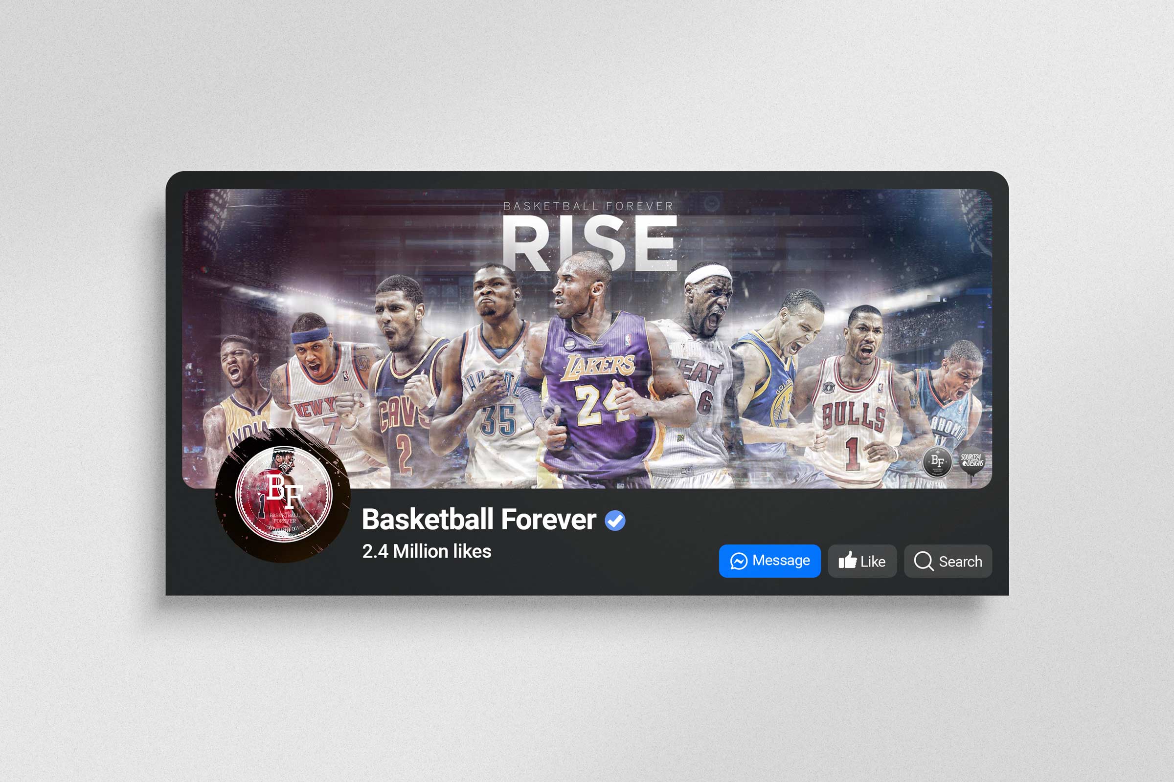
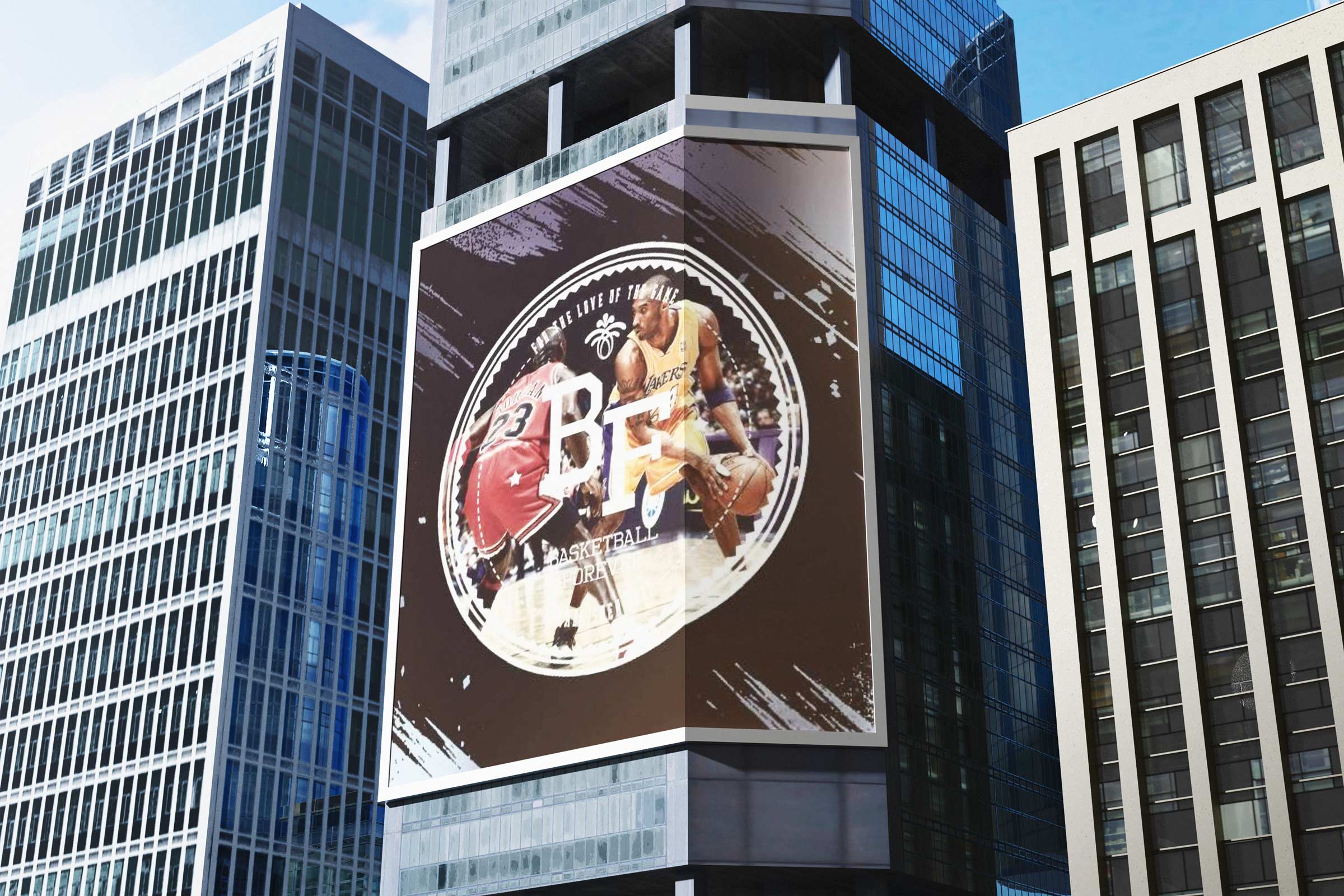
Designing the original Basketball Forever mark in 2011 was an act of stewardship as much as creation, a responsibility to give a young, fast-growing basketball community a symbol that could carry credibility, scale with ambition, and feel worthy of the culture it represented. At a time when sports media identities leaned heavily on gradients, bevels, and ornamental effects, I chose restraint and structure: a confident BF monogram, a circular container, and a badge architecture that could travel seamlessly from avatars to apparel to digital watermarks without losing clarity. The evolved logo had to be built for clarity, but the origin of the brand and how it came to be is an interesting story.
The circle was not decorative. It functioned as infrastructure, a seal of belonging that fans could wear, repost, and rally around, echoing the language of team crests, league patches, and championship insignias while remaining distinctly digital-native. Long before platform-first branding became standard practice, the mark was engineered for thumbnail legibility, merch embroidery, and social distribution, allowing it to operate as both identity and social currency inside emerging online basketball ecosystems. The fact that it was literally designed in my college computer lab is a great bit of lore for the brand. It was 2011 and I was studying organic chemistry and I chose to cook this up:
The refinement builds on that original intent, preserving the spirit while evolving the execution into something more disciplined, durable, and culturally agnostic. By moving away from the era’s “hipster stamp” aesthetic and tightening proportions, contrast, and typographic hierarchy, the identity matures into a timeless design system grounded in mnemonic strength rather than trend. The circular container remains the unifying device, but now with improved optical balance, clearer spacing, and greater versatility across substrates from screen print to backlit signage to motion graphics. What began as a badge for a niche digital basketball community has evolved into a flexible framework that can support content, merchandise, partnerships, and global growth without visual drift. It demonstrates a simple but enduring principle: when a logo is conceived as a system instead of a moment, it resists obsolescence, deepens its cultural resonance over time, and grows stronger alongside the community it was built to serve.
Basketball Forever began not as a traditional media company with offices, overhead, and institutional backing, but as a scrappy Facebook page powered by conviction, taste, and a deep understanding of how basketball fans actually behaved online. At a time when most sports publishers were still thinking in terms of websites first and social as a promotional afterthought, I recognized that the feed itself was becoming the front page, the homepage, and in many cases the entire fan experience. That shift was not obvious to most people yet, but I saw early that attention was migrating toward mobile consumption, habitual scrolling, share culture, and personality driven publishing. What others dismissed as a fan page, I treated as the foundation of a real company with the potential to become a global property with die hard fans spanning every corner of the world.
My instinct was that if we could build trust, rhythm, and recognizability inside the feed, we would not need to borrow relevance from legacy institutions because we could generate our own. The early opportunity was never simply to post basketball content, but to build a new kind of sports platform native to the behaviors of the next generation. That meant thinking beyond isolated posts and toward systems, formats, identity, and repeatable emotional triggers that could compound over time. From the outset, I approached the page with the mindset of a founder and creative visionary, imagining not what it was in that moment, but what it could become if treated with ambition, rigor, and belief. What made the brand special was not only that we were early, but that I had the foresight to understand that being early was meaningless without a clear point of view, a strong aesthetic, and a scalable philosophy behind it.

In the early Facebook era, long before publishers were staffed with social strategists, growth teams, and platform specialists, we were learning the mechanics of attention through instinct, experimentation, and obsessive proximity to the audience. I developed a sharp feel for what would travel, what would stall, what would ignite debate, and what would earn the kind of shares that pushed a page beyond its existing base and into entirely new circles of fandom. That intuition was not luck. It came from living inside the culture, studying the rhythms of the feed, understanding the emotional triggers of basketball discourse, and recognizing that the algorithm increasingly rewarded relevance, consistency, and reaction over static polish. This was a complete disruption of the traditional sports news pipeline that had a stronghold on the majority of the audience.
We were effectively building with tomorrow’s media logic before the industry had language for it, treating distribution as a living design problem rather than a downstream marketing function. I understood that every post was a signal, every spike in engagement was a clue, and every comment section was a real-time focus group revealing what the audience wanted more of. That gave us a competitive advantage well beyond aesthetics because we were not merely publishing into the feed, we were learning how to shape behavior within it. I pushed the brand to act with the confidence of a platform-native company before that was a recognized category, and that mindset helped turn Facebook from a traffic source into the original engine of the business. In many ways, we were not chasing the algorithm so much as intuiting the future direction of digital attention and designing the brand to thrive inside it before everyone else caught up. The first movers advantage in the social era, met with a deep reverance for the game itself and a willingness to put in the work was the key.

I wrote the initial business plan to articulate how a niche community could evolve into a scalable sports media platform, then rebuilt the visual identity from the ground up, designing a logo system and a new generation of cover art that gave the page a professional, own-able presence. Hitting 100K followers became a strategic relaunch moment, not a vanity milestone. I used that inflection point to reposition the page for a new era of basketball culture, designing custom graphics, developing repeatable content formats, and shaping a voice that felt authentic to fans while legible to sponsors. The goal was always to make the community feel both culturally native and commercially viable, a place where brand partners could see clear pathways to integration without diluting the trust of the audience. That forward-looking approach helped transform Basketball Forever from a social feed into a sellable, eventually investable property, years before most publishers understood the value of niche, creator-led sports media.
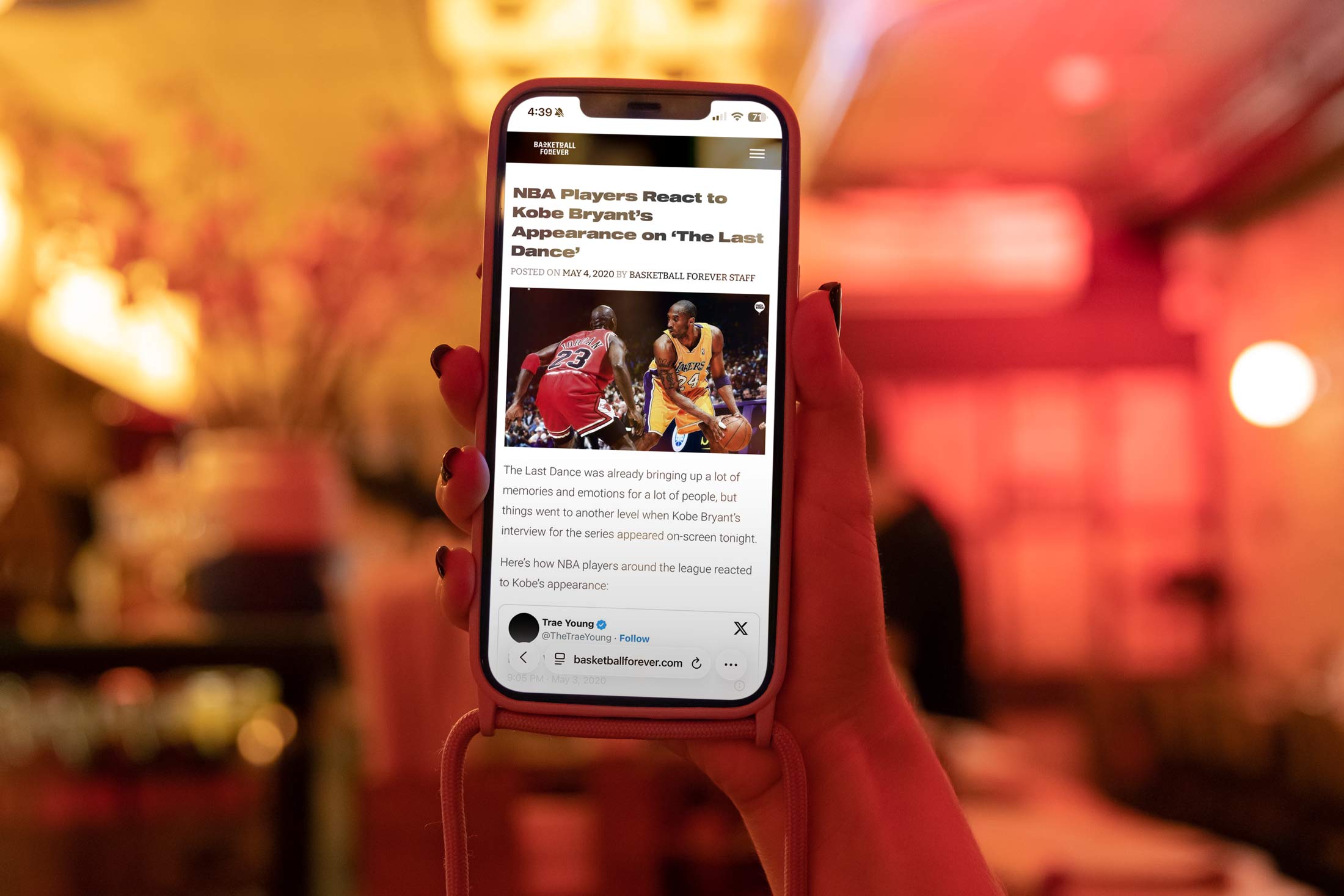
Similarly, my End of an Era series garnered heavy coverage across Reddit and other platforms as an appetite for the full series continued to grow. End of an Era was not simply a spike in views, it was a signal. In under 48 hours, the piece generated over 6.9 million cross platform views and climbed to number three on YouTube’s global trending chart, placing Basketball Forever in direct conversation with the largest media entities in the world. More importantly, it proved that our audience was not only there for highlights or quick hits, but for narrative, nostalgia, and emotional weight.
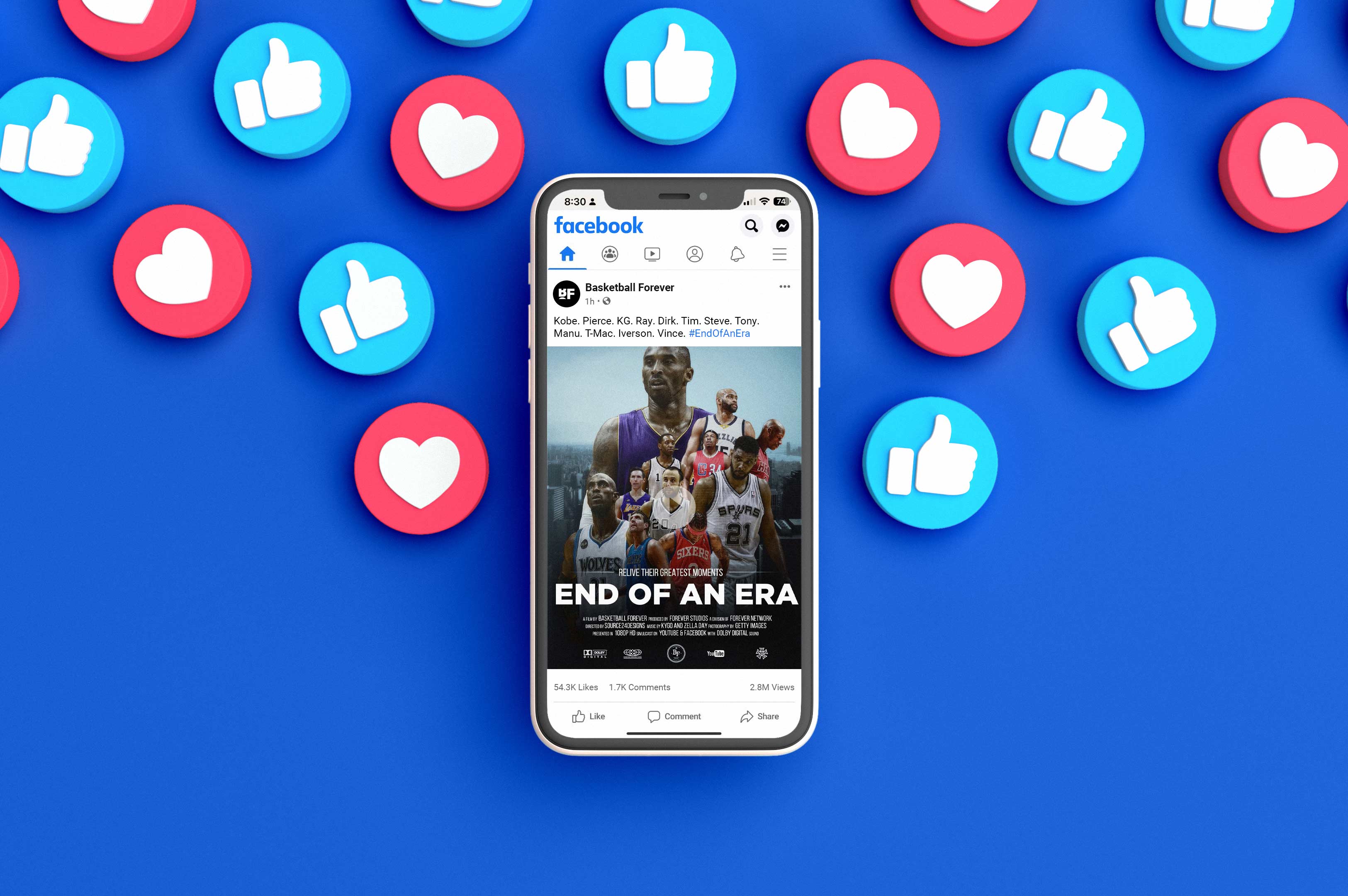
The response validated a deeper editorial instinct, that basketball, at its core, is a cultural archive of moments, eras, and identities that fans want to revisit and reinterpret. This moment became a creative inflection point for the brand. It established a blueprint for how we could balance scale with substance, using storytelling as a growth engine rather than a departure from it. These films built trust with the audience, signaling that Basketball Forever was willing to slow down, reflect, and create meaning in a feed otherwise optimized for speed. In doing so, we expanded from a content publisher into a storyteller with a point of view, capable of shaping how a generation remembers the game.
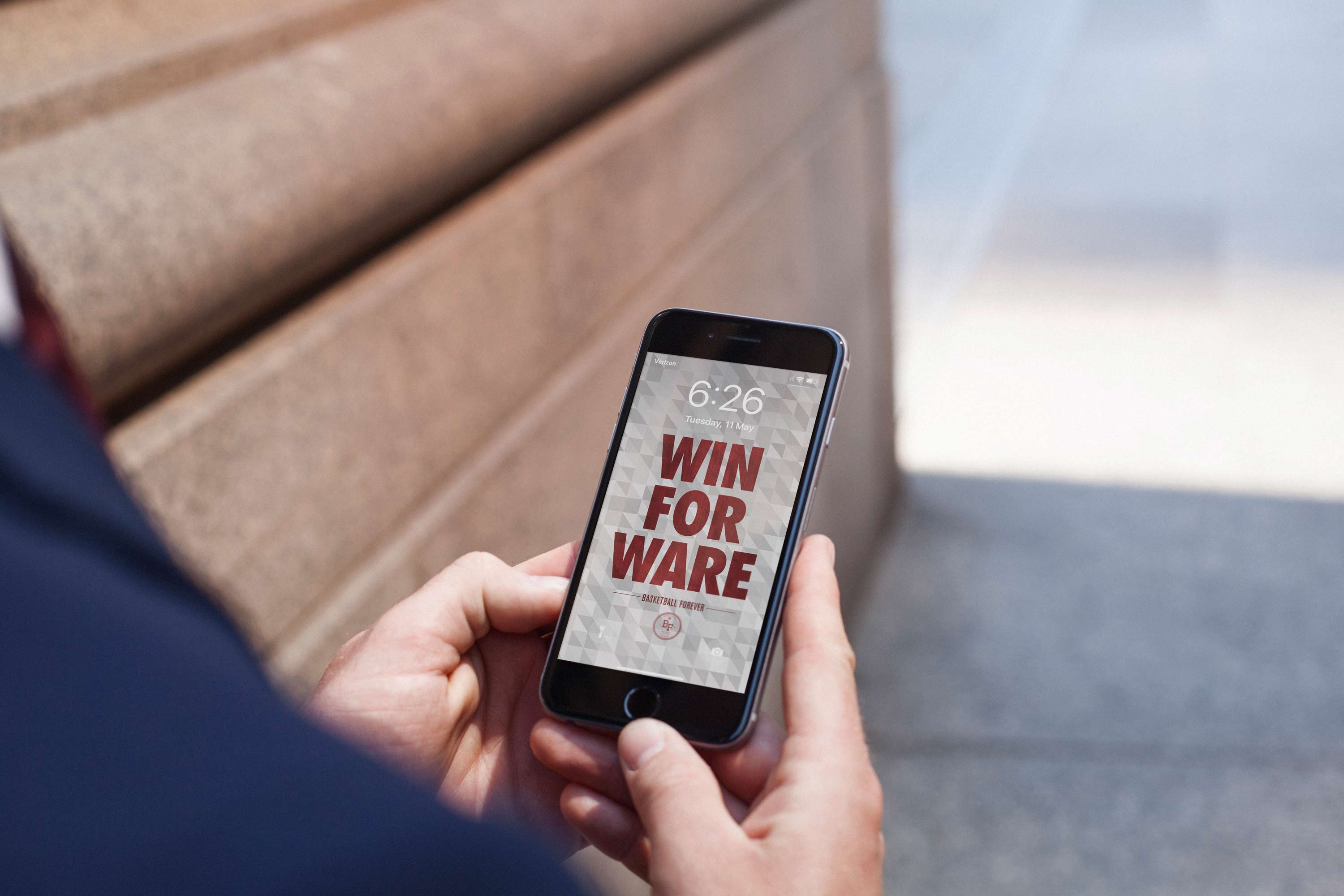
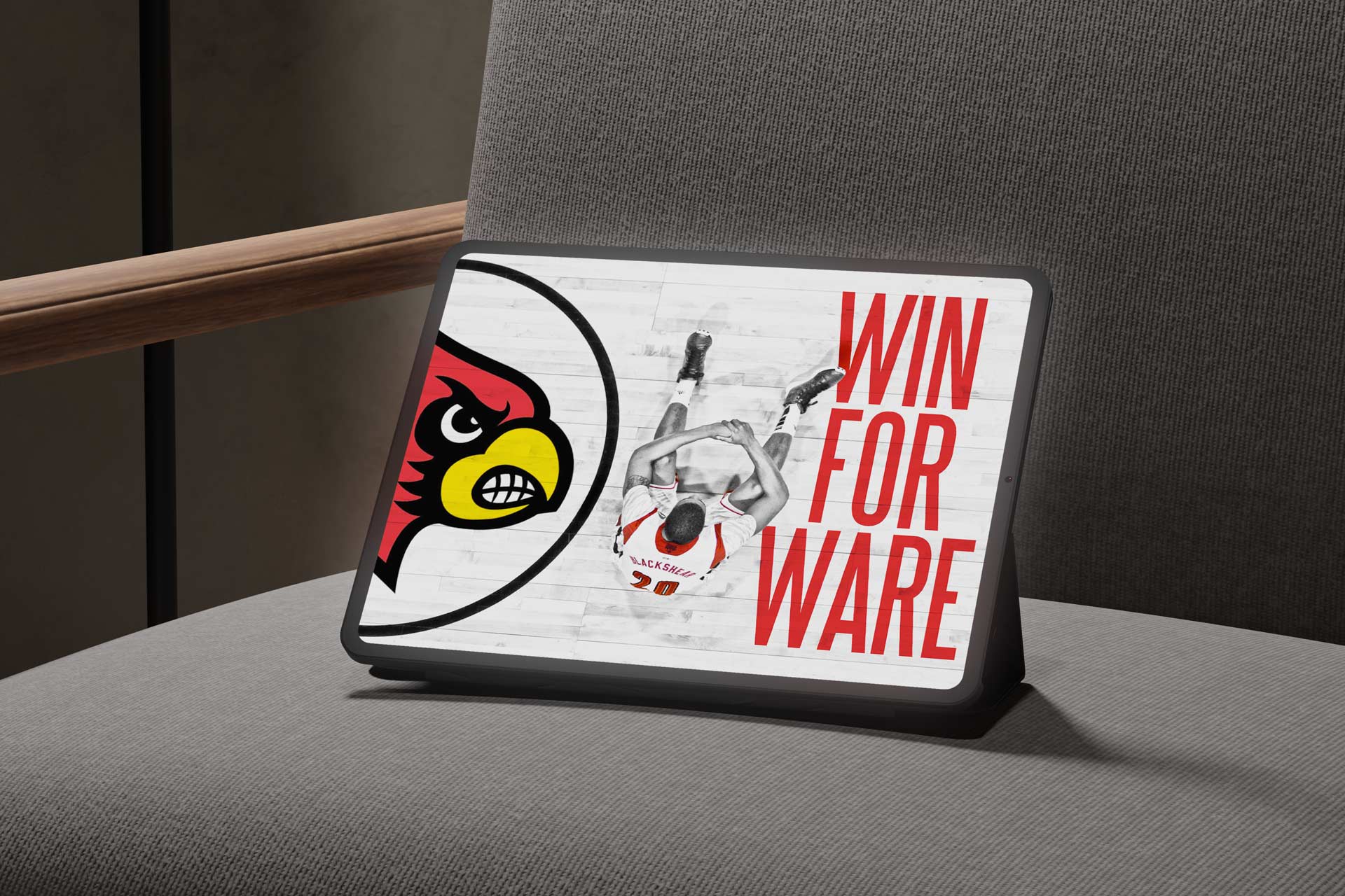
What made the evolution of Basketball Forever real was not just audience growth but the deliberate way we designed it to behave like a business long before it was treated as one. The same instincts I used to build identity systems translated into packaging the platform itself. I approached the page as a product with a clear value proposition, a defined audience, and repeatable formats that could support partnerships, merchandise, and cause-driven campaigns without eroding trust. Early test initiatives like our Win For Ware charity campaign proved the model. The fact is we were all tuned into the same games and having the same conversations. To build community, these moments tapped into that collective experience and allowed us to revel in our fandom.

Win For Ware started as a real time response to a moment that stopped the entire basketball world in its tracks. When Kevin Ware went down during March Madness, everyone was watching the same broadcast, reacting in the same way, and having the same conversations across timelines and group chats, and we recognized how rare that kind of collective attention and emotion really is. We moved quickly to design and launch a line of t shirts that captured that shared feeling, with proceeds going directly toward his recovery fund, positioning it not as merch but as a vehicle for support. The response was immediate and overwhelming, people did not hesitate because it felt native to the moment they were already living through. It showed us that when you are truly in sync with the audience, you can translate cultural energy into action, turning passive viewership into participation. That initiative made it clear we were building something more than content, it was a platform where community could rally, express itself, and create real world impact together.
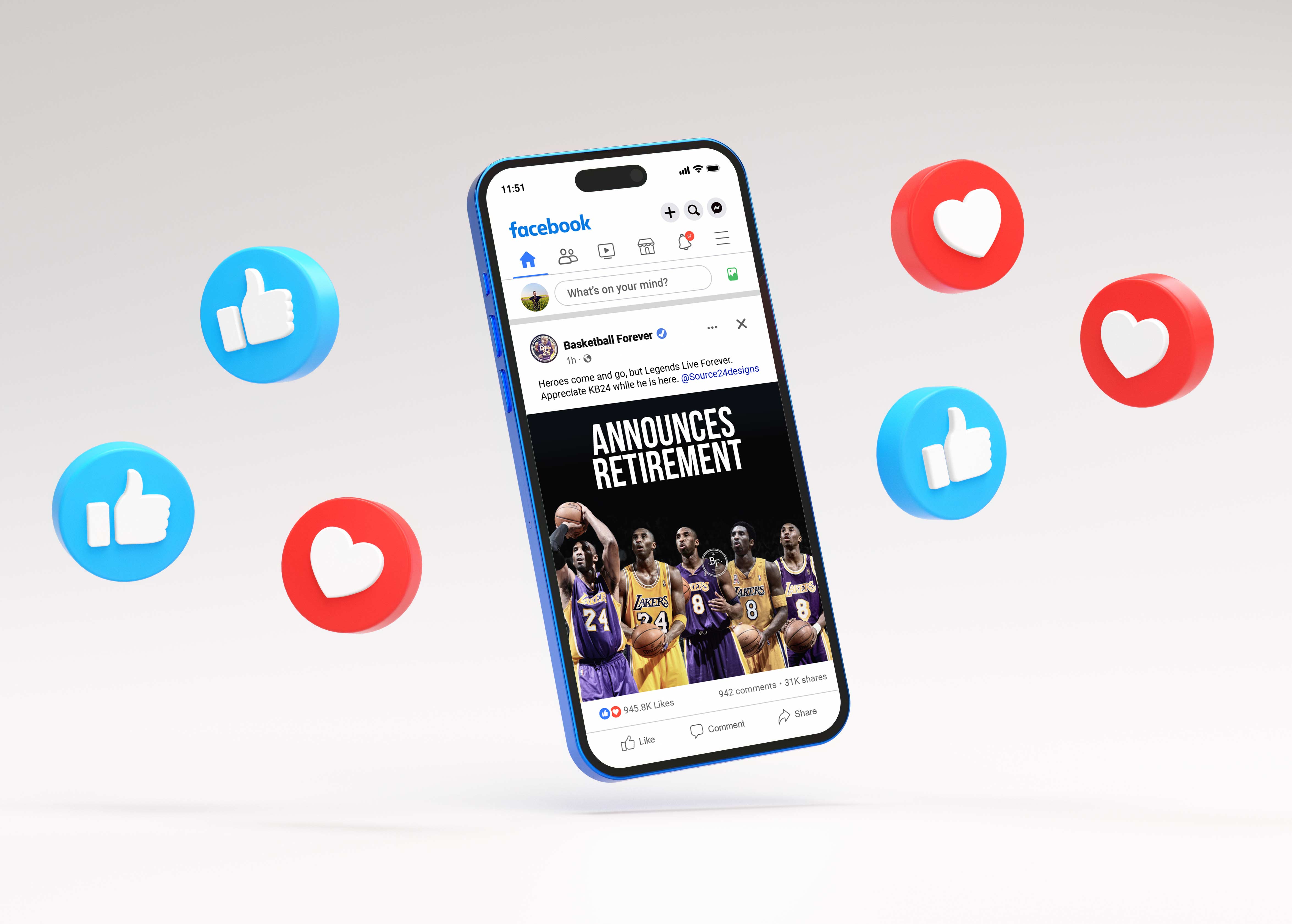
We were able to mobilize the community, drive meaningful reach, and convert attention into donations, demonstrating to partners and stakeholders that the platform could generate both cultural engagement and tangible impact. That moment created proof that Basketball Forever was not just a content destination but a channel capable of activating people at scale, which is the foundation of any viable media business. Series like End of an Era proved that Basketball Forever could create original storytelling that did more than chase engagement. It captured pivotal moments in the sport with emotional weight and narrative clarity, sparking conversation across fan communities and reinforcing that our platform could shape culture rather than simply react to it. Fans were able to rally around him in that moment and show support through our platform because of our consistent voice and presence.
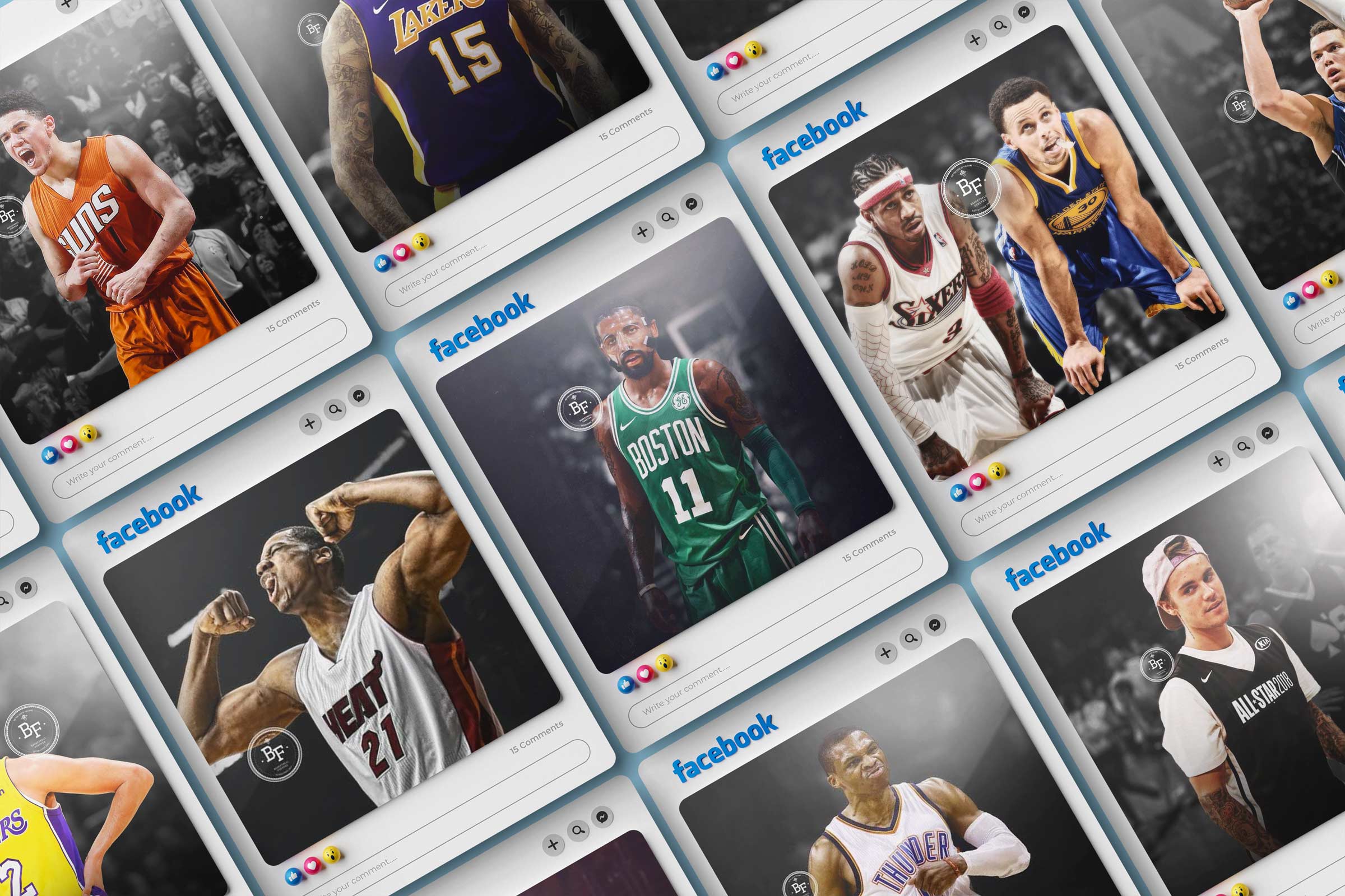
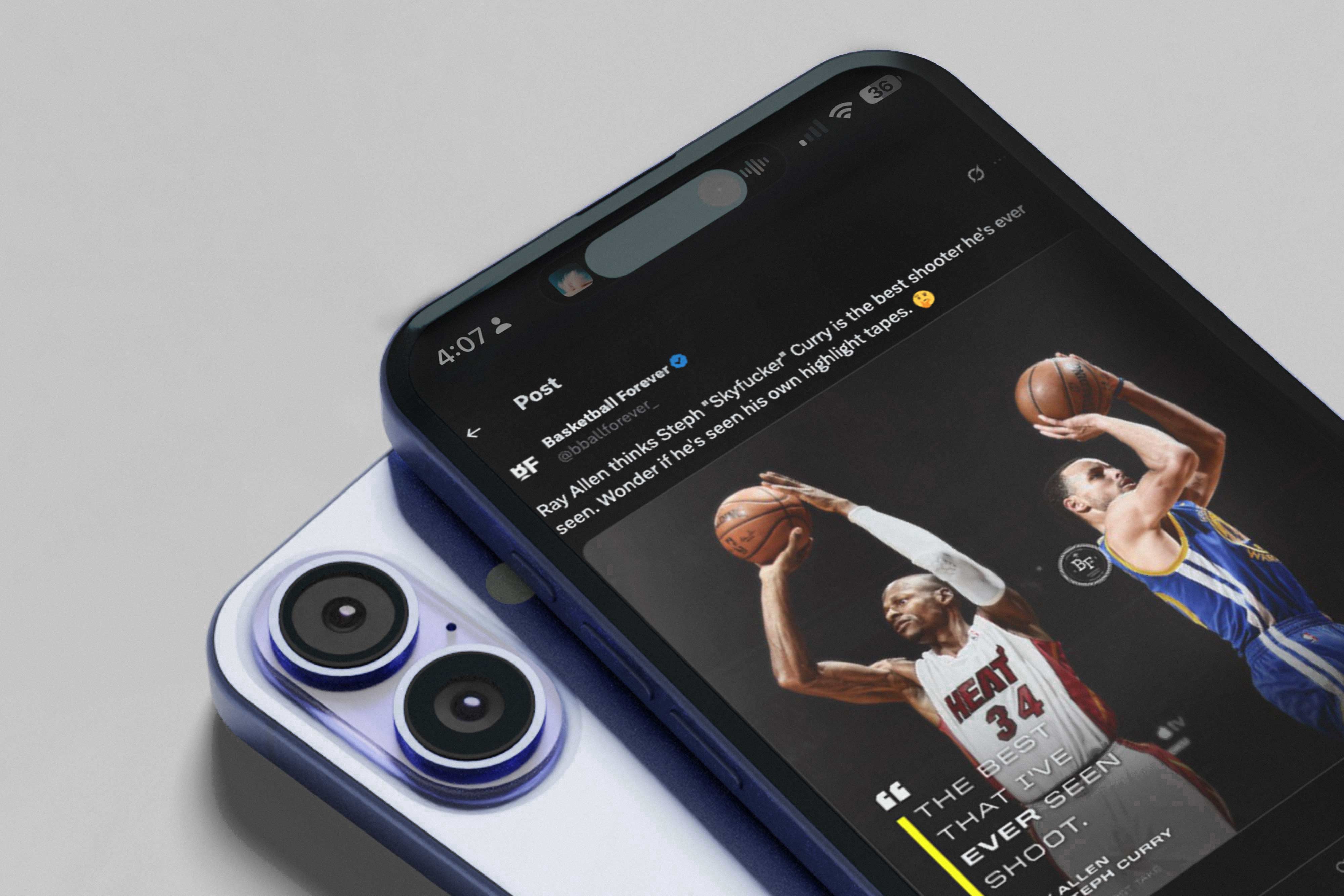
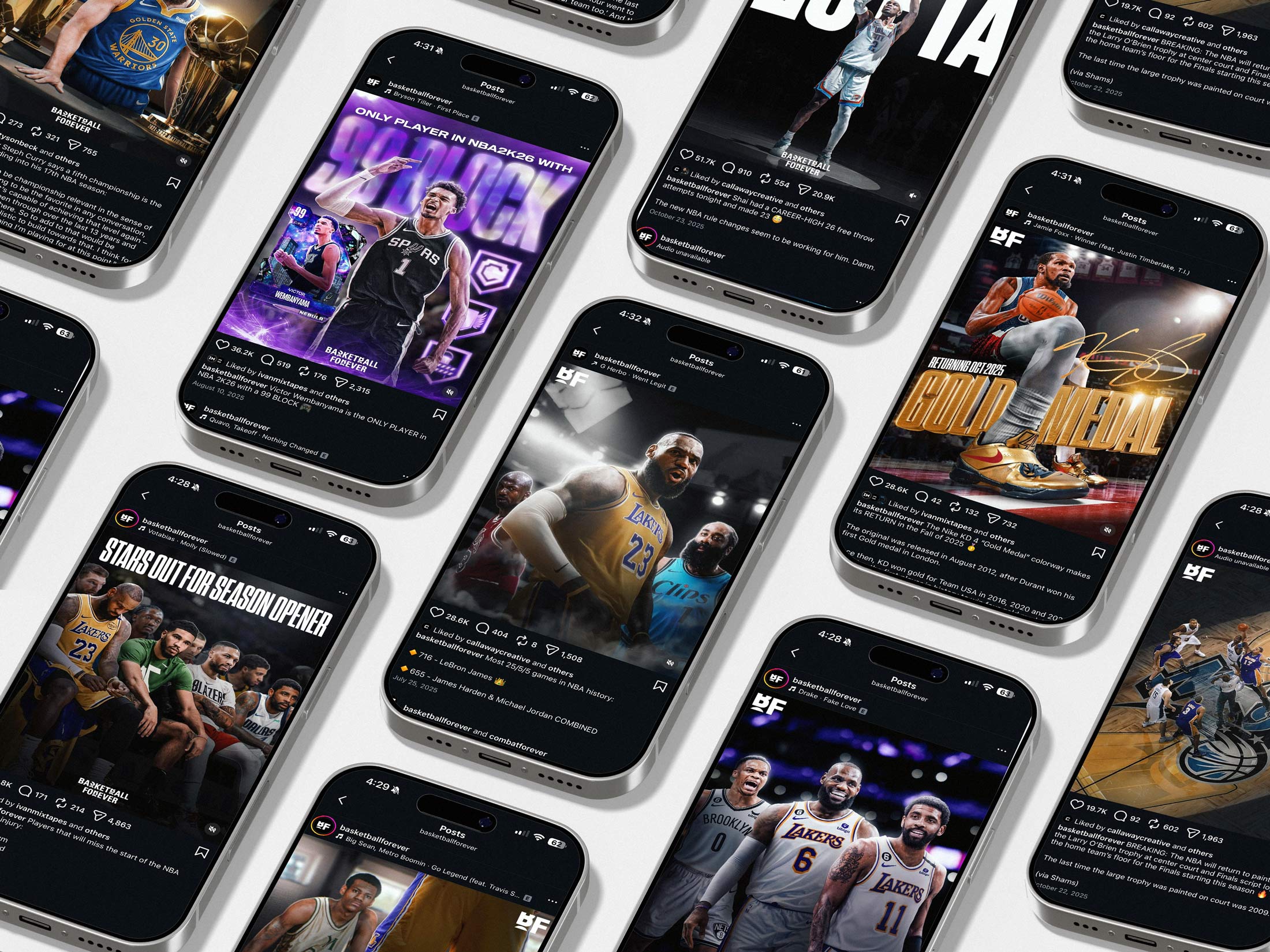
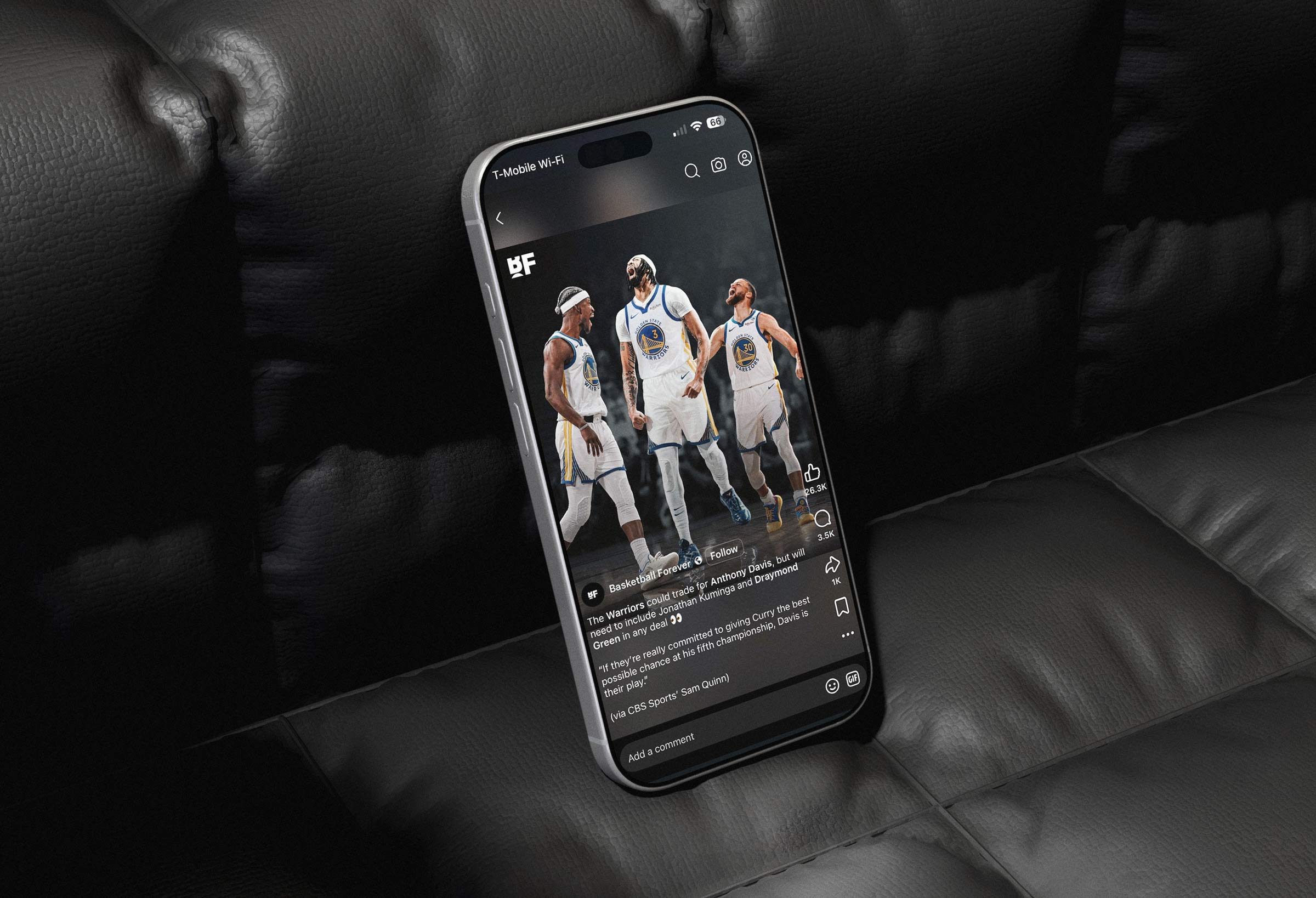
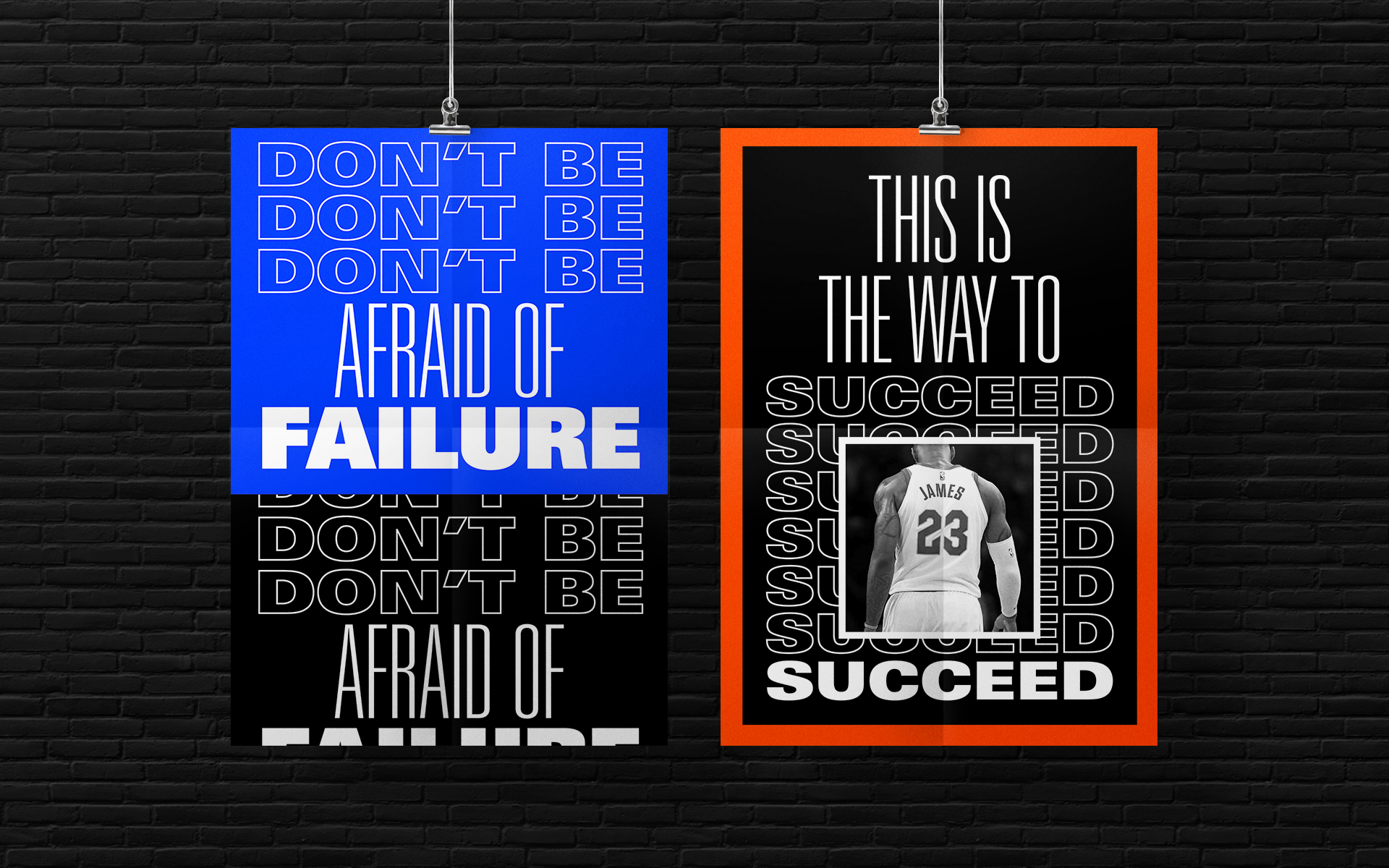
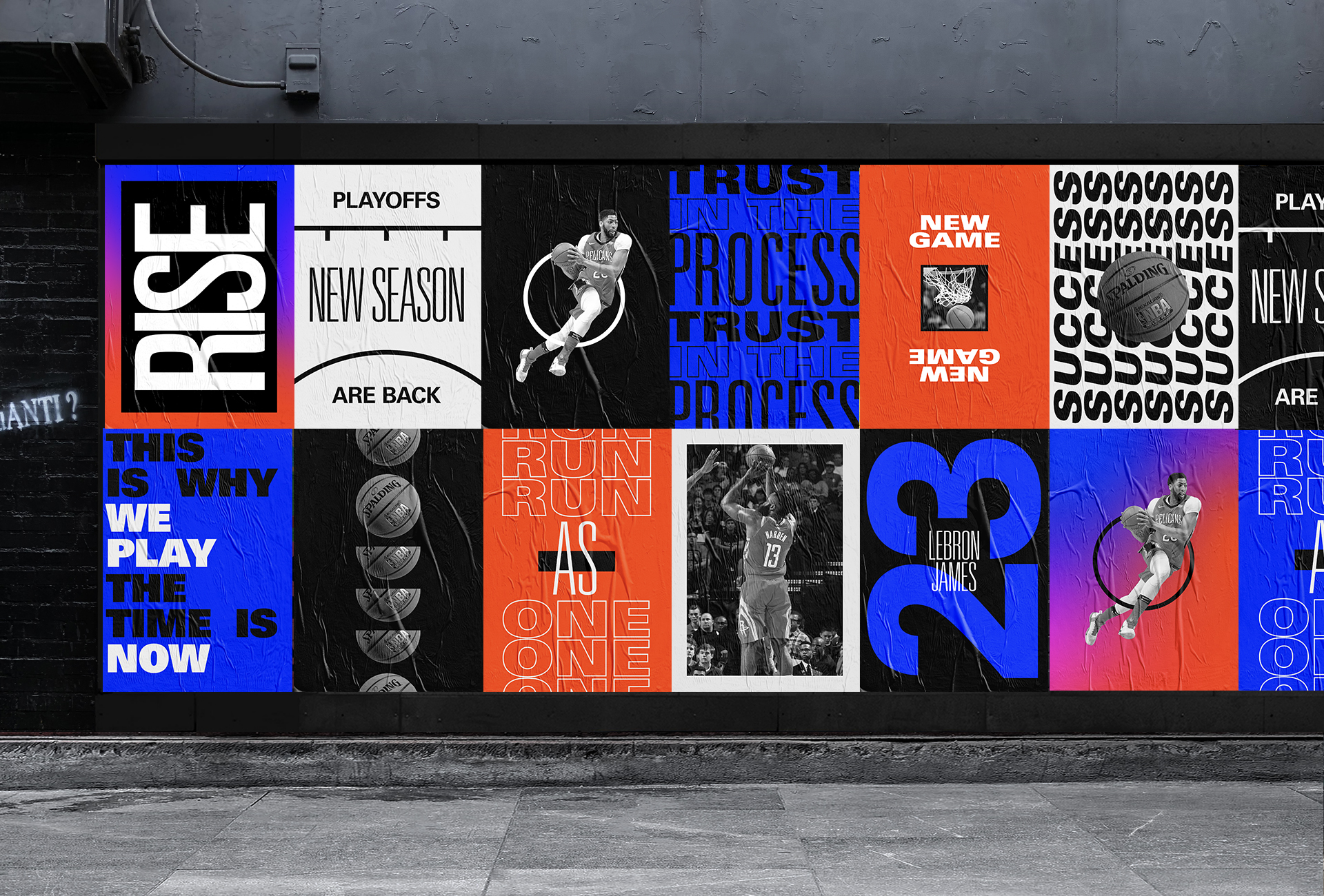
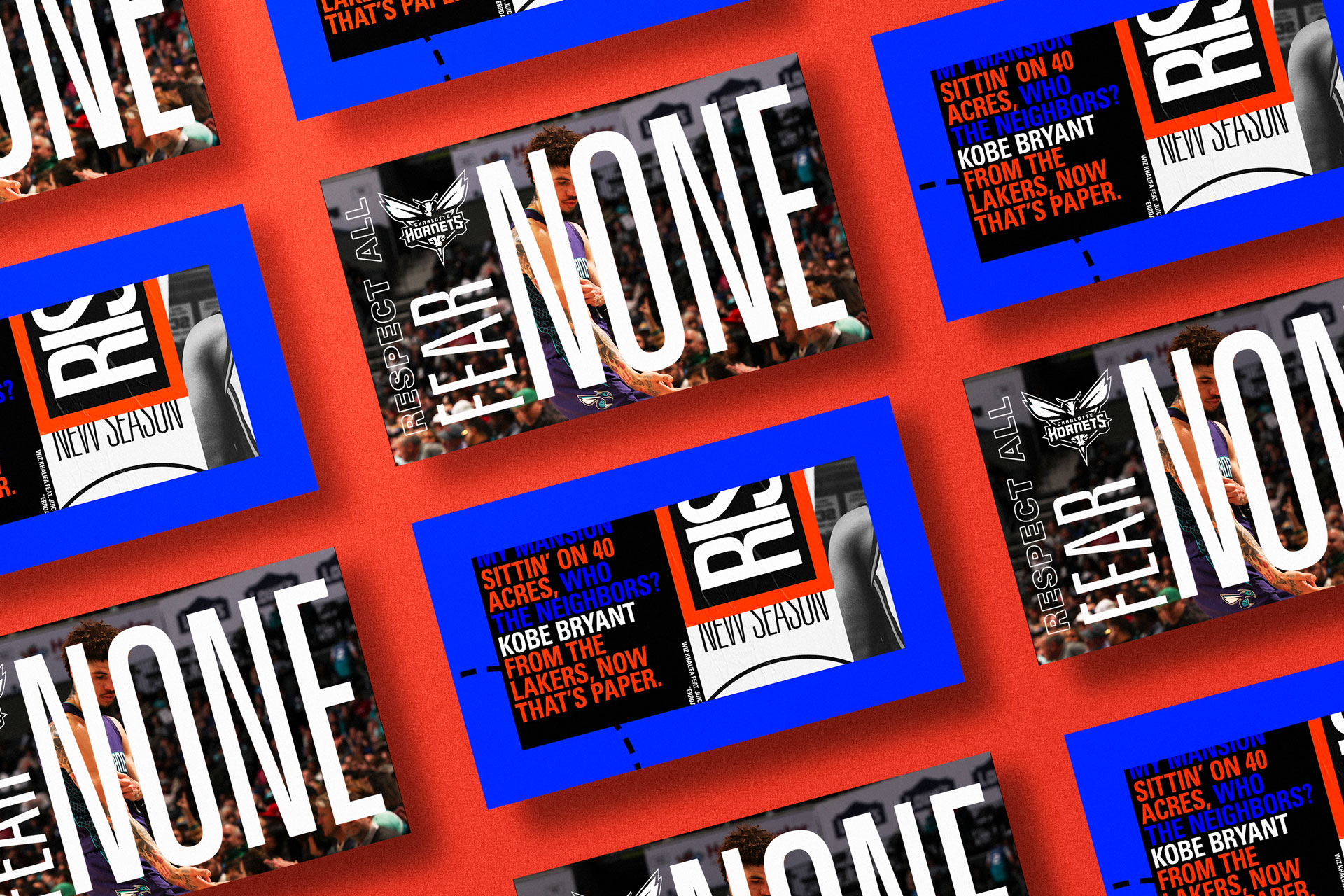
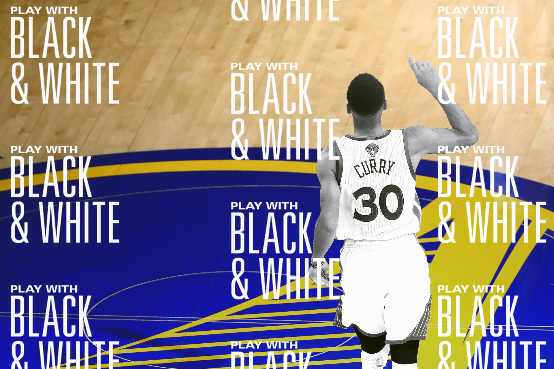
A major part of that viability came from how meticulously we treated imagery and visual consistency. At a time when most sports pages were reposting standard Getty photos with minimal treatment, we developed a signature look built around high-contrast black and white photography, deep shadows, and a controlled spotlight effect that isolated the player or focal point against a darkened background. The intent was emotional as much as aesthetic. The treatment created intimacy in a crowded feed, making each post feel like a quiet, reverent moment rather than another loud sports highlight. It mimicked the feeling of a player stepping into light before a game, a visual metaphor for focus, pressure, and legacy. This discipline gave the brand instant recognizability. A single scroll past a post was enough for audiences to know it was Basketball Forever without seeing the logo. That consistency became our unique value proposition, differentiating us from competitors and signaling to sponsors that this was a premium, own-able environment rather than a commodity feed. The people in our comments really felt like they knew us and the conversation was a two way street.
The clarity of the brand identity also played a crucial role in attracting early brand partnerships and sponsorship opportunities, which in turn strengthened our funding narrative. Advertisers need predictable environments. By establishing consistent layouts, safe zones, and visual standards, we created a brand-safe ecosystem where partner integrations could feel native rather than intrusive. Sponsored stat graphics, branded content, and co-created campaigns could slot into existing templates without disrupting the user experience. This demonstrated to investors that monetization pathways were already embedded within the design system, reducing risk and accelerating revenue potential. Basketball Forever needed to elevate its game to attract more funding as well as advertising dollars through new content vehicles that leveraged these tools. Some of our pre-rebrand video content shows how this expectation became the norm for our brand, and how I was insturmetnal in building that audience appetite.
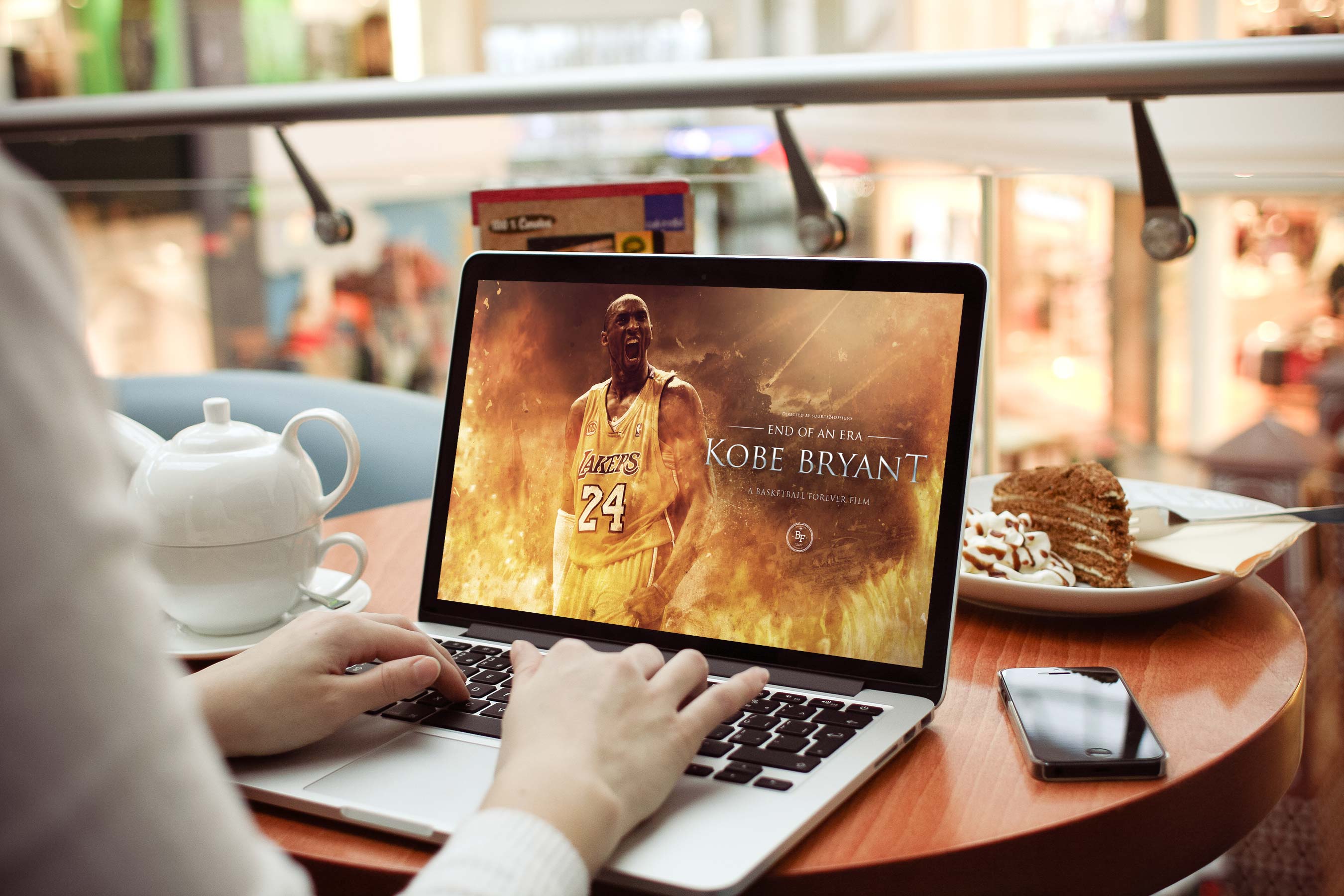
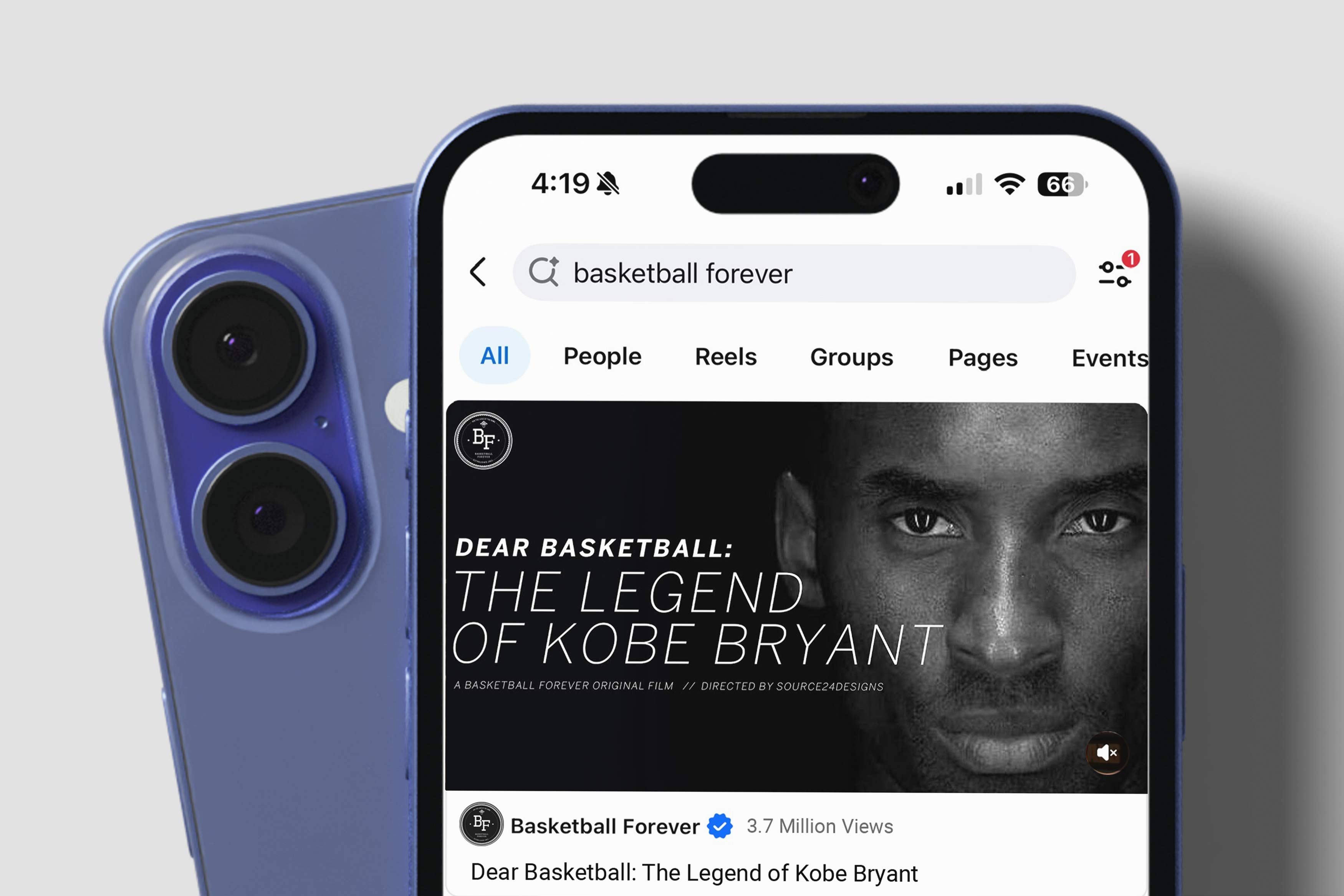
This evolution allowed new avenues of coverage and the development of distinct voices on different platforms. Twitter was a much more real time conversation, while platforms such a youtube provided a backdrop for a more dramatic and cinematic type of storytelling. For instance, the "Dear Basketball" Kobe Bryant tribute I directed and edited garnered over 3 million views and some media coverage. From more cinematic video content like that to far more news centric social news content like the Isiah Thomas piece above were all different storytelling vehicles I helped develop for the brand. It remains on of our most engaged with pieces of content ever (It was actually preceded by a similarly popular mix a little while prior to his final season called Rare Air) and is one of the most meaningful projects that I have had a chance to work on.

Dear Basketball was approached not as a piece of content, but as a film. I took ownership across the entire experience, from mastering the soundtrack and directing a voice actor to bring the poem into spoken word, to editing the full video, crafting the pacing, designing the titles, and building out the visual effects language. Every frame was treated with intention, balancing restraint and emotion to honor Kobe’s voice without overwhelming it. The goal was not to recap a career, but to translate a feeling, to let the audience sit inside the gravity of his words and the finality of that goodbye. The release itself was handled with the same level of care. I treated it like a premiere, shaping the marketing, rollout, and presentation to feel cinematic rather than disposable. What followed was a deeply emotional response from the audience, visible not only in the performance metrics but in the comments, where fans shared personal reflections, grief, and gratitude. It became more than a video, it was a collective moment of remembrance, reinforcing Basketball Forever’s ability to create work that resonates far beyond the timeline.
This meant setting a high bar for visual content across the board, with video operating as the core engine of growth, identity, and differentiation rather than a supporting channel. We approached every piece as both storytelling and system design, building a repeatable framework where narrative structure, pacing, typography, sound, and motion language worked together to create something instantly recognizable within seconds. Our most successful videos were deeply curated, storyline driven features focused on specific players, moments, or legacies, crafted not as highlight reels but as narrative experiences with tension, buildup, and emotional payoff. Through intentional editing patterns, cinematic sound design, and a distinct visual language that blended nostalgia with modern polish, we created content that felt premium yet native to the feed. This system allowed us to scale output without diluting quality, training the audience to expect a consistent level of depth and resonance while driving retention, shares, and habitual engagement. Over time, these videos did more than grow the audience, they defined the brand, shaping how a new generation experienced basketball storytelling online and establishing Basketball Forever as a cultural voice rather than simply a publisher.
Initial video experiments were more so intended to be around specific moments like an MVP or Championship as our video strategy was to amplify the biggest moments in sport using social. However another big focus for these videos was to capture the hectic yet euphoric moments and chaos of an NBA season and distilling it down to a bite size highlight package set to some amazing music that could easily be consumed on mobile phones in a short form setting. The recurring theme was high quality phantom cam level highlights mixed to bright and energetic music that built up to an epic conclusion featuring the biggest names in the game paired with the hottest sounds.
These types of videos really helped define the brand for consumers and made us look like we knew what we were doing, not just in terms of sourcing such high quality clips and editing them so professionally but even from a curation and tastemaking standpoint I felt that my ability to pick music that genuinely fit the vibe of the moment the fans felt in the season totally elevated it even more. Even minor adjustments like pitch shifting a song could have a huge impact in giving consumers a totally new experience. All these things were learned in the process of producing these kinds of hype tapes for Basketball Forever while also still maintaining the social presence and consistently posting on twitter and facebook and other platforms.
The idea with each video was to find unique ways to elevate highlights in an effort to seamlessly blend them with the music to tell a very compelling and comprehensive story. For example the "They Want to See Me Fall" mix I created featuring Steph Curry and Kevin Durant that featured a number of non traditional camera angles and user generated content incorporated in throughout the whole mix along with elevated transitions and typography and visual flourishes unique to my style.
The principle I really honed in on for these videos that I created and directed for Basketball Forever was a high level of attention to detail and an uncompromising level of effort in enhancing the matching of the music to the highlights. The videos were all started by me first listening to a track and visualising what a mixtape could look like, and this is why I always felt that the music was perhaps the most important part of any hype tape as it has to have the right flow and pacing, it has to have the right build up and slow moments to build up suspense. I would always strive to pick music that was unique and felt like it belonged in these mixes but brought a high energy. Often times I would look for something completely original or a twist on a popular hip hop or rap track. Half of the job is finding a sick flip or a high energy remix that our audience will die for.
This visual exploration went hand in hand with the editorial voice, which espoused an authentic connection with the average basketball fan. We aimed to connect with them at their level by capturing the sentiment that being a fan of a player or a team gave them every day of the year. Unlike other players in the market, we focused on quick turn brash social strategies that targeted consumers at the edge of their second screen experience. We spoke to them in the moment and provided a content menu that allowed us to capitalize on the moments they weren’t actively watching games as well as during them. This strategy of bringing the content to the consumer and removing as many barriers as possible between the creative and the customer was a key to brand growth. Convenience and relatability are what made the Basketball Forever brand flourish as it had an inherently authentic social voice that was the same as the audience consuming it. The main reason for that was that we were our own audience in many ways.
Basketball Forever was built on the belief that fandom is not a geography, it is a frequency. The same energy that lives in a pickup run in Manila, a late-night debate in London, a barbershop argument in New York, or a WhatsApp group in Mumbai all speaks the same language, the language of the game. Basketball became the connective tissue, but what truly scaled was the feeling: the inside jokes, the shared references, the irrational loyalty, the heartbreak, the mythology. “Ball is life” was never just a phrase, it was a recognition that for millions of people, the game sits at the center of identity, rhythm, and expression. Our role was to honor that universality while amplifying the nuances, creating a space where a fan from Lagos could see themselves in the same feed as a fan from LA, where humor traveled as easily as highlights, and where passion needed no translation. The hoop became a common tongue, a borderless dialect spoken through clips, memes, nostalgia, and debates, turning Basketball Forever into a global commons where the game, and the culture around it, could exist without friction, hierarchy, or permission.
Our posting strategy was built around a simple but powerful insight: fans did not want to wait for polished recaps from traditional outlets when the emotion of the game was already unfolding in real time across their phones. I spearheaded an approach that prioritized speed, relevance, and emotional immediacy, creating content that felt like it was emerging from inside the culture rather than being translated for it afterward. We posted with the cadence of the internet, not the cadence of broadcast, which meant reacting to breaking moments, hot takes, podcasts, fan debates, player narratives, memes, nostalgia, and cultural cross currents with a fluency legacy media could not match and a speed tha would break necks.
Facebook in that era rewarded consistency, conversation, and shareability, so I helped architect a content engine that kept the page alive at all hours with posts designed to provoke response, spark debate, and move fluidly through fan communities. We treated the feed as a living system rather than a static channel, calibrating tone, timing, and format to align with how the algorithm surfaced content and how audiences actually engaged with it. The goal was never volume for its own sake, but a disciplined cadence that created expectation and habit, where the audience returned not out of chance but because they trusted the page to deliver something timely, culturally aware, and emotionally resonant. By pairing data-informed iteration with strong creative instinct, we were able to compound reach organically, turning engagement into distribution and distribution into sustained audience growth.
This was also the moment when the ceiling of Facebook’s walled garden felt both visible and breakable, and cultural flashpoints like BuzzFeed’s watermelon livestream proved how massive the upside could be when you truly understood the platform’s mechanics. That stream was not about a watermelon, it was about tension, anticipation, and collective participation engineered natively for the feed, and it drew millions into a single moment because it aligned perfectly with how Facebook prioritized watch time, comments, and real-time interaction. I approached Basketball Forever with that same lens, treating every post as an opportunity to hack distribution through emotional triggers, community identity, and algorithmic fluency. By designing for the feed rather than simply publishing into it, we were able to consistently break through, drive exponential reach, and build a system that turned engagement into sustained audience growth within one of the most competitive attention environments on the internet.
We understood early that engagement was not a vanity metric but a signal of community formation, and that every like, share, and comment was part of a larger feedback loop informing the brand’s evolution. In many ways, we were prototyping the playbook that would later define modern social publishing, treating the platform itself as both distribution channel and editorial environment. I pushed us toward a more aggressive and expansive vision of what social media could do for sports storytelling, turning posting strategy into product strategy long before that language became commonplace. That first movers advantage really paid dividends in the long run for us as we disrupted the space and put legacy brands and media companies on notice that there was a new kid on the block in the sports media landscape.
I cared deeply about the long-term trajectory of Basketball Forever, not only as a creative platform but as a scalable media asset with real venture potential. I saw early signals that others might have overlooked, strong engagement velocity, repeatable content formats, and a deeply embedded audience that hinted at product market fit beyond pure content. To me, these were not vanity metrics, they were leading indicators, the kind of early traction that triggers conviction in an angel round. There were clear glimmers of defensibility in the brand’s voice and distribution model, along with optionality across commerce, IP, and partnerships that could expand total addressable market. This was far more than just social or a website or some silly sports videos.
I began thinking in terms of retention curves, lifetime value, and how we could build owned channels that compound rather than rent attention. It felt like we were sitting at the top of a funnel that could evolve into a multi-vertical ecosystem if nurtured correctly. The opportunity was to invest in systems, brand equity, and original IP before scale diluted intention. I wanted to treat every creative decision as if it were a seed investment into the company’s future, building something that could sustain real enterprise value. The goal was to build something sustainable for fans that they were craving.
One of the most important things I understood early was that Basketball Forever was not simply growing an audience, it was building a flywheel. Social content generated attention, but attention alone was never the end goal. What mattered was converting that attention into habit, trust, and repeat engagement, because that is what turns a page into a brand and a brand into a business. The more consistently we delivered timely, emotionally resonant, and visually recognizable content, the more the audience returned, shared, and identified with the platform as part of their daily basketball ritual.
That trust created the conditions for monetization, making sponsor integrations, branded content, merchandise, and owned platforms feel like natural extensions of the ecosystem rather than opportunistic add-ons. Social became the top of the funnel, but it also became the proving ground, where we could test formats, validate demand, and observe behavior in real time before expanding into web, commerce, gaming, and additional verticals. In that sense, the feed was never just a publishing destination, it was an engine for product validation, brand building, and long-term enterprise value. What began as a Facebook page ultimately functioned like the front end of a much larger business architecture, and I was instrumental in recognizing, shaping, and designing for that reality long before it became obvious to the broader market.
Basketball Forever’s rise mirrored the early trajectory of a publisher like Vice, not in form but in spirit, emerging from the edges of culture with a point of view that felt raw, opinionated, and unmistakably of its audience rather than for it. Like Vice in its early days, we were not trying to replicate legacy media, we were building something native to the platforms and communities we lived in, where authenticity, speed, and cultural fluency mattered more than polish or institutional access. What started as a niche voice quickly scaled because it tapped into an underserved appetite, speaking the language of fans in a way traditional outlets could not, blending humor, nostalgia, debate, and identity into a constant stream of content that felt alive. The parallels sit in that outsider energy turning into influence, where a brand that began on the margins becomes a defining voice, shaping how a generation consumes and participates in culture while still retaining the edge and instinct that made it resonate in the first place.
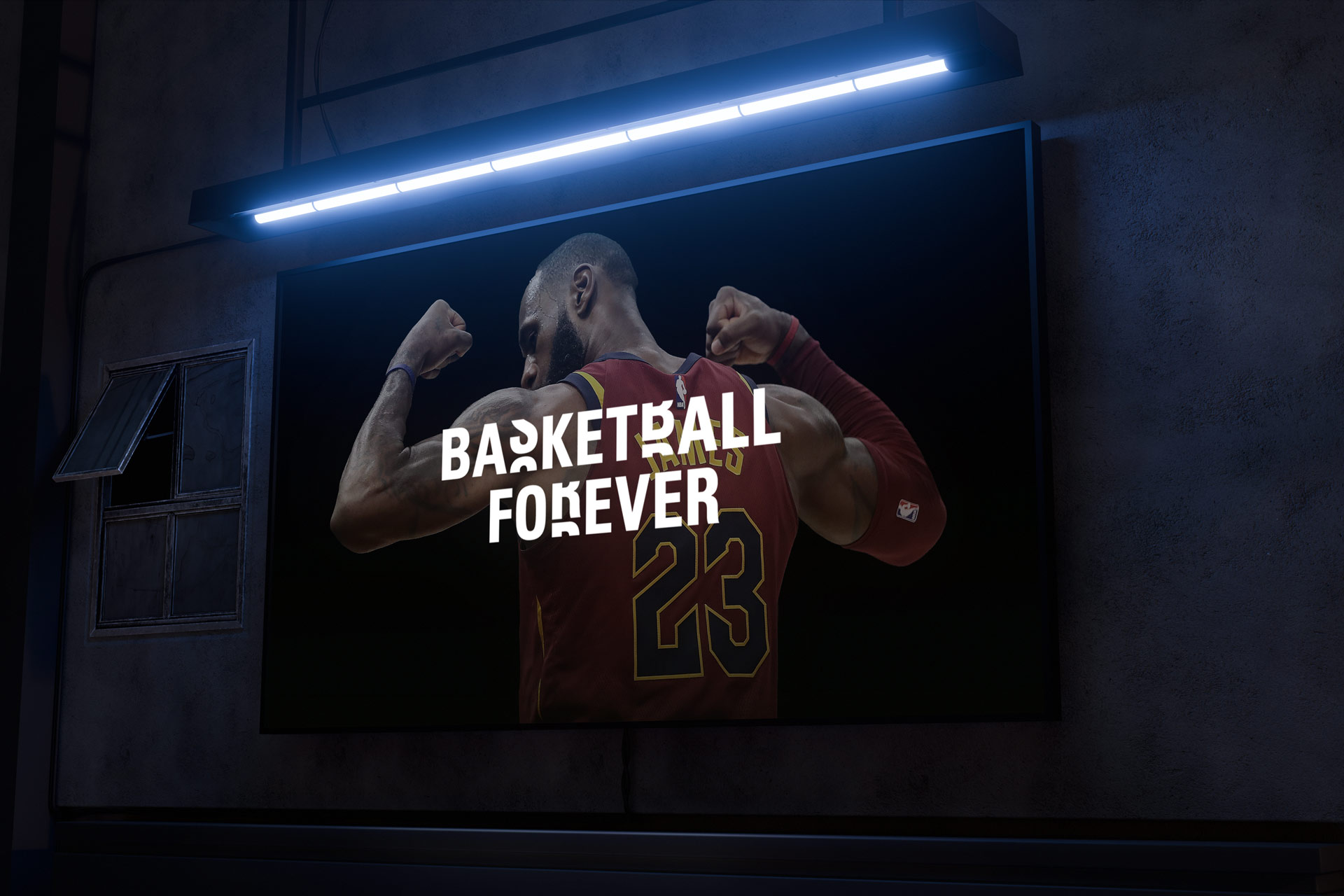
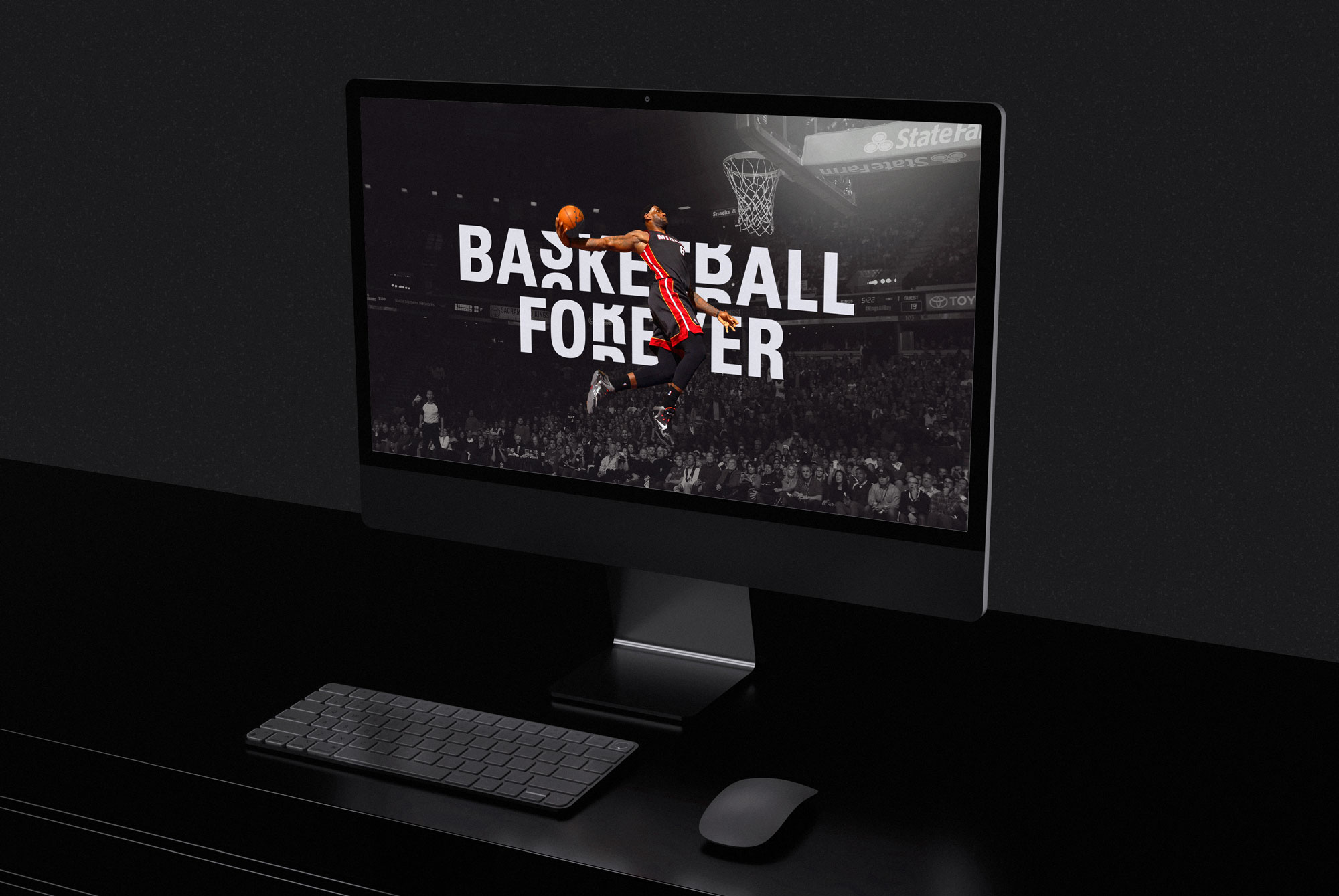
This evolution in voice and behavior demanded a visual system that could keep pace. The original identity had served its purpose, but as Basketball Forever matured into a more expansive storytelling platform, it became clear that the brand needed a mark and typographic language that could carry greater cultural weight. I brought in Not Real deliberately, selecting them for their nuanced understanding of type as both a functional and expressive tool. Together, we developed a new logo system that was confident, adaptable, and built for motion, something that could live seamlessly across social feeds, live content, merchandise, and long-form storytelling without losing its integrity. The process was deeply collaborative but tightly directed. I worked closely with the team to ensure the typography reflected the same immediacy and authenticity that defined our editorial voice. The result was not simply a visual refresh, but a recalibration of how the brand shows up in culture. The new identity allowed us to scale with intention, giving Basketball Forever a sharper, more ownable presence while maintaining the raw, fan-first energy that made it resonate in the first place.
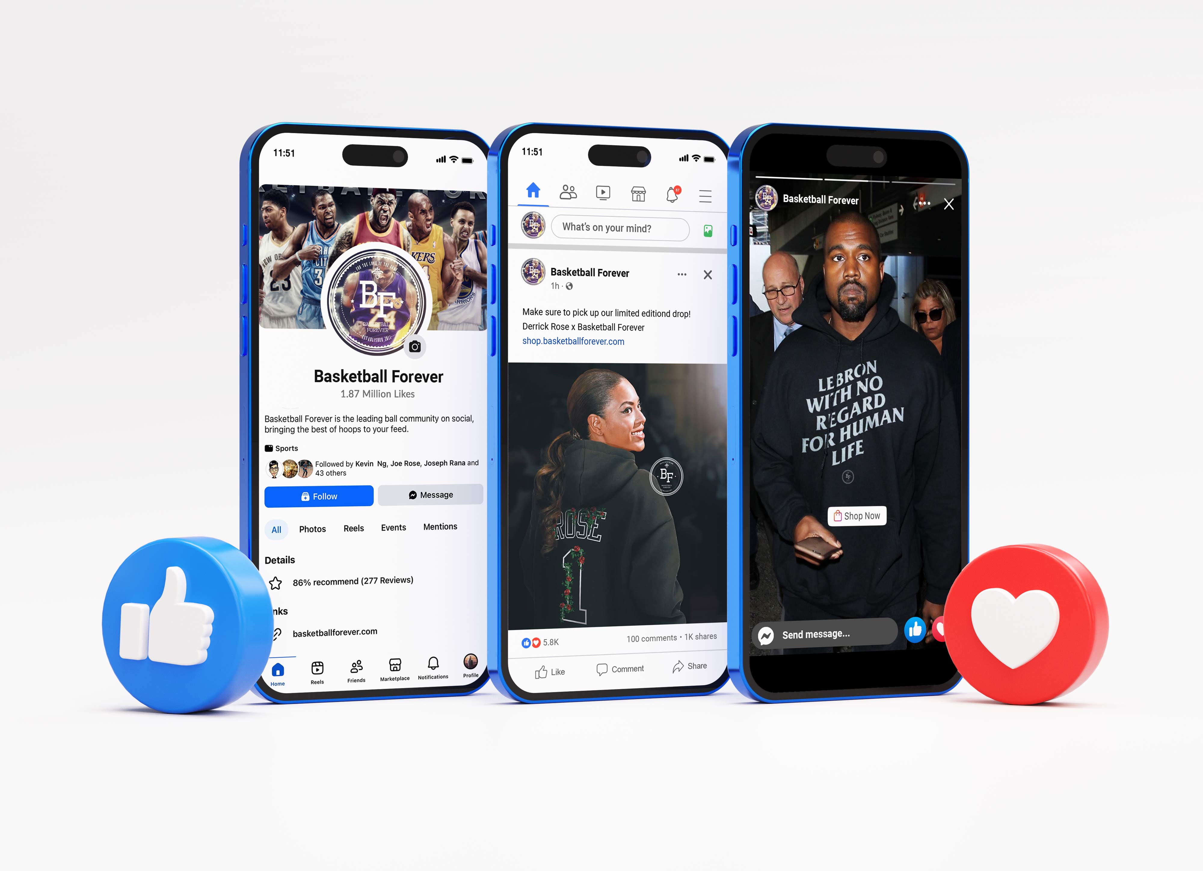
As the platform matured, we built a diversified revenue model that was native to the ecosystem rather than layered on top of it. Sponsored social content became a core driver, with brand integrations seamlessly embedded into our design system so they traveled organically through the feed alongside editorial posts. We extended that into real-world impact through events, including large-scale brand collaborations like our Nike Streetball Tournament, which translated digital community into physical experience and reinforced the brand’s cultural credibility. Native advertising and long-term partnerships with forward-thinking companies such as Kalshi and Polymarket allowed us to align with products that matched our audience’s interests while maintaining authenticity in how they were presented. While I do acknowledge monetization and ethtical issues around the sports world slow descent into more and more normalized betting and gaming avenues for casual consumers to get into gambling, I think there is still work to do on how to integrate this properly.
Interactive activations became another key lever, particularly in moments like NBA 2K launches, where we designed campaigns that encouraged participation, competition, and second-screen engagement rather than passive consumption. At the same time, we built pathways to owned platforms, driving traffic to our website for deeper editorial content and ad monetization, while using social momentum to convert audience affinity into merchandise sales. Each of these streams was not isolated, but interconnected, forming a cohesive commercial ecosystem where content, community, and commerce reinforced one another. This multi-layered approach proved that a social-first sports brand could generate meaningful revenue across touchpoints without compromising the trust or experience of its audience. It was important to us to be as responsible as we could in how we went about scaling.
To be a modern basketball brand is to understand that the game no longer lives only on the court or within broadcast windows. It exists in an always-on cultural loop shaped by social media, music, fashion, gaming, and global fan conversation. Today’s fans experience basketball through highlights in their feeds, tunnel fits on Instagram, debates in group chats, sneaker drops, fantasy stats, and viral moments that travel faster than any recap show. A modern basketball brand must operate at this intersection of sport and culture, speaking the visual and linguistic language of the internet while preserving the emotional gravity of the game. It must be real-time, participatory, and platform-native, designed not only to inform but to spark dialogue, identity, and community. In this landscape, relevance is earned through authenticity and speed, and the brands that matter are those that reflect how fans actually live the game: across screens, across borders, and far beyond the final buzzer.
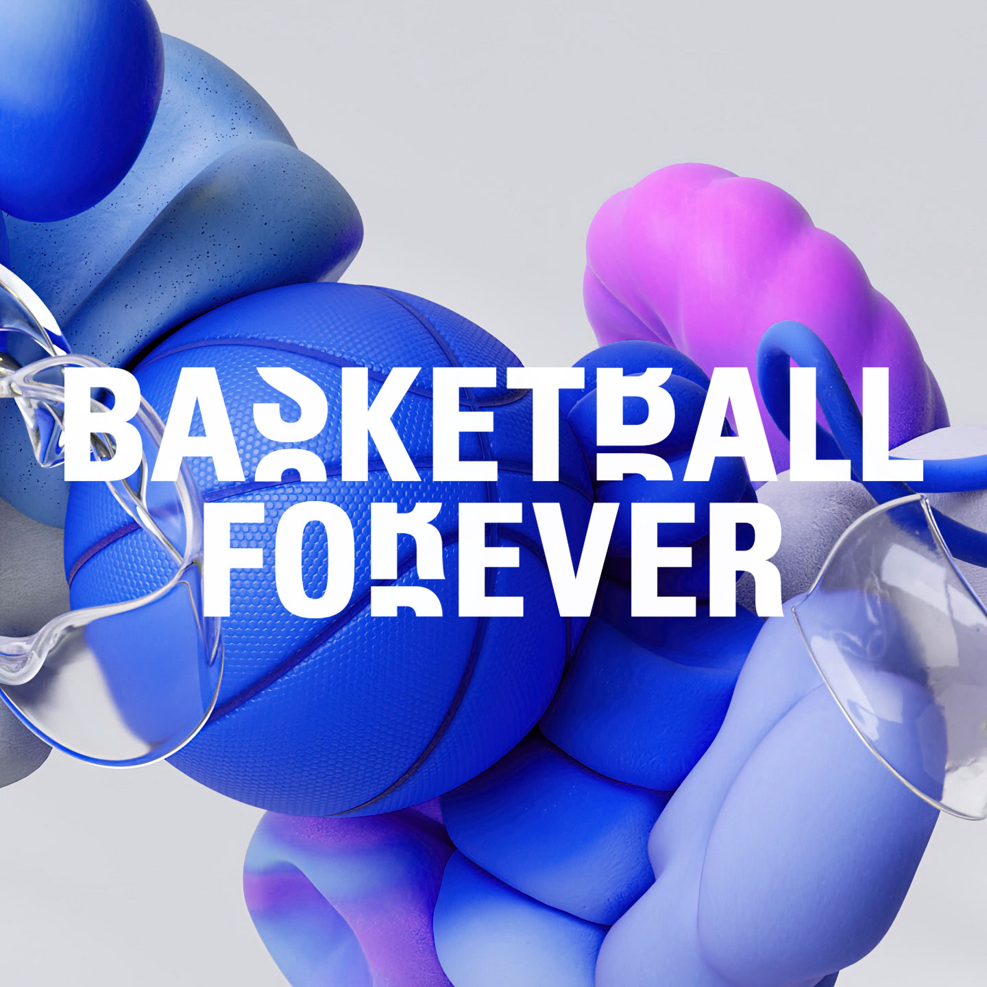
I served as the principal creative visionary responsible for defining, building, and scaling the brand’s visual and editorial identity from inception. What began as a social experiment quickly evolved into a global, social-first basketball media platform, and my mandate was to architect a design system and brand language capable of operating at internet speed without sacrificing coherence or cultural credibility. I established the creative north star, defining the brand’s aesthetic DNA, motion grammar, typographic hierarchy, and platform-native storytelling conventions at a time when legacy sports media remained tethered to broadcast paradigms. The result was a distinctive, instantly recognizable visual ecosystem engineered for infinite scroll environments, optimized for engagement velocity, and calibrated to resonate with a generation of fans whose primary relationship with sport lives on mobile devices. Basketball Forever refreshing to a new elevated look and feel was a culmination of this journey.
.gif)
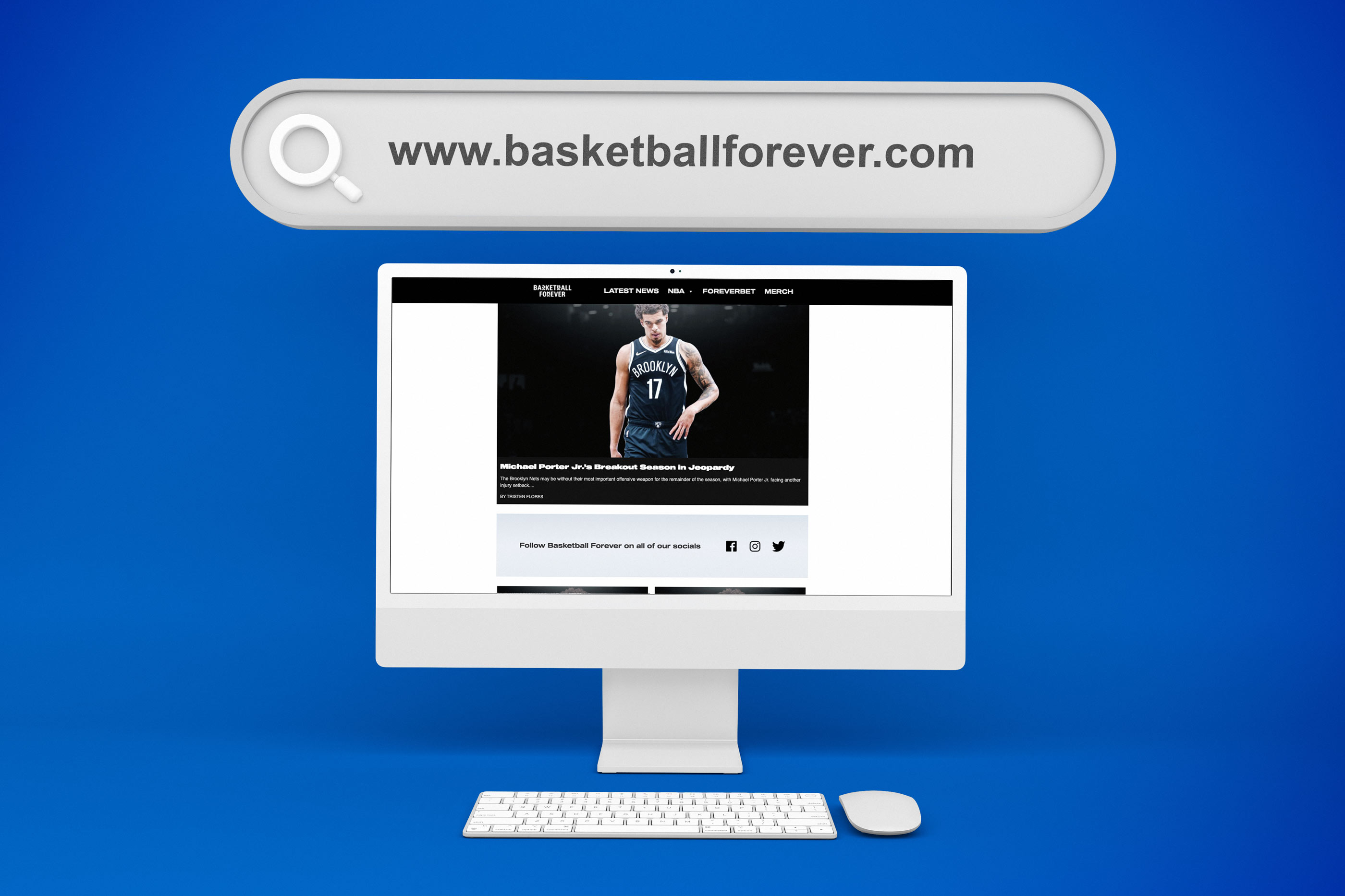
Overtime, through the expansion of our social channels and reach we made the decision to launch a web presence as well to capitalize on these ongoing conversations that we had spurred. By creating a website we were able to funnel our social audience into a walled garden allowing for a more curated experience for users. We were also able to offer them more robust shopping and ecommerce options as well which was a key aspect of our monetization strategy. Traditionally most media companies would do the inverse approach where their editorial strategy would inform their social strategy like I had said earlier, but by focusing on the wants and needs of our audience from a social standpoint, our editorial strategy was able to amplify existing voices and add fuel to the fire of the conversations going on at the moment. This allowed us to transfer the momentum we had on social to our owned and operated channels as well as to our brand and the energy could carry through to events and app and digital.
.jpg)
Basketball Forever’s core advantage has always been its ability to operate with the speed, adaptability, and experimental mindset that legacy sports media organizations struggle to match. Unencumbered by broadcast schedules, league politics, or legacy workflows, the brand built a publishing engine optimized for real-time cultural participation, allowing it to test formats, iterate creative, and launch new verticals at a pace aligned with the rhythms of the internet rather than the constraints of traditional media. I always encouraged us to experiment and to be on the cutting edge of disruptive innovation for our sector the way steel rebar had disrupted its economy. Being witty, paired with the speed to market gave us the combination of authenticity and immediacy that set us apart from all of our establishment competitors and made us an interesting investment.
This nimbleness enabled rapid prototyping across content, commerce, community platforms, and Web3 initiatives like Hoop Hounds, turning audience feedback into product evolution in near real time. By treating its global fanbase as both an editorial compass and an innovation lab, Basketball Forever transformed agility into a strategic moat, proving that in a fragmented attention economy, the ability to move fast, learn faster, and co-create with your audience is more valuable than legacy access or institutional scale and then respond in an authentic voice that feels deeply resonant with them.
Speed to market was not a byproduct of our system, it was a core principle I designed for from day one, recognizing that in social media, timing is often more valuable than perfection. I built a content and design framework that allowed us to react to moments as they were happening, turning breaking news, highlights, and cultural shifts into fully formed, branded assets within minutes. This required a balance of preparation and flexibility, where templates, typographic systems, and layout logic were pre-engineered to enable rapid deployment without sacrificing visual integrity. I pushed the team to operate at the pace of the game itself, publishing in real time so we could participate in the conversation rather than recap it after the fact. That immediacy created a competitive advantage over legacy media, who were constrained by slower editorial workflows and broadcast cycles. Speed became a signal of relevance, reinforcing to our audience that we were tapped into the moment as it unfolded. It also created a feedback loop, where fast iteration allowed us to learn, refine, and improve continuously based on real-time engagement. Ultimately, speed to market was not only about being first, it was about being present, shaping the narrative as it happened and earning a place at the center of the fan experience.
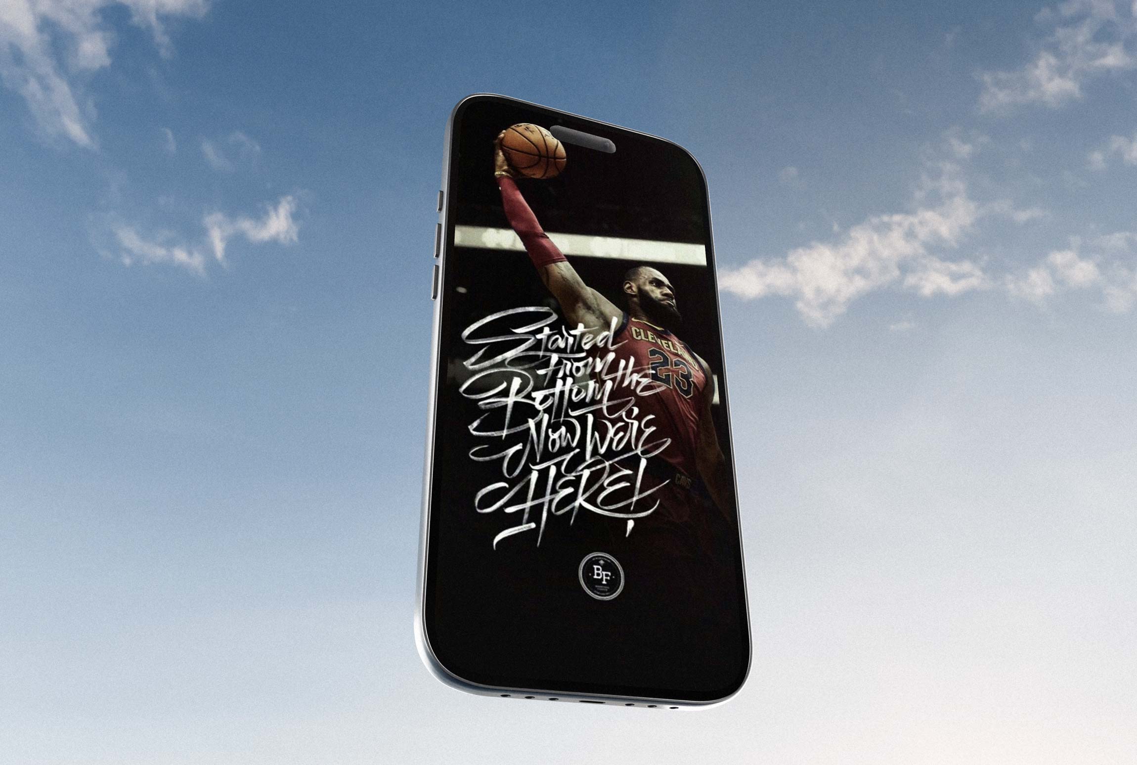
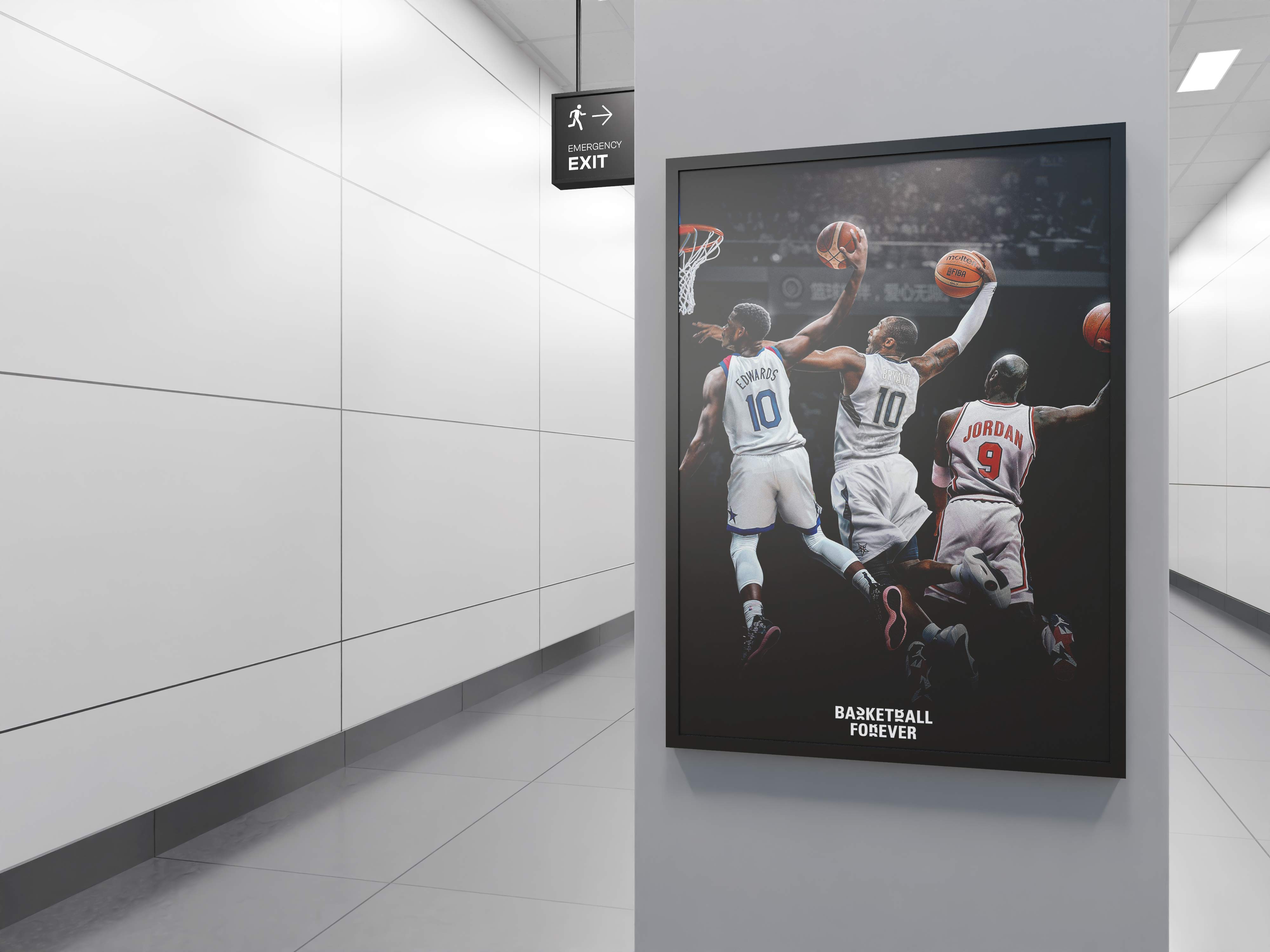
Dynamic player imagery became one of the most defining elements of the Basketball Forever visual language, and I approached it with a clear intention to capture not just what the player was doing, but what they were feeling in the moment. I emphasized expressive faces, tension in the body, and peak-action frames, isolating moments where emotion and movement converged into something instantly legible on a small screen. Rather than relying on static or generic poses, I curated and composed imagery that carried momentum, whether it was the extension of a dunk, the strain of a contested layup, or the intensity in a player’s eyes mid-play. This is something I was a huge stickler on, as I felt photography was the soul of our brand.
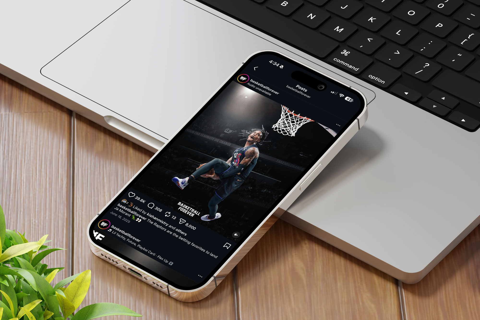
The goal was to make every image feel alive, as if it could move even when frozen. I layered these moments with motion-inspired treatments, textures, and compositional flow that guided the eye across the frame, reinforcing a sense of speed and continuity. By prioritizing facial expression alongside action, I ensured that the content resonated on a human level, allowing fans to connect emotionally, not just visually. This approach transformed imagery from simple documentation into storytelling, where each post carried energy, drama, and narrative weight. It became a signature of the brand, making every piece of content feel immediate, visceral, and unmistakably Basketball Forever. This attention to detail and intimacy even down to the photos was our specialty.
From a design systems perspective, I developed a modular, component-based framework that enabled rapid, high-volume content production across time zones while preserving brand integrity. I commissioned Spain based agency Not Real to help me scale and develop the visual identity toolkit as we embarked to rebrand Basketball Forever. This included creating a flexible typographic system built on bold, condensed sans serif families for headline impact, paired with clean geometric grotesques for legibility in dense information environments. I established a dynamic color architecture anchored in high-contrast gradients and court-inspired hues that evoked arena lighting, hardwood textures, and broadcast overlays, ensuring visual continuity across static posts, motion graphics, video packaging, and experiential applications. Bespoke iconography and pattern systems drew directly from the semiotics of the game, ball channel lines, shot charts, court markings, and LED ribbon boards, abstracted into repeatable motifs that reinforced the concept of “forever” through looping forms, repetition, and continuity. The motion system emphasized kinetic typography, rhythmic cuts, and beat-synchronized transitions, enabling highlights and hype content to feel cinematic while remaining native to social feeds.
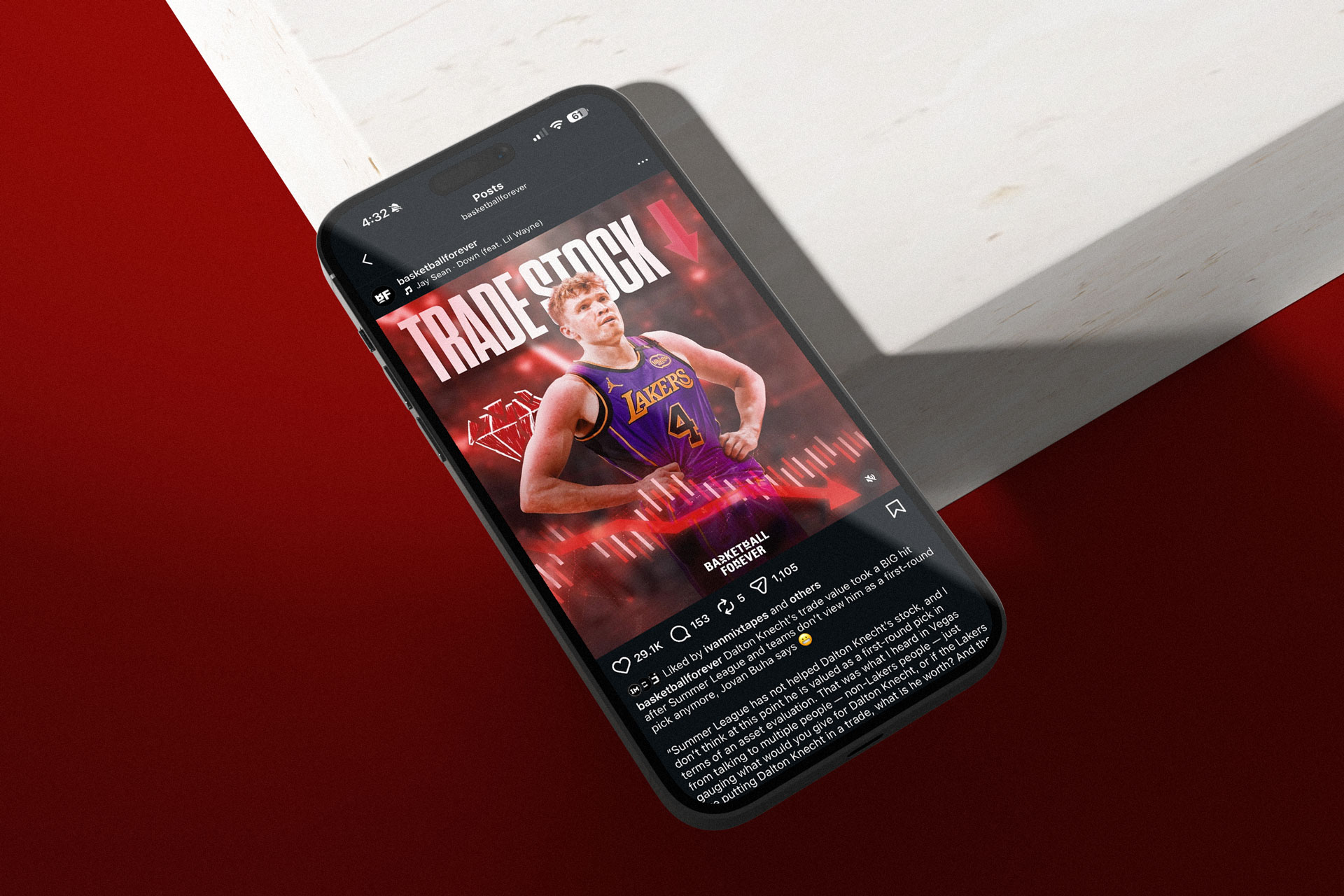
As the platform scaled, I began to view our social graphics not just as content but as premium advertising real estate, where every post carried both cultural and commercial potential. Rather than interrupting the experience with traditional ad formats, I integrated sponsors directly into the design system, embedding logos, brand marks, and subtle co-branding into the native visual language of our posts. This approach allowed partnerships to feel additive rather than intrusive, aligning brands with moments fans already cared about instead of forcing attention through disruption. I treated layout as inventory, carefully designing safe zones, hierarchy, and placement logic so sponsor integrations could live seamlessly alongside headlines, stats, and imagery without compromising clarity or credibility. This effectively turned our feed into a continuous, scalable media surface where branded content could circulate organically through shares, reposts, and group chats. At a time when most publishers were still separating editorial and monetization, we collapsed that divide by proving that design could be the bridge between engagement and revenue. The result was a new kind of social strategy where every post had the potential to generate both cultural impact and commercial value. It became a blueprint for how to monetize attention in a way that preserved trust while unlocking meaningful partnership opportunities at scale in a growing market for a disruptive startup brand.
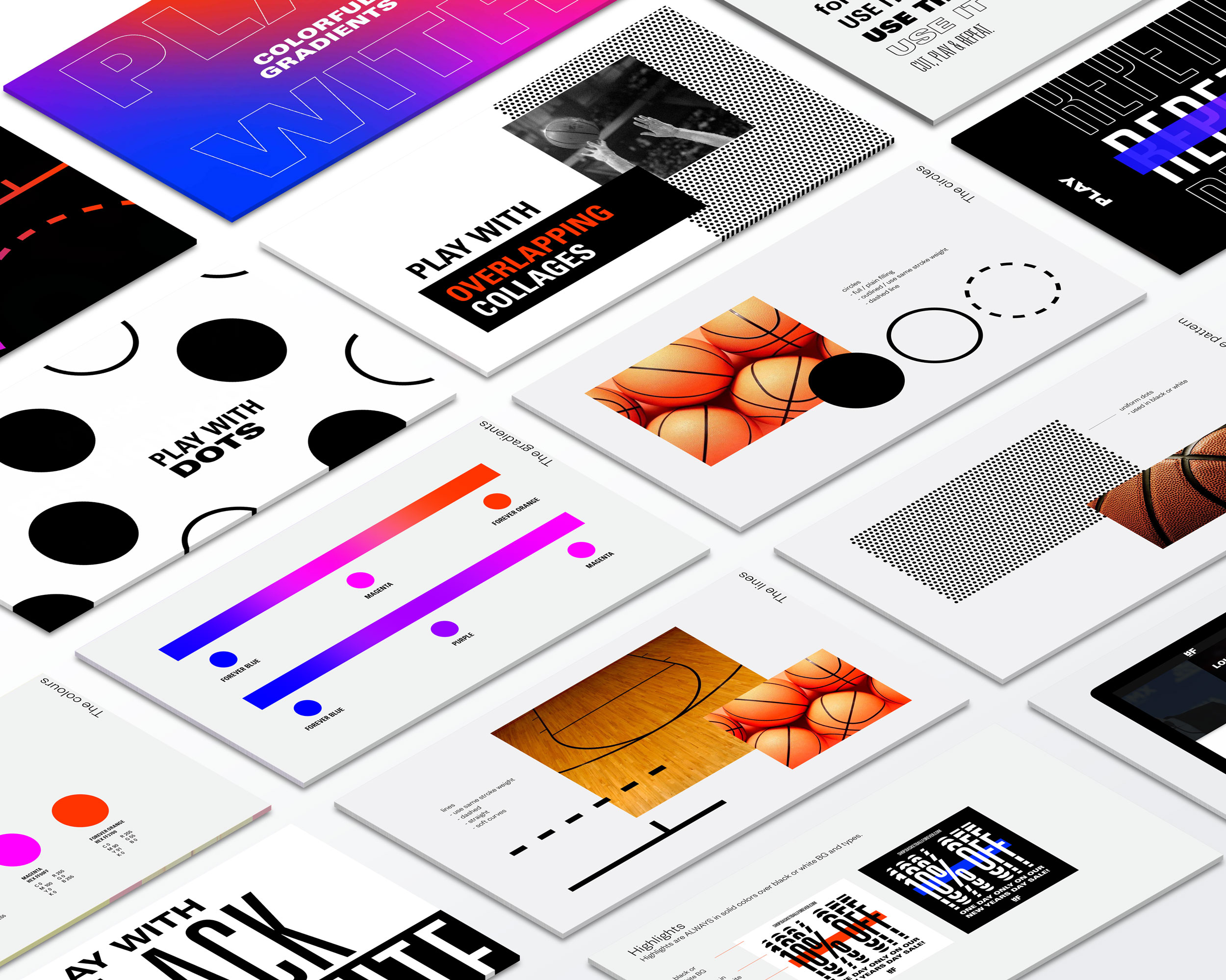
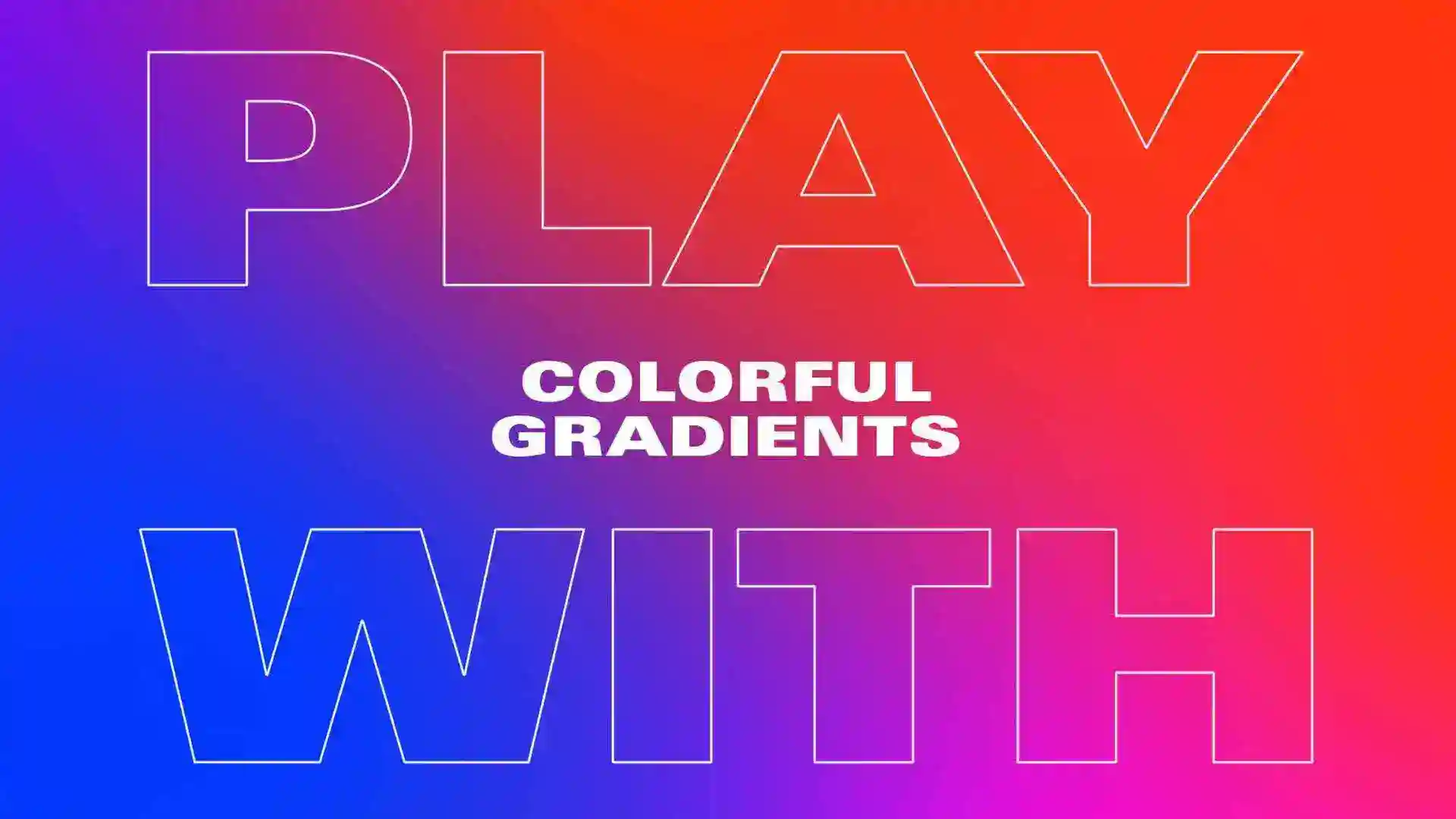
As a brand targeted at a younger demographic, our main goal in rebranding Basketball Forever was building a bold and eye catching visual language that spoke to the nature of the sport and the infinite concept of the word “forever.” Working to develop the creative direction with a team of designers we focused on graphic elements we could relate to the game: the dots of the ball, the lines, lights and colors in the court. Then to capture the concept of “forever” as a visual metaphor we came up with the idea of continuing, never-stopping, repeating elements that played with gradients and clean sans serif typography composed to make a statement. We wanted our consumers to feel the love of the game at every touchpoint with the brand. People are always searching for their tribe, and we wanted to provide a space where they could consume engaging content with like minded fans through content that spoke directly to them in a timely manner from people that looked and talked like them.

Basketball Forever was launched with the intent of becoming a community with a distinctly younger voice and a brand ethos that was targeted at speaking a common language with its audience. We wanted to be a basketball news platform that was built by fans for the fans. My role was to make sure that this voice was authentic and to cultivate a look and feel for all the assets we shared, from video to static to typography. As the brand grew to more platforms and I refined the aesthetic, we saw great success in developing multiple touch points for consumers to interact with us. Making sure that the messaging across all of these different verticals was consistent and felt thoughtful yet curated and unique was no small task.
Basketball Forever initially began its existence as a social media page and then grew into the sports media publishing brand it is today. In a journey that is actually the reverse of how most companies traditionally do it (Establishing their website and app and merchandise first and then developing a social following around that) we were able to flip the script and build a genuine social following before that. Beyond visual execution, I led the development of a content design framework that treated fandom as participatory culture rather than passive consumption. The brand voice was engineered to mirror the cadence of group chats, barbershop debates, and comment-section vernacular, allowing Basketball Forever to operate from inside the culture rather than as an external commentator. This alignment between voice and visual identity created a feedback loop of authenticity that fueled exponential growth, scaling the brand from a few hundred followers to a global audience exceeding tens of millions.
Basketball Forever carved out a distinctly authentic lane by speaking the language of the internet rather than the language of institutions, positioning itself in sharp contrast to legacy outlets like BBC Sport, ESPN, Sports Illustrated, The Score, and even Bleacher Report’s earlier editorial tone. While traditional players optimized for broadcast cadence, brand safety, and top-down storytelling, we operated at the speed of culture, publishing in minutes, not hours, and shaping narratives in real time as games unfolded and memes were born. Our voice mirrored group chats, Reddit threads, and comment sections, blending humor, insider references, and unfiltered fan sentiment in a way that felt participatory rather than performative. This authentic storytelling was key to our unique value proposition and the way that we stood out to consumers.
There is also something mythic to me about the origin of Basketball Forever, because like many meaningful companies, it started with a small signal that only a few people could fully see the scale of in the beginning. I was one of those people. I looked at a humble Facebook page and saw the early architecture of a global youth sports media brand, one that could command loyalty not through institutional authority but through taste, timing, and a more intimate relationship with the fan. That kind of vision matters because plenty of people can help operate something once it is obviously working, but far fewer can identify the dormant potential inside something still rough, still unproven, and still easy to underestimate. My role in those formative years was to help will that future into existence through creative direction, strategic clarity, and a refusal to treat the page like a disposable internet side project. I believed the brand deserved the same intentionality one would bring to a startup, a product, or a company with serious long-term ambition, and I made decisions accordingly. Our small but scrappy team was able to make a news media startup that covered the game like no one else out there.

That belief shaped the tone of the work, the pace of our experimentation, and the systems we built to support scale before scale had fully arrived. What emerged from that foundation was not accidental momentum, but the result of early conviction, and I was one of the people most responsible for giving that conviction form. This immediacy and ear to the ground allowed us to dominate social feeds, consistently outpacing legacy media in engagement velocity, shareability, and community interaction, turning posts into conversations rather than announcements. We weren’t recapping the moment, we were inside it, co-creating with the audience and letting fan energy dictate the editorial rhythm. That speed to market, combined with platform-native storytelling and a willingness to lean into internet vernacular, enabled us to capture disproportionate attention and loyalty, effectively eating the lunch of slower, more institutional competitors who were still optimizing for homepage clicks while we were winning the feed and racking up the likes, comments and engagement. This hyper growth and social amplification made the brand guidelines and governance even more key.

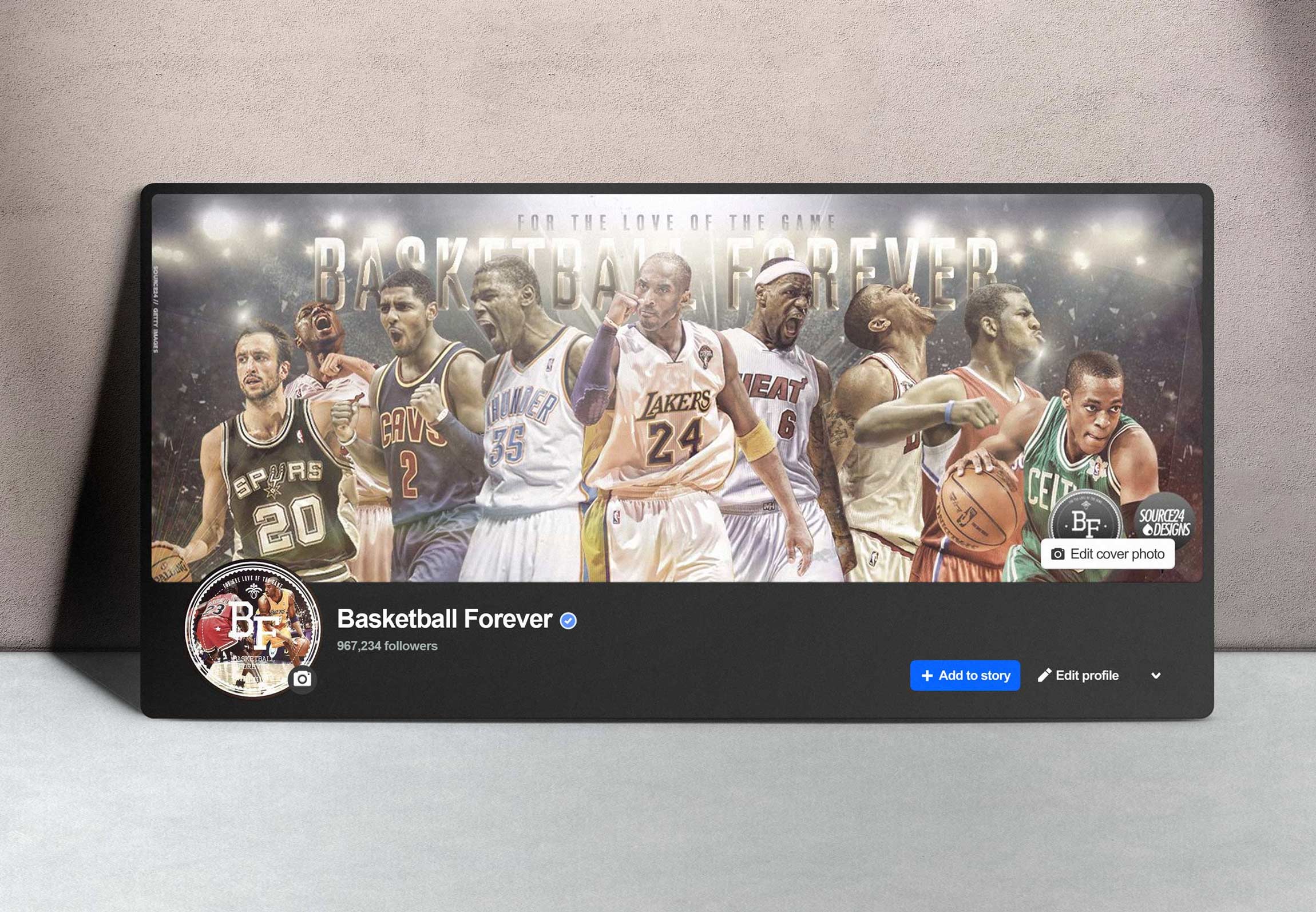
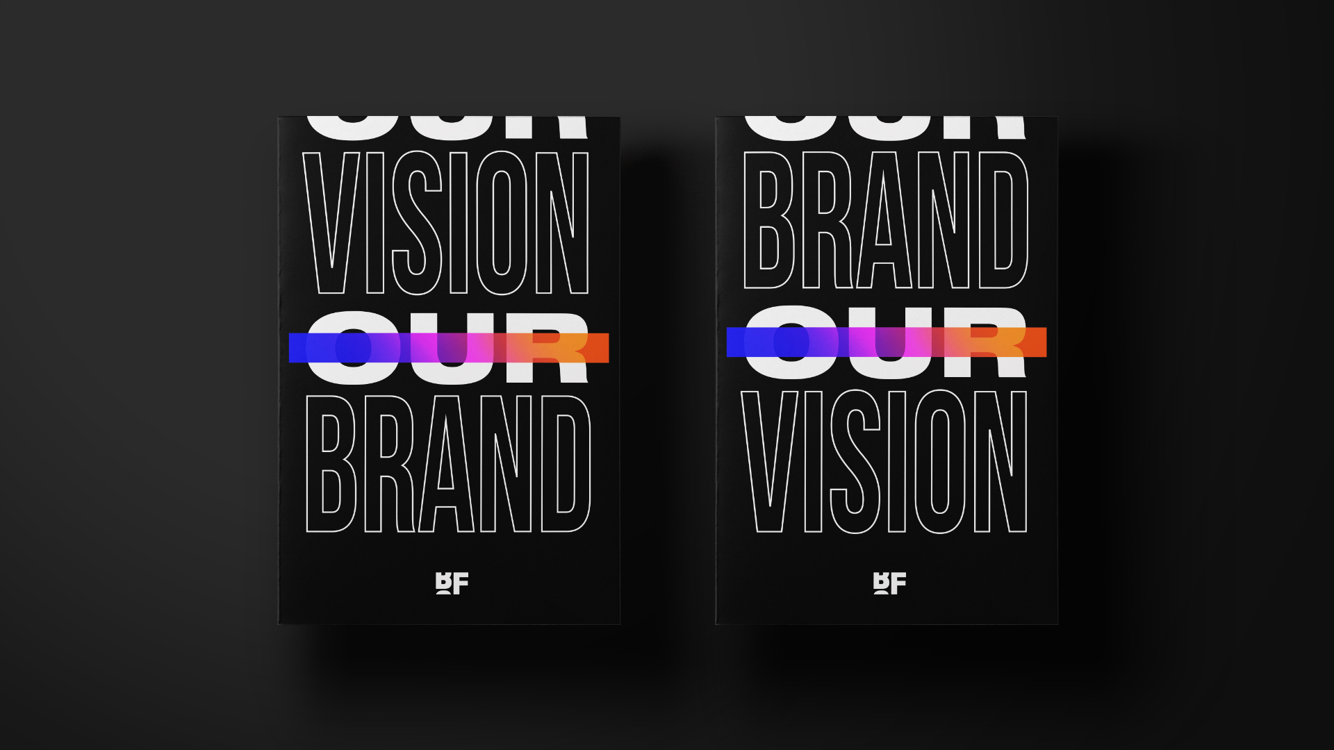
As Basketball Forever scaled from a fast-growing social page into a global sports media platform, the need for a formal rebrand and comprehensive brand guidelines became unavoidable. What had initially thrived on speed and instinct now required clarity, consistency, and governance to support partnerships, advertiser integrations, and investor scrutiny. Without a unified system, the risk was fragmentation. Different teams, contributors, and regions could interpret the brand inconsistently, diluting the voice that made it successful in the first place. The rebrand was not about cosmetic change. It was about codifying the DNA of the brand into a scalable framework that could preserve authenticity while enabling growth. We needed a shared language that ensured every post, campaign, and collaboration reinforced a coherent identity, whether it originated in Sydney, New York, Manila, or London because basketball is a global sport and we wanted this brand to feel universal like the game.
Collaborating with the NotReal team was a reminder that strong creative direction only reaches its full potential when paired with exceptional craft. Working with Milton Gonzalez on animation, Valeria Moreiro and Lu Borzi on graphic design, Luján Borzi on visual development, and Eugenia Garcia Montaldo on production, I had the privilege of guiding a group of deeply talented makers who brought precision and nuance to the Basketball Forever rebrand. I provided the overarching creative direction and developed the brand system, defining the visual language, typography, motion principles, and tonal framework that would carry the identity across platforms. The NotReal team translated that vision into high-fidelity executions, refining layouts, motion behaviors, and graphic details that elevated the system from concept to living brand. Their rigor and attention to detail ensured that the identity felt cohesive, expressive, and production-ready at scale, proving that when clear direction meets world-class execution, a brand can move from idea to infrastructure with clarity and confidence. It was a smooth and seamless process collaborating and providing the north star and creative direction with them.
The brand guidelines became our document of truth, a living system that translated ethos into execution. They defined typography, color logic, image treatment, motion behavior, tone of voice, and layout principles, creating guardrails that empowered teams to move quickly without compromising quality. This was critical as we onboarded advertisers and partners who required brand-safe environments and predictable placements for integrations. A clear design system allowed sponsored content to feel native rather than disruptive, protecting user trust while unlocking revenue opportunities. For seed-stage investors, the existence of a disciplined brand framework signaled operational maturity. It demonstrated that Basketball Forever was not a volatile social trend but a durable media property with the infrastructure to scale responsibly, maintain cultural credibility, and support long-term monetization to ensure the brand was here for the future while retaining the core values it had when we founded it.
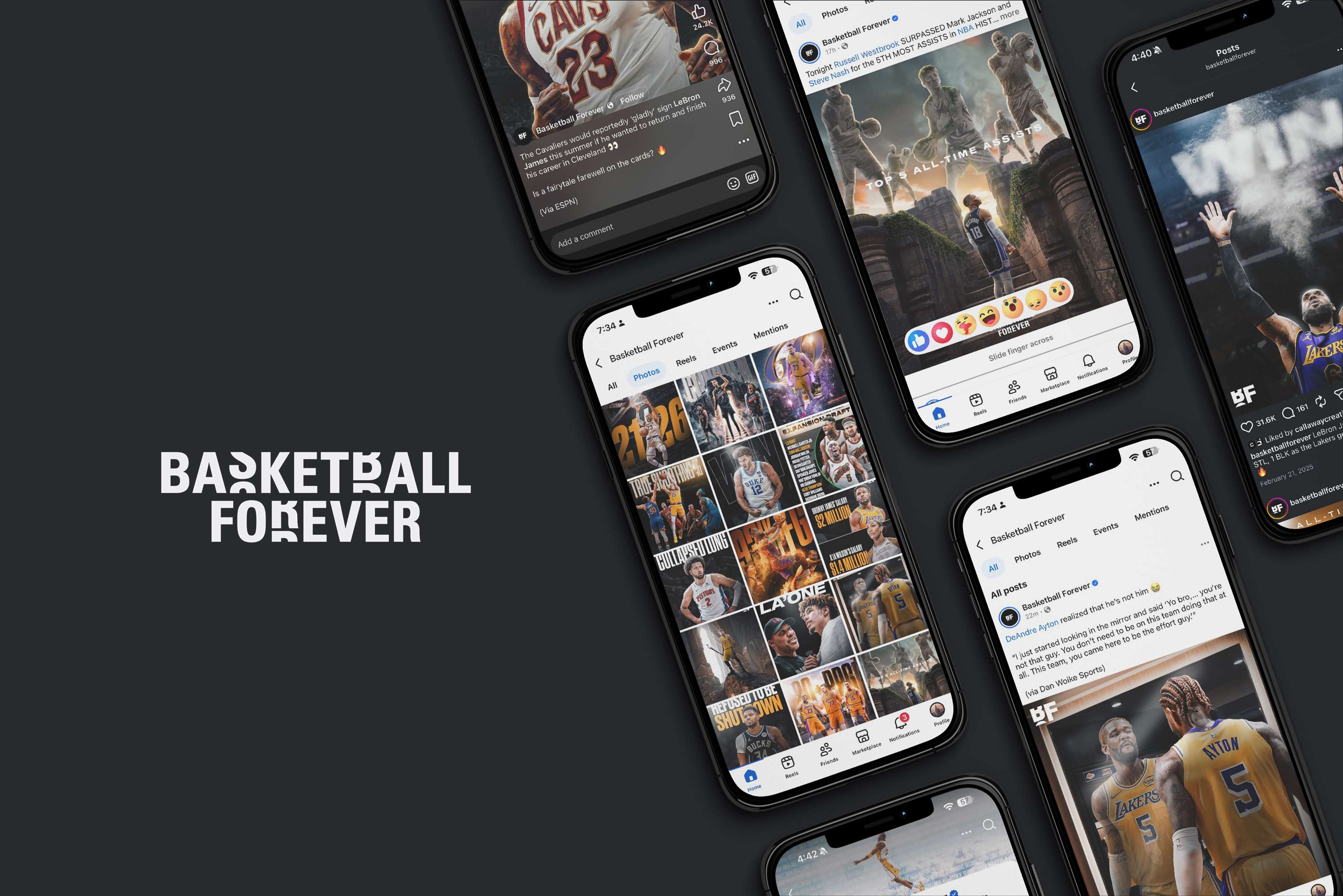
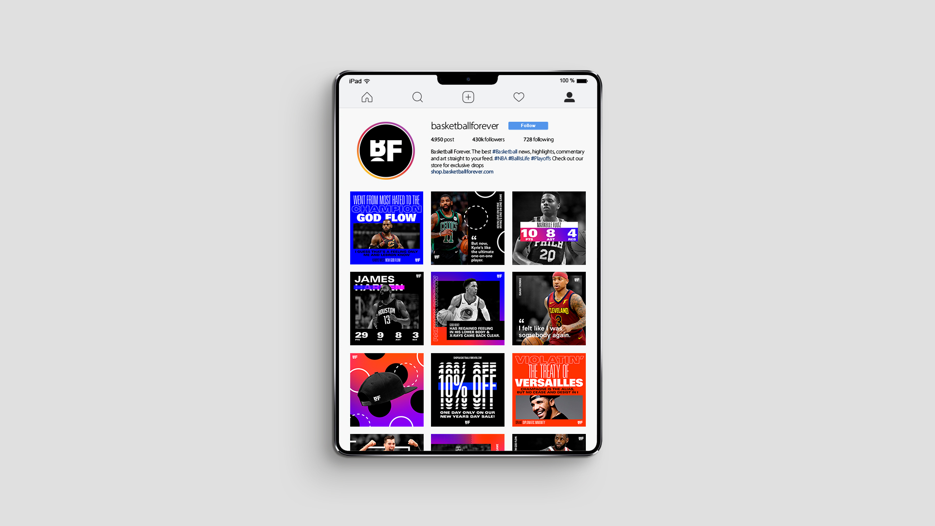
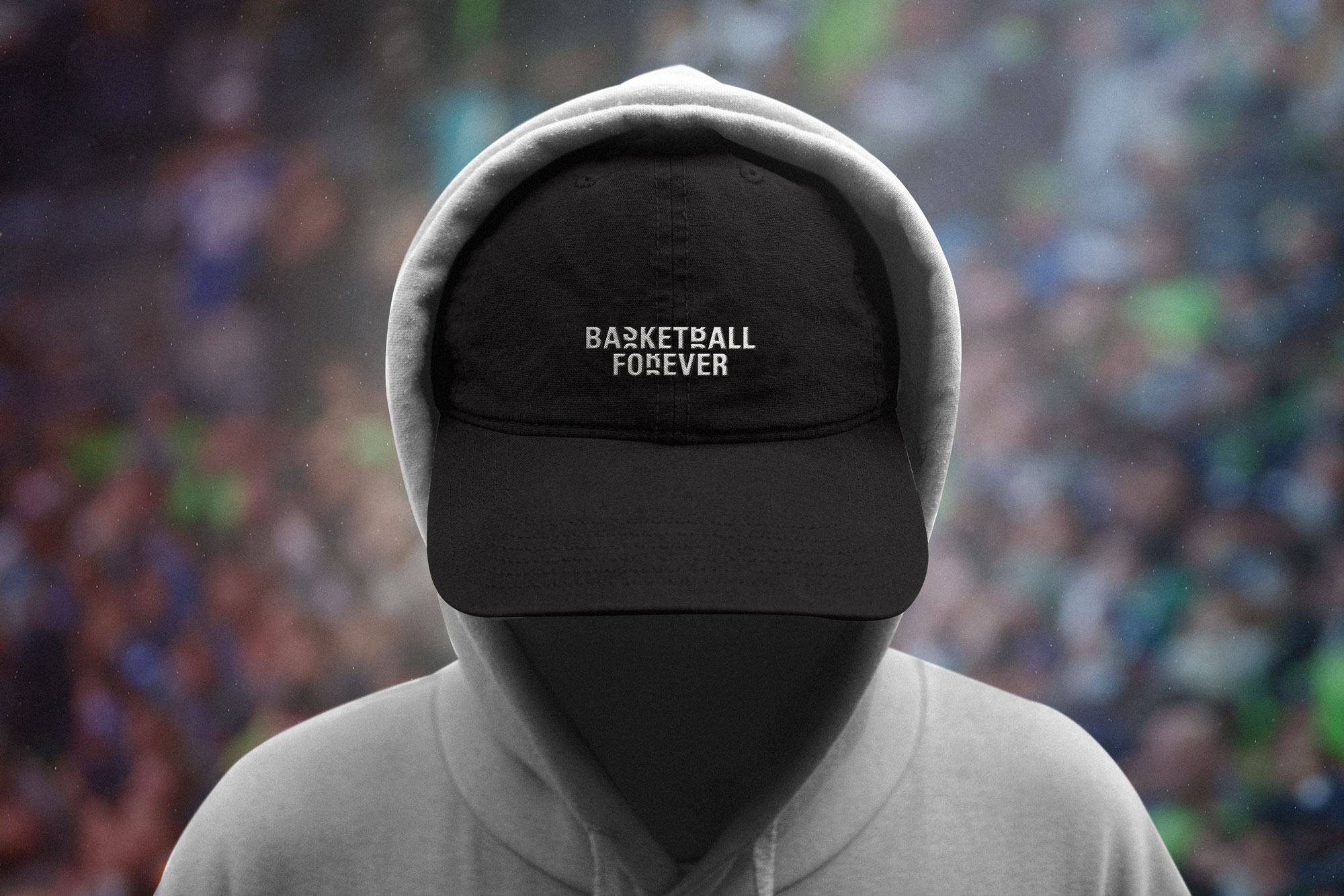
Our two unique points of differentiation in speed to market and authentic voice allowed us to develop a massive audience across different social channels. This included an extremely active facebook page with over 5 million followers, and a quickly growing instagram presence with nearly 1.5 MIllion followers. With such a large audience, the consumption rate of content would be extremely high, so we knew our design language had to be nimble and flexible enough to work across different pieces of content without feeling stale. Our distributed publishing model, powered by the design system I created, enabled contributors worldwide to produce content within a unified framework, transforming geographic dispersion into a strategic advantage and allowing the brand to surface regional narratives while maintaining a cohesive global identity.
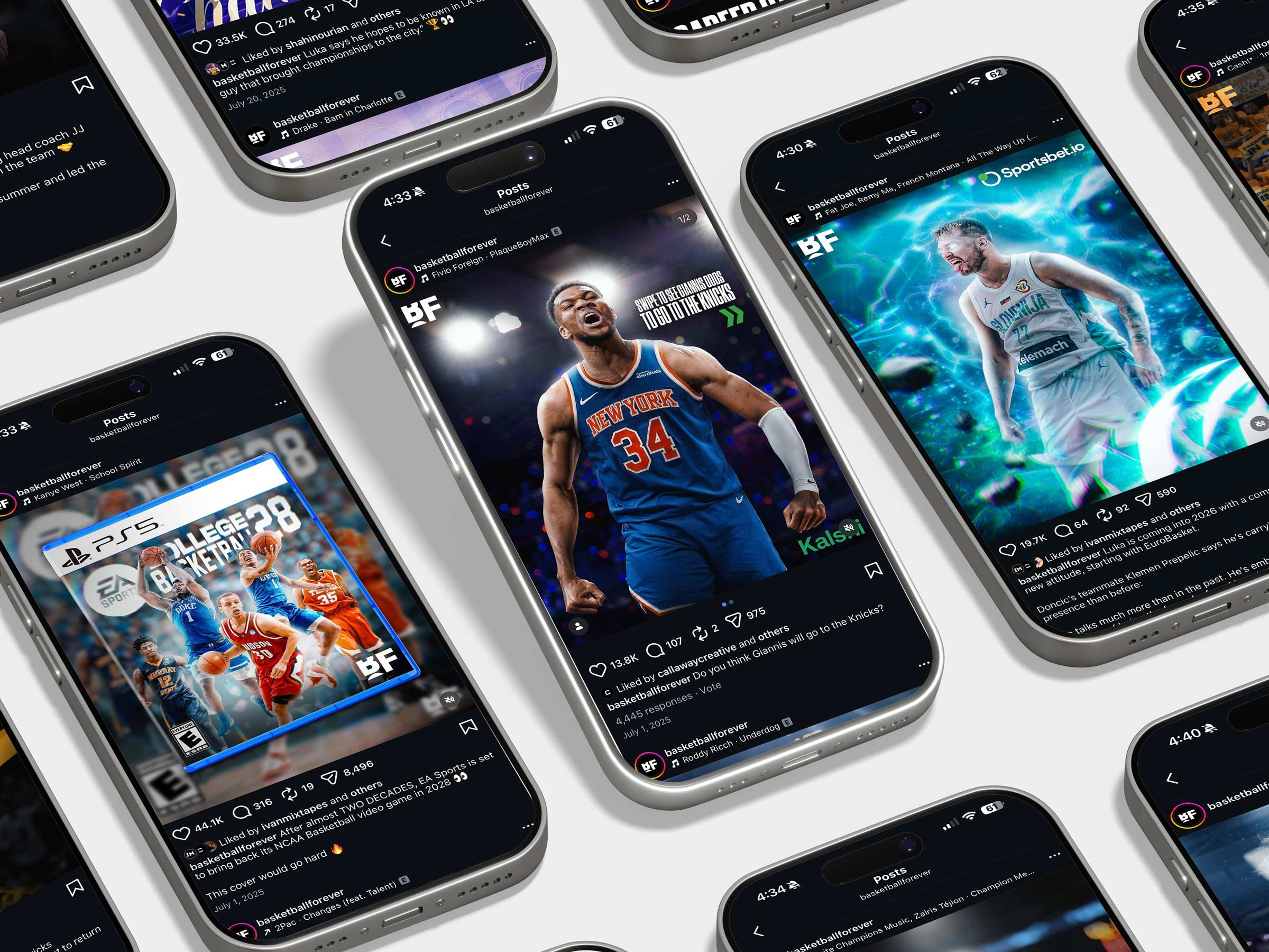
As the platform expanded across Facebook, Instagram, Twitter, YouTube, and web, I evolved the system to support platform-specific storytelling modes while preserving a consistent core identity. Twitter prioritized real-time conversational graphics and rapid response templates. Instagram emphasized bold, scroll-stopping compositions and meme-adjacent formats. YouTube became a canvas for cinematic player features and narrative hype films, where I directed and edited long-form pieces such as tribute mixes and documentary-style content that blended archival footage, music curation, and bespoke motion design. These projects demonstrated the elasticity of the brand system, proving it could support everything from bite-sized highlight packages to emotionally driven long-form storytelling without fragmenting the visual language.
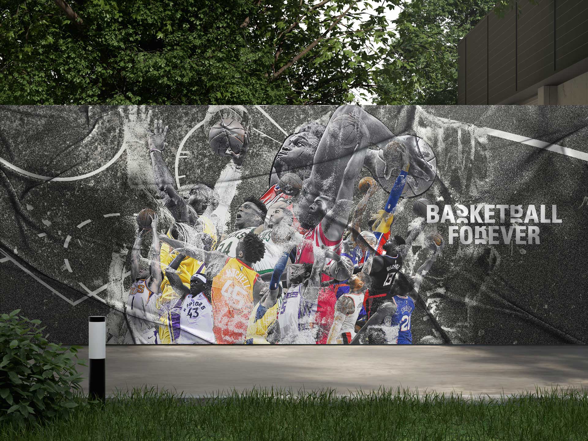
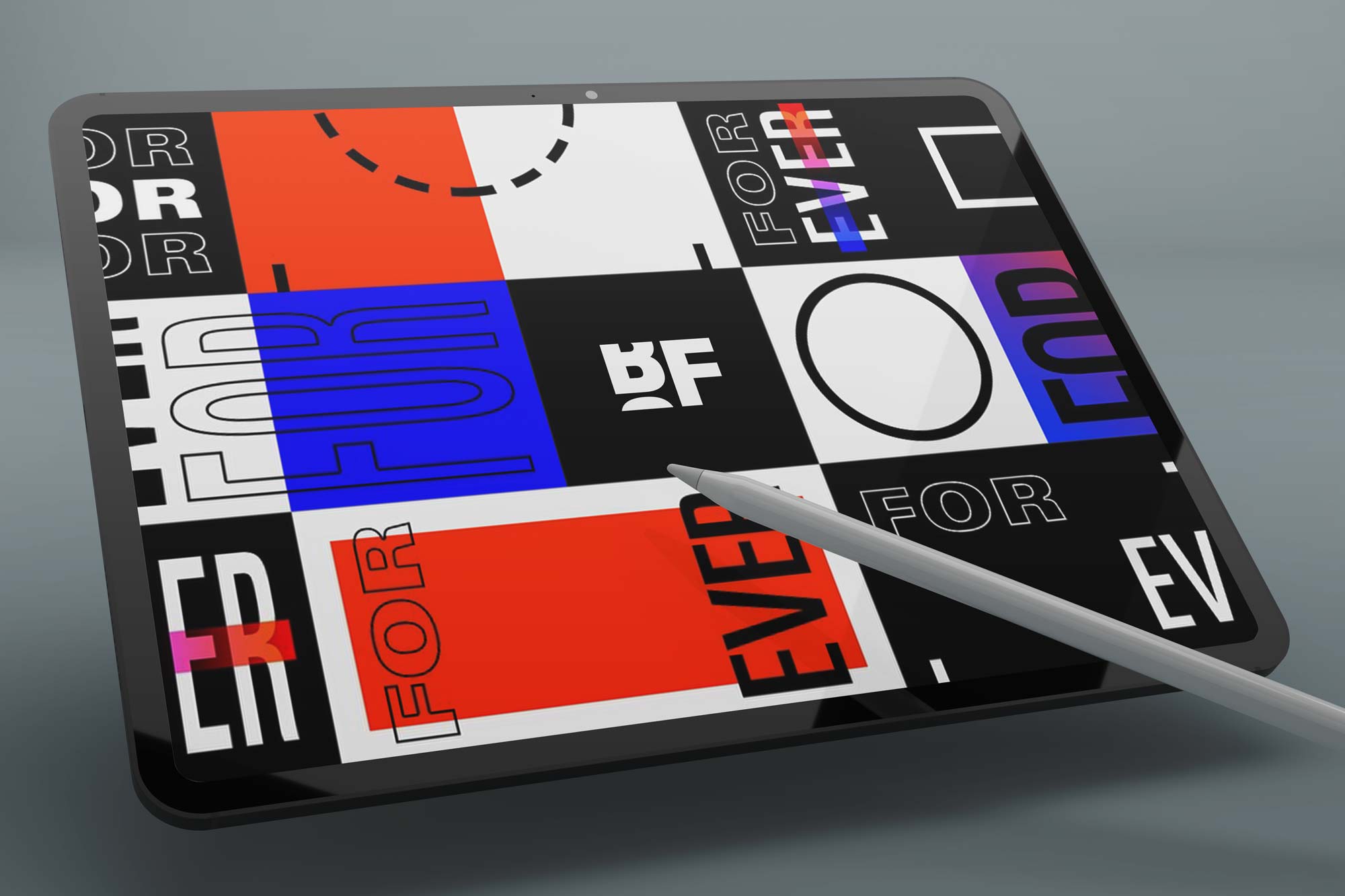
The Basketball Forever rebrand further codified the conceptual interplay between the sport and the idea of infinity. Drawing from the geometry of the ball, the lines of the court, and the rhythm of arena lighting, I led the exploration of repeating graphic elements, looping gradients, and continuous motion patterns that visually articulated the notion of the game never stopping. The resulting system balanced minimalism with boldness, using negative space, oversized type, and high-impact color to command attention within crowded feeds while maintaining a premium, editorial sensibility. This approach future-proofed the brand by creating a toolkit that could evolve with platform behaviors, new formats, and emerging technologies without losing its core identity.
Seed-stage funding often hinges on belief in both vision and execution. The brand system bridged that gap. It showed that we had already solved for scalability, audience recognition, and cross-platform adaptability. Instead of pitching a concept, we were presenting a functioning media engine with a cohesive identity and measurable engagement. The visual consistency across Instagram, Facebook, Twitter, YouTube, and web reinforced the perception of a unified global brand, an essential factor in positioning the company as a legitimate evolution in sports media rather than a fragmented collection of social accounts. Once we felt like a core media package, you can start to sell ads and scale the model into new avenues to develop audience growth.
We approached the brand not as a logo or a social page but as a living design system engineered for infinite scroll environments. The central challenge was to create a visual grammar that could operate at the speed of culture while maintaining coherence across platforms, geographies, and content types. Every design decision, from typography to gradients to motion behaviors, was informed by a single guiding principle: the game never stops, and neither should the brand. This philosophy became the structural backbone of a system built for repetition, rhythm, and perpetual motion, mirroring both the pace of basketball and the cadence of digital consumption. Instagram, Facebook, TikTok, Twitter had the feed where our content felt right at home.
Platform adaptability was central to the system’s success. Twitter demanded rapid-response graphics optimized for real-time discourse. Instagram required bold, scroll-stopping compositions that could communicate instantly without captions. YouTube allowed for cinematic storytelling through motion and sound. The design system functioned as a modular toolkit, enabling platform-specific expressions while preserving a cohesive brand identity. The brand guidelines functioned as a system that was enabling this scale and rapid editorial expantion for the brand at a key time in it's growth.
This flexibility allowed Basketball Forever to operate as a distributed global publisher without diluting its visual voice. Instagram prioritized immediacy and visual arrest. Posts had to communicate hierarchy within milliseconds as users scrolled at high velocity. This led to bold typographic locks, high-contrast color blocking, and gradient fields that could stop the thumb without relying on captions. Square and vertical compositions were engineered with safe zones, edge tension, and focal anchors to ensure clarity across grid view, feed view, and story formats. Instagram became the brand’s gallery and storefront, a place where visual consistency built trust and aesthetic cohesion reinforced credibility and animations and high end graphic treatments or illustrations became mainstays on our feed as my rolodex of artists and vision for BF grew further.
Facebook, by contrast, demanded a more information-dense and share-optimized approach. The platform’s algorithm favored engagement behaviors such as comments, reactions, and shares, so layouts were designed to provoke conversation and invite participation. Longer headlines, layered context, and debate-driven prompts were integrated into graphics without sacrificing clarity. We optimized for mid-feed legibility on mobile while ensuring readability on desktop, recognizing Facebook’s multi-device consumption patterns. The design system allowed for modular expansion, enabling editors to add stats, timestamps, or contextual lines while preserving compositional integrity. Facebook became the arena for discourse, where design supported not only consumption but community dialogue. We made sure we did everything to keep engagement buzzing.
At the core of the ecosystem was a graphics framework built explicitly for social news consumption. Unlike traditional editorial design, which assumes prolonged attention, our system was engineered for sub-second comprehension. Hierarchy, contrast, and typographic rhythm were calibrated to deliver essential information instantly: who, what, where, and why it matters. The layouts functioned as visual headlines, transforming breaking news into scannable artifacts that could travel across feeds, group chats, and reposts without losing meaning. This approach positioned graphics not as supplements to journalism but as the primary delivery mechanism for real-time sports information.
I didn’t set out to design a sports page. I set out to map a culture in motion. Basketball Forever began as a small signal in the noise, a feed run on instinct and obsession, and I saw in it the outline of something larger. The game had already escaped the arena. It lived in tunnel fits, mixtapes, late-night debates, sneaker drops, and the quiet mythology fans build in comment sections at 2 a.m. My role was to give that living organism a body, a visual language and editorial cadence that felt native to the streets of the internet. I built systems that could move at the speed of the scroll while holding onto a point of view, turning breaking news, stat lines, and cultural moments into artifacts people could pass around like contraband. We weren’t chasing relevance. We were documenting it in real time, with the scars and fingerprints still visible.
As the audience swelled and the stakes rose, the work became less about making things look good and more about making the brand inevitable. I treated the design system like a field kitchen, built to serve millions with consistency under pressure, whether the moment called for a last-second buzzer beater or a quote that split the fanbase down the middle. That clarity gave partners and investors something rare in digital media: proof that the chaos had a spine. When Forever Network moved into funding rounds, new verticals, and interactive fan experiences, the infrastructure we’d built held. The brand could stretch without snapping. For me, the reward wasn’t scale for its own sake. It was watching a scrappy, fan-first experiment become a global commons for the game, a place where the culture could see itself reflected without a translator.
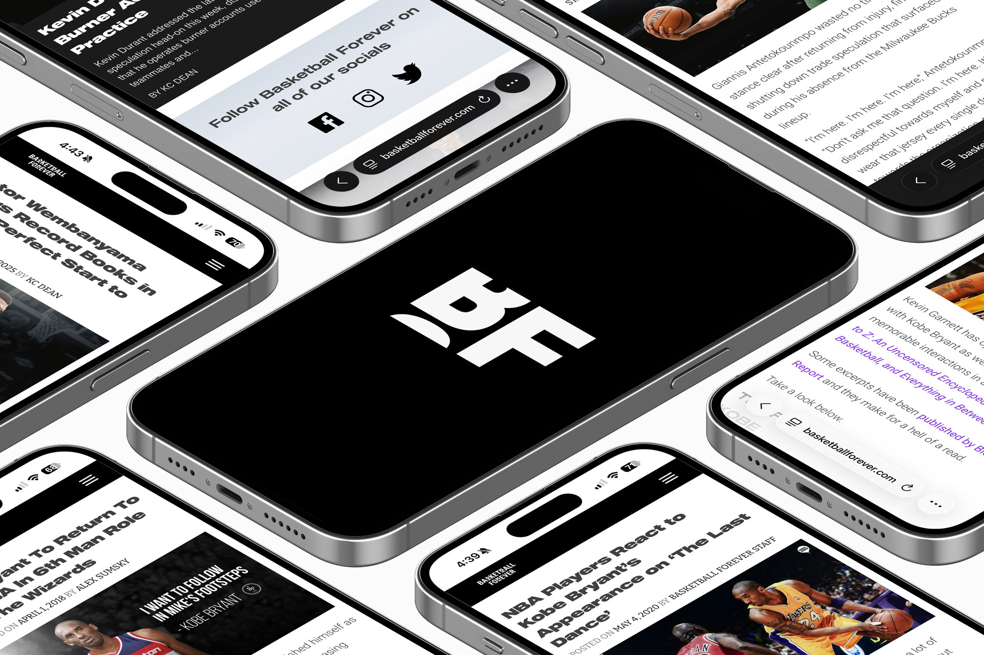
Basketball Forever evolved into a multi-surface ecosystem designed to meet fans wherever their attention lived, transforming a social media origin into a vertically integrated sports and culture platform. What began on Facebook and Instagram as high-velocity content streams expanded into a web destination that served as a curated hub for deeper storytelling, e-commerce, and brand partnerships, while the mobile app extended that experience into a personalized, always-on interface for real-time updates and community engagement. As we expanded to new verticals like gaming, this unlocked new partnerships and revenue driving opportunities.
Over time, each surface was not treated as a silo but as a connected layer within a broader system, where social acted as the discovery engine, web as the depth layer, and mobile as the retention loop. This architecture allowed us to guide fans from passive consumption into more intentional participation, whether that meant reading long-form features, purchasing merchandise, engaging with interactive formats, or returning daily for updates tailored to their interests. The ecosystem was designed to compound attention into habit, and habit into loyalty, creating a feedback loop where audience behavior continuously informed product evolution. As a result, Basketball Forever became more than a destination for content. It became an operating system for fandom, one that translated the fragmented, fast-moving nature of modern sports culture into a cohesive, immersive experience that could scale across platforms, geographies, and business lines without losing its core identity.
Emerging initiatives such as NFTs explored digital ownership and fan identity in Web3 environments, allowing supporters to collect and signal allegiance in ways native to internet culture. Sub-brands like Hoop Hounds tapped into sneaker and streetwear culture, translating on-court influence into lifestyle commerce, while ForeverBet experimented with gamified prediction and fan participation, turning spectatorship into interactive play. Live events and experiential activations closed the loop, bringing the digital community into physical space and reinforcing the brand as more than a publisher. It became a cultural platform where content, commerce, community, and participation converged, demonstrating how a social-first media brand could expand into a holistic fan ecosystem without losing the authenticity that fueled its initial growth.
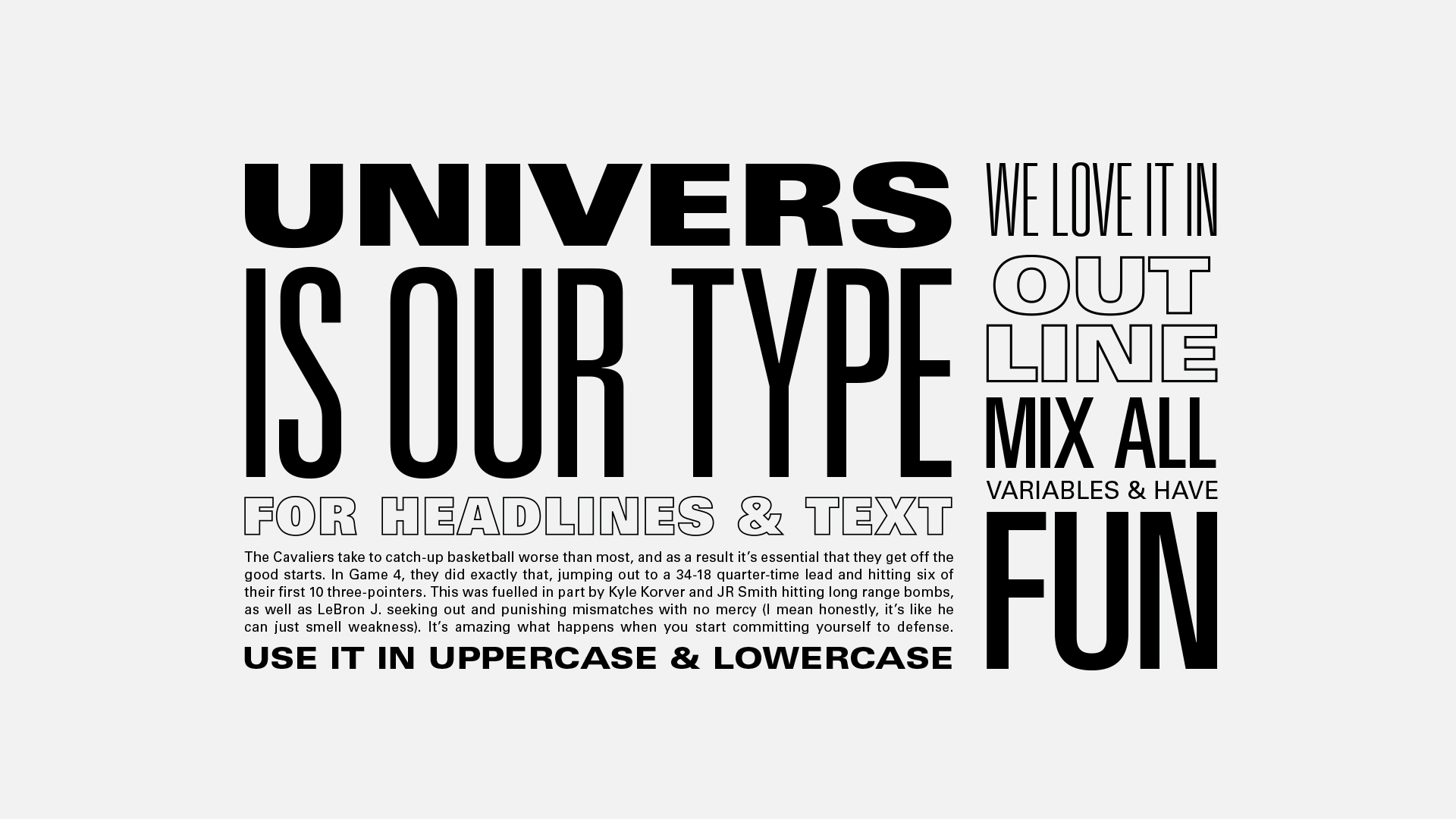
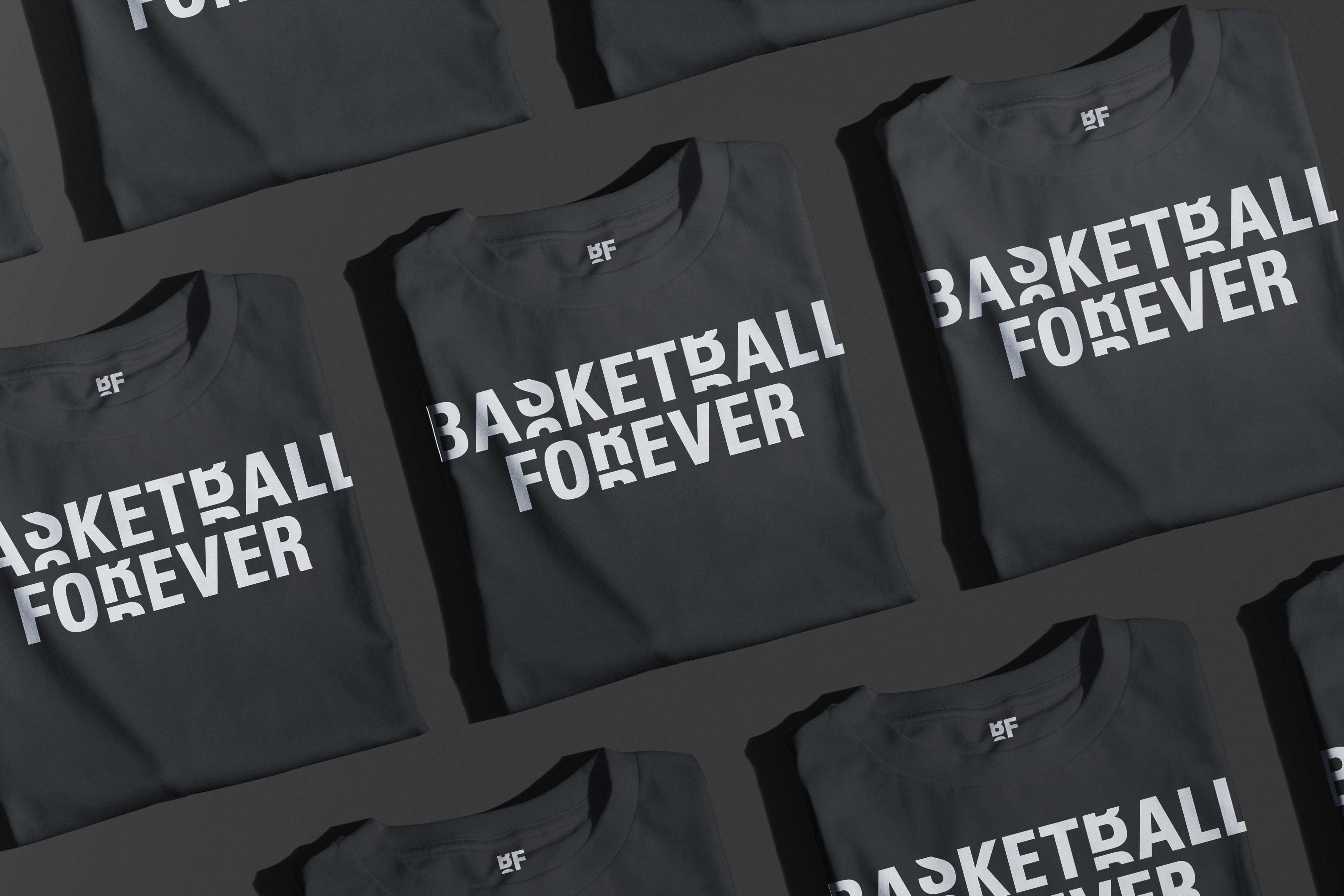
Typography formed the structural spine of the identity. Univers LT Std was selected for its Swiss modernist clarity and extensive variable weights, allowing for condensed headlines, extended compositions, outline treatments, and repetition-based layouts that reinforced the concept of infinity and continuity. The type system was engineered for modularity. Headlines could stack, stretch, repeat, or fragment while maintaining legibility at mobile sizes. Outline variants allowed type to interact with imagery without overpowering it, while bold condensed forms created immediate impact in scroll environments. The deliberate constraint of a single type family enabled expressive variation without visual chaos. This font worked well for the brand and became a core part of our design system. Over time we worked out how bold colors like white or yellow type on high contrast back grounds would really stand out on social.
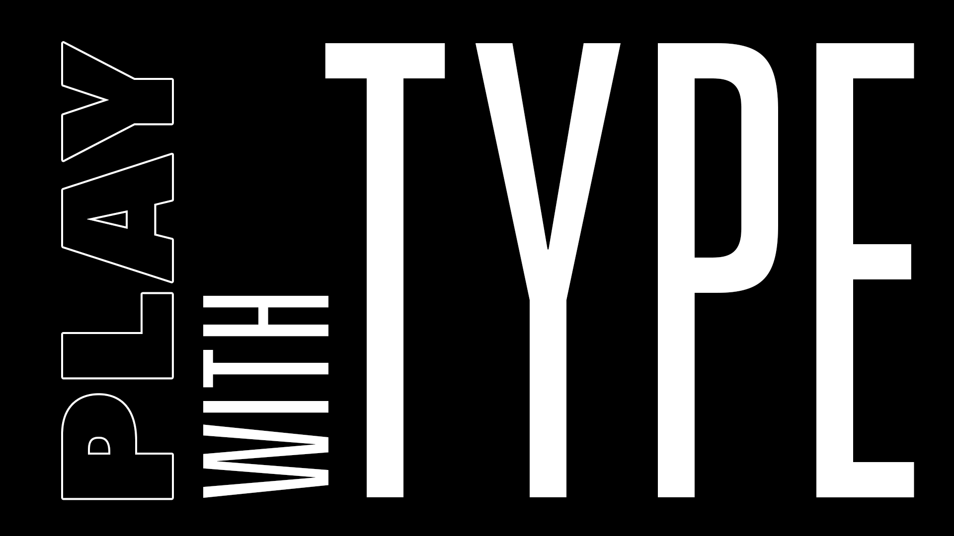
The rebrand’s conceptual anchor, “playing forever,” manifested visually through looping gradients, repeating type, and graphic elements that extended beyond frame boundaries. The identity proposal explicitly framed the concept as never getting bored, more basketball, more entertainment, reinforcing the idea that fandom is continuous rather than episodic. This philosophy informed every design decision, ensuring that the brand’s visual language embodied its editorial mission. The black and white colors and typography paired together to stand out on the feeds.

The Basketball Forever identity system translated that ethos into a kinetic visual language where motion, typography, color, cutout photography, geometric shapes, and collage operated as a cohesive grammar rather than isolated stylistic choices. Type was treated as an active element, stretched, looped, and rhythmically repeated to simulate the cadence of play and the infinite scroll of fan discourse, while saturated gradients pulsed like arena lighting and digital scoreboards to create depth and continuity across touchpoints. Cutout player silhouettes and fragmented textures allowed for modular composition, enabling designers to remix moments into layered collages that felt both archival and immediate, echoing the way highlights circulate through feeds and group chats. I wanted to make scroll stopping content, and the entire design system was created just to do that. Our graphics had to fulfill an informational need while also being disctinctive and memorable.
Bold vector shapes functioned as courts, spotlights, and framing devices, guiding the eye while reinforcing spatial energy, and motion principles ensured that every asset could flex seamlessly from static posts to animated loops without losing coherence. Together, these elements formed a system built for perpetual recombination, a visual engine that mirrored the sport’s pace and the community’s appetite for endless reinterpretation. Whether it was motion graphics or merch, the typography was a core motif that showed up everywhere. Type, template, trade alerts, draft coverage, and stat lines became a unified visual language, engineered to deliver information at speed while turning every post into a recognizable, repeatable asset within the Basketball Forever system.

Line work extended the court into the interface. Straight lines, dashed strokes, and soft curves referenced three-point arcs, key boundaries, and play diagrams, transforming compositional elements into subtle nods to gameplay strategy. These lines often extended beyond frame edges, reinforcing the idea of continuity beyond the screen. Their consistent stroke weight ensured visual harmony, while their placement created dynamic tension and directionality within layouts. The result was a graphic system that felt diagrammatic yet expressive, bridging the analytical and emotional dimensions of fandom.
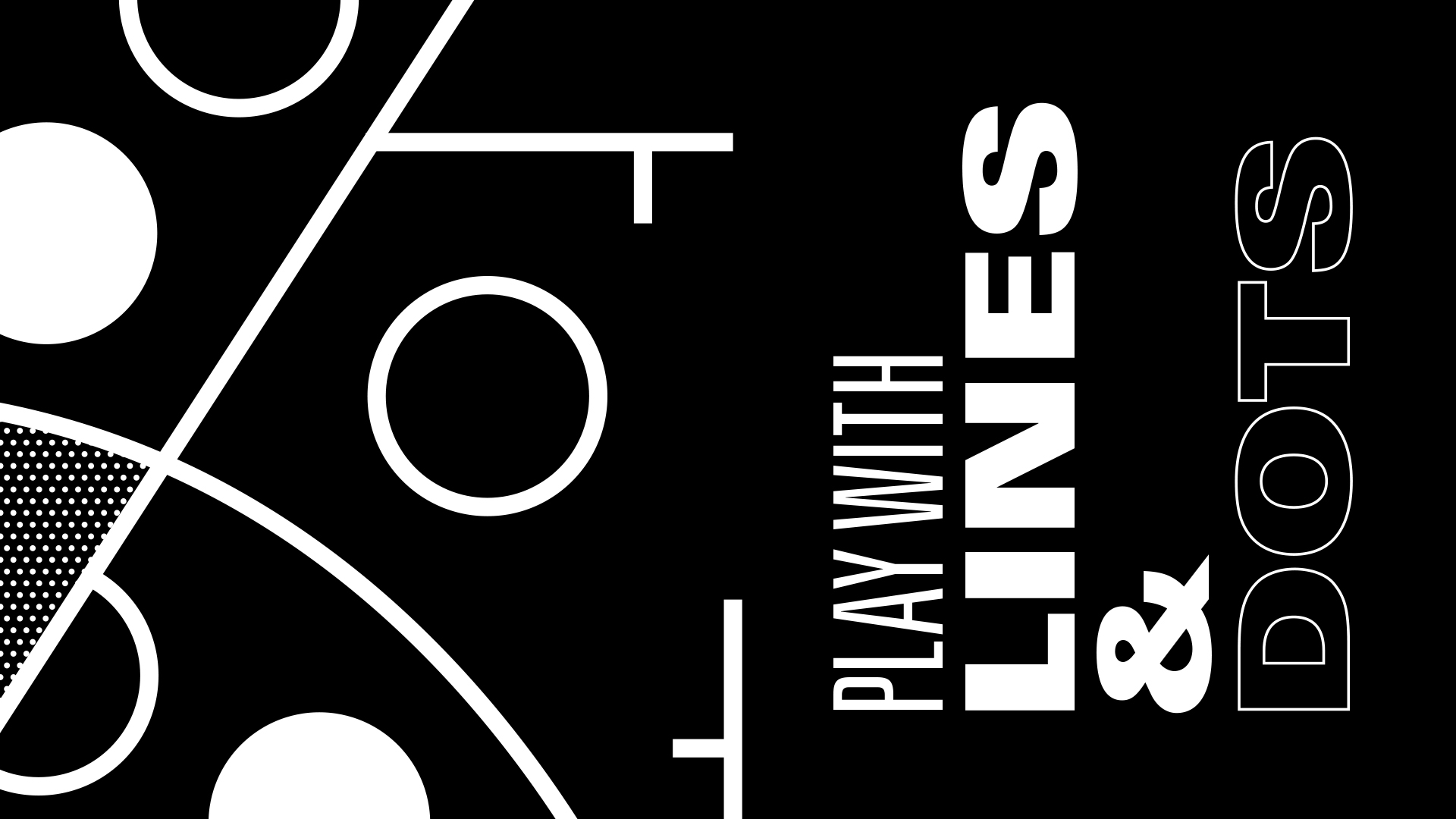
The dot pattern system drew directly from the pebbling of a basketball’s surface, abstracted into uniform grids that functioned as texture, depth, and brand motif. Used in black or white, these patterns provided visual grounding while reinforcing the tactile identity of the sport. They also served a functional role in composition, anchoring layouts, creating contrast against gradients, and providing a neutral field for typography. By translating a physical attribute of the ball into a digital pattern language, the system created a subconscious association between brand and sport and when you layered this on photos in combination with type or color that is when you have a stew cooking and you don't even realize all the layers of flavor.
The layout, color, and typography systems were designed to function as a unified language that could deliver clarity at speed while remaining unmistakably Basketball Forever. Layouts were built on a modular grid that allowed content to flex across formats, from breaking news tiles to long-form storytelling, ensuring hierarchy and legibility in high-velocity feeds. Color operated as both signal and emotion, with bold gradients and high-contrast pairings engineered to stop the scroll while strategically deployed accents guided attention to key information such as scores, stats, and headlines.
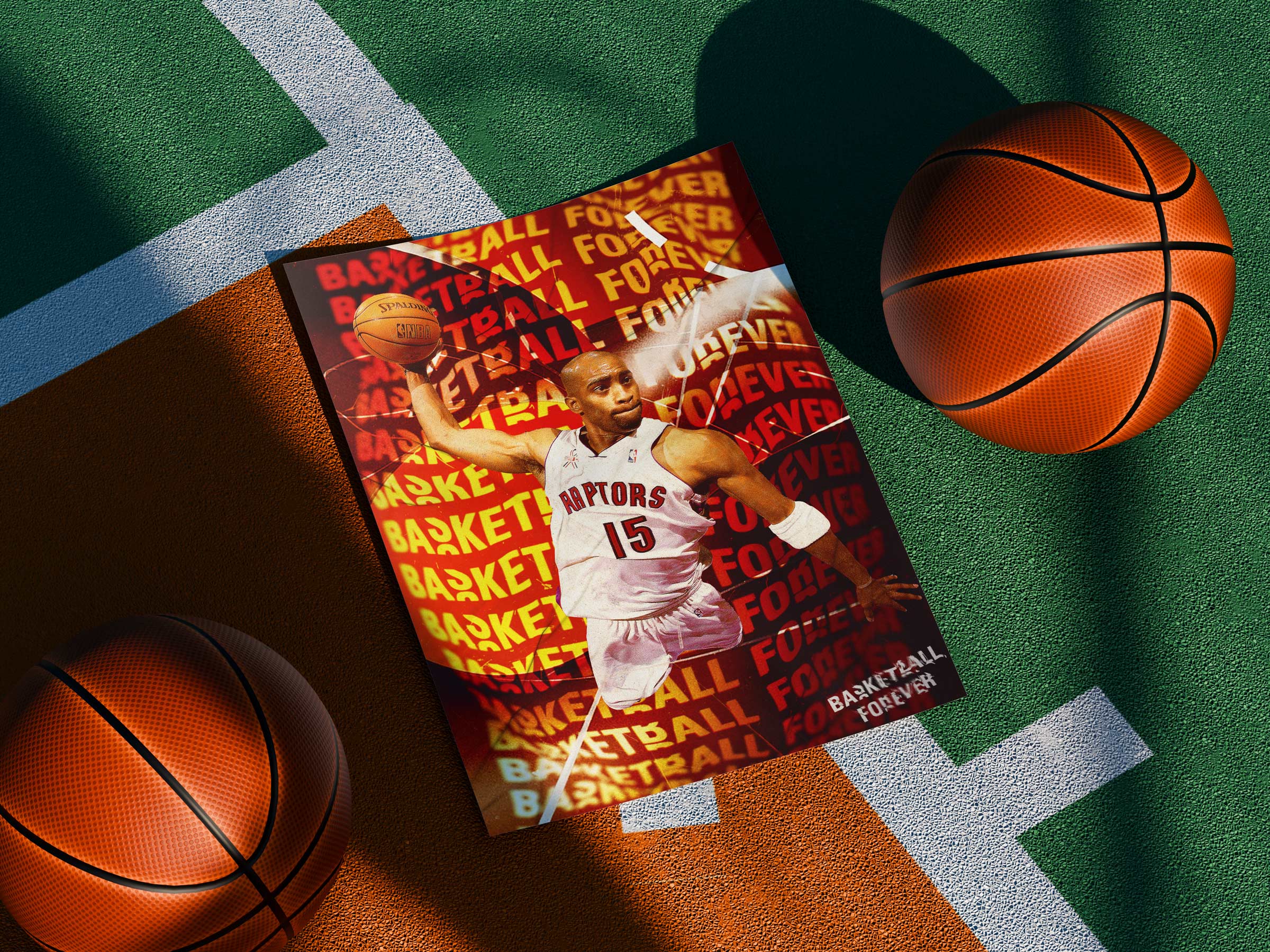
Typography served as the connective tissue, combining condensed headline treatments for density with strong geometric sans serif forms that conveyed urgency and confidence without sacrificing readability on mobile screens. Together, these elements created a system that was not only visually distinctive but operationally resilient, capable of scaling across platforms and time zones while maintaining a consistent, culturally fluent presence in the ever-moving landscape of social sports media where we were competing with a to of upstarts in the space.
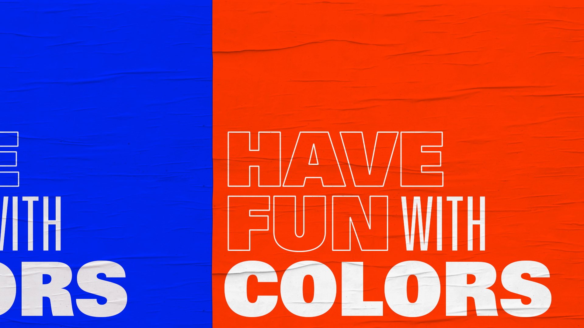
Color was treated as a system of hierarchy rather than decoration. The palette balanced stark black and white foundations with high-saturation accent hues, enabling rapid visual scanning in crowded feeds. Black signaled authority and contrast. White provided breathing room. Forever Blue conveyed trust and continuity. Magenta and purple injected cultural energy and nightlife associations tied to basketball’s relationship with music and street culture. Forever Orange referenced both the ball and the heat of competition. The system allowed color to function as a semantic layer, guiding attention, emphasizing key information, and reinforcing emotional tone without sacrificing brand consistency and cohesiveness. The result was a vibrant overall brand guidelines that allowed the content to pop off the page. These helped the brand stand out and feel truly unique in a sea of sports sameness.
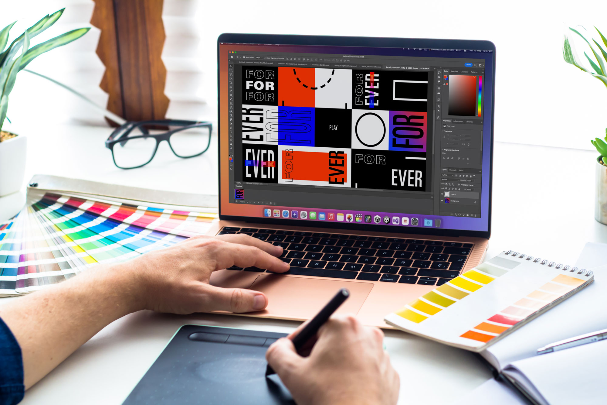
Equally important was how the design system communicated longevity. The concept of “forever” was not only thematic but operational. Repetition-based typography, modular grids, and adaptable color logic ensured the brand could evolve without losing its core identity. This future-proofing reassured stakeholders that the company would not require costly rebrands or structural overhauls as it scaled. The system was built to absorb new formats, sports verticals, and revenue streams, positioning Basketball Forever as a durable platform worthy of long-term investment and with considerable staying power in comparison to it's competitors, especially the ones in the early days who would copy the playbook without understanding the strategy.
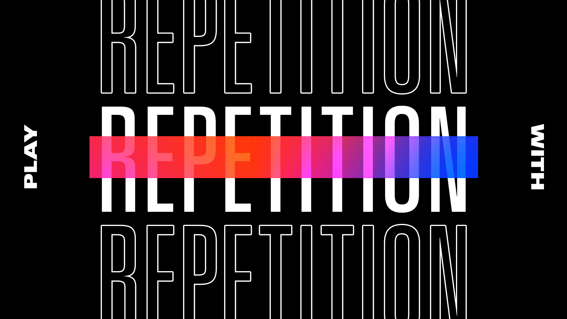
Repetition became a core typographic device, transforming language into pattern and motion. By duplicating words, cutting letterforms, and layering text in rhythmic sequences, the system visually communicated the loop of highlights, debates, and cultural moments that define modern fandom. Repetition headlines created a sense of momentum, echoing the bounce of a ball or the cadence of chants in an arena. This technique allowed static graphics to feel kinetic, reinforcing the brand’s philosophy that basketball culture is cyclical, ongoing, and participatory rather than finite.
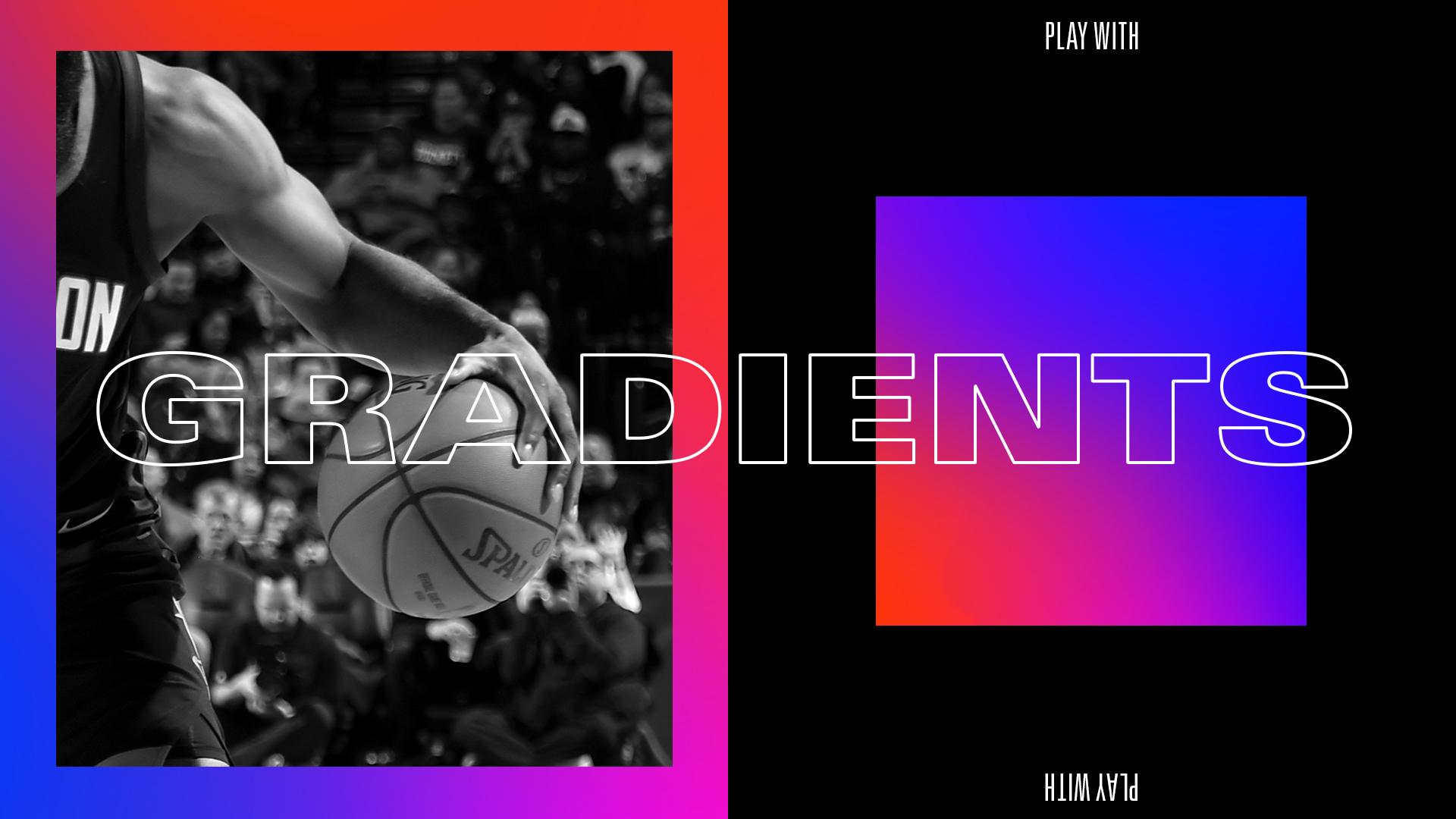
Gradients became the brand’s most recognizable visual signature, functioning as both aesthetic device and conceptual metaphor. Rather than decorative color blends, they represented momentum, transition, and the emotional arc of a game shifting from tension to release. The gradient spectrum, anchored in Forever Blue, magenta, purple, and Forever Orange, created a kinetic visual energy that evoked arena lighting, LED ribbon boards, and the glow of jumbotrons. As outlined in the identity proposal, gradients were used strategically with grayscale imagery and black and white typography to maintain legibility while maximizing visual impact, ensuring the color field energized the composition without overwhelming the content. This was a key design element in making the brand feel alive and youthful and directed at that Gen-Z audience.
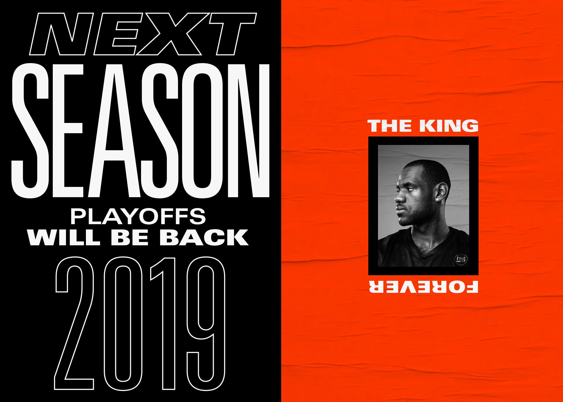
The gradient functioned as a visual motif that ties together the minimal yet bold Universe typeface with the repeating lines and dot patterns we built into the system. The result was a flexible and strong design language that took risks and drew in users as they were going through their social feeds. Knowing how crowded the marketplace was, we wanted to develop something that would look good next to other pieces of content on an infinite scroll timeline.
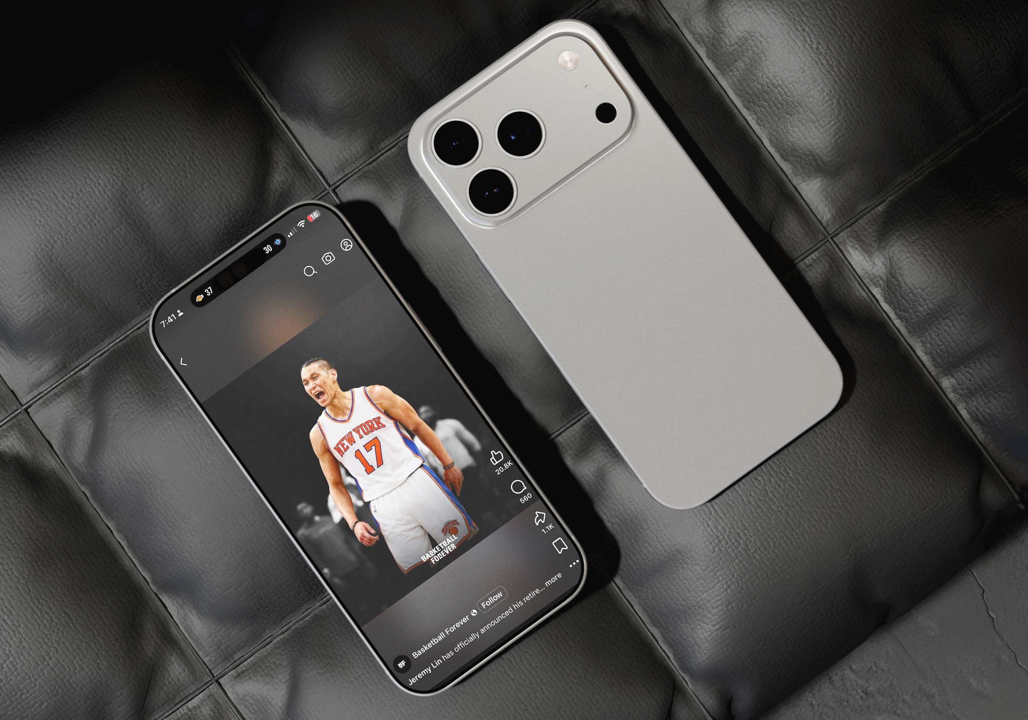
Standing out amongst the noise while still retaining that original attitude and voice that I had helped develop over the early years of Basketball Forever was of utmost importance. Organizational decay often occurs as a brand grows and the voice becomes diluted as the original founder's vision is handed off to other people. From a design perspective, I wanted to give the brand an ethos that would help diminish any of these effects by being brash and staying true to that original vision. The social media identity and the colors screamed bold and loud, and hopefully this would counteract any deleterious effects time might have on watering down the initial concepts. There is only so much you can do though and so part of you just has to put it out there and trust it.

This system proved that design is not merely aesthetic in social media. It is infrastructural. By building a scalable, modular graphics framework tailored to Instagram’s visual velocity and Facebook’s conversational depth, I helped create an engagement engine that converted information into interaction. Breaking news, stat cards, and quote graphics became the connective tissue of the brand, enabling Basketball Forever to operate not just as a publisher, but as a living interface between the sport and the global fan community. The design system was crafted intentionally for both e-commerce as well as our unique social voice. The templates and the functionality of the text to tell a story, move product and convey stats and info was a core consideration.
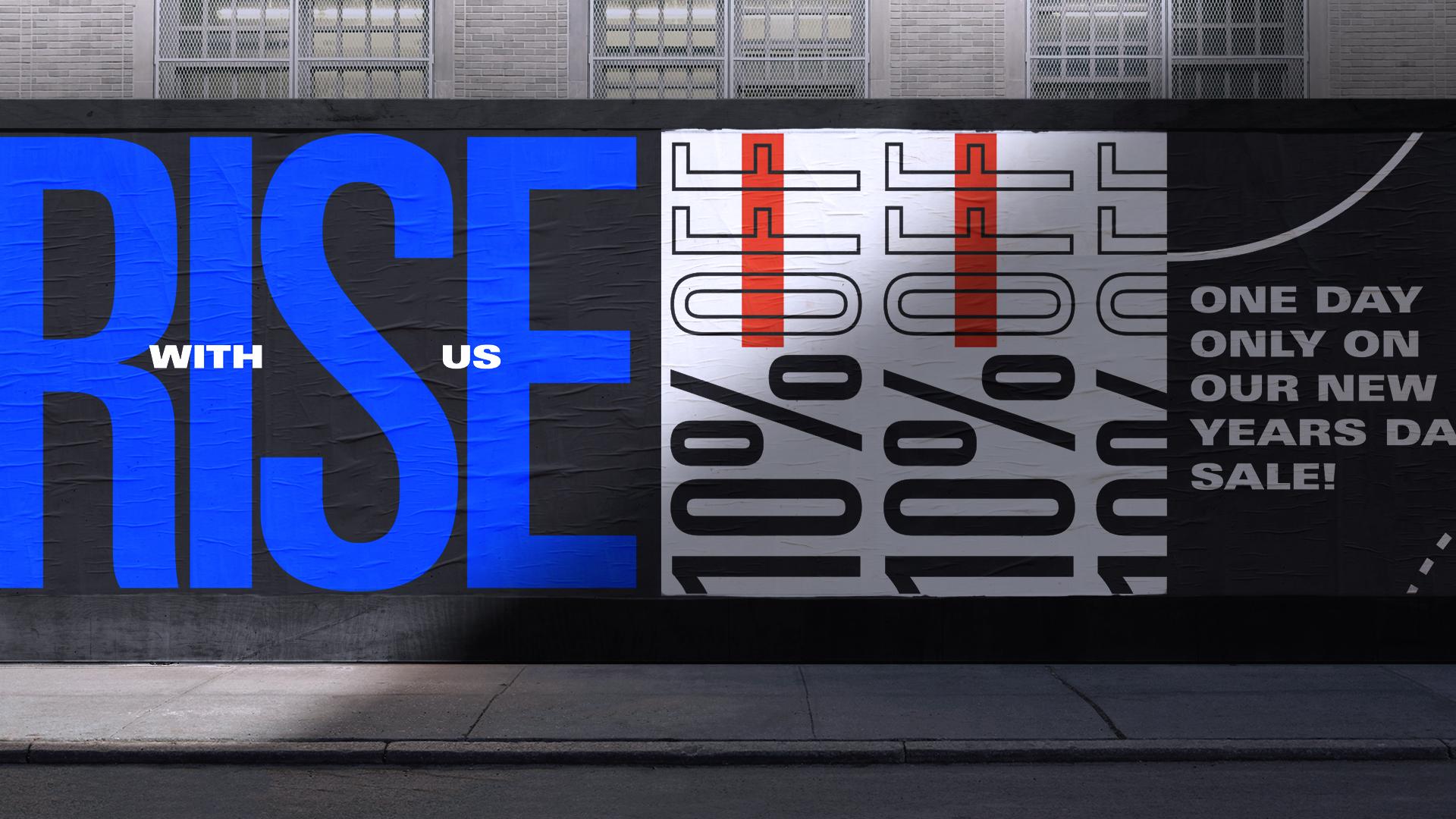
Imagery selection was guided by emotional relevance rather than aesthetic perfection. A slightly imperfect photo capturing a raw reaction often outperformed polished studio imagery because it conveyed authenticity. Cropping strategies emphasized facial expression, body language, and gesture, allowing fans to read emotion instantly. The design system supported these crops with negative space and graphic framing that elevated the moment without diluting its immediacy. These types of design system decisions brought the entire brand up a notch.
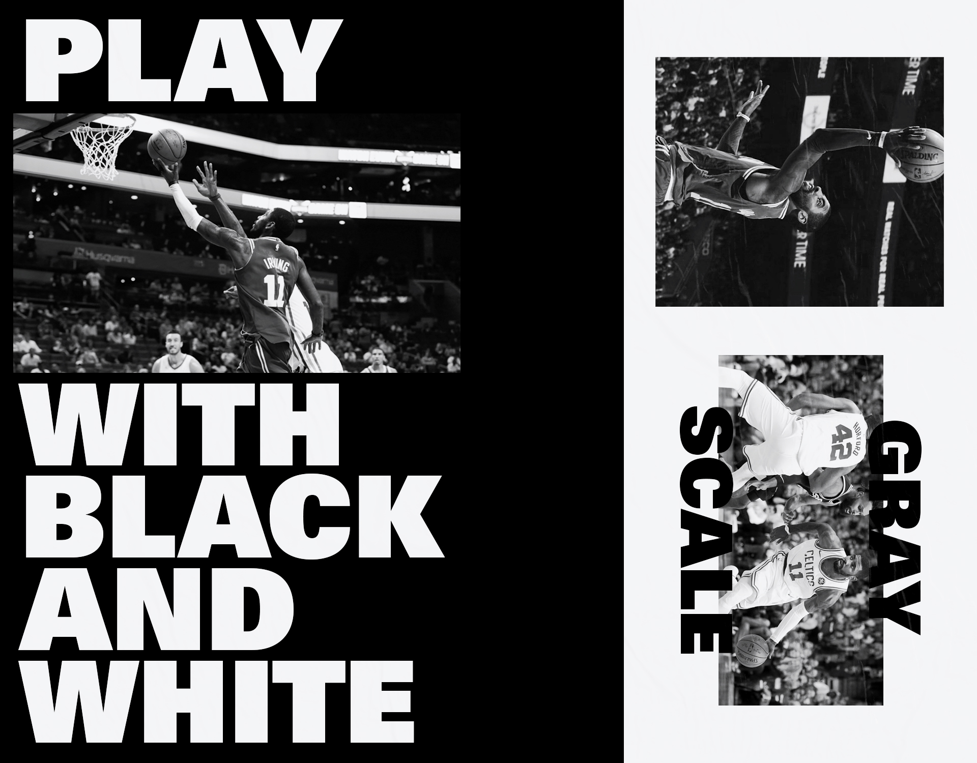
Color logic further enhanced comprehension. Accent hues highlighted key statistics, timelines, or injuries, while grayscale imagery prevented cognitive overload. By limiting color to moments of emphasis, the system ensured that attention was directed intentionally rather than scattered. This approach mirrored broadcast graphics but was optimized for mobile, where excessive color can reduce clarity and increase visual fatigue.
I was not adjacent to the DNA of Basketball Forever, I was a primary author of it. From the earliest stages, I helped define the voice, the visual language, and the pace at which the brand moved, shaping how it showed up in culture and how it resonated with a global audience. The tone, the instinct for timing, the balance between irreverence and emotional depth, those were not accidental, they were built, refined, and executed with intention and with a very clear northstar. The goal was to connect all these voices into one central network with a distinct voice.
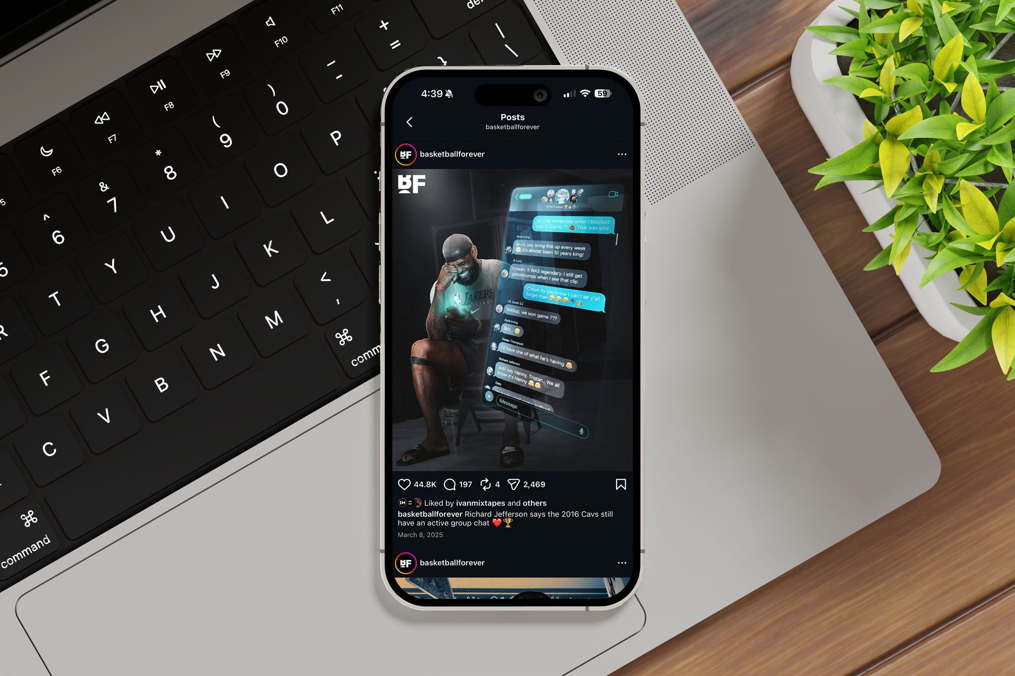
I pushed the brand beyond templated sports content into something that felt alive, reactive, and deeply in tune with the fan. Many of the formats, storytelling approaches, and design systems that later scaled were born out of that foundation. Without that layer of creative direction, Basketball Forever would not have had the same clarity of identity or cultural stickiness that fueled its growth. It is one thing to grow, it is another to grow with a point of view, and that point of view was something I embedded early and consistently. The brand’s success is a result of many contributors, but the core sensibility that made it distinct was something I played a defining role in shaping.
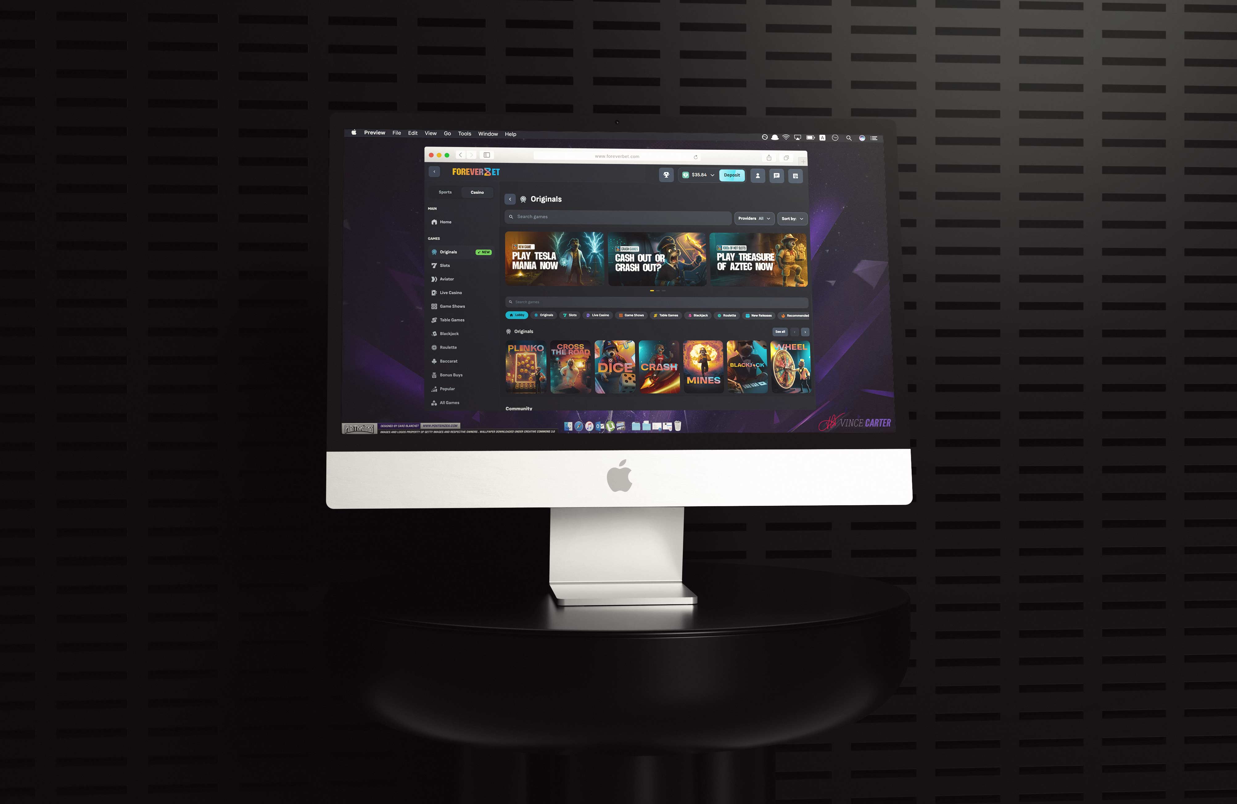
Basketball Forever was built as a social-focused publisher that covers the intersection of sports and culture. The content strategy evolved to feature more and more rich content experiences. What began as a text and image focused social feed of quick to market content, evolved into a heavily focused video publisher and then made a transition to online and written editorialized content. I helped develop the overall voice of the brand through multiple iterative content experiments whether that was on platforms such as the original facebook page, or more real time coverage through our twitter account. This personalized and intimate voice resonated with our core demographic as Basketball Forever evolved to produce richer and more interactive content. This base is what allowed the further content and web diversification.

Breaking news graphics required a balance between urgency and brand consistency. Templates were designed with locked zones for player imagery, headline text, and accent color, allowing editors to publish within minutes while maintaining visual standards. Color highlights signaled importance, while grayscale imagery preserved focus and legibility. The system enabled rapid deployment without sacrificing credibility, ensuring that even the fastest posts felt intentional rather than improvised. In a landscape where speed often undermines design quality, this framework proved that velocity and visual discipline could coexist. Photo use, and heirarchy and layout was something we debated quite a bit, because balance and digestability were key variables.
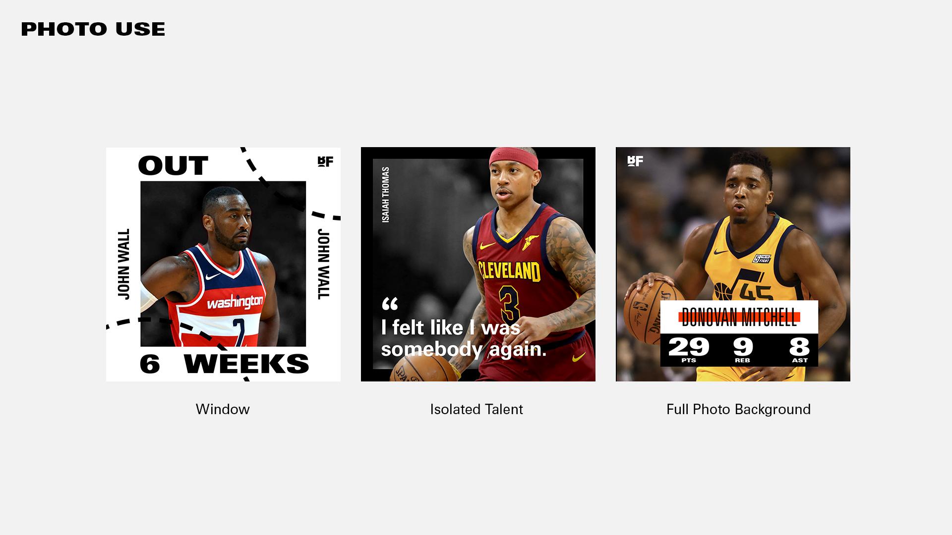
Typography played a crucial role in social news readability. Condensed headline treatments allowed for longer names and statistics within constrained spaces, while bold weights ensured legibility at small sizes. Outline variants provided emphasis without increasing visual weight, and repetition techniques created rhythm that guided the eye through information hierarchies. The type system functioned as both voice and interface, shaping how fans parsed information in high-speed environments. We knew that attention moves at the speed of the scroll, and our design had to move with it and keep up.
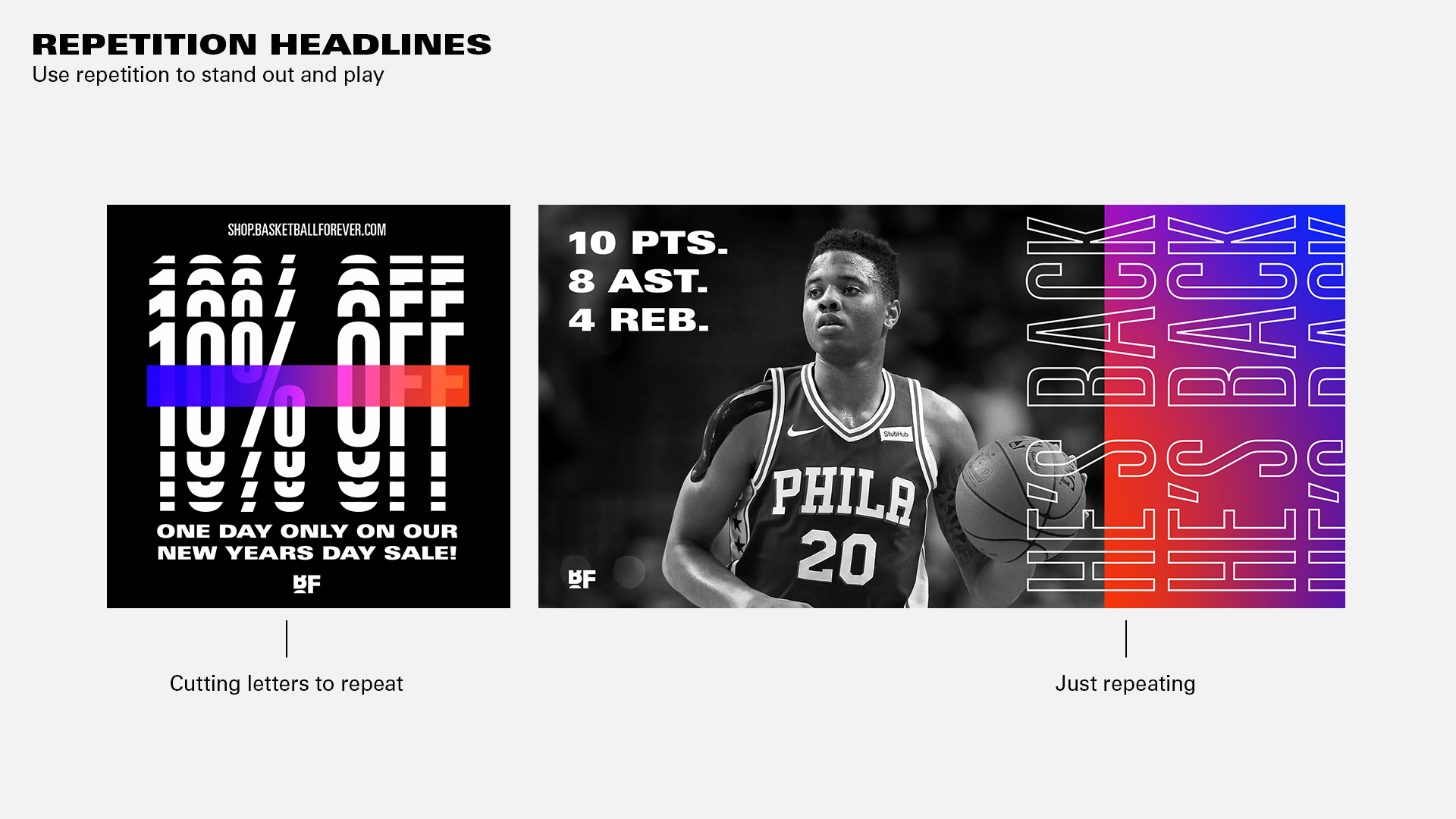
Stat cards emerged as one of the most effective engagement drivers within the ecosystem. These graphics translated quantitative performance into narrative form, transforming numbers into visual storytelling. Layouts emphasized clarity through grid systems, proportional typography, and color coding that guided interpretation at a glance. By isolating key metrics and pairing them with contextual imagery, stat cards allowed fans to grasp performance significance instantly, fueling debate and shareability. The design balanced analytical precision with emotional resonance, acknowledging that statistics in sports are not neutral data but catalysts for conversation. Quote cards functioned as cultural artifacts, capturing the voice of athletes, coaches, and commentators in moments of vulnerability, bravado, or controversy. In many ways our graphics took on a life of their own as memes even out of context.
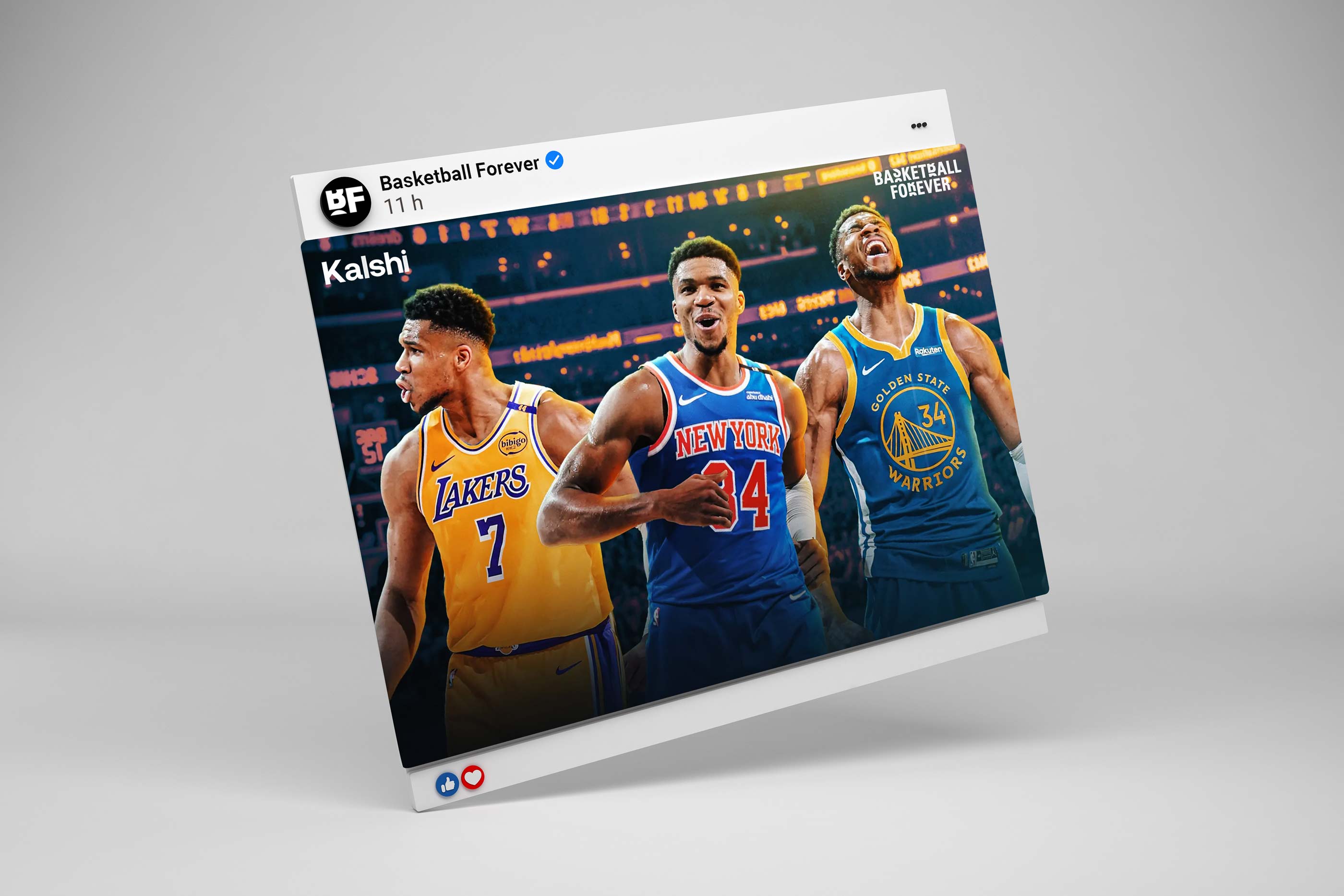
The design system treated quotes as typographic events, using scale, repetition, and highlight bars to emphasize key phrases. Player imagery anchored authenticity, while restrained color use ensured the words remained central. These graphics traveled widely because they distilled complex narratives into a single, emotionally charged statement. By elevating voice through design, quote cards transformed language into shareable identity markers for fans aligning with players or perspectives. Ultimately the look was good enough to package and monetize while maintaining the editorial voice.
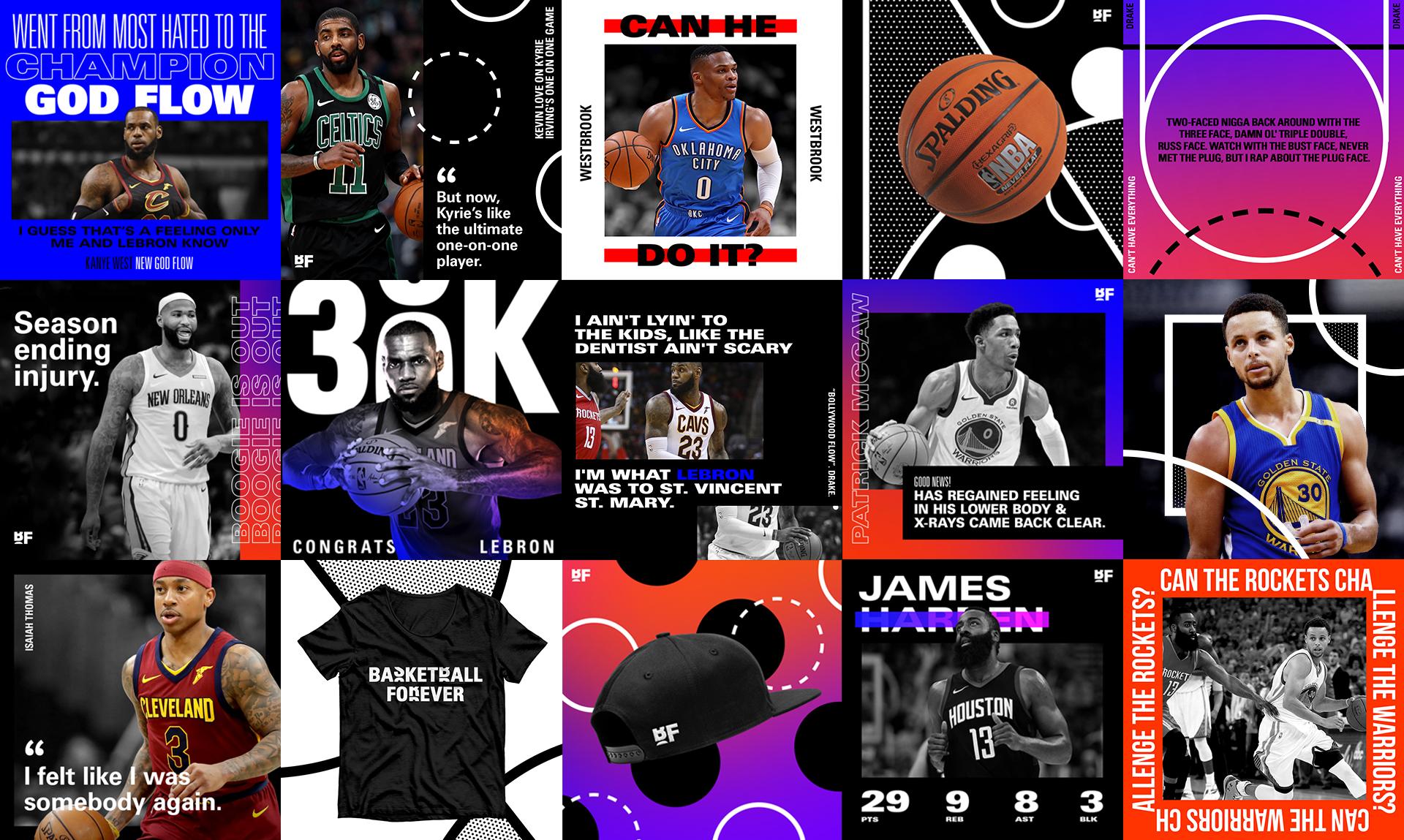
Color logic further enhanced comprehension. Accent hues highlighted key statistics, timelines, or injuries, while grayscale imagery prevented cognitive overload. By limiting color to moments of emphasis, the system ensured that attention was directed intentionally rather than scattered. This approach mirrored broadcast graphics but was optimized for mobile, where excessive color can reduce clarity and increase visual fatigue. Imagery selection was guided by emotional relevance rather than aesthetic perfection. A slightly imperfect photo capturing a raw reaction often outperformed polished studio imagery because it conveyed authenticity. Cropping strategies emphasized facial expression, body language, and gesture, allowing fans to read emotion instantly. The design system supported these crops with negative space and graphic framing that elevated the moment without diluting its immediacy. Throughout the social graphics, these rules allowed us to iterate and respond quickly to any news moment.
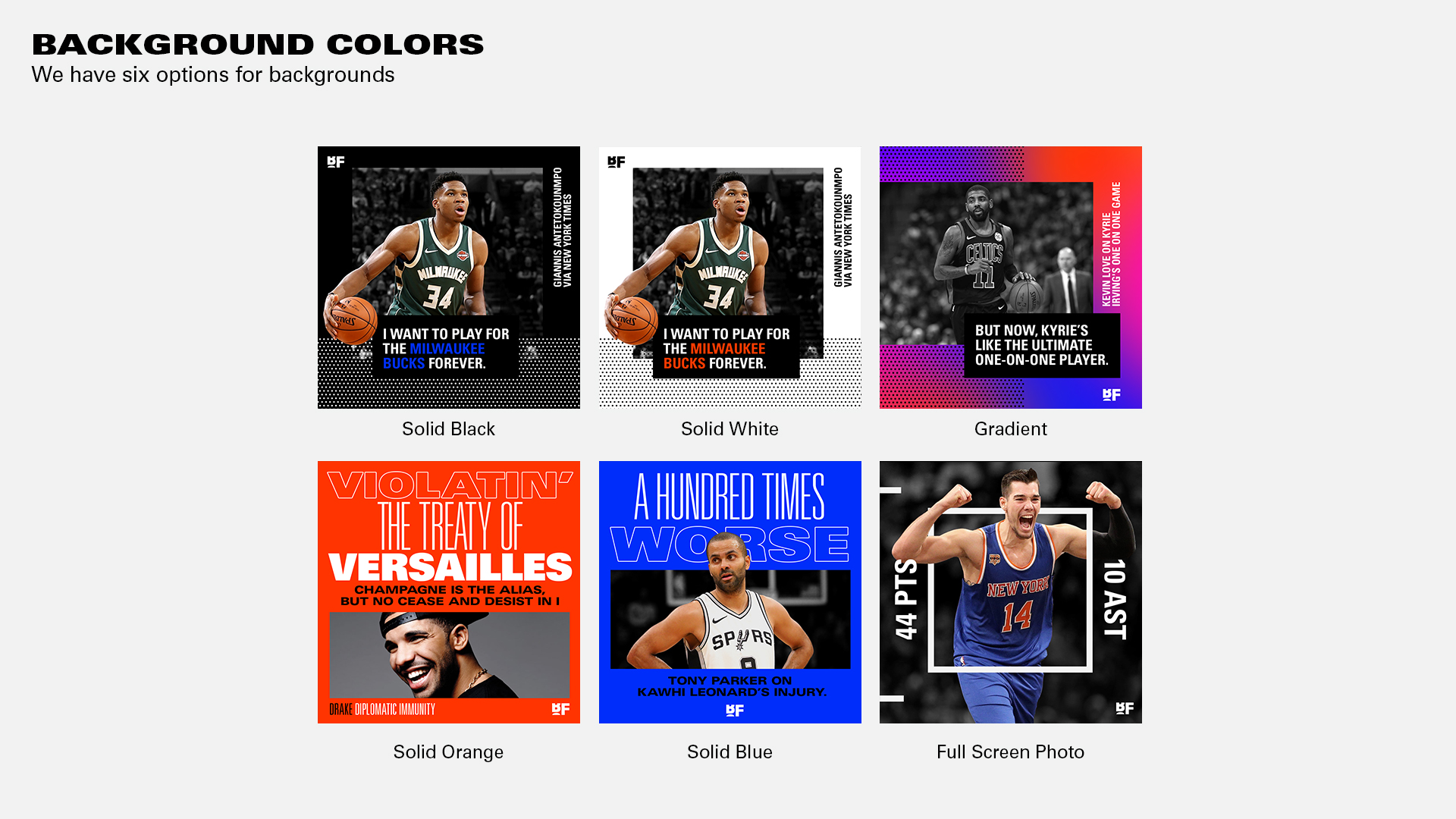
The social news ecosystem ultimately transformed Basketball Forever into a real-time cultural pulse rather than a delayed reporting outlet. Graphics were not static assets. They were conversational triggers, designed to spark debate, affirm allegiances, and circulate within fan networks. By engineering layouts specifically for shareability and rapid comprehension, the brand positioned itself at the center of second-screen behavior, where fans engage with the game through discussion as much as through viewing. This system proved that design is not merely aesthetic in social media. It is infrastructural. By building a scalable, modular graphics framework tailored to Instagram’s visual velocity and Facebook’s conversational depth, I helped create an engagement engine that converted information into interaction. Breaking news, stat cards, and quote graphics became the connective tissue of the brand, enabling Basketball Forever to operate not just as a publisher, but as a living interface between the sport and the global fan community.
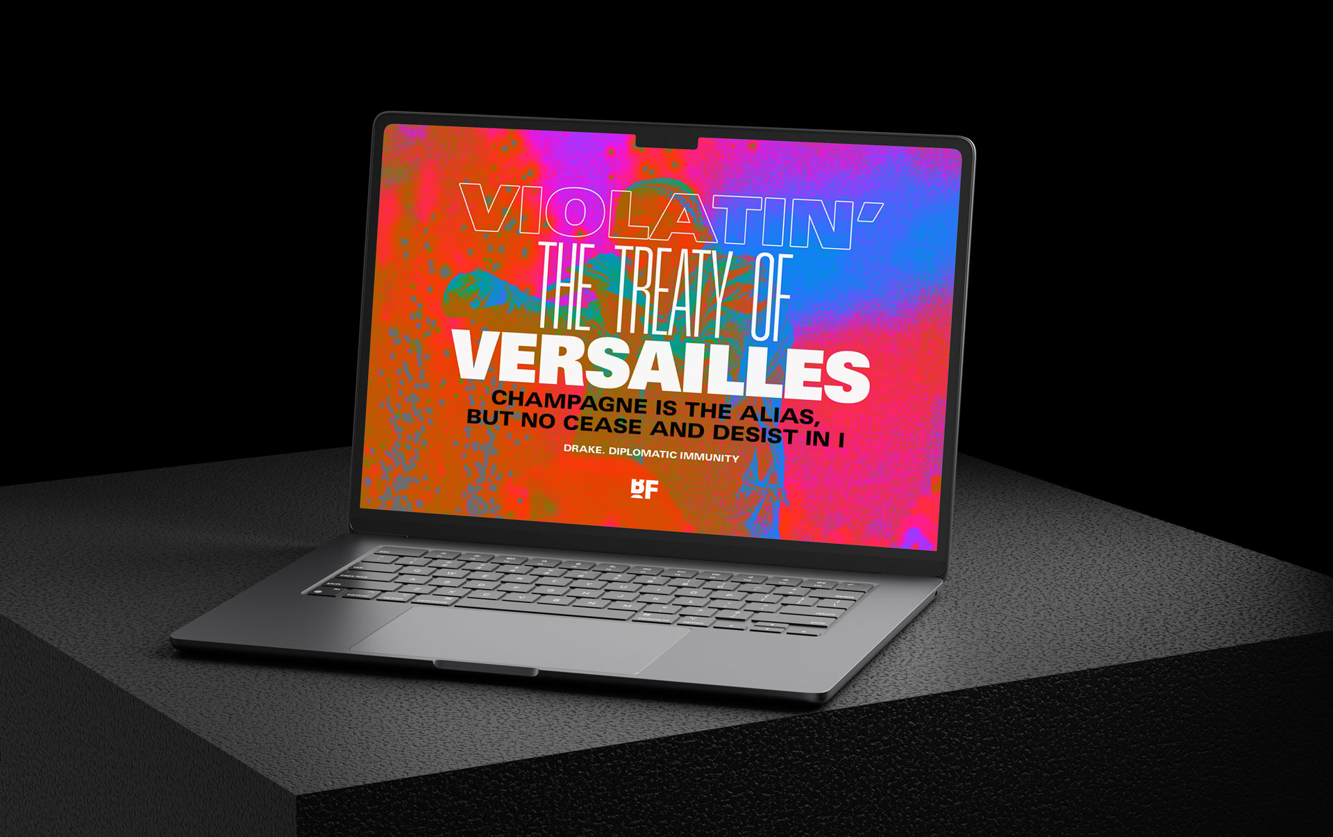
Covering rap and hip hop was not an adjacent content play for Basketball Forever. It was a recognition of the cultural reality that the NBA and hip hop are deeply interwoven ecosystems shaping one another in real time. From tunnel fits and pregame playlists to sneaker collaborations, lyrical references, and athlete-artist friendships, the relationship between basketball and hip hop functions as a shared language of identity, aspiration, and storytelling for a global youth audience. Integrating this dimension into the brand allowed us to reflect the full spectrum of fandom, where a LeBron stat line sits comfortably beside a Drake lyric, and a playoff moment resonates through mixtapes, fashion, and social discourse.
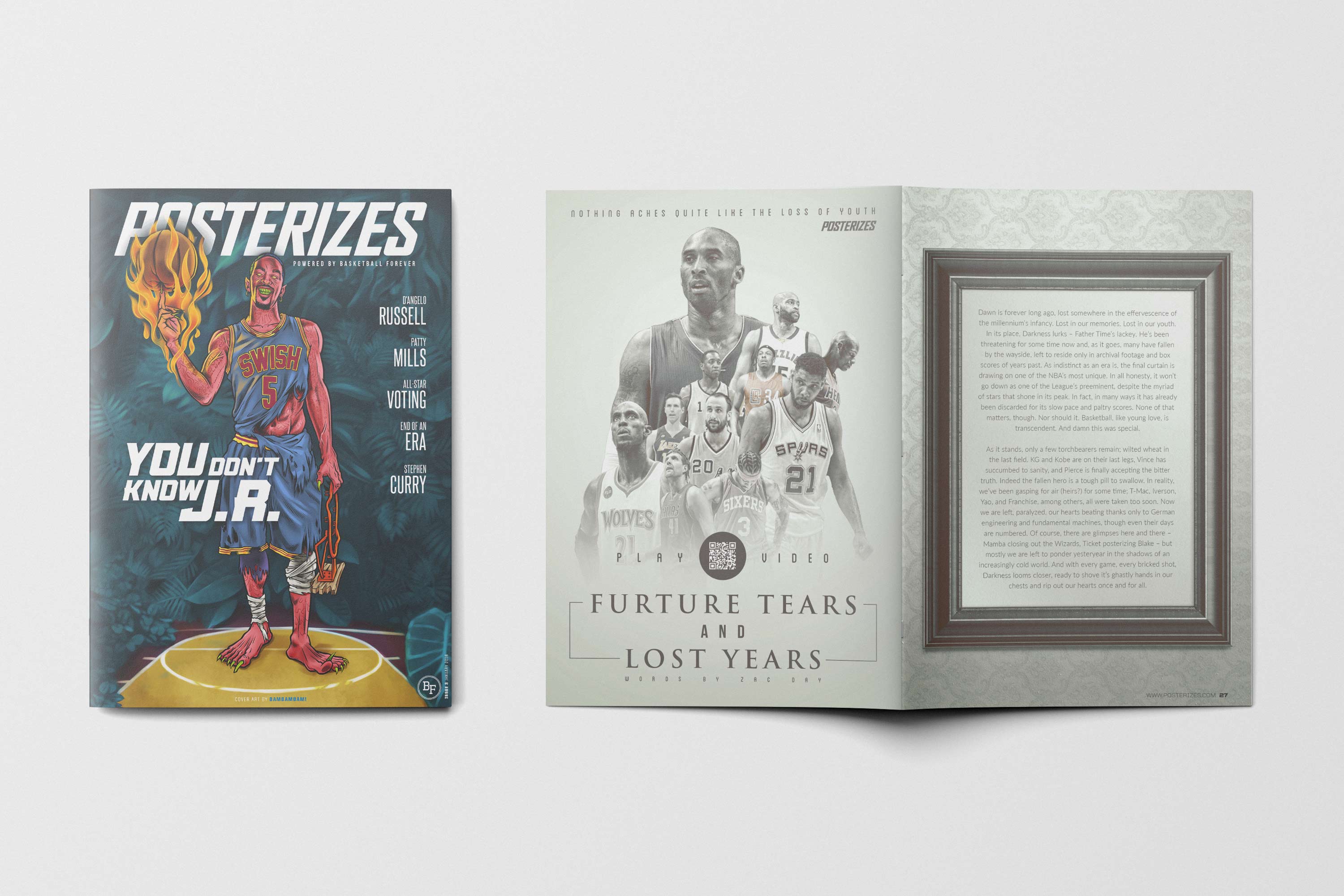
Visually and editorially, we treated hip hop not as a sidebar but as a co-equal pillar, using typography, motion pacing, and color energy inspired by album art, streetwear graphics, and music video aesthetics to create a seamless dialogue between the court and the culture surrounding it. This approach reinforced Basketball Forever’s position at the intersection of sport and lifestyle, acknowledging that for modern fans, the game does not end at the buzzer. It continues in playlists, fits, memes, and conversations that blur the boundaries between athlete and artist, competition and expression, basketball and the broader cultural rhythm that gives it meaning. That meant whether it was on our merch, on social, or even in Posterizes the magazine, it all was connected.
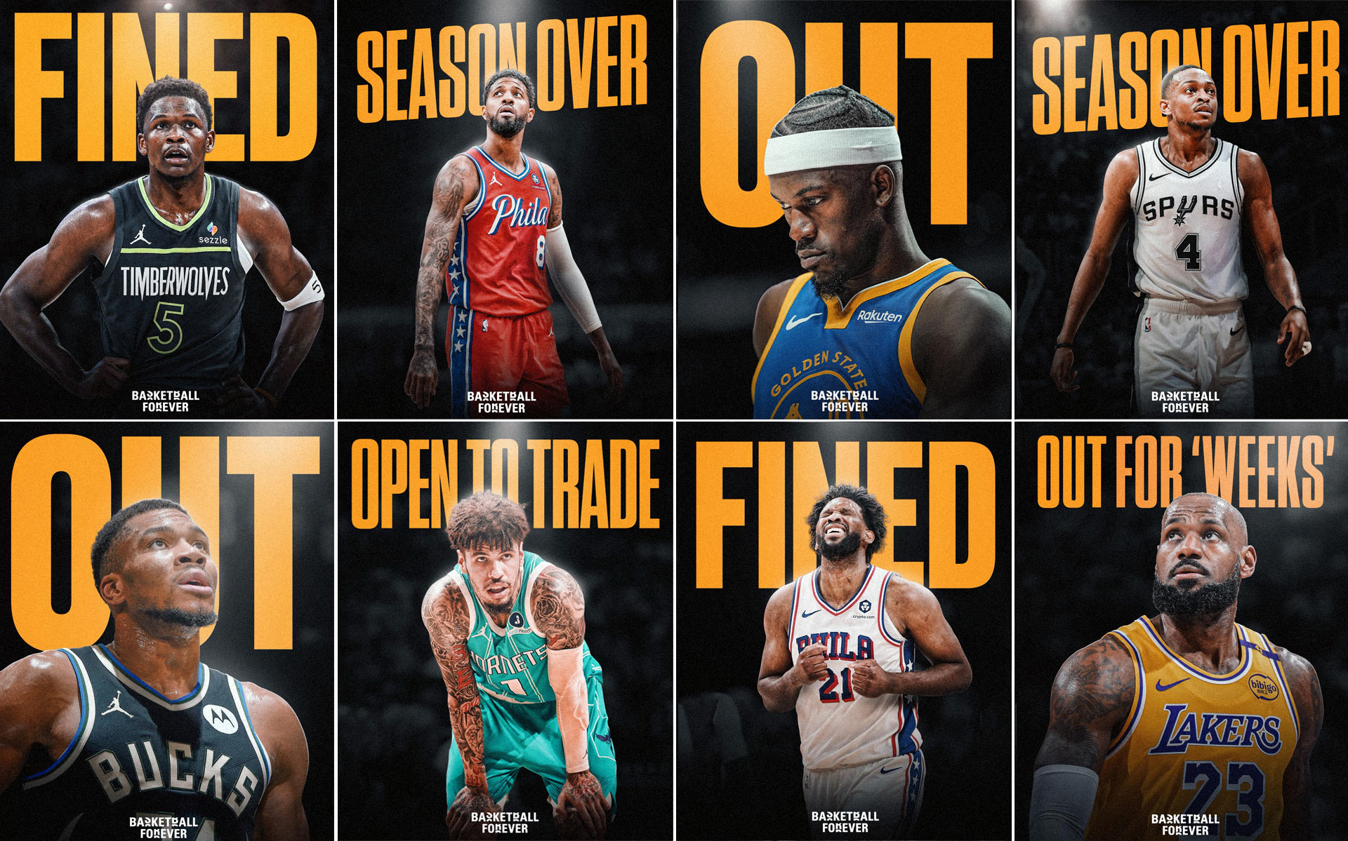
Basketball Forever found its footing as a distinctly Gen Z voice by treating copy not as filler but as culture in motion, written in the cadence of group chats, comment sections, and late night Twitter threads where fans actually live. The tone rejected the stiff, broadcaster-adjacent language that had long defined sports media and instead embraced a conversational elasticity that could swing from irony to sincerity in a single swipe. Headlines read like texts from a friend who watches every game, captions mirrored the rhythm of meme culture, and punchlines landed with the timing of a perfectly clipped reaction GIF. This wasn’t about dumbing anything down. It was about fluency. The platform spoke in the vernacular of a generation that processes sports through highlights, jokes, fashion, music references, and cultural subtext all at once.
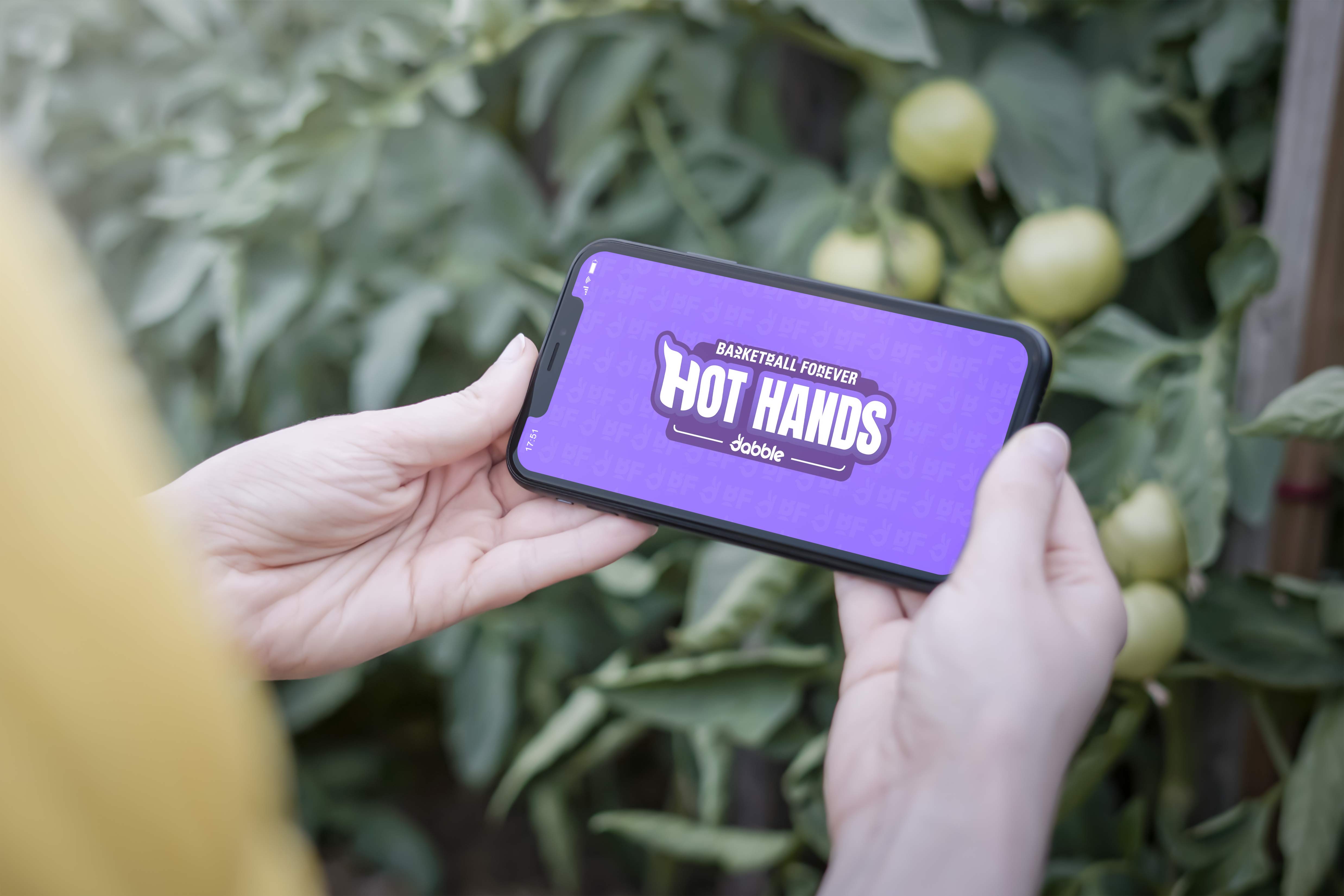
With a lot of our institutional investors in the gambling and sports betting space, it made sense to integrate in these elements from a monetization perspective in a slow, responsible manner over time to integrate that gamified element. Basketball Forever has evolved into a premier digital media platform, delivering extensive coverage of the global basketball scene. Originating in Australia, the company has organically grown its brand, now boasting a monthly audience exceeding 110 million unique visitors worldwide. With a Comscore’s Shareablee score that ranks it as the top sports publisher among millennials, Basketball Forever’s influence stretches far and wide. Despite its initial focus on the Australian market, the platform has a significant following in the United States, with 45 million unique monthly visitors and 4 billion impressions across all social channels in 2023.

Basketball Forever uniquely integrates its gaming operations with its content distribution, leveraging its website and social media platforms to engage users with a compelling second screen experience. This approach not only fosters a vibrant community atmosphere but has also demonstrated its effectiveness in attracting and retaining users, as evidenced by the success of Hot Hands, a live-action, free-to-play game launched during the NBA All-Star Weekend. The game attracted over 10,000 participants, who claimed upwards of 35,000 squares in its inaugural session. The company’s gaming portfolio, which includes V.O.A.T. and Streaker, is also set to expand with upcoming real-money game offerings. This dynamic ecosystem across so many mediums and with so many dynamic multimedia touchpoints for deep user engagement is where we built value and developed our moat.
That voice was built on precision disguised as effortlessness. Copy choices were short, kinetic, and emotionally legible on a four inch screen, optimized for thumb speed and attention economics without feeling engineered. Slang was deployed with intent rather than trend chasing, ensuring the brand sounded native to the moment instead of performative. A post could move seamlessly from a stat line to a meme format to a cultural callback, collapsing the distance between analysis and entertainment. In doing so, Basketball Forever didn’t simply report on the game. It mirrored how the next generation experiences it, as a continuous feed where sport, style, humor, and identity are inseparable. Our logo and branding felt clean yet sport and modern at the same time, all together the full package was a huge leap forward from our origin.
The layout logic across breaking news, stat cards, and quote cards was unified by a modular grid that enabled compositional flexibility without fragmentation. Elements could expand, contract, or rearrange based on content density while maintaining alignment, spacing, and visual rhythm. This modularity allowed contributors across time zones to produce graphics that felt cohesive, reinforcing the brand’s global presence. The grid was invisible to users but essential to scalability, ensuring that every post, regardless of origin, adhered to a shared structural logic. Whether it was company letter head or a social post, consistency allowed everything to feel like it was under our umbrella.
Building the Basketball Forever brand system was not simply a design exercise. It was a market entry strategy. From the outset, I understood that for a social-first sports media startup to be taken seriously by partners, advertisers, and investors, it needed to present itself with the coherence and credibility of an established media property while retaining the agility of a digital-native platform. The brand system functioned as proof of intent. A disciplined visual language, a clear editorial voice, and scalable templates signaled that this was not a fleeting meme page but an infrastructure capable of supporting sustained growth, monetization, and global expansion.
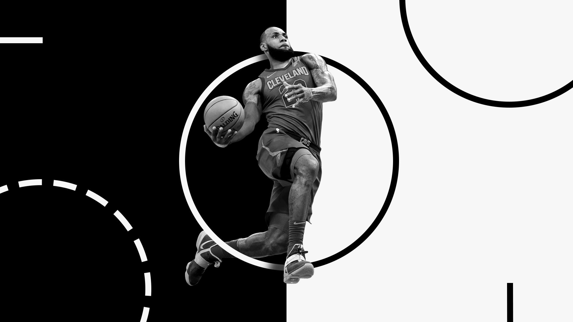
In early go-to-market conversations, the strength of the brand system helped translate abstract vision into tangible value. Investors and partners could see how the modular design framework enabled high-volume publishing without quality degradation, how the typography and color logic ensured instant recognition in crowded feeds, and how the content formats were engineered for engagement rather than passive consumption. The system demonstrated operational leverage. With a small distributed team, we could produce content at a scale and consistency that rivaled far larger organizations. This efficiency, made visible through design discipline, positioned Basketball Forever as a viable media startup and revenue generating business rather than an experimental side project or small community facebook page.

That level of rigor and foresight helped lay the groundwork for future revenue streams. With a cohesive visual identity, engaged audience, and proven ability to mobilize attention for both commercial and charitable outcomes, we created a credible pathway toward merchandise, branded content, and long-term partnerships. The vision was always to build a recognizable sports culture brand rather than a disposable content page, and every design decision supported that trajectory. Looking back, the work anticipated the creator-led media economy that would follow. By treating community, aesthetics, and impact as interconnected levers, I helped transform Basketball Forever into a platform that was not only culturally resonant but structurally investable, a blueprint for how thoughtful design and brand elevation can turn passion into enterprise.
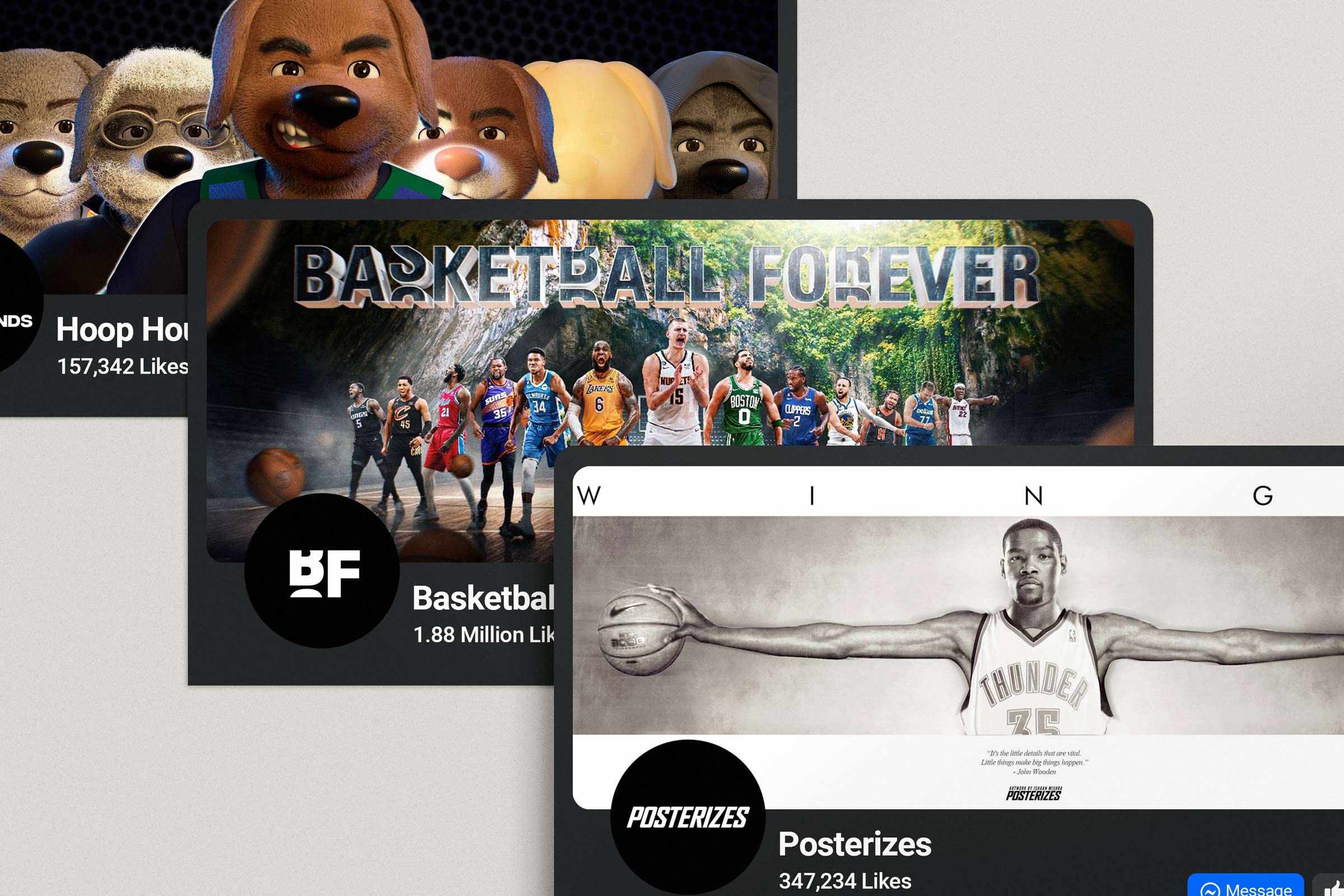
Basketball Forever’s real achievement was not simply that it became a successful media brand, but that it created the conditions for an entire ecosystem to emerge around it. Once the audience trust, distribution power, and cultural legitimacy were firmly established, the brand became more than a publisher. It became a launch platform. The social channels acted as both audience engine and live market research layer, showing us in real time what fans cared about, what they would rally behind, and where adjacent opportunities were beginning to take shape. That meant new initiatives were never built in a vacuum. They were extensions of existing audience behavior, natural outgrowths of the energy already moving through the system. In that sense, Basketball Forever did not merely grow outward. It multiplied, turning fandom into infrastructure for new products, new communities, and new commercial pathways. What made that possible was the fact that we were not treating content as an end point.
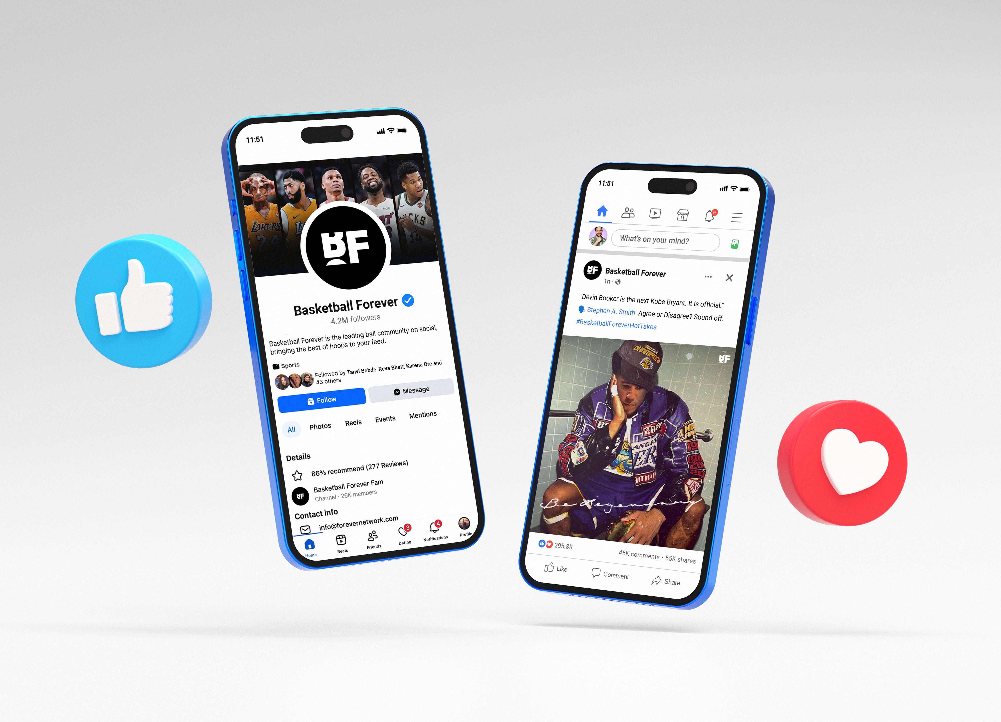
We were treating it as the connective tissue between culture, commerce, and participation. Every post, campaign, and series helped sharpen our understanding of what kind of business this could become beyond social publishing alone. As the platform matured, it became increasingly clear that the real asset was not only reach, but affinity. We had built a brand people wanted to wear, share, debate through, and identify with. That kind of emotional ownership is what allowed the company to evolve from a media property into a broader fan ecosystem, where content could lead to merch, merch could lead to community, community could lead to product experimentation, and product experimentation could lead to entirely new verticals. The business became stronger because the audience relationship was not transactional. It was participatory.
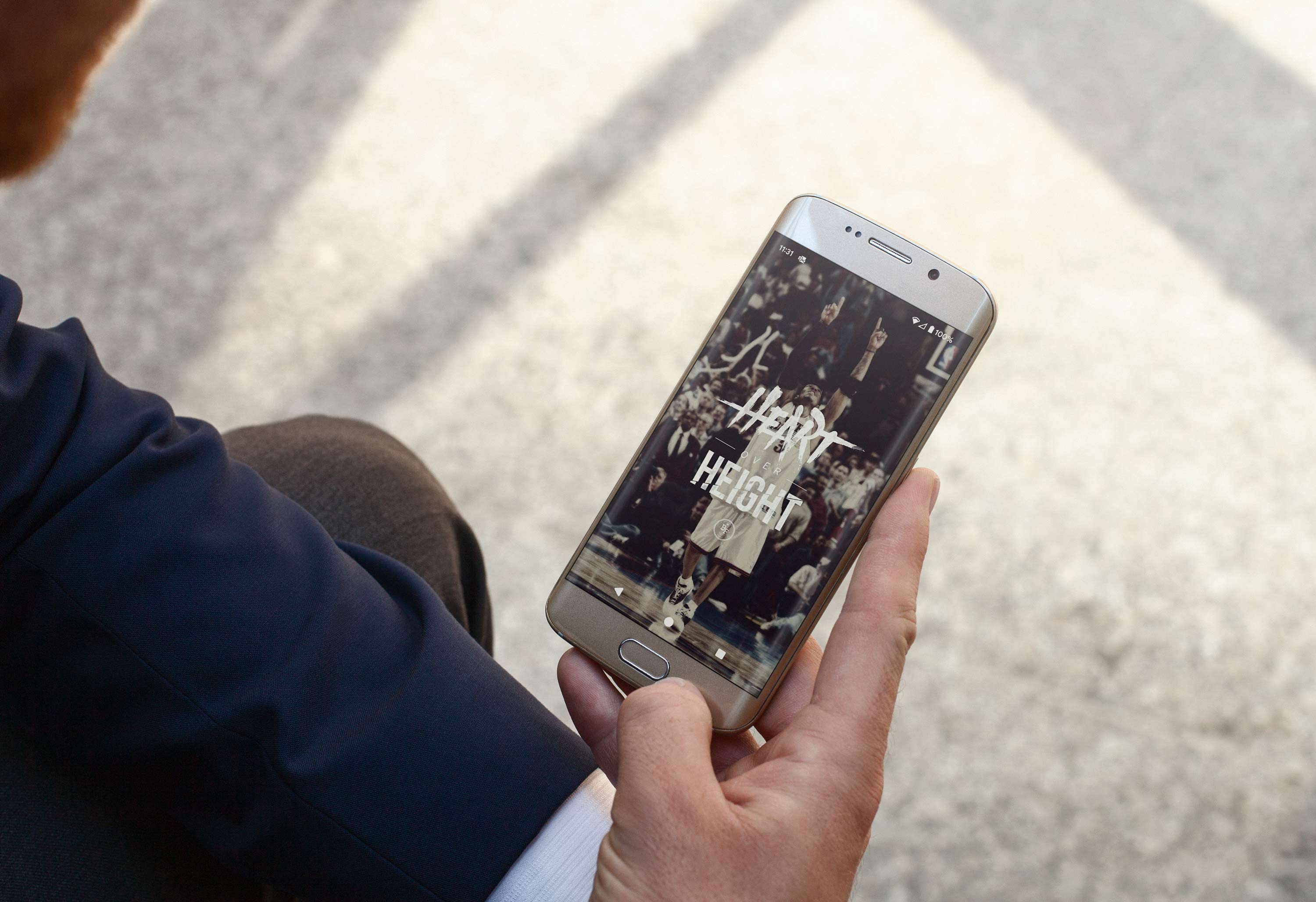
Basketball Forever evolved into a multi-surface ecosystem designed to meet fans wherever their attention lived, transforming a social media origin into a vertically integrated sports and culture platform. What began on Facebook and Instagram as high-velocity content streams expanded into a web destination that served as a curated hub for deeper storytelling, e-commerce, and brand partnerships, while the mobile app extended that experience into a personalized, always-on interface for real-time updates and community engagement. Over time, each surface was not treated as a silo but as a connected layer within a broader system, where social acted as the discovery engine, web as the depth layer, and mobile as the retention loop. This architecture allowed us to guide fans from passive consumption into more intentional participation, whether that meant reading long-form features, purchasing merchandise, engaging with interactive formats, or returning daily for updates tailored to their interests. The ecosystem was designed to compound attention into habit, and habit into loyalty, creating a feedback loop where audience behavior continuously informed product evolution. As a result, Basketball Forever became more than a destination for content. It became an operating system for fandom, one that translated the fragmented, fast-moving nature of modern sports culture into a cohesive, immersive experience that could scale across platforms, geographies, and business lines without losing its core identity.
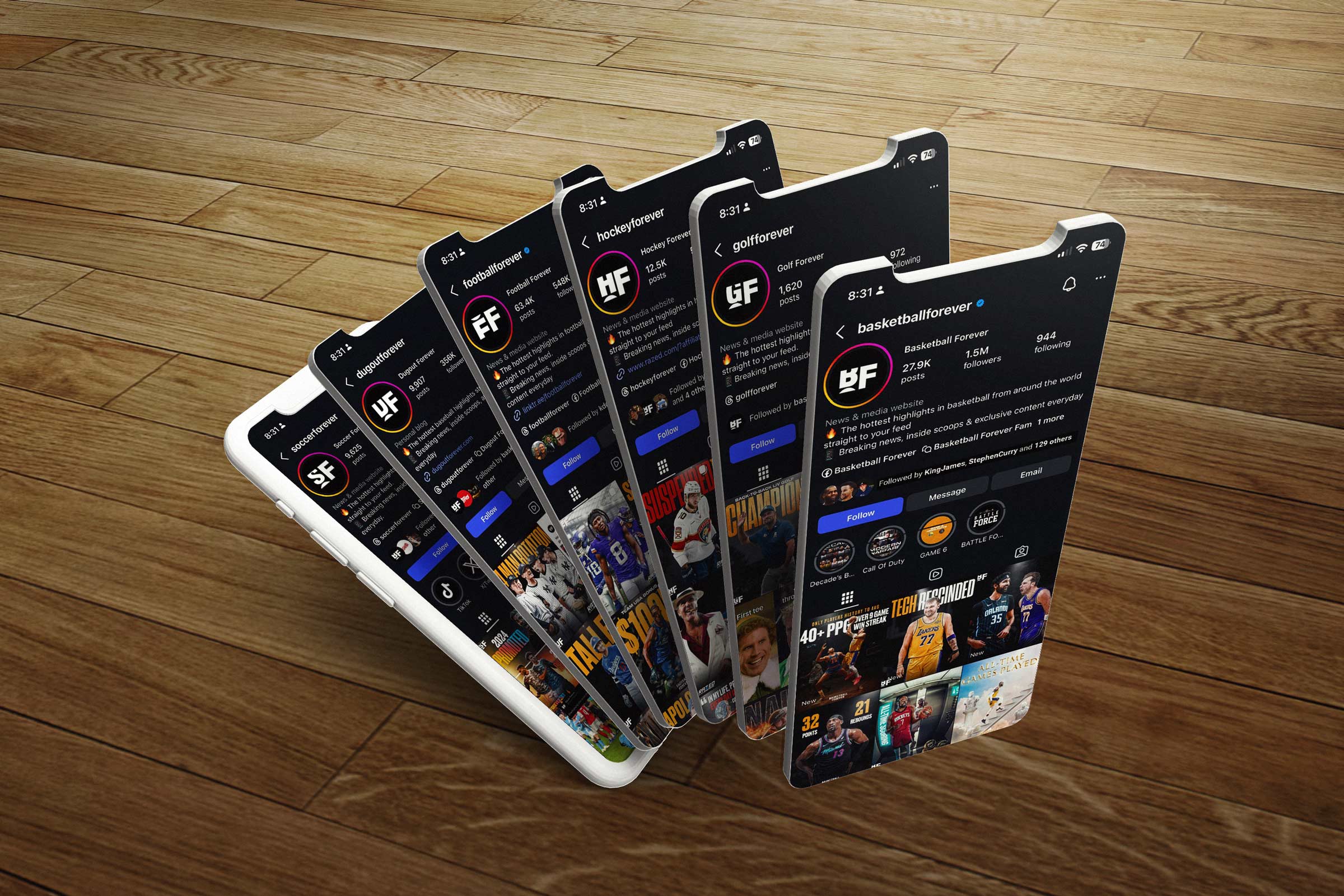
That broader philosophy is what helped shape Forever Network into something more expansive than a collection of sports pages. The opportunity was to take the core operating principles that made Basketball Forever work, authentic voice, speed, cultural fluency, and modular creative systems, and apply them across multiple categories, audiences, and formats. What emerged was a network model designed for compounding value, where each new vertical could benefit from the learnings, infrastructure, and playbooks established by the one before it. Rather than building isolated brands from scratch each time, we were developing a repeatable framework for how modern fan communities could be launched, grown, and monetized. That made Forever Network feel less like a publisher and more like a new kind of sports and culture incubator, one capable of translating niche passion into scalable media businesses.
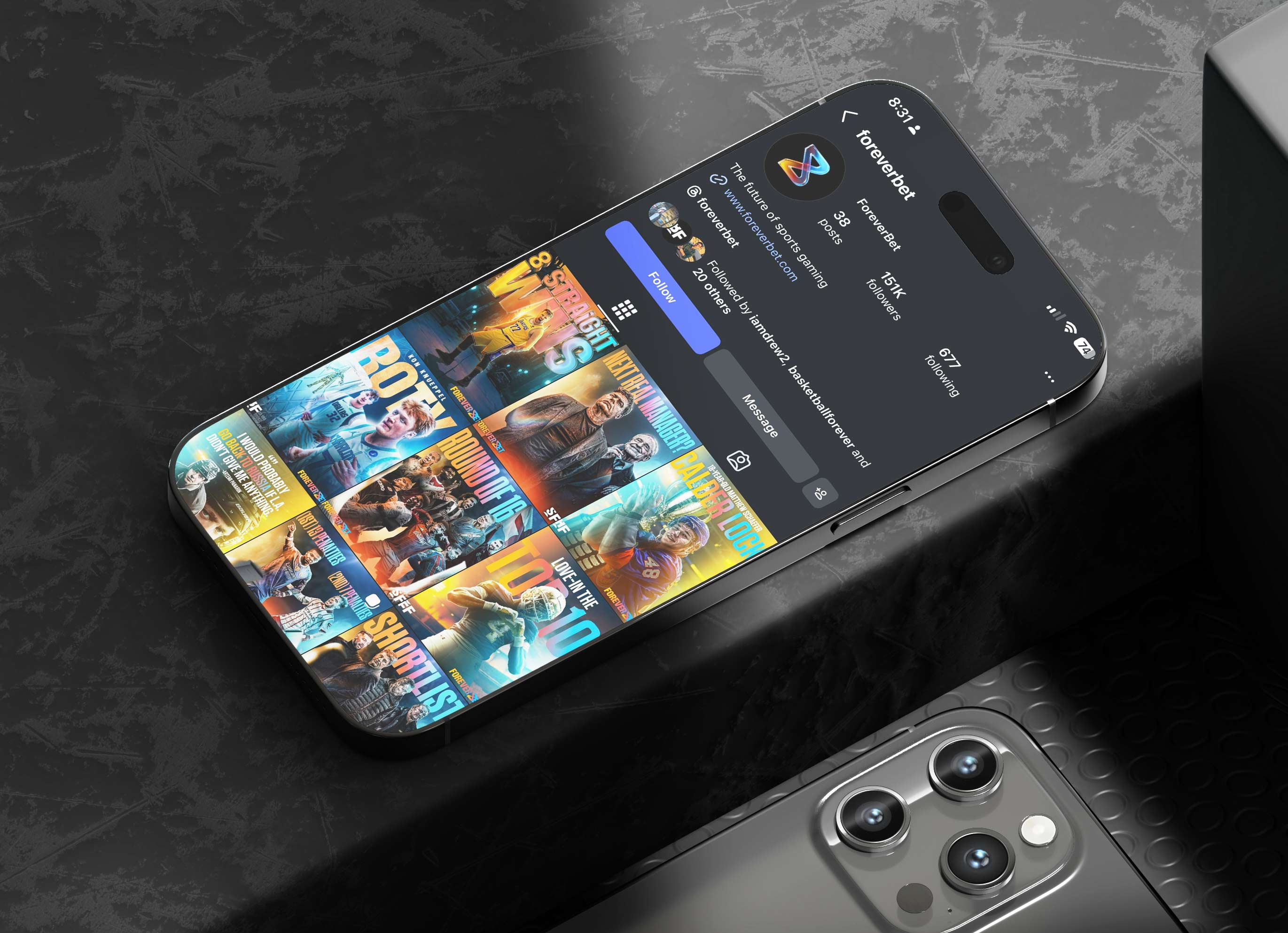
Initiatives like Hoop Hounds represented an especially important evolution because they showed that the brand could generate original intellectual property rather than simply package conversation around existing leagues, teams, and players. Hoop Hounds took the language of basketball fandom and extended it into character, storytelling, collectibility, and digital ownership, opening up a new lane between sports culture, internet identity, and community based product thinking. It was not valuable simply because it was novel. It was valuable because it proved the audience was willing to follow the brand into new terrains so long as the underlying sensibility remained intact. That shift matters. Moving from media to IP is one of the clearest signs that a company is building durable equity rather than renting temporary attention. It means the brand is no longer only reflecting culture, it is writing culture.
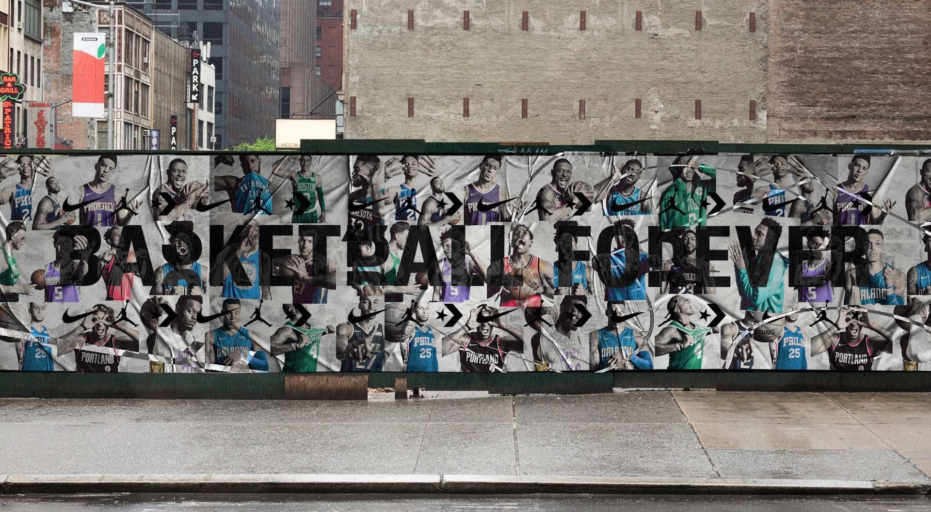
Posterizes and similar initiatives helped reinforce another crucial dimension of the ecosystem, which was the ability to turn moments, aesthetics, and fandom rituals into enduring products with their own value. In a crowded media environment, one of the hardest things to build is not visibility but permanence. Posterizes worked because it translated the emotional charge of sports into something collectible, displayable, and owned, something that could live beyond the feed. That kind of extension deepened the relationship between audience and brand by giving fans another way to participate, not just by watching or liking, but by bringing the identity into their spaces and routines. It also pointed toward a larger strategic truth, which is that the strongest media brands do not only publish content. They produce objects, symbols, and experiences that continue carrying meaning after the scroll is over. The hope was to create something memorable and worth fans spending their time on.
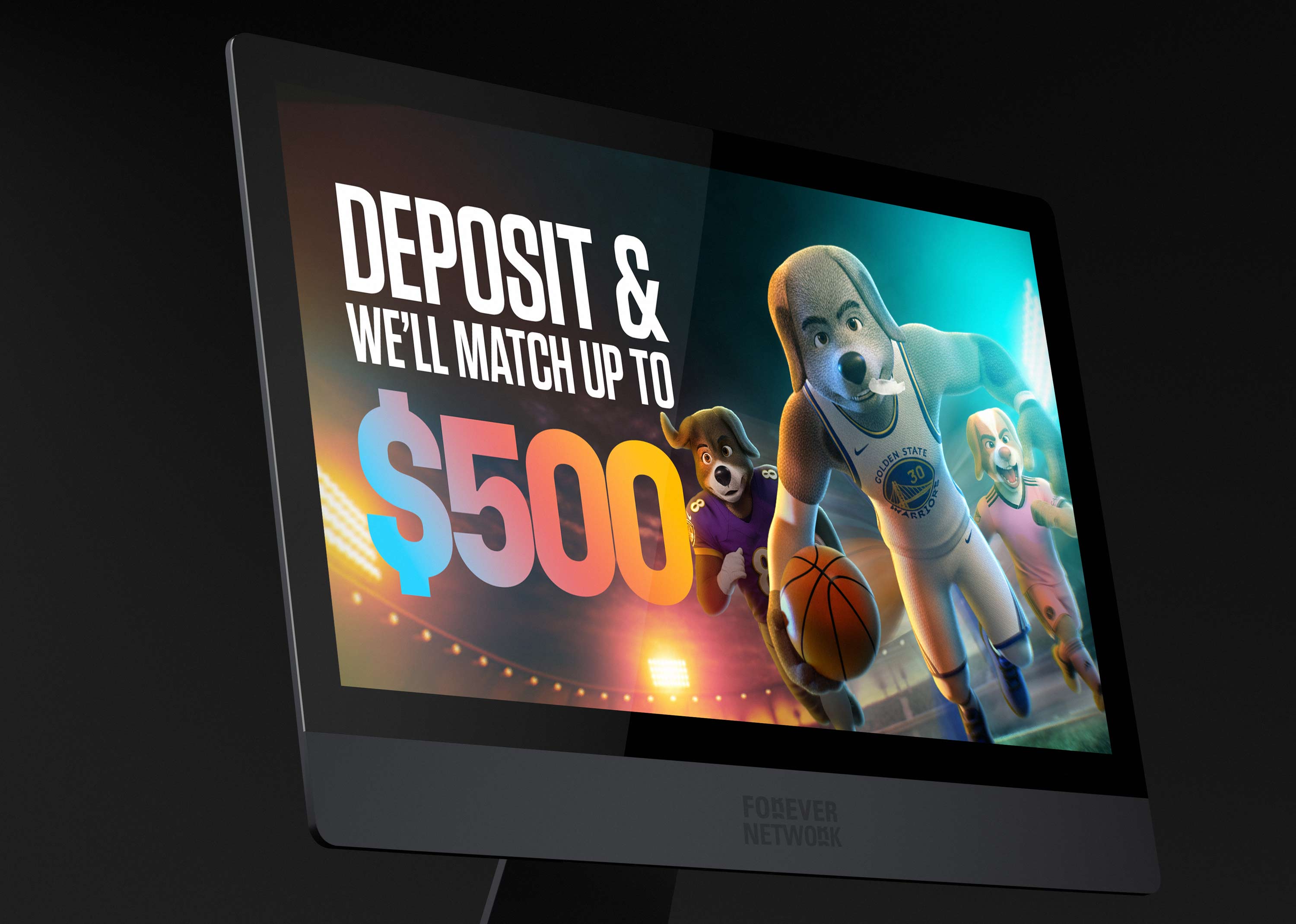
Taken together, these expansions showed that the business was evolving toward a much richer model where media, IP, commerce, community, and interaction all reinforced one another. Basketball Forever built the trust. Forever Network built the structure. New ventures like Hoop Hounds and Posterizes demonstrated the elasticity of the platform and the depth of the audience relationship. For me, that is one of the most meaningful parts of the story. We were not only building a popular sports brand. We were helping pioneer a modern fan economy, one where attention could be converted into belonging, belonging into participation, and participation into long term enterprise value. That is the difference between growing a page and building a company, and it is a distinction I understood early and helped bring to life.
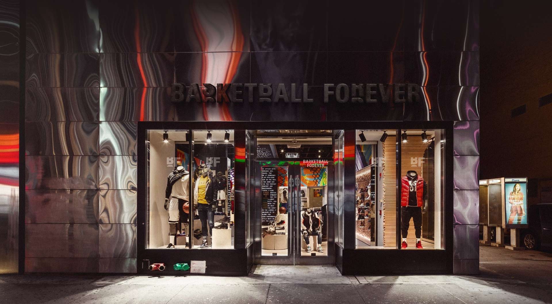
Basketball Forever laid the foundation, but the larger ambition was always ecosystem scale. As the audience deepened and the brand’s cultural authority strengthened, it became clear that we were building more than a content publisher. We were building a platform capable of launching adjacent ideas, products, and communities with built in trust and distribution. That is what ultimately made the business so compelling. The same fan relationship that powered social growth could also support commerce, original IP, experiential activations, gaming concepts, and collectible driven ventures. Rather than treating these as disconnected experiments, I saw them as expressions of a broader architecture, one where every initiative fed the others and strengthened the overall network effect of the brand. The sub brands created a network of stories an a universe of sports content.
This is where Forever Network became especially powerful. What started as a basketball media success story evolved into a repeatable model for building fan centered businesses across sports and culture. Ventures like Hoop Hounds and Posterizes or the rich thriving communities created in alternate sports like football, baseball or soccer reflected that maturity, showing how the company could move beyond publishing into owned intellectual property, design led products, and more participatory forms of fandom. They demonstrated that the audience was not only there to consume content, but to engage with the brand as a cultural world they wanted to belong to. That shift from media brand to ecosystem builder is a major part of what I helped shape. It required not only creative direction, but strategic vision around how trust, taste, and community could be translated into long term business value.

It became clear that the system we had built was not limited to basketball but fundamentally adaptable, which made expanding into Soccer Forever, Football Forever, and additional sports verticals a natural progression rather than a leap. The underlying model, a social-first, design-driven, culturally fluent content engine, was inherently sport-agnostic, rooted more in how fans behave than in the specifics of any one game. We understood that while each sport carries its own nuances, the core dynamics of fandom, identity, debate, and real-time reaction translate across geographies and disciplines. By applying the same principles of speed to market, modular design systems, and authentic voice, we were able to replicate and tailor the framework to new audiences without diluting its impact. It all came down to first principles thinking and having a vision.
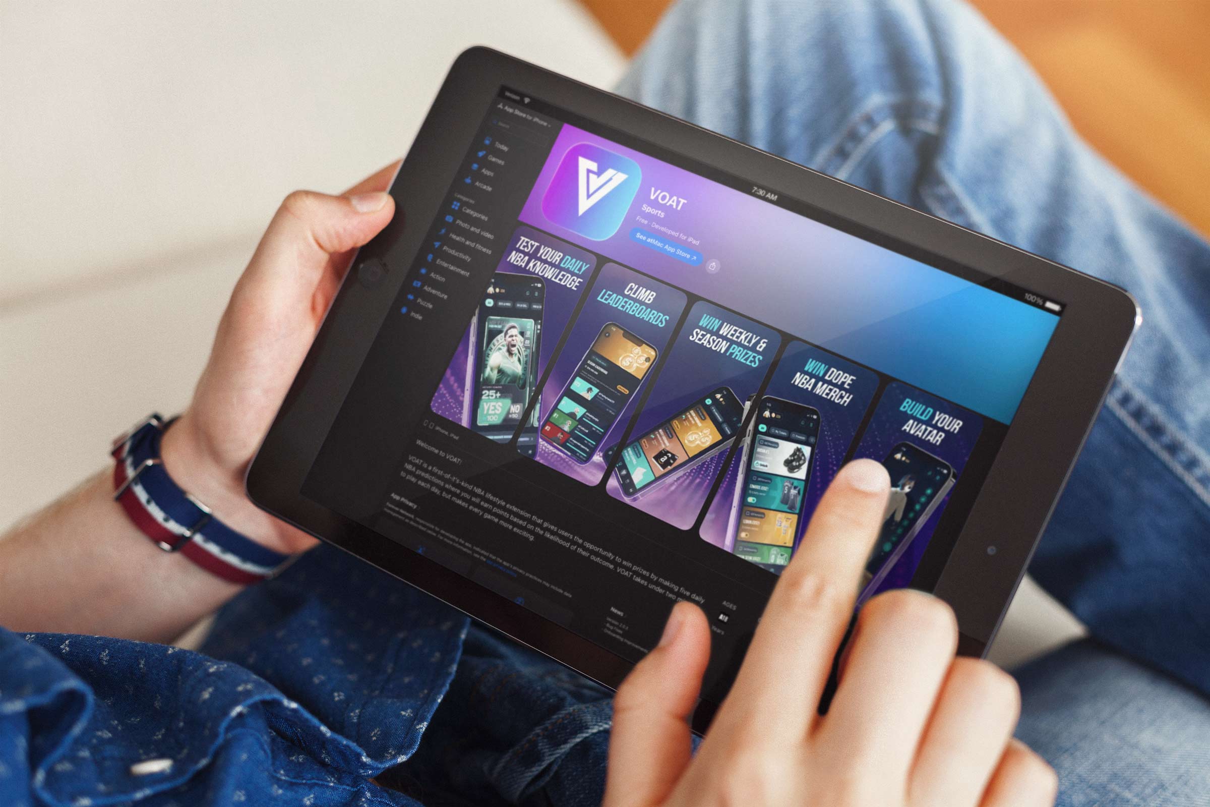
Each vertical became an extension of the same philosophy, localized in tone and content but unified by a consistent approach to storytelling and distribution. This allowed us to scale efficiently, turning what began as a single-channel experiment into a multi-sport ecosystem with shared infrastructure and distinct cultural entry points. The expansion was not about chasing breadth for its own sake, but about recognizing that we had built a repeatable blueprint for modern sports media. In doing so, we transformed Basketball Forever from a standalone success into the foundation of a much larger, interconnected network. This was the unique value proposition that we went to market with.
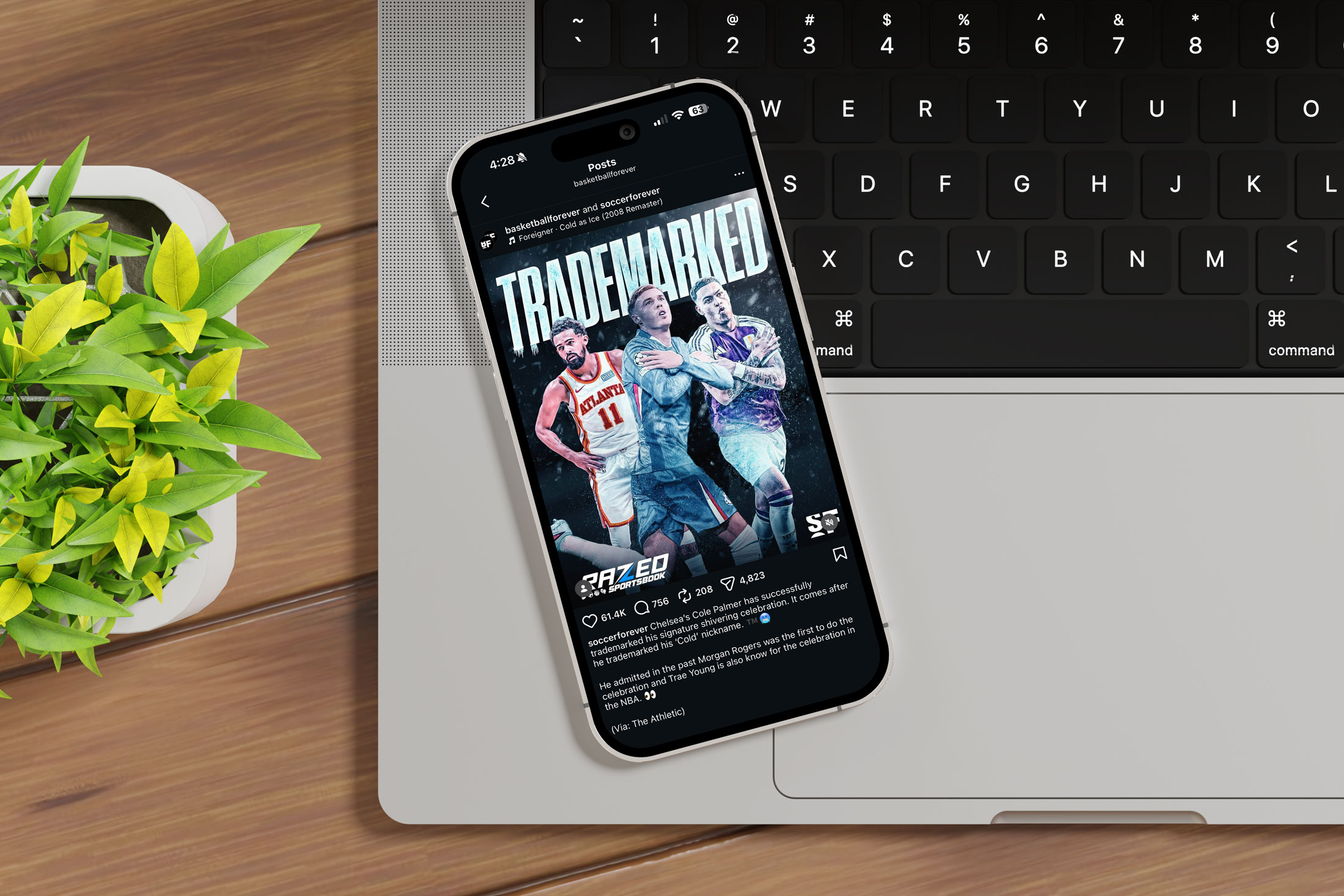
Ultimately, Basketball Forever became more than a publisher. It became a culture engine and a new media grammar for sports. By unifying design systems thinking, platform-native storytelling, and an authentic fan voice, I helped establish a blueprint for how digital-native sports brands can outmaneuver legacy incumbents through speed, cultural fluency, and visual coherence. Watching the brand scale from a concept on my screen to a global ecosystem influencing how millions experience basketball remains one of the most defining and gratifying chapters of my career.
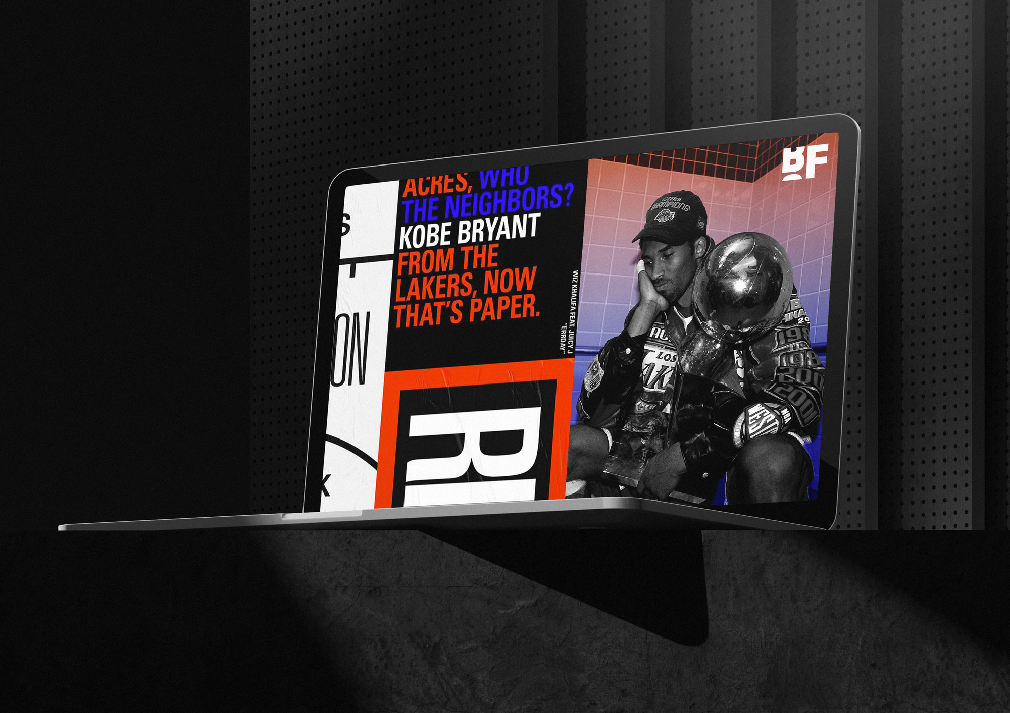
Ultimately, the brand system became a strategic asset in legitimizing Basketball Forever’s transition from scrappy startup to investable media company. By aligning visual coherence with operational scalability and monetization readiness, we demonstrated that design is not surface-level polish but foundational infrastructure. The work helped shift perception from “social page” to “media network,” enabling seed funding conversations grounded in proof rather than promise and establishing the brand as a credible, future-facing player in the evolving landscape of sports and culture.
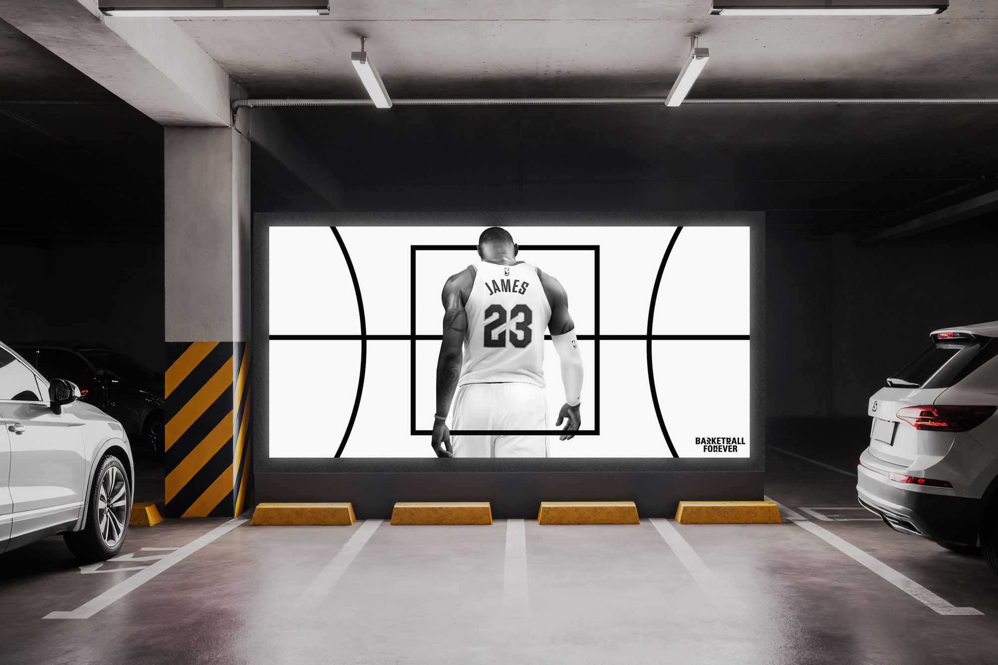
Forever Network, the parent company of Basketball Forever, has evolved from a single-channel basketball page into one of the most expansive social-first sports media ecosystems globally. What began as a focused digital community has scaled into a multi-sport network spanning eight sports with additional verticals in development, delivering tens of billions of impressions and billions of monthly views. The company has positioned itself at the intersection of media, gaming, and interactive fan experiences through strategic partnerships and product innovation, signaling a shift from pure publishing to a holistic sports entertainment platform. With initiatives in betting, prediction markets, and interactive engagement, Forever Network is redefining how fans participate in sports culture, transforming passive consumption into active involvement across digital and experiential touchpoints. To be there at the start to where it is now has been fun to watch, and it only has a positive trajectory from the looks of it moving forward.
What has consistently set me apart is a level of curiosity that is not passive but generative, a constant drive to interrogate how things work, why they resonate, and how they can be reimagined into something more impactful. I do not accept formats, systems, or strategies as fixed. I treat them as starting points, pulling them apart and rebuilding them in ways that better align with emerging behaviors and cultural shifts. That instinct has allowed me to spot patterns early, whether it was the rise of social-first media, the importance of design systems in content velocity, or the opportunity to turn a Facebook page into a scalable business. The core element is a love for storytelling and a passion for creating community through creativity.
My approach to innovation is not about chasing novelty for its own sake, but about connecting dots across design, technology, culture, and audience psychology to create solutions that feel both inevitable and ahead of their time. I am equally comfortable zooming out to define vision and zooming in to refine execution, which is where many ideas either break down or come to life. That range allows me to move fluidly between concept and craft, ensuring that what we imagine can actually be built, scaled, and sustained. I push teams and myself toward more original thinking, more intentional systems, and more ambitious outcomes, because I believe most constraints are self-imposed. At its core, my curiosity is what fuels everything, turning observation into insight, insight into strategy, and strategy into work that moves culture forward rather than reacting to it.
Basketball Forever was not built to report on the game. It was built to live inside it, translating the global language of hoops into a real-time cultural operating system that fans didn’t just consume but inhabited. What began as a digital-native publication evolved into a multi-platform media engine reaching tens of millions of fans, where highlights became identity markers, memes became folklore, and social feeds became the new courtside. My role was to architect the creative and social frameworks that allowed this ecosystem to scale without losing authenticity, designing content systems that moved at the speed of the sport while maintaining a coherent visual and tonal spine. We replaced the top-down voice of legacy sports media with participatory storytelling, empowering fans to remix, share, and carry the brand into their own networks. In doing so, we transformed distribution into community and community into growth. The numbers followed the culture. The culture followed the design.

The impact extended beyond engagement metrics into the commercialization of digital fandom, unlocking sponsorship, merchandise, and partnership opportunities that proved social-first sports media could operate as a sustainable business. By systematizing speed to market, codifying tone, and building modular creative infrastructure, we created a flywheel where cultural relevance drove reach, reach drove revenue, and revenue funded further innovation. Basketball Forever did not chase the conversation. It became the conversation. And in helping shape its voice, systems, and visual language, I did not merely contribute to a brand’s rise. I helped redefine how a generation experiences the game. Seeing it continue to grow and develop into the brand it is today has been a pleasure. I feel like we truly touched the culture and left a mark. We told stories that mattered and a lot of people gave a damn about it.
Key Collaborators: Alex Sumsky, Cooper Jay Preedy, Rashaan Malik, Landon Barimo, Matt Sanoian, Milton Gonzalez, Valeria Moreiro, Lu Borzi, Eugenia Garcia Montaldo, Lujan Borzi, Ben Betts, Samantha Pasfield, Tyson Beck, KC Dean, Nic Jungfer, Allister Coleman
Tools: After Effects, Photoshop, Illustrator, Figma, Cinema 4D, and Sketch
Deliverables: Brand Guidelines, Design System, Motion Package, Merch Guidelines, Product/UI Guidelines, Brand Photography, Presentation Templates