

In 2017, Bleacher Report stood at a true inflection point. Following Turner’s acquisition and years of restructuring, the company had scale but lacked a singular cultural identity in a sports media landscape being rapidly rewritten by mobile behavior, social platforms, and the fragmentation of attention. Younger audiences were no longer gathering around full-game broadcasts or studio analysis. They were consuming sport in bursts, highlights between songs, outfit posts, memes, and group chats, blending athletics with music, fashion, gaming, and internet culture into one continuous feed. As Multimedia Director, I helped translate that behavioral shift into a cohesive brand ecosystem designed for how fandom actually functioned in the wild. My remit spanned visual identity systems, content packaging frameworks, marketing narratives, social-first campaigns, and cross-platform product experiences. I worked to ensure that whether a fan encountered B/R on Instagram, Snapchat Discover, YouTube, the app, linear TV, or physical merchandise, the touchpoint felt unified, immediate, and culturally literate. The rebrand marked a structural repositioning that evolved Bleacher Report from a digital publisher into a culture-shaping platform. I led the development of a modular design system anchored in a high-contrast black and white core with electric green signal accents, engineered for maximum scannability in high-velocity feeds and for consistency across motion, broadcast graphics, editorial layouts, and commerce surfaces. Typography, grid logic, motion behaviors, and iconography were standardized into a scalable toolkit that allowed distributed teams to create with speed while maintaining brand integrity. The visual language drew from streetwear semiotics, nightlife signage, and competitive gaming interfaces to create a sense of urgency and participation rather than passive consumption. By operationalizing these principles into a living brand playbook and embedding them across product, marketing, and content pipelines, I helped position Bleacher Report not only to keep pace with culture but to actively author it, establishing a durable foundation that enabled new revenue streams, deeper fan affinity, and a clear point of view in an increasingly crowded media ecosystem.
29% Increase in average monthly installs & 15% Increase in brand awareness post B/R Rebrand
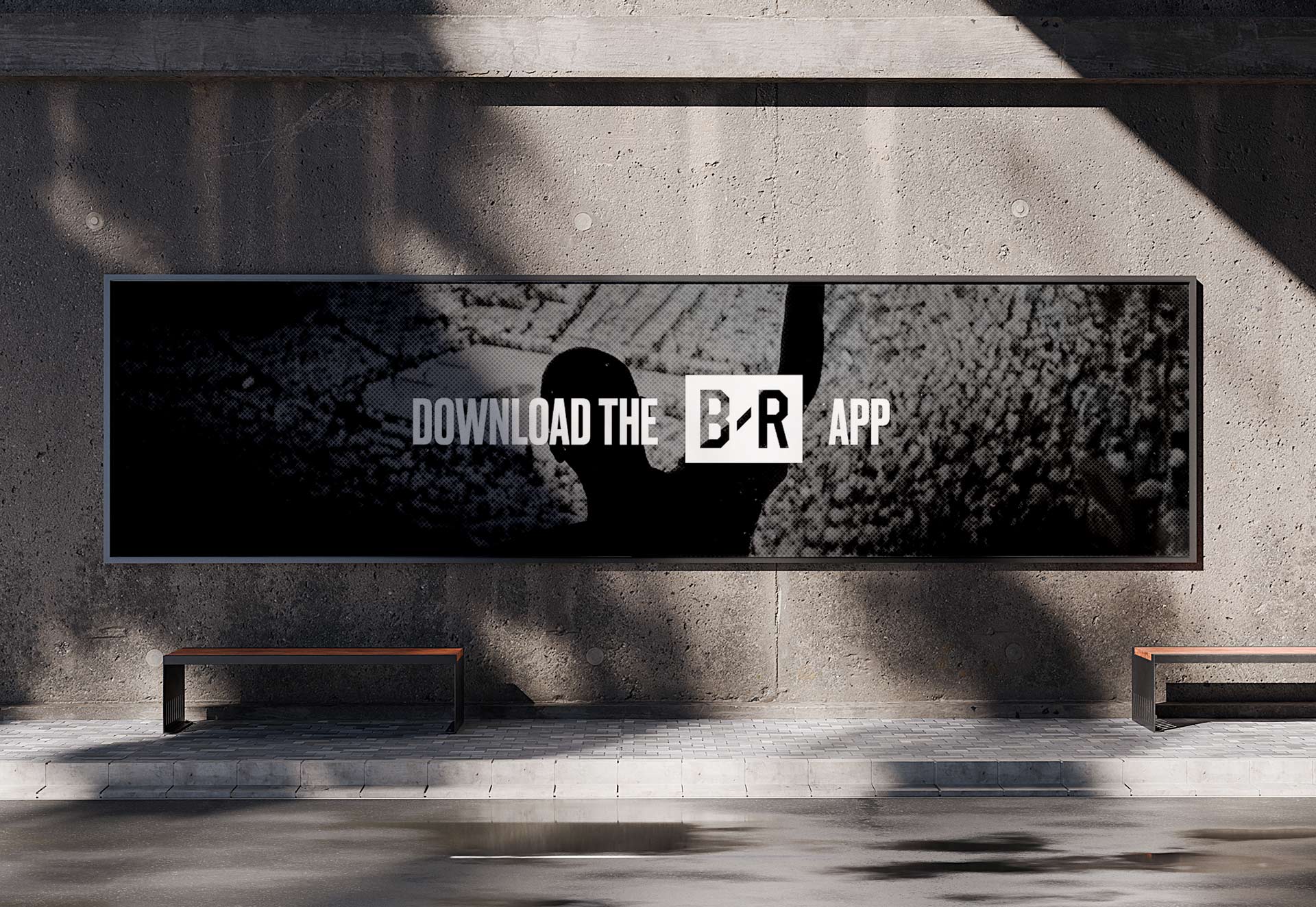
Bleacher Report’s rebrand emerged from a strategic realization about where sports media was headed. A decade after its launch, the platform had built a massive audience, but the broader landscape of sports coverage had shifted. Highlights, scores, and game recaps were no longer the center of gravity. Sports culture had expanded outward into fashion, music, memes, player personalities, and the constant conversation happening across social platforms. The question was no longer how to report on the game, but how to reflect the full ecosystem that surrounds it. The rebrand was grounded in a simple but powerful cultural insight: if you understand the culture, you understand the game. That idea became the organizing principle behind a new creative direction that repositioned Bleacher Report not simply as a sports publisher, but as a cultural authority embedded in the daily rhythm of fandom. The launch strategy reflected that shift. Rather than introducing the new identity through a traditional brand rollout, we treated the rebrand itself as a moment inside sports culture. It debuted during the NBA Playoffs with an Easter egg-driven campaign that rewarded cultural fluency and insider knowledge. Fans were invited to decode references, moments, and personalities woven throughout the creative, reinforcing the idea that Bleacher Report spoke the native language of the modern sports fan. The campaign’s provocation was simple: either you get it, or you don’t. That ethos extended into a large-scale out-of-home presence across key markets, where the new design language appeared across billboards, transit, and digital placements, introducing a bold visual system built for speed, attitude, and cultural immediacy. At the center of the transformation was a new identity system designed to function across the entire B/R ecosystem, from mobile product experiences and social content to broadcast graphics, editorial storytelling, and live activations. The black-and-white mark became a flexible anchor capable of scaling from app icon to arena signage, while a vibrant color system and a typographic pairing of Druk and Effra introduced a confident editorial voice that felt both modern and unmistakably sports-driven. The system was intentionally modular, allowing teams across product, editorial, video, and partnerships to move quickly without losing visual coherence. Whether the content appeared inside the B/R app, on Instagram, on TNT, or across physical installations at events, the brand maintained a consistent attitude while adapting fluidly to each medium. Beyond the visual identity, the rebrand introduced a broader philosophy for how Bleacher Report would operate in culture. Rallying cries like “Own the Moment” and “Fuel the Fire” were less slogans than creative mandates. They encouraged the organization to move faster, take bigger swings, and embrace the spontaneity that defines modern fandom. The goal was not to replicate the voice of traditional sports media but to amplify the energy already present in fan communities. That approach opened the door for new verticals, new formats, and new storytelling models that blurred the line between media, entertainment, and culture. Ultimately, the rebrand positioned Bleacher Report at the center of a generational shift in sports consumption. The modern fan does not experience sports in isolation. They experience it through group chats, social feeds, streetwear drops, viral moments, and the personalities of athletes themselves. By designing a brand system and cultural strategy that could move at that speed, Bleacher Report transformed from a destination for sports coverage into a living participant in sports culture. This meant that the design system had to be both flexible and authentic in it's utility for an actual hardcore sports fan.


As Multimedia Director at Bleacher Report, my role was more than just overseeing content production, it was about shaping the creative direction of our digital identity and fundamentally transforming how B/R operated as a brand in the sports media landscape. When I joined, social media was still seen as a secondary component of the business, mainly used to drive traffic to the website. But I saw the shift happening in real-time, fans weren’t waiting to visit a sports website after a game; they were living in the moment on Twitter, Instagram, and Snapchat. Social wasn’t just a marketing tool; it was where culture was being shaped. Understanding this shift, I helped redefine Bleacher Report’s social presence from a simple content distributor into the definitive voice of sports culture online. That meant crafting an aesthetic, tone, and engagement strategy that wasn’t just about covering the games but about reflecting the emotions, the fandom, and the internet-native conversations happening around them. The vision was clear: B/R wasn’t just going to report sports news; it was going to shape the way fans consumed, reacted to, and engaged with the game itself.
As Bleacher Report began to appear on larger stages, from national television broadcasts and arena signage to merchandise, live events, and global brand partnerships, the need for a logo that could perform at scale became impossible to ignore. The identity had to function as a broadcast bug in the corner of a TNT playoff game, read clearly on a jumbotron, hold presence on a hoodie across the street, and remain instantly recognizable as a tiny social avatar in a fast-moving feed. This required a refinement toward stronger geometry, higher contrast, and a more compact silhouette that could maintain integrity across wildly different sizes and contexts. The resulting mark delivered that flexibility, allowing the brand to show up with confidence whether it was projected thirty feet high in an arena or rendered at sixteen pixels on a phone. That scalability was not only a design solution but a strategic necessity, signaling that Bleacher Report had grown into a national cultural force capable of occupying the same visual territory as the leagues, networks, and brands it stood alongside. I helped transform B/R from a digital publisher into a culture-shaping platform built for the speed of modern fandom.

As our social presence grew, it became increasingly clear that our brand identity needed to evolve to match our cultural dominance. Bleacher Report had established itself as THE social voice of sports, but visually, our branding still carried remnants of an era when we were just another digital publisher. There was a disconnect between our cultural impact and our visual and tonal representation. That’s where the rebrand came in. We needed a design system that could scale, one that reflected the bold, fast-paced, and culturally aware nature of our content. We weren’t just a sports news outlet we were a cultural brand, and we needed an identity that carried the same weight as streetwear brands, music labels, and entertainment powerhouses. This transformation was core to evolving our positioning as a media brand and as an app.
The evolution from the original lowercase “b/r” mark to the bold, uppercase B/R monogram reflects a deliberate maturation of the Bleacher Report brand from scrappy blog-era disruptor to authoritative cultural platform. The earlier identity carried the visual cues of early web publishing with its soft gray typography and conversational tone, signaling accessibility but lacking the presence required for a multiplatform media company operating at global scale. The result was not simply a refreshed logo or design language, but a platform capable of evolving alongside the communities that define the future of fandom.
Leading the logo and brand refresh required assembling a highly tactical, cross functional strike team that could move at the speed of culture while maintaining design rigor. Alongside Justin Chen, Bennett Spector, Chris Perez, Kenny Dorset, and Chris Nguyen, we built a tight operating unit that blended brand strategy, product thinking, social fluency, and production execution. Our mandate was not simply to update a mark but to recalibrate how Bleacher Report showed up across every surface where fans encountered it. We pressure tested the identity in real world scenarios from social avatars and push notifications to broadcast packages, merch applications, and live event environments, ensuring it performed with clarity and confidence at every scale.
The collaboration was deeply iterative and grounded in trust, with each member bringing domain expertise that sharpened the work and accelerated decision making. Together, we translated a massive organizational shift into a cohesive visual system, proving that a focused, empowered team can realign a global brand without losing the speed and authenticity that made it resonate in the first place.

What made this rebrand hard was not designing a new mark, it was governing an always on machine. We had to rebuild identity while shipping daily across dozens of surfaces with different constraints, stakeholders, and failure modes: editors moving at meme speed, product teams optimizing UX, video crews delivering broadcast caliber packages, partnerships needing sponsor safe integrations, and social teams publishing in real time during live games. I led the systemization layer that made consistency possible at scale, creating template kits, motion presets, typography and layout rules, export standards, and review workflows that reduced friction without slowing the newsroom. We pressure tested everything in the ugliest edge cases: tiny avatars, compressed vertical video, low light photography, noisy highlight footage, and co branded lockups. Then we operationalized it through rollout docs, trainings, office hours, and partner handoffs so the identity could be used correctly by default. That is the difference between a rebrand and a brand operating system: it survives velocity, it survives distribution, and it stays recognizable when nobody has time to think.
The impact of the Bleacher Report logo ultimately revealed itself not in launch decks or brand guidelines, but in the way it embedded itself into the visual fabric of sports culture. It became a shorthand for a new kind of fandom, one that lives in memes, group chats, highlight loops, tunnel fits, and late-night trade debates. When the mark appeared in a social watermark, on a hoodie in a pickup run, or glowing on a TNT broadcast graphic, it signaled a specific tone: fast, culturally fluent, and unapologetically fan-first. That consistency transformed the logo into a trust marker, a cue that the content would feel native to the way modern fans actually experience sports. Over time, it helped reposition Bleacher Report from a digital outlet into a cultural authority, proving that a well-executed identity system can do more than identify a brand. It can legitimize a voice, unify a community, and create a visual flag that people choose to rally around. This rebrand repositioned Bleacher Report from reporting on sports to actively authoring sports culture.
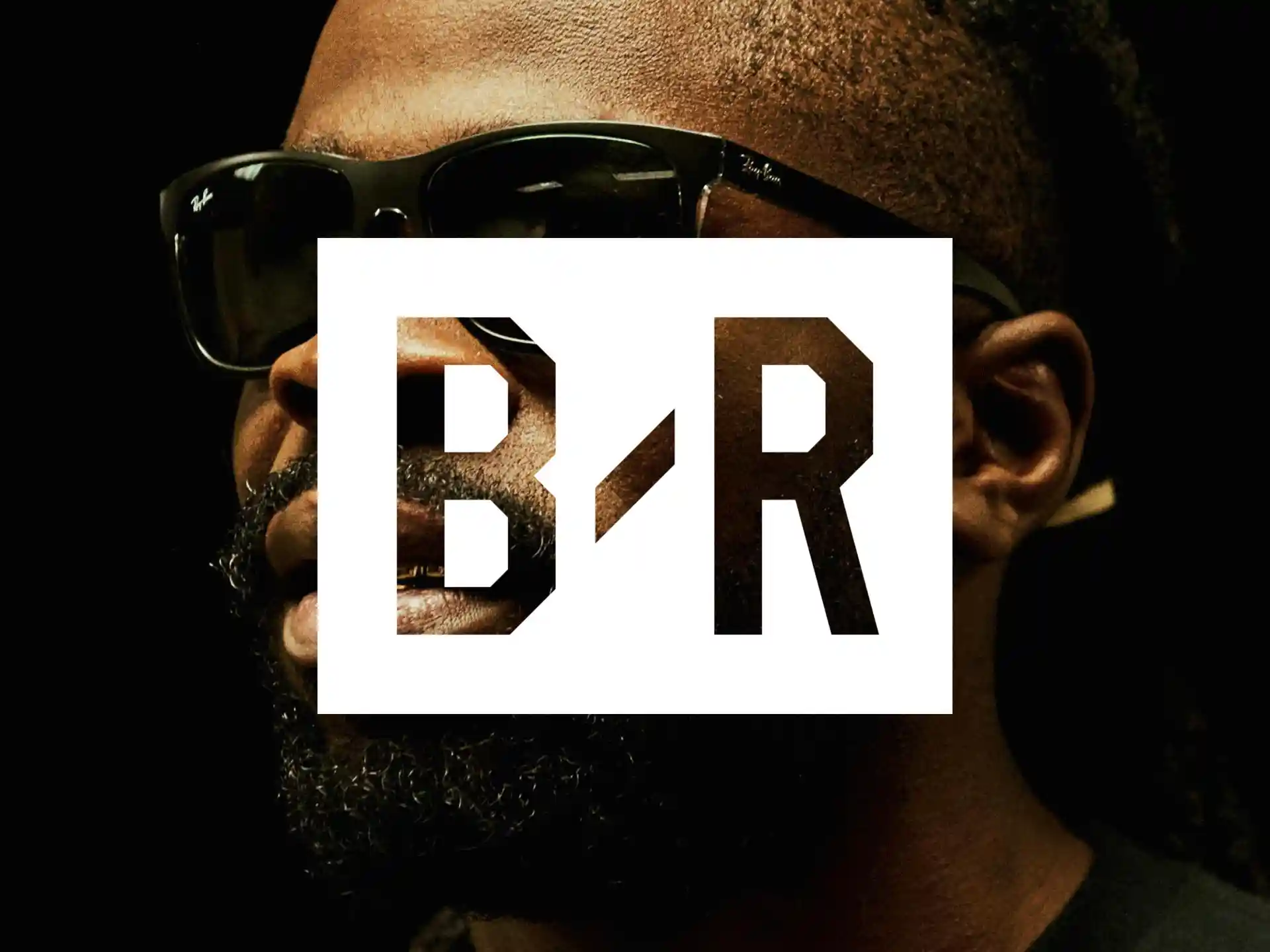
The Bleacher Report logo felt ahead of its time because it was engineered for the realities of mobile consumption before most media brands fully grasped what that meant. Its bold, condensed letterforms and high-contrast simplicity were optimized for legibility at thumbnail scale, whether on push notifications, app icons, social avatars, or lower-thirds on broadcast, allowing it to cut through crowded feeds with instant recognition. The mark’s modularity made it unusually adaptable, able to live comfortably in monochrome, invert cleanly over photography, or anchor high-energy compositions without losing authority, which gave the brand a rare level of consistency across digital, experiential, and merchandise applications. The logo was a great evolution of the original while also being a distinct infusion of fresh energy.
At a moment when many publishers still relied on ornate crests or legacy wordmarks tied to print traditions, B/R embraced a stripped, athletic typographic identity that behaved more like a streetwear logo than a newspaper masthead. That decision positioned the brand not as a commentator on culture but as a participant in it, enabling the logo to travel from screens to hoodies to arena signage with equal credibility and helping redefine what a modern sports media brand could look and feel like. We designed an identity system that allowed Bleacher Report to move at meme speed without losing brand integrity.
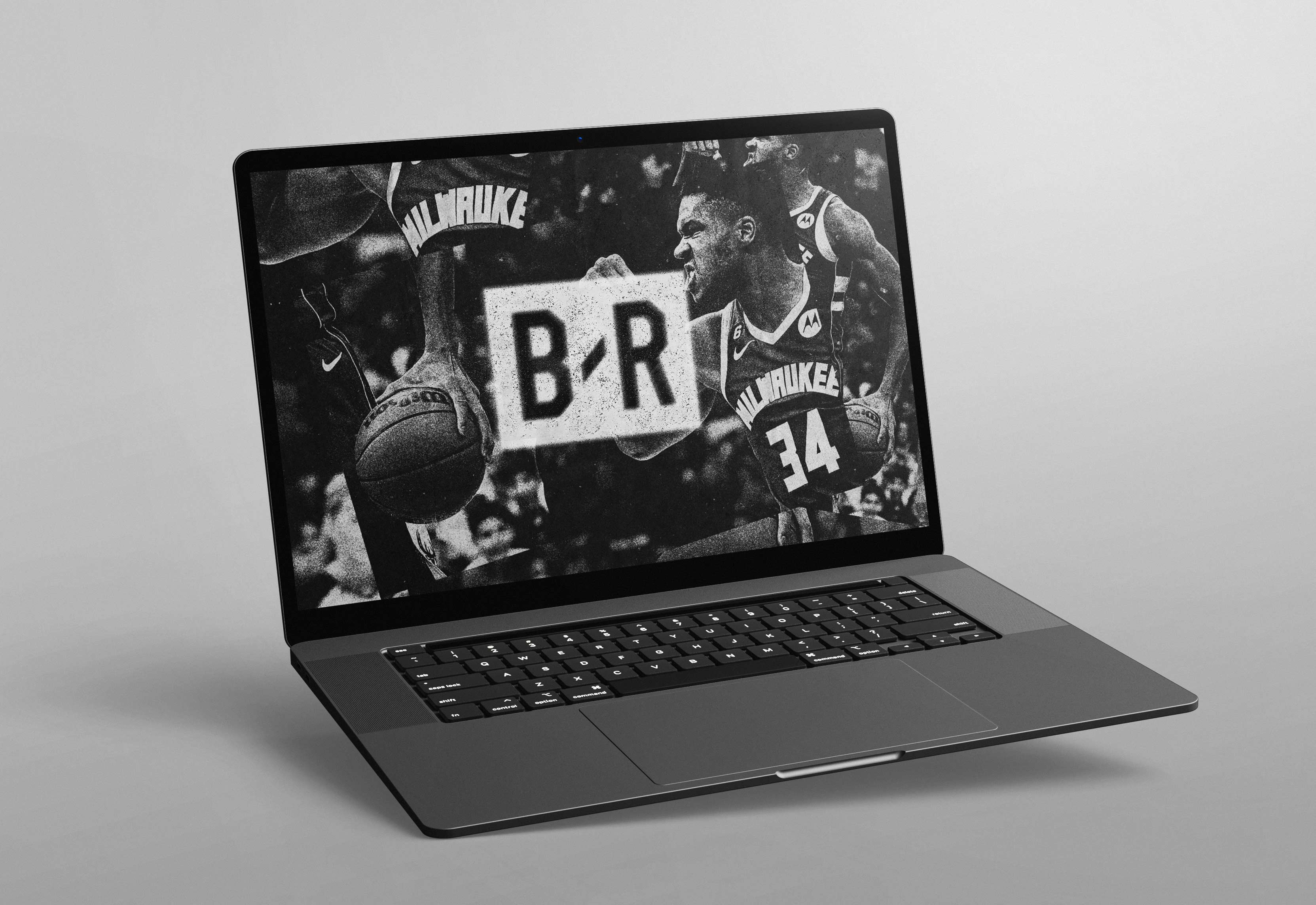
The refreshed Bleacher Report logo injected a new voltage into the brand, sharpening its presence at a moment when scale and cultural relevance demanded greater clarity and confidence. The refined geometry, stronger letterforms, and disciplined monochrome palette gave the mark a sense of authority that could hold its own across everything from vertical video to arena jumbotrons, streetwear, and broadcast graphics. Paired with the electric green accent, the system felt alive, signaling speed, attitude, and a digital native sensibility that mirrored how fans actually experienced sports in the scroll. The result was a logo that did more than identify the brand. It carried momentum. It made every touchpoint feel intentional and charged, reinforcing Bleacher Report’s evolution into a culture-shaping force rather than a platform simply reacting to the game.
.jpg)
I helped lead the creation of a refreshed brand playbook for Bleacher Report at a pivotal inflection point, when the company was transitioning from a fast-growth digital publisher into a fully realized sports culture powerhouse with a distinct editorial voice and global ambitions. This was not a surface-level redesign. It was a strategic recalibration of how the brand expressed itself in an era where attention was fragmented, platforms were proliferating, and culture was moving faster than traditional media systems could keep up. The work began with a modernization of the core logo mark.
I refined proportions, tightened the geometry, corrected optical balance, and improved legibility across fast-scroll social environments, ensuring the mark retained clarity from tiny mobile avatars to broadcast lower-thirds to large-scale environmental graphics. The objective was to elevate the logo so it reflected the premium caliber of Bleacher Report’s long-form storytelling, athlete-driven programming, and culture-first franchises like Game of Zones. By stabilizing the mark and codifying its usage, we created a symbol that could travel fluidly across platforms while maintaining instant recognition in an increasingly saturated visual landscape. The work turned a scrappy blog-era brand into an authoritative cultural operator fluent in the rhythms of sport, and internet culture.
Developing a comprehensive brand playbook for Bleacher Report became essential as the company expanded beyond a fast-growing digital publisher into a vertically integrated Turner property with national reach and cross-platform responsibilities. The playbook functioned as both a strategic blueprint and a practical toolkit, codifying everything from logo usage and typography hierarchies to motion behavior, social voice, broadcast graphics, merch applications, and partner integrations. This ensured that whether B/R showed up inside a TNT playoff broadcast, a Snapchat Discover tile, a push notification, or a retail collaboration, it felt unmistakably cohesive and culturally fluent. By establishing clear guardrails and scalable design systems, I helped equip internal teams, external agencies, and media partners with a shared language that allowed the brand to grow rapidly without fragmenting. The result was a unified identity capable of operating at national scale while still retaining the immediacy and authenticity that had made Bleacher Report resonate with a generation of fans in the first place.

With that foundation secured, we built a comprehensive brand system designed to scale with both the velocity of culture and the operational complexity of a global media company. I helped architect a flexible typography stack capable of handling everything from meme-speed social posts to cinematic feature packaging, alongside an updated color strategy engineered for high-energy culture content that still preserved clarity and hierarchy in motion. We defined motion principles that balanced swagger with readability, ensuring video graphics carried attitude without sacrificing comprehension on mobile screens. The playbook extended beyond visual standards into behavioral guidance, outlining how the brand should show up across video packaging, social templates, merchandise, live events, experiential activations, and partner integrations. It became a foundational operating system for internal teams and external collaborators, giving everyone a shared language and a clear creative north star. This framework enabled Bleacher Report to scale its identity globally across hundreds of touch points while maintaining coherence and authenticity, ensuring that whether a fan encountered B/R in a meme, a tunnel-fit post, a broadcast segment, or a brand partnership, the experience felt unmistakably part of the same cultural universe.

I worked closely with Bennett Spector and our marketing and design teams, to establish the design language for the new Bleacher Report identity. The goal was to create a system that was modern, adaptable, and instantly recognizable across all touchpoints from the app to social media to print and merchandise. The rebranding of Bleacher Report was not just a visual refresh but a complete overhaul of how the brand positioned itself in the sports media landscape. Our original lowercase br logo, housed in a grey-and-orange square, reflected our early days as a digital disruptor, but as we matured into a dominant force in sports culture, it became clear that our branding needed to evolve with us. The new logo, redesigned in-house with lead designer Justin Chen, transitioned to uppercase lettering, a more geometric font, and a bold, collegiate-inspired aesthetic, signifying our authority and presence in the sports world. The square became a rectangle, and the slash between "B" and "R" grew thicker, a subtle yet intentional visualization of the intersection of sports and culture, the foundation of everything B/R stood for.
We refined the B/R logo for clarity, scalability, and mnemonic strength, ensuring it could hold its own in crowded feeds and sit naturally alongside athlete brands and global sponsors. Every typographic decision, motion behavior, and layout system was built to prioritize speed, impact, and shareability without sacrificing craft. My specific impact extended beyond visuals into the narrative architecture of the brand. I helped shift B/R’s center of gravity from transaction to participation, designing systems that allowed fans to feel like insiders rather than spectators. This ethos powered franchises like Game of Zones, culture-first social posts, and athlete collaborations that treated sport as a living language rather than a box score. We mirrored how fans actually spoke, joked, dressed, and debated, embedding the “if you know, you know” sensibility into everything from captions to campaign creative. Our north star was simple: build a brand that felt native to the feed and worthy of the street.
That authenticity became a competitive moat. While legacy players like ESPN and Sports Illustrated remained tethered to highlight packages and punditry, B/R operated at the intersection of sport and culture, where sneakers, music drops, tunnel fits, and memes carried as much weight as stat lines. By aligning product design, content strategy, and brand expression around modern fan behavior, we didn’t merely boost engagement. We redefined what sports media could look like in a mobile-first era. B/R became a place where athletes, artists, and fans coexisted on the same cultural plane, where a post could travel from a locker room to a group chat to a global trend within hours. The rebrand proved that proximity to culture, not proximity to leagues, would determine influence. Helping lead that transformation remains one of the most consequential chapters of my career, because it showed that with the right creative vision and systems thinking, a media brand can evolve from covering the game to shaping how the game lives in culture.
As Bleacher Report’s partnerships and branded content offerings expanded, developing a flexible design language for social vehicles, end cards, co-branding, and sponsorship integrations became critical to maintaining credibility while unlocking revenue. I helped establish modular templates and motion systems that allowed sponsor marks, partner logos, and campaign messaging to live within B/R content without feeling bolted on or disruptive to the fan experience. End cards were treated as editorial extensions rather than ad space, using consistent typography, pacing, and animation principles so transitions from highlight to sponsor felt native to the platform. This approach enabled seamless co-branded storytelling across Instagram, Snapchat, YouTube, and broadcast, ensuring that whether we were integrating a global brand or a one-off cultural partner, the work still carried Bleacher Report’s tone, attitude, and visual authority. By systematizing these elements, we created a repeatable framework that balanced monetization with authenticity, proving that commercial partnerships could enhance the narrative rather than dilute it.
At its core, Bleacher Report has always believed that sport is not only played on the court or the field, but expressed through the culture that surrounds it. Making an impact meant elevating the artists, designers, photographers, and storytellers who shape how the game is seen, felt, and remembered. By treating creative voices as collaborators rather than accessories, we built platforms that gave them visibility, authorship, and scale, allowing their work to travel as far as the highlights themselves. This approach turned content into culture, where visual language, design systems, and original art became as important as the moments they captured. It reinforced a broader ethos that the future of sports media belongs to those who can translate emotion into form and give the community not only something to watch, but something to see themselves in. This was a perspective I brought intentionally to the work, embedding a creative-first DNA that fused art, storytelling, and sport into a unified system rather than treating them as separate layers.
At its core, B/R needed to transcend being just a digital publisher and instead become a cultural hub for sports fans, one that spoke their language, reflected their emotions, and understood their evolving consumption habits. The identity was built around the raw, unfiltered energy of the game, mirroring the voice of a die-hard fan with a mix of irreverence, insight, and impeccable timing. The creative direction leaned into bold typography, kinetic design, and a storytelling approach that blurred the lines between sports, fashion, music, and internet culture. Every touchpoint, from the social feed to the app experience, was crafted to feel like a living, breathing conversation, one that fans didn’t just consume but actively participated in. Bleacher Report became the place where sport meets culture with authenticity and speed.
The Bleacher Report logo has undergone a transformation that mirrors the evolution of both the brand and the broader sports media landscape. In its earliest form, the logo had a 3D extruded and beveled aesthetic, a look that was common in the mid-2000s when digital brands aimed to appear dynamic and dimensional. As design trends shifted toward minimalism and flat aesthetics, B/R followed suit, refining its mark into a cleaner, more modern flat design. A big part of this was because of the growth of our original social team which was a primary touchpoint for the majority of our audience and the proliferation of our app.
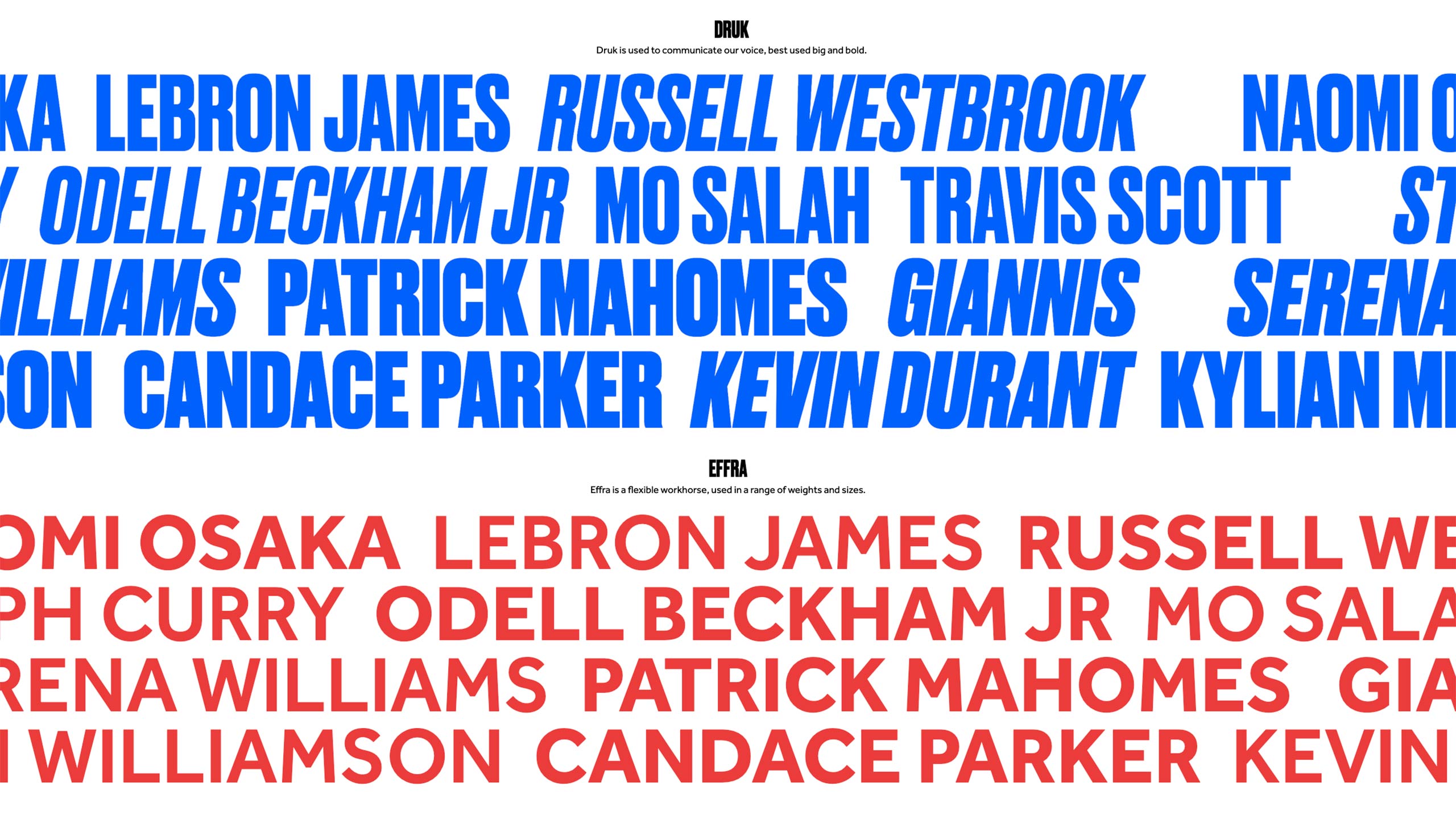
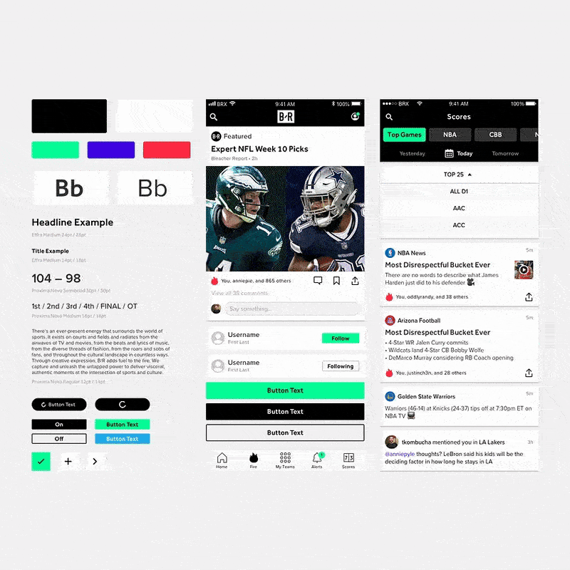
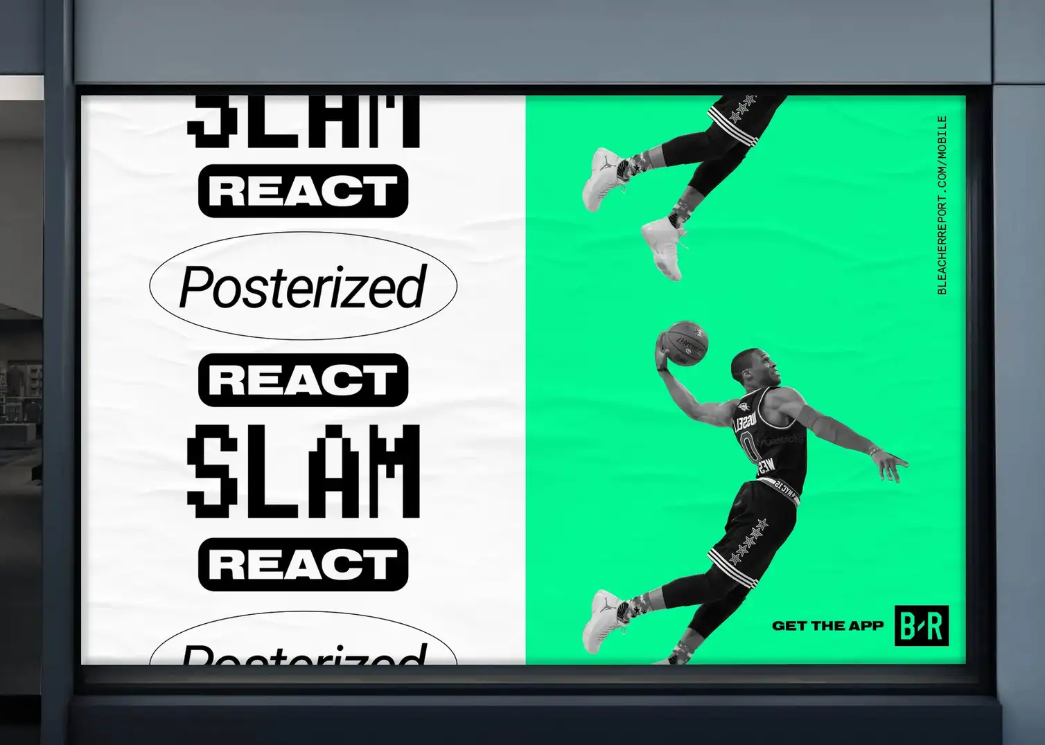
Typography became one of the most powerful levers in shaping Bleacher Report’s voice, functioning not merely as a vessel for information but as a signal of attitude, pace, and cultural fluency. The pairing of a bold, condensed display face like Druk with the versatile workhorse Effra created a dynamic system capable of flexing from high-impact headlines to legible, fast-scrolling mobile contexts. Druk’s compressed geometry and emphatic verticality allowed athlete names and key moments to hit with poster-like force, echoing the visual language of street flyers, sports tabloids, and arena graphics, while Effra provided the clarity and rhythm necessary for body copy, UI elements, and data-heavy environments. This contrast established a typographic hierarchy that felt both editorial and immediate, enabling the brand to move seamlessly between social posts, broadcast lower thirds, app interfaces, and merchandise. We designed for the second screen, the group chat, and the scroll rather than the studio desk.

Bleacher Report has always represented the view from just beneath the bleachers, the vantage point where fandom is loud, unfiltered, and alive with contradictions. It is the pulse of the crowd that cares as much about tunnel fits as box scores, as invested in walkout music as game-winning shots, where sneakers, chants, memes, heartbreak, and victory all live in the same breath. It captures the business of sport and the spectacle around it, the sponsorships and salary caps alongside the sweat on a jersey and the tears after a final whistle. In that space, fashion becomes armor, music becomes narrative, and the arena becomes a cultural stage rather than a mere venue. Bleacher Report does not stand above the game analyzing it from a distance. It stands shoulder to shoulder with fans, translating the energy of the stands into stories that honor both the passion and the humanity that make sports matter in the first place. We developed comprehensive art direction and photography guidelines that established a consistent visual standard across platforms, defining everything from composition and lighting to athlete portrayal and cultural context so every image felt immediate, authentic, and unmistakably Bleacher Report at that intersection where all these worlds collide. The brand system needed to encompass all of this through logo and type and color and system.
The evolution from the original lowercase wordmark to the more assertive uppercase logo marked a subtle but important maturation for Bleacher Report. The early lowercase treatment felt scrappy and digital-native, reflecting the brand’s startup energy and blog-era roots. Moving to an uppercase, collegiate-inspired form gave the mark greater authority and permanence while still nodding to the heritage of sports typography found on jerseys, scoreboards, and campus athletics. The refined proportions, tighter geometry, and improved legibility allowed the logo to perform across everything from mobile screens to broadcast graphics to physical merchandise. It signaled that B/R had grown up without losing its edge, a brand confident enough to stand shoulder to shoulder with legacy sports institutions while still speaking fluently to a new generation of fans.
This shift signified a deliberate progression toward a contemporary, digital-native identity system engineered for velocity, clarity, and modularity across an increasingly mobile and platform-fragmented media environment. We refined the mark to perform as a high-functioning asset within dense social feeds, small-screen contexts, motion packages, and broadcast overlays, prioritizing optical balance, negative-space efficiency, and scalable geometry. As the ecosystem matured, the logo evolved into a monochromatic expression that eliminated visual noise and reinforced a premium, editorial tonality aligned with long-form storytelling, athlete-driven narratives, and culture-first programming. The restrained palette increased versatility across co-branded executions, merchandise, live events, and partner integrations, while strengthening brand recall through consistent silhouette recognition rather than decorative treatment. The brand spoke in the voice of the crowd, not the commentary booth.
This phase of the visual identity signaled Bleacher Report’s transition from an insurgent digital publisher to an authoritative cultural platform with the confidence to communicate through reduction. By stripping away superfluous effects and embracing a disciplined typographic and compositional system, the brand projected credibility, longevity, and design maturity, positioning itself alongside premium media properties while maintaining its edge within youth culture. The current iteration of the logo represents the culmination of that evolution: a mark that is instantly recognizable at any scale, structurally sound across mediums, and intentionally understated, allowing the surrounding storytelling, athlete voices, and cultural moments to take center stage while the brand operates as a quiet but unmistakable signature of relevance and trust.
From a brand positioning and strategy standpoint, the rebrand made decisive sense because it clarified Bleacher Report’s role from content distributor to cultural interpreter, a shift that allowed the brand to own meaning rather than chase relevance. In a media environment saturated with highlights and statistics, differentiation came from perspective, tone, and symbolic fluency. By codifying a visual and editorial language that mirrored how fans actually experienced sport through style, music, memes, and identity, we aligned the brand with lived fandom rather than institutional coverage. This coherence built semiotic equity: the electric green accent, the stark contrast system, and the culture-forward storytelling became signals of immediacy, credibility, and participation. Over time, that consistency compounded into reputation, positioning B/R as the place where sport met culture with authenticity and speed, where athletes were collaborators rather than subjects, and where fans recognized their own voice reflected back at them. The rebrand did not simply refresh aesthetics; it established a durable strategic posture that made every touchpoint an act of meaning-making and every interaction an opportunity to reinforce trust, relevance, and cultural authority. It wasn’t about covering the game. It was about capturing the culture around it.

At Bleacher Report, we treated sponsorship and co-branding as part of the culture itself, not something layered on top of it. The goal was to make partner integrations feel native to the fan experience, whether they appeared in social videos, end cards, live broadcasts, or on connected TVs. By developing a consistent motion language, clear typographic hierarchy, and flexible layout system, we ensured that co-branded content carried B/R’s visual credibility while still giving partners room to show up meaningfully. The result was a unified ecosystem where editorial, commerce, and brand storytelling worked together seamlessly. Instead of breaking the experience, these integrations strengthened it, reinforcing Bleacher Report’s role as a modern sports culture platform that could deliver real value to partners while maintaining the trust and attention of its audience. Designed for velocity, the identity survives compression, motion, and co-branding without losing clarity.
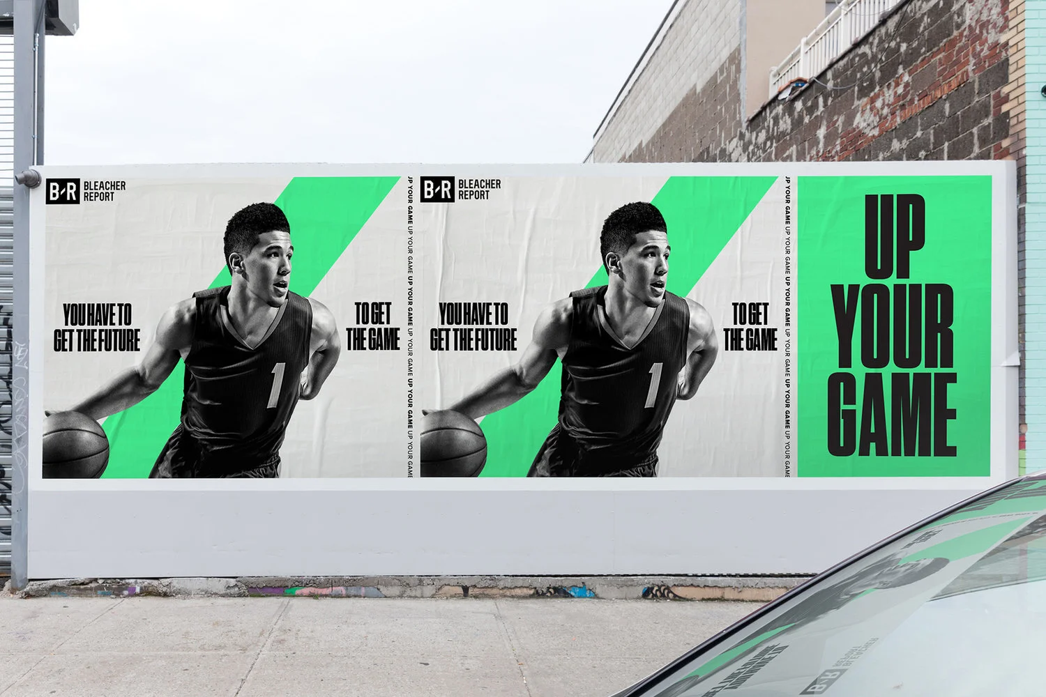
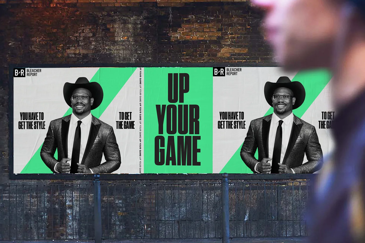
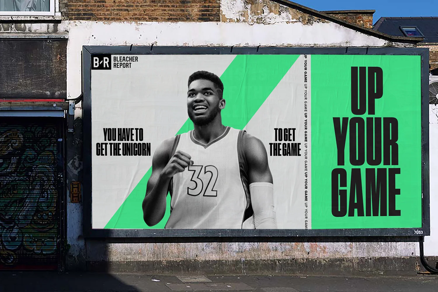
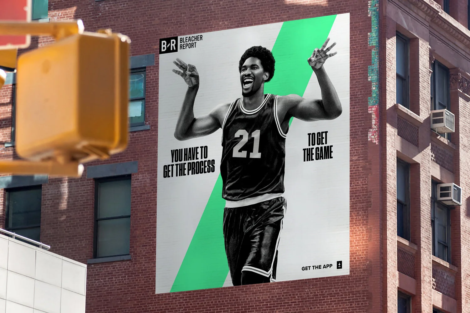
The brand guidelines were the visual and tonal DNA of Bleacher Report, ensuring consistency across all creative executions. The color palette was built around a modern, high-contrast black and white base, punctuated with accent colors that adapted based on cultural moments or partnerships. Typography was bold, aggressive, and dynamic large, high-impact headlines that mimicked the urgency of a breaking sports story. Motion design played a critical role in defining the brand’s aesthetic, with fast-paced cuts, glitch effects, and layered textures creating an unmistakable visual language. The photographic and video treatment leaned into a mix of grainy, cinematic compositions and high-energy action shots that felt immersive and visceral. But as our influence grew, so did the need for a brand campaign that articulated what we stood for. Fans already loved our content, but we needed to make it clear to the world that B/R was more than a news outlet it was the new authority on sports culture. That’s where "Up Your Game" came in.
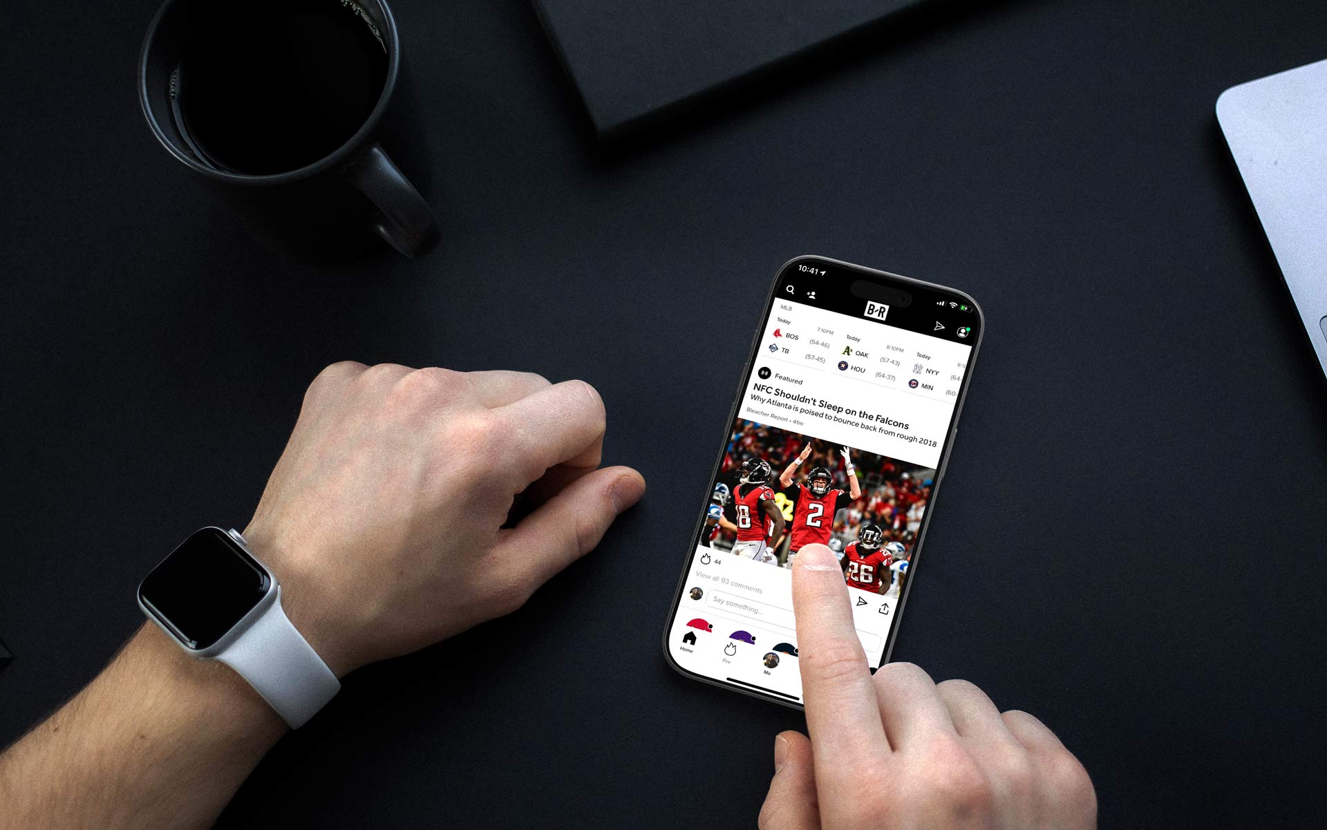
Before the rebrand, Team Stream existed as a standalone app built primarily around real-time scores, alerts, and hyper-personalized team tracking. It was fast, functional, and trusted by millions of fans who relied on it as their second screen during games, but it lived somewhat separately from Bleacher Report’s broader cultural voice and storytelling ecosystem. As part of the brand transformation, we made the strategic decision to evolve Team Stream into the unified B/R app, folding its powerful personalization engine into a much larger platform that could deliver not only scores and breaking news, but highlights, social video, culture coverage, and commerce in one cohesive experience. This shift required careful product and design integration to ensure that the speed and utility users loved were preserved while introducing a richer editorial environment and a more expressive visual identity. By bringing everything under one roof, the app became the beating heart of the Bleacher Report ecosystem, a single destination where fandom could be lived in real time, whether through alerts on a lock screen, vertical video in a social feed, or a late-night merch drop timed to a buzzer beater.
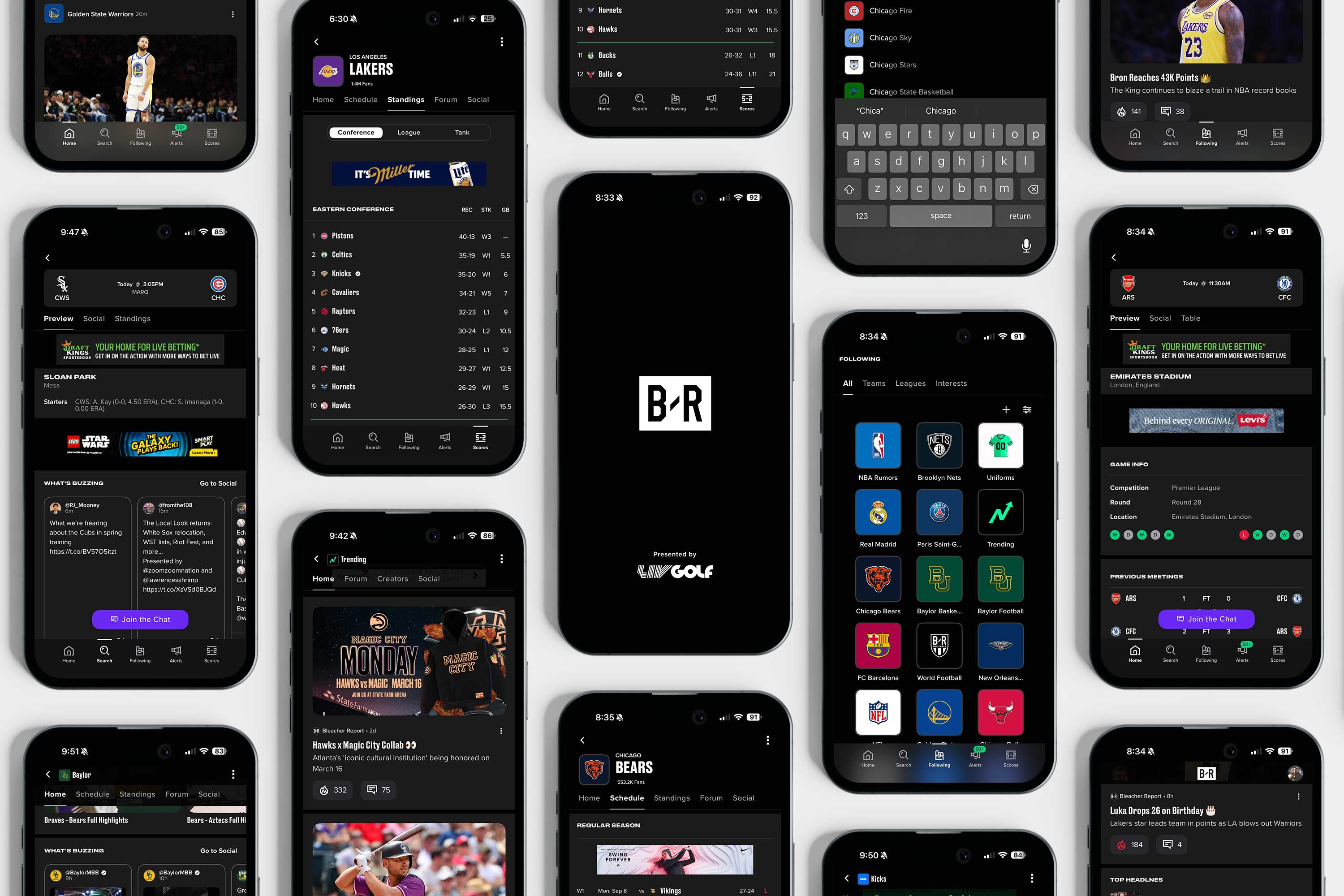
The app became the operational core of Bleacher Report’s ecosystem because it met fans at the exact intersection of urgency, personalization, and habit. Scores, breaking news, trade alerts, and injury updates are time sensitive by nature, and push notifications transformed B/R into a real time companion rather than a destination users had to remember to visit. By allowing fans to follow specific teams, leagues, and players, the app delivered a tailored stream of information that felt indispensable on game nights and during major sports moments. That utility built daily engagement, while the surrounding content highlights, social storytelling, and commerce integrations deepened the relationship beyond the scoreboard. In a landscape where attention is fragmented, the combination of instant alerts and personalized feeds positioned the app not only as a service tool but as a loyalty engine, embedding Bleacher Report into the rhythm of how fans experience sports minute by minute.
Behind that seamless experience was an intensely competitive programming operation that treated speed as a form of editorial authority. Our team monitored live feeds, league data, broadcast delays, and social chatter in real time, racing ESPN, the NBA, and the NFL to deliver the first alert to a fan’s lock screen. Those seconds mattered. Being first built trust and trained users to rely on B/R as their primary source of truth when the game hung in the balance. War room–style coordination during playoffs, trade deadlines, and draft nights meant designers, editors, and programmers worked in lockstep to ensure notifications were not only fast but clear, emotionally resonant, and on brand. Over time, that consistency reshaped perception. We were no longer the scrappy upstart. We were the alert that buzzed first in your pocket when history happened. I still remember designing our "Top News" icon like it was yesterday on the first month that I started at Bleacher Report.
Bleacher Report evolved into a fully integrated media ecosystem where every surface worked in concert to serve the modern fan. The website functioned as the editorial backbone, housing long form journalism, features, and tentpole storytelling, while the app delivered real time utility through scores, alerts, and personalized feeds that kept fans tethered to the action minute by minute. Social platforms became the brand’s cultural front line, translating sports into memes, short form video, and reactive storytelling that traveled at the speed of conversation. The goal was consistency without rigidity, a mark that adapts without dilution.
On television and connected TV, B/R extended its voice through premium programming and partnerships with Turner and TNT, bringing a digital sensibility to broadcast environments, while the SiriusXM radio partnership carried that same voice into cars, offices, and daily routines, turning commutes into extensions of the fan experience. Beyond screens, the brand manifested through merch, live events, murals, and experiential activations that allowed fans to physically inhabit the culture they consumed online. Together, these touchpoints formed a cohesive loop where journalism informed social, social fueled video, video drove commerce, radio deepened daily habit, and real world experiences reinforced loyalty, positioning Bleacher Report not as a single channel but as an always on cultural operating system.

Among hardcore sports fans, the app became less of a media product and more of a daily instrument, a tool that lived on the home screen because it delivered the one thing fandom demands above all else: immediacy with context. For users tracking multiple leagues, fantasy implications, trade rumors, and late-breaking injury reports, the ability to customize alerts down to specific teams and players created a sense of control and insider access that traditional broadcasts could not match. Game nights turned into second-screen rituals, with fans refreshing live stats, watching highlight clips within minutes of a play, and jumping into comment threads or group chats armed with real-time information. That reliability built trust. When a notification came through, fans knew it mattered. Over time, that trust translated into habit, and habit into loyalty, positioning the app as a cornerstone of the modern sports experience for the most engaged audiences, the ones who do not merely watch the game but live inside its every update.

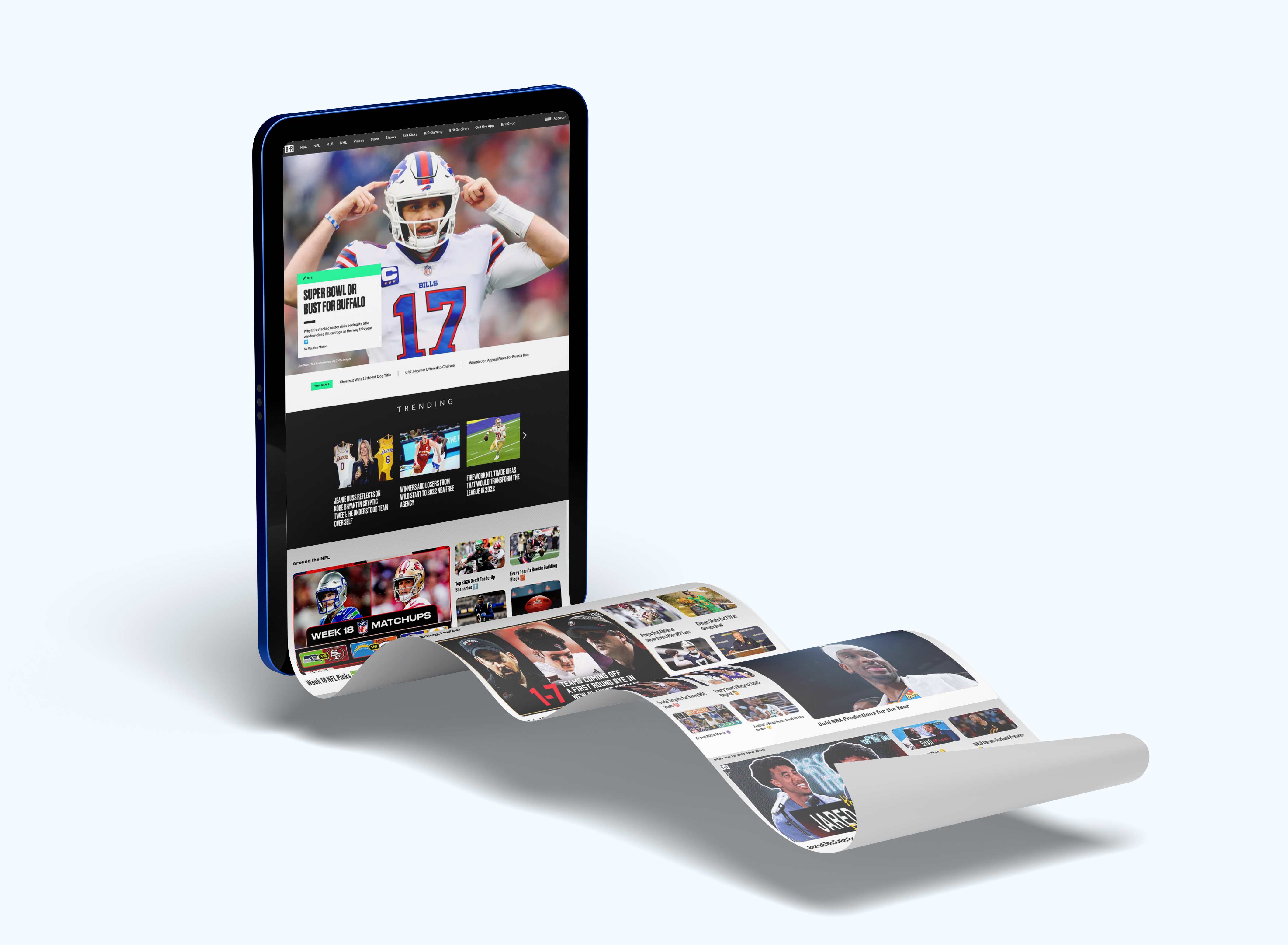
The Bleacher Report rebrand was more than just a visual overhaul, it was a cultural repositioning that introduced the next evolution of sports media, fandom, and digital engagement. With an updated logo, refined brand identity, and a bold new creative direction, the rebrand solidified B/R as the preeminent voice in sports culture, bridging the gap between on-field action and off-field influence. The launch was paired with a revamped website and mobile app, designed to provide an immersive, curated experience for modern fans who engage with sports in bite-sized, socially-driven formats rather than traditional full-game viewing. The product experience was rebuilt around speed, personalization, and visual clarity, with card-based content modules, improved video integration, and a mobile-first architecture that reflected how the next generation of fans actually consumed highlights, rumors, and cultural moments in real time.
But a transformation of that scale could not live solely within the product and design system, it required a moment of cultural declaration. Once the new identity, platform architecture, and editorial voice were established, the next challenge was announcing to the world that Bleacher Report had arrived in a new era. The brand needed a campaign that could capture the energy of the redesign while signaling a broader shift in how sports media would operate going forward. This meant translating the refreshed look and feel into a larger narrative moment, one that celebrated the evolution of fandom itself and positioned B/R as the definitive destination for the intersection of sports, culture, and digital storytelling. The rebrand laid the foundation, but it also created the opportunity to introduce a bold new campaign that would showcase the platform’s renewed vision, amplify the redesigned experience, and make it unmistakably clear that Bleacher Report was entering its next chapter.
The "Up Your Game" campaign wasn’t just about sports; it was about what it truly means to be a fan. In today’s world, fandom is about more than just the box scores and game highlights it’s about the stories, the rivalries, the fashion, the drama, and the personalities that define the culture of sports. This campaign, our first major brand effort in partnership with Johannes Leonardo, challenged fans with a simple question: "Think you got the game?" But it wasn’t about playing the game it was about understanding it beyond the surface. The commercial showcased the layers of sports culture, featuring kids with undeniable swagger walking through the streets, asking viewers if they truly “get it.” Cameos from sports icons like Allen Iverson and Marquette King reinforced the idea that being a fan means knowing the history, the trends, the moments, and the language of the game that true fans would always resonate with or know what we are talking about. If you know, you know.
The rebrand wasn’t just an internal exercise it needed a cultural moment to announce itself to the world. That’s where our national rebrand campaign came in. Working closely with Will Leivenberg from our brand marketing team, I helped gut-check, consult, and provide creative oversight as we collaborated with Johannes Leonardo, one of the most respected creative agencies in the industry, to bring the campaign to life. The challenge was clear: we had completely transformed as a company, but there were millions of fans who still saw us as the Bleacher Report of old. The commercial needed to reintroduce B/R to the sports world, showing that we weren’t just another sports publisher, we were THE social voice of sports. The combination of the rebrand, the national campaign featuring a commercial and OOH ad placements, and our evolved social-first content strategy cemented Bleacher Report’s position as the definitive sports media brand for the next generation. Our work transformed B/R from a digital sports site into a cultural force, one that wasn’t just covering sports but shaping the way fans experienced them. The rebrand was a reflection of our evolution, and the results spoke for themselves.
As consulting producer and art director, and the originator of the entire BR playbook up to this point I was tasked with protecting the cultural integrity of the campaign and ensuring it felt unmistakably Bleacher Report. By that point, B/R had carved out a singular position in sports media, one rooted in social fluency, meme literacy, and a deep respect for fan voice. My role was to translate that DNA into a premium brand execution without diluting its edge. Every decision, from casting to pacing to visual tone, was filtered through a simple question: does this feel like the internet-native sports culture we helped build, or does it feel like advertising pretending to understand it.
Bleacher Report’s rise was not accidental. It was powered by the daily cadence of social, the irreverent humor of Game of Zones, the immediacy of highlight culture, and the instinct to treat fandom as participatory rather than passive. We weren’t speaking at fans. We were speaking with them, in the language they had already made their own. “Up Your Game” drew directly from that ecosystem. The campaign didn’t imitate our voice. It emerged from it. The “if you know, you know” ethos that drove our most viral moments was embedded in every frame, rewarding cultural awareness and making the work feel like a natural extension of the feed rather than an interruption.
What made this moment significant was not simply reach, but legitimacy. By grounding the commercial in real sports culture instead of a polished facsimile, we reinforced B/R’s authority in a space where authenticity is the only currency that matters. The work acknowledged the way fans actually consume sports in the modern era: through clips, conversations, inside jokes, and shared rituals that live across timelines and group chats. In doing so, we didn’t just attract new audiences. We signaled to our core community that the brand they helped build was scaling without losing its soul. This was not a redesign. It was a brand operating system built for scale.
The introduction of electric green into the Bleacher Report palette functioned as a strategic visual disruptor, a high-voltage accent that cut through the grayscale foundation and mirrored the kinetic energy of modern sports culture. In fast-scroll social environments and second-screen viewing scenarios, that flash of green acted like a navigational beacon, instantly signaling B/R content amid a sea of visual noise. It evoked the glow of scoreboards, the pulse of gaming interfaces, and the neon undercurrent of nightlife and streetwear, embedding the brand within the same visual language that defines how younger audiences experience sport and culture. More than a visual flourish, the color became a functional cornerstone of the system, guiding attention, establishing hierarchy, and creating a recognizable signature that translated seamlessly across motion graphics, app interfaces, broadcast packages, and physical products. We turned design into infrastructure, enabling speed, consistency, and cultural fluency across platforms.
%20(1).webp)
Working with Johannes Leonardo was a rare kind of creative partnership where strategic rigor and cultural intuition operated in lockstep. They brought a level of craft and narrative discipline that pushed every idea beyond surface cleverness into something with real staying power, while still leaving room for experimentation and edge. What I appreciated most was their respect for the audience’s intelligence. Nothing felt pandering or over-explained. We were aligned in believing that sports fans are fluent in culture and can sense authenticity instantly, so the work had to meet them at that level. Collaborating with their team sharpened my own thinking around storytelling architecture, brand voice, and the balance between restraint and impact. It was the kind of environment where good ideas were stress-tested, great ideas were protected, and the final output felt inevitable rather than manufactured. The rebrand aligned product, content, and marketing around modern fan behavior.
“Up Your Game” became the clearest and most unapologetic articulation of Bleacher Report’s transformation from a digital publisher into a full-fledged cultural engine. Arriving in lockstep with the logo refresh, website redesign, and the transition from Team Stream to the unified B/R app, the campaign signaled a coordinated evolution across every touchpoint. We were no longer content to document sports culture from the sidelines. We were designing within it, shaping how it looked, sounded, and moved across screens. The creative leaned into the behaviors we had been studying for years: second-screen viewing, meme fluency, athlete-driven narratives, and the collapse of boundaries between sport, music, fashion, and internet vernacular. Every frame, casting choice, and visual cue reflected the world our audience already inhabited, which is why the work resonated as native rather than manufactured. By codifying visual and behavioral systems, we transformed brand consistency from effort into default.

The packaging of Bleacher Report’s content and brand touchpoints played a decisive role in clarifying its position within the modern marketing funnel. Rather than operating only at the top as an awareness engine or at the bottom as a conversion tool, B/R built a full funnel presence by treating every asset social tiles, push alerts, highlight loops, merch drops, and sponsored integrations as cohesive brand packaging. The visual system created instant recognition in feed driven environments, pulling users into the consideration phase through culturally fluent storytelling, athlete access, and participatory formats that deepened affinity. From there, commerce integrations, app engagement, live events, and co branded merchandise provided natural conversion pathways that felt like extensions of fandom rather than transactions. This approach reframed B/R from a media publisher into a culture conduit, where packaging functioned as strategic infrastructure guiding audiences from discovery to loyalty while reinforcing a brand identity that felt native at every step.
.jpg)
By fusing real-time digital sensibilities with cinematic production value, we demonstrated that modern sports media is not defined by rights packages or locker-room access, but by proximity to fans and credibility within their culture. “Up Your Game” reframed Bleacher Report as a brand that doesn’t wait for the moment but helps create it, a platform where highlights, humor, style, and identity coexist in the same breath. The campaign functioned as both proof of concept and rallying cry, aligning internal teams, partners, and advertisers around a shared understanding of what B/R had become. It wasn’t a commercial in the traditional sense. It was a declaration of intent, a statement that the future belongs to brands that participate in culture with authenticity and speed. Helping architect that inflection point remains one of the defining privileges of my career.

The style-focused segments paid homage to the way athletes use fashion as self-expression, from Allen Iverson’s braids and baggy fits setting trends in the early 2000s to the NBA tunnel walk era, where players like Russell Westbrook and LeBron James transformed pre-game entrances into fashion runways. The game-changing headlines segment nodded to Kyrie Irving’s flat-earth comments, which ignited a cultural debate beyond basketball, and Kevin Durant’s infamous burner account fiasco, illustrating how social media has become an integral part of an athlete’s narrative. The flash of individuality was embodied in Antonio Brown’s Lego haircut, a symbol of the league’s growing embrace of personality, while Jaylon Sewell’s Odell Beckham Jr.-inspired blonde hair controversy subtly highlighted racial and generational divides in sports institutions. Sneaker culture’s billion-dollar influence was captured through Benjamin Kickz, the young sneaker mogul, emphasizing the role of hype culture in sports. Bat flips from Yasiel Puig and José Bautista symbolized the shifting unwritten rules of baseball, a sport traditionally resistant to change.

The tribute to Craig Sager underscored the intersection of sports and media, honoring his legendary sideline presence and signature colorful suits. Kevin Durant’s “cupcake” meme, which originated as Russell Westbrook’s subtle dig after KD’s departure from OKC, illustrated how digital culture can redefine rivalries. Allen Iverson’s “We talkin’ about practice” rant was repurposed to show how a single moment can transcend time and remain culturally significant. The “No Fun League” theme featuring Marquette King tackled the NFL’s historically strict stance on celebrations, reflecting the players’ push for more individuality. Finally, the Dee Gordon home run tribute to José Fernández, where a teammate honored his fallen friend in one of baseball’s most emotional moments, emphasized that sports are about more than just the game they are about legacy, emotion, and human connection. Every reference was deliberately placed to capture the soul of sports culture today, proving that understanding the game means understanding the world around it. This was a unique campaign that felt like our fans and audience voice with plenty of easter eggs for people to notice.

The visual language was bold, the pacing was electric, and every beat of the spot was meant to feel like it belonged in the social conversation, not just on a television screen. The creative structure of the commercial followed the same philosophy that had made B/R’s Social Moments team a success: sports moments don’t just happen, they reverberate. The spot showed how a single highlight can become a viral meme, how a hairstyle can spark debate, how a post-game interview can become an anthem, and how a simple celebration can shift the culture and how Bleacher Report was the one stop shop for all of it.
It was designed to be referenced, remixed, and reshared, embodying the way fans engage with sports in the digital age. This wasn’t just an advertisement it was an invitation for fans to see themselves in the story of sports culture. It acknowledged that the biggest moments aren’t just about who wins or loses, but about how those moments are remembered, talked about, and reinterpreted across generations. More than anything, it was a statement that if you don’t understand sports culture, you don’t truly understand sports. The response to the commercial was immediate and undeniable. Within months, brand awareness surged, logo recognition increased by 46%, and engagement across B/R platforms reached new heights. But beyond the numbers, what mattered most was that fans saw themselves in the brand in a way they hadn’t before. This wasn’t just Bleacher Report covering sports this was Bleacher Report owning the conversation around it.
.webp)
The impact of the rebrand was immediate. Monthly app installs surged by 20%, signaling a renewed user interest in B/R’s digital experience. On launch day alone, the platform hit 40 million total visits, setting a single-day traffic record and proving that fans were eager to engage with this new iteration of Bleacher Report. The rebrand also fueled a 200K increase in active monthly users, cementing B/R’s role as the go-to destination for sports coverage that was deeply connected to music, fashion, social media, and entertainment. This transformative campaign was widely recognized across the industry, earning Clio Sports Silver for Integrated Campaign, Bronze in Film, and an Effie Silver for Entertainment & Sports, acknowledging its impact on both branding and marketing effectiveness. The campaign also reached #1 on Creativity-Online’s Top 20, reinforcing how B/R’s "Up Your Game" campaign wasn’t just about a new look it was a statement about the future of sports media. By leaning into the cultural intersections of sports, B/R didn’t just report the game it shaped how fans experienced it.

What made the Bleacher Report evolution so formidable was the reality that the brand no longer lived in a single container. It had to perform as a coherent system across an ecosystem that spanned mobile feeds, social platforms, connected TV apps, linear broadcast, live events, and commerce touchpoints. A fan might encounter B/R in a 9:16 highlight on Instagram, a push notification from the app, a long-form feature on a smart TV, a lower third during a TNT playoff broadcast, or a piece of merch surfaced through an e-commerce drop. My role was to help ensure the brand behaved consistently and intelligibly across each of these surfaces, adapting to context without diluting its voice. The vertical integration with Turner and TNT added another layer of complexity and opportunity, allowing the identity to travel from phone screens to arena jumbotrons to living room televisions in a single game cycle. Designing for that level of ubiquity required a modular system, motion principles that scaled from thumb-scroll to broadcast, and a visual language that could hold its own whether it appeared for two seconds in a social clip or as part of a national primetime package. The result was a brand that didn’t chase the audience. It met them everywhere they already were.

The Bleacher Report logo has become an iconic symbol in modern sports culture, transcending its original identity as a media brand and embedding itself in the very fabric of sports and entertainment. The bold, minimalist B/R mark not only streamlined the brand’s presence across platforms but also repositioned Bleacher Report as more than just a news source, it became a cultural curator, an essential voice in the ever-evolving dialogue of sports. The rebrand wasn't just about aesthetics; it was about making a statement, establishing B/R as the leader in sports culture storytelling, and distinguishing it from traditional, legacy sports media. The presence of the Bleacher Report logo on NBA courts during TNT broadcasts was a defining moment for the brand, solidifying its position as an essential part of the sports conversation.
Working on a mark that had to perform across platforms, cultures, and contexts reshaped how I think about identity design at its core. I learned that a logo is not a static artifact but a living interface between a brand and its audience, one that must anticipate motion, scale, material, and behavior long before it ever ships. It forced me to design with systems thinking, considering how typography, color, spacing, animation, and usage guidelines form an ecosystem rather than a single deliverable. I became far more attuned to edge cases, how a mark degrades on low bandwidth streams, how it reads in peripheral vision, how it translates across fabrics, finishes, and lighting environments. Most importantly, it reinforced that the strongest identities earn trust through consistency while still leaving room for cultural expression, and that the real success of a logo is measured not in design awards but in how naturally people adopt it into their daily lives.
In a saturated sports media landscape where feeds blur into a sea of interchangeable highlights and templated graphics, a distinctive logo functions as the anchor of brand recall and the entry point into a cohesive identity system. Designing at the center of this ecosystem required treating the mark not as decoration but as a scalable asset, one that could hold integrity across avatars, watermarks, motion packages, merchandise, and platform-native adaptations without losing recognizability. The north star was always ownability: a form simple enough to be legible at 16 pixels yet iconic enough to carry cultural weight at billboard scale. By prioritizing silhouette, negative space, and modular geometry, we created a logo that could flex across contexts while reinforcing a unified visual language, ensuring that every touchpoint, from social posts to live activations, compounded brand equity rather than diluting it. In an attention economy defined by speed and replication, an ownable identity is not a luxury, it is the infrastructure that allows a brand to be recognized, trusted, and remembered. This project reshaped how I think about identity design as a living system rather than a static mark.

By securing OOH (out-of-home) space on the sideline digital screens, we weren’t just advertising we were embedding B/R into the fabric of live sports culture. The logo’s placement became more than just branding; it became a symbol of modern fandom, digital-first storytelling, and cultural relevance. Moments like LeBron James sitting courtside during the NBA Bubble with the B/R logo in clear view, or star players making game-winning shots with the brand subtly but powerfully present in the background, created an organic visual connection between B/R and the game itself. These high-impact placements weren’t just about visibility; they reinforced B/R as a mainstay in sports media, not just as a digital platform but as a recognizable force in real-world sports environments.
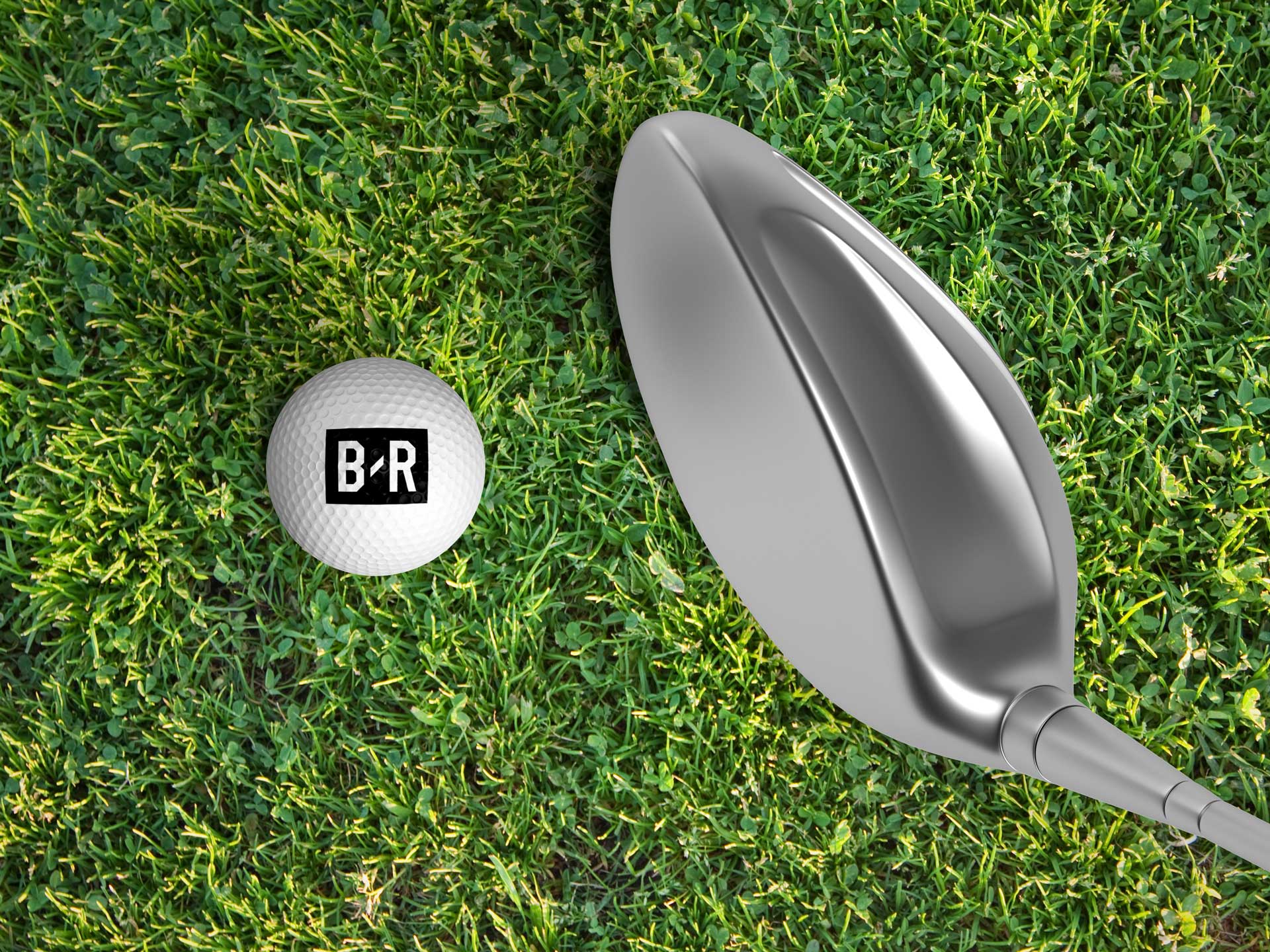
Since its launch, the B/R logo has become synonymous with high-energy, socially-driven, fan-first content, appearing everywhere from digital platforms to branded collaborations, apparel, and athlete partnerships. You now see it on sideline gear, sneaker releases, exclusive merch drops, and within the social media content of the most influential athletes and artists. It’s a mark that resonates beyond just highlights and scores, it represents a new generation of sports fandom, one that thrives at the intersection of sports, music, fashion, and pop culture. The rebrand infused Bleacher Report with new energy, solidifying it as the definitive media brand for modern fans who consume sports in real-time and in ways that extend beyond the game itself. I was proud to be a small part of the team that helped bring this transformation to life, working alongside incredibly talented designers, strategists, and marketers to craft an identity that wasn’t just recognizable, but meaningful. The impact of the B/R logo today is undeniable it has become a cultural badge, a symbol of the way sports are experienced today: through community, creativity, and an unapologetic embrace of everything that makes the game bigger than the scoreboard. Seeing the logo adopted in the wild confirmed that the work had crossed from brand into culture.

From the outset, the logo had to operate as a true system mark, not merely a digital avatar. It needed to hold its own in the hyper-compressed real estate of a social avatar, watermark cleanly on vertical video, and remain legible on mobile lock screens, while also scaling seamlessly to arena LED ribbons, step-and-repeat walls, OOH billboards, merch embroidery, and broadcast lower thirds. We refined geometry, stroke weight, and spacing to ensure clarity across substrates and lighting conditions, from backlit signage to screen-printed cotton to high-gloss vinyl wraps. The goal was consistency without rigidity, a mark that could feel native whether encountered in a push notification, on a courtside activation, or across a multi-story experiential takeover. That versatility allowed the brand to show up with the same authority in pixels, print, and physical space, reinforcing recognition while letting the surrounding environment carry the energy of the moment.

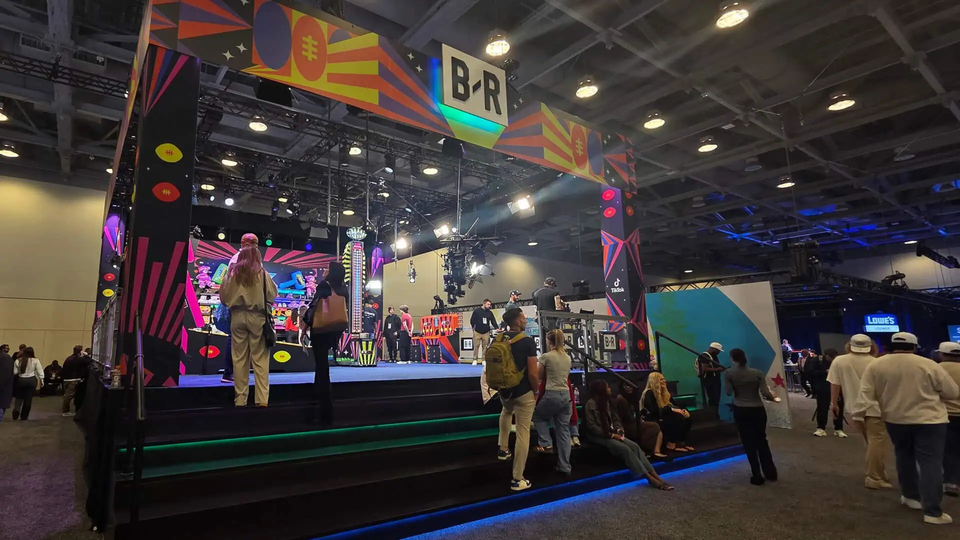
As Bleacher Report expanded into live events and experiential environments, the brand system had to evolve beyond screens and function convincingly within physical space while maintaining the same clarity, confidence, and cultural tone that defined the digital product. We developed detailed guidance around materiality, finishes, and spatial applications so the logo and visual language could maintain presence across stages, step-and-repeats, pop-ups, studio sets, and partner activations. That meant thinking carefully about how brand elements behaved at scale, from large stage backdrops and LED walls to subtle environmental graphics integrated into venue architecture. We established recommendations for scale relationships, clear space, and substrate selection that allowed the mark to perform consistently across environments with dramatically different lighting conditions and viewing distances. Materials such as matte black metals, powder-coated steel, brushed aluminum, backlit acrylic, and high contrast vinyl were chosen to ensure durability while preserving visual integrity. The emphasis was always on legibility and presence, making sure the brand read clearly whether viewed through a broadcast camera, a social media clip, or in person by fans moving through the space. By extending the system into the built environment, the brand began to function less like a graphic overlay and more like a spatial language that could anchor the entire experience.
Beyond signage and surfaces, we treated the environment itself as a storytelling canvas that could reinforce Bleacher Report’s culture-first identity. Furniture choices, sightline planning, staging layouts, and environmental graphics were all considered part of the brand expression rather than purely logistical decisions. Seating arrangements were designed to encourage energy and engagement, while wayfinding systems and branded installations carried the same tone of modern, culture-forward minimalism found across the company’s digital platforms. The visual system needed to remain flexible enough to adapt to different venues, production setups, and audience sizes without losing coherence. This approach allowed each activation to feel distinctive while still clearly belonging to the Bleacher Report universe. Whether it was a pop-up experience, live panel discussion, or broadcast set, the brand language helped unify the environment into a cohesive visual narrative. The goal was consistency without rigidity, creating spaces that felt unmistakably B/R while remaining responsive to the needs of partners, fans, and production teams. In that sense the logo stopped functioning as a simple mark and instead became an architectural element embedded within the experience itself. I’m proud to have helped build something that audiences did not simply consume on a screen but chose to carry with them into real world spaces.
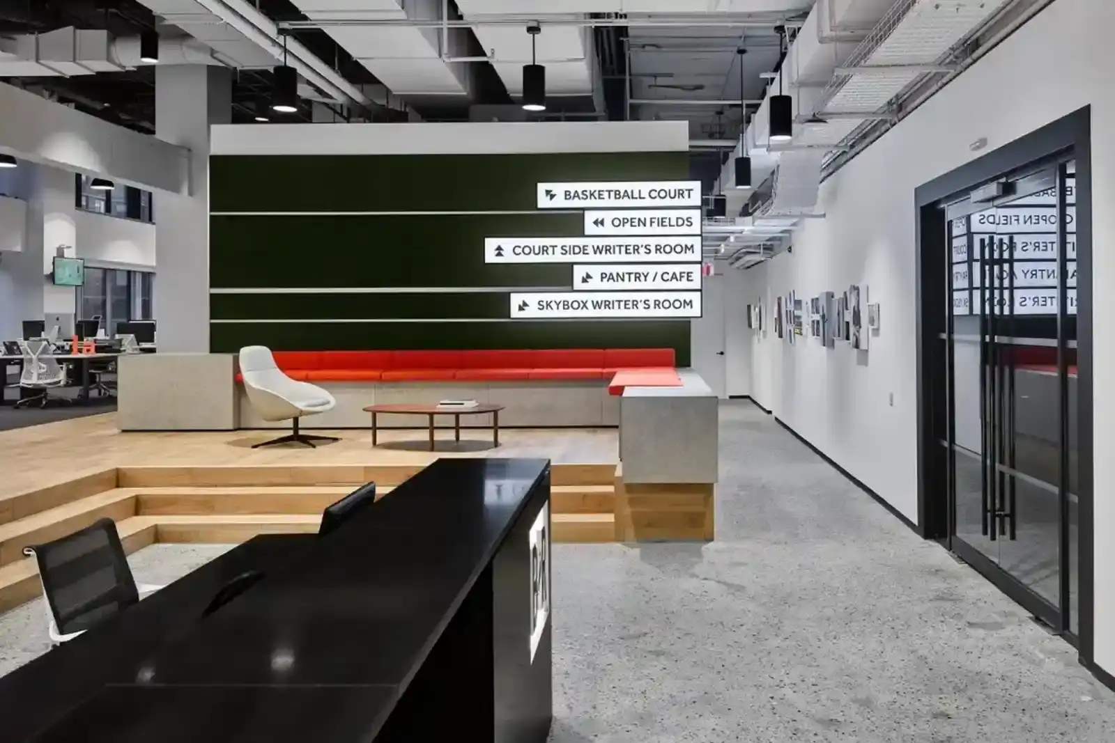
The design of Bleacher Report’s New York City headquarters was a direct reflection of the brand’s evolution modern, dynamic, and deeply immersed in sports culture. As part of the team overseeing the creative vision of the space, I worked closely with Brian Johnson, our Senior Director of Video Production & Technology, to art direct and build out an office environment that was more than just a workspace, it was an extension of the brand’s identity. The space, designed by Design Republic with Gardiner + Theobald as project managers and Omara as contractors, had to balance technical functionality with creative energy. The second and third floors of 1633 Broadway became a playground for innovation, with state-of-the-art production studios, edit bays, and control rooms seamlessly integrated alongside open, collaborative workspaces. We wanted to design an environment that felt alive with sports culture, where the energy of the game met the pulse of digital media and storytelling.
.jpg)
The Bleacher Report headquarters in New York City was more than an office it was a declaration of who we had become. Every surface, sightline, and material choice was designed to reflect the velocity of the brand at a moment when sports, culture, and media were collapsing into one shared language. This was not a place built for quiet corporate routine. It was built to feel alive, charged with the same urgency as a trade deadline, a buzzer beater, or a viral moment racing across timelines. The journey began in a tight 2,000 square foot Chelsea space, where the scrappy, digital first ethos of B/R took shape in close quarters and late nights. Growth demanded oxygen, leading to 888 Seventh Avenue, a 13,000 square foot office that signaled scale and ambition. Yet even that expansion felt like a prelude. The move to 1633 Broadway was not about square footage alone. It was about cultural footprint. It marked the transition from a fast growing sports site to a media force shaping how a generation experiences the game.
Designing the 1633 space was my opportunity to translate that transformation into something tangible, a coming out party rendered in steel, glass, light, and motion. We built an environment where production studios, edit bays, open work areas, and cultural touchpoints flowed into one another, mirroring the way content itself moved across platforms. The office functioned as both engine and stage, a place where ideas were made and immediately broadcast into the world. It hosted athletes, artists, and collaborators who recognized it as a hub rather than a headquarters. Working closely with Design Republic, Rory Brown, Brian Johnson and a team of contractors we slowly brought the space to life. For me, the project was about proving that a digital native brand could occupy physical space with the same authority it held online. 1633 Broadway became that proof. It was not only where we worked. It was where Bleacher Report stepped fully into its identity as a cultural institution.
The basketball court at the center of the office became the company’s crown jewel, a symbolic reminder that we weren’t just reporting on the game, we were living it. The open layout fostered collaboration, while the cutting-edge production studios ensured that B/R could produce content at the highest level, in real-time, as sports culture unfolded. It was in this space that we fully embraced what B/R had become: not just a news outlet, but the social voice of sports. It was in this office that our boldest ideas took shape, where creative risks were encouraged, and where we truly defined our identity as a brand that sat at the intersection of sports, entertainment, and digital storytelling.
.jpg)
One of the key elements we focused on was making the office feel like a sports culture hub, rather than a traditional media headquarters. That meant including a basketball court where employees could literally play during breaks or hold impromptu meetings while shooting around. The court wasn’t just an amenity, it was a statement about how B/R lived and breathed sports, reinforcing that the game wasn’t just something we covered, but something we actively participated in. To further emphasize our connection to sports, entertainment, and pop culture, we curated bold, visually striking murals and art installations throughout the space. These weren’t just decorative elements, they were storytelling pieces, illustrating the dynamic energy of sports fandom and bridging the gap between athletes, fans, and digital content. A rotating gallery space in the heart of the office showcased emerging and established artists, reflecting B/R’s role in championing creativity and cultural relevance in sports media. I helped Will fill the walls with art from some of our favorite collaborators on the social moments team like Ryan Simpson or PVTSO.
The headquarters functioned as a physical manifestation of Bleacher Report’s editorial engine, where content, culture, and community coexisted in one continuous loop. The open office plan encouraged cross-pollination between writers, designers, producers, and social teams, dissolving the silos that slow traditional media. Conversations that began at a desk could evolve into a motion graphic, a meme, or a breaking story within minutes. The energy was kinetic, shaped by the constant hum of live sports, trending topics, and real-time fan reactions. It felt less like a workplace and more like a trading floor for culture, where attention was the currency and speed was survival.

The studios and control rooms were the nerve center of that operation, engineered for immediacy and scale. Banks of monitors tracked live feeds, social chatter, and global games simultaneously, allowing teams to respond to moments as they unfolded. This was where highlights were cut in real time, where graphics were rendered for broadcast, and where digital segments were produced for millions of viewers across platforms. The infrastructure rivaled that of traditional networks, yet the output moved faster and spoke in a language native to the internet. It was proof that a digital-first company could operate with the rigor of television while maintaining the agility of social.

And then there was the court. The in-office basketball court wasn’t a novelty; it was a thesis statement. It grounded the brand in the physical reality of the sport it covered, turning the game from abstraction into lived experience. Employees shot around between edits, talent filmed segments on the hardwood, and visiting athletes immediately felt at home. The court connected the newsroom to the culture it documented, reinforcing that Bleacher Report wasn’t reporting from the sidelines. It was in the paint, part of the rhythm, translating the sound of sneakers on wood into stories that traveled the world.

On the production side, we ensured that the Black Box Studios, Voice-Over Booths, and Racked Equipment Rooms were built to high-performance standards, capable of producing real-time content, breaking news coverage, and high-quality original video. Working closely with Brian, we made sure that our editors, producers, and creatives had the tools they needed to keep up with the always-on sports news cycle, while also having the freedom to experiment with new storytelling formats. Every element of the office design was intentional it was about creating an atmosphere that fueled creativity, encouraged collaboration, and reflected the DNA of B/R’s brand. This was a space that felt as authentic and culturally sharp as the content we were creating every day. It was more than an office; it was a physical manifestation of the new Bleacher Report, a brand that didn’t just report on sports but shaped the culture around it. Having all these things functioning, recording podcasts while shooting hoops in one space was a balance.

Madsteez, the Los Angeles–born artist known for his kinetic line work, saturated palettes, and pop-surrealist characters, has built a reputation for turning walls into immersive cultural tapestries that feel equal parts street art, comic panel, and fever dream. His work lives at the intersection of sport, music, and counterculture, making him a natural collaborator for a brand attempting to visualize fandom as a living ecosystem rather than a static logo on drywall. We first partnered with him on murals for our San Francisco office, where his layered compositions and hidden visual easter eggs transformed transitional hallways into destinations, encouraging employees and visitors to slow down, decode references, and see Bleacher Report not merely as a publisher but as a cultural conduit. That earlier collaboration proved how environmental graphics could function as storytelling infrastructure, shaping mood, behavior, and brand perception in ways traditional signage never could.
When Will and I stet out to work with Madsteez a big part of it was that he was a basketball fanatic as well and appreciated the art and references and impact such vibrant murals would have on the office space. The murals were instant photo moments, and while we have now moved out of the 1633 building to be further downtown and be closer to HBO and Discover and the other Time Warner properties. Even in the new office we have three large madsteez paintings, since another mural would have been cost prohibitive. But it was an iconic piece of the office and a really cool project to be a part of.
When we began envisioning the New York office court as a symbolic nucleus for the brand, bringing Madsteez back felt inevitable. Together with Will Leivenberg, we asked him to create a mural that would anchor the space and translate B/R’s ethos into a visual language that employees could quite literally play beneath. The resulting court wall became a monumental homage to basketball’s global mythology, with Michael Jordan suspended mid-flight as both athlete and archetype, encircled by a courtside constellation of cultural figures whose presence spoke to the sport’s reach across music, fashion, and film. It was not decoration; it was narrative architecture. The mural turned the court into a stage, a meeting ground, and a daily reminder that Bleacher Report’s identity lives where sport intersects with the broader currents of culture, and that the brand’s evolution is written as much on walls and floors as it is on screens. The logo, the colors, the imagery and the artistry that B/R was known for needed to jump off the wall.
.jpg)
But this was more than just an art installation, it was a physical manifestation of our rebrand. Every element of the mural spoke to B/R’s role in shaping sports culture rather than just reporting on it. From Drake, Spike Lee, and Jack Nicholson each representing a different era of die-hard courtside fandom to Jay-Z, Beyoncé, and Rihanna, who exemplified the growing crossover between music, fashion, and sports, the mural told a deeper story. It even featured Craig Sager, suited in his signature flamboyant style, nodding to B/R’s parent company, TNT, and the enduring legacy of sports media. An empty seat was deliberately placed courtside, inviting employees, guests, and athletes to step into the mural for photo ops that seamlessly integrated them into the culture B/R championed. With the B/R logo placed boldly in the upper corner, the mural wasn’t just a backdrop, it was a declaration. This was the new Bleacher Report, where sports weren’t just covered, but celebrated as a cultural movement.
It became a living canvas that evolved with every interaction, every photo, every moment shared across feeds and screens. What began as a static piece quickly transformed into a dynamic system of participation, where fans, creators, and athletes all became part of the narrative itself. The mural didn’t simply reflect culture, it absorbed it, refracting new meaning each time someone stepped into frame and made it their own. In doing so, it redefined what a brand installation could be, not a fixed artifact, but a platform for expression that extended far beyond its physical boundaries. This approach blurred the line between audience and subject, turning spectators into contributors and content into a shared cultural loop. It demonstrated how physical space could be designed with the same intentionality as digital product, engineered for virality, resonance, and repeat engagement. The result was an experience that lived simultaneously on the wall and in the world, amplified through every post, every share, every reinterpretation. In that sense, the mural wasn’t the end product, it was the ignition point for a broader cultural conversation that positioned Bleacher Report at the center of it all.
.jpg)
When David Garcia was tasked with developing the new office artwork following Bleacher Report’s move into the Turner headquarters alongside HBO and Discovery at 230 Park Avenue South, he approached it with a deep respect for what had already been built. Rather than starting from scratch, he traced the lineage back to the original DNA that Will and I had established through the Madsteez murals, a visual language rooted in energy, irreverence, and cultural immediacy. The result was a series of three large-scale paintings installed in the café, each one carrying forward that spirit while evolving it for a new environment. They transformed the space into more than an office amenity, it became a living extension of the brand’s identity, where art, sport, and storytelling intersected daily. In many ways, it felt like a continuation of a dream we had started, reinterpreted with care and intention, ensuring that the legacy of those early creative risks remained embedded in the walls of the company as it scaled.
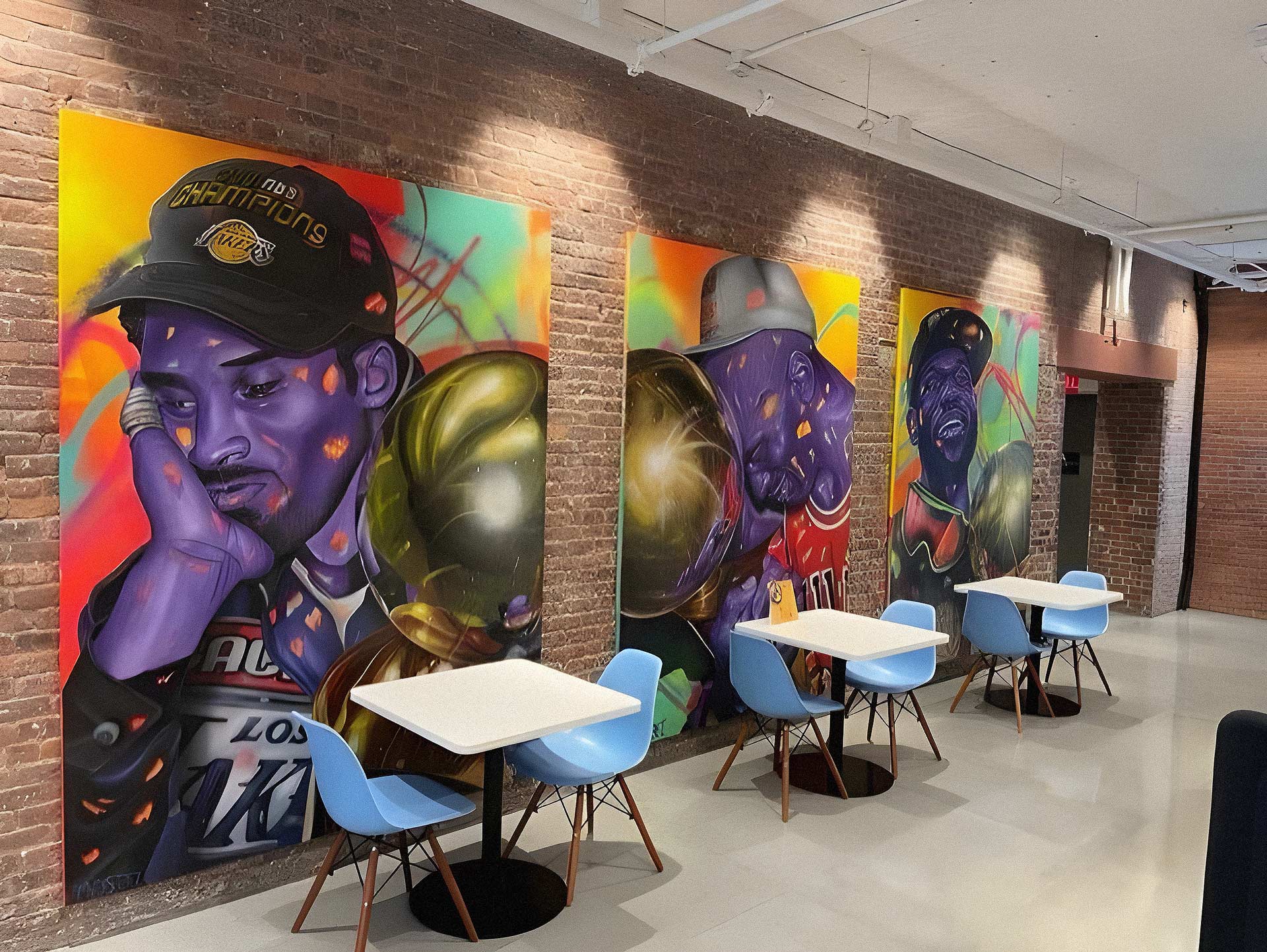
Will and I had worked with Timothy McAuliffe in our Media Lab days, and he was one of our favorite artists someone whose work resonated deeply with the way we saw sports culture merging with art. His ability to capture the essence of athletes beyond the game, in quiet, reflective moments, set him apart. One particular piece a striking portrait of Kobe Bryant had caught both of our eyes, and we knew that his perspective would be a perfect fit for the Bleacher Report office. We wanted to infuse that same energy into our new space, ensuring that the culture of sports wasn’t just something we talked about but something physically present in the environment we worked in every day. The art set the stage as the conference rooms and other small elements always being a nod to the culture and sports.

Bringing Tim into the fold was a natural extension of our vision, and his contributions to the CULT-URE series became a defining element of the office’s aesthetic. His pieces helped solidify the idea that sports weren’t just about competition they were about identity, influence, and the personalities that shaped the cultural conversation. This wasn’t just about filling wall space; it was about making a statement that sports deserved the same artistic reverence as music, film, and fashion. For Will and me, this was a full-circle moment getting to champion an artist we both admired while reinforcing B/R’s mission to push beyond traditional sports media.

The art gallery space at Bleacher Report’s headquarters was a dynamic hub that went beyond simply displaying artwork. It became a gathering place where sports, music, and creativity collided, shaping an environment that felt alive with culture. It hosted unforgettable moments, like a holiday concert with Big Baby DRAM that turned the office into a celebration of sound and energy, or the day DaniLeigh stopped by and transformed an ordinary afternoon into something dynamic and unexpected. The space had a way of drawing people in, creating an atmosphere where athletes, musicians, and creatives could exist in the same orbit. It wasn’t just about what was on the walls but about the experiences that unfolded there. Whether through live performances, artist showcases, or unexpected collaborations, the gallery gave Bleacher Report a physical space to amplify the cultural connections it championed, making it feel less like an office and more like the epicenter of something bigger.
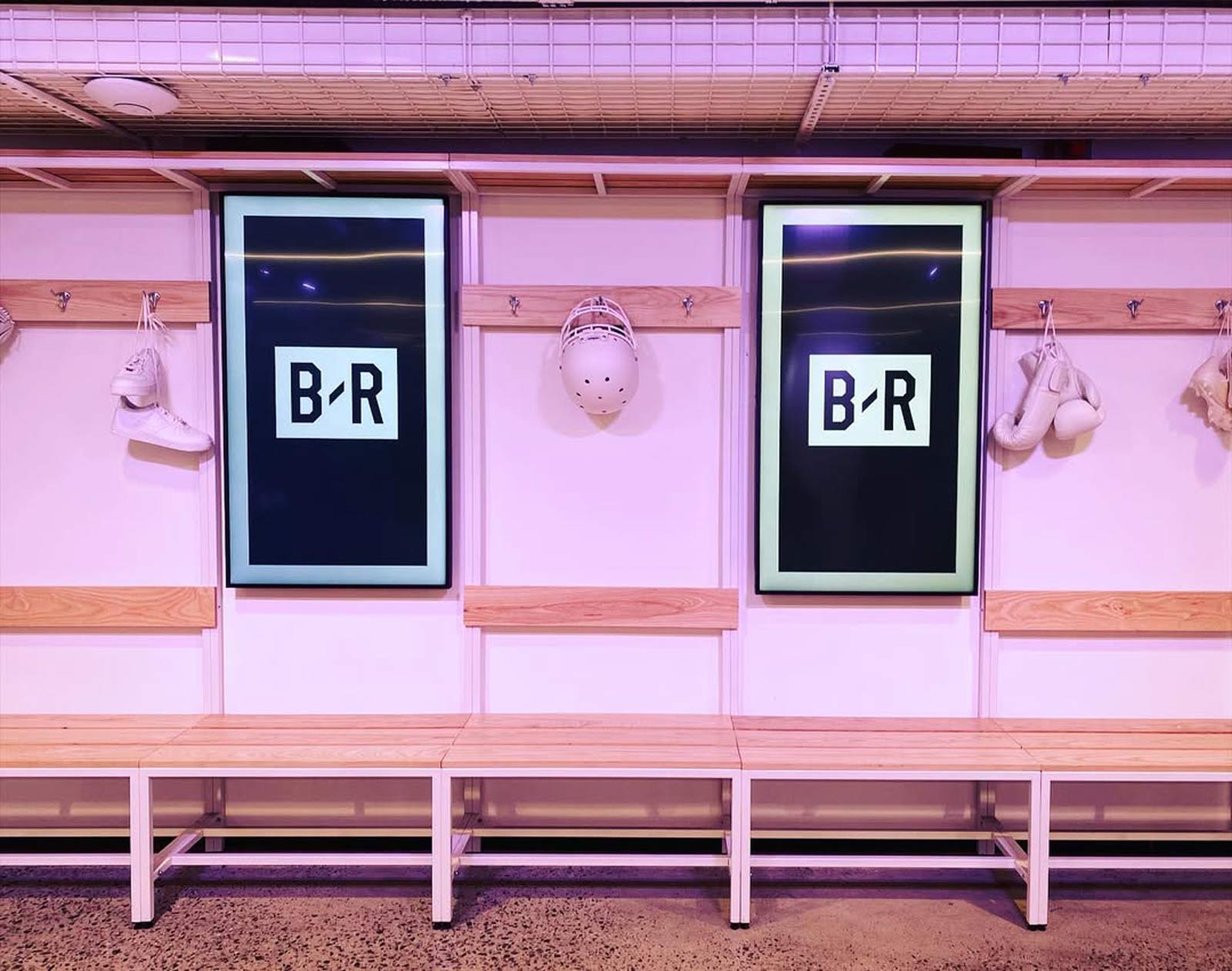
The inclusion of an art gallery space within the office was a deliberate move to shape the emotional cadence of the workplace, offering a quiet counterbalance to the velocity of a real time media environment. It created a zone where employees could step away from dashboards, deadlines, and live programming to engage with visual work that sparked reflection, curiosity, and creative cross-pollination. Beyond aesthetics, the gallery functioned as a spatial exhale, a place to think, sketch, reset, or have more considered conversations away from the hum of production. Rotating exhibitions and culture-driven installations reinforced the brand’s commitment to art and storytelling while reminding teams that inspiration does not only come from screens. In a company built on interpreting culture, having a contemplative space embedded in the daily flow helped sustain the creative energy required to do that work at a high level.

Being a steward of the Bleacher Report brand during this stage of its development was an incredible experience. This office became the crucible where so much growth happened, not just for the company but for the individuals who worked there. It was where we launched a complete rebrand, built a new design language, and expanded our cultural footprint in ways that were once unimaginable. From the moments of creative breakthroughs in our Media Lab to the intensity of real-time content creation during major sporting events, this space was where it all came together. Seeing how the environment shaped the team’s creativity and collaboration made it clear that this wasn’t just an office it was the beating heart of Bleacher Report’s new era. I’m proud to have played a role in bringing this vision to life, ensuring that B/R wasn’t just a company people worked at, but a brand they felt deeply connected to.
Bleacher Report helped redefine the fabric of modern sports fandom by shifting coverage from institutional broadcast voice to participatory, platform-native storytelling, meeting fans where culture actually happens rather than where legacy media insisted it should. Instead of treating sports as scheduled programming, we treated it as a living, breathing conversation that unfolded across timelines, group chats, and meme cycles in real time. My role within that ecosystem centered on translating raw athletic moments into culturally fluent creative systems that could travel at the speed of the internet without losing brand integrity. Through motion templates, social packaging, and visual vernacular tuned for algorithmic lift, we turned highlights into shareable identity markers that fans used to signal belonging. This approach transformed engagement from passive consumption into active distribution, effectively deputizing the audience as the media channel. The result was a flywheel where culture drove reach, reach drove revenue, and revenue validated further investment in platform-native storytelling.
At the strategic level, the creative and social frameworks I helped build enabled Bleacher Report properties like House of Highlights, B/R Kicks, and HighlightHER to scale from niche verticals into multi-million dollar media businesses with premium sponsorship inventory and global brand partnerships. By systematizing speed to market, codifying tone, and designing modular content architectures, we reduced production friction while increasing output quality and consistency across platforms.

This infrastructure allowed the brand to capture share of attention during peak cultural moments, converting virality into durable audience growth and advertiser confidence. The commercial impact was not accidental; it was the direct outcome of a creative strategy that treated fandom as infrastructure and design as a growth lever. While large organizations distribute credit broadly, the fingerprints of this work are visible in the templates, visual language, and social behaviors that still define the ecosystem today. I did not simply participate in that transformation. I helped architect the conditions that made it possible.
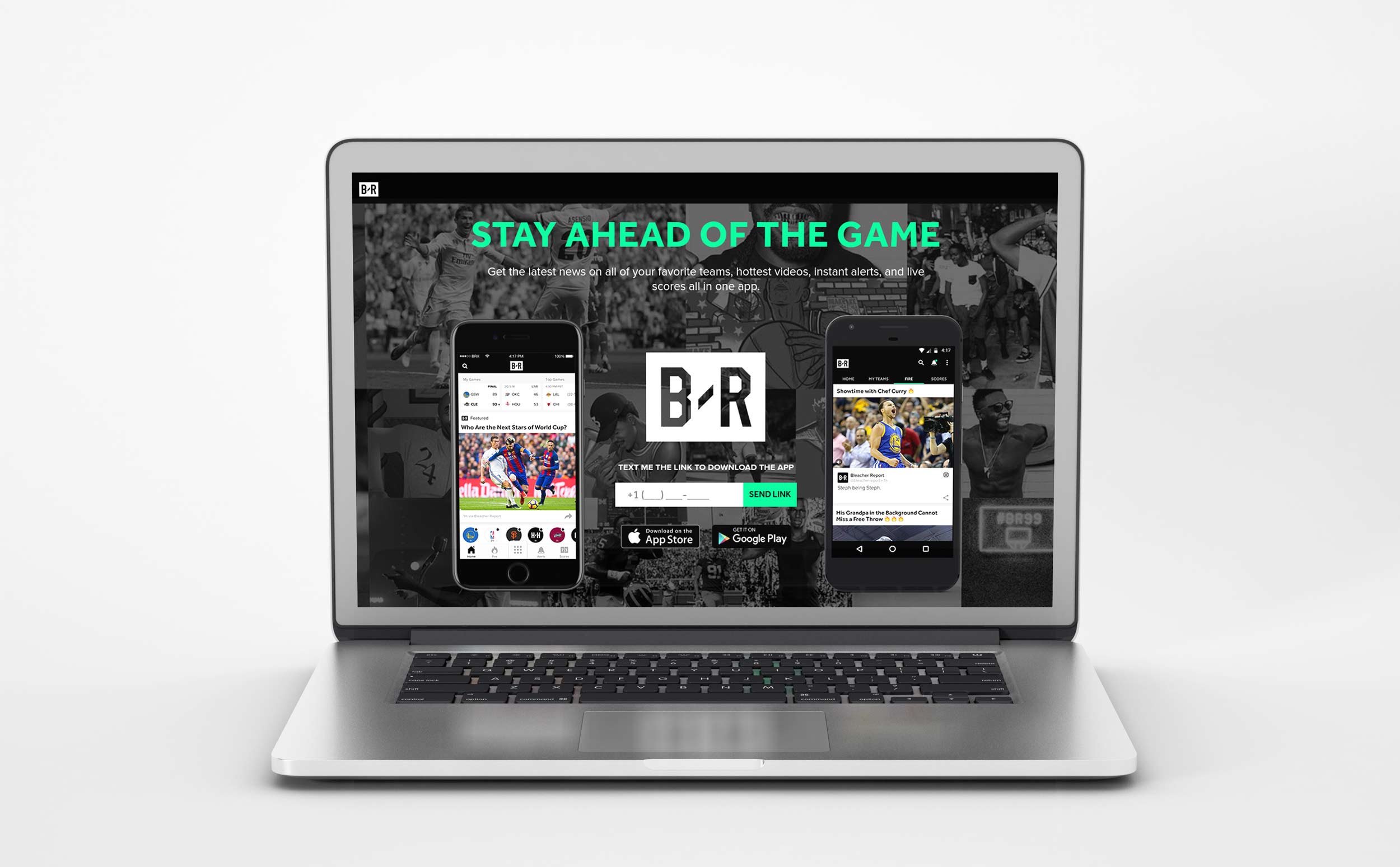
Being there during Bleacher Report’s formative years felt like standing inside a live wire as it hummed to life. We weren’t inheriting a legacy playbook. We were writing one in real time, launching core social channels that would become the brand’s primary interface with fans and shaping a voice that spoke with the immediacy, humor, and cultural fluency the old guard simply couldn’t match. Every post, caption, and motion graphic was an experiment in tone and timing, a chance to prove that sports media could feel as native to the feed as music drops, sneaker releases, and meme culture. As that voice solidified and the audience scaled into the millions, we carried those learnings into a full brand reintroduction, refining the identity, codifying the design system, and relaunching Bleacher Report to the industry not as a scrappy upstart but as a confident cultural operator. Watching something we built from instinct and iteration evolve into a recognized standard for how modern sports media looks, sounds, and behaves remains one of the most electric chapters of my career. Its always dope when my brother is rocking a Bleacher Report backback or hoodie I designed and someone asks him how he has that and he proudly tells them his big brother worked at bleacher report and designed the logo and branding and they get a real kick out of it and thats a thing of pride for me.
There’s a quiet kind of magic in walking through the city and catching the Bleacher Report mark in the wild on a hoodie in SoHo, a dad cap on the PATH, a tee at a pickup run where nobody is talking about media strategy, they’re talking about who’s got next. Most people wearing it have no idea how many whiteboards, late nights, Slack threads, and microscopic design decisions it took to make that logo feel effortless. That’s the point. When a digital-born brand slips so naturally into streetwear and personal style that it feels native to the culture, you know it has crossed a threshold. B/R was never meant to live only in score bugs or app icons. It was built to capture the tempo of sports culture itself, the overlaps with music, fashion, gaming, and the everyday rituals of fandom. Seeing people choose to wear the mark on their chest or crown it on their cap is proof that the identity resonated beyond screens and into lived experience. The real success wasn’t the launch. It was the identity’s ability to endure velocity and scale.
For me, those moments land with a mix of pride and disbelief. I helped shape that visual language, pushing for a system that felt sharp, culturally literate, and worthy of being worn, not merely seen. Whether it’s a late-night bar packed for a playoff game, a sideline at a rec league, or someone passing by on a random Tuesday, each sighting is a small confirmation that the work traveled. It means Bleacher Report didn’t remain a destination you visit; it became something you carry. A signal. A shorthand. A piece of the movement that said sports media could live beyond the box score and into the fabric of everyday life. And knowing I had a hand in that transformation is something I’ll carry with me for a long time. Bleacher Report is a core part of the sports ecosystem now and something any athlete is going to be familiar with, and that was the goal when we revamped the brand and made sure it was ready for prime time and the big stage.
My impact at Bleacher Report extended far beyond individual projects, helping redefine what sports media could look and feel like in a social first, mobile dominant era. I pushed the organization to treat design not as surface polish but as a strategic growth lever, embedding visual storytelling, motion systems, and platform native formats into the core of editorial and branded content. From pioneering new content templates optimized for feed consumption to elevating long form storytelling through interactive and immersive design, my work helped shift the industry standard toward experiences that were faster, more expressive, and culturally fluent.
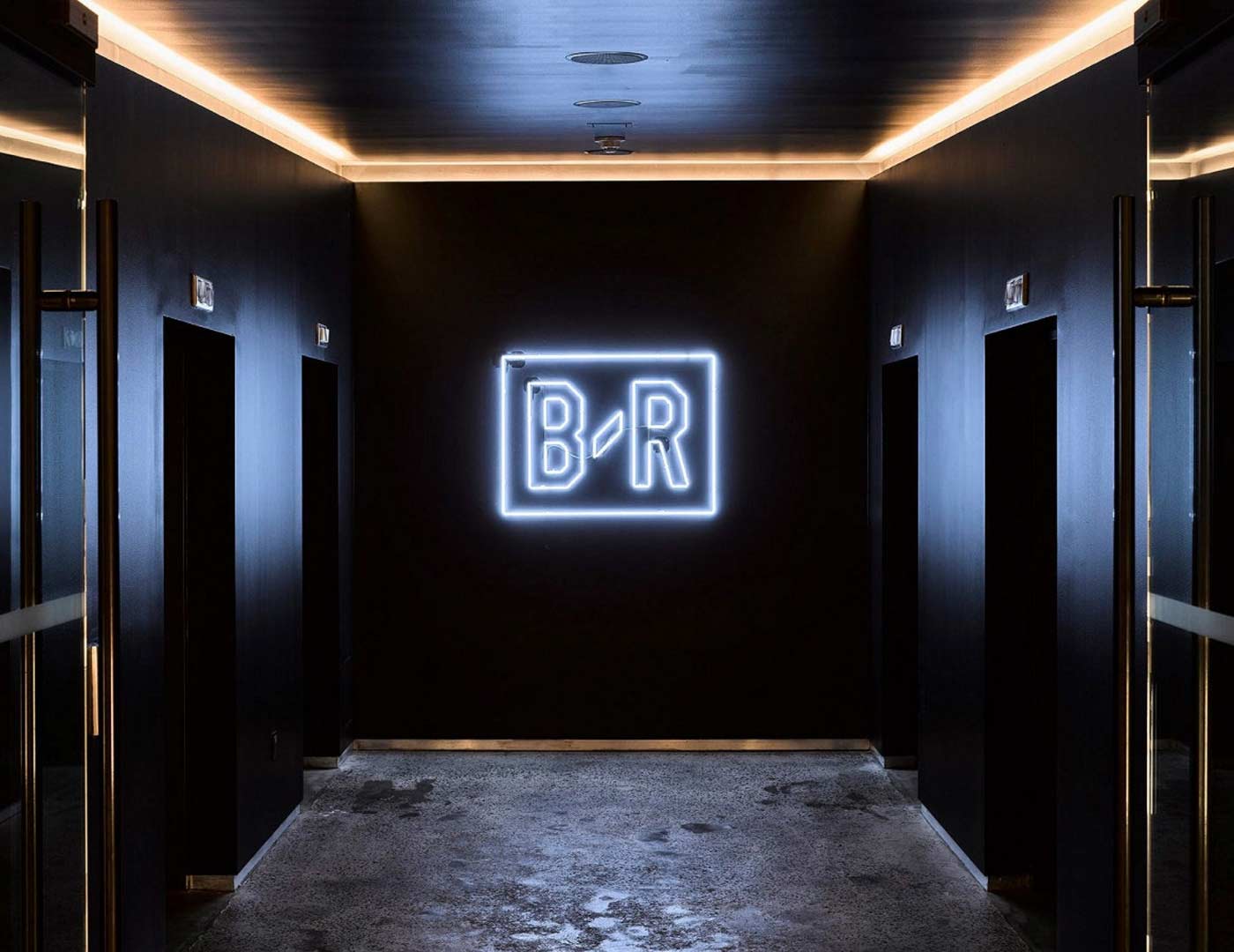
I championed a multidisciplinary approach that brought together illustrators, animators, product designers, and editors into a cohesive creative engine, enabling Bleacher Report to move at the speed of the internet without sacrificing craft. The visual language we built influenced not only B R’s sub brands and IP but also competitors who began adopting similar motion graphics, meme literate typography, and social optimized layouts in response. In a landscape that had long been dominated by static recaps and highlight reels, I helped usher in a new design paradigm where sports media became participatory, stylized, and unmistakably native to the platforms where fans actually lived.
.jpg)
What matters most to me isn’t the mark itself, it’s the discipline behind it. We turned a rebrand into a working identity that could survive velocity, scale, and the ugliness of real-world constraints, shipping daily without losing coherence. Whether the logo appears as a tiny social avatar, a broadcast bug, an arena ribbon, or a piece of merch, it carries the same confidence because the logic underneath it holds. That’s what makes an identity endure. Not the launch moment, but the way it keeps performing long after the deck is closed. For me, this was never just about a new look. It was about building something that could keep its composure under pressure, across feeds, screens, and formats we can’t fully predict. When the mark shows up small, stretched, animated, or printed on something cheap at scale, it still feels like itself. That’s the quiet win. Brands don’t last because of launch hype. They last because the thinking underneath them holds up when nobody’s watching.
Key Collaborators: Justin Chen, Dylan Lathrop, Chris Nygen, Bennett Spector, Will Leivenberg, Johannes Leonardo, Brian Johnson, Ryan Smith, Noah Chestnut, Ryan Hurst, Matt Sanoian, Kate Leahy, Line Postmary, Ryley Brown, Shelley Urick-Scillone, Adam Rubin, Mike Blanch, Omid Amidi, April Pascua, Tim Saputo, David Garcia, Vince Chang, Jason Gomez, Chris Perez, Kenny Dorset, Timothy Mcaullife, Mikey Navarro
Tools: After Effects, Photoshop, Illustrator, Figma, Cinema 4D, and Sketch
Deliverables: Brand Guidelines, Design System, Motion Package, Merch Guidelines, Product/UI Guidelines, Brand Photography, Presentation Templates