

As TikTok scaled from cultural phenomenon to global platform infrastructure, the mandate evolved from expressive branding to a disciplined, enterprise-grade design system. I led the creation of a modular identity framework that balanced governance with creative velocity, codifying motion principles derived from in-product behaviors, architecting an accessibility-first color system for algorithmic and UI surfaces, extending custom typography for performance and multilingual scalability, and implementing a responsive grid engineered for vertical, scroll-native consumption. This system unified global expression while enabling regional nuance, equipping internal teams, agencies, and creators with a coherent toolkit that preserved TikTok’s improvisational, creator-first energy. In partnership with Wolff Olins, I operated at the intersection of brand strategy, systems design, and cultural intelligence, translating TikTok’s creative ethos into an operational model that aligned Product, Marketing, Sales, and Trust and Safety under a shared visual language. Through refined art direction, typographic restraint, and elevated photography and video standards, we introduced signals of credibility that expanded TikTok’s appeal to enterprise partners, educators, policymakers, and multigenerational audiences without diluting its cultural edge. The motion language, rooted in the physics of the upward swipe and inertial scrolling, created a kinetic brand signature that felt native to the product experience. The impact was both infrastructural and cultural. The refreshed identity reduced production friction, accelerated go to market timelines, and enabled localized storytelling at scale while preserving a unified global brand. It strengthened TikTok’s positioning as a cultural operating system rather than a social app, supporting engagement across industries from music and sports to education, commerce, and public sector communication. With more than one billion active users, the design system continues to function as a dynamic platform layer, evolving in lockstep with culture while ensuring TikTok shows up with clarity, trust, and creative authority worldwide. In the end, the work was not about enforcing consistency but about creating the conditions for creativity to scale, allowing TikTok to grow into a global brand without losing the spontaneity and cultural immediacy that made it matter in the first place.

"TikTok saved my life." - Dame Judy Dench
As Design Director, I was tasked with bringing structural coherence to a brand that was scaling faster than its visual and operational systems could support. TikTok was expanding across regions, verticals, and enterprise partnerships, and without a unified framework, creative output risked fragmentation, inconsistent quality, and erosion of brand trust at a critical stage of growth. We approached the redesign as a systems alignment effort rather than a cosmetic refresh, establishing a governance-ready design framework that could support global scale while preserving the cultural specificity that makes TikTok feel native in every market. Instead of producing a static rulebook, I led the development of an operational philosophy translated into modular toolkits that teams could deploy across campaigns, product surfaces, and partner activations. The scope included motion behaviors derived from in-product physics, an accessibility-calibrated color architecture, grid logic engineered for vertical, broadcast, and large-format environments, and typographic hierarchies optimized for multilingual scalability. We also redefined brand photography and video standards to privilege immediacy, diversity, and lived-in authenticity over high-gloss artifice, ensuring the system reflected the participatory nature of the platform. On the TikTok for Business side, my focus was on extending these foundations into an enterprise-ready ecosystem that could support complex partner narratives without diluting the creator-first voice. This meant designing enablement assets that functioned across sales, marketing, and regional teams, including presentation frameworks, data visualization standards, event franchise templates, and motion-ready social toolkits. The goal was not only consistency but velocity, enabling teams to execute at the speed of culture while maintaining clarity, accessibility, and brand integrity. By reducing reliance on bespoke solutions, we eliminated production inefficiencies and created a shared language that allowed cross-functional teams to collaborate with greater confidence and autonomy. The system also enabled the brand to travel beyond the app with authority, performing seamlessly across out-of-home, broadcast, experiential environments, and partner co-branded campaigns. Collaboration with Wolff Olins and regional Creative Labs ensured the framework was informed by lived cultural context rather than imposed from a single market perspective. Through iterative testing and global co-creation, we built a design infrastructure that balanced governance with creative latitude, allowing local teams to express nuance without drifting from the core identity. What emerged was not simply a refreshed toolkit but a scalable operating model that helped TikTok behave like a mature global brand while preserving the improvisational energy that defines the platform. In practice, this meant faster go-to-market timelines, higher craft consistency, and a brand presence that felt unmistakably TikTok wherever it appeared. The system reduced production turnaround times across regions and significantly decreased reliance on bespoke design solutions, enabling teams to launch campaigns faster without sacrificing brand integrity. This chapter marked a shift in my practice from designing artifacts to designing systems, building the structures that enable teams to move faster, collaborate better, and show up with clarity wherever the brand lives. The challenge was to build a system resilient enough to scale globally while remaining flexible enough to reflect the cultures it would inevitably inhabit and operate within.


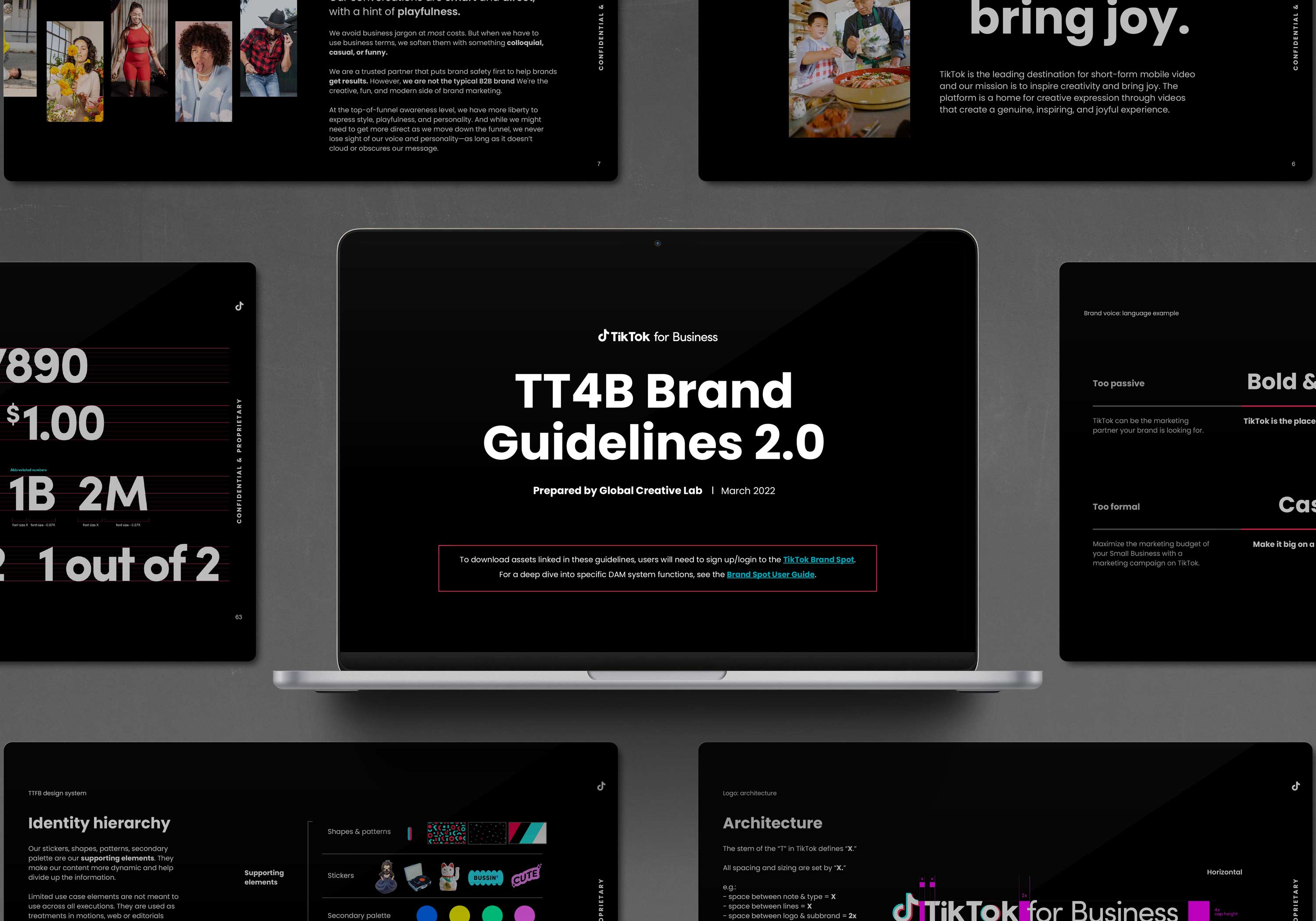
When I joined TikTok, the company was scaling faster than its brand infrastructure could support. The platform had already won with creators and Gen Z, but the visual system needed to mature to meet enterprise partners, new product surfaces, and global markets. I led the buildout of a modular, governance-ready brand system for TikTok for Business while partnering with Wolff Olins and our consumer-side Creative Lab to align on one global source of truth. My scope included typographic hierarchy, layout and grid logic, motion behaviors derived from the upward swipe, and an accessibility-first color architecture designed to perform across screens and real-world environments. We approached the guidelines as an operating system, not a static rulebook, so teams could move fast without fragmenting the brand. To drive adoption, I built practical enablement tools like deck templates, data visualization standards, sticker and GIF libraries, and event franchise playbooks. This created a shared language across Product, Marketing, Sales, and regional teams while still allowing local nuance. The outcome was a system that reduced production friction, improved consistency, and raised the craft bar across touchpoints. It helped TikTok show up with clearer authority everywhere, without losing the creator-first energy that made the brand culturally inevitable.
.webp)
What became immediately apparent was that TikTok was no longer operating as a single product with a unified audience, but as an ecosystem of surfaces, stakeholders, and cultural entry points moving at different speeds. The same brand needed to speak credibly to creators filming in their bedrooms, CMOs evaluating media spend, policymakers scrutinizing safety, and fans encountering TikTok on a stadium ribbon or a Times Square billboard. This fragmentation was not a weakness but a signal that the platform had outgrown campaign thinking and required infrastructural design thinking.

The task, then, was to create a system that could hold contradiction: playful yet trustworthy, global yet locally fluent, structured yet permissive of remix. Rather than impose a static identity, we focused on codifying behaviors, patterns, and principles that could travel across product, marketing, and experiential contexts without losing cultural relevance. This meant aligning cross-functional teams around shared design logic so that every output, whether a deck, an in-app banner, or a live event stage, felt authored by the same underlying intelligence. In practice, the work became less about producing assets and more about designing the conditions under which thousands of assets could be produced coherently. That shift in orientation set the foundation for everything that followed, reframing brand not as decoration but as operating system. What began as guidelines evolved into a shared language across teams and surfaces.
I took part in the creation of a unified and cohesive visual identity for TikTok and TikTok for Business in an over year long collaboration with our agency Wolff Olins. We began with an in-depth competitive analysis, examining how other brands approached the relationship between their business and consumer-facing identities. This research helped us pinpoint opportunities for differentiation and areas where we could strengthen our own presence while our user side team spearheaded a more consumer and campaign focused brief. From there, we carried out a comprehensive brand audit that reviewed every touchpoint, including regional marketing materials, social content, in-app visuals, presentations, and websites. This revealed missing components and inconsistencies across regions that were diluting the brand’s impact.
The design system emerged from an urgent need to bring cohesion and scalability as the brand matured and regional markets deepened their penetration within distinct funnels. TikTok had grown from a disruptive newcomer into a global platform with diverse audiences, verticals, and advertiser relationships, which created increasing pressure on consistency and clarity. Without a unifying system, creative output risked fragmentation, diluting both recognition and trust at a critical stage of growth. The framework provided a shared visual and strategic foundation that could flex for local nuance while reinforcing a global brand voice. It enabled regions to activate within their own cultural contexts without drifting from the core identity, aligning internal teams, partners, and agencies around one scalable approach. This balance of structure and adaptability was essential to elevating TikTok from a fast-growing app to an established cultural and business powerhouse.
.jpg)
Thinking TikTok first when developing a brand system is essential because the platform itself has redefined how culture is created, consumed, and shared. A TikTok-first approach ensures the identity is not built in abstraction but directly rooted in the behaviors, tools, and creative language of the platform. This means designing for vertical video, motion as a core principle, and community-driven storytelling as the foundation rather than an afterthought. By aligning the system with the lived experience of discovery, participation, and remix culture, brands can build identities that feel native and credible in the environment where their audiences spend the most time. This approach also creates scalability, as assets built for TikTok can extend outward into other channels with consistency and cultural resonance. Rooting a brand system in the platform experience ensures it is not only visually coherent but also strategically relevant, future-proof, and built to thrive where culture is moving fastest.

Our goal was to sharpen the brand and build a cohesive design system that could maintain a strong global identity while respecting local nuance. We created a flexible system grounded in a clear philosophy that guided every toolkit and informed our design decisions. The scope of work included motion theory, an extended color palette, grid systems, custom typography, brand photography, video guidance, and other foundational elements that would bring consistency without sacrificing creativity. We made the process highly collaborative by inviting regional Creative Labs to participate in biweekly co-work sessions. These sessions created a space to share progress, gather immediate feedback, and make adjustments in real time. By engaging teams from around the world in shaping the system, we ensured the guidelines were embraced and adapted with confidence. Working closely across brand, creative, business, marketing and many other functions allowed for us to gather a full understanding of all of our brand touchpoints.
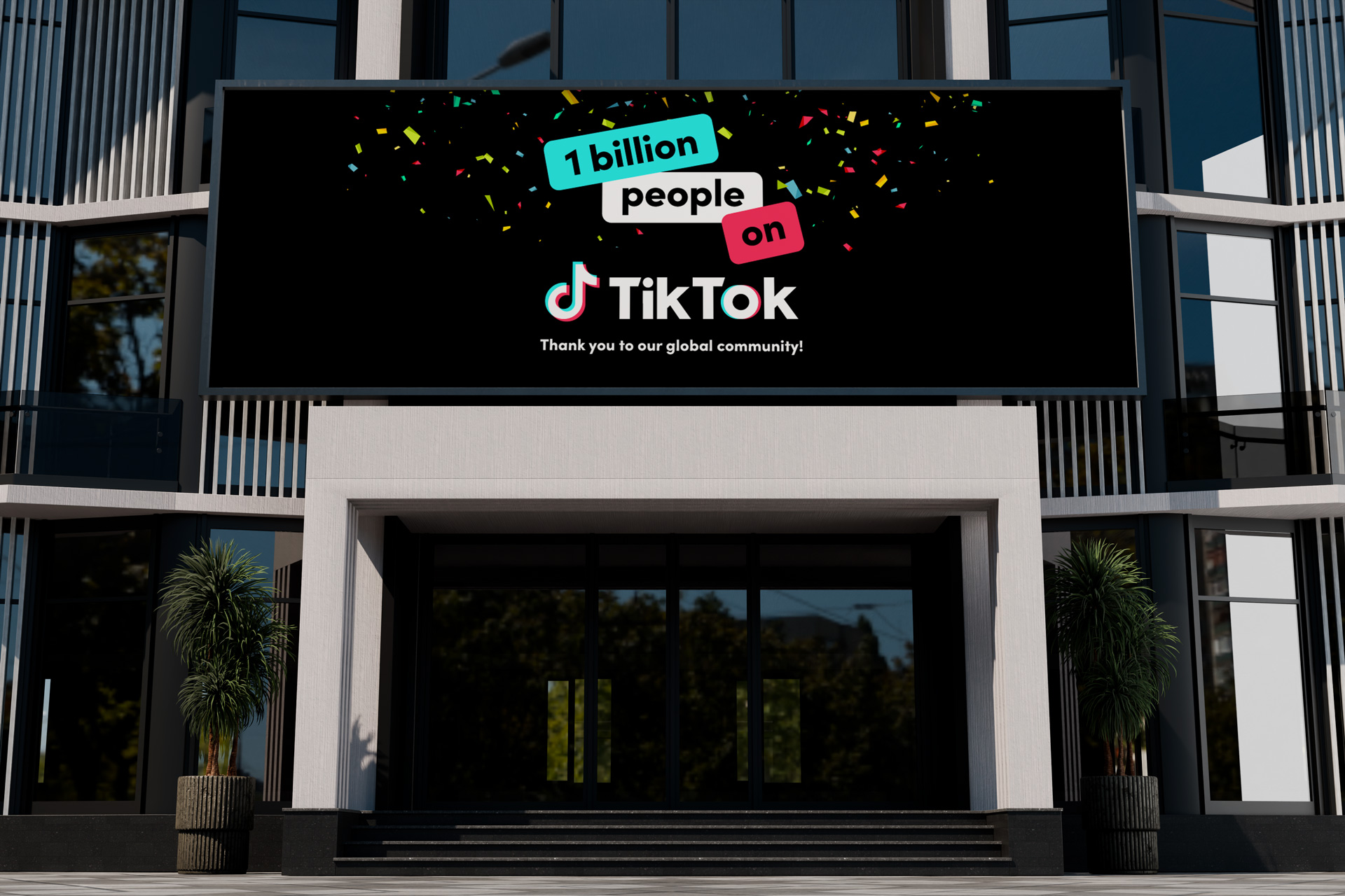
Reaching one billion monthly active users marked a defining inflection point for TikTok, signaling its transition from a fast-growing platform to a truly global utility woven into daily life. MAU at that scale reflects habit, not novelty. It means hundreds of millions of people returning every day to create, discover, and participate in culture in real time. For the brand system, this milestone underscored the responsibility to design with clarity, accessibility, and consistency across languages, regions, and devices. The work had to perform just as effectively on a low-bandwidth Android phone in emerging markets as it did on a Times Square billboard or a national television broadcast. More importantly, the billion-user mark validated TikTok’s core premise that creativity and participation, not polished production, drive cultural momentum. Designing for that scale required thinking in systems rather than campaigns, enabling expression rather than dictating it. Every typographic decision, motion behavior, and layout principle needed to support an ecosystem where culture moves at network speed and where a single post can resonate from a bedroom studio to a global audience overnight.
.jpg)
The final system embodied TikTok’s core ethos of authenticity, creativity, and self expression, translating the platform’s kinetic culture into a flexible yet unmistakable design language. We introduced expressive staggered headlines that favored rhythm over rigidity, paired with dynamic grid systems engineered for energy, variation, and rapid iteration across formats. The photography approach centered on real people and real moments, celebrating the breadth of the global TikTok community while avoiding overly polished tropes in favor of immediacy and relatability. On website, social, app and print as well as digital, all the elements needed to work together cohesively.
To support storytelling at scale, we developed bold data visualization frameworks optimized for both static and motion, ensuring insights could be communicated with clarity and impact in fast scroll environments. A vibrant sticker library injected emphasis and personality into everyday communications, while a reimagined use of the TikTok logo as a modular pattern system allowed the brand to maintain a strong visual presence even in the absence of traditional imagery, reinforcing recognition through repetition, motion, and cultural fluency. And what more can I say, so here is Drake standing in front of our TikTok ad just to hammer home how cool it was what we were doing.

Crucially, the system was built to perform seamlessly across contexts, from the smallest mobile screens in the hands of users across the globe to the scale and spectacle of linear broadcast television and large format out of home placements. Type weights, color contrast, and motion behaviors were calibrated for legibility in bright outdoor conditions, clarity on living room displays, and immediacy in vertical mobile environments where attention is earned in seconds.
Whether appearing as a lower third during a live broadcast, a full screen takeover on a city billboard, or a thumb stopping post in a crowded feed, the system retained its voice and integrity. This scalability ensured that TikTok felt cohesive wherever it appeared, not as a series of disconnected executions but as a living, breathing brand that moved at the speed of culture and met audiences wherever they were whether that was on the small screen or on the large one. This flexibility was key to developing a large scale global brand system that worked in a myriad of scenarios and across a number of material design systems and platforms.

I spearheaded the TikTok For Business creative ecosystem, leading the development of scalable design systems that unified our global B2B identity while empowering regional teams to move faster and stay on brand. While the user-facing side focused on campaign-specific storytelling and vertical activations, my work centered on building the foundational assets that powered them, including typography systems, motion and presentation toolkits, event franchise templates, and swag and brand-extension guidelines. Both sides were working in parallel, complementing each other’s goals, and the next stage was merging everything into one cohesive toolkit, which I helped ensure was executed with precision and high creative standards that were befitting of a company that had finally reached our level of global status and market penetration.
.jpg)
From the outset, our goal was to establish a best-in-class brandbook that defined how TikTok should be represented visually across every touchpoint. We recognized that as the brand continued to scale globally, it required a single source of truth that would unify our identity while also enabling creativity. The intent was to create a framework that balanced rigor with flexibility, ensuring that every application of the brand looked and felt unmistakably TikTok, while still adapting to the wide variety of cultural contexts in which it lives. Especially existing in a hyper growth startup stage, we knew that we were building the plan while we were flying it.
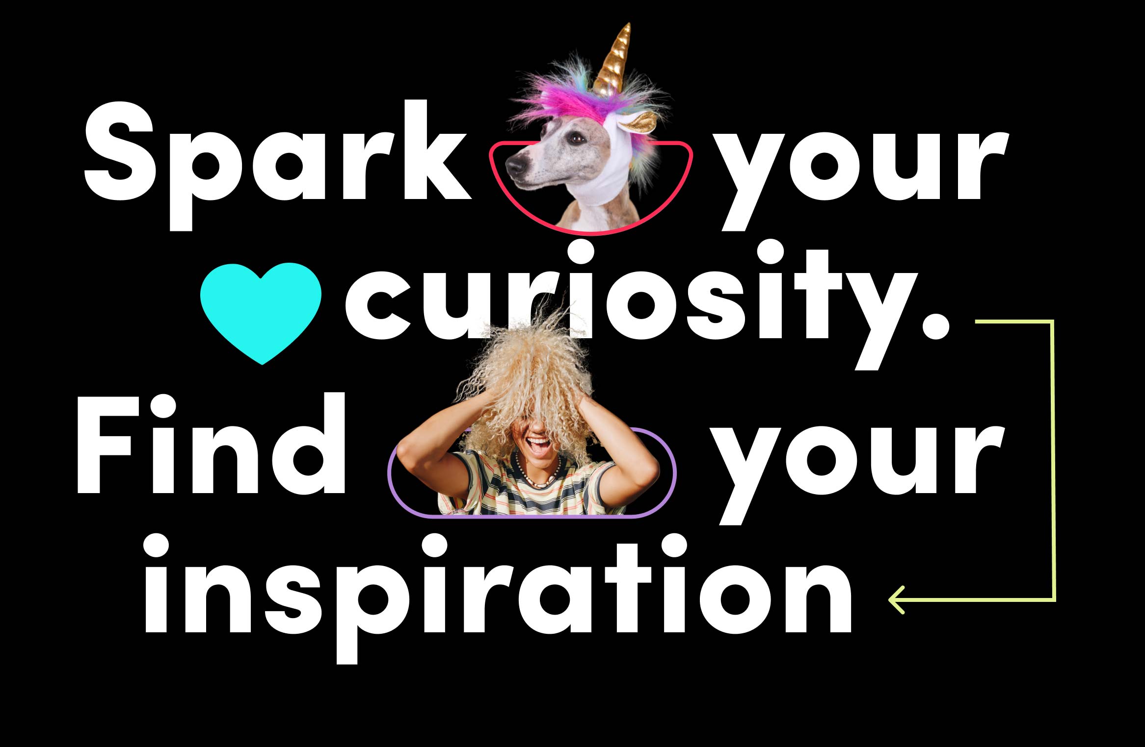
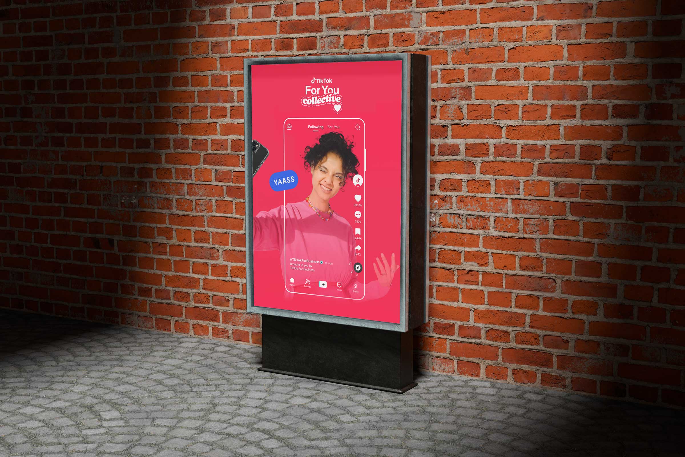
TikTok’s design language reflects the same sense of discovery and joy that defines the For You Page. The palette is bold and unapologetic, with colors like Splash and Razzmatazz that create an instant sense of energy and contrast. Photography is vibrant and expressive, capturing people in real, unscripted moments that radiate confidence and individuality. The use of Sofia Pro gives the system a modern and human voice, balancing precision with warmth and rhythm. Each visual choice works together to evoke curiosity and delight, turning design into an open invitation to explore, create, and connect. The result is a visual identity that feels alive and full of motion, mirroring the spark that makes TikTok such a boundless source of inspiration. Razz is our bright red pop and of course splash is our sanguine touch of blue that shows up.
The team worked to develop a guide that is both comprehensive and inspirational. It provides clear rules on core elements such as logo usage, color, typography, and art direction, but also introduces principles that encourage discovery, adaptability, and creative remixing. My role was to define the overarching design direction and to make certain that the system reflected the brand strategy of being real, lively, daring, and encouraging. Beyond setting guidelines, I ensured the brandbook empowered global teams with the confidence to create, giving them a flexible but consistent foundation that can scale with new products, partnerships, and campaigns. In essence, the brandbook is not a static rulebook, but a living reference designed to evolve alongside TikTok’s culture and community. I was also big on keeping fun whimsical color names and the like because our brand was based on joy and creativity and this should be reflected in the DNA of our design system itself.
.jpg)
Creating a global deck template was a foundational undertaking for ensuring consistency and excellence across all of TikTok’s business collateral. The template had to function as more than a presentation tool. It became a core asset that unified how teams across regions communicated TikTok’s story, products, and value proposition. Given the scale of the organization, it was critical that the system balanced polish and flexibility, enabling everything from executive presentations to client-facing sales materials to feel cohesive and on-brand. This required a deep focus on typographic standards, alignment rules, and color use, as well as the ability to adapt to different content needs without losing the integrity of the visual system. This was a key feature that my team undertook of the full toolkit, and we were able to build out a very robust set of solutions across the org.
At TikTok’s scale, the design system had to function less like a style guide and more like an operating system for global expression. The grid provided a flexible but disciplined foundation that could accommodate everything from dense data overlays to creator-first storytelling, ensuring layouts remained coherent whether viewed on a small phone in Jakarta or a transit shelter in São Paulo. Our typography balanced personality with utility, pairing expressive headline treatments with highly legible system fonts that could support dozens of languages and scripts without losing rhythm or hierarchy. UGC and imagery were treated as primary, not decorative, so we established clear rules around framing, safe zones, contrast, and motion behavior to protect creator content while maintaining brand consistency.
.jpg)
The process was a large-scale effort that evolved over multiple versions and updates. I led my team, including Dana Spomer, Joy Seet, and Vanessa Rizk, in expanding the range of slide options and refining each category. The template ultimately encompassed a wide spectrum of formats, including cover and agenda slides, speaker and quote pages, TikTok showcase layouts, data visualization options, case study formats, and even specialized slides such as timelines, challenges and solutions, and budget frameworks. Each category was designed with intention, ensuring teams could easily tell stories that were strategic, data-driven, and visually compelling. What emerged was a robust set of templates that not only supported the daily work of hundreds of colleagues worldwide but also elevated the standard of how TikTok shows up in every conversation with partners, clients, and stakeholders. These elements laddered into the larger conversations and deliverables that we were slowly building up towards.
Deck templates rarely carry the glamour of campaigns or product launches, yet they function as one of the most powerful levers in sales enablement, shaping how a platform articulates value at scale. By systematizing typography, data visualization, narrative flow, and brand expression, the templates transformed fragmented regional presentations into a cohesive, persuasive storytelling engine that sales teams could deploy with confidence. What might appear as incremental operational work in reality reduced friction across thousands of client interactions, ensuring that every pitch, keynote, and proposal reinforced the same strategic positioning and visual credibility. This consistency accelerated deal velocity by allowing teams to focus on insight and relationship-building rather than formatting and brand compliance. The impact was measurable: in the year following the rollout, TikTok’s ad revenue surpassed $5 billion, up from $3 billion the year prior, reflecting not only market demand but the platform’s improved ability to communicate its value clearly and convincingly. In this sense, the templates functioned as invisible infrastructure for growth, embedding design thinking directly into the revenue pipeline. What seemed like small, procedural work became a force multiplier, proving that clarity at scale is a competitive advantage.

The TikTok design system was built to serve as a living framework that captures both the structure and spontaneity of the platform. At its core is a modular grid and bold palette that anchor the identity while allowing for flexible interpretation across channels, regions, and audiences. The system encodes discovery into its DNA, using typography, motion, and compositional logic to create moments of surprise that still feel consistent and on brand. It brings together rhythm and clarity, building a foundation that can flex across storytelling, product, and campaign environments while keeping the same heartbeat of authenticity and play. The visual language invites experimentation within a shared creative code that keeps the brand recognizable in any context. It is designed for collaboration and adaptation, balancing precision with expressive freedom that reflects TikTok’s culture of participation. The idea is to center surprise, joy and discovery while making TikTok feel accessible and human.
To make the system usable at global scale, we treated governance as product design. We established a single source of truth across living Figma libraries and motion toolkits, introduced versioning and release notes so updates could ship without breaking teams mid cycle, and built an intake and exception process that clarified what required review versus what teams could self serve. Regional office hours and hands on training turned adoption into muscle memory, not compliance theater. Partner agencies were onboarded with the same rigor through clear video and case study guidelines, ensuring external output matched internal craft standards. This operational layer is what kept the system coherent under growth, because the brand was not protected by rules alone, it was protected by workflow. The consumer-side team and Wolff Olins established TikTok’s global brand voice through campaign expression and product alignment. We stewarded the TikTok for Business expansion of that foundation, transforming it into a governance-ready system that enabled global adoption across sales, marketing, and partner ecosystems.
.jpg)
Discovery sits at the foundation of the design philosophy. It shapes how visual hierarchy guides attention, how motion creates continuity, and how transitions encourage exploration rather than distraction. Every choice, from typography scaling to sound alignment, supports a sense of curiosity and intention. The grid behaves like a navigational framework, giving creators and designers a structure through which new ideas can emerge organically. Discovery acts as the guiding principle that keeps the system evolving, encouraging visual storytelling that feels fresh, cohesive, and inherently connected to TikTok’s creative energy. Structure did not constrain expression, it made it legible at scale.
Another key gap we addressed was the lack of cohesion between static design, motion behavior, and long-form video storytelling, which had evolved in parallel rather than as parts of a single system. We built a unified motion language that translated the brand’s core principles into timing, easing, transitions, and spatial logic so that typography, UI elements, and graphic motifs behaved consistently whether in a keynote opener or a six-second in-feed ad. In close partnership with our motion design team, I helped define a modular animation toolkit that standardized intros, lower thirds, data callouts, and end cards, allowing teams to assemble high-quality outputs without reinventing fundamentals for every project. We then extended this foundation into comprehensive video guidelines developed with Eastward, ensuring external agencies could produce work that felt native to TikTok rather than retrofitted for it.

These guidelines codified pacing, safe zones, caption treatments, sound alignment, and platform-specific framing, enabling creative to travel seamlessly from vertical mobile to broadcast and large-format displays. Case study frameworks were also introduced to align narrative structure with visual consistency, giving marketing and sales teams a repeatable way to showcase results while maintaining brand integrity. By integrating motion, static, and video into a single design ecosystem, we eliminated stylistic drift and accelerated production across regions and partners. The outcome was a scalable content pipeline where every frame, whether animated or still, reinforced a coherent visual voice. The result was not uniformity, but a clarity that allowed variation to thrive.
As the system matured, the focus shifted from creation to adoption, ensuring it was not merely documented but actively used across regions, disciplines, and partner networks. We embedded the framework into onboarding, workshops, and live office hours, helping teams internalize the principles as a shared language rather than a compliance checklist. Centralized Figma libraries, motion toolkits, and template repositories reduced production time while increasing visual coherence across campaigns and surfaces. External agencies were onboarded through clear video guidelines and case study frameworks, aligning output quality without stifling creative interpretation. When tensions arose between local experimentation and global consistency, the system provided a structured way to evaluate deviations as potential innovations rather than errors. Feedback loops allowed successful regional adaptations to inform future iterations, ensuring the brand evolved with culture rather than lagged behind it. As new products like Shop, Live, and emerging ad formats expanded the platform’s footprint, the system proved resilient, extending into new contexts without requiring reinvention. This consistency strengthened trust with partners, advertisers, and policymakers, reinforcing TikTok’s credibility as it scaled into new markets. In practice, my role became one of translation, bridging creative ambition, operational realities, and cultural nuance to ensure the brand remained both unified and alive.
.jpg)
TikTok’s color palette operates as a functional language, guiding attention and shaping emotional tone across a wide range of environments. Rather than serving as ornament, each hue is assigned a clear role that supports readability, hierarchy, and cultural resonance in fast-moving feeds. Splash acts as an ignition point, introducing visual energy that captures focus without overpowering surrounding elements. Razzmatazz brings a sense of warmth and approachability, grounding the interface with a human note that reflects the platform’s emphasis on self-expression. Lemon and Pacific provide counterbalance, offering moments of brightness and calm that help pace the eye against deeper base tones. All values are tuned for performance across devices and lighting conditions, from entry-level phones to large public displays, ensuring reliability in real-world use. Depth is achieved through placement and proportion instead of decorative effects, allowing motion, type, and content to carry expressive weight.

In the attention economy, TikTok is not competing with other social apps so much as it is competing with time itself, carving minutes and hours from the same finite pool once reserved for television, film, and even sleep. The platform’s rise reframed entertainment from scheduled commitment to ambient consumption, where users can move through the emotional arc of a feature-length film in fragments between subway stops or during a coffee line. Instagram still trades in aspiration, YouTube in depth, Netflix in narrative, but TikTok owns velocity, delivering cultural relevance at a pace no legacy medium can match. This shift has measurable consequences: users now spend the equivalent of a movie’s runtime on TikTok daily, not because they intend to, but because the feed dissolves the boundary between intention and discovery. Designing for this reality meant understanding that every interaction exists in a battlefield of competing stimuli, where the true currency is not views but seconds of sustained curiosity.

The challenge was to create a brand presence that felt native to this behavioral loop, reinforcing the sense that TikTok is not an interruption to life but the place where culture is happening in real time. In that context, success is not measured by dominance over competitors, but by becoming the default gesture, the reflexive tap that turns idle moments into shared experience. What stayed with me throughout the process was how differently people across the company described the same brand. Engineers talked about performance and latency, sales teams talked about credibility, creators talked about freedom, and regional marketers talked about cultural fit. My role was not to force these perspectives into uniformity but to build a framework where each could coexist without contradiction.

The design system became a translation layer, allowing the brand to speak in multiple dialects while remaining unmistakably itself. In practice, this meant listening as much as directing, observing how the system behaved in real use, and refining it through adoption rather than enforcement. The most successful elements were not the ones we controlled most tightly but the ones teams embraced and extended on their own. That adoption signaled trust, and trust is what turns guidelines into culture. By the end, the work felt less like a deliverable and more like shared authorship across the organization and scaled in partnership with agencies and production crews around the globe.

We paid attention that every element was designed to scale, ensuring that whether applied to digital surfaces, physical merchandise, or global campaigns, the identity retains coherence without losing energy. By grounding the system in principles rather than rigid templates, we created a toolkit that empowers teams and creators to express themselves while reinforcing a unified brand voice. This approach reflects TikTok’s role as a cultural engine where content, community, and creativity intersect. The result is a system that feels both timeless and adaptive, capable of evolving alongside the platform itself. This disciplined approach keeps the palette and type and layout dynamic without slipping into visual noise. In practice, design becomes both signal and setting, reinforcing recognition while allowing the creativity on screen to remain the focal point.
TikTok’s design system was built to reflect the platform’s universality, where a single space means something entirely different to each user. We leaned on Sofia Pro as our primary typeface because of its clarity, warmth, and versatility, a font that feels equally at home in a creator’s bedroom setup, a boardroom presentation, or a global event stage. Its geometric simplicity provided a neutral canvas, allowing vibrant content to take center stage. In app we were using Proxima Nova as well as a few custom ones for our video editing interface. By translating creator energy into a durable brand language, we ensured TikTok could remain culturally fluent at global scale, proving that infrastructure, when designed thoughtfully, can amplify rather than constrain expression. The design held its integrity from the smallest screen to the largest stage.
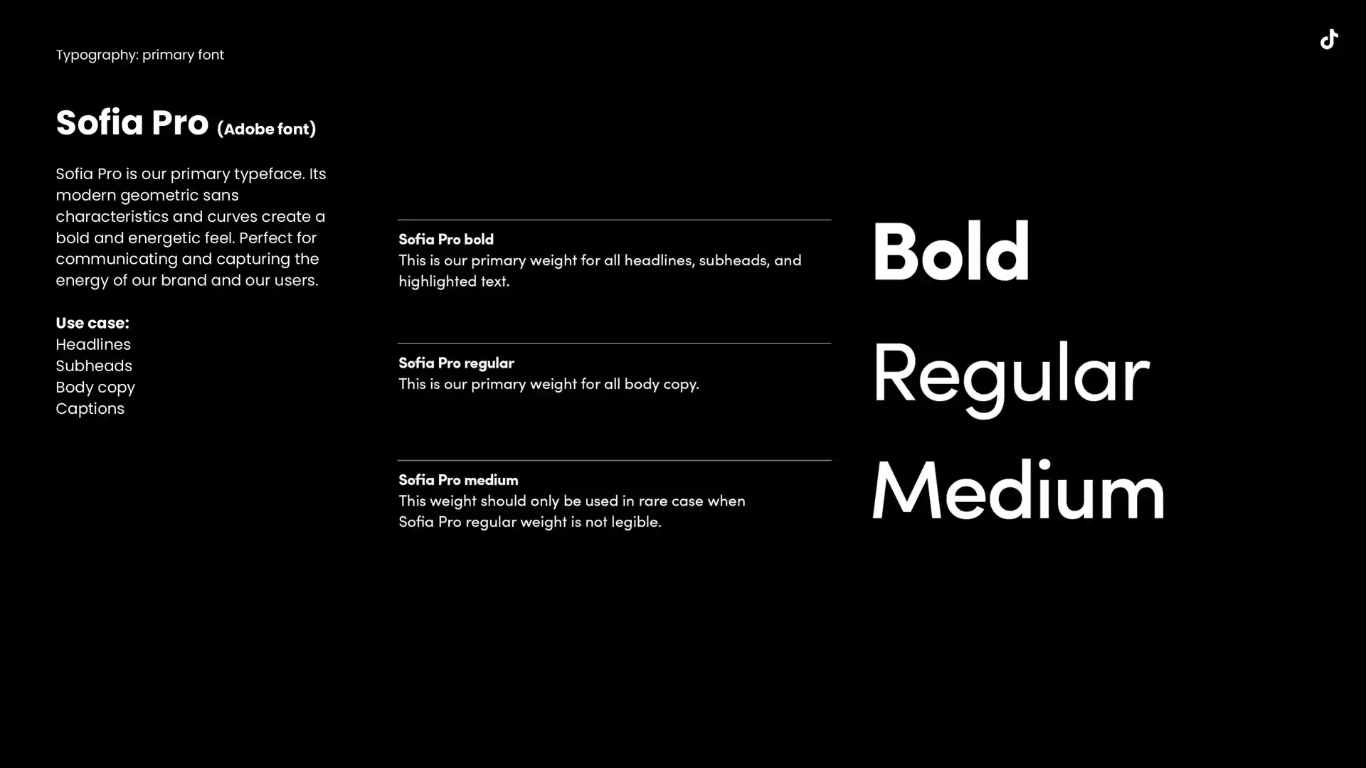
Sofia Pro was created by Olivier Gourvat and released through Mostardesign in 2009 as a contemporary geometric sans serif inspired by early twentieth-century European modernism. Its structure is based on rational geometry, yet it retains subtle human proportions that give it a smooth and approachable rhythm. The typeface was designed to work across a wide range of weights and optical sizes, making it both expressive and reliable. Its letterforms are clean and architectural, built on circles and vertical precision rather than soft or rounded curves. This foundation allows it to convey authority and clarity without losing warmth. Within TikTok’s brand world, Sofia Pro acts as a bridge between technology and humanity, offering a clear and consistent typographic system that can hold emotion, humor, and motion without distortion. It carries a sense of modern craftsmanship, echoing the platform’s dual commitment to structure and play, and serves as the visual voice through which the brand speaks to millions every day.
I worked closely with my direct report Henry Kaye to concept, design, and art direct a comprehensive Data Visualization toolkit that addressed the unique needs of our B2B organization. We recognized early on that standard templates would not be sufficient for the volume and complexity of metrics TikTok needed to communicate, so we built a system from the ground up. This work reframed my role from maker to architect, teaching me that the most meaningful design is not what we produce, but what we enable others to create with confidence long after we’re gone. Data Viz has become an integral part of our business and is indespensible as a sales tool.
.jpg)
Together we developed custom guidelines for graphs, charts, and number presentations that balanced clarity with brand expression, along with an animated motion toolkit that gave life to statistics in a way that felt native to TikTok’s visual identity. This toolkit quickly became foundational, used across sizzles, executive decks, keynote presentations, and even experiential activations, ensuring that data was never presented as a dry afterthought but as a core storytelling device that matched the energy of the platform.
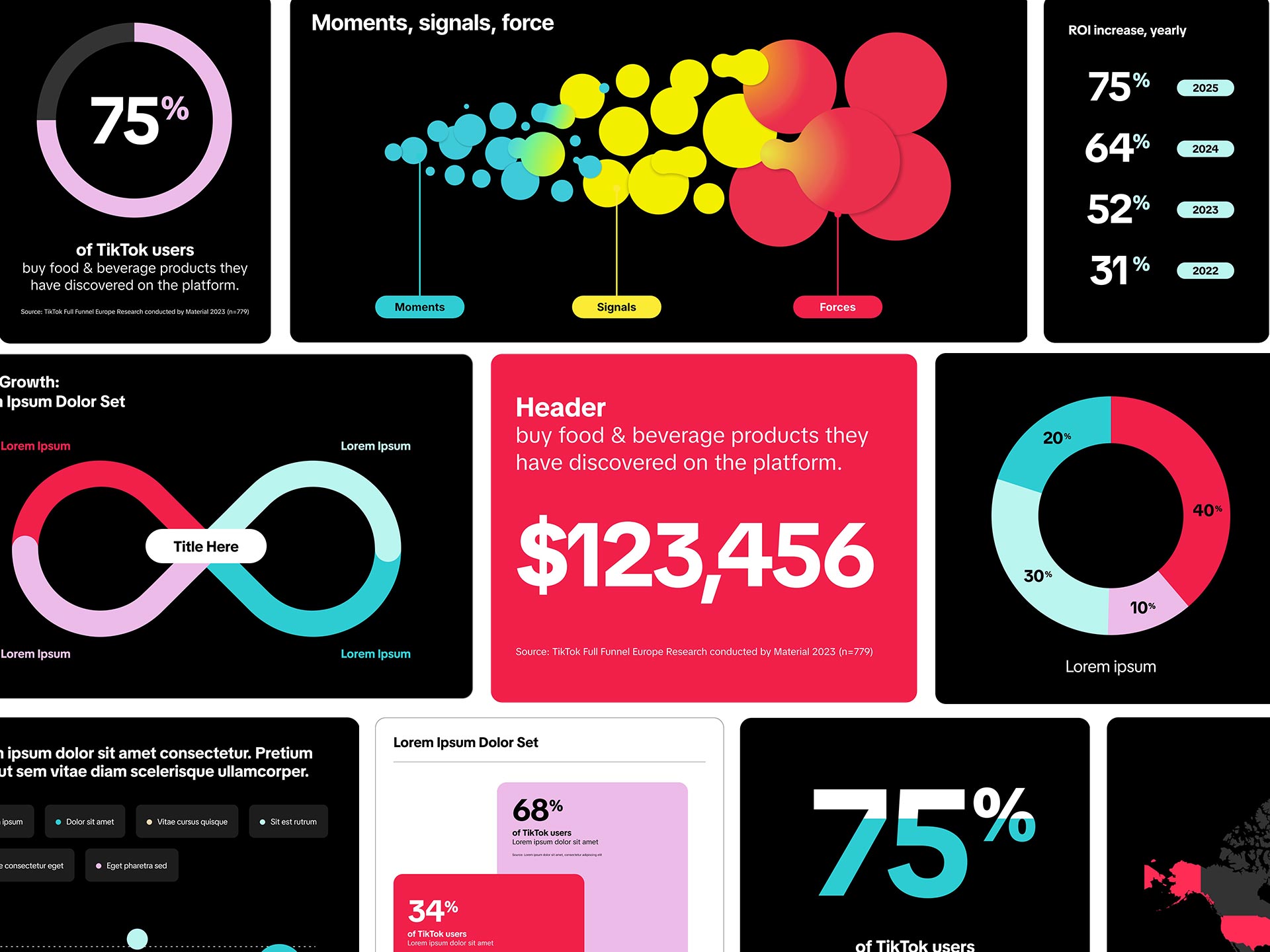
Data visualization became a cornerstone of sales enablement by transforming abstract metrics into compelling narratives that clients could instantly grasp. Instead of presenting numbers in static charts, the system framed insights with bold typography, dynamic layouts, and motion principles drawn from TikTok’s design language. This approach turned performance data into a storytelling tool, giving sales teams the ability to connect value propositions to real outcomes with clarity and impact. By elevating data beyond simple reporting, the toolkit empowered conversations that felt more persuasive, memorable, and culturally aligned with the platform’s creative energy.
.jpg)
Data visualization became a language of clarity and emotion. In the brand refresh, modular design principles were essential to building a system that could flex across every surface while remaining cohesive. The use of color, transparency, and rhythm allowed information to breathe and tell its own story, turning raw numbers into something that felt alive and intuitive. These visual cues carried meaning beyond their metrics, showing how audiences interact, how trends rise, and how creativity flows across categories. By designing a toolkit rooted in modularity, each element could evolve independently while contributing to a unified whole, making the brand not only scalable but expressive in every context. A brand system is only successful when it disappears into the work, and in helping TikTok scale without losing its voice, we built something designed to do exactly that. These types of design systems only worked when everything was in symbiosis creatively.
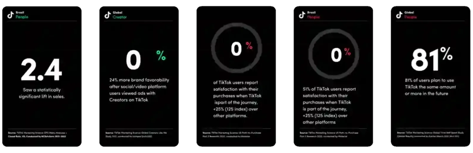
Data visualization emerged as a critical bridge between TikTok’s creative culture and its business credibility, transforming performance metrics into narratives that clients and partners could understand at a glance. Rather than relying on generic charts, we developed a branded framework that integrated typographic hierarchy, motion behaviors, and color logic drawn from the core design system, ensuring insights felt native to the platform’s visual language. The toolkit standardized everything from KPI callouts and comparative graphs to animated data sequences used in sizzles, keynotes, and sales decks, allowing teams to communicate complex performance stories with clarity and speed. Motion principles gave life to statistics, aligning transitions and pacing with the rhythm of the feed so that numbers felt contextual rather than abstract. This approach elevated data from supporting material to a primary storytelling device, helping sales and marketing teams connect platform value to real-world outcomes in ways that were both persuasive and culturally aligned. By embedding consistency into how metrics were visualized across regions and partners, we reduced misinterpretation while strengthening trust in TikTok’s reporting. The result was a scalable data language that reinforced credibility without sacrificing the brand’s expressive energy. In practice, this work helped position TikTok not only as a cultural force but as a measurable, accountable platform for growth.
To visually express TikTok’s multiplicity and cultural resonance, we introduced the signature glitch effect, symbolizing the convergence of countless subcultures, ideas, and creative voices that define the platform. This design language is more than aesthetics; it represents a living ecosystem where a musician’s viral sound can change their life overnight, a comedian’s short-form skit can ignite a movement, and a small business can scale globally from a single post. By marrying technical precision with expressive motion, TikTok’s identity communicates a world where creativity is infinite and deeply personal, capturing the emotional impact the platform has had on millions of creators. Rooted in the cyan and magenta tones you get in a 3D anamorphic effect, we found a place to root our color system and add motion to the brand system.
We worked to align every market under one coherent and consistent brand identity that could be instantly recognized anywhere in the world. This unity was central to our growth strategy, allowing us to present TikTok as a single, global voice while supporting local adaptations. My contribution was to reinforce the vision of one TikTok brand and ensure its values translated across all design decisions. As part of the brand guidelines refresh, and in an effort to develop this instant recognizability, we also developed and executed a comprehensive global brand photoshoot designed to equip our teams with a consistent library of imagery for sales decks, motion graphics, and sizzle content. Working in close partnership with Shutterstock Studios, we oversaw a photography studio production in North America while also coordinating global shoots with select creators in Brazil, Japan, and other priority markets and our internal production teams remotely and often times on site on shoots.
1.jpg)
The objective was to build an image library that genuinely reflected the breadth of TikTok’s global community, spanning geographies, generations, and lived cultural contexts rather than relying on stock tropes or staged diversity. To achieve this, we developed a comprehensive photography framework that centered authenticity, inclusivity, and narrative clarity as core principles rather than afterthoughts. The guidelines provided clear direction on composition, lighting, color interaction, and tonal consistency, ensuring that every image felt aligned with the refreshed brand identity while remaining grounded in real human moments. We emphasized natural light, environmental context, and expressive body language to capture scenes that felt observed rather than orchestrated. At the same time, the system balanced brand polish with spontaneity, preserving a sense of immediacy that mirrors how content is created and shared on the platform. This approach allowed photography to function not just as decoration but as cultural documentation, reinforcing TikTok’s role as a space where everyday creativity becomes visible and valued.
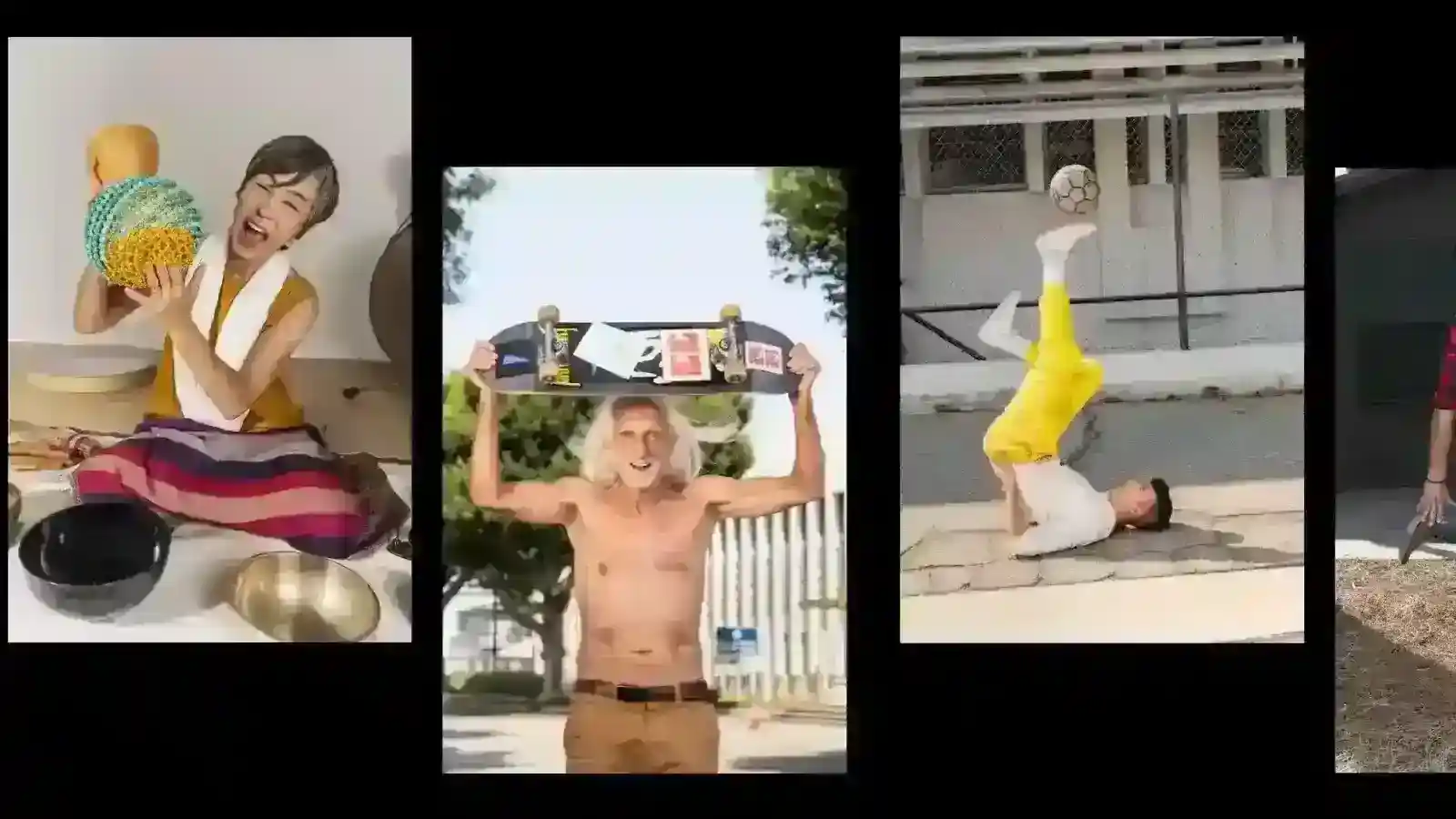
Production was intentionally structured to represent a wide spectrum of people and verticals where TikTok drives influence, including gaming, cooking, sports, automotive, telecom, education, and small business entrepreneurship. Casting prioritized real creators, professionals, and community members whose presence brought credibility and relatability, ensuring the imagery felt lived-in rather than aspirational in a traditional advertising sense. We collaborated with regional teams to identify culturally specific settings and visual cues that would resonate locally while still aligning with global standards. The resulting library now operates as a shared global resource, enabling teams to produce materials that feel cohesive, strategically aligned, and contextually relevant across markets. Beyond expanding the visual toolkit, the work established a durable foundation for how TikTok presents itself to partners, advertisers, and institutions seeking both cultural fluency and brand trust. In practice, the photography system helps the brand show up with consistency and humanity, reinforcing the idea that TikTok is not defined by a single audience but by the collective creativity of its communities.

One of my favorite expansion elements that brought this personality and vibrancy to life in addition to our photography set was our sticker pack. I partnered with Crystal Yin and Joy Seet on my design team to guide our team in developing a comprehensive sticker pack that could be used across global markets. The goal was to create a versatile set of visual assets that carried TikTok’s energy and personality while remaining adaptable across formats and being eyecatching elements to fill negative space.
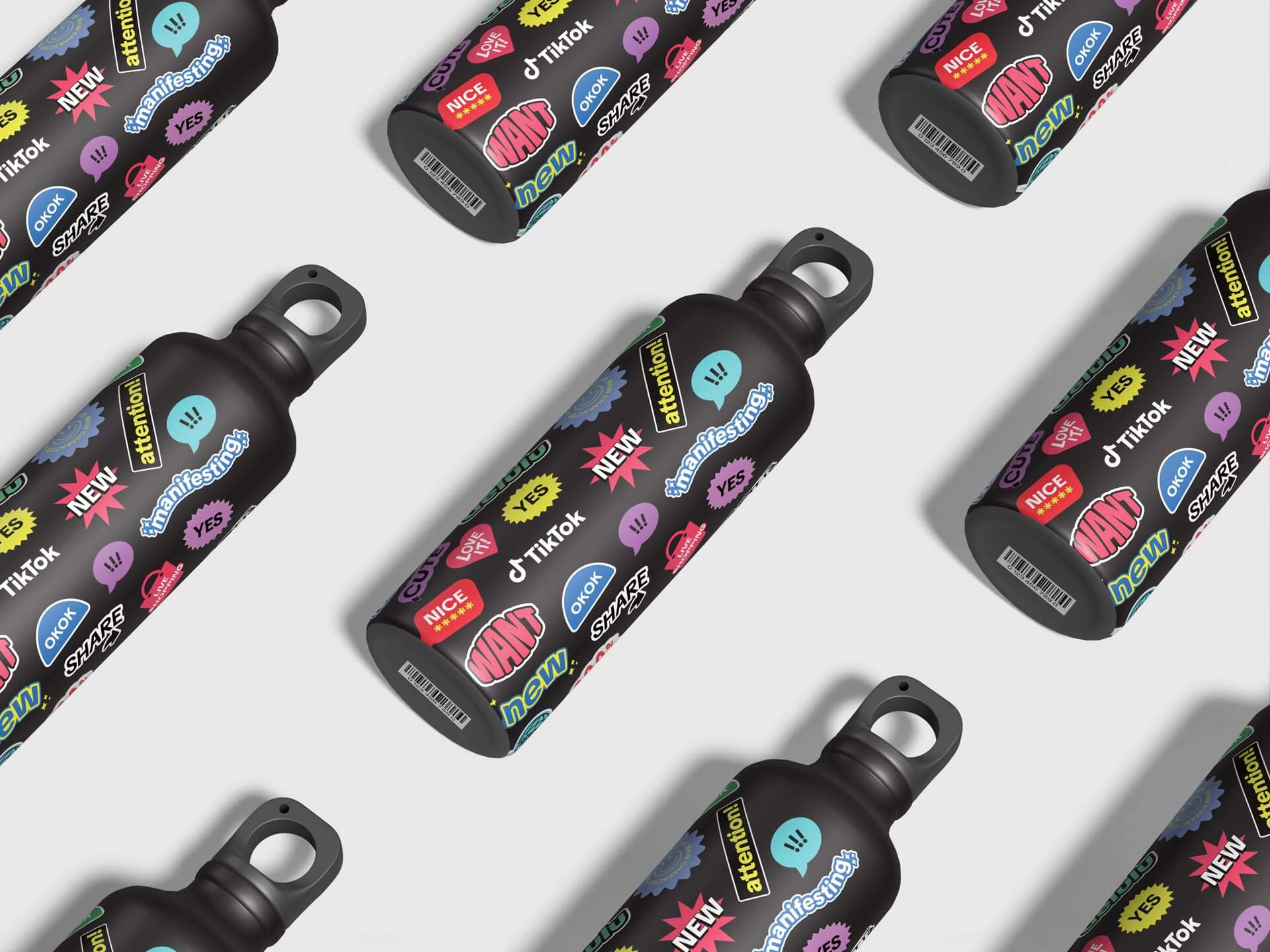
Working closely with our summer interns, Cassidy Cho and Kristine Xiu, we identified trending styles and themes from the platform that could translate into both text and photo-based stickers. I oversaw the process end to end, ensuring consistency with brand guidelines and maintaining a balance between playful creativity and professional usability. The final package was designed for broad application, from events to decks to social and digital channels, adding a layer of personality and vibrancy wherever they appeared. By curating a set that worked equally well in motion, presentations, and social content, the stickers became a flexible toolkit for teams worldwide. Their impact went beyond decoration; they functioned as a recognizable brand extension, emphasizing key messages and moments while giving layouts a fresh and engaging edge.
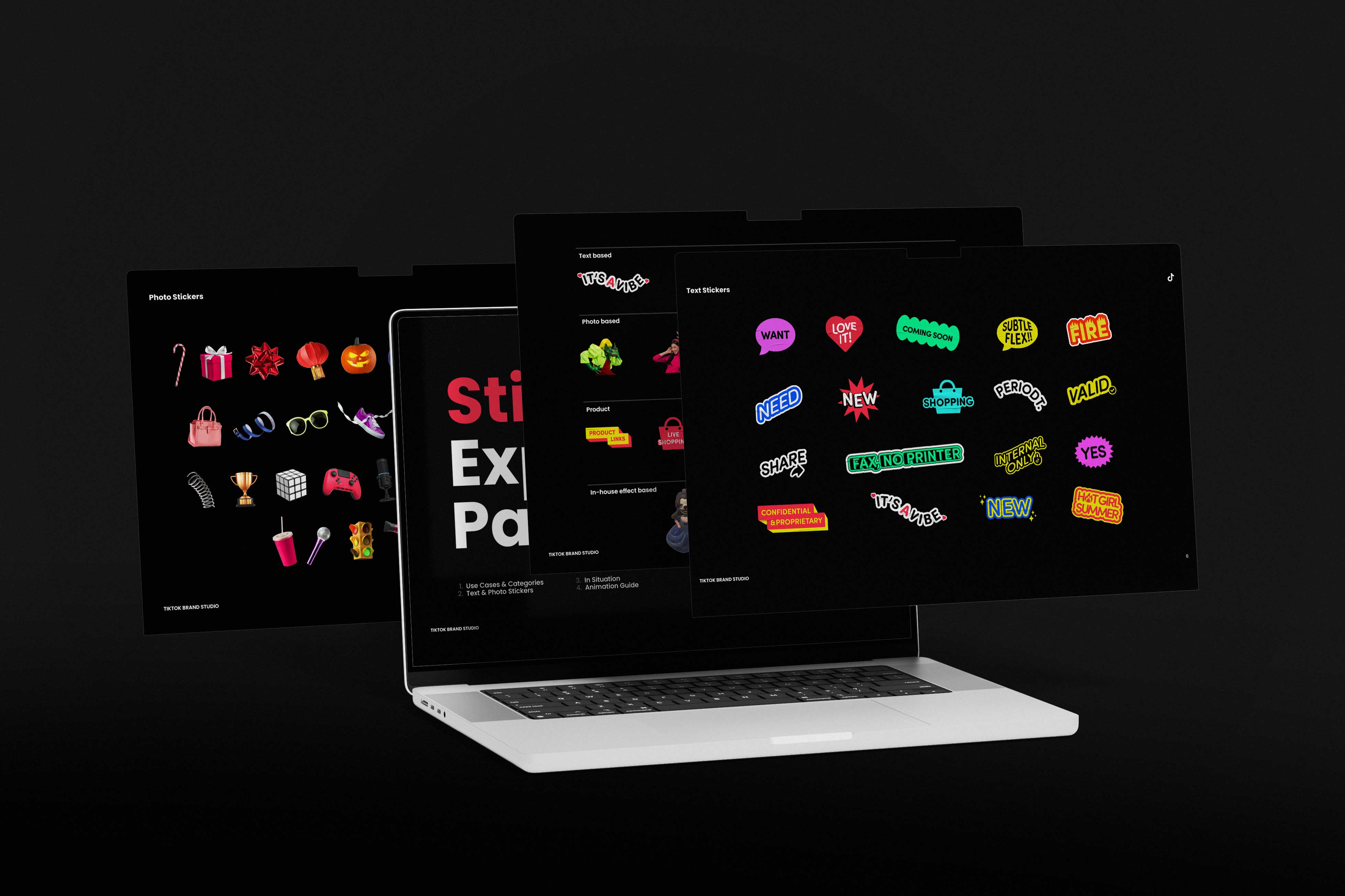
Stickers became a core vernacular within TikTok’s youth culture, functioning as modular micro-expressions that allowed users to layer tone, irony, and emphasis onto otherwise ephemeral content. Rather than decorative assets, they operated as a lightweight semiotic system, enabling creators to punctuate narratives, signal in-group references, and guide viewer attention within the rapid tempo of the feed. From a design systems perspective, the sticker library extended the brand’s visual language into a participatory toolkit, translating typography, color logic, and motion cues into scalable, remixable components. Their utility lay in their adaptability across surfaces, appearing in videos, comments, livestream overlays, and presentations while maintaining visual coherence. By standardizing scale, contrast, and safe-zone behavior, we ensured stickers remained legible in high-velocity scroll environments without overpowering user-generated content. The pack’s aesthetic drew from platform-native humor and meme formats, allowing the brand to embed itself in cultural dialogue without imposing top-down messaging. In practice, stickers became a bridge between institutional voice and creator expression, reinforcing TikTok’s identity as a platform where meaning is built collaboratively, one layer at a time.
When TikTok began to emerge from the shadow of Musical.ly and shed the perception of being a novelty lip-sync app, the challenge was not simply growth but legitimacy. The platform was scaling at a pace that outstripped its visual and narrative infrastructure, showing up everywhere from brand campaigns to news coverage without a cohesive system to anchor its identity. To be taken seriously by global advertisers, cultural institutions, and creators who saw it as a career engine, TikTok had to look and behave like a real brand at scale. That meant establishing a design language that could carry authority without losing the raw creativity that made the platform magnetic in the first place. We needed to signal permanence, trust, and cultural fluency all at once, proving that TikTok was not a passing trend but a foundational layer of modern media.
.jpg)
The reality was that we were building the plane as we flew it. New surfaces, partnerships, and use cases appeared faster than any traditional brand rollout could anticipate, forcing us to create a system that was both principled and elastic. We developed modular guidelines that could stretch from scrappy creator spotlights to Fortune 500 campaigns, from in-app moments to Times Square takeovers, ensuring the brand felt cohesive even as it evolved in real time. This iterative approach allowed us to refine the identity in public, learning from how communities used the platform and folding that behavior back into the system. In doing so, TikTok transformed from a misunderstood app into a global cultural infrastructure, and the brand system became the connective tissue that made that transformation visible and believable.
One of the defining challenges of the design system was its need to operate seamlessly across a wide constellation of global teams and product surfaces, from the consumer experience to TikTok LIVE, TikTok Shop, TikTok for Business, and emerging initiatives still taking shape. Each function had distinct goals, audiences, and regulatory realities, yet the brand needed to feel cohesive and recognizable wherever it appeared. To create that alignment, we anchored the strategy in three core pillars: creativity, humanity, and connection. These principles acted as a shared foundation that could translate across cultures and use cases, ensuring the work remained emotionally resonant while meeting functional demands. We paired them with four actionable personality traits that designers could embed directly into their output: real, lively, daring, and encouraging.

Rather than treating these as abstract descriptors, I worked with the team to translate them into concrete design behaviors, from casting choices and motion pacing to typographic voice and color interplay. This made the system usable in day-to-day decision-making, allowing designers in different regions and disciplines to interpret the brand with confidence while maintaining a unified tone. At its core, the goal was to ensure audiences felt that TikTok’s visual language extended the same spirit of creativity they experienced on the platform, projecting it outward through campaigns, partnerships, and environments. By embedding emotional intent into operational guidance, we created a framework that scaled globally without diluting the platform’s sense of immediacy and possibility.
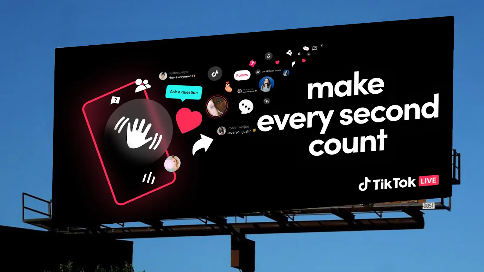
On the platform side, these principles were expressed through UI elements that balanced functionality with personality. From the way buttons pulsed with motion to the typography system designed for legibility across devices, every detail reinforced the brand’s energy while staying accessible to a global audience. Layout grids created cohesion between TikTok Live, Shop, and Business while leaving room for localized nuance. The system made the UI feel not only seamless and intuitive but also distinctly TikTok, ensuring the product experience embodied the same creativity and connection that defined our campaigns.
When showing the product, we stripped away nonessential UI elements so the focus stayed on the TikTok experience. The team simplified visuals by removing OS-specific details, captions, and clutter. I guided the approach to ensure product representation was clean, functional, and on-brand. Our photography and art direction embraced TikTok’s authentic, unpolished look. We focused on spontaneous moments, bright natural light, and a sense of attitude and diversity.

Discovery was established as a foundational principle of the design system, serving as both a creative and structural driver. The framework was intentionally designed to reflect TikTok’s core value of serendipitous exploration, embedding flexibility and modularity across motion, typography, and compositional grids. This ensured the system could scale globally while maintaining local relevance, enabling audiences to encounter content in ways that feel fresh and intuitive. By architecting discovery into the visual language itself, the design system reinforced TikTok’s positioning as a dynamic platform where culture is not only consumed but continually uncovered and redefined.
.jpg)
This work was showcased during a company-wide all-hands meeting where I presented new deck templates and data visualization updates to the entire organization, setting a higher standard for storytelling and design consistency. Blake Chandlee, President of Global Business Solutions and former Facebook exec, recognized this impact as transformative, noting that my creative vision captured the heartbeat of the platform and accelerated TikTok’s global growth. I had a chance to speak with him about it on set for one of our global gaming events, TikTok Made Me Play It, where he said that the energy of the company reminded him of his early days at Meta.
We defined a design system idea with Wolff Olins and our user side consumer team that captured TikTok’s spirit of remixing, surprising, and encouraging exploration. Whether it was a duet, the fun new content on your For You Page, or the origin of a new trend, we wanted the visuals to capture this energy. The identity needed to evolve constantly and stay fresh for every audience. My role was to work with the team to translate this concept into a system that could be scaled globally while retaining its sense of energy and discovery. By collaborating across the globe and with different functions, we were able to unify the brand across all the different parts of the organization.
%20(1).png)
Each personality trait was given a visual expression so it would show up consistently in our photography, typography, and layouts. “Real” felt confident and honest, “lively” felt energetic and boundless, “daring” felt expressive and current, and “encouraging” felt inclusive and motivating. I oversaw how the team embedded these traits into every creative asset, especially on the business side. There needed to be a feeling of boundless creativity and joy in all of our digital and physical touchpoints.
We built a flexible layout system that drew its structure directly from the layers of the TikTok logo, allowing our brand’s most iconic asset to become the foundation for design. The grid was intentionally crafted to feel dynamic rather than rigid, giving designers the ability to create endless unique compositions while still maintaining a cohesive visual language. Each layer could be combined, scaled, or remixed to suit the specific needs of a project, whether it was for core brand communications, campaign work, or creator-led experimental pieces. This grid is at the core of the TikTok Design System. The framework proved durable, absorbing change without losing coherence and governance became an enabler rather than a constraint. Consistency was achieved not through control, but through shared understanding.
.gif)
The team invested significant effort in defining a set of modes that addressed different use cases, from full-bleed photography to graphic-heavy treatments, ensuring that every composition type had clear guidance for typography, color application, and logo placement. These modes became a toolkit that balanced versatility with brand control, making it easy for regional teams to adapt assets for their markets while staying true to the TikTok identity. My role was to oversee the overarching design direction, providing feedback at each stage with Hamilton Tamayo and Francis Mikhail to make sure the system captured TikTok’s sense of energy and playfulness without drifting into inconsistency. I worked closely with designers to refine the rules so they were clear enough to protect recognizability yet open enough to invite creative exploration, ensuring the layout system could thrive across both global campaigns and locally driven content. The signal traveled further because it spoke in a voice people already trusted.
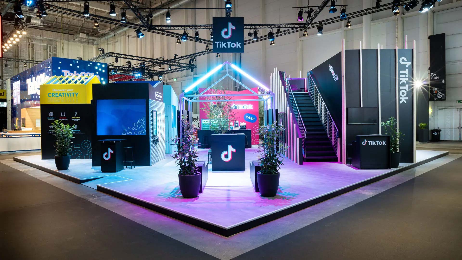
My team and I were instrumental in developing the event franchise playbooks and templates that defined how TikTok shows up in real life across global markets. With a heavier concentration of activations on the business side, we made it a priority to bring creative and experiential oversight under our purview to ensure consistency, flexibility, and brand cohesion. We built a modular system of spatial design patterns, material guidelines, and installation options that could adapt to different scales and venues, from CES to Cannes Lions to SXSW. This meant thinking beyond aesthetics and into logistics, creating toolkits that covered everything from architectural layouts and lighting schemes to signage hierarchies, digital integration, and localized storytelling. Each playbook was crafted to balance creativity and efficiency, giving regional teams the freedom to adapt while preserving the same sense of TikTok energy and immersion no matter where in the world the experience unfolded.
.jpg)
The evolution of the design system unfolded more like an ecosystem taking shape than a project reaching completion. Each decision informed the next, creating a rhythm of observation, iteration, and response. It was less about defining absolute rules and more about shaping an environment where form and behavior could coexist in harmony. Typography, layout, and color were treated as interdependent forces that adapted through constant dialogue with real use. Nothing remained fixed for long because the goal was not permanence but resonance. The system learned from every launch, every market, and every creative experiment that stretched its edges, becoming stronger through participation rather than preservation, over time we were able to add in and build new elements to the toolkit to make it more robust.

Surprise and delight live in the small pivots that shift perception and invite a smile before thought can catch up. Within the TikTok brand system, these moments are woven into rhythm, pacing, and tone rather than layered on top. The idea is to create movement that feels alive and responsive, revealing something new each time without repeating the same trick twice. Visuals evolve through play, where color, scale, and tempo move together in unexpected harmony. This creates a sense of fluid unpredictability that mirrors the way content emerges and transforms on the platform. The work is not about control but about orchestrating chance, leaving room for discovery to appear naturally. In this way, delight becomes part of the design language itself, not as an interruption but as a pulse that reminds people that TikTok’s world is in constant motion, filled with surprise, and always ready to reveal another layer of wonder. Culture did not need to be translated, it was already embedded in the system.
.jpg)
What emerged was a living framework that invited motion, variation, and discovery. Every component carried a sense of intention without feeling rigid, allowing the brand to breathe and evolve with culture. The process blurred the line between creation and calibration, treating feedback as fuel rather than correction. Teams across disciplines became co-authors in a shared language that valued rhythm over uniformity. Instead of striving for visual closure, the work stayed open, inviting new layers of meaning each time it was used. In that openness, the system found its continuity, growing through use rather than control, alive in every act of creation.

Certain verticals like gaming required their own specialized visual identities that spoke directly to the culture and language of those communities while still tying back to TikTok’s larger brand ecosystem. These teams needed deeper design exploration, from motion systems and typography treatments to color palettes and iconography that reflected the immersive, playful nature of the category. My role was to ensure that these tailored identities did not feel siloed but instead reinforced TikTok’s overarching creative DNA. By building connective tissue through consistent grid systems, type hierarchies, and motion principles, I created a framework where vertical-specific branding could thrive independently while still feeling unmistakably part of TikTok’s global story.
A major part of my role involved building out event franchise templates that could scale across verticals while still feeling distinctive and tailored to each audience. For flagship tentpole experiences like the For You Summit, TikTok’s owned and operated product announcement symposium, we needed a system that could flex between high-level brand storytelling and granular product education. I developed design frameworks that incorporated adaptable grids, modular layouts, and a consistent typographic hierarchy so that the visual language held strong whether applied to stage environments, keynotes, or social extensions. At the same time, for verticals like gaming, we introduced distinctive elements such as glass-like 3D icons that immediately signaled a more playful, immersive identity. These frameworks gave our experiential activations a repeatable structure without ever feeling formulaic, ensuring that each vertical had its own personality while remaining part of a unified TikTok ecosystem.
.webp)
We established a clear decision framework that clarified when to deploy core brand assets and when extended, more experimental expressions were appropriate, giving teams confidence to move quickly without second-guessing the boundaries. This structure helped distinguish moments where consistency was non-negotiable from those where creative exploration could strengthen cultural relevance. I led the definition of these guardrails to ensure they protected brand integrity while still encouraging innovation, framing constraints not as limitations but as tools for sharper expression. As part of this effort, the team refined the logo system so each lockup and variation served a distinct functional role across product, marketing, and partner contexts. We developed precise guidance for placement, scale, clear space, and color modes to preserve legibility and recognition across environments ranging from mobile screens to stadium signage. These standards reduced misuse and visual drift while allowing flexibility for co-branding and regional adaptations. By codifying intent alongside execution, the system enabled teams to push boundaries responsibly, ensuring that experimentation reinforced rather than diluted the brand. Overall this helped us scale to the next level as the brand really went mainstream globally and in rapid fashion.
One dimension that often goes unspoken in a project of this scale is governance: how the system is maintained, evolved, and protected over time so it does not fragment under the weight of growth. We established stewardship models that clarified ownership across Product, Marketing, and regional Creative Labs, ensuring decisions could be made quickly without diluting the core identity. Versioning protocols and living documentation allowed the toolkit to evolve in response to new surfaces such as TikTok Shop, Live, and emerging ad formats, while preserving backward compatibility for teams mid-production. We built feedback loops that treated regional adaptations as signals rather than deviations, folding successful local innovations back into the global standard. Training sessions, office hours, and onboarding modules helped new hires and agency partners internalize the system as a way of thinking rather than a static rulebook. Performance metrics tied design consistency to business outcomes, giving leadership visibility into how brand coherence improved trust, conversion, and partner confidence. This operational layer transformed the design system from a set of assets into a durable capability embedded in the organization. It ensured the brand could expand into new markets, products, and cultural contexts without losing its center of gravity. In doing so, the work closed the gap between vision and execution, proving that design systems succeed not only through aesthetics, but through the structures that sustain them.

The design system was intentionally engineered to operate across a spectrum of regional languages, market maturity levels, and brand awareness thresholds while maintaining the integrity of TikTok’s core identity. In high penetration markets, the system had to deliver advanced expressions that reinforced brand equity and cultural leadership, while in emerging markets it needed to introduce the platform with clarity, accessibility, and immediate recognition. Multilingual adaptability was embedded into the typographic and compositional frameworks, ensuring that scripts with differing densities, orientations, and character sets could coexist within a unified structure. This approach allowed the system to function as both an accelerator in established regions and an educator in newer ones, creating a consistent brand experience that was sensitive to local nuance. By balancing scalability with cultural specificity, the system ensured TikTok could speak fluently to global audiences without diluting its distinct identity as the platform of discovery and creativity and joy across so many places on this earth. We wanted to make sure in any language that you could participate and enjoy TikTok.
Video content was designed to mirror the native in-app experience while still meeting the strategic needs of brand and performance marketing across regions. We defined a motion framework that covered pacing, transition logic, safe zones, caption hierarchies, and CTA behaviors so content would feel platform-authentic while remaining legible in broadcast, social, and out-of-home contexts. I led the development of CTA modules and sticker systems that adhered to TikTok’s graphic language, ensuring they were not only visually distinctive but also functionally optimized for tap targets, dwell time, and conversion cues. Clear specifications for size, placement, animation timing, and contrast ratios ensured accessibility and clarity across device types and viewing environments. To support global scale, we built a regional templatization model that allowed local teams to plug into a shared motion and layout system while adapting language, cultural cues, and regulatory requirements. This modular system enabled APAC, EMEA, and the Americas to localize content without fragmenting the core visual grammar, preserving brand coherence across thousands of outputs. Templates were structured with locked and flexible zones, giving markets room to tailor messaging while safeguarding typography, grid behavior, and interaction patterns. By embedding global design system thinking into video production workflows, we ensured that every asset, whether a creator ad, live stream overlay, or stadium screen takeover, felt unmistakably TikTok while resonating with local audiences as well as brands, clients and investors on our corporate side.
As the brand system matured, the video guidelines were conceived as a natural evolution of the static foundations, translating the core visual language into motion that felt true to the platform experience. The static framework of grids, typography, and color blocking established clarity and recognition, while the motion package extended these principles into dynamic behaviors that mirrored the upward swipe and perpetual flow of content. We defined how elements should enter, exit, and transition, creating a rhythm that was both intuitive and distinctive to TikTok. This ensured that motion was not treated as an afterthought but as an integrated component of the system, reinforcing the energy and immediacy of the brand. The guidelines provided teams with scalable rules for pacing, layering, and interaction, enabling consistency across markets and mediums while leaving room for creative interpretation. This is one area where my team was very impactful merely from the scale of video production we were doing.
.jpg)
The scale of our production pipeline made formal video guidelines essential, not optional. With hundreds of assets moving simultaneously across regions, partners, and verticals, we needed a system that could preserve brand integrity while accelerating throughput. I led the development of a comprehensive video guidelines framework that standardized motion behaviors, color usage, typography treatments, caption styling, and CTA logic so teams could produce at speed without reinventing decisions. This reduced review cycles, minimized fragmentation, and allowed creative energy to focus on storytelling rather than troubleshooting inconsistencies. The guidelines were built to integrate directly into our production workflows, from Figma templates to After Effects toolkits, ensuring that designers, editors, and external vendors were working from the same source of truth. A tight core palette anchored brand recognition, while a controlled method for sampling hues from user generated content allowed visuals to harmonize with the content itself. The 30 percent brand color threshold ensured that TikTok’s signature tones remained accents rather than overlays, preserving clarity and preventing visual fatigue. I worked closely with the team to operationalize these rules so they supported both flexibility and brand equity, enabling localized expression without diluting recognition. This approach allowed our video ecosystem to feel native to creators while still unmistakably TikTok, reinforcing trust and coherence.
In-app banners were conceived as a flexible system spanning a spectrum from TikTok-led to partner-led executions, with clear guidance on imagery, typography, motion, and co-branding behavior so placements felt native while still delivering on campaign objectives. I helped define this continuum to preserve brand authenticity at both ends, ensuring that even heavily co-branded units retained TikTok’s visual cadence and clarity. Distinct presentation modes such as hero, story, overlay, and window were formalized with specific rules governing hierarchy, copy length, safe zones, and type scale so content remained legible and performant across devices and regions. We also codified a set of “don’ts” to prevent common pitfalls like logo crowding, excessive color stacking, or partner treatments that overpowered the user experience. We alighed closely with regional creative leads and product teams to translate these standards into templates and review checklists, making them easy to apply within fast-moving campaign cycles. This structure reduced friction between marketing ambition and product integrity, enabling teams to move quickly while maintaining a cohesive in-app presence.
Profile and hashtag visuals were engineered with precise sizing matrices and safe-zone protocols to ensure clarity and brand legibility at even the smallest scales, with every specification grounded in real platform constraints and UI behaviors. Internal presentations extended this rigor, using core colors, bold typographic hierarchy, and fresh UGC to maintain vibrancy while reinforcing a consistent visual voice across teams and regions. Templates were designed to balance modular flexibility with a recognizable structure so local teams could adapt content without diluting brand equity. Swag guidelines followed the same system-first thinking, translating the brand into physical artifacts that felt considered rather than promotional. We defined standards for material selection, color application, logo placement, and scale so items like apparel, totes, lanyards, and event giveaways maintained visual integrity across vendors and regions. I worked with cross-functional partners to ensure production constraints, print methods, and fabric limitations were accounted for upfront, preventing common issues like color drift or logo distortion. The result was a cohesive merchandise framework that allowed teams worldwide to create items people genuinely wanted to wear and keep, turning swag into a durable extension of the brand rather than disposable collateral.
.png)
Our approach to swag was about creating items that people would actually want to use and wear, not just collect. The team designed apparel, accessories, and everyday objects that extended TikTok’s personality beyond the screen, using our typography, color palette, and patterns in ways that felt bold but wearable. We focused on pieces that sparked conversation and built affinity, whether they were given to employees, partners, or creators. My role was to make sure these items carried the same design integrity as our digital work, so every touchpoint reinforced the brand’s authenticity and energy.
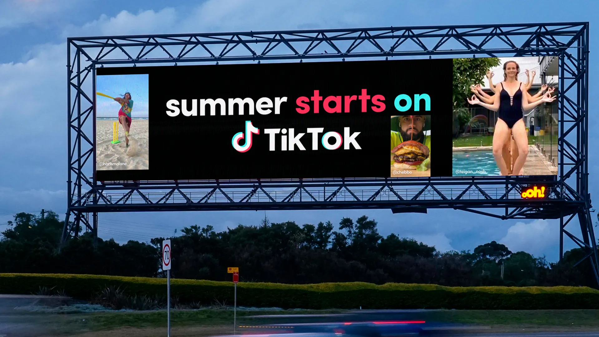
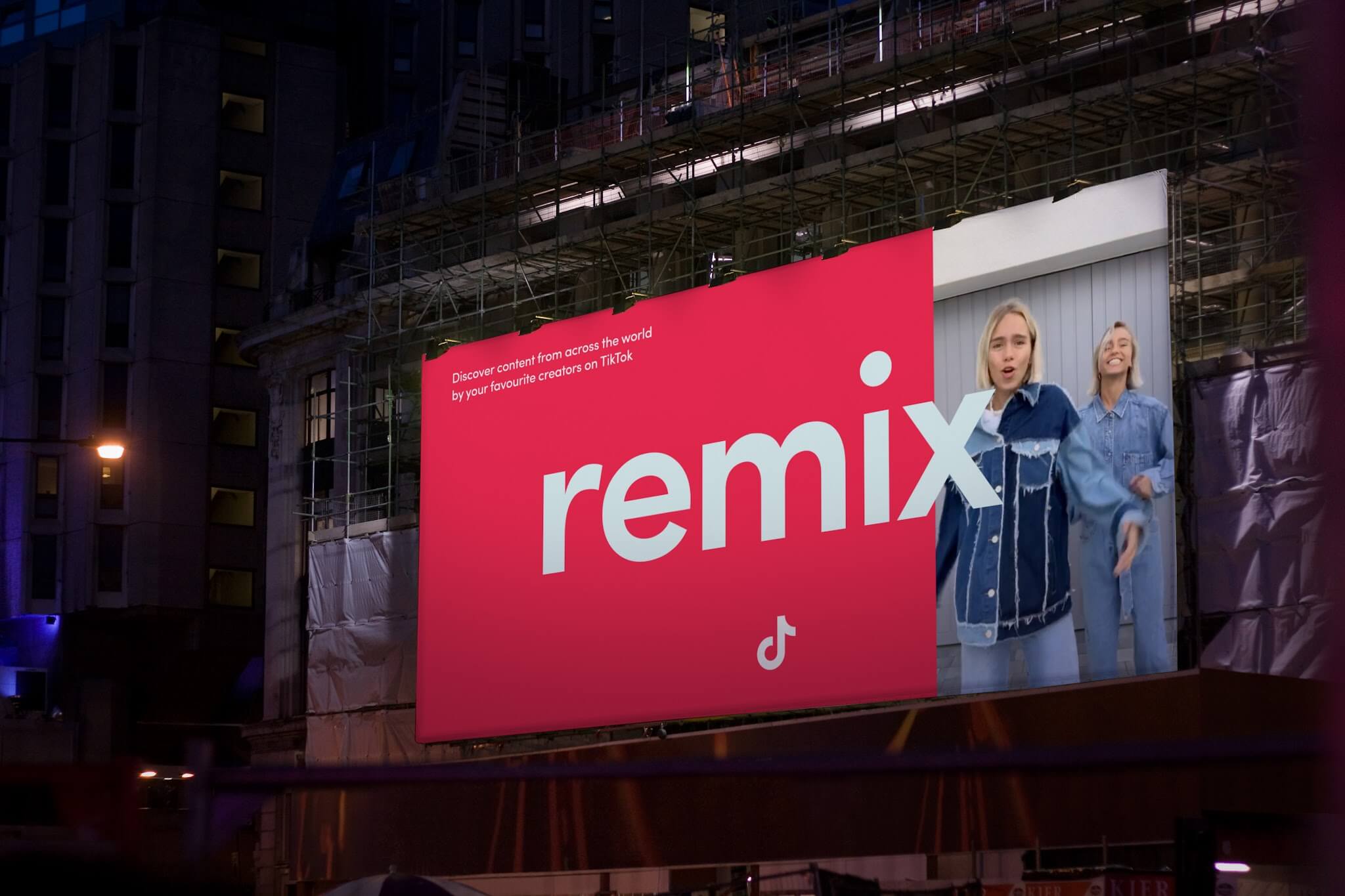
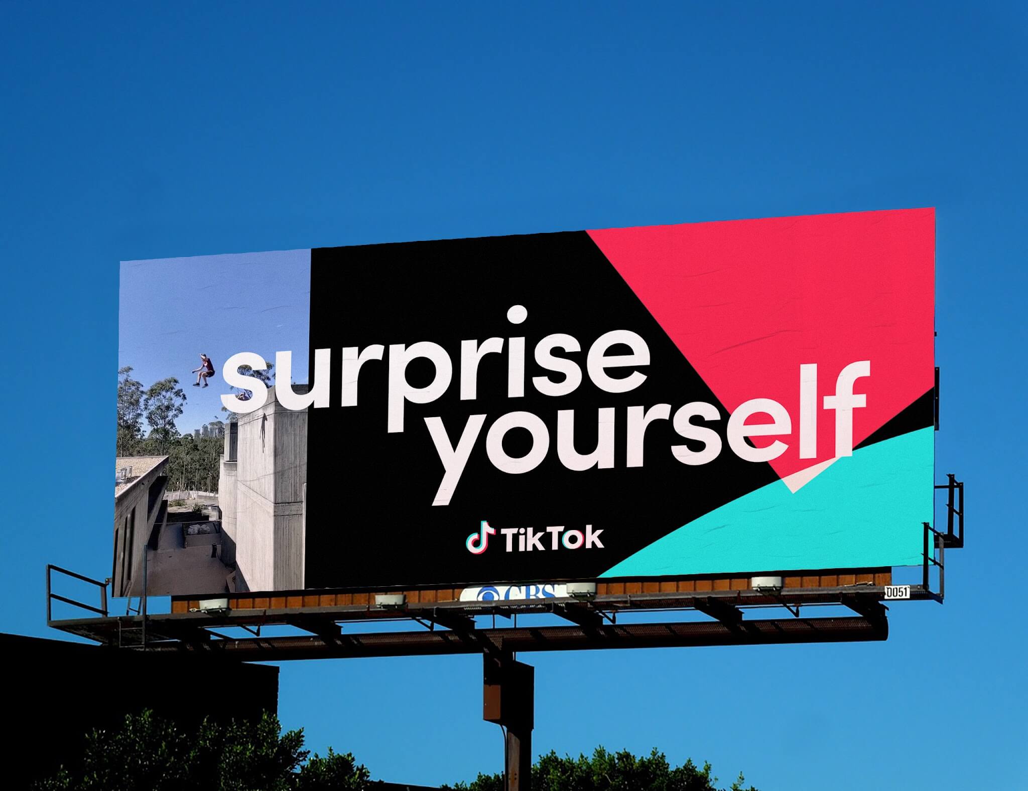
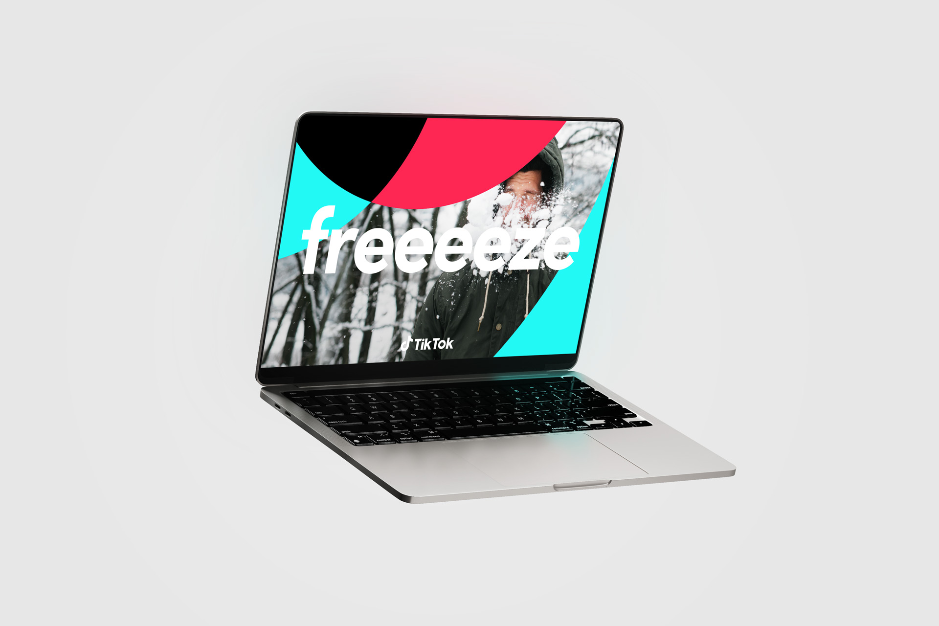
For out-of-home campaigns, the mandate was to command attention in seconds while preserving brand integrity at monumental scale. The digital design language was translated into large-format applications by recalibrating type weights, color ratios, and motion cues to account for viewing distance, dwell time, and environmental variables such as transit speed and visual clutter. Billboards, transit wraps, wild postings, and event signage functioned as extensions of the platform rather than advertisements, using bold typography, high-contrast color blocking, and creator-led imagery to convey immediacy and cultural relevance. Placement guidelines, file specifications, and motion adaptations for digital OOH ensured executions remained legible and on-brand across diverse markets. The result was a scalable framework that allowed TikTok’s lively, inclusive personality to inhabit physical space with the same clarity it holds in the feed, turning cities into touchpoints of the platform’s creative ecosystem.
.png)
We treated brand perception as an ecosystem rather than a logo recall exercise, engineering a presence that felt culturally fluent, globally coherent, and unmistakably TikTok in any context. Campaigns and activations were designed to operationalize our core values of creativity, inclusivity, and connection, ensuring the brand resonated not only with creators but with policymakers, partners, and audiences encountering TikTok beyond the feed. By systematizing visual behaviors, motion cues, and tonal principles, the identity maintained vibrancy without sacrificing credibility, allowing it to earn trust across markets with vastly different cultural expectations. This consistency did not flatten expression; it created a shared language that enabled regional teams to localize storytelling while preserving a recognizable global signal. The result was a brand that felt contemporary and participatory rather than imposed, one that audiences could see themselves inside of rather than simply observe.
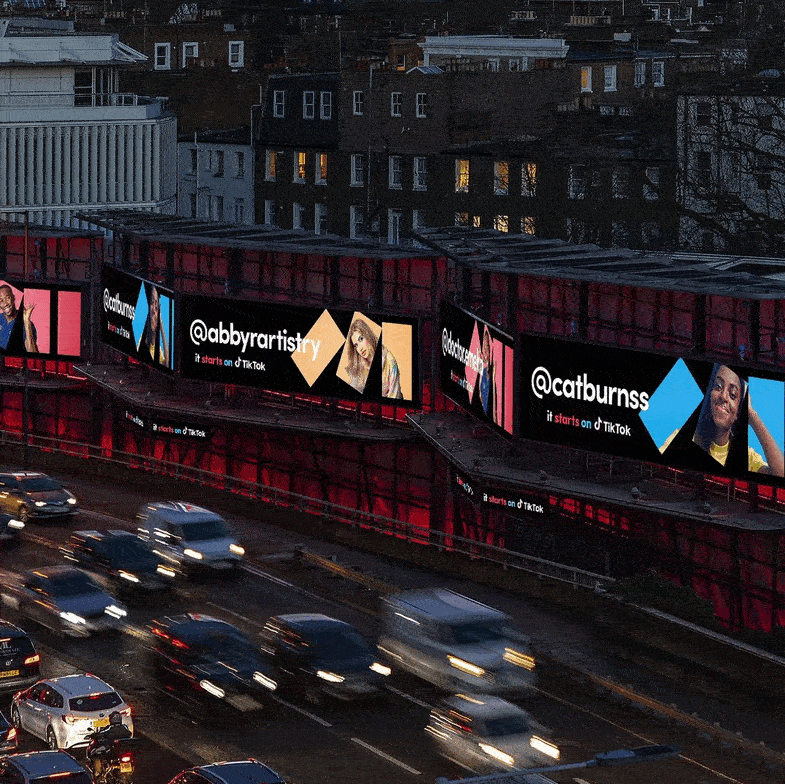
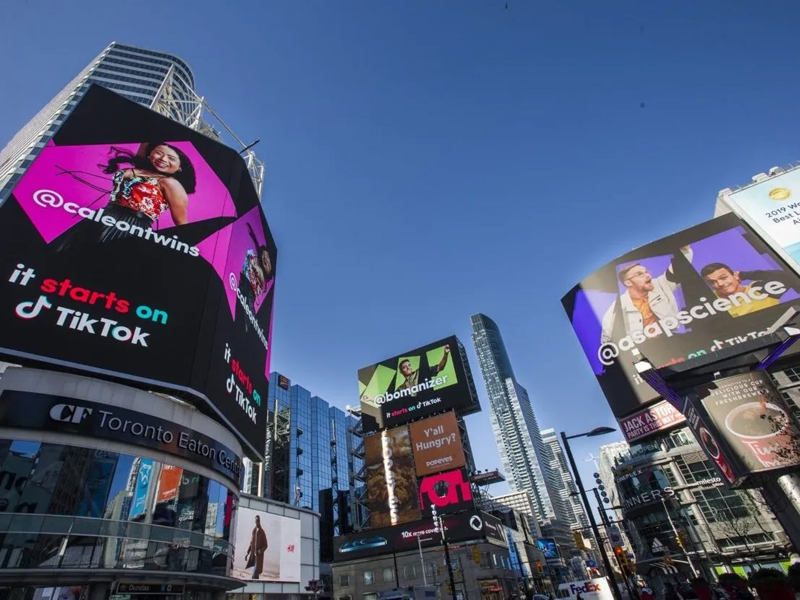
Our in-market presence was designed to meet audiences where they are and create memorable, shareable moments. This meant building campaigns that worked across multiple touchpoints, blending digital storytelling with impactful physical experiences. We paid close attention to how the brand translated across different cultures and cities, tailoring executions while keeping our core identity intact. Large-scale out-of-home activations became a key part of our strategy for embedding TikTok into the cultural landscape. Billboards in Times Square, Piccadilly Circus, Shibuya Crossing, and other high-visibility locations brought our bold visuals and energetic tone to millions of people every day. These placements acted as both a celebration of our community and a statement of our influence in the cultural conversation.
.webp)
The grid system was designed as the invisible backbone of our brand, giving structure to everything from digital campaigns to large-scale physical activations. Built from the layered geometry of the TikTok logo, it provided a flexible but consistent framework that allowed for endless compositions without losing recognizability. On digital platforms, the grid allowed assets to feel dynamic and adaptable, supporting multiple formats like social posts, in-app banners, and web layouts while preserving a clear visual hierarchy. In physical spaces, that same grid translated seamlessly to billboards, event signage, and environmental graphics, ensuring the brand felt just as intentional at 100 feet tall as it did on a mobile screen. By grounding all creative work in this shared system, the team could work faster and with more confidence, knowing that every output felt unmistakably part of the same visual family. Over time, this approach shifted TikTok’s perception from a fast-moving app to a cultural infrastructure, reinforcing its role as a platform where communities gather, trends emerge, and identity is performed in real time.
.jpg)
Our typography choices further anchored that consistency, with Sofia Pro serving as the primary typeface across all brand expressions. Its clean geometry and versatile weights allowed for expressive headline treatments while maintaining clarity and legibility in both short, impactful bursts and longer informational copy. On digital surfaces, Sofia Pro could be animated, staggered, or paired with motion to interact directly with content, reflecting TikTok’s energy. In physical formats, it held its integrity at scale, whether on a Times Square billboard or printed event collateral, maintaining strong legibility from a distance. The pairing of the grid system with Sofia Pro created a unified design language that bridged the gap between digital and physical, ensuring that no matter where someone encountered TikTok on their phone, on a poster, or in a massive OOH display, the experience felt cohesive, deliberate, and alive with the brand’s personality.
The TikTok brand guidelines are designed to move fluidly across mediums and subjects, adapting to the rhythm of culture rather than defining it rigidly. They live in motion, image, and sound, shaping how the brand expresses itself in ways that feel spontaneous yet intentional. Whether seen in a digital interface, an outdoor installation, or a live event, the system holds together through tone, balance, and clarity. It allows for experimentation while maintaining coherence, creating a visual and emotional language that feels alive in every context. The guidelines are less about constraint and more about harmony, guiding how creativity and identity coexist in the same breath. The system was designed to reduce friction, increase clarity, and protect the brand as TikTok expanded across markets, verticals, and stakeholders.
.jpg)
Everything begins on TikTok. The stories we share in the world are seeded on the platform, shaped by the creativity of our community and the ways people use our tools to express themselves. Whether it is a jersey reveal for the Portland Thorns, a fan reaction at Providence Park, or a highlight clip that catches fire online, the content starts in the feed before it ever appears on a billboard, in a stadium, or on retail merchandise. By beginning on TikTok, we capture the authenticity and cultural energy that define the brand, and we make sure every activation in market feels true to the ecosystem our users create. This platform-first approach ensures that our personality and voice remain intact across every market and format. I really aim to design human centric creative systems that scale brands across markets, mediums, and touchpoints, enabling consistent expression while empowering local teams to adapt with cultural precision and the goal is to work across all of these contexts.

TikTok’s power lies in the way it has extended beyond being a platform into becoming a cultural signifier. The brand shows up consistently across music, gaming, movies, sports, fashion, and everyday consumer behavior, positioning itself less as an app and more as a lifestyle brand. In music, TikTok has become the primary driver of chart success, with songs breaking on the platform before they hit streaming services or radio. In gaming, TikTok Made Me Play It and other vertical activations have shown how discovery and community transform gameplay into cultural moments. In film and television, TikTok drives conversation through fan edits, challenges, and viral campaigns that amplify launches. In sports, from NBA highlights to grassroots football, TikTok has become a second screen experience where culture and fandom unfold in real time. Designing for TikTok at this scale ultimately becomes an exercise in listening at volume, translating collective behavior into structures that let culture move faster than any single author could. This took multiple teams and creative organizational force to build at this scale across the company and regions.
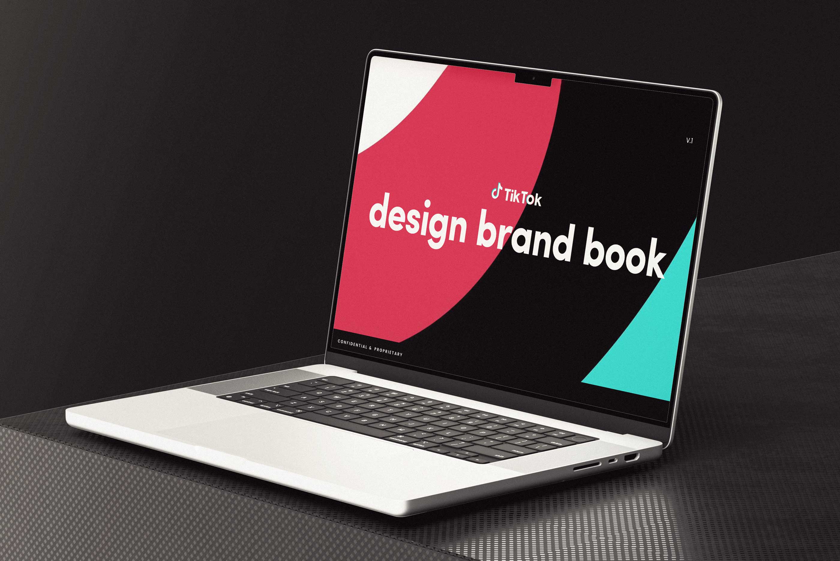
Designing for TikTok meant designing for the tempo of the zeitgeist itself, a living feed where culture is not archived but negotiated in real time by millions of hands on glass. Trends emerge, mutate, and dissipate within hours, so the role of design shifts from broadcasting messages to building elastic frameworks that can metabolize change without losing coherence. The audience is not a segment but a swarm of creators, lurkers, remixers, and entrepreneurs whose expectations are shaped by speed, authenticity, and participation rather than polish alone. At global scale, this requires visual systems that remain legible across languages, bandwidth conditions, and cultural codes while still feeling native to each context they inhabit. Every typographic rhythm, motion behavior, and compositional rule must anticipate reuse, parody, and transformation, because the community will inevitably bend the system in ways no guideline can predict. Instead of resisting that entropy, the design strategy embraces it, creating guardrails that protect recognition while inviting reinterpretation. The result is a brand presence that feels less like a fixed identity and more like a shared vernacular, evolving alongside the people who use it. In this environment, success is measured not by control but by cultural fluency, the ability to show up in countless moments without feeling out of place.
.jpg)
I led the strategy and creative direction behind the full suite of TikTok’s enablement tools and guidelines that unified our brand presence across regions and empowered teams to operate with greater speed, confidence, and creative alignment. My focus was on building an ecosystem of resources that included presentation templates, data visualization hubs, GIF libraries, entertainment deck frameworks, sticker systems, and our signature PBS playbooks. Each of these was designed to help internal and regional teams self-serve with quality and consistency, dramatically reducing the need for external agencies and eliminating redundant workstreams. By standardizing design principles, tone of voice, and motion systems, these toolkits allowed us to move from fragmented regional output to a cohesive global visual identity. I collaborated closely with regional creative leads across EMEA, LATAM, and APAC to understand their challenges, then architected a shared design infrastructure that met both local and global needs. This cross-functional alignment turned what was once a scattered process into an integrated creative operation, cutting production time, maintaining brand integrity, and allowing TikTok’s visual storytelling to thrive across every platform, market, and business vertical.
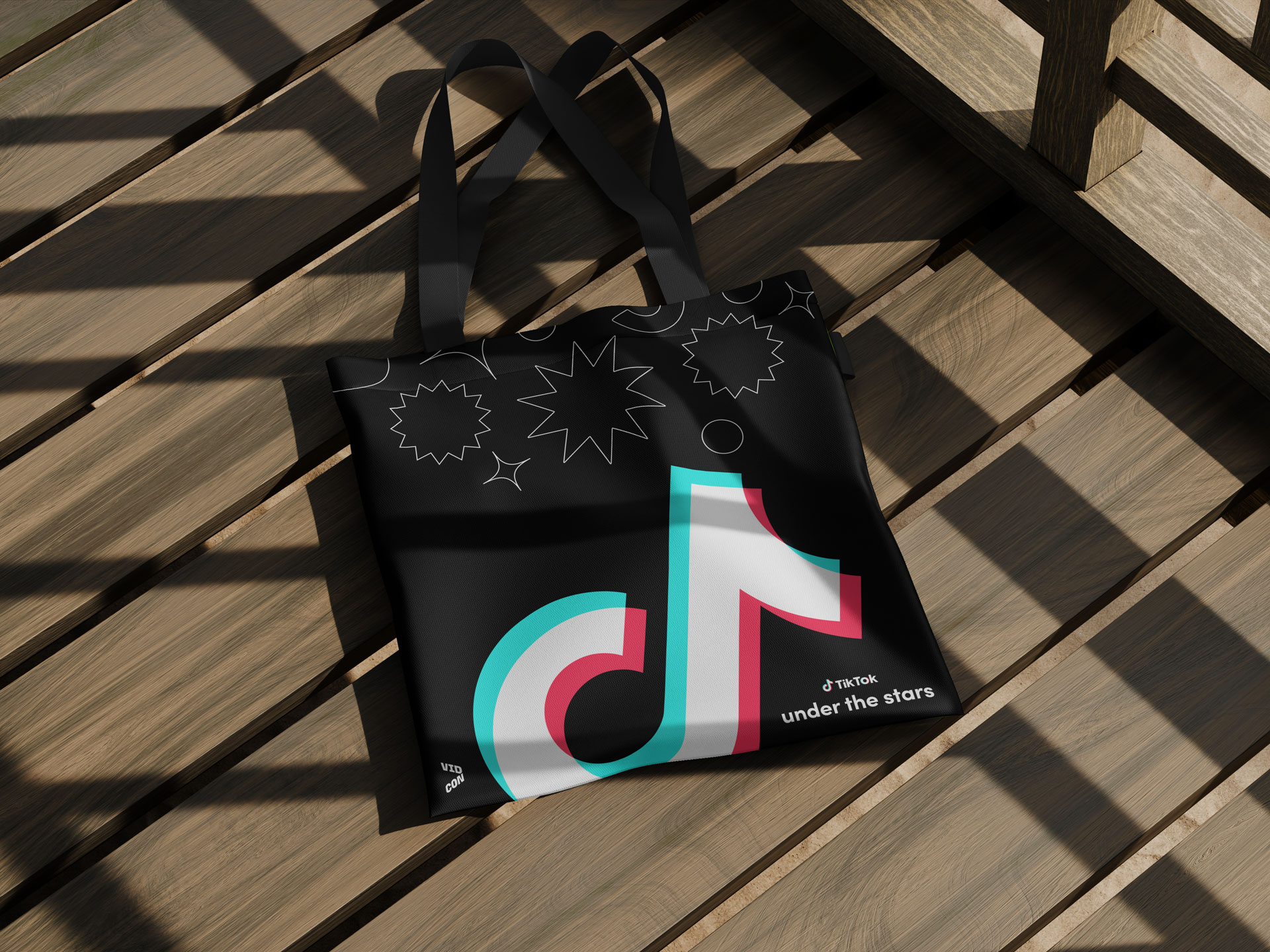
This cultural proliferation mirrors how iconic brands once anchored themselves in entertainment and lifestyle. Britney Spears made Pepsi feel like the soundtrack of a generation, Michael Jordan made Nike synonymous with aspiration and greatness, and TikTok is now weaving itself into the cultural fabric in a similar way. By embedding itself in the very spaces where culture is created and consumed, TikTok isn’t only a platform where trends happen but also a brand that symbolizes creativity, participation, and belonging. My work contributed to this larger vision by ensuring design direction, visual identity, and experiential activations tied each vertical expression back to the core TikTok brand, making sure the connective tissue was always there so the platform felt unified even as it scaled into every corner of pop culture.
.jpg)
Bringing these ideas to life requires deep collaboration across many teams. Wolff Olins provided the foundational brand strategy and visual framework, which our Creative Lab team built upon to design systems and executions that work for both the user side and the business side. Our global teams brought regional insight, ensuring the work resonated locally while maintaining a unified identity. The business side team helped translate creative concepts into campaigns that drive measurable results, while the user side kept us anchored in the authentic expressions of our community. The system supported campaigns across dozens of markets and thousands of deliverables, enabling faster launches while maintaining a unified brand presence worldwide.
This collaboration operated as a continuous feedback loop, with open critique across teams, rapid prototyping cycles, and a shared commitment to solving problems in real time rather than handing work off between silos. Ideas moved fluidly between product, marketing, and creative, allowing concepts born on the platform to be pressure-tested and refined through multiple lenses before reaching the public. We treated each iteration as an opportunity to strengthen clarity and cultural relevance, ensuring that the work resonated natively rather than feeling translated. This approach enabled campaigns and activations to perform with equal strength in a TikTok feed, on a stadium sleeve, or across iconic out-of-home placements worldwide. By designing with adaptability in mind, we preserved a consistent brand signal while allowing form and scale to shift with context. The process also built trust across disciplines, establishing a rhythm of collaboration that outlasted individual projects. In the end, the work demonstrated that when teams co-create rather than sequence tasks, ideas gain the resilience needed to travel across mediums, audiences, and moments without losing their core intent.
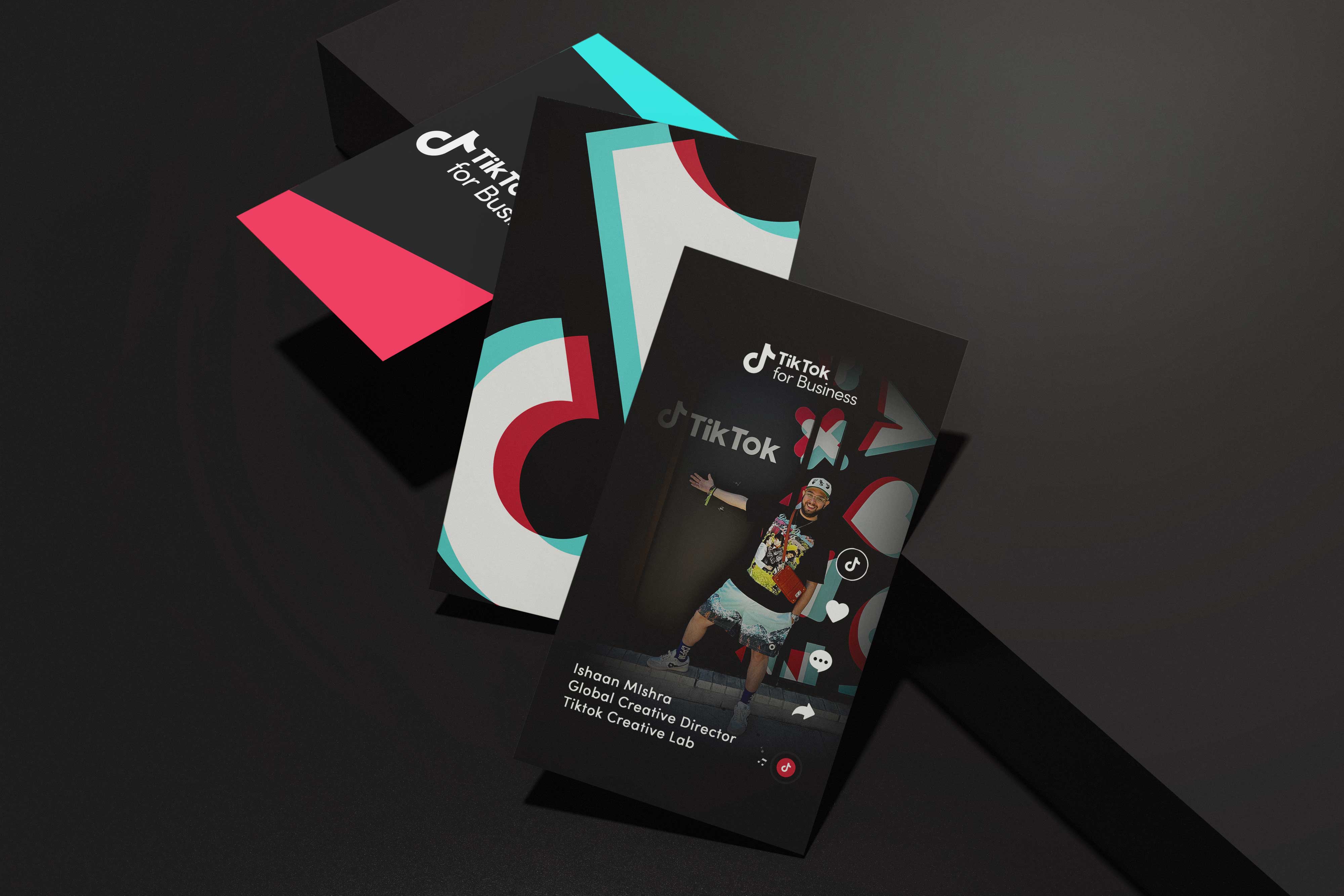
Across this work, I learned that brand systems are not static artifacts but living agreements between people, tools, and culture. The real measure of success was not visual consistency alone, but whether teams felt empowered to create with clarity and confidence. By building infrastructure that balanced governance with freedom, we enabled the brand to evolve without losing its center. The system continues to adapt as new markets, formats, and behaviors emerge, proving that durability comes from flexibility anchored in principle. For me, this chapter marked a shift from designing outputs to designing conditions, from crafting visuals to shaping how work happens. It reframed my role from executor to architect, responsible not just for what the brand looks like but how it behaves in the world. That perspective continues to inform how I approach every platform, environment, and community I design for. I am proud to say I helped build the future of TikTok.
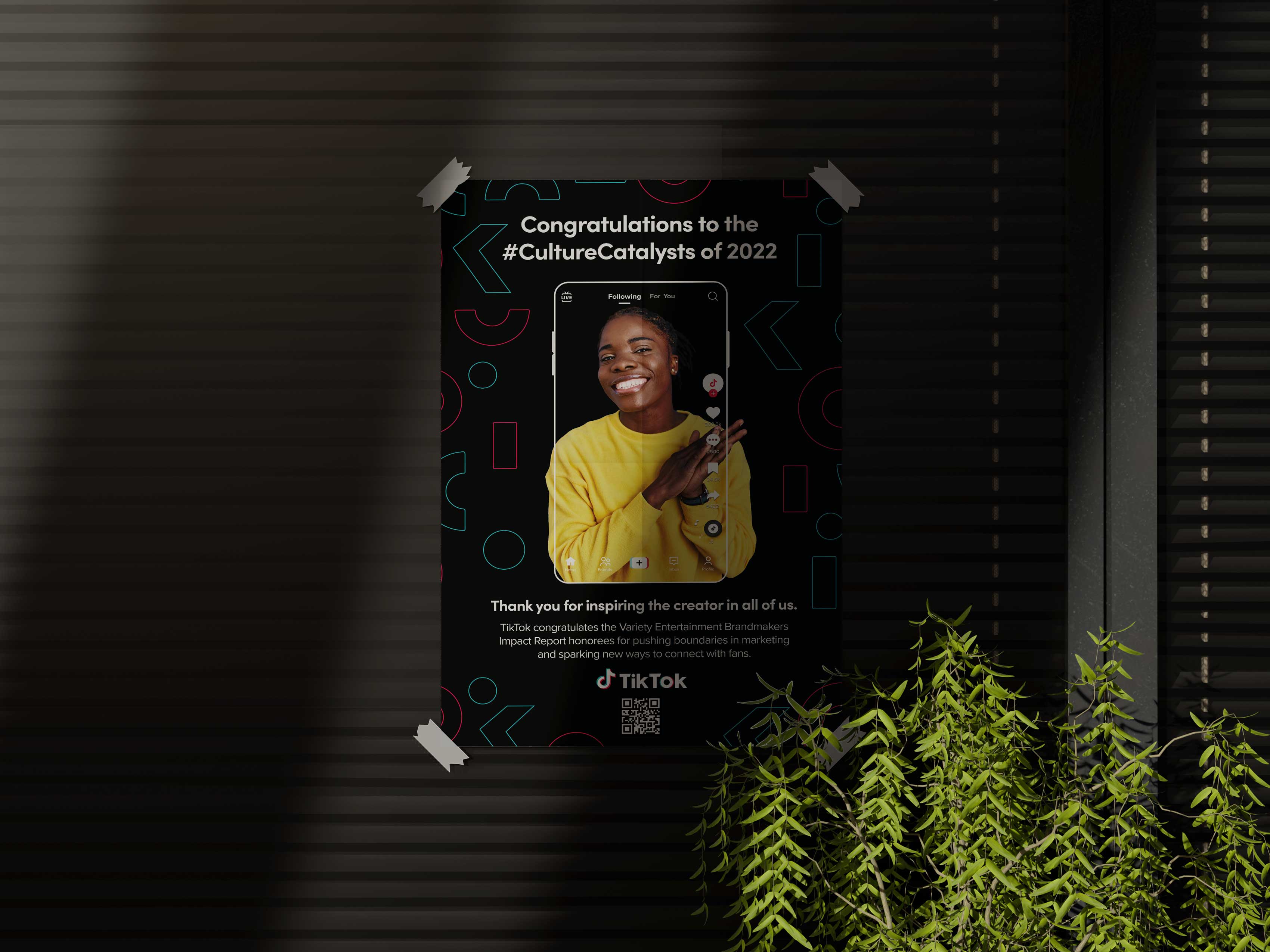
My role extended beyond visual output into defining how TikTok’s brand operates at scale. I was responsible for translating strategic intent into systems that teams could use daily, ensuring the brand remained coherent as the company expanded across markets, products, and partnerships. Rather than centralizing control, we built frameworks that allowed regional teams to adapt with confidence while preserving a recognizable global identity. This approach reduced production inefficiencies, minimized one-off solutions, and created a shared language across Product, Marketing, Sales, and Creative. Adoption was driven through practical tooling and collaboration, not enforcement, allowing the system to embed itself into workflows organically.

As a result, campaigns moved faster, craft consistency improved, and cross-functional alignment strengthened. The work also elevated TikTok’s credibility with enterprise partners, enabling the brand to show up with clarity in environments where trust and professionalism were essential. Internally, the system shifted design from a reactive service to a strategic multiplier that empowered teams to execute with autonomy. Taken together, these efforts helped position TikTok not only as a cultural platform but as a mature global brand capable of sustaining its influence as it scaled.
Looking back, the work was never simply about refining a visual identity, but about shaping the conditions under which a global culture could recognize itself. A design system at this scale becomes less a set of rules and more a shared language, one that allows millions of creators, partners, and teams to participate in the same story without losing their individual voice. What we built was not a fixed artifact but a living framework that could absorb change, travel across mediums, and remain legible in moments of both chaos and celebration. In an era defined by velocity, the true measure of success was not how quickly we could produce, but how coherently we could evolve. This chapter marked a turning point in my own practice, shifting from the pursuit of singular outputs to the stewardship of ecosystems that enable others to create with clarity and confidence. The most meaningful outcome is not any one campaign, deck, or activation, but the invisible continuity that now connects them all. Long after individual assets fade, the system endures as infrastructure for expression, proof that thoughtful design can scale without flattening the humanity it is meant to serve.
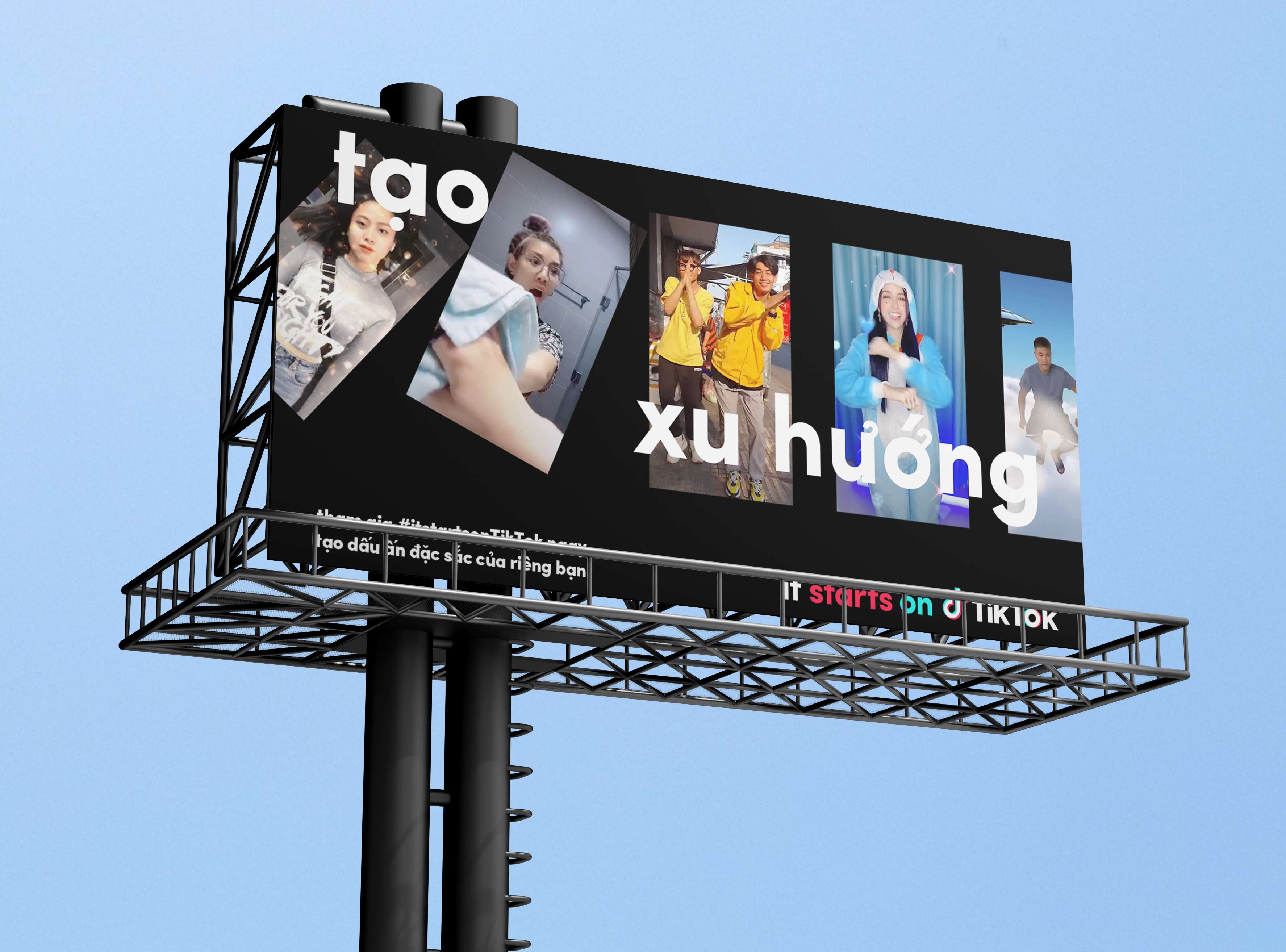
What emerged was not a rulebook but a living framework, one that allowed TikTok to scale across markets, mediums, and moments without losing the spontaneity that made it matter in the first place. The system held because it was designed as behavior and workflow as much as aesthetics, enabling thousands of creators, marketers, and partners to build within a shared language while still expressing local truth. In shaping this infrastructure, my role evolved from maker to steward, focused on creating the conditions for clarity, speed, and trust at global scale. The most meaningful outcome was not what we produced, but what others could now produce with confidence.
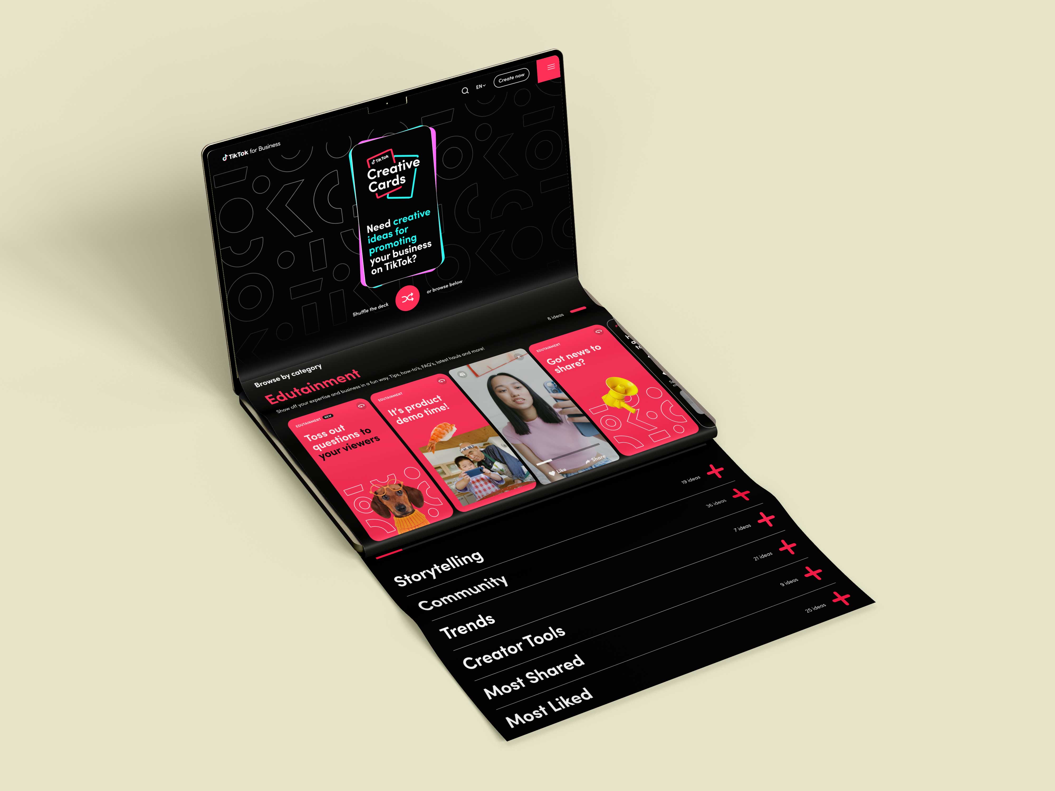
Key Collaborators: Wolff Olins, Francis Mekhail, Stacey Dsylva, Julia Zhou, Joshua Covarubbias, Johnny Chiu, Natalie Matutschovsky, Snog Productions, Jinglu Li, Ryan Northway, Ye Lin, Fernando Wang, Yujie Li, Peijun Guo, Qinyi Yao, Eason Shen, Jessie Ning, Jerio, Alex Ng, Mercy Tee, Haoqi Wen, Shayna Wenger, Raisa Janjua, Ian Alexander, Hamilton Tamayo, Crystal Yin, Chang Ma, Jialu Li, Thomas Cheng, Lachlan Bradford, Guandong Li, Yunfeng He, Tiantuo You, Haoyu Wang, Jun Shen, Haohao Duan, Melon Lee, Yuhang Liu, Miaomiao Liu, Xiangyu Kong, Yixia Xu, Kristin Peak, Nilesh Patel, Belle Baldoza, Jenny Westin, Parris Pierce, Alex Polo, Mike Hinson, Joy Seet, Antonio Fragoso, Kenneth Liew, Rachel Horlick, Kitty Mok, Jason Gomez, Vanessa Rizk, Dana Spomer, Kristine Xiu, Cassidy Cho
Tools: After Effects, Photoshop, Illustrator, Figma, Cinema 4D, and Sketch
Deliverables: Brand Guidelines, Design System, Motion Package, Merch Guidelines, Product/UI Guidelines, Brand Photography, Presentation Templates