

When I first stepped into the role of Design Director for TikTok, the company was still in its meteoric rise, recognized as a disruptive new player that was reshaping entertainment and social media at a pace few had seen before. At that time, the energy of the brand was its strongest asset, but the identity system supporting it was not built to scale with the speed and scrutiny that would inevitably come. By 2025, the landscape had shifted dramatically. TikTok was no longer the scrappy challenger but a cultural institution and a geopolitical flashpoint, facing mounting questions about ownership, governance, and its influence on global culture. What had once been seen as a playful and youthful visual identity now felt too shallow to sustain the trust and credibility the company needed in order to grow and hold its position. That was the moment when a brand refresh became not just desirable but critical. My role leading the design direction for the Global Brand Studio placed me at the center of this work, particularly on the business-facing side, where the stakes were highest. Agency collaboration and art direction closely supplemented the work of our internal user side design team and our Global Brand Studio to expand the toolkit to it's full potential. These were the spaces where global advertisers, C-suite executives, and industry leaders were making decisions about whether to trust TikTok with their investments, and it was vital that every touchpoint, from a keynote stage to a sales deck, communicated clarity, authority, and cultural fluency that our campaigns, platform and user experience all illustrated. To accomplish this, we partnered with DixonBaxi, whose history of building cinematic, modular, and scalable brand systems made them an ideal agency collaborator. Over time, this refresh not only elevated how we presented ourselves to the outside world but also reshaped how the company saw itself, giving our teams a unified identity system that aligned the smallest local campaign with the biggest global event. The refresh in 2025 was not simply about creating a new look; it was about giving TikTok the foundation to stand as a trusted global brand under intense scrutiny, a brand that could hold its place alongside long-established platforms without losing its sense of cultural relevance. For me, the work represented the culmination of five years of building toward this moment, evolving TikTok’s design from a playful start-up identity to a system capable of carrying the weight of a global institution while still radiating the creative energy that defines its community.
"I downloaded TikTok and just said that I am gonna do this for the rest of my life. Where there is a will, there is an app for it. - TikTok Superstar & Multi Platinum Recording Artist Addison Rae
The real challenge of the refresh was not simply the design itself but the scale of alignment it demanded across a company that had grown at breakneck speed. The original framework from the initial branding exercise we did with Wolff Olins years prior had given TikTok a recognizable presence, but after years of expansion the system was showing cracks, with teams improvising solutions that left the brand inconsistent and diluted. Having seen what they had done with brands like Hulu, the agency DixonBaxi was brought in to evolve that foundation in partnership with our internal design teams, not to discard what had been done but to refine it into a scalable system and build upon what was existing. The work began in earnest with a design summit in Mexico City in July of 2024 where we gathered leaders from across creative, marketing, events and product from around the globe and representing various teams across the organization to map out the company’s future needs and launch a full brand audit. That summit set the tone for months of deep collaboration where every element was tested against the demands of both consumer and business audiences. My role as Design Director was to hold the center, leading the business-facing direction while working hand in hand with counterparts on the user side to ensure the refresh did not fracture into two separate languages. Timelines added further complexity. The initial goal of a December launch quickly proved unrealistic once we understood the scale of adaptation required. Rather than rushing, we shifted to an iterative rollout, introducing a soft launch in June 2025 that allowed us to test key elements in the market before committing to a full phase two rollout in September. Over time, my team and the broader cross functional partners took on the monumental task of updating the full design and brand guidelines toolkit in that time. That second phase expanded the system dramatically, with our business teams taking ownership of new assets like global deck templates, social kits, event franchises, and motion packages that gave the refresh both credibility and reach. I partnered with counterparts on the user side consumer design team to ensure that the refresh felt holistic rather than siloed. Balancing these needs was a challenge in itself, since the brand had to resonate as much in a consumer-facing campaign as it did on a C-suite stage or inside a business toolkit. Every decision had to pass both tests. The challenge was therefore one of scale, coordination, and timing as much as it was one of design, and it required patience, diplomacy, and vision to make sure the refresh did not feel rushed or superficial but instead landed with credibility, clarity, and impact. The true difficulty was not only producing a clean, cohesive visual identity but ensuring that the process itself built alignment across disciplines and regions, creating a brand system that could endure under scrutiny while still moving at the speed of culture. The challenge was less about defining the need for a refresh and more about orchestrating a process that could match the size, speed, and complexity of TikTok itself, essentially building the plane while we were flying it.


The TikTok refresh began with a simple but daunting question: how do you evolve the identity of a platform that had already become one of the most recognizable cultural forces on the planet without dulling its energy or repeating what had been done before. TikTok in 2025 was not the same as TikTok in 2020. It was no longer defined only by playful chaos but by the responsibility of scale, the tension of global scrutiny, and the opportunity to cement itself as a lasting institution. The work had to honor that duality. It had to build a system that was clear enough to stand up in boardrooms and global stages while still leaving room for the spontaneity that drives creativity on the platform. This was not just design as decoration but design as a declaration of what TikTok wanted to be in its next chapter.

That duality became the defining tension of the work, and solving for it required a design system that was more than a set of guidelines. It needed to be an adaptable framework capable of serving vastly different audiences, functions, and regions without ever losing coherence. TikTok’s presence spanned continents, industries, and cultures, and each touchpoint carried a different weight. A sales deck in New York needed to communicate trust and clarity to advertisers, while a campaign rollout in Jakarta needed to feel locally expressive yet recognizably TikTok. Having closely worked on our initial branding exercises early in my Bytedance tenure, I was excited to build on it with this refresh.
The same system had to live on massive keynote stages where CEOs were making decisions about partnerships, and as tour visuals behind superstar performers being iconic on stage, and also in the hands of social teams producing daily content in dozens of languages. Building for that breadth meant moving away from the piecemeal improvisations of the past and toward a cohesive architecture where typography, color, motion, and iconography could stretch fluidly without breaking. What emerged was a brand language that was cinematic at scale yet meticulous in detail, able to flex from high production global events to regional activations and everyday marketing assets both on the business and consumer sides. It was the first time TikTok had a system that recognized the complexity of its ecosystem and gave every team from marketing to product to sales the tools to operate with confidence under one shared identity while also having the flexibility and design system to serve new resource needs as well.

TikTok has emerged as the most dynamic mirror of contemporary culture, a platform where global superstars and first-time creators coexist within the same algorithmic arena and where influence is earned through resonance rather than conferred by legacy. It is the place where songs become global anthems before they ever reach radio rotation, where experimental fashion codes are validated by community remix before entering the retail mainstream, and where athletes, artists, and public figures reveal dimensions of themselves that traditional media never captured. The platform has collapsed the historical distance between celebrity and community, brand and consumer, trend and cultural adoption, replacing linear influence with a continuous feedback loop that recalibrates relevance in real time. In this environment, creativity is not broadcast. It is iterated, dueted, stitched, and collectively authored, making TikTok one of the most vibrant engines of participatory culture in the world.
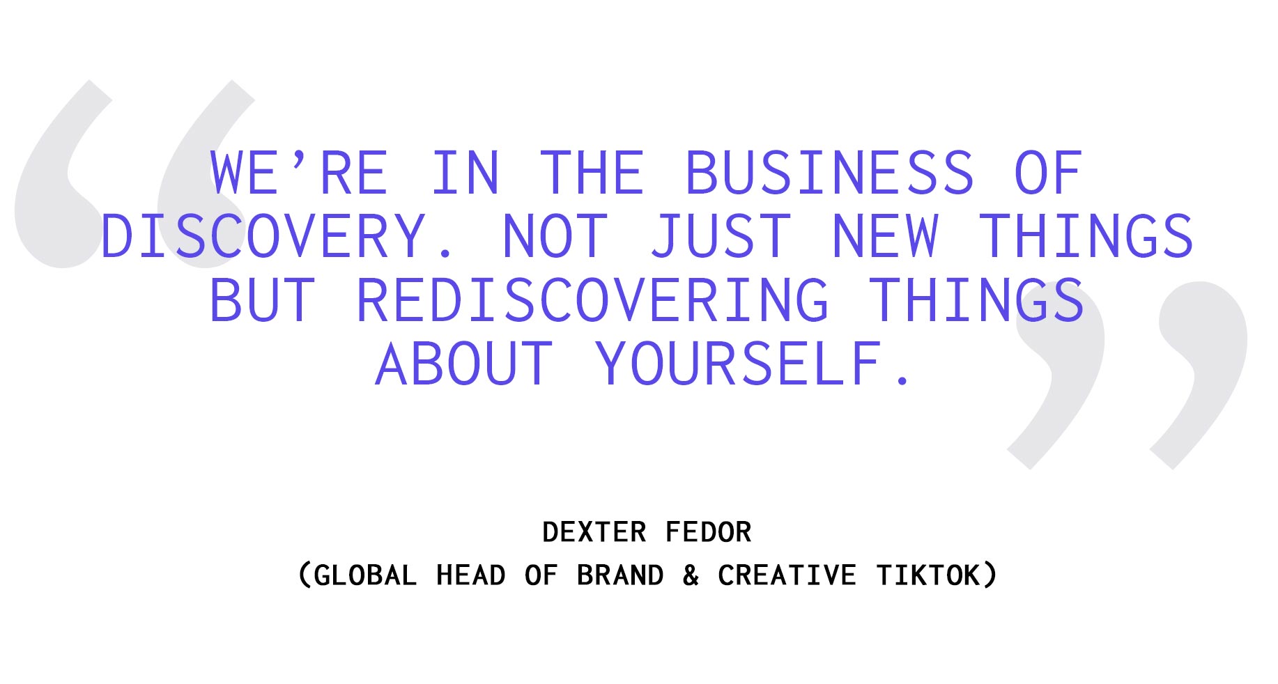
To shape the design system and define the creative language of a brand operating within this ecosystem was a rare and consequential opportunity. It required building a visual and experiential framework flexible enough to evolve at the speed of culture while remaining coherent across billions of daily interactions. The challenge was not only aesthetic but systemic: to create a language that empowered creators, honored authenticity, and allowed brands to participate without disrupting the native rhythm of the platform. Contributing to that foundation meant helping define how stories are framed, how tools invite expression, and how a global community recognizes itself within a shared visual grammar. At this scale, design is not decoration. It is infrastructure for culture, and being entrusted with that responsibility at such a formative moment remains one of the most defining experiences of my career and one that taught me a ton about design systems, collaboration across time zones and launching across this many touch points.
To understand TikTok is to understand how culture now forms, spreads, and renews itself. It is not simply reflecting the zeitgeist, it is the zeitgeist, and the brand system had to rise to that scale of meaning. Thinking TikTok first when developing a brand system is essential because the platform itself has redefined how culture is created, consumed, and shared. A TikTok-first approach ensures the identity is not built in abstraction but directly rooted in the behaviors, tools, and creative language of the platform. This means designing for vertical video, motion as a core principle, layering and embracing the chaos of creativity and authentic community-driven storytelling as the foundation rather than an afterthought. The teams we assembled to execute this refresh were all well versed in the power of the FYP, and this was key to making an effective system.
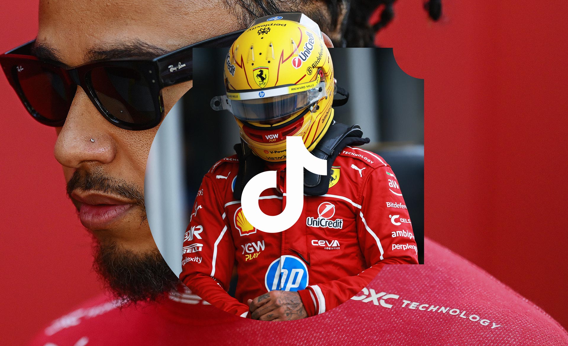
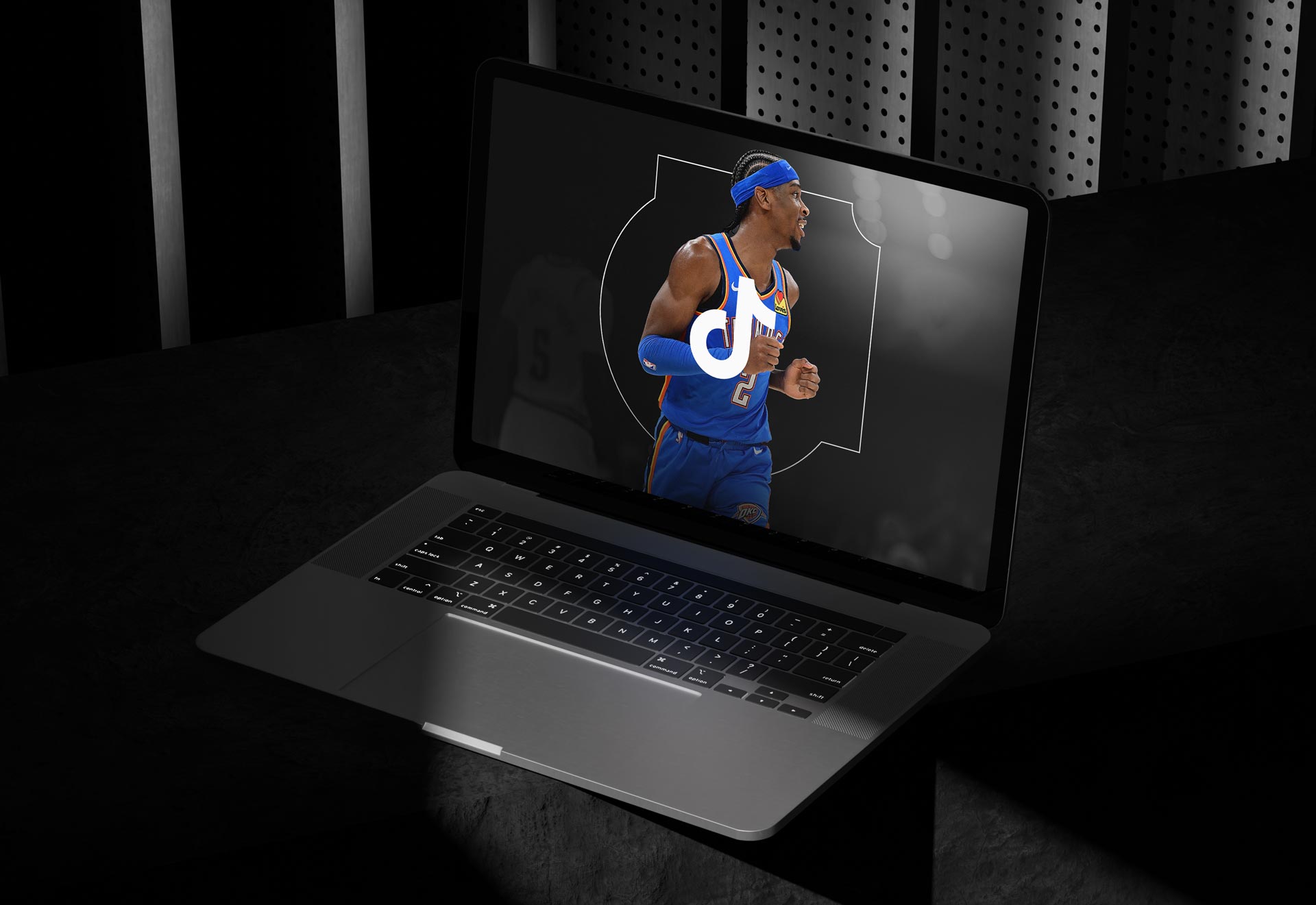
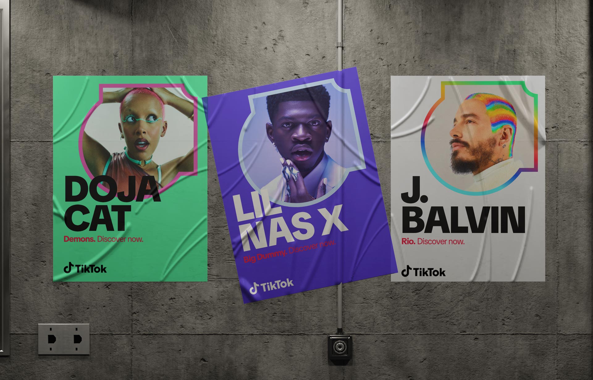
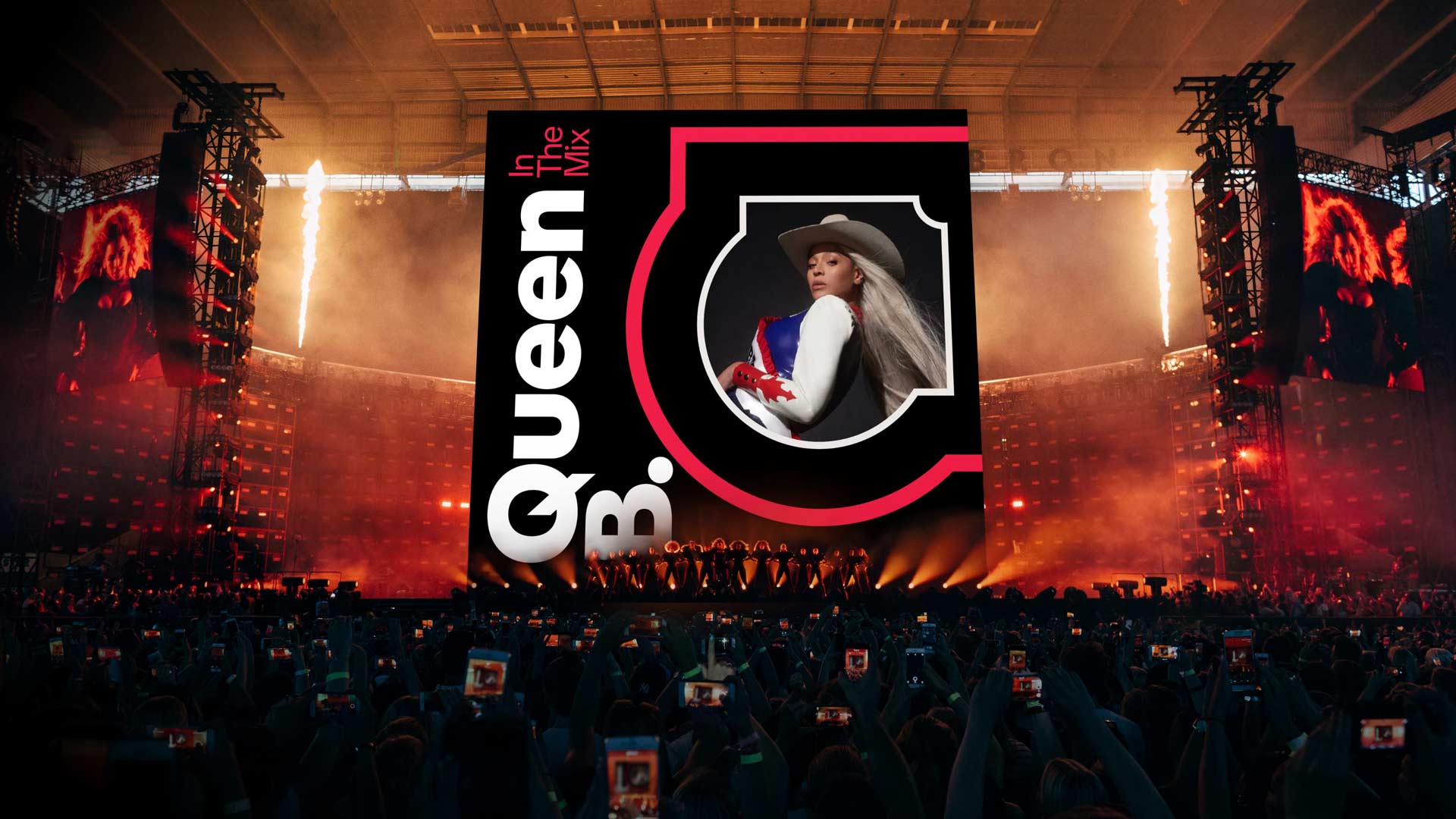
TikTok’s influence across music, sport, and pop culture revealed the sheer range of environments where the brand had to operate, and with that came the demand for a system both resilient and adaptable. One day the brand needed to live on a Formula 1 broadcast with global sponsors, the next it had to frame an emerging musician’s first viral moment, and in the same breath it had to carry authority on a mainstage at an advertising summit. This spectrum of applications exposed the limits of the earlier identity and clarified the need for a design system that could scale without losing coherence. The refresh answered this by creating a framework that provided discipline for consistency while leaving space for expression, allowing TikTok to show up with the same clarity whether it was amplifying the world’s biggest stars or the voices of its everyday creators.

Nothing was sacred in this refresh, and that was the point. Every element was put back on the table and interrogated, even the iconic details that had come to define the brand in its earliest days. There were heated debates about whether the glitch effect on the logo should stay or go, whether TikTok was a brand of rounded corners or sharp 90 degree edges when it came to framing UGC, and whether the smallest details of spacing and proportion needed rethinking. These discussions were never about surface aesthetics alone but about what kind of company TikTok wanted to project to the world. In the process we revisited the logo itself, a mark so widely recognized it could be seen on a phone screen from across a subway car. The TikTok logo has gone through various stages of design refinement but this was all while becoming one of the most recognizable brands in the world. What was great was that we even got feedback directly from our CEO, Shou Chew around the new logo, where he espoused the importance of our brand identity and people recognizing TikTok, going so far as to mention how much he loved our glitch. We took all of this feedback in stride during the creative development of this toolkit.

Our task was to preserve that inherent and growing brand recognition TikTok had developed while refining it for longevity as we matured. We rebalanced the form of the core logo by straightening curves, adjusting the stroke, sharpening diagonals, and cleaning terminals, creating a logo that felt stronger, more intentional, and more precise. The update was not meant to announce itself loudly but to quietly ensure that the logo could thrive across every medium, from the tiniest app icon to the largest arena screen. It was evolution through precision, the kind of craft that makes itself felt even when it is not consciously noticed. This, paired with our new elements like patterns and shapes and an extended color palette helped form the core backbone of this brand refresh. The core elements that always made it stand out were there, but now there was more optionality to flex and use different tones and elements depending on the audience, along with guidance on overall tone of voice as well as copywriting.
The previous brand guidelines had carried TikTok through its explosive rise, giving the platform a playful and recognizable presence that resonated with a generation of creators and audiences hungry for something new. The bold use of color, the familiar note, and the glitch effect became shorthand for a disruptive energy that felt different from anything else in the market. Those elements served us well in establishing the brand’s early identity and building awareness at unprecedented speed. But as the platform matured and its role in global culture expanded, that identity began to feel too narrow and too tied to its origins. What once felt edgy and youthful risked being read as inconsistent or unfinished when applied to the complexity of business partnerships, industry events, and large-scale campaigns. The guidelines had reached their limits, unable to scale across the breadth of audiences and functions TikTok now had to serve. The moment called for a shift toward a system that could balance credibility and play, one that would evolve the original language into something capable of carrying the weight of a global institution while still honoring the creative spirit that had fueled its rise.

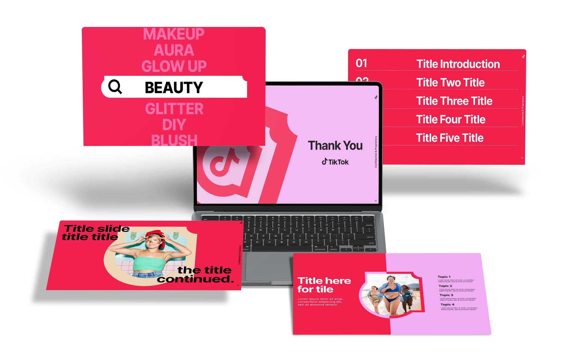
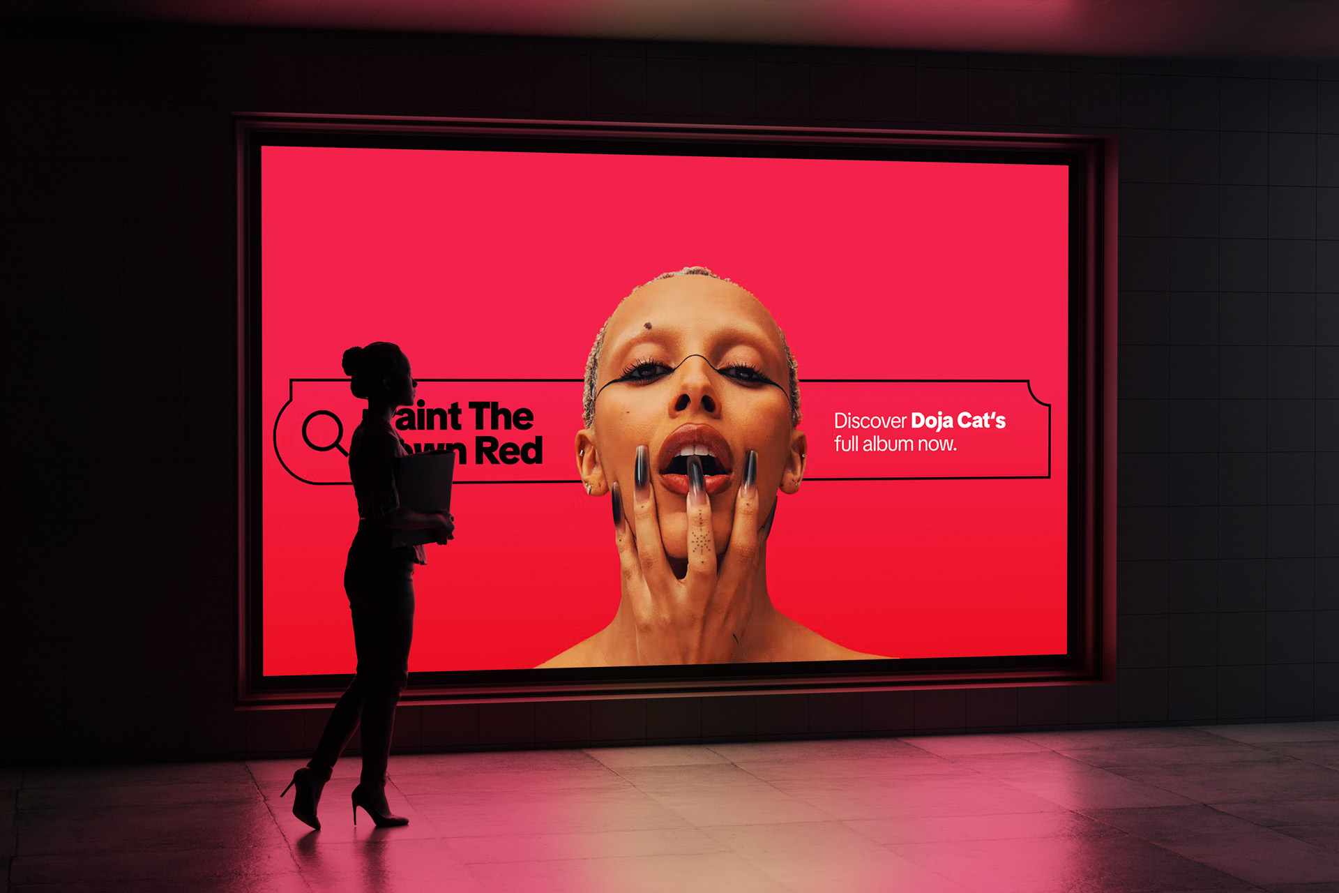
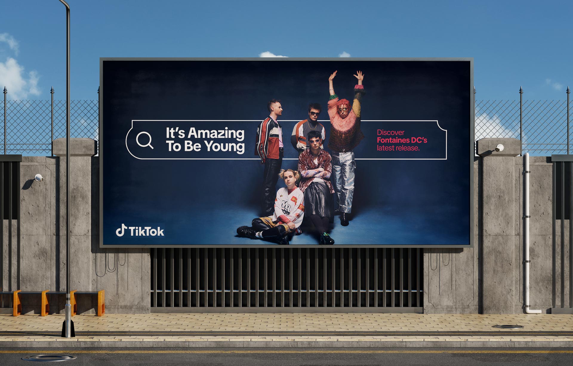
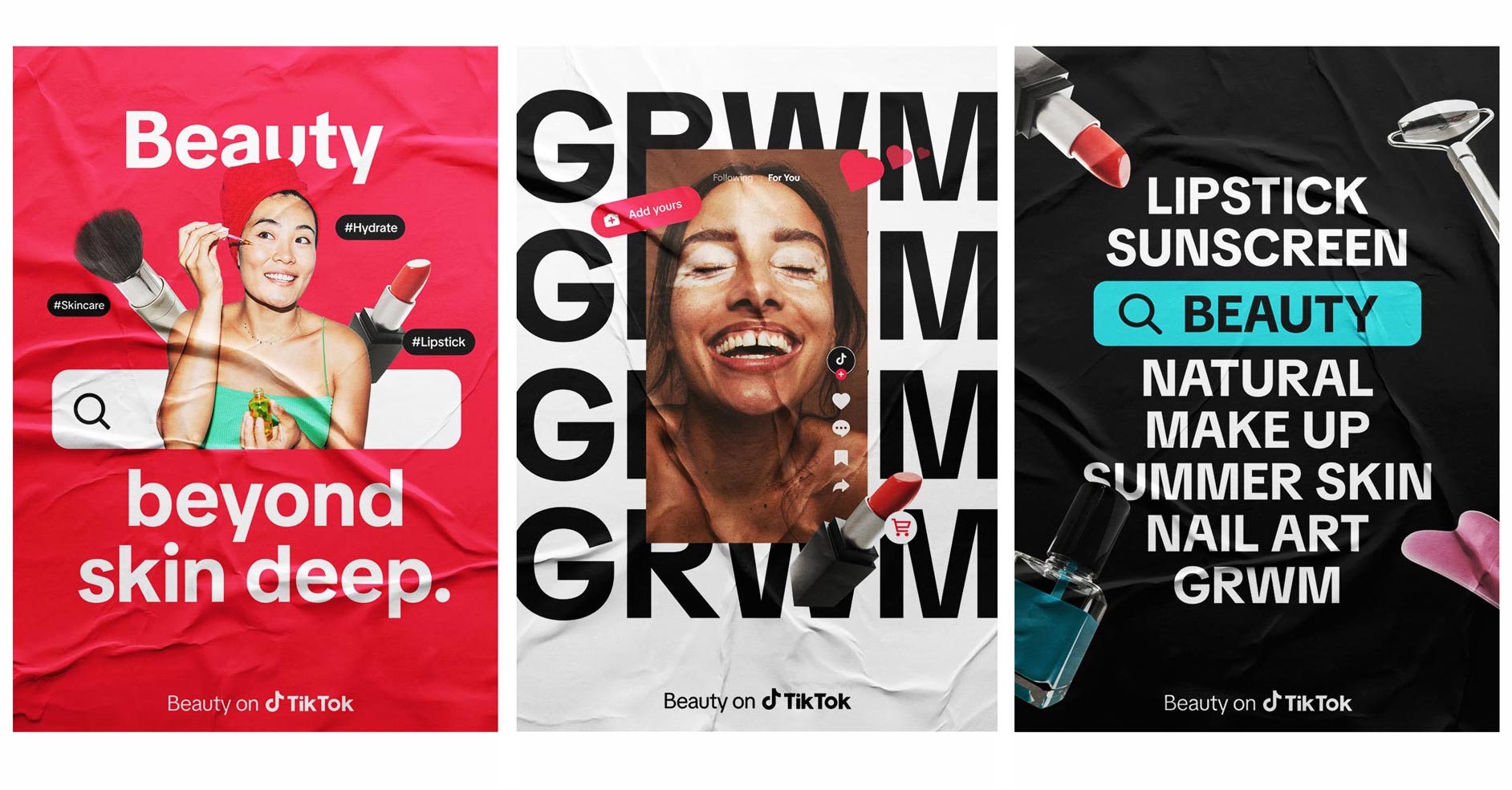
The brand refresh focused on transforming how people perceive TikTok by establishing it as a trusted, distinctive platform centered on creativity and discovery. The goal was to move beyond the idea of TikTok as purely a hub for user-generated content and instead present it as a springboard for cultural connection and inspiration. The system was intentionally built to be flexible and scalable, capable of adapting across global markets while maintaining visual consistency and emotional coherence. The new identity builds around energy, clarity, and humanity, creating a design language that feels alive across motion, color, and form. It embraces the duality of entertainment and sophistication, showing that TikTok can speak to creativity, commerce, and culture all at once. The refresh introduced a more flexible tonal range, capable of feeling both elevated and approachable, adapting naturally across business, creator, and consumer-facing expressions.
A huge amount of credit goes to Raisa Nawar, Dexter Fedor, and the TikTok user side Design team in LA for truly taking ownership of the brand guidelines and driving them from concept into a robust, production-ready system. In close collaboration with DixonBaxi and the talented agency team, they established a thoughtful, future-facing foundation that balanced clarity, craft, and cultural fluency, giving the brand a cohesive language that could scale globally. What made the effort particularly strong was how that creative backbone opened the door for deeper integration with the business side, where I partnered with the team to build out the operational layer across backend systems, event templates, pattern libraries, and data visualization frameworks. That work extended the guidelines from a static document into a living, full-service toolkit that could flex across product, marketing, and experiential surfaces. The agency’s strategic rigor and design excellence set the tone, while the internal team ensured it could actually live and perform in the real world, creating a system that was not only beautifully articulated but genuinely usable at scale. We built on top of that core foundation.

TikTok sits at the center of the zeitgeist, not as a passive reflection of culture but as one of its most powerful engines. It has reshaped how music is discovered, how trends spread, how communities organize, and how influence is defined. For a generation of artists, athletes, and icons, TikTok is not a side stage but the main arena where careers are launched and movements find their voice. That level of cultural gravity brings with it both opportunity and scrutiny. The brand could no longer rely on the playful improvisation of its early years. It needed an identity that matched the scale of its influence, one that could stand alongside the very stars it helped create and the industries it continues to transform. The rebrand was not about chasing a new look but about rising to meet the cultural and commercial role TikTok now occupies, building a system that could project both authority and imagination while holding its place as the defining platform of our era.

TikTok is the change agent at the inflection point of modern culture, the place where conversations ignite, memes are born, and trends take flight before rippling outward into every corner of society. It is where a bedroom performance can transform into a global stage, where a catchphrase can become a movement, and where commerce itself is redefined through phenomena like #TikTokMadeMeBuyIt. Music charts bend to its influence, fashion cycles accelerate through its feed, and pop culture itself is continually re-scripted by the creative energy of its community. The ethos of the brand refresh was to capture this resonance, to give visual form to the waves of influence that emanate from TikTok and spread across culture with immediacy and force. It was about designing a system that embodied the platform’s role as both origin and amplifier, an identity built not to sit quietly in the background but to move with the same momentum as the cultural currents it helps create. This perspective set the stage for the evolution of a new symbol that could encapsulate this cultural energy and translate it into a design system capable of reaching every audience and touchpoint.
The brand refresh was built on a series of deliberate shifts that reframed what TikTok stood for in the eyes of the world. We could no longer be defined as a social media platform alone. That language was reductive and failed to capture the truth of what was happening on the platform. TikTok had become a springboard for discovery, a place where people encountered ideas, products, and communities that they never expected to find, and where the act of scrolling turned into something closer to exploration. The platform had also grown out of its early adolescence. What once carried the tone of youthful chaos needed to evolve into something grown up, but without losing the vitality that made it irresistible in the first place. That meant embracing maturity without aging into irrelevance, presenting TikTok as a brand with authority but still filled with fun.
The refresh marked the arrival of a universal design system for TikTok, one that could finally hold the scale and complexity of the brand without losing its humanity. It was built in close collaboration with DixonBaxi, who brought their history of shaping global icons into dialogue with the foundation that had been set years earlier by Wolff Olins. That first wave gave TikTok a recognizable presence, but over time our internal design teams expanded it, adapted it, and iterated on it to meet the daily realities of a platform that moves at the speed of culture. By 2025 it was clear that a more integrated, resilient, and flexible framework was needed, one that could bridge the divide between consumer-facing storytelling and the business narratives powering growth. The refresh did not erase what came before but honored it, drawing from the typographic backbone created with Grilli Type and evolving TikTok Sans into a truly global font. It was the result of deep collaboration across the Global Brand Studio, the consumer design organization, and product teams who ensured the work showed up seamlessly in product surfaces as much as it did in billboards, pitch decks, and cultural activations. What emerged was not a cosmetic update but a universal system with reach and intent, capable of moving between commerce and creativity, between the local and the global, and between the spontaneity of user-generated content and the authority of a billion-dollar brand.
The new look makes a declaration that TikTok is no longer content to be seen as a fleeting phenomenon or a platform defined by novelty alone. It signals a company ready to claim its role as a cultural institution, one whose influence stretches from living rooms to boardrooms and from underground subcultures to global stages. The universal system announces that TikTok is a brand with permanence, clarity, and a point of view, not only a space for entertainment but a force that shapes discovery, drives commerce, and redefines how culture itself moves. The refined logo, the expanded toolkit, and the cohesive visual language all serve as proof points of this shift. They say to the world that TikTok has grown up without growing old, that it can be intentional and authoritative while still holding on to the spontaneity that made it magnetic in the first place. In its design, the refresh tells the story of a brand that has achieved scale, weathered scrutiny, and emerged with a stronger, more unified identity capable of carrying it into the next era of global impact and creativity unleashed and the sky is the limit.
Brand guidelines were once static rulebooks, binders that gathered dust while real work happened elsewhere, but over the past few decades they have evolved into living systems that shape how organizations move, speak, and scale. As brands expanded across digital channels, global markets, and real-time content cycles, consistency could no longer rely on policing usage; it required infrastructure that made the right choices easy and the wrong ones hard. Modern brand systems emerged at the intersection of design, technology, and operations, embedding typography, color logic, motion behavior, and voice into templates, toolkits, and workflows that travel with the work. What began as identity standards became operating models, enabling distributed teams to produce at speed without fracturing the signal. In this context, TikTok’s guidelines function not as constraints but as a shared language that allows cultural immediacy to coexist with global coherence. They acknowledge that brand is no longer a static artifact but a dynamic behavior, expressed across feeds, stages, interfaces, and conversations in real time. The true value of a contemporary brand system lies in its ability to scale trust, ensuring that no matter where or how the brand appears, it feels intentional, recognizable, and alive.

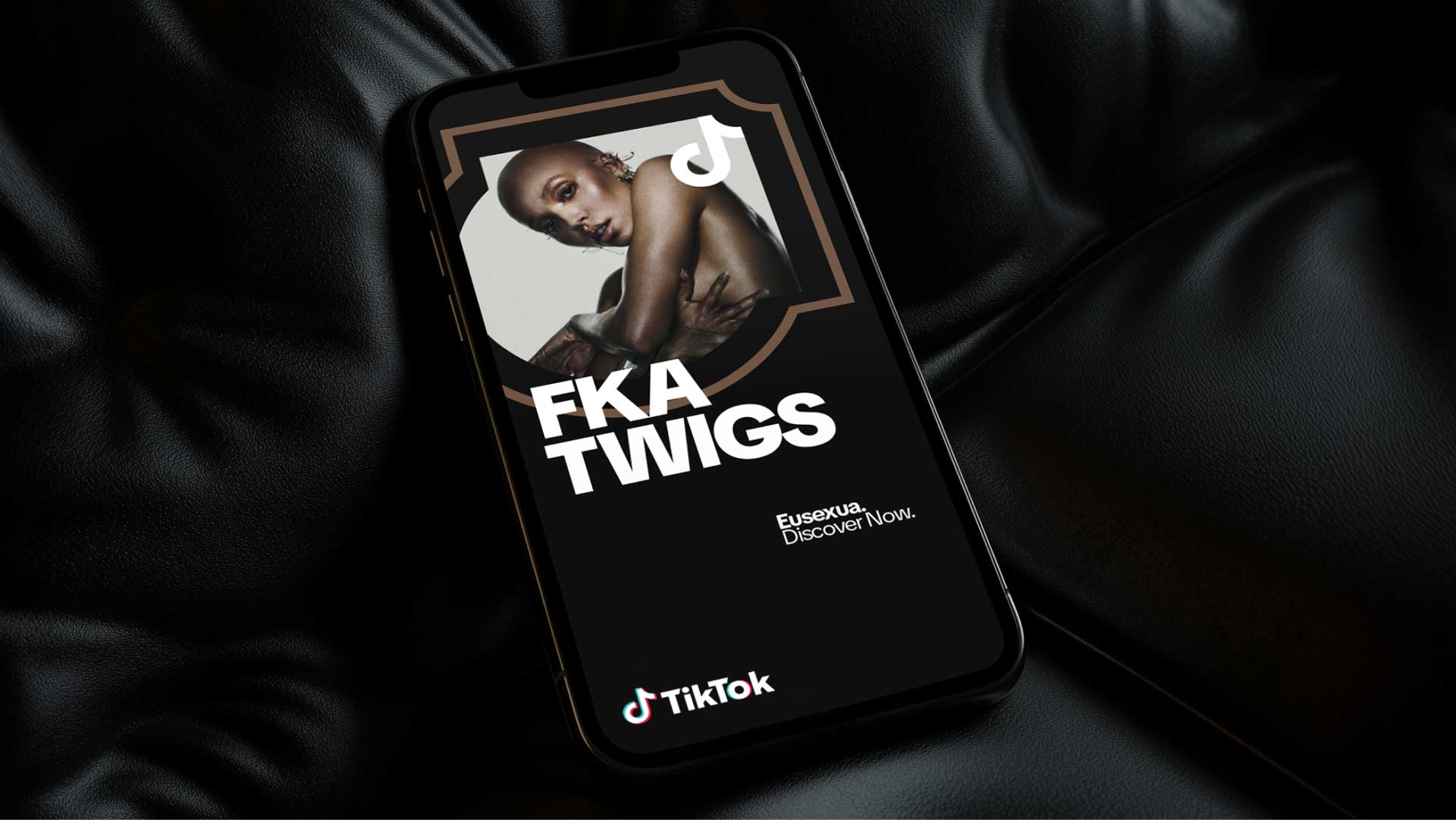
The music note has always been more than a logo for TikTok, it is a cultural marker that ties the platform back to its roots in musical.ly and the early lip sync era where creativity was expressed in seconds of sound and performance. From that seed grew TikTok, and during the pandemic the icon became synonymous with a new kind of global stage where dances like the Renegade, songs from unknown artists, and remixed audio clips traveled faster than traditional media ever could. The note represents rhythm, resonance, and the universal language of music that has always been at the heart of the platform, but it also embodies the way creativity emanates outward into culture, setting trends that reach every corner of the world. In shaping the refresh, the music note was not treated as a static mark but as the core symbol of our design thinking, a reminder that TikTok’s power comes from the way sound, motion, and human expression intersect to create something that moves both people and culture forward.
To touch a brand like TikTok at this scale is to step into something far larger than any individual. A rebrand of this magnitude is never the work of one person, but the work of many voices, each adding their craft and vision to a shared system that only functions because of the village behind it. I built on a framework that was already in motion, one that began with Wolf Ollins defining the first principles of TikTok’s identity when it was still finding its global voice, one that leaned on Grilli Type to shape TikTok Sans as a bespoke expression of our character, and one that has now evolved through the stewardship of DixonBaxi and the countless designers, writers, and strategists across TikTok’s own teams. To even play a small part in this continuum is humbling. I did not invent the spark of culture that TikTok represents, nor did I singlehandedly define the shapes, the colors, or the grid, but I stood in the current of a collective flow and added what I could. What I admire most is how the work moves forward through us rather than because of us, and how design at this scale becomes a living inheritance, touched by hundreds of hands, yet still carrying a singular pulse. In the end, the act of contributing to something so much larger is its own kind of reward, because the brand is not mine or yours, but ours, and it will continue to evolve long after any of us have moved on.
The global summits in Mexico City and London were where the first real conversations about the refresh began to crystallize. It brought together voices from every corner of the company, from consumer-facing design leads to business marketing directors, product managers, engineers, and members of the brand studio. Each stakeholder carried different needs, pressures, and visions for what the future identity should be. The consumer design team stressed the importance of staying close to creators and preserving the authenticity that made TikTok magnetic in the first place. We worked closely together across these conversations to adress what different stakeholders felt was of utmost importance through a process of note taking and auditing over time to discover commonalities and the problems we could solve with most impact.
The business teams called for more authority and polish, a design system that could carry weight in front of global advertisers and C-suite leaders. Product leaders wanted a visual language that could scale seamlessly across interfaces, touch points, and use cases without breaking down under the complexity of global adaptation. The brand studio, which I directed on the design side, emphasized cohesion, clarity, and an identity system that could bridge the gap between all these worlds. These conversations were not about aesthetics alone, but about aligning TikTok’s identity with its role in culture, commerce, and community. The debates were spirited and sometimes contentious, but they reflected the scale of the challenge we were taking on. The summit created a shared understanding that this was not a cosmetic update but a fundamental reframing of how TikTok would be seen in the world, and it gave us the mandate to build a system full of options, tools, fonts, patterns, sounds, templates for our needs and just generally expansive enough to hold all of these ambitions at once to embrace the multitudes we all contain and reflect that vision back out into the world.

At the Mexico City summit I led a working session on the current state of our creative where I laid out what was thriving, what was fragmenting across regions, and where governance had slipped as speed overtook craft. I built the session around a wall of audits that made the inconsistencies impossible to ignore, lining up decks, event kits, social templates, motion stings, and in-product surfaces side by side to show how color, type behavior, logo usage, and UGC framing had drifted without a central anchor. That session opened a direct line with Raisa Janjua, who was leading Global Brand Standards at the time, and together we translated those discussions into a sharp brief that defined the problem, set success criteria, and prioritized needs for both the consumer design org and my Global Brand Studio. It was the spark that set the direction for the next phase of our work. These discussions, diverse and sometimes conflicting, were necessary to clarify where we needed to go.

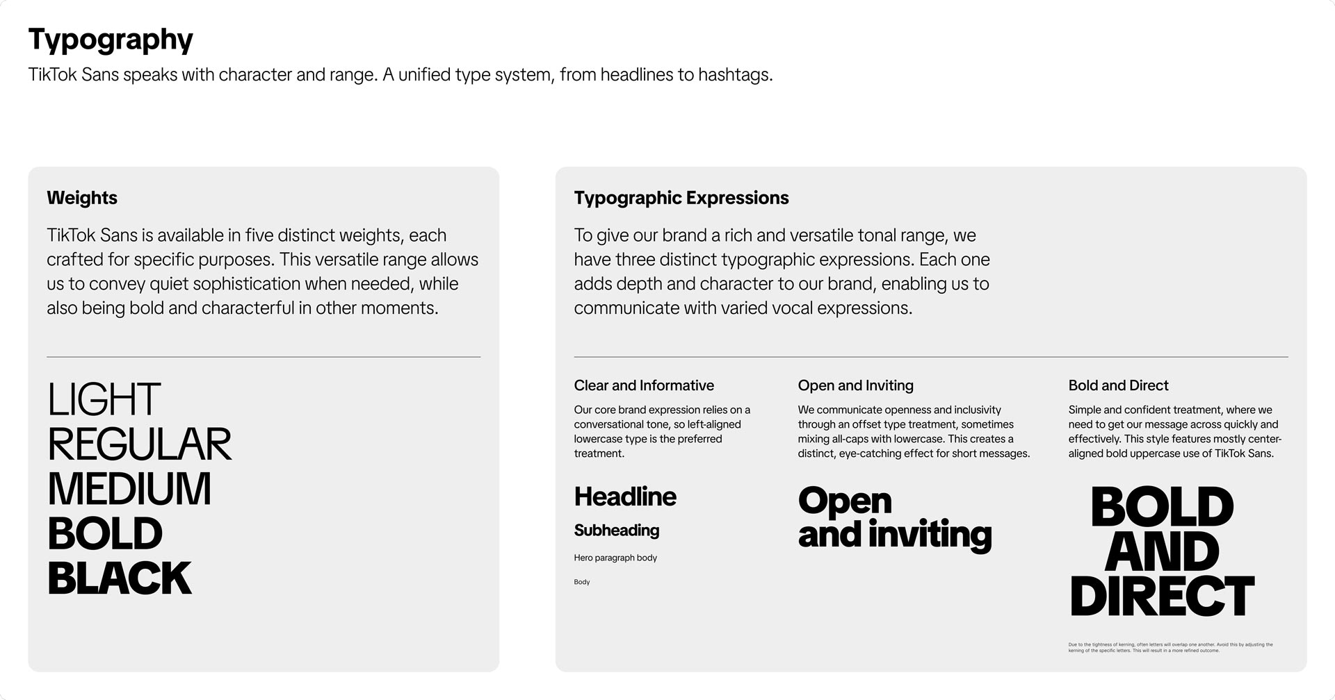
In parallel with those summit conversations, another effort was already underway that would become a cornerstone of the refresh. TikTok Sans, our first fully bespoke typeface, had launched earlier in 2024 after years of advocacy and development. The font provided proof of what a unifying system could achieve at scale. Built in collaboration with Grilli Type and refined with Type Network, CoFo, and Channel Creative, TikTok Sans gave us a typographic backbone that stretched from captions inside the app to keynote headlines and outdoor billboards. Its geometric construction, drawn from the DNA of the note mark, softened into a human rhythm that carried presence at scale but retained clarity in product. By the time DixonBaxi came on board to formalize the refresh, the typeface was already functioning as connective tissue across teams and markets, offering a real-world example of how discipline, cultural fluency, and expressive design could coexist. It made the refresh tangible before any new system had even launched, and it set the stage for everything that followed. The typeface represented the direction of the brand and how it exists at such a wide scale.

TikTok Sans became the structure that allowed the refreshed identity to breathe. It was not only a typographic choice but a system designed to scale with the speed and variety of TikTok itself. From captions on a phone screen to data visualizations in investor reports, it carried the same recognizable cadence. The variable design gave it elasticity, letting it whisper through product UI while still commanding entire walls in a campaign. This adaptability is what made it the quiet backbone of the refresh, always present, always shaping the voice. It provided DixonBaxi a foundation to work off of and stood as the connective tissue between eras.

Within the refresh, we defined clear typographic modes that extended the system’s range without fracturing its unity. Clear and Informative gave us the everyday voice of the platform, steady and approachable. Bold and Direct allowed us to step into cultural moments with urgency and impact. Open and Inviting brought in playfulness, mixing styles in a way that reflected the vernacular of our community. This diversity in tonal language and typographic expression really helped open us up as a safe space for a myriad of folks.
The decision to make TikTok Sans open source, with the support of Type Network and partners, expanded its role beyond internal identity. By releasing it through Google Fonts, TikTok turned its own visual voice into a contribution to the creative ecosystem. This move reflected the platform’s culture of participation: tools built for everyone, designed to scale with the imagination of creators. In the context of the refresh, that decision made the typeface not only a unifier of the brand but also a symbol of TikTok’s openness to the world, and this tied directly into the vision of this brand refresh, to position ourselves as transparent candid and clear.
If the open sourcing of TikTok Sans marked an invitation, Amplified Type was its declaration. Where the core family gave the brand a unified voice, Amplified Type pushed that voice into a louder register, turning typography into a stage. Building on the original Grilli Type guidelines and extended through DixonBaxi’s work on the refresh, we introduced all-caps treatments, bold scaling, and rhythmic distortion that let words move from conversational to commanding. This was TikTok Sans evolving from a quiet backbone into an expressive headline act, ready to carry campaigns, cultural moments, and brand storytelling with unapologetic presence.
The power of Amplified Type came in its ability to hold more than language. Through layering, clipping masks, and embedded imagery, letterforms became living vessels, fusing words with culture itself. Names, slogans, and key messages were no longer static text but visual statements, filled with photography, motion, and texture that expanded their meaning. Each execution turned language into an experience, allowing TikTok to amplify not only what it says but how it feels, and to project that energy across every surface from feeds to festivals. This type of energy was something core to this refresh and can truly be seen in motion as it comes alive just like a For You Page.

Layering in the refresh was about building a visual world that felt alive. Text, imagery, and pattern were no longer treated as separate elements but as components designed to interact with each other. Shapes became containers, clipping masks turned photography into texture, and type moved in and out of visual planes. This approach let the brand speak with energy while still holding a clear hierarchy, where information could be bold without overwhelming and expressive without losing clarity. The importance of this layering lay in its ability to create both structure and surprise. A headline might stretch confidently across the frame, while behind it patterns rippled, images shifted, and supporting text sat on its own layer of clarity. The interplay of these parts gave the system its richness. It ensured that campaigns, events, and even product surfaces carried the same sense of depth and dynamism, with each layer working in harmony to tell a story that felt distinctly TikTok.

TikTok Sans represents more than a typographic choice. It is a strategic asset that transforms the brand’s voice into a proprietary system of expression. In an ecosystem where platforms compete for attention in milliseconds, an owned typeface ensures instant recognizability across feeds, broadcasts, out-of-home, and partner environments without relying on logos or color alone. Designed for performance as much as personality, TikTok Sans balances geometric clarity with human warmth, maintaining legibility across languages, screen sizes, and motion contexts while carrying the rhythm and energy of the platform. Its variable structure enables responsive scaling and expressive hierarchy, allowing headlines to feel dynamic and native to vertical video while body copy remains precise and accessible. By controlling its typographic infrastructure, TikTok reduces dependency on third-party licenses, ensures global consistency, and embeds brand equity directly into every interface, caption, and campaign. In practice, the typeface becomes a silent ambassador, reinforcing trust and recognition even when other brand cues are absent. Owning the letterforms means owning the tone, and in a culture shaped by text overlays, subtitles, and on-screen storytelling, that control translates into lasting cultural and commercial advantage.
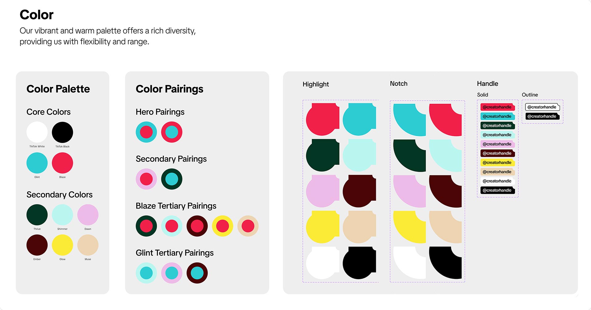
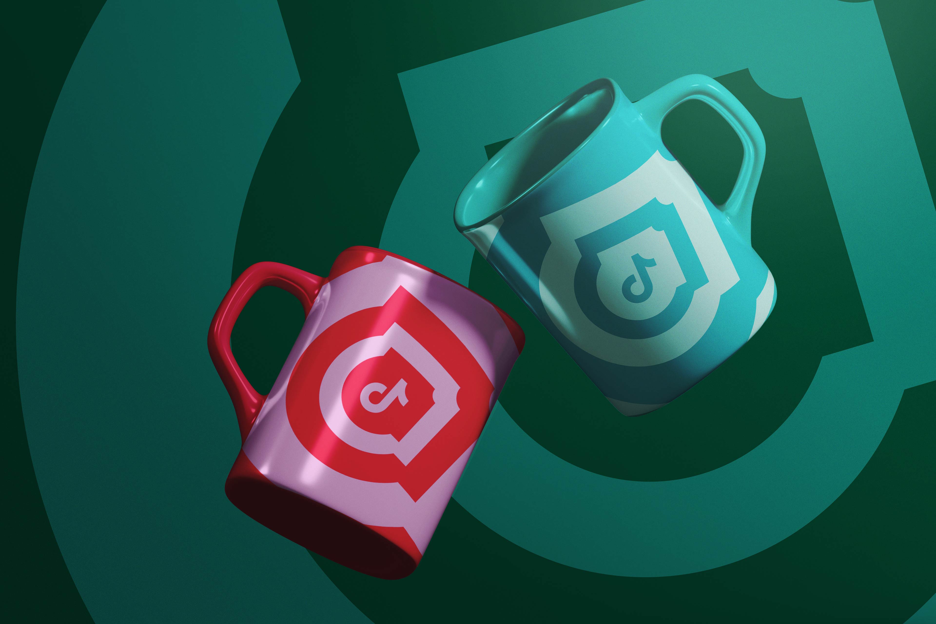
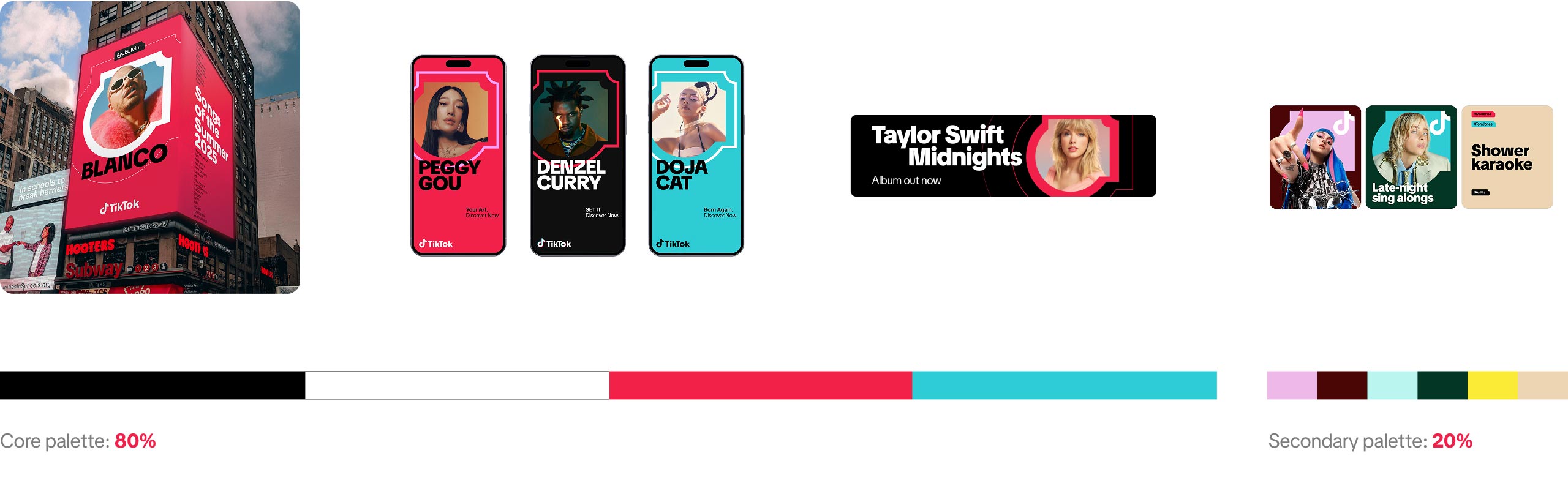
Alongside the typographic system, the refresh also introduced an expanded color palette that gave the brand more nuance and flexibility. The original TikTok colors had always been bold and recognizable, but they were also limited, often leaving designers to stretch or improvise in ways that created inconsistency. With the refresh, the palette grew into a broader spectrum designed to support both expressive and functional needs. It included hues that could carry energy for campaign work, softer tones that worked in more editorial contexts, and a range that was optimized for clarity and accessibility.

The color system was created to capture TikTok’s evolving creative energy while maintaining clarity and harmony across every surface. The primary palette of Glint, Blaze, White, and Black establishes the brand’s foundation through a balance of vibrancy and restraint. Glint carries the brightness of discovery, Blaze evokes energy and cultural expression, while White and Black provide structure and compositional stability. Around these anchors sits a secondary spectrum of Thrive, Shimmer, Dawn, Ember, Glow, and Muse, designed to bring nuance and warmth to every expression of the brand. The naming system for the colors was an intentional extension of the brand’s spark motif, where every shade carries a sense of ignition and energy. These tones expand the visual voice, offering emotional depth and tonal variety that can flex between editorial calm and expressive energy. This relationship between name, hue, and energy keeps the brand’s visual system tied to its spirit of momentum and play, reminding every creator that inspiration is something both seen and felt and a core element of igniting creativity on the platform.
The new brand colors introduced in the refresh open up a wide spectrum of expression for how TikTok can show up across different contexts and audiences. They create a richer visual language that allows the brand to move fluidly between playful, premium, and professional tones without losing its distinct energy. By expanding beyond the core black, white, and signature neon hues, the updated palette gives designers the freedom to build narratives that feel more human, diverse, and emotionally varied. These new tones bring balance and depth to the brand’s storytelling, helping TikTok feel equally at home in cultural, business, and creator-driven spaces while staying true to its identity of creative optimism.
.jpg)
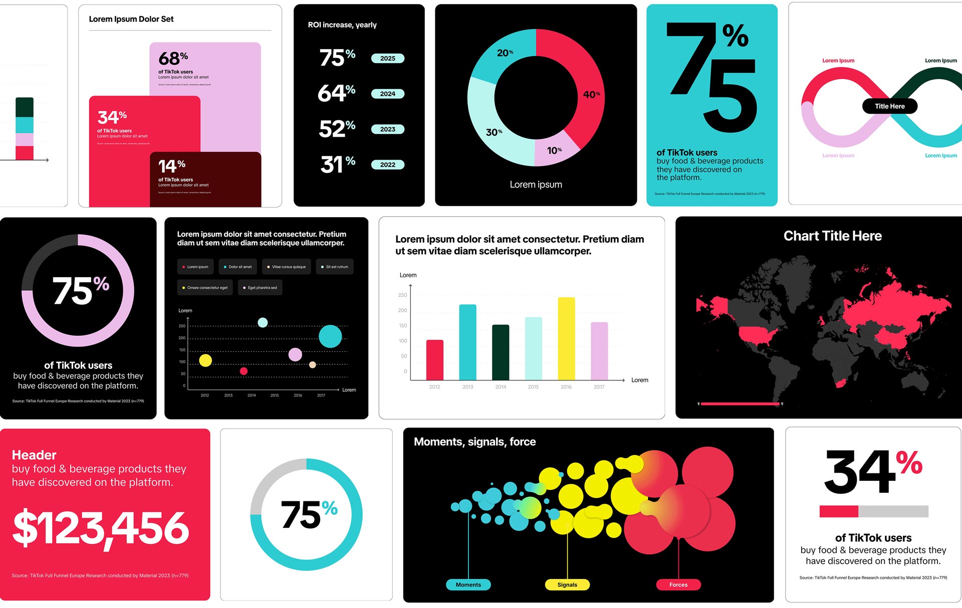
Building on the foundation of the refreshed design system, the evolution of our typography naturally extended into how we visualize information. Both type and data serve as carriers of clarity, rhythm, and hierarchy, and together they define how insight is experienced. Working closely with my direct report, Henry Kaye, we developed a modular suite of charts, graphs, number layouts, and motion templates that aligned to the refreshed visual system while maintaining flexibility for storytelling. I partnered with Design Force to build and refine the motion files, ensuring they could be delivered in toolkit form through customizable After Effects templates with automated resizing, light and dark modes, and dynamic data fields. The finished toolkit became a core design resource for teams across the company, bridging business reporting, campaign storytelling, and platform education within one unified visual language. The Data Visualization Toolkit was first developed in the interim period following the initial brand refresh, but this new phase allowed us to reinforce and expand it into a far more comprehensive system. As part of the update, we rebuilt every component to align with the refreshed design language and reworked the full color library to match the new palette, ensuring visual consistency across all charts, graphs, and motion templates.
DixonBaxi were the right partners to take on this work because they specialize in building brands that thrive at scale while staying culturally sharp. Their systems balance discipline with energy, allowing expressive design to live alongside clarity. That ability has been proven across a wide spectrum of their projects, from unifying Hulu’s identity across binge and billboard, to reimagining AC Milan as more than a football club and positioning it as a cultural icon. They helped Delta set the course for its next hundred years and created a disruptive presence for ITV by leaning into the power of being an “X” in a world of pluses. That range of transformation work made them the perfect choice to guide TikTok through a refresh that needed to honor its existing foundation while elevating it to a more universal, global language.

The refresh distilled TikTok into a brand built for discovery, one that mirrors the spontaneity of the platform itself. Every element was rethought to carry that spark of possibility, from the refined clarity of the note mark to the introduction of the Spark shape as a new vessel for imagery, motion, and storytelling. Color expanded into a palette designed to flex with mood and accessibility, while TikTok Sans gave the system its voice with range and precision. Together these tools formed a framework that could scale across every surface, but always return to the same core idea: a brand that moves with culture, frames creativity, and invites people into a world where one spark can lead anywhere. It was a pleasure to take part in this team effort to relaunch the brand and ensure the toolkit had all the elements needed to scale globally.
The refresh was not only about visuals. Voice carried equal weight, because the way TikTok speaks is inseparable from the way it looks and moves. In culture, TikTok is not a distant brand talking at you. It is the friend who shares something unexpected, the guide who shows you a new path, the cheerleader who amplifies your wins. Our voice needed to reflect that. It had to build trust while keeping the playfulness and spontaneity that define the platform. To achieve this, we organized the brand voice into four pillars: Curious, Unexpected, Helpful, and Uplifting. Each pillar captured a different aspect of how TikTok lives in the world. Curiosity speaks to discovery and open dialogue. Unexpectedness channels the immediacy of real conversation and serendipity. Helpfulness ensures clarity and transparency, cutting through noise with guidance that empowers. Uplifting brings the energy of celebration and community, reminding audiences that TikTok is built to champion creativity.
This framework gave the teams a flexible tonal range that could scale across audiences. For non-users, the brand could spark intrigue. For everyday users, it could mirror their joy and humor. For creators, it could encourage experimentation and support their craft. For partners and opinion leaders, it could reassure with clarity and optimism. By grounding all communication in these shared pillars, TikTok developed a voice that is adaptable yet also its own to continue to build upon, reinforcing the refresh with language as dynamic and recognizable as its visuals. The Spark shape, the new layout rules, the ability to really think in terms of design systems was a gamechanger.
The strength of TikTok’s voice lies in its ability to flex across extremes without ever losing its center. On one end it lives in the spontaneity of creators, the thrill of a festival crowd, the humor of an influencer post, or the chaos of a viral trend. On the other, it has to shift seamlessly into spaces where clarity and trust are paramount, whether that is guiding a brand through commerce opportunities, presenting at a summit on safety, or supporting business partners with confidence. This tonal spectrum is not a contradiction but a reflection of TikTok itself, where play and professionalism coexist. It created the foundation for the Spark shape, a visual counterpart to this range, able to carry both cultural energy and business credibility. This shape was one of the most important aspects of the entire brand refresh project and showcases a lot of first principles thinking.
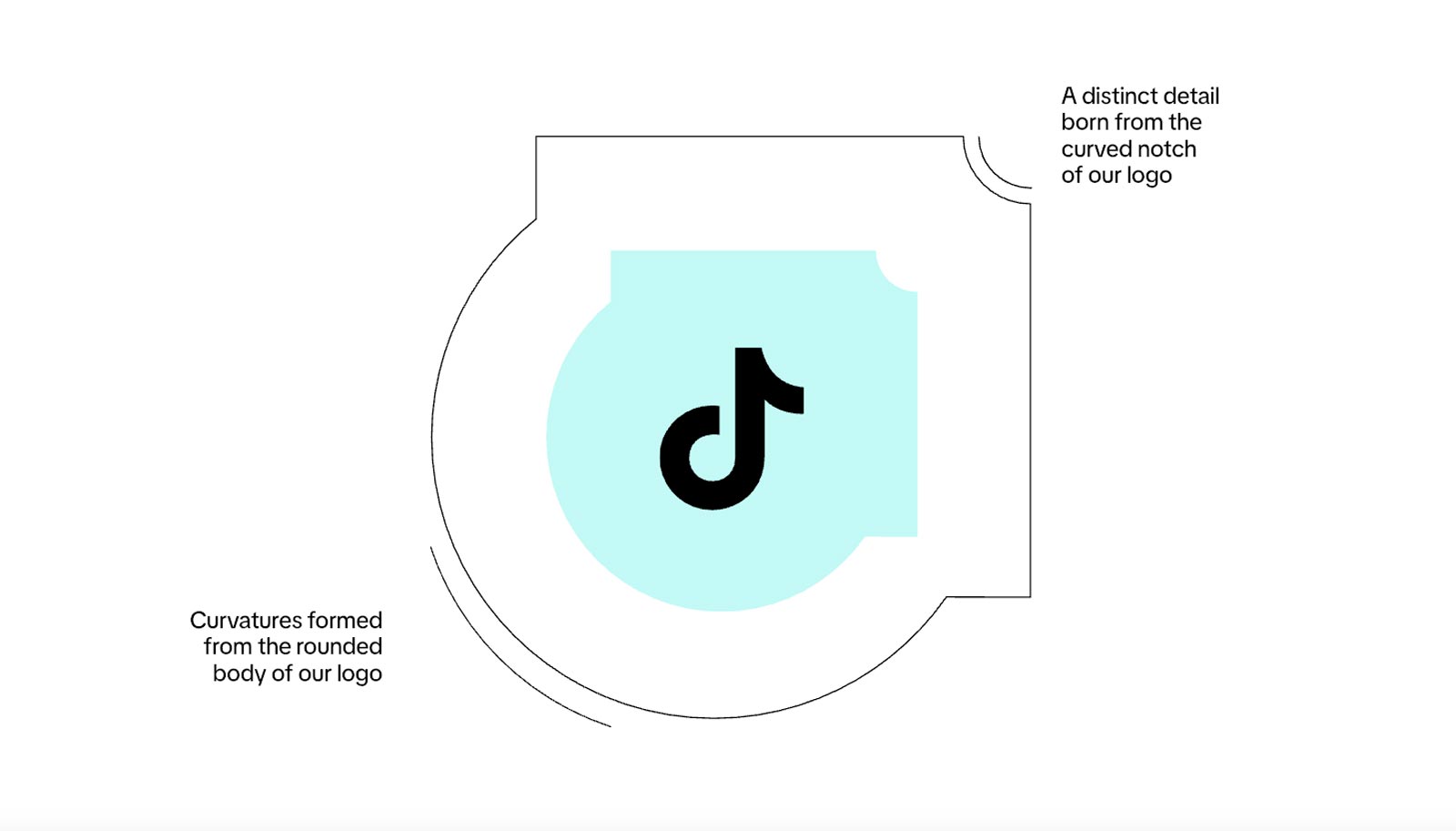
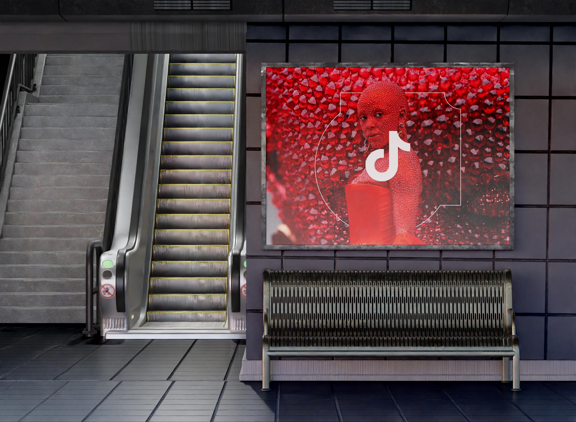
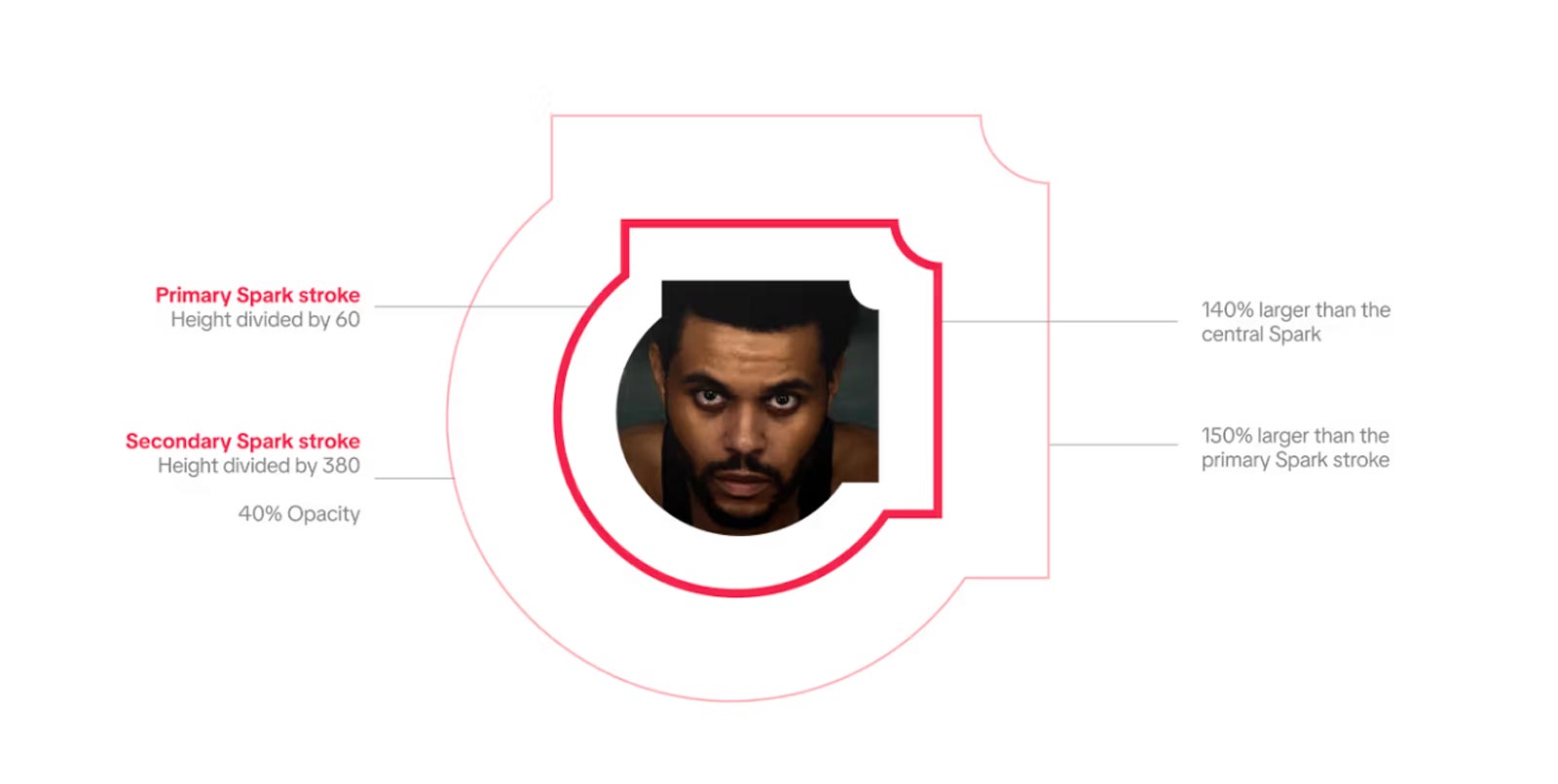
The Spark is the organizing idea that turns a logo into a living system. Drawn from the curve and notch of the note, it reads as a portal and a stage at once, a frame that pulls focus without stealing it. In practice it behaves like a piece of visual grammar. It gives the eye a place to enter, it holds attention around the subject, and it leaves enough negative space for copy, motion, and product UI to breathe. Because the geometry is rooted in the mark itself, every expression feels native to TikTok while still flexible enough to stretch across culture, commerce, and community. It is an expantion of our core music note and a flexible new container to use throughout layouts.
.jpg)
More than a shape, it became a lens that gave the brand consistency without ever feeling static. By allowing images, patterns, and type to layer within and beyond its edges, the Spark captured the feeling of discovery itself: a moment of energy that starts small and ripples endlessly outward. By abstracting a single curve from the logo and expanding it into a flexible shape, we created a visual element that could behave like a stage, a spotlight, or a frame. It was never intended to sit quietly in the background. It was made to guide the eye, to give form to the act of discovery, and to remind audiences that TikTok is not static but in constant motion.
The introduction of the Spark marked a shift in how the brand communicated scale. Rather than relying solely on color or type to anchor recognition, the Spark gave TikTok a new visual presence that was instantly identifiable even when the logo was absent. It could house photography, expand into motion, or hold typography in ways that felt distinctively TikTok. That flexibility allowed the system to operate in global campaigns, local activations, and product surfaces with equal strength, always recognizable but never predictable. The Spark was designed to move fluidly between mediums, from the permanence of print to the immediacy of digital and the interactivity of web. In print, it acts as a bold container or frame, grounding photography and typography with a shape that is instantly recognizable.
On digital surfaces, the Spark takes on a more kinetic role. It can pulse, scale, or shift in subtle ways that echo the rhythm of the platform itself, adding energy without distracting from the content. As a motion device, it becomes a way to reveal or highlight creators, products, or moments, ensuring the story feels alive and in sync with the pace of culture. In essence, the Spark operates as both a design element and a navigational device. It frames sections, guides hierarchy, and becomes part of the user journey. Its flexibility allows it to expand across full-bleed imagery or sit small within UI, always adapting while maintaining its symbolic link to discovery. This adaptability across mediums ensures that the Spark is not tied to one channel but functions as a universal expression of the brand wherever it appears.
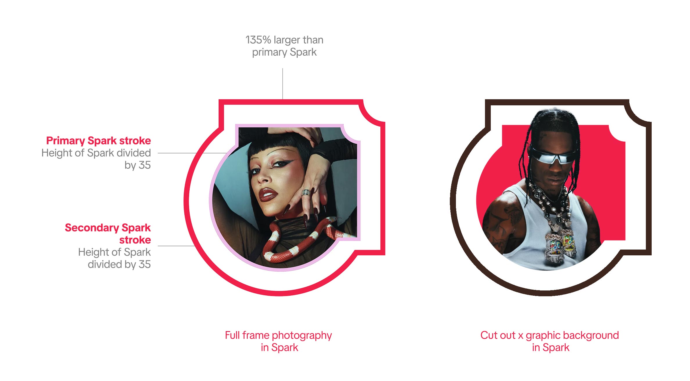
The Halo treatment takes the Spark and pushes it to its most expressive edge. By outlining the form with a bold inner stroke and layering multiple rings, it transforms the Spark into a stage light, an aura, a moment of emphasis. The choice of stroke thickness is carefully proportioned to the Spark’s size so it never feels heavy or clumsy. This creates a rhythm where the primary and secondary outlines work together, one crisp and structural, the other looser and more atmospheric. Color is what turns the Halo from a technical device into a visceral one. Pairing two distinct hues, always with one drawn from the primary palette, creates a vibration that feels alive on screen and in print. The double stroke variation heightens this effect, producing a sense of depth and movement even when static. Against a dark background the Halo glows, almost humming with energy, while on lighter grounds it provides contrast without losing clarity. The interplay of color is not random but intentional, a way to reflect the vibrancy of TikTok’s culture while maintaining legibility and balance so that it works across different mediums and use cases on web, social, campaign or OOH and more.

The result is a design behavior that does more than decorate. It signals importance, draws the eye, and sets a tone. When applied to artists, creators, or key brand moments, the Halo amplifies their presence in a way that feels celebratory but never gratuitous. It is technical in its construction yet emotional in its impact, which is what makes it a signature tool in the refreshed system. The halo expression of the Spark works because it turns a structural device into an emotional one. By introducing layered outlines with heightened saturation, the form takes on a presence that feels more like a stage light than a border. It is not only about visibility but about amplification, lifting creators, artists, and cultural moments into focus with an energy that feels unmistakably TikTok. The color logic is deliberate. Saturation is pushed so that every tone holds up against a spectrum of backdrops, digital or physical. This discipline keeps the Spark alive across surfaces while the expressive stroke treatments ensure it never falls flat.
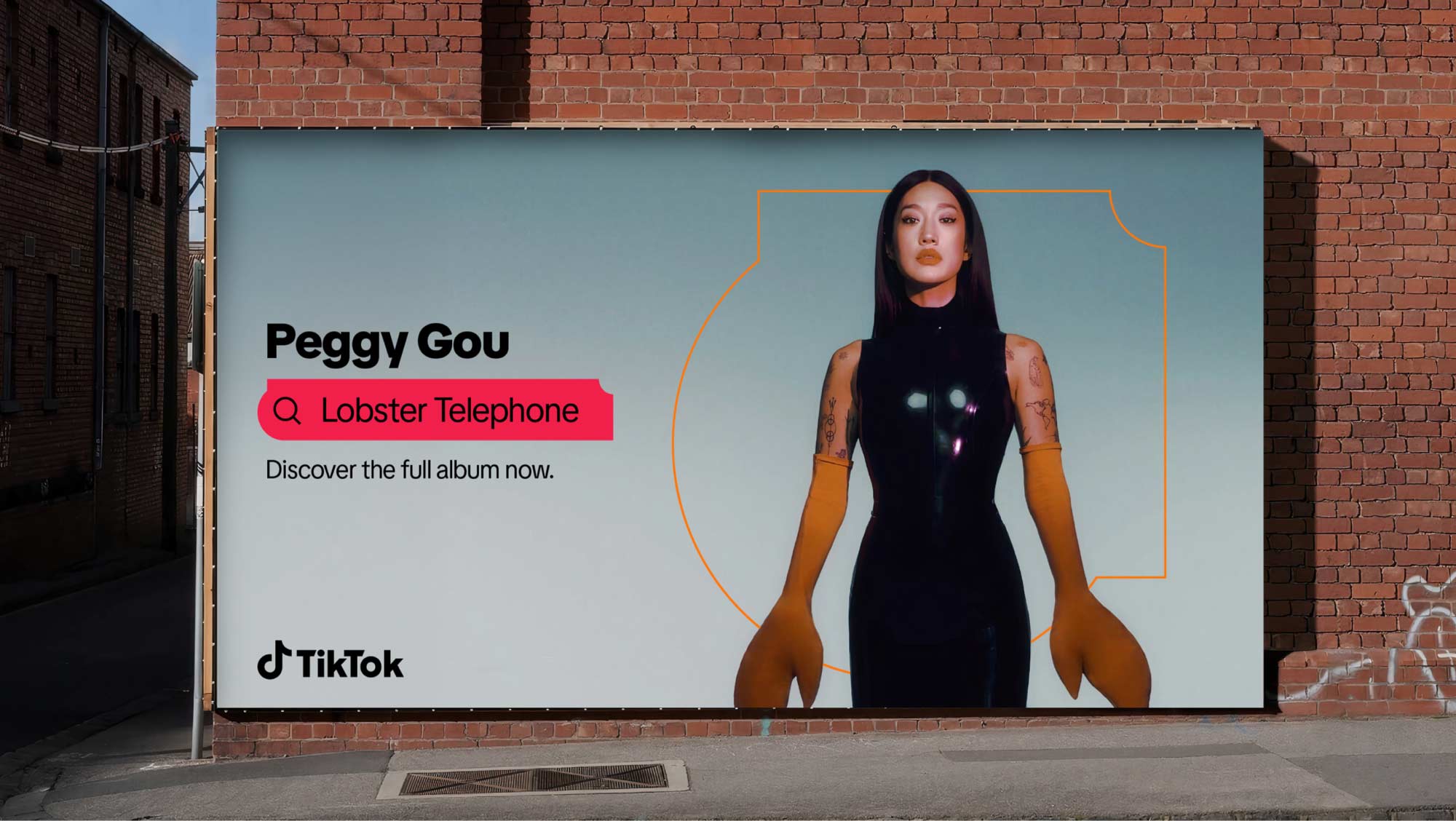
Music has always been at the heart of TikTok’s identity, shaping the way people connect, create, and discover culture on the platform. Every sound, beat, or remix becomes a gateway to storytelling, giving artists and audiences new ways to interact in real time. TikTok has become a launchpad for emerging talent and a cultural amplifier for established musicians, turning snippets of songs into global anthems that drive charts, trends, and brand movements. For creators, music is the emotional glue that ties together visuals and ideas, while for brands it serves as a bridge to authenticity and participation. The way people discover and share songs on TikTok is a reminder that sound is not just background but a language that fuels creativity and community. It is one of the most powerful expressions of the brand’s mission to inspire imagination and bring joy through participation, proving that music on TikTok is both the soundtrack and the soul of modern culture.

When translated into campaign work, the Spark becomes a connector between intimacy and scale. It can carry the raw immediacy of a single creator’s presence and still hold its own in the noise of outdoor environments. What makes this powerful is not the shape alone but the rhythm created when it sits alongside supporting content, short verticals, textures, or social proof that mimic the platform experience. In these moments the Spark is not decoration. It becomes infrastructure for storytelling, guiding the eye while keeping the energy of discovery intact. These core pillars coming through the visual identity was an important part of the toolkit development.
When DixonBaxi first presented the Spark shape, my reaction was cautious. It felt unfamiliar, almost like a baseball diamond, and I wasn’t immediately convinced it could carry the weight of becoming the foundation of our brand system. At first glance it seemed bold but perhaps too singular, and I wondered whether it had the range to flex across the variety of contexts TikTok demands, from creator-first expressions to B2B communications. As the work progressed, I had to sit with it. The user side was actively experimenting, bringing prototypes into our shared sessions, while the business side of the house, myself included, raised questions and floated alternatives. There was a natural tension in those conversations. We were protecting brand equity and consistency, while they were pushing for something that could stretch and feel fresh. That back and forth forced us to test the Spark against real-world scenarios rather than treating it as a purely theoretical device.
The breakthrough came when the Spark moved beyond static design. Once we saw it in motion, framing creators, opening up as a portal, and carrying layered imagery, it no longer felt like an odd geometric flourish but a flexible tool. The clipping mask applications showed how it could transform content without overpowering it, and the layered treatments demonstrated depth and playfulness. That was the moment it clicked. What once looked like a rigid outline started to feel alive, a shape that could belong equally to creators, brands, and the platform itself. Over time it grew on me, and I began to see how essential it was to the refresh.

While DixonBaxi was refining the Spark and putting forward their vision, the Global Brand Studio was already moving in parallel. Our team wasn’t waiting on a single reveal or handoff, we were actively testing, building, and weaving the early elements of the system into real designs. That meant trialing the Spark in decks, layering it into event visuals, and stress-testing it inside enablement kits that needed to scale across regions. By working in tandem, we were not only evaluating the potential of this shape but also shaping how it would actually live inside the broader organization. All of this work was going on in parallel and in a deeply collaborative self referential manner.
This dual-track process mattered because TikTok’s creative ecosystem is massive, spanning product, marketing, partnerships, and local market activations. A brand device that looked strong in a keynote would fall apart if it didn’t integrate into the templates and tools that teams across the world rely on daily. The Global Brand Studio became the bridge, translating the abstract design principles into usable assets, and feeding those insights back to the design partners. It was less about rolling out a logo in isolation and more about embedding a system into the workflows that drive how TikTok shows up globally in a systemic manner, even for edge cases and novel use cases.
In that sense, the Spark was never just about one shape. It became a symbol of scale and unification, showing how a single device could move across different contexts without breaking. The process of implementing it through toolkits, libraries, and design governance was a step toward coherence at a level TikTok hadn’t fully achieved before. It marked a shift from fragmented regional adaptations to a shared, living system, one that could flex across creators and commerce, play and polish, without losing its core identity.
Once it proved itself as a versatile device, it became the seed for a larger shape system that extended the brand’s visual language. The curves, angles, and proportions of the Spark informed how secondary forms like the Canvas, Scroll, Handle, and Notch were drawn. Each of these shapes carried the same DNA, which meant they could be deployed across different use cases without feeling like a departure from the core identity. By rooting everything in the Spark, we created a system where the brand could flex while remaining cohesive. What began as a symbol of discovery evolved into a framework that could carry typography, imagery, and interaction. It created a shared grammar across teams and contexts, ensuring that no matter the format or audience, the brand always spoke in a unified visual voice.
The most direct expression of this system was the creation of the Discovery Bar. It took the familiar shape language rooted in the Spark and translated it into a functional tool, one that could frame text, guide navigation, and signal interaction. Designed for clarity, the Bar became a natural extension of how users already explore the platform, now elevated into a core brand device. Its strength comes from simplicity. The proportions adapt without losing form, expanding or contracting depending on whether it carries a single word or a full sentence. The consistent treatment of typography within the Bar gives writing a unified voice across every channel, from campaign billboards to in-app surfaces. Because of this, the Bar acts as both container and compass: a place where the system’s visual character meets the practical needs of navigation, communication, and accessibility. With search becoming a core tenant, and one of the first places people often go when they open the app, we knew we had to integrate it into our visual toolkit.
Search on TikTok had evolved into more than a feature. It became one of the clearest demonstrations of how the platform had changed user behavior worldwide. People were no longer turning to traditional engines first. They were searching TikTok because they trusted content that came from peers, creators, and communities. Reviews felt lived-in, recommendations were rooted in real experiences, and everything from restaurants to toys to books to entire travel plans could be discovered through the lens of culture rather than commerce. That immediacy and authenticity became one of TikTok’s strongest value propositions and a story we wanted to tell clearly in the refresh.

Discovery was established as a foundational principle of the design system, serving as both a creative and structural driver. The framework was intentionally designed to reflect TikTok’s core value of serendipitous exploration, embedding flexibility and modularity across motion, typography, and compositional grids. The Discovery Bar was not just a container for text. It framed curiosity, spotlighted recommendations, and gave tangible form to the idea that TikTok is where people start. In doing so, it reinforced search as a cultural habit while also becoming one of the most recognizable tools in the system. It was a moment where the design work mirrored the behavioral truth of the platform, aligning user instinct with brand expression in a way that felt inevitable once you saw it in place.
This ensured the system could scale globally while maintaining local relevance, enabling audiences to encounter content in ways that feel fresh and intuitive. By architecting discovery into the visual language itself, the design system reinforced TikTok’s positioning as a dynamic platform where culture is not only consumed but continually uncovered and redefined. Unlike Google, where results are optimized by algorithms and websites, TikTok’s search is driven by lived experiences, creators’ voices, and the authenticity of UGC. That changes the psychology of how people trust what they find. Search on TikTok is not a sterile index. It is a living archive of recommendations, unboxings, hacks, and firsthand reviews. That distinction made it vital that our brand system reflected search as an act of participation in culture, not just navigation of it.
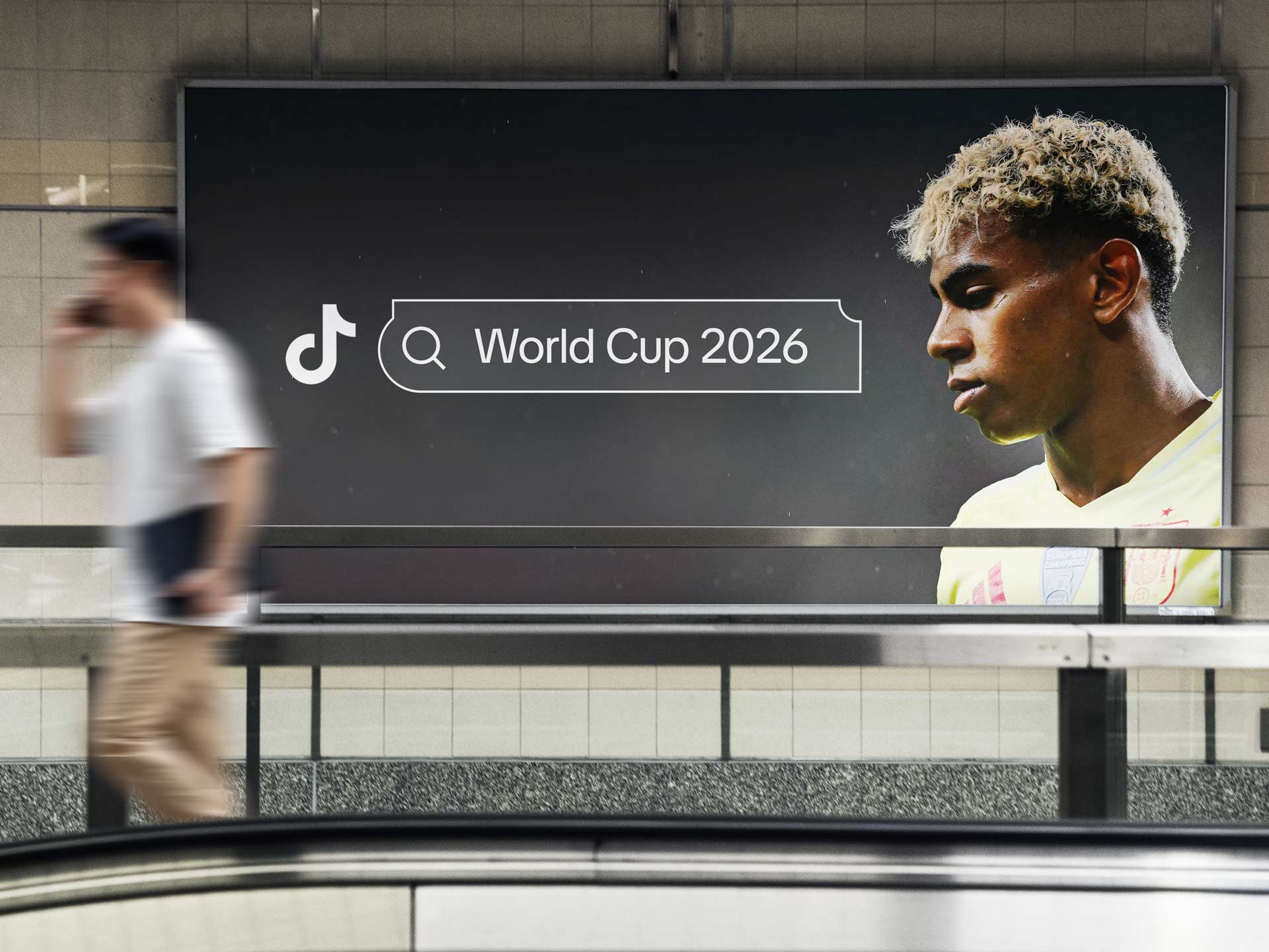
Future proofing also meant designing with an eye toward the calendar of global culture. In 2026 the FIFA World Cup will dominate the world’s attention, and TikTok is positioned to be the arena where fans, brands, and creators converge. Search will play a pivotal role in that moment. People will not only watch matches but search for highlights, jerseys, fan experiences, travel tips, and local celebrations. The Discovery Bar and the expanded system around it had to be built with this in mind, capable of handling spikes in global activity while maintaining clarity, speed, and consistency across markets.
Search inside TikTok is not an isolated tool, it is woven into the same feed that drives the entire ecosystem. Sports highlights, music drops, film clips, emerging creators, and shopping moments all live side by side. When people search, they are not stepping out of the experience into a static results page, they are pulling the thread of a story already in motion. A basketball fan might arrive looking for last night’s game and end up discovering a sneaker drop. A film clip might lead to an edit trend, which leads to tickets being bought. Search on TikTok does not sort content into lanes, it collapses them into one living feed where categories blur and influence crosses over.
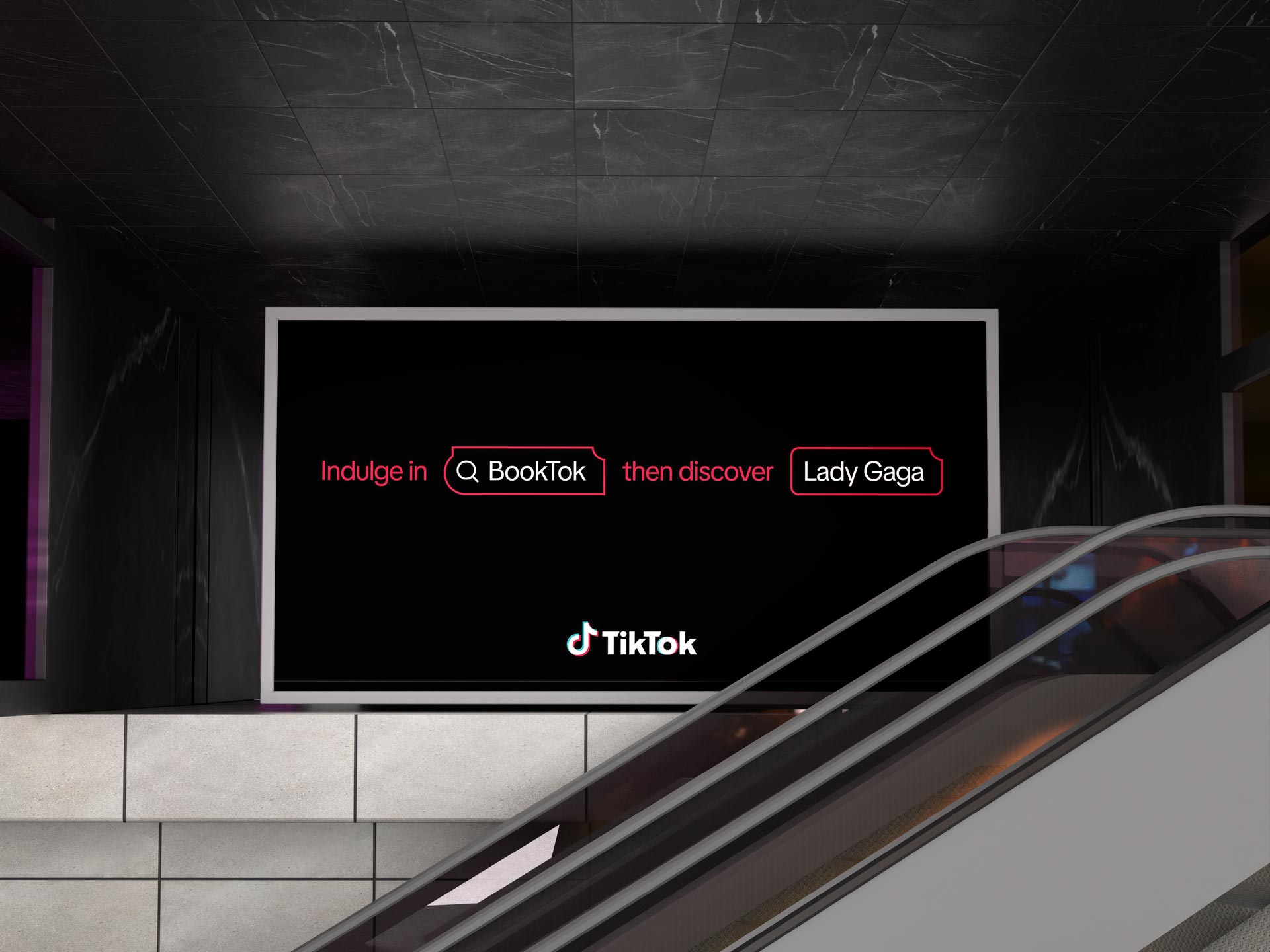
Discovery sat at the center of the brief we shared with DixonBaxi, not as a slogan but as the organizing principle for the entire identity. We emphasized that TikTok was not only about finding new music, creators, or trends, but also about rediscovering pieces of yourself through community, culture, and play. The brand system needed to reflect that duality, creating a flexible design language that could feel spontaneous and surprising while also structured enough to guide billions of people through their own journeys of exploration. Discovery was the lens that shaped every creative decision, from typography and color to the development of the Spark and the Discovery Bar, ensuring that the system always returned to the idea of opening doors and sparking curiosity.
What makes TikTok unique is that discovery on the platform does not sit in a silo. The same mechanics that launch a dance or a meme also drive shopping lists, travel itineraries, and playlists. Search becomes the connective tissue between culture and commerce, moving seamlessly from curiosity to consumption. That bridge is what this system captures: the way a spark of interest, whether a book review or a music clip, ricochets into new worlds of art, influence, and purchase.
If users were already treating TikTok as the top funel of content and viral discovery of art and music then they were also using it as the place to search for sneakers, skincare, or travel spots, then advertisers needed a brand framework that legitimized those behaviors as high-value commercial moments. Search Ads became the tool to translate that trust into performance. But the visual system had to make those experiences feel natural, not forced. The refresh gave us a way to encode search into the visual language of TikTok itself, making it recognizable both as a design device and as an invitation for brands to enter conversations without disrupting them.
Around this time we also developed a national ad campaign and television spot to highlight the spot that discovery has in becoming the new engine of search for our culture thanks to TikTok with an extremely compelling story around the rise of Booktok and how creators have created countless communities that drive commerce and online discovery. Discovery is the invisible engine that powers TikTok’s entire ecosystem, shaping how culture circulates, ideas spread, and communities form in real time. On BookTok, this dynamic has transformed reading from a solitary pastime into a shared cultural movement rooted in emotion, curiosity, and connection.
Instead of relying on publisher campaigns or traditional critics, users encounter books through raw, personal moments such as someone crying mid-chapter, annotating the margins, or pairing a passage with music that captures its tone. The algorithm amplifies these moments by prioritizing genuine engagement over prestige, allowing a debut author’s novel to sit beside a literary classic purely because readers felt something and passed it on. This loop of discovery creates trust and momentum, inviting readers to explore genres and authors they might never have considered. The same principle shapes TikTok at large, where people come not to find what they already know but to stumble upon something they did not know they needed. In this way, discovery becomes the heartbeat of the platform, a living system that connects human curiosity to creative expression and makes the act of searching itself feel spontaneous, intuitive, and alive.

Books on TikTok exist in the same creative current as music and sound, where emotion becomes the language of discovery and stories are felt as rhythm, cadence, and atmosphere as much as they are read on the page. A rhythm begins quietly, spreading through color, motion, and form until it connects everything around it. On TikTok, music moves beyond sound to become a unifying force that ties fashion, beauty, and storytelling together in a single creative current. Within the brand refresh, this connection takes visual shape through elements like the discovery bar, which acts as a dynamic thread linking verticals and helping people move fluidly between what they hear, what they wear, and what they create. The gradients, layered compositions, and modular grid echo that sense of cultural flow, representing how inspiration circulates across the platform. Music may begin as sound, but on TikTok it transforms into the architecture of discovery itself, turning creativity into a living ecosystem.
.jpg)
Music, discovery, and search exist as parts of one continuous current within TikTok’s ecosystem. They move together, blurring the line between intent and serendipity. Someone might begin with a sound in their head or a feeling they cannot name, and through scrolling, remixing, or exploring, they uncover something unexpected that feels personal and new. A song becomes a portal to creators, a challenge, or a movement that connects strangers through rhythm and shared emotion. Discovery happens both by choice and by chance, revealing how the act of searching is rarely linear and often emotional. The more people explore, the more the system learns to reflect their curiosity back at them, not as data points but as possibilities. Music fuels this cycle, giving shape to moments, trends, and identities that travel beyond the screen. It is an ongoing conversation between the listener, the creator, and the culture itself, unfolding in ways that keep the platform alive with connection and surprise.
.jpg)
A major focus of the refresh was the development of verticalized event templates for priority industries, from gaming and beauty to financial services and beyond. Each vertical demanded its own nuance in tone, visual style, and narrative framing, yet all had to remain rooted in the same refreshed system. Overarching toolkits were created that gave sales, marketing, and events a consistent base to work from while layering in tailored treatments for each sector. By creating this family of verticalized event templates within one universal structure, we allowed teams to scale campaigns and activations globally without losing the specificity that makes each industry feel authentically engaged. It turned the brand refresh from a static set of guidelines into a flexible operating system that could flex with the needs of every market and partner conversation.
By treating search as a cornerstone of the refresh, we ensured the brand could hold its ground when the world’s biggest stages light up. The design system anticipates those moments where billions of impressions are at stake, when brands want to insert themselves into the conversation and fans want to find the exact clip, product, or community that matters to them. The refresh prepared TikTok to not only host culture but to organize it, ensuring that at times of peak global attention the platform looks and feels cohesive, reliable, and open for both discovery and commerce. Our team developed toolkits, event franchise collateral, and enablement materials based on this north star.
The verticals project was one of the most ambitious undertakings of the entire refresh, requiring input, alignment, and execution across a massive cross-functional team. Each vertical represented a world of its own with unique audiences, partners, and cultural codes, and the challenge was to build a system that could respect those nuances while still feeling unmistakably TikTok. It was not only about design but also about creating a scalable foundation for marketing, sales, and events teams in every region to use with confidence. This level of integration demanded a deep collaboration between design, brand, and business stakeholders, underscoring the importance of strong direction and brand stewardship to keep the system coherent. A key part of bringing the verticals to life was the development of bespoke 3D icons that could serve as recognizable anchors for each industry, from gaming and sports to beauty and financial services. My direct report Joy Seet led the effort to create these icons, carefully designing each one so that it captured the essence of its vertical while working seamlessly within the refreshed brand system.
.jpg)
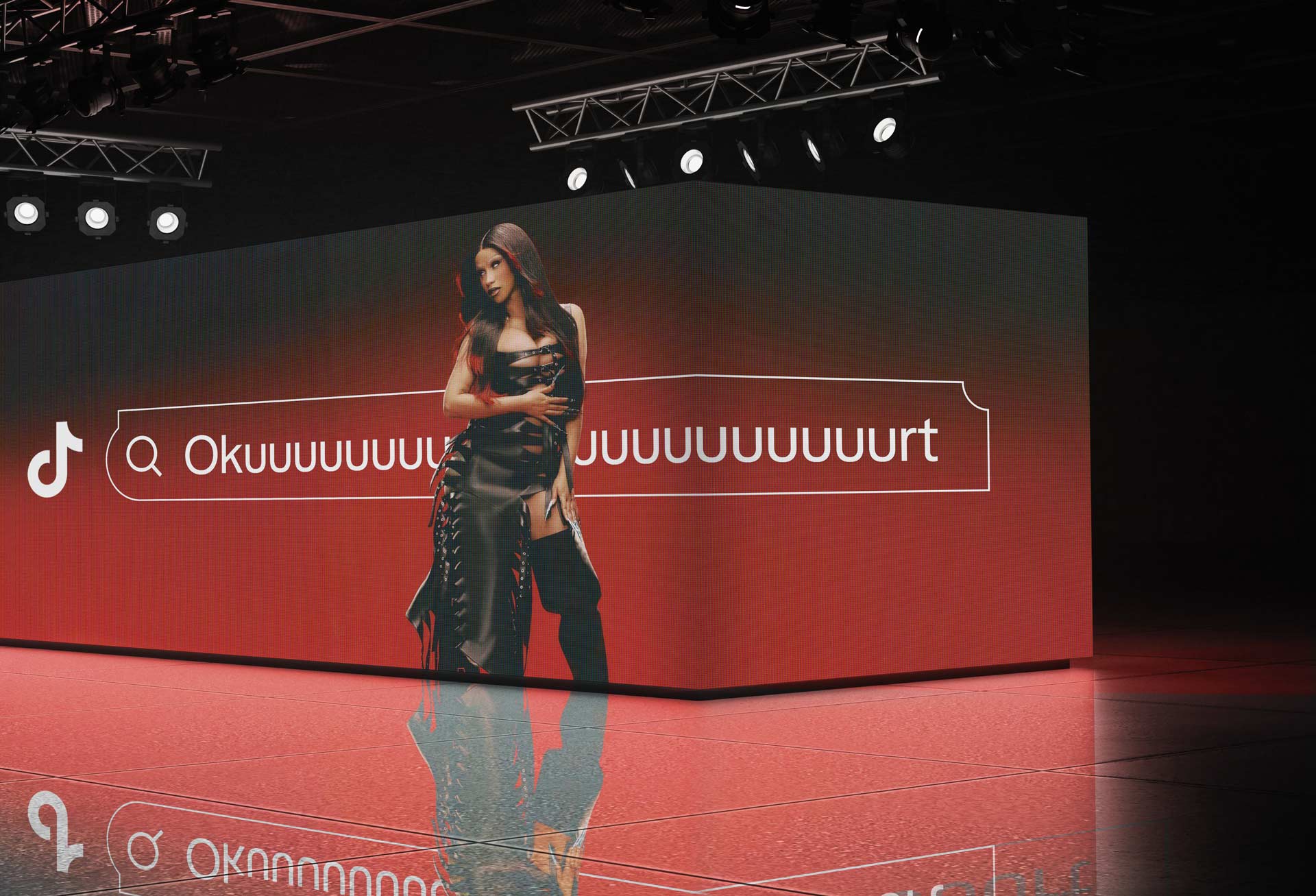
This is where the power of the platform comes into focus. Unlike traditional search that responds to intent with information, TikTok responds with culture. The query is less a question and more a spark that pulls together sports culture, music fandom, lifestyle content, and commerce into one continuous experience. The feed itself becomes the answer, layered with personal relevance and collective trends. For brands, this means being present not only when people are searching for them directly, but when the curiosity of culture brings audiences to their doorstep. From Cardi B to Caleb Williams, and every product that connects them in the six degrees of separation, TikTok search reveals how culture, sport, music, and commerce all collapse into one continuous ecosystem of discovery.

Sports on TikTok embodies the perfect dichotomy. The game itself is only the entry point. Around it lives the broader ecosystem that fans actually consume: the player’s diet routines, the tunnel fits that signal fashion trends, the sneaker drops that move from hardwood to streetwear, and the behind-the-scenes moments that humanize stars. All of these layers blur into one feed, where performance, personality, and product feed off each other. It is not only about highlights, it is about lifestyle storytelling that spans wellness, style, music, and culture in a single stream. Creatively, and from a B2C and B2B standpoint this is where our paths all converge.

This blending of content types is precisely what makes TikTok central to how people search today. The search bar does not just return scores or stats, it surfaces the sneakers the player wore, the restaurant they were spotted at, the soundtrack to their pre-game routine. For fans, this is a richer search experience, one that fuses culture and commerce. For brands, it is a signal that last-click attribution is outdated. Audiences are not moving linearly from search to purchase, they are entering TikTok to discover, explore, and then buy. Search here is not the end of the funnel, it is the starting point where decisions are shaped by community, creativity, and culture.
TikTok’s partnerships with Nielsen and other attribution experts have been critical in proving what we already knew intuitively: discovery drives commerce. Last-click attribution was never going to capture the full picture of how people move from culture to consumption. On TikTok, a soccer highlight can ignite a search for outdoor activities, which surfaces publisher ads, and before long someone is buying a brand-new Nike Mercurial boot through TikTok Shop. This flow from spark to search to purchase shows how vertical integration is not only possible but essential to the platform’s future revenue model.

Search on TikTok is less about a single query and more about opening an entire branching ecosystem of possibilities. Unlike traditional search engines that return static lists, TikTok predicts and shapes a user’s journey through patterns of behavior, cultural signals, and content cadence. The platform is designed to anticipate the rhythm of what someone might want to see next, whether that is another highlight from last night’s match, a recipe that a player swears by, or a look at the sneakers they wore walking into the arena. This predictive approach unlocks not one path but many, where discovery flows outward like branches from a single search point.

What makes this system powerful is that every branch carries the potential to convert culture into commerce. A search for new music might lead to a behind-the-scenes clip from a festival, which surfaces styling ideas, which then unlocks ads for brands that match that vibe. In sports, a search for a favorite team can move seamlessly into athlete lifestyle content, brand sponsorships, and ultimately a purchase decision. Each path is connected, each branch informed by the cadence of what resonates most with the user, and TikTok’s predictive design makes these leaps feel natural rather than forced.
TikTok’s design system collapses the traditional distance between browsing and buying. What begins as a visual language of shapes, typography, and color becomes a framework that guides behavior inside the app and across touchpoints. The same grammar that makes a video feel spontaneous and playful is also what makes a product feel instantly desirable and shoppable. UI patterns like the Discovery Bar or the Spark don’t operate in isolation. They echo out into physical campaigns, live events, and brand collaborations, creating a seamless feedback loop between what people see on their screen and how they experience culture in the world. Commerce is not bolted on top of content but woven into the cadence of discovery and content consumption, as this all lives within the feed.
This is where TikTok’s position in the attention economy becomes clear. The same feed that turns a new track into a viral moment is also the perfect environment to sell the headphones listeners will use to play it, all while they scroll tiktok as a second screen experience where they watch a clip of a twitch streamer reacting to the same song, showing how music discovery and product discovery naturally converge on TikTok. The ecosystem is ripe for the likes of creators, brands as well as artists who are looking to join in on the conversation. It's all connected, from the way we creatively express our brand, to the ecosystem and platform that we build for brands and creators.

The design system is not only about aesthetics or consistency but about enabling flow. It shapes how a user moves from a dance trend to a sneaker drop, from a music clip to a festival ticket, from a skincare tip to a direct purchase. Culture and commerce no longer run on separate tracks. They move together through a unified design language that anticipates curiosity and channels it toward action. This is not a brand separating culture from transaction but one that shows how the two feed each other. A creator’s recommendation shapes taste, which turns into demand. A trend drives not just participation but sales. The Discovery Bar frames that loop visually, not as a cold function of keywords but as an invitation to explore. In doing so it makes search feel less like a utility and more like part of the cultural conversation, giving brands and audiences a shared stage where curiosity naturally leads to action. The imagery works without words, which makes it an extremely powerful brand visual.

The search bar became one of the most universal elements we could work with. It is instantly understood regardless of language or region, and that simplicity gave us an enormous advantage. For TikTok, it meant we could use a single visual device to anchor an entire ecosystem, from culture and entertainment to commerce and utility. That universality also meant that when we aligned it with TikTok Shop, it was not just a functional tool but a bridge into discovery-driven shopping. The same gesture of typing curiosity into the bar could spark a journey that starts with content and ends with a purchase, collapsing what were once fragmented steps into one seamless loop.

One of the reasons the discovery bar became such a critical piece of the identity was its ability to transcend language and geography. A search field is universally understood as a place to begin a journey. Whether you type in Hangul, Hindi, Arabic, or English, the action is the same and the intention is clear. That meant we had a single UI gesture that could unify audiences across wildly different regions. In markets where text-heavy interfaces can overwhelm, the simplicity of a clean bar with a prompt invited exploration without cultural friction. In others, where commerce or entertainment habits were already shifting to mobile-first, the bar instantly felt familiar, lowering the barrier to entry and reinforcing trust, but no matter where you go around the globe there is an understanding of the meaning which is huge for us as a creative team.

For a platform as global as TikTok, this was a massive selling point. It gave us a way to communicate consistency without enforcing sameness. The bar could flex with local typography, color pairings, and creative treatments while remaining recognizable as the core gateway into discovery. That balance was key. Brands and users alike could feel that TikTok was speaking their language, yet still part of one shared ecosystem. For us internally, it became an anchor around which to build design systems that scaled, letting the search reference serve as both a functional tool and a cultural signifier. In many ways, it was proof that design could be both universal and deeply local at once, and that duality was one of the strongest cases we made in positioning TikTok’s brand for the future.
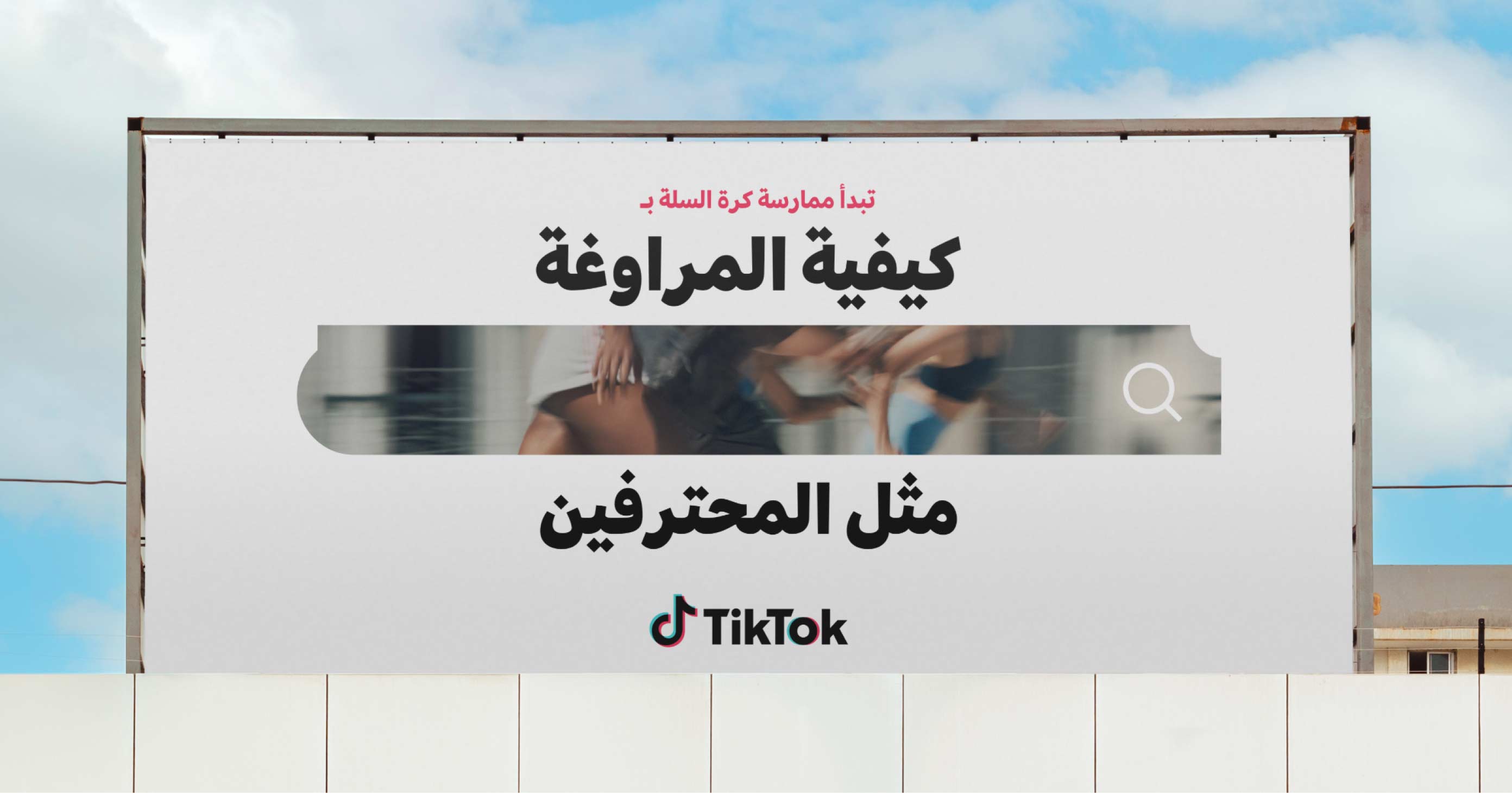
The universality of the discovery bar was not just about a shared visual gesture but about true adaptability. It functioned seamlessly in both left-to-right and right-to-left scripts, maintaining the same clarity whether in English, Arabic, Japanese, or Thai. This flexibility was crucial for a platform as global as TikTok, ensuring that users across regions experienced the same sense of immediacy and accessibility. The design’s balance and simplicity made it instantly recognizable while still leaving room for cultural nuance, which gave us confidence in deploying it everywhere from São Paulo to Tokyo to Bangkok without compromise.

Designing for METAP was about more than translation. It was about learning how light, language, and climate all shape what good design means. Arabic script carries its own rhythm and balance, so we built a dual-language system that treated it as central to the composition rather than an afterthought. Every curve and counterspace was tuned for readability and respect for the script’s natural flow. The region itself offered lessons too. In desert heat, black vinyl doesn’t just fade, it can soften and melt, warping the work before an audience even sees it. That reality pushed us to rethink color and material choices, building lighter variants with white and off-white bases that reflected heat while preserving contrast and clarity. Moving away from the dark-heavy look of earlier templates became both a design evolution and a practical adaptation, proof that creativity can live beautifully within environmental constraints. This is one of those things you don't realize unless you have experience in the region.
.jpg)
Designing the regional toolkits meant creating visual systems that could respond to light, space, and texture while staying true to the brand’s essence. The foundations were intentionally bright and open, using layered whites, gentle layouts, and matte finishes that performed beautifully in luminous venues. Inspiration came from the region’s architecture and craft traditions, where slatted wood, brushed metal, and soft sand-toned textiles offered both warmth and restraint. The visual rhythm extended from the toolkit to the stage itself, where furniture, materials, and screen design shared a common language of quiet sophistication. The result felt balanced and intentional, a system that worked in harmony with the physical world rather than against it. This was all thanks to heavy regional collaboration and regular check ins with their teams.
.jpg)
In the decks and environmental templates, movement and clarity came together through the grid, the discovery bar, and layered modules that housed tags and text in clean, structured alignment. The color palette leaned toward luminosity, with Glint, Blaze, black, and white working in unison to emphasize space and legibility. These principles shaped not only screens but the entire experiential flow, giving teams a way to design with sensitivity to culture, light, and climate. Each decision, from motion cues to material finishes, contributed to a coherent atmosphere that reflected the energy of the region and the spirit of discovery at the heart of the brand.

Out of home and campaign work pushed the Discovery Bar beyond its everyday role in the app and turned it into a stage for storytelling. On billboards, subway wraps, and event takeovers, the bar became a bold graphic anchor that could house both content and messaging. Its simple geometry meant it scaled without losing clarity, whether stretched across a digital screen in Times Square or set against the side of a festival stage. By framing content inside the bar, campaigns were able to immediately signal “this is TikTok” while delivering messages that felt native to how people already interact with the platform.
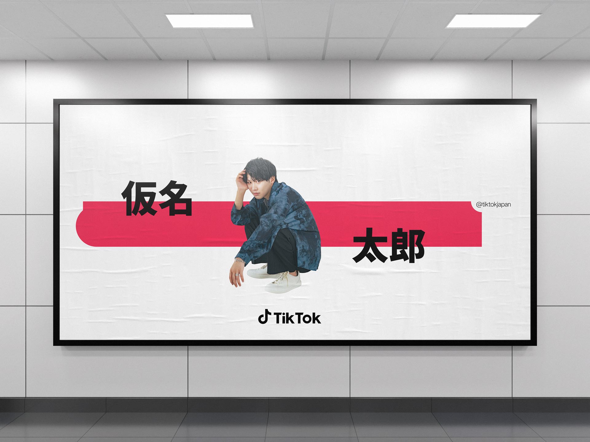
In Spanish-language campaigns, the Spark shape took on a more expressive role, adapting fluidly to the tone and rhythm of regional storytelling. The Handle and Tag Bar system allowed the language itself to become a design element, where words carried both semantic meaning and visual presence. The form balanced bold typography with spacious composition, making every creator handle and phrase feel intentional, lyrical, and alive. This adaptation showed how the same design logic could move seamlessly across languages, maintaining the integrity of the brand while honoring local voice and cadence.
.jpg)
In campaigns, the Discovery Bar also offered a way to tie product, culture, and call-to-action together in one device. A search prompt could be filled with trending phrases, artists’ names, or cultural hooks, turning what is usually a functional UI into a brand moment that feels playful and interactive. Marketers leaned on this device to connect commerce with culture, embedding product discovery into the same format where fans search for memes, creators, or music. This versatility allowed the Discovery Bar to bridge the gap between user behavior inside the app and TikTok’s storytelling outside it, making campaigns feel both familiar and fresh.

The Spark shape did not remain confined to the center stage of the design system. It evolved into a modular language that extended into new forms, most notably the Discovery Bar, and then further into the Handle and Tag Bar. In the Discovery Bar, it served as a container for search itself, a place where curiosity is given form and context. That same DNA then carried through into the way we displayed creator handles and hashtags. The Spark’s distinct notch became the visual anchor for the Handle and Tag Bar, a subtle but recognizable cue that tied every element back to the core identity. Without the search icon, these bars stood on their own as clean, ownable shapes, instantly signaling TikTok while still being functional tools for navigation and engagement. This progression showed how one device could scale across very different use cases, from search to identity to cultural tagging, always keeping the brand cohesive without limiting its flexibility. The brand system is all about both utility as well as flexibility.

The design system brings together color, typography, and structure in a way that feels alive and intuitive. TikTok Sans serves as the central voice of the brand, balancing geometric precision with warmth and rhythm. The palette centers on Glint and Blaze alongside deep black and white, creating contrast that moves like light across surfaces. These tones are used to signal energy and focus rather than decoration, guiding how the eye travels through motion and still design. The spark shape interacts with the layered grid and discovery bar to suggest movement and curiosity, forming a visual path that feels both natural and dynamic. Tags live within bars that float above the composition, distinct from text overlays but part of the same visual conversation. Each layer contributes to the sense of rhythm and hierarchy, ensuring that content, color, and type always feel connected without losing spontaneity. The grid system holds it all in place, making discovery itself feel like design in motion.
.jpg)
The Spark’s modularity did not end with UI and product surfaces. Its influence carried into the collateral and tools we relied on to communicate as an organization, shaping the refreshed deck system that became a backbone for sales, marketing, content, and events. In many ways, this was a continuation of work I had started in an earlier sprint with our former designer Dana Spomer, when we first proved that presentations could be elevated through a unified design language rather than treated as an afterthought. That foundation showed the value of systematizing storytelling, and during the refresh we expanded it with the full power of the new identity.
.jpg)
I led this effort with Joy Seet and Vanessa Rizk as my direct reports, building on our earlier learning to integrate the Spark, the Discovery Bar, and the expanded palette of color and type into a presentation system that felt both functional and expressive. We worked closely with Jose Hunt, our PM, to structure the rollout and collaborated with Sophie Rosseau and our agency partner Design Force to extend the templates into high-profile decks for external use. The work lived in a central Figma board, a living hub where assets, examples, and guidance were continuously refined. For me, the most rewarding part was seeing how design discipline scaled into enablement: by providing a clear, flexible structure, we freed teams to focus on the story itself rather than wrestling with inconsistent slides. It was a reminder that design leadership is not only about aesthetics but about creating systems that empower others to carry the brand forward with confidence.
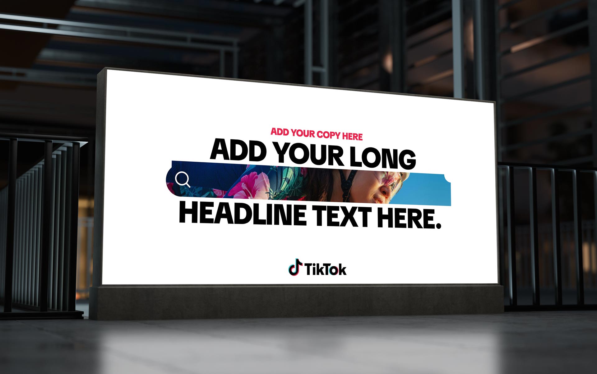
A large part of our team’s remit extended beyond day-to-day collateral into the creation of evergreen event systems, global franchises, and toolkits that could be reused and adapted year over year. These were not one-off campaigns but long-term platforms that needed to carry the same visual discipline and evolve alongside the brand. As Design Director, I was responsible for ensuring that every expression, from a sales deck to a flagship event identity, built upon the guidelines we had established rather than straying from them. Acting as brand stewards, my role was to safeguard consistency across touch points while leaving enough room for regional teams and partners to bring cultural nuance and creative flair into their executions. It was a balance of governance and freedom, and it reinforced the idea that the refresh was not just a set of visuals but an operating system for how TikTok showed up in the world. The system needed to be sustainable and of use for a long time and through many years.
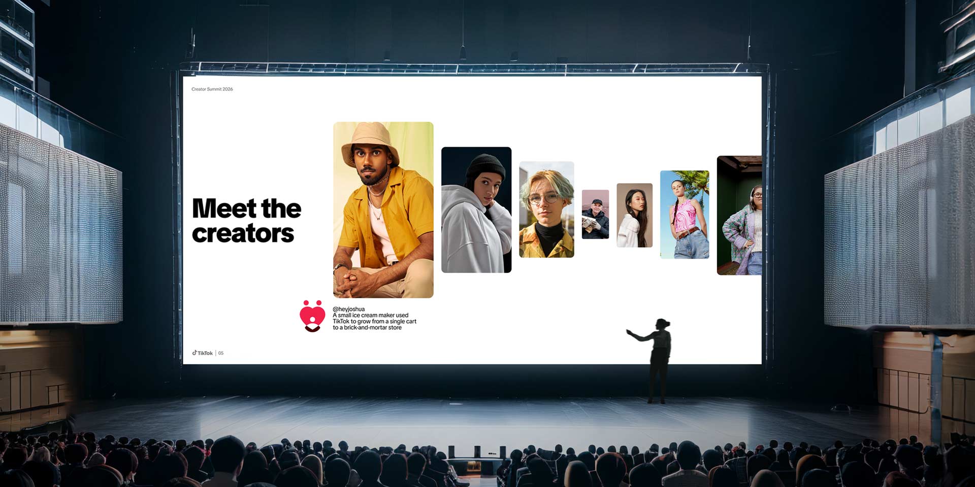
Alongside this, I worked closely with my counterpart Hyunjin Park to police usage and implementation across regions, making sure the integrity of the system held as it scaled. We operated under the guidance of Hamilton Tamayo and Tom Skinner as our Group Creative Leads, aligning our work with their vision while ensuring the brand refresh remained both consistent and adaptable in practice. A major extension of the refresh work was in creating universal templates for the everyday communications that power TikTok’s ecosystem. Beyond the high-visibility campaign assets, we knew that touchpoints like emails, newsletters, and event invites carried just as much weight in shaping perception. These pieces were often the first interaction clients or partners had with us, and inconsistency in their design chipped away at the credibility of the larger system. To solve this, we built a suite of templates that carried forward the same rules of type, color, and Spark-driven framing, but in a stripped-back, accessible format that any team could pick up and use without specialized design support. These tools were key to brand consistency as well as expansion.

By codifying these smaller but high-frequency elements, the system became truly universal. Invitations carried the same recognizable rhythm as a keynote slide, and newsletters felt connected to the same brand family as an event toolkit. These assets were intentionally designed to be modular, allowing for rapid personalization while still locking into the larger framework. In practice, this meant that whether someone was sending a B2B partnership update, a product launch invite, or a simple community newsletter, the look and feel always traced back to the refreshed identity. It was a quiet but powerful way to extend the brand into the daily workflow of the company, ensuring every outward-facing message reinforced TikTok’s voice and presence.

When it came time to reimagine the illustration system, we built on a foundation that already had history inside the company. Mike Hinson had led the original 1.0 illustration guidelines years earlier in collaboration with Oddfellows, and that system had served us well. But for the refresh, we knew we needed something that felt sharper, more modern, and more versatile across an ecosystem that had grown far beyond where TikTok was at the time of the first build. I worked closely with Mike, drawing on his original thinking but steering it into a new phase. We set out to create a style that could flex from playful consumer-facing stories to more polished and corporate expressions without losing its recognizable DNA. This was not a wholesale reinvention but a considered evolution, one that acknowledged where we had come from while pushing into new territory. One of the best things about this was how adept Mike was in terms of the art direction and development, this feel right in his wheelhouse.
Timing was as much of a challenge as design. We were running major projects in parallel, so there was a strategic layer to when and how we introduced the new illustration language. Raisa and the consumer team were essential partners here, as their campaigns would be among the first to use the new style. Together, we mapped a phased rollout, deciding which assets could switch immediately and which would transition later to avoid disruption. That collaboration helped us avoid a jarring handoff and instead created a smooth adoption across teams. A large part of my role was ensuring that our events carried the refreshed look and feel, which meant building toolkits that could be tested in major tentpoles and then scaled across regions. These kits gave local teams a clear framework while still allowing for flexibility, creating a consistent global presence that could adapt to different cultural contexts and help us use budget on elevating the experiences rather than on redundant work by external local agencies.

This was not a one off exercise but a continuation of our role as brand stewards, ensuring that every event from sales summits to cultural tentpoles carried the same level of polish and cohesion. Together we redesigned the frameworks for invites, agendas, recaps, and toolkits so that teams across regions had access to materials that felt both instantly TikTok and adaptable to local needs. Updating the franchises meant revisiting not only visual language but also the workflows that had become entrenched over years, and doing so in a way that respected the equity of past work while setting a new standard.

Working with Joy and Vanessa once again, I led the effort to bring our event templates and evergreen franchises in line with the refreshed system. Kenneth Liew played a key role in helping us operationalize this system by building out the infrastructure for ongoing updates and ensuring the templates lived beyond static decks. We had long recognized, dating back to conversations at the Mexico summit, that one of our biggest pain points was the lack of a single source of truth for brand materials. This had also been a pain point brought up numerous times in our meetings and audits with various regions and cross functional partners as well.
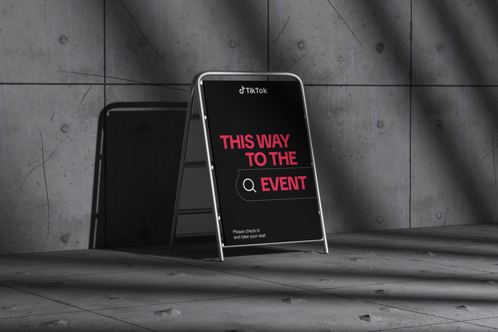
To solve this, we partnered with Sanity.io to create a central repository that gave teams real time access to guidelines, changelogs, and a dedicated TikTok for Business section. The hub turned what had once been a fragmented and inconsistent process into a living platform where new learnings, event kits, and brand evolutions could be distributed globally with clarity and speed. It became a foundation for how we scaled the refreshed brand across every market and business function. From a digital asset management standpoint this was a great way to ensure we had better control over versioning and updates to these franchises as we updated them and released them widely.
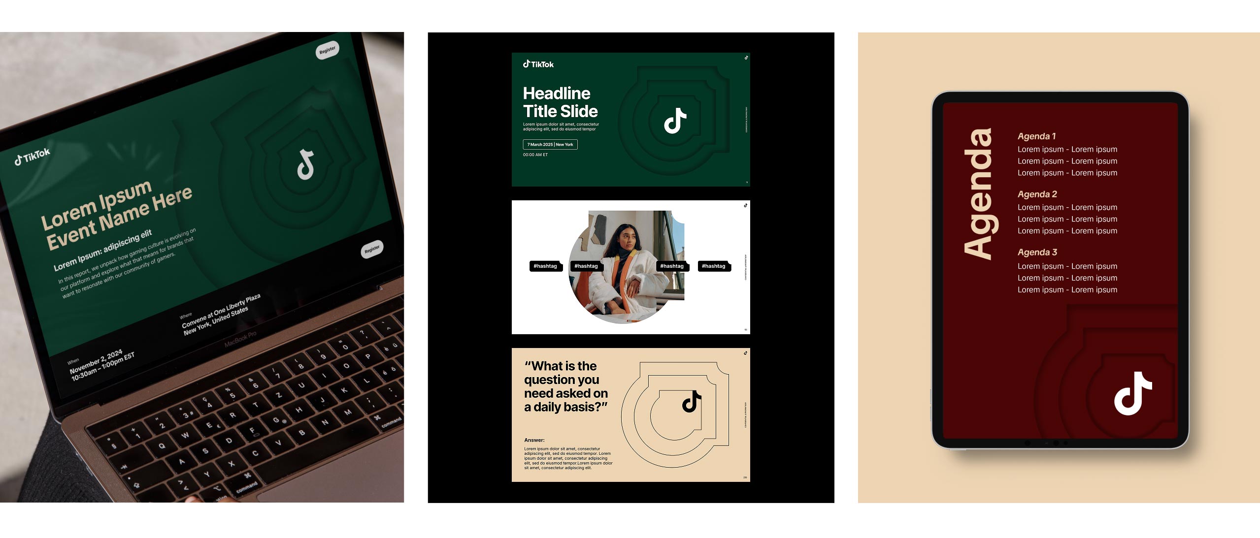
One of the most important pieces of the refresh was updating our executive C-suite summit franchise, an event series designed to speak directly to the top of the industry where the largest ad spend decisions are made. These summits were unlike other events, with a toolkit that leaned into restraint and refinement. The experience was intentionally elevated and minimal, focused on tactile textures, high touch print, and carefully chosen details that signaled exclusivity and authority. In the original buildout I had partnered with Mike Hinson to shape this toolkit during the first brand guidelines update, creating a system that carried weight and prestige without losing the agility of the TikTok brand. As part of the refresh, I worked closely with my direct report Emma Tobin, based in the UK, to bring this system forward into the new visual language.
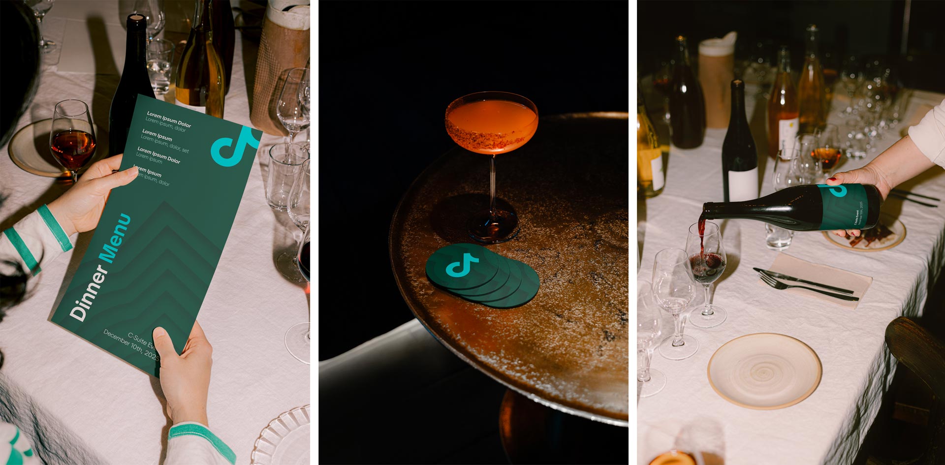
Together we rethought every touchpoint, from invitation design to presentation templates, ensuring the updated Spark, expanded color palette, and TikTok Sans lived comfortably within an aesthetic that still felt premium and understated. This became one of the most utilized event franchise toolkits across the organization, so we knew the demand and importance of this delivery was there. The challenge was to introduce the new identity without losing the balance and polish that had made these summits so impactful in the first place. Emma’s eye for refinement paired with my continuity from the original buildout allowed us to create a refreshed toolkit that felt both evolved and consistent, giving our executives the confidence that the design matched the stakes of the conversations taking place inside the room.
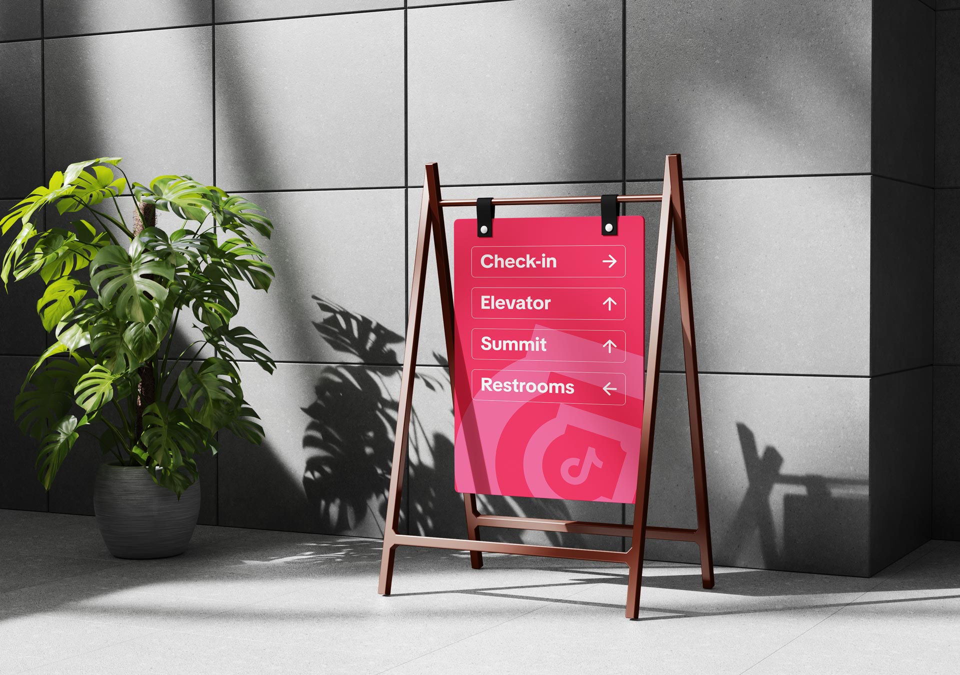
The franchise events became a proving ground for how the refreshed identity could scale. What began as a set of elevated toolkits for executive summits expanded into a broader library that teams across regions could use and adapt. By systematizing the visual language and building it into flexible templates, we gave marketing, sales, and events a foundation that carried the same elevated design standards whether applied in New York, London, or Singapore. The refreshed look and feel anchored by the Spark, TikTok Sans, and the expanded palette was translated into event collateral, presentation decks, and digital touchpoints. This library could be piloted in one market and then rolled out globally with confidence, ensuring that TikTok showed up with clarity and sophistication in every region while still leaving space for local nuance and adaptation.
The refresh was not a project owned by any one group but a shared undertaking across the business and consumer sides of the company, supported by DixonBaxi as our creative partner. Each team brought its own perspective on what TikTok needed to become. The consumer side held the responsibility of ensuring the system worked inside the product and resonated with creators, while our studio was focused on how the brand showed up in the external world across clients, partners, and global stages. DixonBaxi stood in the middle, translating these diverse inputs into a coherent system that could flex across both arenas without losing its core spirit.

What you start to see is not a platform made up of features, but a living system where discovery, culture, and commerce move together in real time. TikTok collapses the old funnel by letting people wander from curiosity to action in a single scroll, where entertainment, community signals, and buying intent sit side by side without feeling transactional. The Discovery Bar, modular grids, and Spark framework are less about UI and more about navigation, quietly guiding people toward what they didn’t know they were looking for. Creator rituals and everyday moments become entry points, giving brands permission to show up in ways that feel native rather than imposed.

In this environment, relevance isn’t bought, it’s earned through proximity to culture already in motion. The system gives brands structure, but it also leaves room for improvisation, which is where the magic tends to happen. What emerges is a feedback loop where participation fuels visibility, visibility fuels affinity, and affinity translates into measurable impact. Search, creators, and shopping are no longer separate behaviors but part of the same gesture, a thumb moving upward in pursuit of something that feels both useful and alive. At its best, the platform feels less like media and more like a crowded night market of attention, where stories, signals, and transactions blur into one.
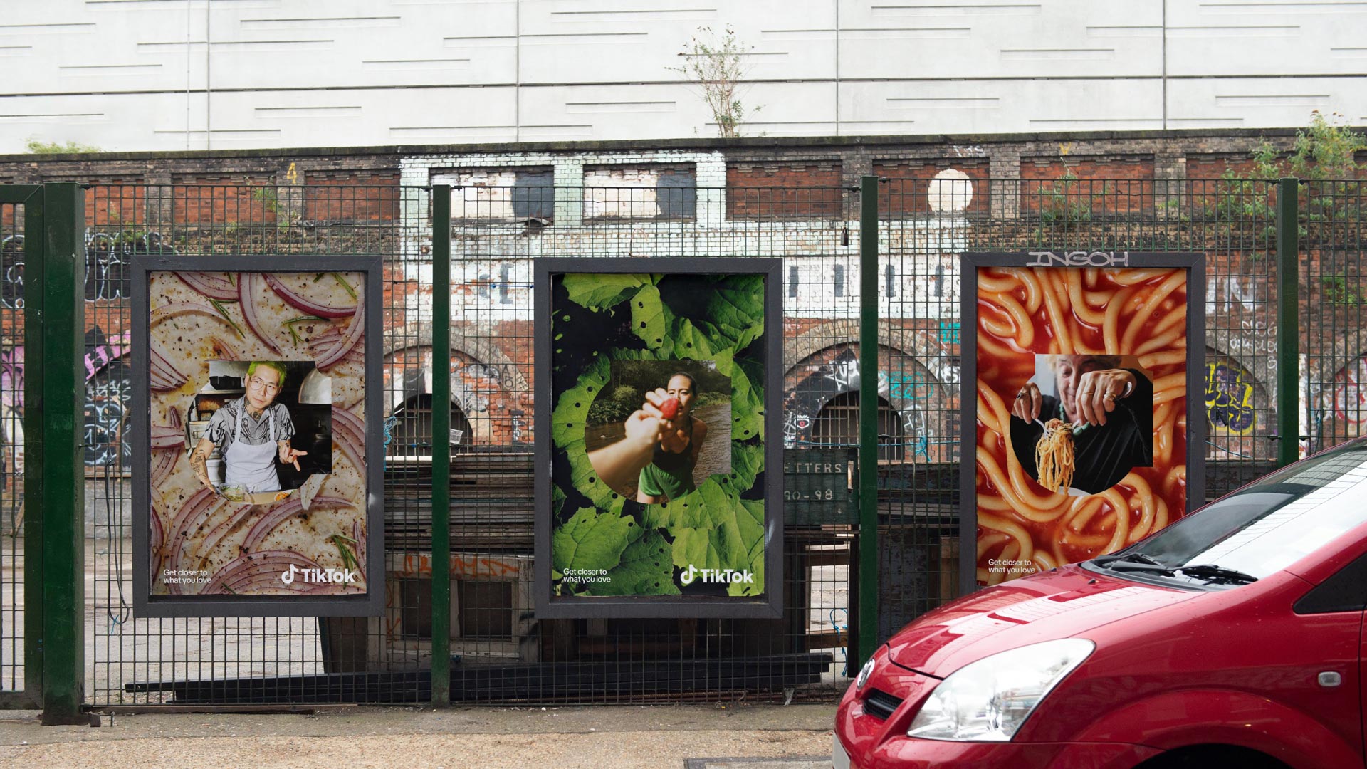
The brand refresh was not a single launch or a fleeting campaign, it was the setting of a foundation that will continue to shape the way TikTok lives in the world for years to come. To reimagine an identity at this scale was to recognize the platform’s dual nature: a place of spontaneity and cultural chaos on one hand, and an institution of global significance on the other. The work needed to serve both realities. It had to give structure to billion-dollar business conversations in boardrooms while leaving enough openness for the sparks of creativity that ignite on the For You Page every second. That balance required more than guidelines. It demanded a living system, one that could hold the breadth of the TikTok experience across continents, industries, and audiences while still feeling unmistakably alive. Every decision, from the refinement of the logo to the invention of the Spark shape, was driven by this pursuit of scale without sacrifice, coherence without dullness, and clarity without losing the texture of culture.
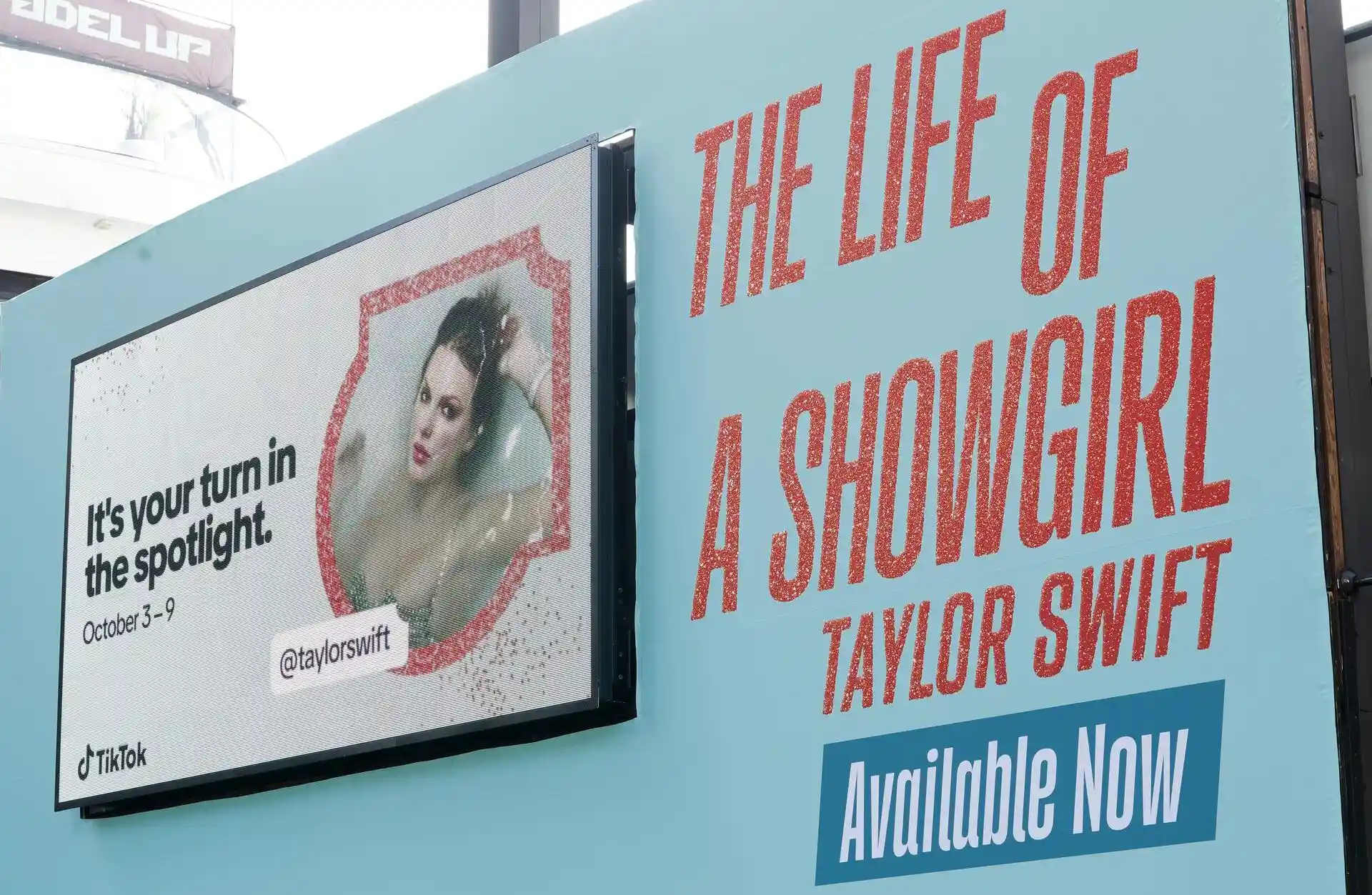
This new look was unlike any campaign or event because it was never meant to have a single moment in time. It was designed as a living system that would ripple forward into every activation, campaign, and piece of communication that followed. Where most projects have a clear launch and finish, this one was built to endure, shaping how TikTok shows up globally for years to come. The real measure of its success was not the initial rollout but the way it would become invisible in practice, woven seamlessly into the everyday work of countless teams. That longevity was evident almost immediately. Even in the earliest activations, you could see how the refreshed system elevated the work, from major cultural campaigns to artist partnerships. The new visual and verbal toolkit created a consistent language that tied everything together while still leaving room for expression. This framework was made possible because of a robust design and brand system that allowed for a lot of optionality and growth.
As a team we saw ourselves as brand stewards during the TikTok brand refresh, and it was important that every partner understood and adhered to the new system. That included longtime collaborators like Done and Dusted, who supported us on the Taylor Swift activation and were very familiar with the previous visual language. We spent time realigning them to the refreshed toolkit, explaining the intent behind the new rules, and reviewing creative to ensure consistency across motion, staging, graphics, and the overall show experience. It mattered to us that the refresh lived fully in the work and that external agencies stayed true to the updated look and feel.

Everything begins on TikTok. The stories we share in the world are seeded on the platform, shaped by the creativity of our community and the ways people use our tools to express themselves. Whether it is a jersey reveal for the Portland Thorns, a fan reaction at Providence Park, or a highlight clip that catches fire online, the content starts in the feed before it ever appears on a billboard, in a stadium, or on retail merchandise. By beginning on TikTok, we capture the authenticity and cultural energy that define the brand, and we make sure every activation in market feels true to the ecosystem our users create. This platform-first approach ensures that our personality and voice remain intact across every market and format.
.jpg)
What emerged was not only a visual system but a cultural architecture. Typography, color, motion, and shape became tools to channel the rhythms of a global stage where creators, brands, and audiences now meet. The Discovery Bar embodied this most directly, a universal UI gesture turned into a storytelling device that framed curiosity and commerce alike. In a world where TikTok is where you search first, where you discover what to eat, what to wear, what to play, and who to follow, the system needed to honor that reality. It turned search into a cultural act rather than a utility, a spark that could lead to sneakers, songs, or entire movements. This was TikTok’s evolution into a platform that no longer simply reflects culture but organizes it, guiding the flow between art, influence, and transaction. The refresh made that journey visible, proving that design could become the connective tissue that ties together the chaos of creativity and the order of commerce.
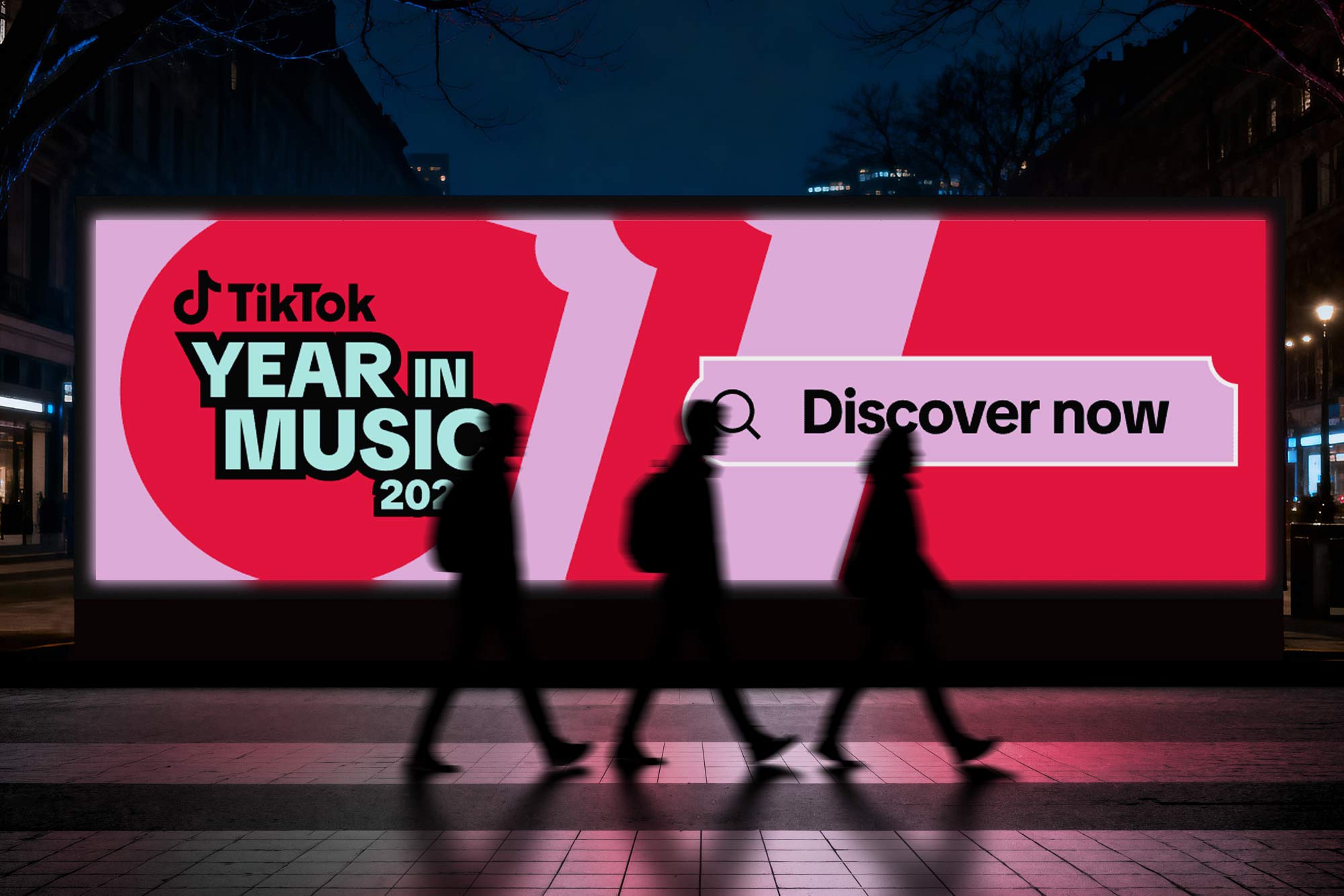
Music has always been TikTok’s native language, the connective tissue between creators, culture, and commerce, moving through the platform with a speed and intimacy that traditional distribution models cannot replicate. Sounds travel faster than headlines, turning unknown artists into global fixtures and transforming fragments of songs into shared emotional shorthand that people use to narrate their own lives. The platform does not just distribute music. It incubates it, allowing tracks to evolve through remix, reinterpretation, and repetition until they become inseparable from the moments they soundtrack. A chorus becomes a meme, a dance becomes a ritual, and a bedroom recording becomes a stadium chant, not through marketing spend alone but through collective participation. This participatory loop collapses the distance between artist and audience, making discovery feel communal rather than curated and turning listeners into collaborators in the lifecycle of a song. In this environment, TikTok does not follow culture. It sets the tempo, shaping what people hear, how they share it, and how music embeds itself into daily life long before charts or radio acknowledge its reach.
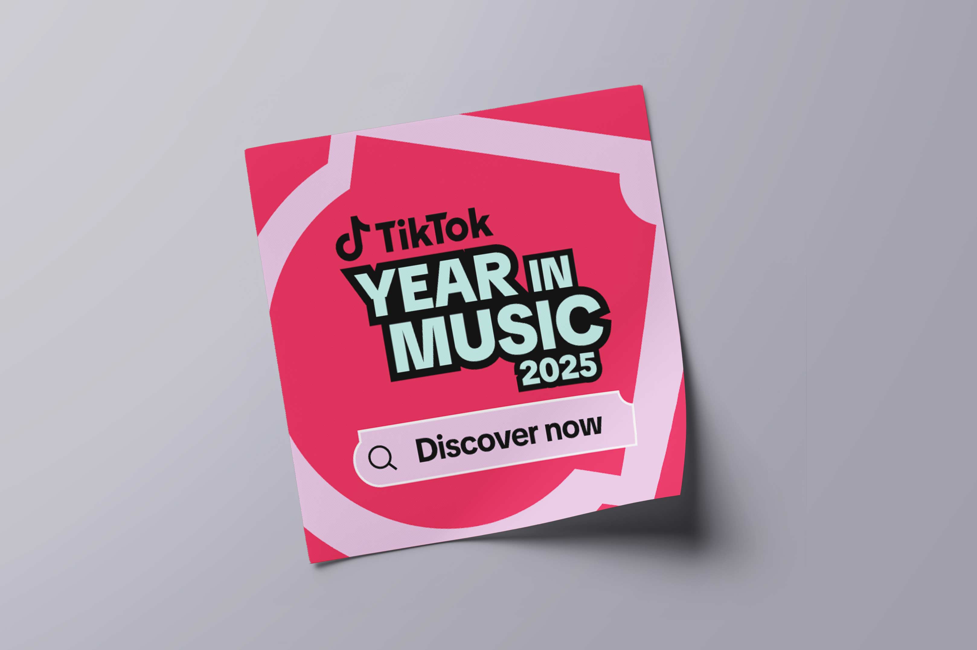
The Year in Music campaign became the clearest articulation of that influence, a global moment that translated data into storytelling and discovery into action while honoring the emotional weight music carries across regions and communities. Rather than presenting charts as static rankings, the campaign framed music as lived experience, surfacing the sounds that defined how people moved, created, mourned, celebrated, and connected throughout the year. The Discovery Bar played a central role, transforming a familiar UI gesture into an invitation to explore artists, tracks, and trends directly from the creative, collapsing the gap between awareness and engagement. What might have been a passive recap became an active gateway, encouraging audiences to search, listen, and participate in the cultural moments they had helped create. It demonstrated how TikTok’s ecosystem turns reflection into momentum, using design and interaction to convert curiosity into measurable behavior while reinforcing the platform’s role as both archive and engine. The result was a campaign that felt less like a year-end summary and more like a living index of collective memory, one that people could step back into with a single tap.

Visually, the system thrived in this context, proving that a flexible design language can carry emotional storytelling without sacrificing clarity or scale. The Spark shape functioned as a dynamic container for artist imagery, elevating performers into cultural icons while maintaining a cohesive frame across formats ranging from large-scale out-of-home placements to in-app modules and social cutdowns. TikTok Sans carried the campaign with bold, declarative typography that felt both authoritative and unmistakably native to the platform, demonstrating its strength across motion, static, and responsive environments. Layered color, motion behaviors, and modular layouts allowed the work to flex across regions while preserving a unified rhythm, ensuring that local nuance could exist within a globally recognizable system. Together, these elements showed how the refreshed design system was not merely aesthetic but behavioral, guiding audiences from recognition to discovery to action through visual consistency and intuitive hierarchy. In the Year in Music campaign, the brand did not just celebrate culture. It demonstrated how TikTok’s design infrastructure can hold it, shape it, and move it forward without diluting the messiness that makes culture worth participating in.

This phase of the refresh focused on extending TikTok’s brand from a contained interface into a cohesive system that could live across every touchpoint where culture is experienced. I worked to translate core product behaviors such as search, discovery, and feed-based storytelling into a flexible visual language that could scale globally while remaining instantly recognizable. By aligning typography, motion logic, color systems, and compositional rules across brand, product, and regional teams, we ensured that every expression felt native to the platform rather than imposed upon it. The goal was not to decorate surfaces but to embed participation into the design itself, so that each interaction mirrored the way people actually explore, create, and share on TikTok. This approach reinforced the platform’s role as a discovery engine and cultural connector, enabling the brand to move fluidly between digital and physical environments while maintaining clarity, authenticity, and local nuance.
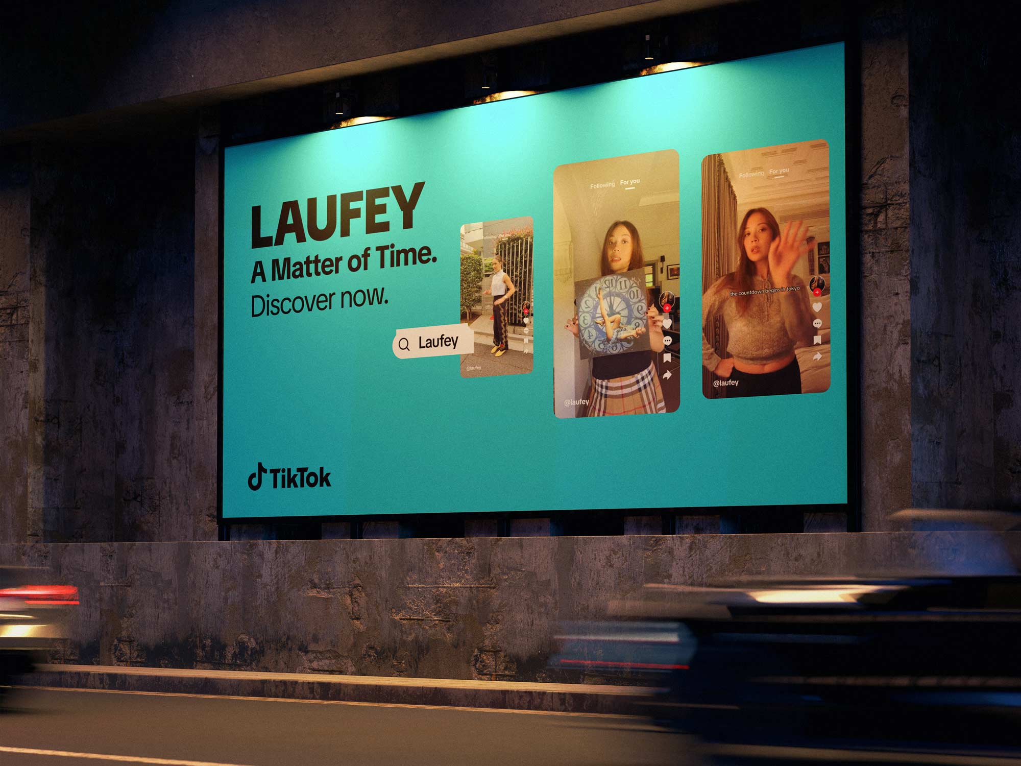
In the end, the refresh is less about what was changed and more about what was unlocked. By aligning the brand with the behavior of discovery itself, TikTok ensured its identity will always feel current, because discovery never ends. Each spark on the platform ricochets outward, creating ripples that touch music, fashion, sport, commerce, and community. The design system does not try to tame this energy but to frame it, to give it form without slowing its pace. That is why this work will endure. It is not a static set of rules but a living inheritance, a system that evolves as the culture it represents evolves. To contribute to it was to step into something far larger than myself, a continuum of voices and visions that together built an identity capable of carrying the weight of the world’s most dynamic stage. The refresh proved that design can be both mirror and engine, reflecting culture while also propelling it forward, and in doing so it ensured that TikTok’s brand will remain as alive as the creativity it hosts.
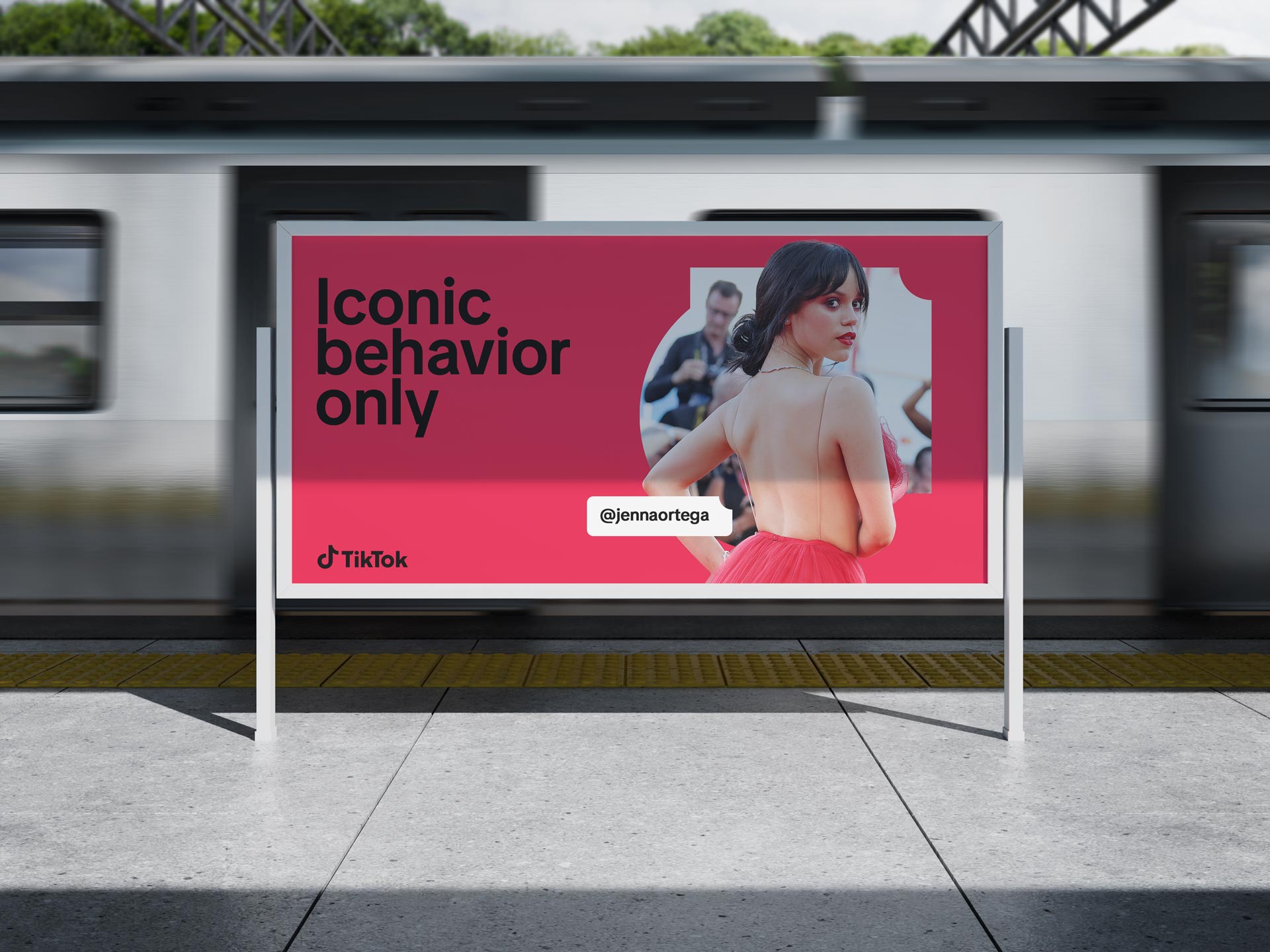
Over the course of this work, I helped transform a fragmented, regionally improvised brand presence into an operational system that global teams could adopt with confidence, enabling consistent storytelling, faster campaign deployment, and a clearer value proposition for partners and advertisers. I led cross functional collaboration across design, marketing, sales, and regional stakeholders to translate strategic ambition into usable frameworks, ensuring the brand could scale without losing cultural nuance or platform fluency. The result was not just a refreshed identity but an infrastructure for growth that supported enterprise partnerships, creator ecosystems, and tentpole activations at global scale. As my time in this chapter comes to a close, I see this system as a foundation rather than a finish line, one designed to evolve alongside the platform’s expanding role in commerce, AI driven personalization, and participatory media. In 2026 and beyond, the opportunity is to push this work further into adaptive brand systems, real time content orchestration, and deeper creator co authorship, ensuring the brand remains as dynamic as the communities that shape it.
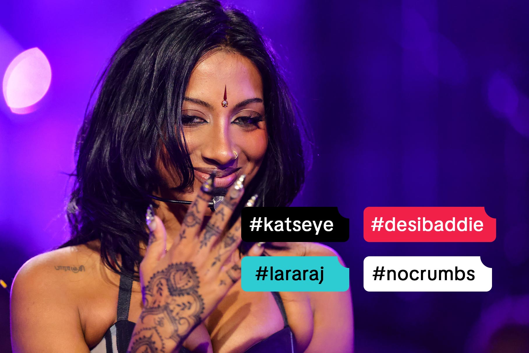
What remains with me most is not a logo refinement, a system rollout, or a campaign moment, but the realization that at this scale design becomes a form of stewardship. We were not simply shaping how a company looks, we were shaping how billions of people encounter culture, discover ideas, and recognize themselves within a shared visual language. The refresh gave TikTok the coherence to move with confidence and the flexibility to remain alive, a system sturdy enough to support global enterprise and porous enough to let creativity flow through it. Long after individual campaigns fade and leadership changes hands, the true measure of this work will be its ability to feel inevitable, as if it had always been there, quietly framing the sparks that continue to ignite across the platform. To have contributed to that continuity, to have helped build a structure that others can inhabit, adapt, and carry forward, is the kind of work that outlives a title and settles into legacy. And if the platform continues to evolve as culture does, then the system we built will not stand still either, it will keep learning, stretching, and making space for the next generation of voices who arrive with something new to say.

The refresh was never about locking the brand into a fixed expression. It was about creating the conditions for it to keep moving, to absorb new voices, formats, and behaviors without losing its center of gravity. At this scale, design works when it becomes indistinguishable from use, when discovery feels effortless, when creators recognize themselves in the frame, and when partners find clarity without friction. The goal was not polish for its own sake but resonance, a visual language that can stretch across cultures, communities, and moments while still feeling unmistakably TikTok. If the brand continues to feel alive, it is because it was shaped to evolve alongside the people who define it every day. This work does not close a chapter. It opens the space for everything that comes next. Grateful to DixonBaxi, our Consumer and Business teams, international partners, and the many cross functional collaborators whose craft, perspective, and trust made this work possible.

Key Collaborators: Dexter Fedor, Raisa Janjua, Vanessa Rizk, Joy Seet, Kenneth Liew, Stephanie Yin, Tracy Llewellyn, Hamilton Tamayo, Alainna Schiano, Sophie Rosseau, Connor Kort, Ali Lebow, Parris Pierce, Emma Tobin, Peter Henderson, Amy Heathorn, Jessica Dong, Ellie Sunakawa, Josh Covarrubias, Madison Laclair, Sophia Lipp, Dana Viltz, Hyunjin Park, Christie Ramistella, Jose Hunt, Henry Kaye, Jinglu Li, Ryan Northway, Ye Lin, Fernando Wang, Yujie Li, Peijun Guo, Qinyi Yao, Marina D'Orthez, Eason Shen, Jessie Ning, Jerio, Alex Ng, Mercy Tee, Haoqi Wen, Shayna Wenger, Julia Zhou, Ian Alexander, Johnny Chiu, Chang Ma, Jialu Li, Eason Shen, Thomas Cheng, Lachlan Bradford, Guandong Li, Yunfeng He, Tiantuo You, Haoyu Wang, Jun Shen, Haohao Duan, Melon Lee, Yuhang Liu, Miaomiao Liu, Xiangyu Kong, Yixia Xu, Kristin Peak, Nilesh Patel, Belle Baldoza, Jenny Westin, David Jonathan, Ross Guido Ferreyra, Maria Doreuli, Krista Radoeva, DixonBaxi, CoFo , GrilliType, Design Force, Type Network
Tools: Adobe After Effects, Adobe Photoshop, Adobe Illustrator, Figma, Cinema 4D, Final Cut Pro and Sketch
Deliverables: Brand Guidelines, Design System, Motion Package, Merch Guidelines, Product/UI Guidelines, Brand Photography, Presentation Templates, Event Templates, Typography, Brand Positioning, Tone of Voice, Enablement Materials